Freight Mobility Trends Report 2019EXECUTIVE SUMMARYThe Freight Mobility Trends Report 2019 reflects the results of the Freight Mobility Trends (FMT) dashboard, measuring freight performance trends between 2017 and 2019. The Freight Mobility Trends dashboard measures mobility using the following indicators:
The Nation’s highways serve a vital role in moving both people and goods. According to the Bureau of Transportation Statistics (BTS), traffic volume increased 17.9 percent between 2000 and 2018, from 2,747 billion to 3,240 billion vehicle miles traveled.1 Highways are an integral element of the national, multimodal freight transportation system. Goods movement by truck represents 67 percent of the total domestic tonnage. The Freight Analysis Framework estimates freight tonnage will increase about 37 percent between 2018 and 2045.2 Long-haul freight truck traffic is concentrated on major routes connecting population centers, ports, border crossings, and other major hubs of activity. BTS projects that truck travel may increase from 311 million miles per day in 2015 to 488 million miles per day by 2045, a 60 percent increase. With projected growth in travel, the Nation’s highways will continue to experience even greater demand.3 To address this increase in transportation, decision makers should ensure transportation funding is allocated toward projects that provide maximum benefit. To do this, decision makers need information on performance of the transportation system so that they can optimize investments and operational strategies to address congestion and reliability. Decision makers also need to understand the results of improvements to identify whether or not the investment or operational strategy is working as expected. To be able to effectively plan for, improve, and operate the transportation system, there needs to be ways to comprehensively monitor and assess transportation performance and mobility trends. The Federal Highway Administration’s FMT dashboard provides high-level, national trends in freight mobility and assesses freight movement over a range of locations based on truck travel data:
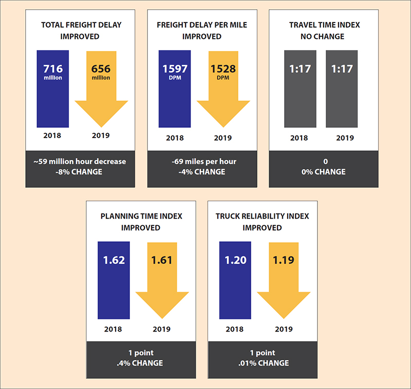
Freight Performance TrendsIn general, freight performance between 2017 and 2019 showed the following results:
The following sections provide results for the different geographic ranges and locations. National Trends
Key: delay per mile (DPM), travel time index (TTI), planning time index (PTI), truck reliability index (TRI), buffer index (BI) For specific indicators, the following results show that:
Source: FHWA Figure 2 shows performance for States and regions based on delay per mile:
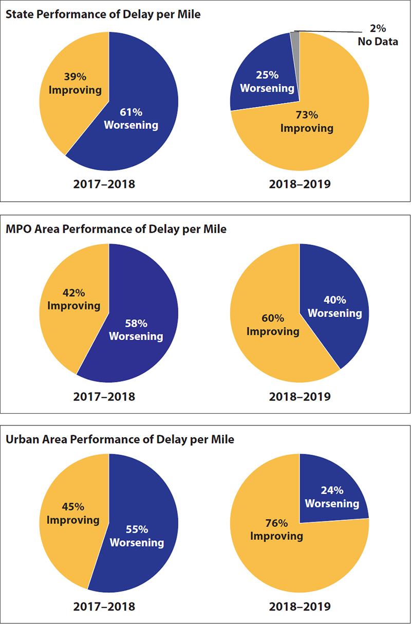
Source: FHWA National-Level Urban and Rural RoadwaysThe performance of urban and rural roadways between 2017 and 2019 shows that (table 2):
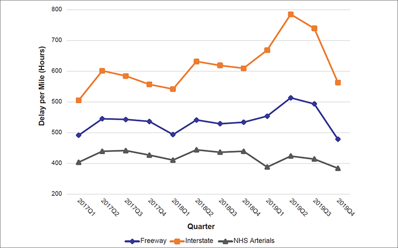
Key: delay per mile (DPM), travel time index (TTI), planning time index (PTI), truck reliability index (TRI), buffer index (BI) Trends by Functional ClassificationDifferent types of performance issues occur for the various roadway types on the National Highway System (NHS) at the national level (figure 3, figure 4, and table 3):
Source: FHWA 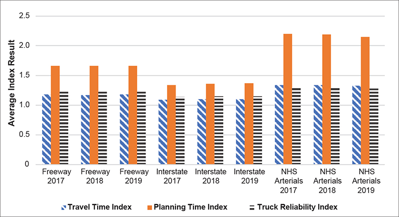
Source: FHWA
Key: delay per mile (DPM), travel time index (TTI), planning time index (PTI), truck reliability index (TRI), buffer index (BI) The following results show national-level performance trends by quarter for roadway type by functional class and area (urban or rural) (figure 5):
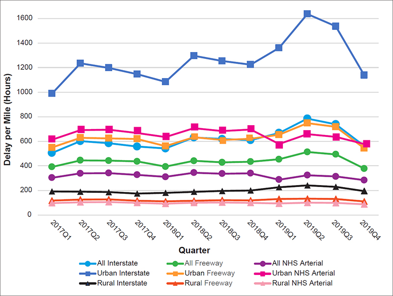
Source: FHWA Freight Performance by State and RegionThe Freight Mobility Trends Report 2019 summarizes freight performance by State, urban area, and MPO region. State-Level ResultsMost States had improved or mixed results for freight performance between 2018 and 2019. Figure 6 shows a map of States that represents whether the States worsened or improved by aggregating performance for the indicators of delay per mile, total delay, TTI, PTI, and TRI. Freight performance in the States is scored for the number of measures that improved or worsened. Based on this analysis:
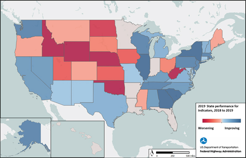
Source: FHWA As shown in figure 6, States that had consistent improvements in most indicators between 2018 and 2019 include:
The following States had worsening performance in most indicators between 2018 and 2019:
The following States were neutral for performance meaning that there was improvement for two indicators, worsening for two indicators, and no change for one indicator.
Note that data for Hawaii are not available for 2019. National Performance Measure for Truck Travel Time ReliabilityThe national performance measure to assess freight movement on the Interstate is the truck travel time reliability (TTTR) index under 23 CFR 490.607. The TTTR index measures the reliability or consistency of truck travel times on the Interstate over the course of a year. The national TTTR index measured over the entire Interstate system increased from 1.36 in 2017 to 1.39 in 2019. Figure 7 shows the percent change in TTTR by State between 2017 and 2019 and the results for each State are in table 4. 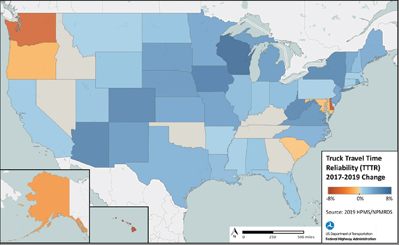
Source: FHWA
Key: truck travel time reliability (TTTR) Urban AreasFigure 8 shows the delay per mile for the urban areas throughout the United States. Delay per mile appears highest in areas such as the Northeast, California, and coastal Louisiana. 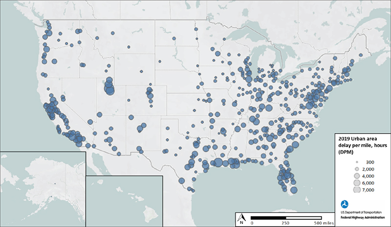
Source: FHWA Metropolitan Planning Organization AreasFigure 9 shows the performance of MPO areas for delay per mile in 2019. Similar to urban areas, MPO areas reflect higher delay per mile in areas such as the Northeast, California, and coastal Louisiana. Because MPO regions include some rural counties, the delay per mile results may appear lower. 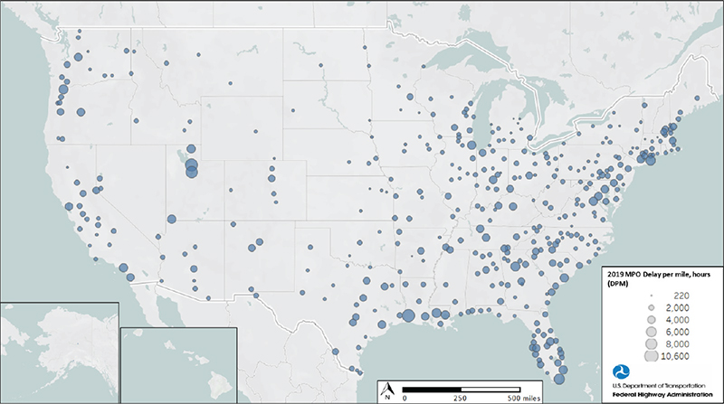
Source: FHWA Figure 10 shows the comparison of delay per mile for States, urban areas, and MPO areas by quarter. Urban areas exhibit higher delay per mile than MPO areas, but the trend is the same for all three. All three show increases in the second quarter of each year. Urban performance appears to drive overall performance. 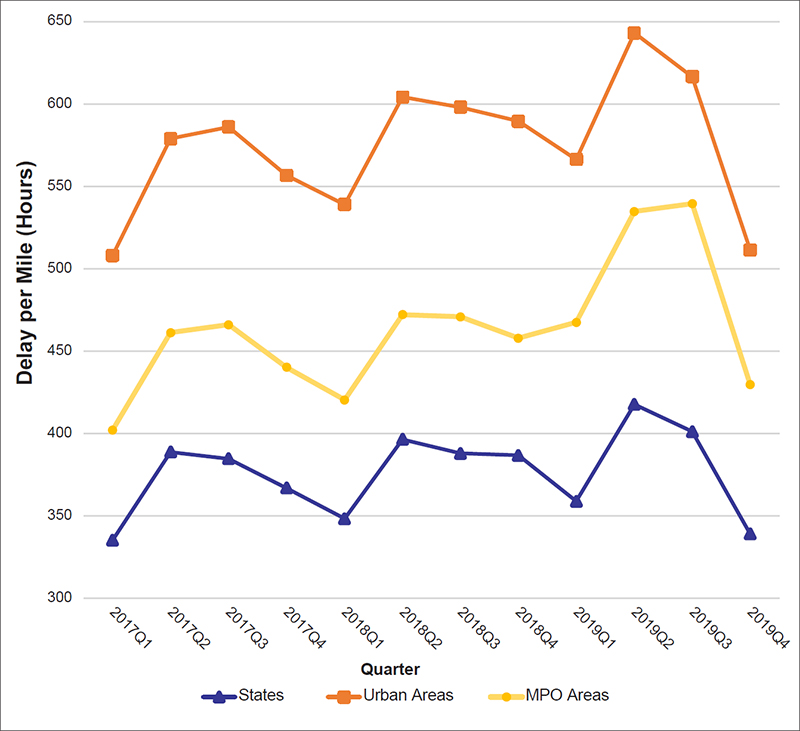
Source: FHWA National Freight Highway BottlenecksThe FMT was used to identify major freight highway bottlenecks and congested corridors based on annual truck hours of delay per mile. Figure 11 shows the top 100 Interstate bottlenecks and congested corridors in the United States in 2019. Of the 100 bottlenecks mapped, table 5 lists the top 25 with the greatest truck hours of delay per mile. These NHS locations have high truck volumes and congestion that present a significant cost to Interstate freight flows. 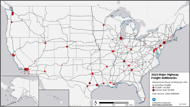
Source: FHWA
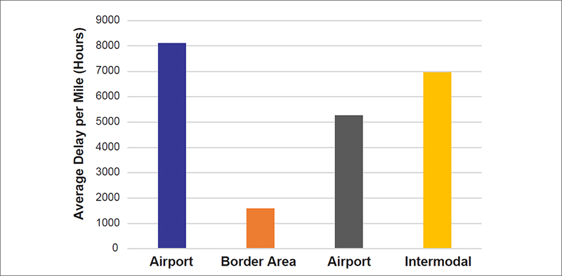
Freight FacilitiesThe FMT was also used to assess mobility on the NHS accessing intermodal locations like airports, ports, intermodal rail facilities, and borders. As shown in figure 12 and figure 13, highways accessing these freight facilities had the following results:
Source: FHWA 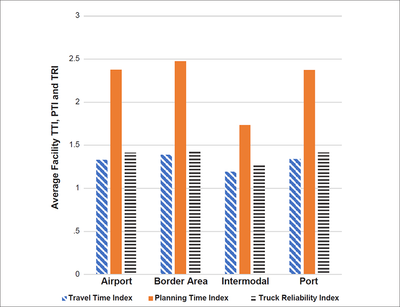
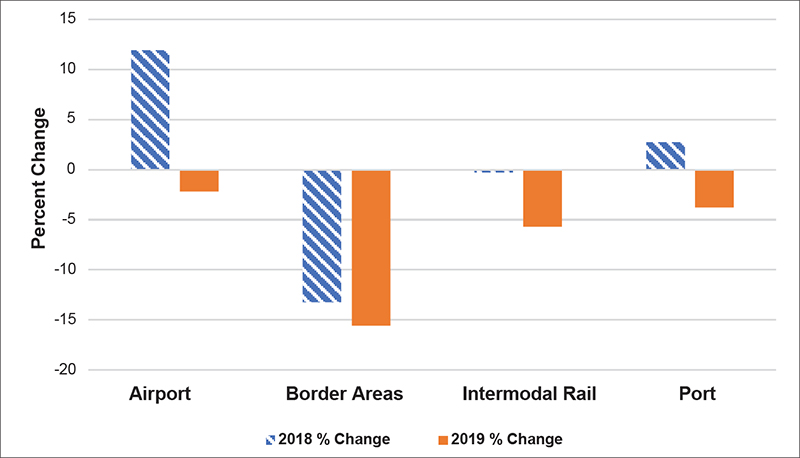
Source: FHWA Figure 14 shows the percent change for delay per mile for NHS routes accessing facilities from 2017 to 2018 and 2018 to 2019, with the following results:
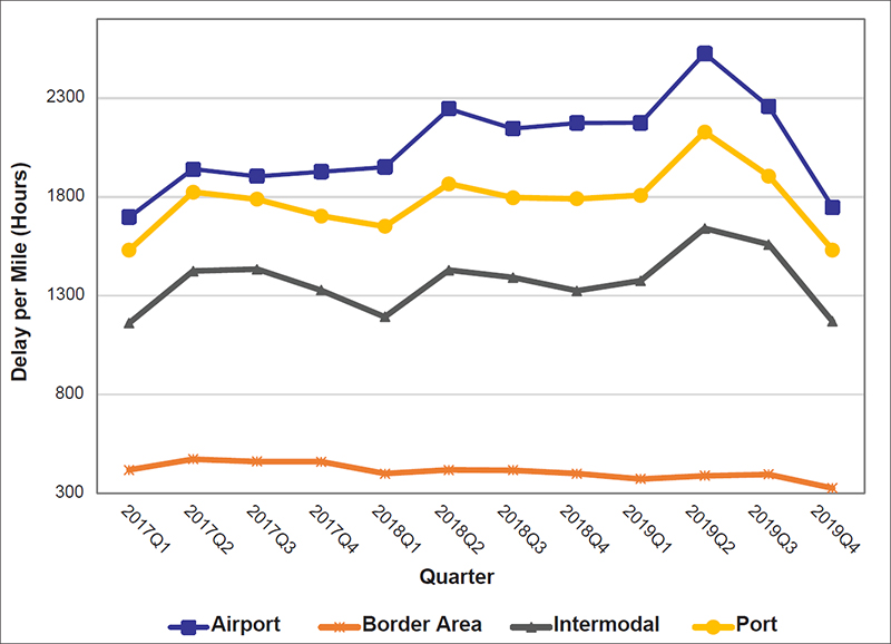
Source: FHWA Figure 15 shows the quarterly comparison of access to freight facilities, with the following results:
Source: FHWA Figure 16 shows delay per mile for NHS routes surrounding airports, intermodal rail facilities, ports, and borders. The larger circle sizes reflect greater delay per mile. 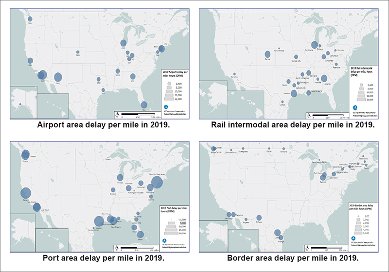
Source: FHWA Findings for NHS routes surrounding freight facilities include:
ConclusionThe Freight Mobility Trends analysis yields helpful information to aid understanding of dynamics in freight demand on the national transportation system. Increasing demand on the freight transportation system highlights the importance of investments in system capacity and operational strategies to address congestion, reliability, and intermodal connectivity. This report highlights challenges and opportunities where improvements can be achieved through a range of suggested strategies. Demands on the Interstate System from the higher truck and passenger vehicle volumes is evident in the significant amount of delay seen by the data in major urban areas. These freight bottlenecks not only impact mobility, but also have adverse environmental and congestion impacts on local communities. Major freight bottlenecks and congested corridors on the Interstate System tend to be concentrated in megaregions, with Los Angeles, New York, Chicago, Atlanta, San Francisco, and the “Texas-Triangle” (Dallas/ Fort Worth, Houston, and San Antonio) and having the greatest number of major bottlenecks. While the top 100 freight bottlenecks and congested corridors only make up a little more than 1 percent of the Interstate System, these locations account for 21 percent of total Interstate System truck delay. This underscores the need for targeted, data-driven transportation investments to address congestion and increase the efficiency of freight movements around major centers of industry and trade. While the Interstate System tends to be more reliable than other parts of the NHS, the TTTR index shows a decline in reliability on the Interstate System from year to year, indicating this reliability is gradually worsening as congestion continues to grow. Transportation System Management and Operations (TSMO) initiatives, such as integrated corridor management, managed lanes, work zone management, traffic incident management, and travel demand management, can leverage operational strategies and technologies to optimize existing capacity under the growing demand placed on the Interstate System. The data show that arterials tend to have more challenges with reliability than other roadways. Upon leaving the Interstate System, freight must travel through congested arterials mixed with traffic interacting with the local street system, further impacting first and last-mile travel to major destinations. Urban areas tend to have worse freight performance than rural areas in terms of congestion, delay, and unreliability. However, the data also show that rural roadway performance declined from 2017 to 2019. This shows that the impact of growth in travel demand is not just limited to urban areas, but also affects the performance in rural areas. Seasonal fluctuations can be seen in the performance indicators for many States. TSMO initiatives, such as road weather management and incident response, are key to managing these impacts on the rural freight transportation system. Intermodal connections from highways to ports, rail, and airports are key to an efficient intermodal freight transportation system. The data show that NHS routes surrounding airports and port areas also show mobility challenges. An emphasis on improving intermodal connections to freight facilities is critical to improving access to these major trade gateways and the multimodal freight transportation system's performance. Freight truck traffic is concentrated on major routes connecting population centers, ports, border crossings, and other major activity hubs. Corridor coalitions and similar coordination between States will continue to address common needs for safe and efficient freight mobility along key corridors supporting economic development. Coordination between States and MPOs around megaregions can also help support integration of transportation planning with economic development. This increased demand on the transportation system calls for decision makers to ensure limited public funding is allocated toward projects that provide the maximum benefit. For the U.S. Department of Transportation (USDOT), State DOTs, and MPOs to plan for, improve, and operate the transportation system more effectively, there need to be ways to comprehensively monitor and assess transportation performance and mobility trends. This report provides information that can support national, state, and regional freight transportation planning, programing, and investments. States and MPOs are taking a variety of approaches to address freight mobility based upon local factors. USDOT can support these efforts through the National Freight Strategic Plan, promoting multimodal and operational solutions through programs such as the National Highway Freight Program, and considering freight mobility needs in Federal grant funding through programs such as the Infrastructure for Rebuilding America (INFRA) and other discretionary grant programs. Highways are an integral element of the national, multimodal freight transportation system. The Nation’s highways serve a vital role in moving both people and goods. Continuous freight mobility measurement will provide important information that can be used in conjunction with other economic and infrastructure condition indicators to understand how to keep freight moving throughout the Nation. This report provides information on the performance of the freight system and insights into needs for planning and coordinating investments to support freight efficiencies. | ||||||||||||||||||||||||||||||||||||||||||||||||||||||||||||||||||||||||||||||||||||||||||||||||||||||||||||||||||||||||||||||||||||||||||||||||||||||||||||||||||||||||||||||||||||||||||||||||||||||||||||||||||||||||||||||||||||||||||||||||||||||||||||||||||||||||||||||||||||||||||||||||||||||||||||||||||||||||||||||||||||||||||||||||||||||||||||||||||||||||||||||||||||||||||||||||||||||||||||||||||||||||||||||||||||||||||||||||||||||||||||||||||||||||||||||||||||||||||||||||||||||||||||||||||||||||||||||||||||||||
|
United States Department of Transportation - Federal Highway Administration |
||