Freight Mobility Trends Report 2019SECTION 2: FREIGHT PERFORMANCE RESULTSThis section provides the 2017 through 2019 trends for the freight mobility indicators at the national level, followed by information at the State level and specific tracked locations. National TrendsAt the national level, all of the measures can be rolled up (aggregated) into single indicators, providing a high-level indication of freight performance throughout the United States. Table 6 provides the national roll-up (aggregated) indicator results. In addition to the measures of delay, the indices for travel time index (TTI), planning time index (PTI), truck reliability index (TRI), and buffer index (BI) provide indicators of the variability or unreliability of the system. If these indicators were provided at a segment level, the actual number would reflect a real experience for that segment. For example, at the segment level, a PTI of 1.50 means that to ensure on-time delivery for a trip that typically takes 30 minutes in light traffic, one needs to plan 45 minutes (30 minutes × 1.50) during congested conditions for important trips. Segments with worse reliability have higher PTIs. There is little change at the national level over the three-year period. Data show slight increases for 2018 for all indicators except TTI. Table 7 shows an increase in truck vehicle miles traveled (TVMT) between 2017 and 2018, which may contribute to the worsening of reliability and congestion seen in 2018. At the time of this report, the 2019 TVMT data were unavailable.
Key: delay per mile (DPM), travel time index (TTI), planning time index (PTI), truck reliability index (TRI), buffer index (BI)
Key: truck vehicle miles traveled (TVMT) Figure 18 illustrates delay per mile for the three-year period and shows a pattern of increases in the second quarter for each year, as well as an improvement in the fourth quarter of 2019. These second-quarter spikes may reflect supply chain cycles and an increase in production and related congestion following winter and global production patterns (e.g., Chinese New Year) that occur in quarter one. 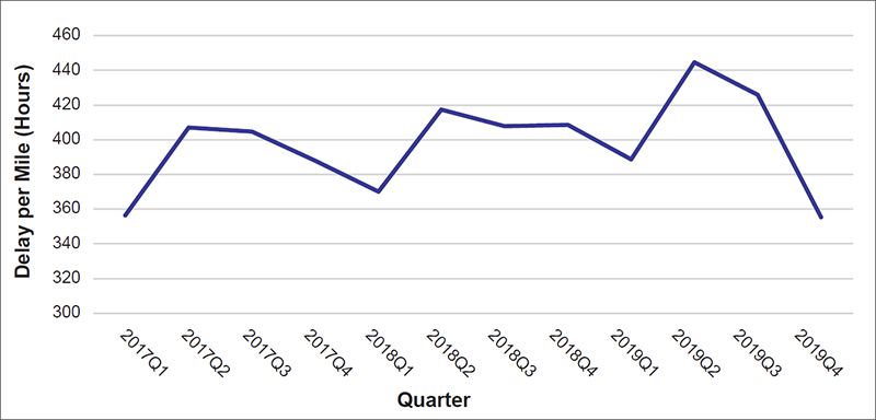
Source: FHWA Figure 19 shows the quarterly performance for the national mobility and reliability indicators. The TTI gives an indication of the travel time needed during the peak period compared to free flow. The PTI compares the time that is needed to ensure 95 percent on-time arrival to the typical free-flow travel time. The TRI shows day-to-day variation travel time by comparing the 95th percentile travel time to typical travel during the same time of day. At the national level, all three indicators are stable over the three-year period, but the PTI does show slightly more fluctuation each quarter due to being at the tail of distribution rather than in the middle like a TTI measure. The indicators also show an improvement in reliability in the fourth quarter of 2019 similar to the reduced delay per mile results. 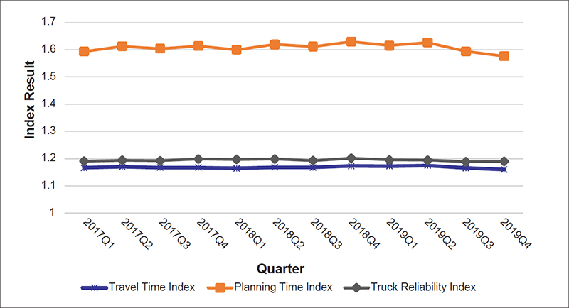
Source: FHWA Table 8 shows that urban roadways experience higher levels of congestion or delay and unreliability than rural roadways. While most delay is observed on urban roadways, there is slight worsening for both urban and rural roadways from 2017 to 2018. Urban roadways show slight improvements for delay per mile in 2019. Rural roadway delay per mile worsened each year. Rural areas show slight increases in total delay over the three years. Urban areas show an increase in total delay in 2018 and a decrease in total delay in 2019.
Key: delay per mile (DPM), travel time index (TTI), planning time index (PTI), truck reliability index (TRI), buffer index (BI) Figure 20 shows the quarterly delay per mile trends by urban and rural roadways. Urban roads have the highest levels of congestion, and these levels increase in the second quarter of each year. Rural roadways have lower congestion and variability. The rural roadways are stable, and a second-quarter increase is slight. Rural roadways will not show much change because a large extent of the mileage is close to free flow and reliable, which serves to obscure any delay or variability in smaller areas of the rural network. 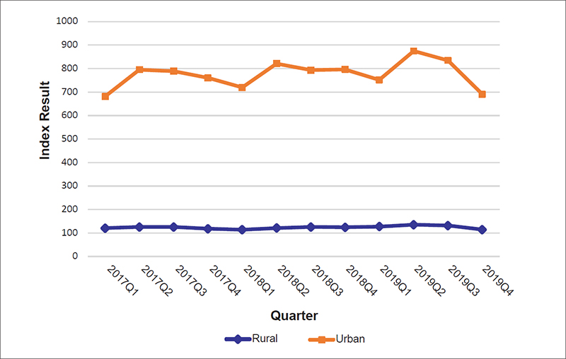
Source: FHWA Figure 21 shows the quarterly results for the TTI, PTI, and TRI by urban and rural roadways. The urban PTI shows the most fluctuation, similar to the national result discussed previously. The other indicators are mostly stable over the three-year period. 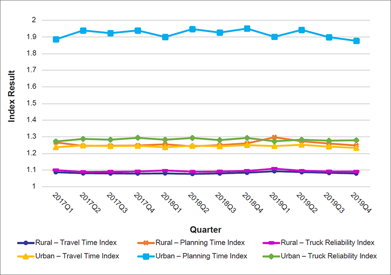
Source: FHWA Table 9 provides the indicators and delay for roadway type on the National Highway System (NHS). For the NHS, functional classes are Interstates, freeways (off the Interstate), and NHS arterials. NHS arterials tend to have higher mobility and reliability challenges. This is likely due to the signalized nature of arterial roadways that introduce variability into the traffic along with increased access points on the surface streets. Interstates show higher levels of delay per mile, which is likely due to the higher volumes and increased peak-period congestion.
Key: delay per mile (DPM), travel time index (TTI), planning time index (PTI), truck reliability index (TRI), buffer index (BI) Figure 22 depicts the national performance for delay per mile by NHS roadway over the three-year period. Delay per mile shows variability, especially for Interstates. That Interstates’ have higher delay per mile but improved reliability reflects that they can be reliably congested, while other roadways like NHS arterials experience more unreliability due to elements like surface street operations. 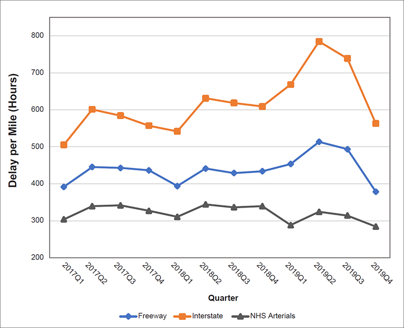
Source: FHWA Figure 23 represents the data for the 2019 mobility and reliability indicators for NHS roadways. There is only minor fluctuation in performance. The PTI decreases over the three-year period for NHS arterials, stays the same for freeways, and worsens slightly for Interstates. The TRI improves slightly for NHS arterials, stays the same for freeways, and just slightly increases for Interstates. The TTI improves for NHS arterials, has a slight dip in 2018 for freeways, increases in 2019, and slightly increases for Interstates. These fluctuations are minimal but show a small decline in reliability for the Interstate and a slight improvement in reliability for NHS arterials. 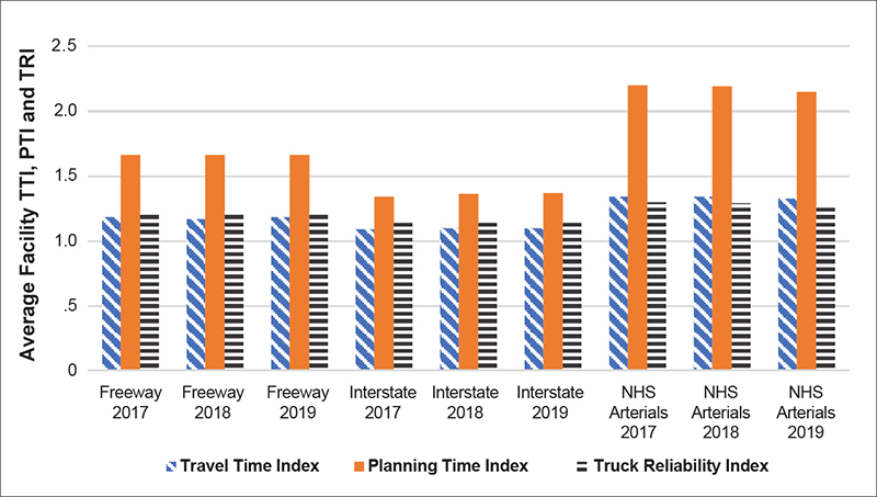
Source: FHWA StatesMost States had improved or mixed results for freight performance between 2018 and 2019. A few States showed consistent improvements or worsening across all measures. Figure 24 shows a map of States that represents whether the States worsened or improved by aggregating performance for the indicators of delay per mile, total delay, TTI, PTI, and TRI. Freight performance in the States is scored for the number of measures that improved or worsened. A description detailing figure 24 follows. 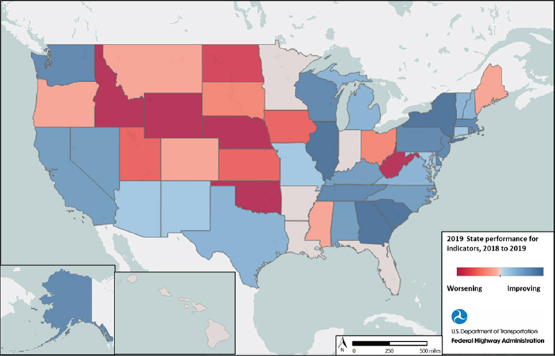
Source: FHWA Most States improved or had mixed results on the indicators. A few States showed consistent improvements or worsening across all indicators, but many showed improvements in the indicators. The following States had consistent improvements in most indicators between 2018 and 2019:
The following States had worsening performance in most indicators between 2018 and 2019:
The following States were neutral for performance meaning that there was improvement for two indicators, worsening for two indicators, and no change for one indicator.
Note that data for Hawaii are not available for 2019. Table 10 shows the 10 States with the highest 2019 indicators for all roadways (urban and rural combined). California is the only State to appear in the 10 highest results for each indicator. Washington, D.C., Maryland, California, New York, and New Jersey are highest for five of the indicators. These are shown in orange and bold font. There are no data for Hawaii for 2019.
Key: delay per mile (DPM), travel time index (TTI), planning time index (PTI), truck reliability index (TRI), buffer index (BI) Table 11 shows the States with the highest 2019 results for all indicators for urban roadways. California is the only State in the 10 highest for all indicators. Washington, D.C., New York, and Washington are in the 10 highest for five of the six indicators. These are highlighted in orange and bold font.
Key: delay per mile (DPM), travel time index (TTI), planning time index (PTI), truck reliability index (TRI), buffer index (BI) Table 12 shows the States with the highest 2019 result for all indicators for rural roadways. No State appears in the 10 highest for all indicators, but Delaware is the only State in five of the six indicators. Alaska, New Hampshire, Colorado, Vermont, and South Dakota are highest for four of the six indicators. These States are highlighted in orange and bold font.
Key: delay per mile (DPM), travel time index (TTI), planning time index (PTI), truck reliability index (TRI), buffer index (BI) Figure 25 is a map of the delay per mile for 2019. Darker blue represents higher delay per mile. This reflects the results of the rankings for delay per mile described previously, with the greater delay per mile for locations including Washington, D.C., Maryland, and California. Table 13 provides the DPM for 2019 that corresponds to figure 25. 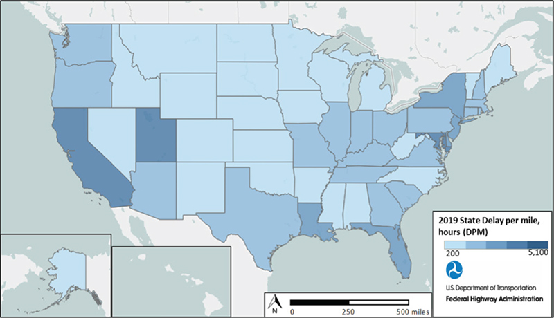
Source: FHWA
Among States, Interstates have the highest delay per mile, followed by freeways (figure 26). 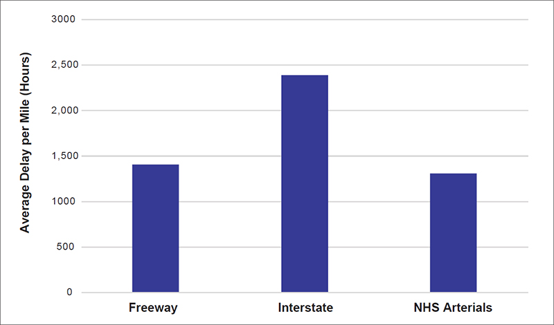
Source: FHWA NHS arterials have higher unreliability (figure 27), while Interstates are more reliable. Though Interstates are more reliable, they have higher delay per mile (as seen previously), likely due to heavier volumes and more consistent operations that make them reliably congested. However, NHS arterials have higher unreliability, likely due to characteristics such as signalization, intersection spacing, and design. 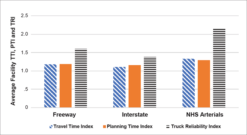
Source: FHWA Urban Interstates show higher delay per mile than freeways and NHS arterials (figure 28). 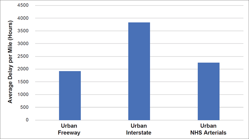
Source: FHWA Urban NHS arterials are higher for unreliability than freeways and Interstates (figure 29). 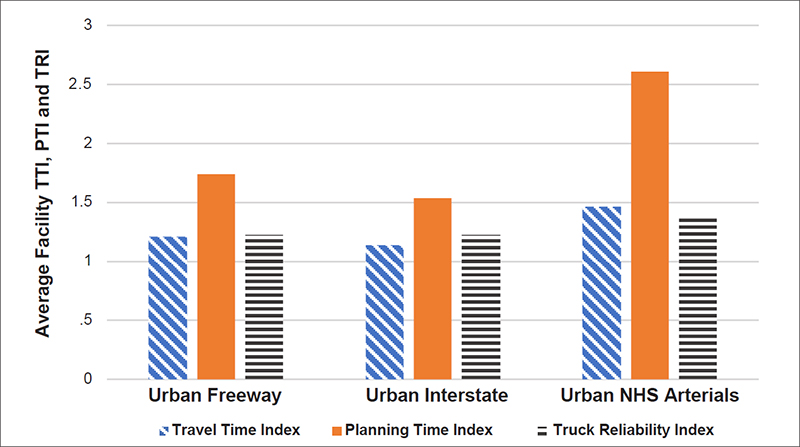
Source: FHWA Rural Interstates exhibit higher delay per mile (figure 30). For rural roadways, NHS arterials remain the roadway type with higher unreliability although less pronounced than in urban areas (figure 31). This analysis generally shows that urban Interstates have the highest delay per mile and tend to drive the overall result. NHS arterials tend to show lower for reliability in both urban and rural areas. 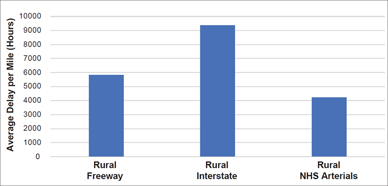
Source: FHWA 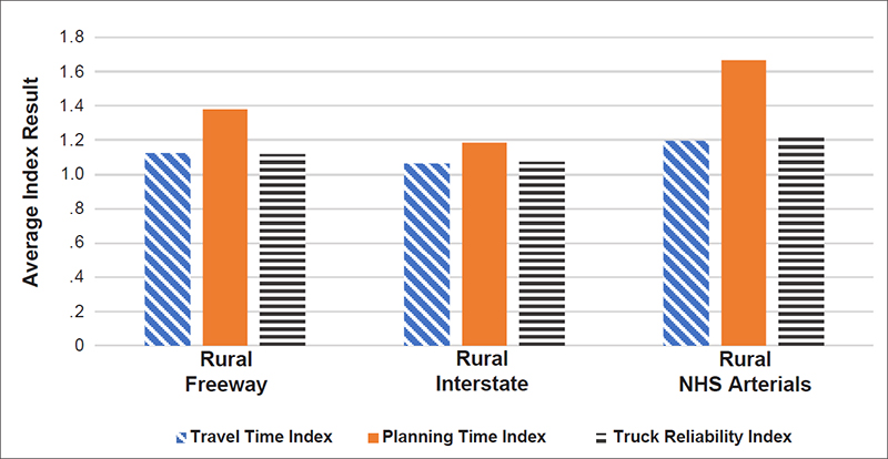
Source: FHWA National Performance Measure for Truck Travel Time ReliabilityThe performance measure to assess freight movement on the Interstate is the Truck Travel Time Reliability (TTTR) index. The TTTR index measures the reliability or consistency of truck travel times on the Interstate over the course of a year and provides a key indicator of transportation system performance. The TTTR index is the ratio of the 95th percentile truck travel time to the 50th percentile truck travel time. The national TTTR index measured over the entire Interstate system increased from 1.36 in 2017 to 1.39 in 2019. Figure 32 shows the results of each State’s 2019 TTTR measure. Table 14 provides the 2019 data shown in the map in figure 32. 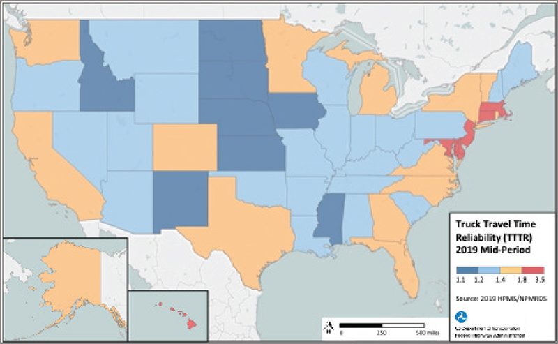
Source: FHWA Table 14 shows the 2017 and 2019 TTTR measure of each State along with the 2017–2019 TTTR index percent change. The largest increase in TTTR was in Wisconsin and West Virginia with 7 percent increases, followed by Iowa, Colorado, and New York with 6 percent increases. The State with the largest improvement was Hawaii with an 11 percent decrease, followed by Delaware with a 7 percent decrease and Washington with a 6 percent decrease.
Key: truck travel time reliability (TTTR) Figure 33 shows the percent change in TTTR between 2017 and 2019. The data for each state shown in the map in figure 33 is in table 14. 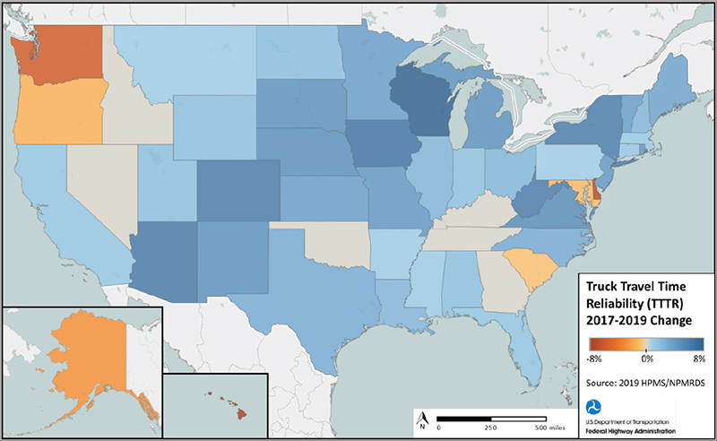
Source: FHWA Urban AreasTable 15 shows the 10 urban areas highest for the six indicators. Only Los Angeles–Long Beach–Anaheim, CA, is among the highest for each indicator. Lexington Park–California–Chesapeake Ranch Estates, MD, St. Augustine, FL, Napa, CA, and San Jose, CA, are highest for four of the five indicators. These States are highlighted in orange and bold font. Some of these locations such as Lexington Park, MD, are near major freight generators or connections. Lexington Park, for example, is the home of the Patuxent Naval Air Station and is an urban area with mostly signalized roadways. Twin Rivers, NJ, is an area just south and west of the New York metropolitan area and is at the crossroad of I-95 and major freight roadways.
Key: planning time index (PTI), truck reliability index (TRI), buffer index (BI) Figure 34 shows the delay per mile for the urban areas throughout the United States. Delay per mile appears highest in areas such as the Northeast, California, and coastal Louisiana. Areas in Utah also have high delay per mile. However, this may be a result of a data error from higher Annual Average Daily Truck Traffic (AADTT) being reported from the State. 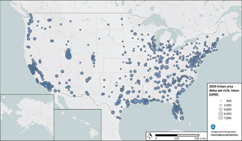
Source: FHWA Metropolitan Planning Organization RegionsTable 16 lists the Metropolitan Planning Organization (MPO) regions that are highest for the six indicators. No MPO region appears highest for all indicators, but some are present in five or four indicators. These include:
These MPOs highest for most of the indicators are highlighted in orange and bold font. Like these urban areas, some locations like the Calvert–St. Mary Metropolitan Planning Organization (Maryland) are less populated but have major employers, such as a major military installation. Some of these smaller MPOs that are in the highest rankings of the indicators may have limited NHS miles that are driving the increases.
Key: planning time index (PTI), truck reliability index (TRI), buffer index (BI) Figure 35 shows the quarterly trends for delay per mile by urban and rural roadways and type for MPO areas. MPO areas have urban Interstates with the highest delay per mile, followed by urban NHS arterials. Rural roadways in MPO regions have lower delay per mile. All roadways follow similar trends as described previously for the national level, where there is a noticeable increase in the second quarter of all years and decrease in quarter four of 2019. Rural freeways and NHS arterials in MPO areas show less fluctuation although rural Interstates exhibit changes each quarter more like urban roadways. 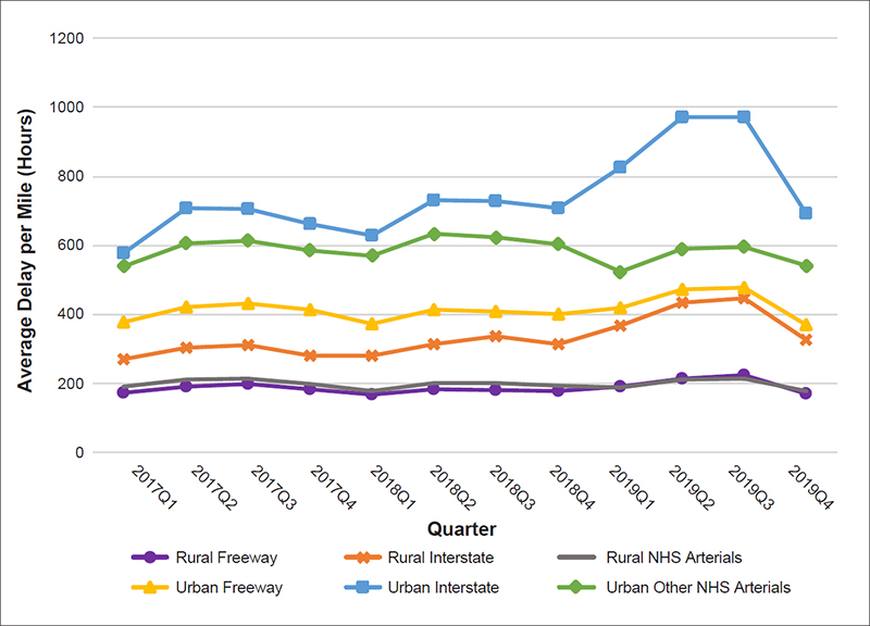
Source: FHWA Figure 36 shows the delay per mile for MPO areas throughout the United States. The larger circles reflect those in the list in table 16. As mentioned previously, Utah’s results may be lower than shown due to a possible error in the data, and no data exist for Hawaii in 2019. 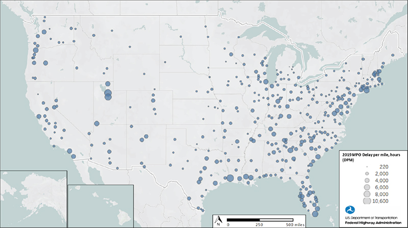
Source: FHWA National Highway Freight NetworkFigure 37 shows the National Highway Freight Network (NHFN) delay. For this analysis, the only parts of the NHFN included are the Primary Highway Freight System (PHFS) and other Interstates not on the PHFS. No critical urban corridors or critical rural corridors are included. Like other locations, urban roadways exhibit the most delay, and delay increases noticeably around the second quarter for roadways that are part of the NHFN. However, whereas Interstates have shown the highest delay for other locations and at the national level, for the NHFN, urban freeways have more delay than Interstates in the fourth quarter of 2017 and then from the fourth quarter of 2018 on. Similarly, rural freeways exhibit higher delay than rural Interstates or NHS arterials. It is expected that since the NHFN used in this analysis is primarily Interstates, it would be similar to the national analysis of delay. For example, out of the 41,518 miles of the PHFS, only an approximate 10 percent of the miles are non-Interstate roads. For these urban roadways on the PHFS, there is significantly higher delay, which may be attributable to their importance as goods movement links that warranted their inclusion in the PHFS. 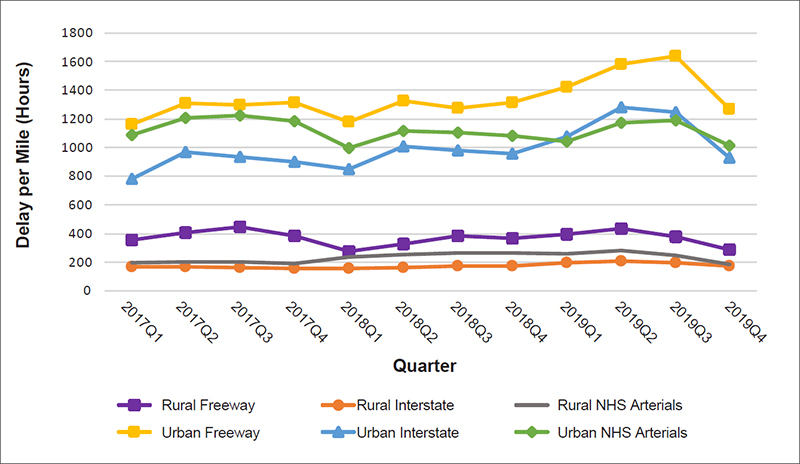
Source: FHWA Strategic Highway NetworkFor the Strategic Highway Network (STRAHNET), figure 38 shows that delay performance mirrors the national delay, with urban Interstates exhibiting the highest delay followed by urban freeways and urban NHS arterials. Rural roadways have much lower delay. While rural Interstates have the highest delay from the first quarter of 2018, rural freeways had more delay in 2017 and then decreased. 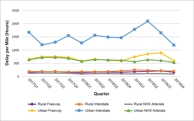
Source: FHWA | |||||||||||||||||||||||||||||||||||||||||||||||||||||||||||||||||||||||||||||||||||||||||||||||||||||||||||||||||||||||||||||||||||||||||||||||||||||||||||||||||||||||||||||||||||||||||||||||||||||||||||||||||||||||||||||||||||||||||||||||||||||||||||||||||||||||||||||||||||||||||||||||||||||||||||||||||||||||||||||||||||||||||||||||||||||||||||||||||||||||||||||||||||||||||||||||||||||||||||||||||||||||||||||||||||||||||||||||||||||||||||||||||||||||||||||||||||||||||||||||||||||||||||||||||||||||||||||||||||||||||||||||||||||||||||||||||||||||||||||||||||||||||||||||||||||||||||||||||||||||||||||||||||||||||||||||||||||||||||||||||||||||||||||||||||||||||||||||||||||||||||||||||||||||||||||||||||||||||||||||||||||||||||||||||||||||||||||||||||||||||||||||||||||||||||||||||||||||||||||||||||||||||||||||||||||||||||||||||||||||||||||||||||||||||||||||||||||||||||||||||||||||||||||||||||||||||||||||||||||||||||||||||||||||||||||||||||||||||||||||||||||||||||||||||||||||||||||||||||||||
|
United States Department of Transportation - Federal Highway Administration |
||