Freight Mobility Trends Report 2019
SECTION 3: FREIGHT-SPECIFIC LOCATIONS
Though the indicators are important at the national level to understand nationwide position and trends, it is also important to consider performance at different types of locations. This section depicts performance at different geographic levels. These levels include:
- Major freight highway bottlenecks.
- Freight Significant Corridors.
- Key freight facilities:
- Airports.
- Rail intermodal facilities.
- Ports.
- Border areas.
- Border crossings.
Major Freight Highway Bottlenecks and Congested Corridors
Table 17 lists the 2019 top Interstate bottlenecks and congested corridors in the United States based on truck hours of delay per mile for 2019. Delay per mile (DPM) was calculated for each Interstate segment using the National Performance Management Research Data Set (NPMRDS) travel time data in the Freight Mobility Trends (FMT) tool. These locations were then compared with the bottlenecks identified by States in their 2019 Baseline Performance Reports. The analysis was completed for 2017 and 2018 to track trends from year to year, and the 2018 ranking is also included in the table. The Federal Highway Administration (FHWA) will conduct this analysis on an annual basis to update the list, track trends, and allow dialog with States on methods to address congestion at major bottlenecks. This will allow FHWA to identify successful transportation management techniques that can be shared with other States.
Table 17 lists the route, urban area, and State ordered by the 2019 truck hours of delay per mile. Information is provided for directional Annual Average Daily Truck Traffic (AADTT), annual truck hours of delay per mile, and total corridor congestion cost per year. Annual truck hours of delay per mile is determined at the most congested segment of the corridor. The generalized bottleneck location/congested corridor is estimated based on a review of corridor congestion scans in the NPMRDS. For major congested corridors, this may include multiple contiguous bottlenecks along the corridor. Total corridor congestion cost is calculated for the full extent of delay along the congested corridor, which may include multiple segments, as a function of both the time and fuel used while the truck is in congested traffic, factoring costs of personnel, commercial vehicle operation, and wasted fuel.
Appendix B provides detailed information on bottlenecks.
Table 17. Major Interstate freight highway bottlenecks and congested corridors based on truck hours of delay per mile from the 2019 National Performance Management Research Data Set.
| 2019 Rank |
2018 Rank |
Road |
Urban Area |
State |
Generalized Bottleneck Location/ Congested Corridor |
AADT (Trucks) |
DPM (Truck Hours) |
Total Corridor Congestion Cost ($) |
| 1 |
1 |
I-95/ I-295 |
New York |
NY/NJ |
I-278/I-678 to NJ side of GW Bridge/SR-4 |
9,555 |
263,116 |
76,000,000 |
| 2 |
3 |
I-90/ I-94 |
Chicago |
IL |
I-94 N to I-55 |
8,003 |
140,942 |
86,900,000 |
| 3 |
4 |
I-605 |
Los Angeles |
CA |
I-5 to SR-60 |
10,963 |
139,777 |
62,500,000 |
| 4 |
2 |
I-35 |
Austin |
TX |
Airport Blvd. to Stassney Ln. |
11,074 |
111,359 |
109,900,000 |
| 5 |
6 |
I-610 |
Houston |
TX |
I-69 to I-10 |
7,379 |
104,009 |
60,800,000 |
| 6 |
5 |
I-678 |
New York |
NY |
I-495 to Belt Pkwy. and I-295/I-95 to south end Bronx-Whitestone Bridge |
6,510 |
100,237 |
40,000,000 |
| 7 |
11 |
I-405 |
Los Angeles |
CA |
I-105 to SR-42 Manchester Blvd. |
12,139 |
95,686 |
147,800,000 |
| 8 |
7 |
I-290 |
Chicago |
IL |
I-90/I-94 to I-290 |
8,726 |
94,778 |
59,700,000 |
| 9 |
8 |
I-69/ US 59 |
Houston |
TX |
Buffalo Speedway to I-45 |
6,831 |
89,185 |
57,800,000 |
| 10 |
12 |
I-278 |
New York |
NY |
I-95/I-678 to Grand Central Pkwy. and SR 27 Prospect Expy. to SR-29 Queens Blvd. |
6,607 |
88,339 |
147,000,000 |
| 11 |
9 |
I-24 |
Nashville |
TN |
US-41 to SR-155 |
12,775 |
86,920 |
52,200,000 |
| 12 |
10 |
I-10 |
Los Angeles |
CA |
20th St. to I-5 and at I-605 |
7,036 |
86,745 |
164,100,000 |
| 13 |
15 |
I-710 |
Los Angeles |
CA |
Cesar Chavez Ave. to Atlantic Blvd. |
6,833 |
85,730 |
47,500,000 |
| 14 |
23 |
I-45 |
Houston |
TX |
US-90 to I-69 |
7,184 |
84,471 |
58,800,000 |
| 15 |
17 |
I-680 |
San Francisco |
CA |
SR-262 to SR-238 |
6,406 |
81,240 |
14,000,000 |
| 16 |
25 |
I-495 |
New York |
NY |
Little Neck Pkwy. to Queens Midtown Tunnel |
8,988 |
70,916 |
112,400,000 |
| 17 |
21 |
I-5 |
Seattle |
WA |
I-90 to 85th St. and SR 18 to Port of Tacoma Rd. |
6,876 |
69,732 |
62,500,000 |
| 18 |
14 |
I-5 |
Los Angeles |
CA |
SR-134 Ventura Fwy. to I-605 |
7,097 |
68,560 |
123,200,000 |
| 19 |
20 |
I-76 |
Philadelphia |
PA |
University Ave. to US-1 |
4,605 |
67,019 |
37,500,000 |
| 20 |
19 |
I-87 |
New York |
NY |
I-278 to 230th St. |
4,900 |
64,891 |
25,100,000 |
| 21 |
27 |
I-105 |
Los Angeles |
CA |
I-405 to Long Beach Blvd. |
7,397 |
64,807 |
56,800,000 |
| 22 |
22 |
I-75 I-85 |
Atlanta |
GA |
I-20 to I-75/I-85 split |
7,355 |
63,432 |
19,300,000 |
| 23 |
34 |
I-10 |
New Orleans |
LA |
I-610 to Pontchartrain Expy. |
14,179 |
61,114 |
73,000,000 |
| 24 |
73 |
I-10 |
Lake Charles |
LA |
At I-210 |
14,179 |
61,114 |
31,500,000 |
| 25 |
26 |
I-210 |
Los Angeles |
CA |
SR-39/164 Azusa Ave. to SR-19 Rosemead Blvd. |
10,007 |
60,414 |
67,600,000 |
| 26 |
18 |
I-10 |
Baton Rouge |
LA |
I-110 to SR-1 |
10,718 |
57,724 |
33,800,000 |
| 27 |
32 |
I-25 |
Denver |
CO |
I-70 to University Blvd. |
7,030 |
55,696 |
54,200,000 |
| 28 |
29 |
I-5 |
Portland |
OR |
Columbia River to Terwilliger Blvd. |
7,988 |
55,154 |
53,100,000 |
| 29 |
31 |
I-55 |
Chicago |
IL |
I-94 to SR-171 |
7,376 |
53,860 |
58,300,000 |
| 30 |
37 |
I-285 |
Atlanta |
GA |
East/SR-400 to US-78 and West/I-20 to Northside Dr. |
11,855 |
53,821 |
137,500,000 |
| 31 |
46 |
I-495 |
Washington |
MD/ VA |
I-66 (VA) to I-95 (MD) |
9,544 |
53,507 |
93,900,000 |
| 32 |
33 |
I-70 |
Denver |
CO |
I-25 to I-270 |
5,973 |
53,461 |
26,700,000 |
| 33 |
55 |
I-30 |
Little Rock |
AR |
At I-630 |
19,820 |
51,924 |
11,700,000 |
| 34 |
35 |
I-80 |
San Francisco |
CA |
US-101 to Bay Bridge; and at I-580 |
2,737 |
51,110 |
35,200,000 |
| 35 |
39 |
I-10 |
Houston |
TX |
I-69 to I-45 |
9,085 |
50,107 |
53,700,000 |
| 36 |
40 |
I-270 |
Denver |
CO |
I-25 to I-70 |
5,364 |
50,104 |
14,500,000 |
| 37 |
47 |
I-95 |
Washington |
VA |
SR-123 to SR-286 |
8,092 |
49,241 |
49,800,000 |
| 38 |
24 |
I-110/ CA-110 |
Los Angeles |
CA |
I-10 to SR-42 Stauson Ave. |
3,890 |
48,762 |
23,100,000 |
| 39 |
36 |
I-10 |
Phoenix |
AZ |
At I-17 from 51st Ave. to SR-143 |
11,718 |
48,254 |
91,200,000 |
| 40 |
45 |
I-15 |
Riverside |
CA |
At SR-91 |
5,267 |
48,175 |
18,600,000 |
| 41 |
30 |
I-15 |
Salt Lake City |
UT |
At I-215 (SR-173 to SR 48) |
32,835 |
47,435 |
62,139,000 |
| 42 |
44 |
I-15 |
Los Angeles |
CA |
At I-10 |
9,099 |
47,170 |
12,700,000 |
| 43 |
59 |
I-80/ I-94 |
Chicago |
IL |
I-294 to I-94 |
20,900 |
46,615 |
9,100,000 |
| 44 |
50 |
I-695 |
Baltimore |
MD |
I-95 to I-795 |
10,497 |
46,428 |
45,400,000 |
| 45 |
57 |
I-71/ I-75 |
Cincinnati |
KY/ OH |
I-275 to Western Hills |
15,297 |
44,603 |
18,300,000 |
| 46 |
81 |
I-90 |
Chicago |
IL |
I-90/94 to I-294 |
3,595 |
43,345 |
32,300,000 |
| 47 |
51 |
I-64 |
St. Louis |
MO |
Market St. to I-70 (over Mississippi River) |
9,240 |
42,771 |
9,100,000 |
| 48 |
28 |
I-294 |
Chicago |
IL |
At I-290 and at I-90 |
9,449 |
42,295 |
40,900,000 |
| 49 |
61 |
I-405 |
Seattle |
WA |
I-90 to SR-520 |
4,796 |
40,760 |
12,800,000 |
| 50 |
127 |
I-75 |
Chattanooga |
TN |
At I-24 |
11,798 |
40,747 |
6,000,000 |
| 51 |
65 |
I-676 |
Philadelphia |
PA |
I-76 to I-95 |
3,695 |
40,448 |
7,300,000 |
| 52 |
56 |
I-238 |
San Francisco |
CA |
I-880 to I-580 |
9,026 |
40,088 |
4,600,000 |
| 53 |
64 |
I-35 |
San Antonio |
TX |
At I-10 |
13,515 |
39,338 |
24,300,000 |
| 54 |
53 |
I-494 |
Minneapolis |
MN |
SR-77 to W Bush Lake Rd. |
6,142 |
38,514 |
9,000,000 |
| 55 |
58 |
I-85 |
Atlanta |
GA |
I-75 to SR 13/141 and I 285 to SR-378 |
8,539 |
37,663 |
35,700,000 |
| 56 |
48 |
I-35E |
Dallas |
TX |
I-30 to Market Center Blvd. |
7,786 |
37,601 |
24,900,000 |
| 57 |
54 |
I-635 |
Dallas |
TX |
I-35 to SR-78 |
10,114 |
37,059 |
61,400,000 |
| 58 |
42 |
I-95 |
Baltimore |
MD |
I-395 to I-895 |
9,481 |
36,203 |
34,900,000 |
| 59 |
79 |
I-95 |
Philadelphia |
PA |
At I-676 |
5,085 |
35,789 |
11,900,000 |
| 60 |
67 |
I-270 |
St. Louis |
MO |
I-64 to SR 100 |
17,600 |
35,500 |
28,200,000 |
| 61 |
63 |
I-215 |
Riverside |
CA |
I-10 to SR-80 |
7,241 |
35,057 |
35,300,000 |
| 62 |
38 |
I-75 |
Cincinnati |
OH |
SR-562 to SR-126 |
11,175 |
34,492 |
29,500,000 |
| 63 |
52 |
I-94 |
Chicago |
IL |
I-90/94 to US-14 |
8,000 |
33,752 |
12,900,000 |
| 64 |
74 |
I-880 |
San Francisco |
CA |
At I-980 and at US 101 |
6,035 |
32,983 |
55,800,000 |
| 65 |
70 |
I-24 |
Chattanooga |
TN |
I-75 to US-41 |
11,133 |
32,057 |
18,500,000 |
| 66 |
100 |
I-40 |
Albuquerque |
NM |
At I-25 |
14,443 |
31,823 |
9,700,000 |
| 67 |
72 |
I-805 |
San Diego |
CA |
SR-52 to SR-163 |
6,210 |
31,791 |
13,900,000 |
| 68 |
60 |
I-30 |
Dallas |
TX |
I-35 to Grand Ave. |
9,311 |
31,390 |
14,300,000 |
| 69 |
84 |
I-376 |
Pittsburgh |
PA |
Fort Pitt Bridge to Squirrel Hill |
2,591 |
31,346 |
2,800,000 |
| 70 |
78 |
I-10 |
Riverside |
CA |
At I-215 |
11,505 |
31,196 |
17,300,000 |
| 71 |
75 |
I-84 |
Hartford |
CT |
SR-2 to Prospect Ave. |
5,792 |
29,849 |
7,700,000 |
| 72 |
73 |
I-405 |
Portland |
OR |
I-5 to US-26 |
4,297 |
29,467 |
1,200,000 |
| 73 |
86 |
I-95 |
Wilmington |
DE |
At I-295/I-495 |
12,139 |
28,402 |
2,700,000 |
| 74 |
43 |
I-94 |
Minneapolis |
MN |
SR-280 to Hennepin Ave. |
4,350 |
28,016 |
4,400,000 |
| 75 |
80 |
I-205 |
Portland |
OR |
At I-84 |
5,290 |
27,951 |
7,100,000 |
| 76 |
82 |
I-95 |
Fredericksburg |
VA |
US-17 to Russell Rd. |
9,889 |
27,933 |
20,000,000 |
| 77 |
96 |
I-93 |
Boston |
MA |
At I-90 and at SR-3 |
4,381 |
27,386 |
19,600,000 |
| 78 |
85 |
I-95 |
Bridgeport |
CT |
At US-1 in Fairfield and at US-1 in Stamford |
5,893 |
27,289 |
51,000,000 |
| 79 |
71 |
I-40 |
Nashville |
TN |
I-24 to I-65 |
5,379 |
27,148 |
4,100,000 |
| 80 |
87 |
I-95 |
New Haven |
CT |
I-91 to SR-10 |
6,047 |
26,805 |
2,700,000 |
| 81 |
94 |
I-78 |
New York |
NJ |
US-22 to SR-440 |
6,083 |
26,033 |
6,700,000 |
| 82 |
98 |
I 35W |
Dallas |
TX |
At I-30 |
5,426 |
24,953 |
11,900,000 |
| 83 |
68 |
I-15 |
Ogden |
UT |
SR-232 to SR-273 |
10,303 |
24,114 |
5,995,000 |
| 84 |
88 |
I-75 |
Atlanta |
GA |
I-85 to Moores Mill Rd. |
8,403 |
23,791 |
6,300,000 |
| 85 |
— |
I-65 |
Indianapolis |
IN |
I-70 N to Fall Creek Blvd. |
6,901 |
23,639 |
1,500,000 |
| 86 |
140 |
I-20/ I-59 |
Birmingham |
AL |
At I-65 |
7,435 |
23,124 |
2,500,000 |
| 87 |
119 |
I-270 |
Washington |
MD |
At I-495 |
6,801 |
22,345 |
26,400,000 |
| 88 |
16 |
I-15 |
Las Vegas |
NV |
I-515 to Tropicana Ave. |
6,661 |
22,146 |
17,000,000 |
| 89 |
111 |
I-280 |
New York |
NJ |
Garden State Pkwy. to SR-21 |
4,450 |
22,029 |
2,900,000 |
| 90 |
94 |
I-95 |
Miami |
FL |
Florida Turnpike to I-395 |
4,745 |
21,894 |
29,400,000 |
| 91 |
97 |
I-4 |
Tampa |
FL |
At I-275 |
6,558 |
21,620 |
6,900,000 |
| 92 |
110 |
I-670 |
Kansas City |
MO |
At I-70 |
4,358 |
21,163 |
1,200,000 |
| 93 |
89 |
I-395 |
Washington |
DC/VA |
US-50 to VA-236 |
5,204 |
21,150 |
700,000 |
| 94 |
112 |
I-580 |
Livermore |
CA |
I-205 to First St. |
7,153 |
20,960 |
8,300,000 |
| 95 |
109 |
I-95 |
Washington |
MD |
I-495 to SR-200 |
10,661 |
20,807 |
6,300,000 |
| 96 |
124 |
I-95 |
Boston |
MA |
SR-38 to I-93 |
4,057 |
20,726 |
8,600,000 |
| 97 |
103 |
I-84 |
Portland |
OR |
At I-5 |
4,543 |
20,359 |
3,400,000 |
| 98 |
90 |
I-65 |
Nashville |
TN |
I-40 to I-440 |
10,952 |
20,093 |
13,500,000 |
| 99 |
114 |
I-40 |
Knoxville |
TN |
I-75/I-640 to I-275 |
8,346 |
20,059 |
2,500,000 |
| 100 |
115 |
I-71 |
Columbus |
OH |
At I-670 |
7,597 |
19,511 |
7,300,000 |
Key: annual average daily traffic (AADT), delay per mile (DPM)
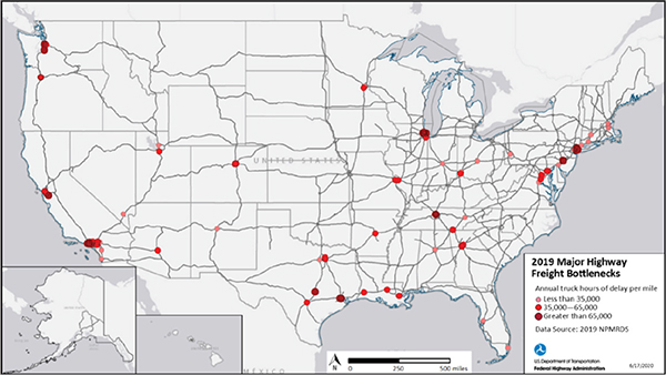
Figure 39 shows the top Interstate bottlenecks in the United States based on freight mobility indicators of annual truck hours of delay per mile from 2019. While the top 100 bottlenecks and congested corridors only make up a little more than one percent of the Interstate System, these locations account for 21 percent of total Interstate System truck delay.
This analysis uses delay per mile for assessing bottlenecks to allow for comparison over the entire Interstate system across all States. Individual State Departments of Transportation (DOTs) and Metropolitan Planning Organization (MPOs) use a range of bottleneck identification methods based on their local traffic characteristics, infrastructure constraints, and impediments to efficient freight movement. A range of methods are used that consider congestion, delay, reliability, and truck-specific restrictions.
Source: FHWA
Figure 39. Map. Major highway freight bottlenecks in 2019.
Freight Significant Corridors
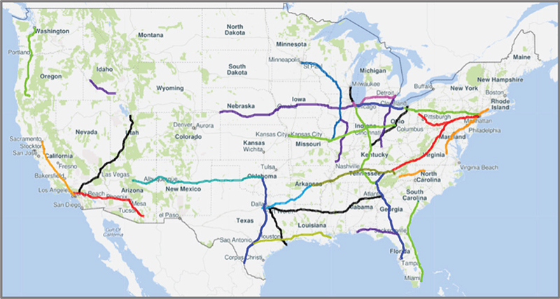
FHWA has been tracking a set of nationally significant Interstate freight corridors with a Buffer Index (BI) measurement since 2012. To continue this effort, the FMT includes these corridors and five additional corridors important for freight. Figure 40 shows the corridors, and figure 41 shows the corridors with an indication of Truck Vehicle Miles Traveled (TVMT). The TVMT and number of segments per corridor is detailed in table 18.
As a consideration of additional time that drivers need to add to their trip to account for delay and unreliability, the BIs for these corridors range from lower index results for corridors—such as I-10 from Los Angeles, CA, to Tucson, AZ, and I-5/CA 99 from Sacramento, CA, to Los Angeles, CA—to higher BI results on corridors—such as I-45 from Dallas, TX, to Galveston, TX, and I-95 in the Northeast and I-94 from Chicago, IL, to Milwaukee, WI.

Source: FHWA
Figure 40. Map. Freight-significant corridors.

Source: FHWA
Figure 41. Map. Freight-significant corridors with truck vehicle miles of travel detail.
Table 18. Freight significant corridor average daily truck vehicle miles traveled (TVMT) (in miles) and number of traffic message channel (TMC) segments from the National Performance Management Research Data Set (NPMRDS) per corridor.
| Corridor |
Average Daily Truck VMT (miles) |
Number of Traffic Message Channel Segments from the NPMRDS Data |
| I-5/CA 99: Sacramento to Los Angeles |
5,533 |
911 |
| I-5: Medford, OR to Seattle |
4,928 |
676 |
| I-10: Los Angeles to Tucson |
6,156 |
1,020 |
| I-10: Pensacola to I-75 |
3,063 |
161 |
| I-10: San Antonio to New Orleans |
7,556 |
962 |
| I-15: Los Angeles to Salt Lake City |
5,673 |
704 |
| I-20: Dallas to Atlanta |
5,803 |
1,147 |
| I-30: Little Rock to Dallas |
7,103 |
739 |
| I-35: Laredo to Oklahoma City |
6,189 |
1,565 |
| I-40: Knoxville to Little Rock |
6,964 |
645 |
| I-40: Oklahoma City to Flagstaff |
3,800 |
1,092 |
| I-40: Raleigh to Asheville |
2,489 |
317 |
| I-45: Dallas to Galveston |
5,623 |
652 |
| I-55/I-39/I-94: St. Louis to Minneapolis |
4,707 |
725 |
| I-57/I-74: I-24 (IL) to I-55 (IL) |
3,701 |
246 |
| I-65/I-24: Chattanooga to Nashville to Chicago |
7,706 |
771 |
| I-70: Kansas City to Columbus |
6,532 |
935 |
| I-71: Louisville to Cleveland |
5,565 |
442 |
| I-75: Lexington to Detroit |
7,590 |
712 |
| I-75: Tampa to Knoxville |
6,455 |
875 |
| I-78/I-76: New York to Pittsburgh |
2,861 |
489 |
| I-80: Chicago to I-76 (CO/NE border) |
4,699 |
807 |
| I-80: Cleveland to Chicago |
4,622 |
80 |
| I-80: New York to Cleveland |
5,364 |
523 |
| I-81: Harrisburg to I-40 (Knoxville) |
6,002 |
583 |
| I-84: Boise to I-86 |
3,034 |
139 |
| I-94: Chicago to Detroit |
5,118 |
610 |
| I-94: Chicago to Milwaukee |
7,449 |
414 |
| I-95: Miami to I-26 (SC) |
4,415 |
757 |
| I-95: Richmond to New Haven |
6,483 |
1,180 |
Table 19 provides the BI for the corridors using an area graph. I-94 from Chicago, IL, to Milwaukee, WI, and I-95 from Richmond, VA, to New Haven, CT, have the highest BI results. Almost all corridors appear to worsen in the fourth quarter of 2019. This is the opposite of national-level findings that show improvements for this quarter.
Table 19. BI Percent for freight significant corridors by quarter.
| Corridor |
2017
Q1 |
2017
Q2 |
2017
Q3 |
2017
Q4 |
2018
Q1 |
2018
Q2 |
2018
Q3 |
2018
Q4 |
2019
Q1 |
2019
Q2 |
2019
Q3 |
2019
Q4 |
| I-5/CA 99: Sacramento Los Angeles |
11 |
10 |
12 |
12 |
11 |
10 |
10 |
13 |
12 |
11 |
11 |
13 |
| I-5: Medford, OR to Seattle |
16 |
16 |
17 |
17 |
15 |
16 |
16 |
19 |
16 |
17 |
19 |
20 |
| I-10: Los Angeles to Tucson |
13 |
12 |
12 |
15 |
14 |
13 |
13 |
16 |
14 |
13 |
14 |
16 |
| I-10: Pensacola to I-75 |
3 |
3 |
3 |
2 |
3 |
3 |
3 |
5 |
6 |
5 |
5 |
7 |
| I-10: San Antonio to New Orleans |
13 |
13 |
16 |
15 |
17 |
15 |
14 |
16 |
17 |
16 |
16 |
17 |
| I-15: Los Angeles to Salt Lake City |
7 |
5 |
5 |
6 |
6 |
6 |
5 |
7 |
8 |
7 |
7 |
11 |
| I-20: Dallas to Atlanta |
4 |
4 |
5 |
5 |
5 |
5 |
5 |
7 |
5 |
6 |
6 |
7 |
| I-30: Little Rock to Dallas |
11 |
12 |
10 |
13 |
13 |
12 |
11 |
14 |
13 |
13 |
13 |
15 |
| I-35: Laredo to Oklahoma City |
15 |
15 |
13 |
15 |
15 |
14 |
13 |
18 |
17 |
18 |
16 |
20 |
| I-40: Knoxville to Little Rock |
6 |
7 |
7 |
8 |
10 |
9 |
7 |
9 |
8 |
9 |
8 |
9 |
| I-40: Oklahoma City to Flagstaff |
3 |
2 |
2 |
2 |
3 |
2 |
2 |
5 |
5 |
3 |
3 |
6 |
| I-40: Raleigh to Asheville |
6 |
9 |
9 |
10 |
7 |
11 |
7 |
10 |
7 |
12 |
13 |
15 |
| I-45: Dallas to Galveston |
14 |
13 |
15 |
15 |
15 |
15 |
14 |
16 |
15 |
14 |
15 |
15 |
| I-55/I-39/I-94: St. Louis to Minneapolis |
4 |
4 |
4 |
4 |
6 |
5 |
5 |
6 |
9 |
6 |
6 |
8 |
| I-57/I-74: I-24 (IL) to I-55 (IL) |
2 |
8 |
6 |
5 |
3 |
3 |
2 |
3 |
4 |
4 |
3 |
5 |
| I-65/I-24: Chattanooga to Nashville to Chicago |
8 |
9 |
9 |
10 |
11 |
10 |
10 |
12 |
11 |
10 |
11 |
12 |
| I-70: Kansas City to Columbus |
4 |
6 |
6 |
5 |
6 |
5 |
5 |
6 |
6 |
6 |
7 |
8 |
| I-71: Louisville to Cleveland |
9 |
11 |
11 |
10 |
12 |
11 |
12 |
14 |
11 |
12 |
13 |
13 |
| I-75: Lexington to Detroit |
9 |
11 |
11 |
11 |
13 |
12 |
11 |
13 |
11 |
13 |
14 |
15 |
| I-75: Tampa to Knoxville |
7 |
8 |
11 |
9 |
8 |
9 |
7 |
11 |
9 |
9 |
9 |
10 |
| I-78/I-76: New York to Pittsburgh |
8 |
9 |
9 |
8 |
9 |
8 |
9 |
11 |
9 |
8 |
9 |
10 |
| I-80: Chicago to I-76 (CO/ NE border) |
4 |
3 |
3 |
3 |
6 |
3 |
3 |
5 |
9 |
5 |
5 |
6 |
| I-80: Cleveland to Chicago |
4 |
5 |
4 |
5 |
8 |
3 |
2 |
4 |
6 |
3 |
2 |
4 |
| I-80: New York to Cleveland |
7 |
6 |
8 |
7 |
9 |
8 |
9 |
9 |
8 |
9 |
9 |
9 |
| I-81: Harrisburg to I-40 (Knoxville) |
3 |
6 |
6 |
6 |
5 |
7 |
7 |
10 |
5 |
7 |
7 |
6 |
| I-84: Boise to I-86 |
14 |
2 |
3 |
3 |
4 |
3 |
3 |
4 |
5 |
3 |
4 |
7 |
| I-94: Chicago to Detroit |
14 |
18 |
14 |
16 |
16 |
15 |
13 |
14 |
18 |
16 |
15 |
17 |
| I-95: Miami to I-26 (SC) |
11 |
9 |
12 |
12 |
12 |
10 |
9 |
12 |
12 |
10 |
12 |
13 |
| I-95: Richmond to New Haven |
27 |
33 |
30 |
34 |
29 |
34 |
31 |
36 |
28 |
36 |
33 |
37 |
| I-94: Chicago to Milwaukee |
37 |
51 |
46 |
45 |
42 |
46 |
51 |
44 |
35 |
43 |
40 |
36 |
To assess the corridors with a different lens, Table 20 shows the same corridors measured with the TRI. The results are similar to those for the corridors of I-94 from Chicago, IL, to Milwaukee, WI, and I 95 from Richmond, VA, to New Haven, CT, but are less reliable than the others. However, the fluctuation from quarter to quarter appears less pronounced.
Table 20. Truck Reliability Index for freight significant corridors by quarter.
| Corridor |
2017
Q1 |
2017
Q2 |
2017
Q3 |
2017
Q4 |
2018
Q1 |
2018
Q2 |
2018
Q3 |
2018
Q4 |
2019
Q1 |
2019
Q2 |
2019
Q3 |
2019
Q4 |
| I-5/CA 99: Sacramento to Los Angeles |
1.12 |
1.11 |
1.12 |
1.13 |
1.12 |
1.11 |
1.11 |
1.13 |
1.13 |
1.12 |
1.12 |
1.12 |
| I-5: Medford, OR to Seattle |
1.18 |
1.19 |
1.20 |
1.20 |
1.17 |
1.19 |
1.19 |
1.21 |
1.18 |
1.19 |
1.21 |
1.20 |
| I-10: Los Angeles to Tucson |
1.15 |
1.14 |
1.15 |
1.18 |
1.16 |
1.15 |
1.15 |
1.18 |
1.17 |
1.15 |
1.16 |
1.19 |
| I-10: Pensacola to I-75 |
1.03 |
1.03 |
1.03 |
1.02 |
1.03 |
1.03 |
1.03 |
1.04 |
1.06 |
1.05 |
1.04 |
1.03 |
| I-10: San Antonio to New Orleans |
1.16 |
1.16 |
1.17 |
1.18 |
1.19 |
1.18 |
1.16 |
1.18 |
1.19 |
1.18 |
1.18 |
1.18 |
| I-15: Los Angeles to Salt Lake City |
1.07 |
1.06 |
1.06 |
1.06 |
1.06 |
1.07 |
1.06 |
1.07 |
1.08 |
1.07 |
1.07 |
1.09 |
| I-20: Dallas to Atlanta |
1.05 |
1.05 |
1.06 |
1.06 |
1.06 |
1.06 |
1.06 |
1.07 |
1.05 |
1.06 |
1.06 |
1.05 |
| I-30: Little Rock to Dallas |
1.14 |
1.14 |
1.12 |
1.15 |
1.16 |
1.15 |
1.13 |
1.16 |
1.15 |
1.15 |
1.15 |
1.17 |
| I-35: Laredo to Oklahoma City |
1.17 |
1.18 |
1.15 |
1.17 |
1.18 |
1.16 |
1.16 |
1.21 |
1.19 |
1.20 |
1.18 |
1.21 |
| I-40: Knoxville to Little Rock |
1.07 |
1.08 |
1.09 |
1.09 |
1.12 |
1.10 |
1.08 |
1.10 |
1.09 |
1.10 |
1.09 |
1.11 |
| I-40: Oklahoma City to Flagstaff |
1.04 |
1.02 |
1.02 |
1.02 |
1.03 |
1.02 |
1.02 |
1.06 |
1.05 |
1.03 |
1.03 |
1.05 |
| I-40: Raleigh to Asheville |
1.06 |
1.10 |
1.10 |
1.11 |
1.07 |
1.12 |
1.07 |
1.10 |
1.07 |
1.12 |
1.13 |
1.11 |
| I-45: Dallas to Galveston |
1.16 |
1.14 |
1.15 |
1.16 |
1.16 |
1.17 |
1.15 |
1.17 |
1.15 |
1.16 |
1.16 |
1.14 |
| I-55/I-39/I-94: St. Louis to Minneapolis |
1.05 |
1.05 |
1.04 |
1.05 |
1.06 |
1.05 |
1.06 |
1.06 |
1.10 |
1.07 |
1.05 |
1.06 |
| I-57/I-74: I-24 (IL) to I-55 (IL) |
1.02 |
1.09 |
1.07 |
1.05 |
1.04 |
1.03 |
1.02 |
1.03 |
1.04 |
1.04 |
1.03 |
1.04 |
| I-65/I-24: Chattanooga to Nashville to Chicago |
1.10 |
1.11 |
1.11 |
1.12 |
1.14 |
1.12 |
1.10 |
1.13 |
1.12 |
1.11 |
1.12 |
1.13 |
| I-70: Kansas City to Columbus |
1.05 |
1.07 |
1.07 |
1.06 |
1.07 |
1.06 |
1.06 |
1.07 |
1.06 |
1.07 |
1.08 |
1.09 |
| I-71: Louisville to Cleveland |
1.10 |
1.13 |
1.14 |
1.12 |
1.14 |
1.13 |
1.14 |
1.15 |
1.12 |
1.14 |
1.15 |
1.14 |
| I-75: Lexington to Detroit |
1.10 |
1.11 |
1.11 |
1.11 |
1.13 |
1.13 |
1.11 |
1.15 |
1.12 |
1.14 |
1.15 |
1.15 |
| I-75: Tampa to Knoxville |
1.09 |
1.10 |
1.13 |
1.11 |
1.10 |
1.10 |
1.08 |
1.12 |
1.11 |
1.11 |
1.08 |
1.10 |
| I-78/I-76: New York to Pittsburgh |
1.09 |
1.10 |
1.10 |
1.10 |
1.11 |
1.09 |
1.11 |
1.13 |
1.10 |
1.10 |
1.10 |
1.11 |
| I-80: Chicago to I-76 (CO/ NE border) |
1.04 |
1.03 |
1.03 |
1.03 |
1.08 |
1.04 |
1.04 |
1.04 |
1.09 |
1.05 |
1.05 |
1.05 |
| I-80: Cleveland to Chicago |
1.05 |
1.05 |
1.04 |
1.05 |
1.10 |
1.03 |
1.02 |
1.04 |
1.07 |
1.03 |
1.02 |
1.04 |
| I-80: New York to Cleveland |
1.09 |
1.07 |
1.10 |
1.09 |
1.11 |
1.10 |
1.11 |
1.09 |
1.08 |
1.10 |
1.09 |
1.09 |
| I-81: Harrisburg to I-40 (Knoxville) |
1.04 |
1.08 |
1.08 |
1.07 |
1.06 |
1.08 |
1.09 |
1.11 |
1.06 |
1.08 |
1.07 |
1.06 |
| I-84: Boise to I-86 |
1.15 |
1.02 |
1.04 |
1.03 |
1.04 |
1.03 |
1.03 |
1.03 |
1.05 |
1.03 |
1.03 |
1.04 |
| I-94: Chicago to Detroit |
1.16 |
1.22 |
1.17 |
1.19 |
1.19 |
1.18 |
1.16 |
1.16 |
1.20 |
1.18 |
1.15 |
1.16 |
| I-95: Miami to I-26 (SC) |
1.12 |
1.10 |
1.13 |
1.14 |
1.15 |
1.12 |
1.10 |
1.13 |
1.13 |
1.11 |
1.12 |
1.12 |
| I-95: Richmond to New Haven |
1.31 |
1.38 |
1.35 |
1.40 |
1.34 |
1.39 |
1.36 |
1.43 |
1.32 |
1.41 |
1.37 |
1.43 |
| I-94: Chicago to Milwaukee |
1.47 |
1.65 |
1.58 |
1.56 |
1.52 |
1.58 |
1.62 |
1.54 |
1.40 |
1.52 |
1.49 |
1.41 |
Freight Facility Locations
This section focuses on the performance of the National Highway System (NHS) surrounding airports, rail intermodal facilities, ports, and borders. The focus is not on the mobility of the actual facilities but the NHS roadways surrounding the facilities. Mobility trends are shown first by comparing the facilities and then are detailed for the specific type of facility.
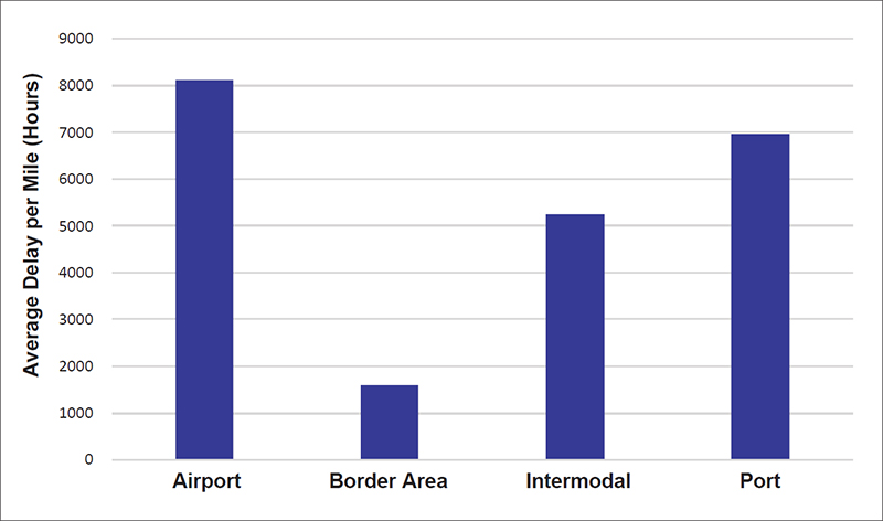
By evaluating the performance of the highways accessing the freight facilities in terms of delay per mile, border areas have the lowest delay, while airports, ports, and rail intermodal facilities experience much higher delay (figure 42).

Source: FHWA
Figure 42. Chart. Delay per mile for access to freight facilities in 2019.
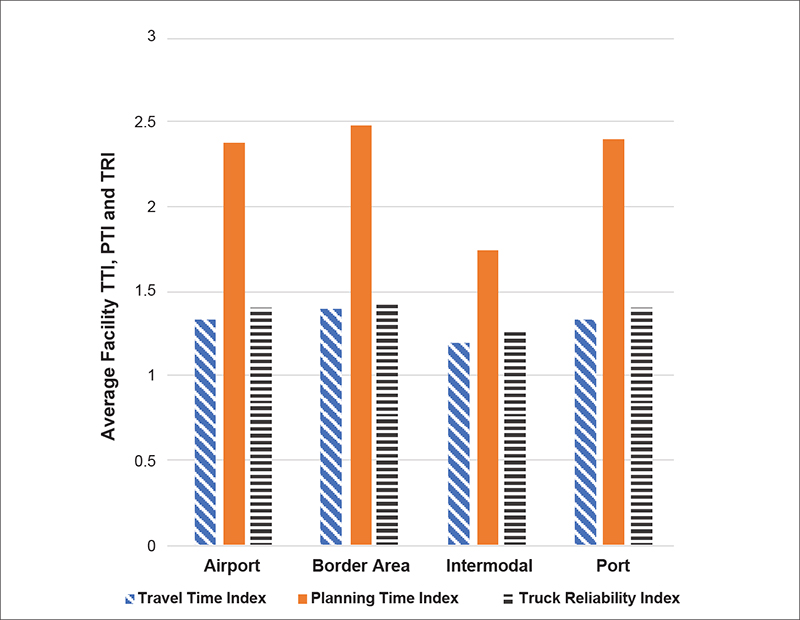
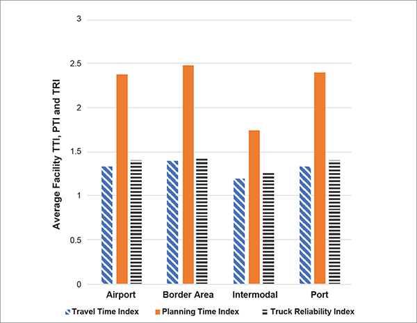
Figure 43 shows the Travel Time Index (TTI), Planning Time Index (PTI), and Truck Reliability Index (TRI) for the areas surrounding airports, border areas, rail intermodal facilities, and ports. Ports and airports have the highest PTI, closely followed by border areas. Airports, ports, and border areas are higher on the three indicators than rail intermodal facilities. This may be due in part to some rail intermodal facilities being located outside major urban areas, whereas ports and airports in the FMT are largely in urban areas with urban roadways. Border areas may reflect the delays as a result of border crossing and related traffic at those locations.
Overall, NHS routes accessing ports and airports exhibit higher challenges for reliability, mobility, and delay than border areas and intermodal facilities. This may be the result of the high level of activities at these locations and the constant streams of truck traffic. Airport access may also be impacted by the challenges of mixed passenger and freight traffic.
Source: FHWA
Figure 43. Chart. Average travel time index, planning time index, and truck reliability index for access to freight facilities in 2019.
Airports
Table 21 shows the performance of NHS routes around airports included in the FMT. Appendix A provides airport code definitions. No data for Hawaii airports are available for 2019.
Table 21. The 10 highest airport area results for the Freight Mobility Trends performance indicators in 2019.
Note: Airport areas highest in most of the indicators are colored orange and have bold font.
| Airport |
DPM
(Hours/ Mile) |
Airport |
Total Delay
(Annual Truck Hours) |
Airport |
TTI |
Airport |
PTI |
Airport |
TRI |
Airport |
BI
Percent |
| ONT |
21,677 |
MIA |
1,916,376 |
JFK |
1.71 |
LAX |
3.89 |
PHX |
2.03 |
LAX |
118 |
| PHX |
20,075 |
ORD |
1,849,221 |
LAX |
1.67 |
JFK |
3.75 |
MIA |
1.74 |
MIA |
112 |
| LAX |
14,019 |
ONT |
1,568,160 |
MIA |
1.65 |
MIA |
3.6 |
SEA |
1.56 |
PHX |
112 |
| JFK |
12,955 |
JFK |
1,482,231 |
ANC |
1.45 |
PHX |
2.99 |
LAX |
1.54 |
JFK |
111 |
| MIA |
12,070 |
LAX |
1,187,584 |
EWR |
1.36 |
IAH |
2.82 |
OAK |
1.52 |
IAH |
83 |
| ORD |
11,895 |
EWR |
1,157,682 |
IAH |
1.34 |
ANC |
2.46 |
ONT |
1.46 |
OAK |
80 |
| OAK |
8,736 |
PHX |
1,134,501 |
PHX |
1.34 |
OAK |
2.45 |
ORD |
1.41 |
SEA |
70 |
| ATL |
8,735 |
ATL |
960,651 |
OAK |
1.32 |
EWR |
2.39 |
JFK |
1.41 |
EWR |
67 |
| SEA |
6,085 |
SEA |
720,996 |
ORD |
1.30 |
SEA |
2.22 |
ANC |
1.40 |
ONT |
67 |
| MEM |
5,767 |
OAK |
529,033 |
SEA |
1.26 |
SEA |
1.26 |
EWR |
1.39 |
ANC |
65 |
Key: delay per mile (DPM), travel time index (TTI), planning time index (PTI), truck reliability index (TRI), buffer index (BI). airports: Memphis International (MEM); Ted Stevens Anchorage International (ANC); Louisville International–Standiford Field (SDF); Miami International (MIA); Indianapolis International (IND); Chicago O’Hare International (ORD); Los Angeles International (LAX); John F. Kennedy International (JFK); Cincinnati/Northern Kentucky International (CVG); Dallas/Fort Worth International (DFW); Newark Liberty International (EWR); Metropolitan Oakland International (OAK); Ontario International (ONT); Hartsfield-Jackson Atlanta International (ATL); Honolulu International (HNL); Philadelphia International (PHL); George Bush Intercontinental/Houston (IAH); Phoenix Sky International (PHX); Seattle-Tacoma International (SEA); Denver International (DEN)
Airports such as Los Angeles, CA (LAX), New York/Kennedy (JFK), Miami, FL (MIA), Phoenix, AZ (PHX), Oakland, CA (OAK), and Seattle, WA (SEA), are in the highest 10 for all indicators for surrounding highways accessing the airport.
Figure 44 shows the delay magnitude or total delay quarterly for highways accessing the airports in order from lowest to highest delay per mile. The airports with high delay per mile follow the same trend as national delay per mile results, with an increase in the second quarter each year and downturn in the fourth quarter of 2019. This pattern is observed in most of the airports except those with the lowest delay per mile such as Philadelphia (PHL), Denver (DEN), and Anchorage (ANC).
Table 22 provides the delay per mile by quarter for each airport area as shown in figure 44.
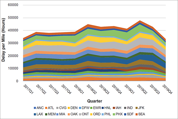
Source: FHWA
Key for Airports: Memphis International (MEM); Ted Stevens Anchorage International (ANC); Louisville International–Standiford Field (SDF); Miami International (MIA); Indianapolis International (IND); Chicago O’Hare International (ORD); Los Angeles International (LAX); John F. Kennedy International (JFK); Cincinnati/Northern Kentucky International (CVG); Dallas/Fort Worth International (DFW); Newark Liberty International (EWR); Metropolitan Oakland International (OAK); Ontario International (ONT); Hartsfield-Jackson Atlanta International (ATL); Honolulu International (HNL); Philadelphia International (PHL); George Bush Intercontinental/Houston (IAH); Phoenix Sky International (PHX); Seattle-Tacoma International (SEA); Denver International (DEN)
Figure 44. Graph. Total airport access delay by quarter.
Table 22. Airport access delay per mile by quarter.
| Airport Area |
2017
Q1 |
2017
Q2 |
2017
Q3 |
2017
Q4 |
2018
Q1 |
2018
Q2 |
2018
Q3 |
2018
Q4 |
2019
Q1 |
2019
Q2 |
2019
Q3 |
2019
Q4 |
| ANC |
479 |
462 |
505 |
453 |
470 |
522 |
585 |
480 |
324 |
355 |
457 |
430 |
| ATL |
1,542 |
1,778 |
1,831 |
1,741 |
1,956 |
2,818 |
2,160 |
2,274 |
2,429 |
2,736 |
2,339 |
1,851 |
| CVG |
914 |
1,318 |
1,261 |
992 |
1,010 |
1,260 |
1,571 |
1,439 |
1,292 |
1,962 |
2,391 |
989 |
| DEN |
541 |
643 |
663 |
616 |
572 |
581 |
560 |
574 |
677 |
730 |
676 |
635 |
| DFW |
1,041 |
1,237 |
1,175 |
1,193 |
1,094 |
1,285 |
1,176 |
1,243 |
1,537 |
1,791 |
1,257 |
724 |
| EWR |
1,291 |
1,606 |
1,552 |
1,664 |
1,343 |
1,655 |
1,400 |
1,605 |
1,379 |
1,821 |
1,719 |
1,403 |
| HNL |
1,319 |
1,641 |
1,707 |
1,664 |
1,929 |
2,106 |
1,952 |
1,913 |
|
|
|
|
| IAH |
705 |
722 |
751 |
739 |
930 |
1,186 |
912 |
1,026 |
1,797 |
2,036 |
1,763 |
633 |
| IND |
661 |
792 |
783 |
758 |
826 |
927 |
1,075 |
889 |
1,679 |
1,995 |
2,190 |
924 |
| JFK |
2,327 |
3,132 |
2,969 |
2,971 |
2,856 |
3,571 |
3,209 |
3,376 |
2,215 |
3,681 |
2,810 |
2,401 |
| LAX |
3,093 |
3,581 |
3,403 |
3,281 |
3,618 |
4,337 |
4,048 |
3,989 |
3,599 |
4,011 |
4,997 |
4,149 |
| MEM |
1,277 |
1,465 |
1,428 |
1,460 |
1,325 |
1,513 |
1,457 |
1,437 |
1,598 |
1,854 |
1,796 |
1,436 |
| MIA |
3,227 |
3,397 |
3,333 |
3,595 |
2,956 |
3,256 |
3,043 |
3,194 |
3,156 |
3,544 |
3,552 |
3,104 |
| OAK |
2,181 |
2,335 |
2,077 |
2,256 |
2,024 |
2,253 |
2,224 |
2,336 |
2,218 |
2,380 |
2,327 |
2,019 |
| ONT |
4,231 |
4,523 |
4,673 |
5,091 |
4,371 |
5,004 |
5,044 |
5,462 |
5,164 |
5,668 |
4,404 |
3,853 |
| ORD |
2,089 |
3,391 |
3,208 |
2,791 |
2,486 |
3,728 |
4,158 |
3,219 |
2,449 |
3,643 |
3,550 |
2,687 |
| PHL |
643 |
903 |
883 |
875 |
831 |
1,010 |
928 |
885 |
803 |
1,022 |
1,079 |
872 |
| PHX |
4,019 |
3,192 |
3,079 |
3,619 |
5,347 |
4,414 |
4,066 |
5,113 |
6,233 |
5,540 |
2,366 |
2,393 |
| SDF |
974 |
1,081 |
1,141 |
1,104 |
1,099 |
1,279 |
1,241 |
1,274 |
1,335 |
1,583 |
1,433 |
1,121 |
| SEA |
1,394 |
1,616 |
1,688 |
1,708 |
1,994 |
2,234 |
2,123 |
1,764 |
1,468 |
1,653 |
1,804 |
1,581 |
Key for Airports: Memphis International (MEM); Ted Stevens Anchorage International (ANC); Louisville International–Standiford Field (SDF); Miami International (MIA); Indianapolis International (IND); Chicago O’Hare International (ORD); Los Angeles International (LAX); John F. Kennedy International (JFK); Cincinnati/Northern Kentucky International (CVG); Dallas/Fort Worth International (DFW); Newark Liberty International (EWR); Metropolitan Oakland International (OAK); Ontario International (ONT); Hartsfield-Jackson Atlanta International (ATL); Honolulu International (HNL); Philadelphia International (PHL); George Bush Intercontinental/Houston (IAH); Phoenix Sky International (PHX); Seattle-Tacoma International (SEA); Denver International (DEN)
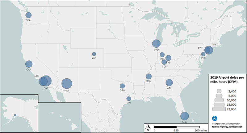
Figure 45 shows airport area delay per mile for 2019. The larger circle sizes reflect the airports listed for delay per mile in table 21. The actual 2019 delay per mile for all airports in figure 45 is in table 23.
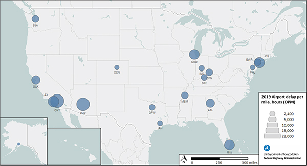
Source: FHWA Key for Airports: Memphis International (MEM); Ted Stevens Anchorage International (ANC); Louisville International–Standiford Field (SDF); Miami International (MIA); Indianapolis International (IND); Chicago O’Hare International (ORD); Los Angeles International (LAX); John F. Kennedy International (JFK); Cincinnati/Northern Kentucky International (CVG); Dallas/Fort Worth International (DFW); Newark Liberty International (EWR); Metropolitan Oakland International (OAK); Ontario International (ONT); Hartsfield-Jackson Atlanta International (ATL); Honolulu International (HNL); Philadelphia International (PHL); George Bush Intercontinental/Houston (IAH); Phoenix Sky International (PHX); Seattle-Tacoma International (SEA); Denver International (DEN)
Figure 45. Delay per mile for airport areas in 2019.
Table 23. Airport area access delay per mile for 2019.
| Airport Area |
2019 Delay per Mile |
| Ted Stevens Anchorage International (ANC) |
2,496 |
| Hartsfield -Jackson Atlanta International (ATL) |
8,735 |
| Cincinnati/Northern Kentucky International (CVG) |
5,525 |
| Denver International (DEN) |
2,589 |
| Dallas/Fort Worth International (DFW) |
4,300 |
| Newark Liberty International (EWR) |
5,639 |
| George Bush Intercontinental/Houston (IAH) |
3,395 |
| Indianapolis International (IND) |
4,019 |
| John F. Kennedy International (JFK) |
12,955 |
| Los Angeles International (LAX) |
14,019 |
| Memphis International (MEM) |
5,767 |
| Miami International (MIA) |
12,070 |
| Metropolitan Oakland International (OAK) |
8,736 |
| Ontario International (ONT) |
21,677 |
| Chicago O’Hare International (ORD) |
11,895 |
| Philadelphia International (PHL) |
3,012 |
| Phoenix Sky International (PHX) |
20,075 |
| Louisville International–Standiford Field (SDF) |
4,724 |
| Seattle-Tacoma International (SEA) |
6,085 |
Figure 46 shows the airports where access improved or worsened from 2017 to 2018 and 2018 to 2019 based on delay per mile. Honolulu, HI, is not accurate due to no truck data being available in 2019. However, access to airports like Anchorage, AK, Houston, TX, Chicago, IL, and Los Angeles, CA, improved in 2019, while other airports such as Denver, CO, and Ontario, CA, worsened.
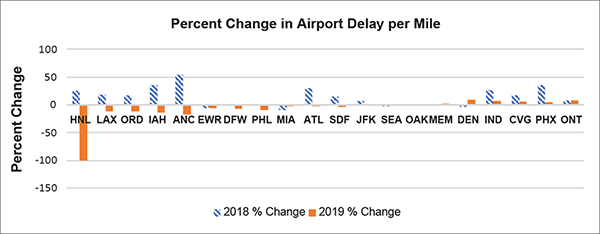
Source: FHWA
Key for Airports: Memphis International (MEM); Ted Stevens Anchorage International (ANC); Louisville International–Standiford Field (SDF); Miami International (MIA); Indianapolis International (IND); Chicago O’Hare International (ORD); Los Angeles International (LAX); John F. Kennedy International (JFK); Cincinnati/Northern Kentucky International (CVG); Dallas/Fort Worth International (DFW); Newark Liberty International (EWR); Metropolitan Oakland International (OAK); Ontario International (ONT); Hartsfield-Jackson Atlanta International (ATL); Honolulu International (HNL); Philadelphia International (PHL); George Bush Intercontinental/Houston (IAH); Phoenix Sky International (PHX); Seattle-Tacoma International (SEA); Denver International (DEN)
Note: No data are available for Honolulu (HNL) in 2019.
Figure 46. Graph. Percent change in airport access delay per mile.
Rail Intermodal Facilities
Table 24 shows the performance of rail intermodal facilities included in the FMT. Appendix A provides definitions of the rail intermodal locations.
A number of facilities score highest for all indicators. These locations are areas with heavy freight activity and multimodal connections. For example, locations such as Chicago, IL, Houston, TX, Atlanta, GA, New Orleans, LA, Cincinnati, OH, and Fort Worth, TX, are major intermodal connections and hubs.
Table 24. The 10 highest rail intermodal area results for the Freight Mobility Trends performance indicators in 2019.
Note: Rail intermodal areas highest in most of the indicators are colored orange and have bold font.
| Rail Intermodal |
DPM
(Hours/ Mile) |
Rail Intermodal |
Total Delay (Annual Truck Hours) |
Rail Intermodal |
TTI |
Rail Intermodal |
PTI |
Rail Intermodal |
TRI |
Rail Intermodal |
BI Percent |
| Chicago, IL |
13,807 |
Chicago, IL |
2,326,172 |
Denver, CO |
1.37 |
Atlanta, GA |
2.56 |
Atlanta, GA |
1.59 |
Atlanta, GA |
81 |
| Houston, TX |
12,763 |
Denver, CO |
1,831,769 |
Atlanta, GA |
1.36 |
Denver, CO |
2.51 |
Cincinnati, OH |
1.56 |
Denver, CO |
76 |
| Atlanta, GA |
12,379 |
Atlanta, GA |
1,619,883 |
Chicago, IL |
1.34 |
Chicago, IL |
2.41 |
New Orleans, LA |
1.48 |
Chicago, IL |
71 |
| Denver, CO |
10,732 |
Houston, TX |
1,092,608 |
Conway, PA |
1.30 |
Cincinnati, OH |
2.28 |
Chicago, IL |
1.47 |
Cincinnati, OH |
68 |
| Memphis, TN |
6,559 |
Cincinnati, OH |
990,138 |
Cincinnati, OH |
1.29 |
New Orleans, LA |
2.17 |
Denver, CO |
1.46 |
New Orleans, LA |
61 |
| New Orleans, LA |
6,131 |
Kansas City, MO |
637,408 |
New Orleans, LA |
1.28 |
Houston, TX |
2.10 |
Houston, TX |
1.44 |
Houston, TX |
57 |
| Cincinnati, OH |
5,594 |
Fort Worth, TX |
573,588 |
Houston, TX |
1.24 |
Conway, PA |
1.97 |
Jacksonville, FL |
1.34 |
Conway, PA |
46 |
| Fort Worth, TX |
4,987 |
New Orleans, LA |
569,098 |
Fort Worth, TX |
1.22 |
Fort Worth, TX |
1.82 |
Fort Worth, TX |
1.28 |
FortWorth, TX |
41 |
| Kansas City, MO |
4,490 |
North Little Rock, AR |
565,702 |
Memphis, TN |
1.19 |
Jacksonville, FL |
1.73 |
Conway, PA |
1.26 |
Jacksonville, FL |
39 |
| North Little Rock, AR |
3,969 |
Memphis, TN |
447,040 |
Jacksonville, FL |
1.19 |
Kansas City, MO |
1.72 |
Kansas City, MO |
1.26 |
Kansas City, MO |
33 |
Key: delay per mile (DPM), travel time index (TTI), planning time index (PTI), truck reliability index (TRI), buffer index (BI)
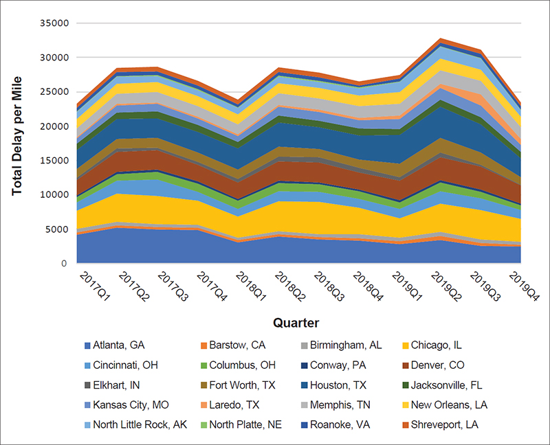
Figure 46 illustrates the delay per mile performance by quarter for access to rail intermodal facilities in ascending order from lowest to highest delay per mile. Like national delay per mile results, most of the facilities except those with the lowest delay per mile exhibit a similar trend of increases in delay per mile in the second quarter of each year. Additionally, the decreases in quarter four of 2019 are sharp for most of the facilities.
Table 25 provides the quarterly delay per mile for each rail intermodal facility area as shown in figure 47.
Source: FHWA
Figure 47. Graph. Quarterly total delay per mile for access to rail intermodal facilities.
Table 25. Rail intermodal facility area access delay per mile by quarter.
| Rail Intermodal Area |
2017
Q1 |
2017
Q2 |
2017
Q3 |
2017
Q4 |
2018
Q1 |
2018
Q2 |
2018
Q3 |
2018
Q4 |
2019
Q1 |
2019
Q2 |
2019
Q3 |
2019
Q4 |
| Atlanta, GA |
4,194 |
5,214 |
4,932 |
4,843 |
3,067 |
3,909 |
3,478 |
3,327 |
2,791 |
3,435 |
2,580 |
2,453 |
| Barstow, CA |
348 |
333 |
326 |
335 |
312 |
336 |
338 |
381 |
489 |
597 |
391 |
254 |
| Birmingham, AL |
464 |
500 |
469 |
446 |
389 |
465 |
467 |
596 |
491 |
539 |
495 |
468 |
| Chicago, IL |
2,660 |
4,160 |
4,133 |
3,494 |
3,067 |
4,367 |
4,712 |
3,777 |
2,803 |
4,117 |
4,283 |
3,329 |
| Cincinnati, OH |
1,233 |
1,829 |
2,355 |
1,343 |
1,120 |
1,465 |
1,398 |
1,322 |
1,381 |
1,845 |
1,727 |
1,290 |
| Columbus, OH |
786 |
991 |
1,119 |
1,144 |
1,177 |
1,179 |
1,135 |
1,085 |
969 |
1,277 |
997 |
688 |
| Conway, PA |
250 |
342 |
360 |
332 |
253 |
325 |
290 |
304 |
283 |
337 |
279 |
237 |
| Denver, CO |
2,185 |
2,860 |
2,780 |
2,464 |
2,378 |
2,833 |
2,900 |
2,503 |
2,836 |
3,339 |
3,364 |
2,615 |
| Elkhart, IN |
403 |
525 |
413 |
417 |
563 |
682 |
794 |
658 |
560 |
674 |
265 |
132 |
| Fort Worth, TX |
1,279 |
1,378 |
1,382 |
1,367 |
1,402 |
1,498 |
1,177 |
1,230 |
1,900 |
2,139 |
1,782 |
1,111 |
| Houston, TX |
2,709 |
2,900 |
2,895 |
2,967 |
3,028 |
3,466 |
3,162 |
3,494 |
4,189 |
4,563 |
4,135 |
2,774 |
| Jacksonville, FL |
902 |
990 |
994 |
1,053 |
932 |
1,026 |
980 |
958 |
930 |
1,003 |
1,026 |
879 |
| Kansas City, MO |
768 |
1,021 |
1,089 |
941 |
876 |
1,274 |
1,248 |
1,239 |
1,418 |
1,699 |
1,668 |
1,027 |
| Laredo, TX |
199 |
220 |
227 |
229 |
263 |
288 |
318 |
331 |
539 |
582 |
1,654 |
891 |
| Memphis, TN |
1,321 |
1,470 |
1,513 |
1,539 |
1,493 |
1,698 |
1,661 |
1,696 |
1,722 |
1,969 |
1,960 |
1,668 |
| New Orleans, LA |
1,366 |
1,445 |
1,461 |
1,466 |
1,392 |
1,469 |
1,515 |
1,539 |
1,642 |
1,718 |
1,651 |
1,534 |
| North Little Rock, AR |
997 |
1,005 |
870 |
882 |
942 |
952 |
866 |
1,056 |
1,479 |
1,726 |
1,606 |
996 |
| North Platte, NE |
127 |
127 |
123 |
123 |
109 |
124 |
131 |
133 |
112 |
108 |
86 |
89 |
| Roanoke, VA |
443 |
548 |
546 |
534 |
410 |
558 |
537 |
259 |
444 |
531 |
569 |
493 |
| Shreveport, LA |
597 |
633 |
685 |
654 |
700 |
681 |
725 |
605 |
528 |
624 |
664 |
474 |
Figure 48 shows the delay per mile for access to rail intermodal facilities, with larger circles relating to larger delay per mile. The actual delay per mile for 2019 for each rail intermodal facility is in table 26.
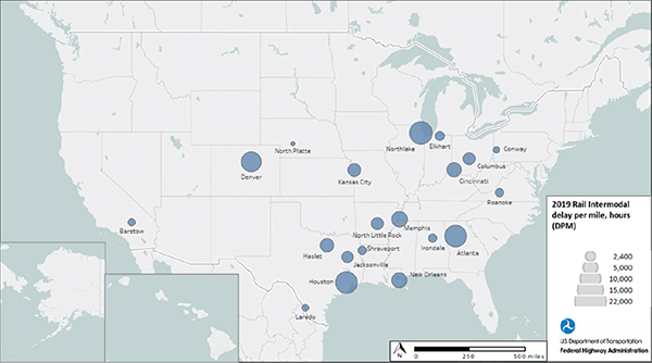
Source: FHWA
Figure 48. Map. Rail intermodal area delay per mile in 2019.
Table 26. Rail intermodal area access delay per mile for 2019.
| Rail Intermodal Location |
State |
2019 Delay Per Mile |
| Atlanta |
GA |
12,379 |
| Barstow |
CA |
1,418 |
| Irondale |
AL |
1,826 |
| Northlake |
IL |
13,807 |
| Cincinnati |
OH |
5,594 |
| Columbus |
OH |
3,671 |
| Conway |
PA |
1,101 |
| Denver |
CO |
10,732 |
| Elkhart |
IN |
2,278 |
| Haslet |
TX |
4,987 |
| Houston |
TX |
12,763 |
| Jacksonville |
TX |
3,571 |
| Kansas City |
MO |
4,490 |
| Laredo |
TX |
1,241 |
| Memphis |
TN |
6,559 |
| New Orleans |
LA |
6,131 |
| North Little Rock |
AR |
3,969 |
| North Platte |
NE |
466 |
| Roanoke |
VA |
1,958 |
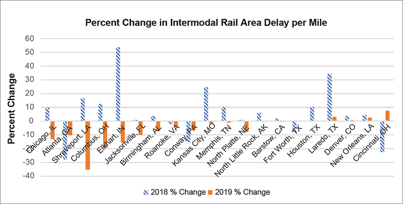
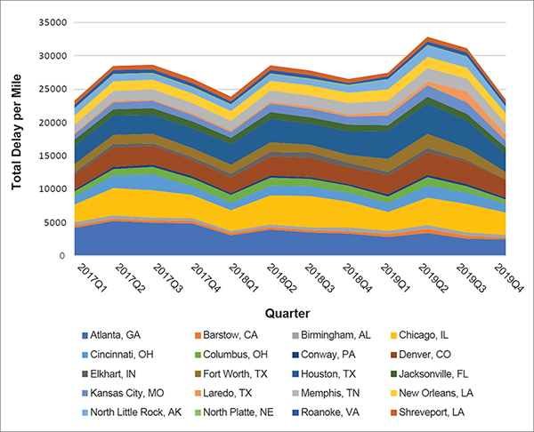
Figure 49 shows the percent change for rail intermodal facilities from 2017 to 2018 and 2018 to 2019 based on delay per mile on surrounding NHS routes. Locations such as Shreveport, LA, Elkhart, IN, Jacksonville, FL, and Atlanta, GA, show improvements in 2019, while areas such as Cincinnati, OH, Laredo, TX, and New Orleans, LA, do not.

Source: FHWA
Figure 49. Graph. Percent change in rail intermodal area delay per mile.
Ports
Table 27 shows port performance for the FMT indicators. Appendix A provides port definitions. Truck data for Hawaii ports do not exist for 2019.
Performance at major ports such as New York–New Jersey, Oakland, CA, Seattle, WA, Tacoma, WA, New Orleans, LA, and Miami, FL, score highest in the indicators.
Table 27. The 10 highest port area results for the Freight Mobility Trends performance indicators in 2019.
Note: Port areas highest in most of the indicators are colored orange and have bold font.
| Port |
DPM
(Hours/ Mile) |
Port |
Total Delay
(Annual Truck Hours) |
Port |
TTI |
Port |
PTI |
Port |
TRI |
Port |
BI
Percent |
| New York–New Jersey |
20,292 |
New York–New Jersey |
1,899,634 |
New York–New Jersey |
1.79 |
New York–New Jersey |
4.39 |
Oakland, CA |
1.74 |
New York–New Jersey |
130 |
| Oakland, CA |
16,728 |
Houston, TX |
1,639,442 |
Miami, FL |
1.64 |
Miami, FL |
3.67 |
Miami, FL |
1.67 |
Miami, FL |
119 |
| Houston, TX |
15,488 |
Baltimore, MD |
1,446,424 |
New Orleans, LA |
1.49 |
Oakland, CA |
3.21 |
New York–New Jersey |
1.63 |
Oakland, CA |
100 |
| Tacoma, WA |
10,090 |
Oakland, CA |
1,253,834 |
Oakland, CA |
1.47 |
New Orleans, LA |
2.89 |
Baltimore, MD |
1.56 |
Tacoma, WA |
84 |
| Seattle, WA |
9,843 |
Baton Rouge, LA |
1,099,556 |
Seattle, WA |
1.45 |
Seattle, WA |
2.88 |
Tampa, FL |
1.55 |
Seattle, WA |
84 |
| Long Beach, CA |
9,634 |
Cincinnati, OH |
949,034 |
Pittsburgh, PA |
1.42 |
Tacoma, WA |
2.79 |
Pittsburgh, PA |
1.52 |
New Orleans, LA |
86 |
| New Orleans, LA |
9,542 |
Tacoma, WA |
911,249 |
Tacoma, WA |
1.42 |
Pittsburgh, PA |
2.75 |
Chicago, IL |
1.51 |
Pittsburgh, PA |
80 |
| Los Angeles, CA |
8,448 |
New Orleans, LA |
858,402 |
Los Angeles, CA |
1.39 |
Tampa, FL |
2.51 |
New Orleans, LA |
1.51 |
Tampa, FL |
76 |
| Baton Rouge, LA |
7,759 |
Seattle, WA |
700,267 |
Tampa |
1.35 |
Los Angeles, CA |
2.47 |
Cincinnati, OH |
1.47 |
Los Angeles, CA |
74 |
| Miami, FL |
7,423 |
Tampa, FL |
700,115 |
Savannah, GA |
1.35 |
Virginia |
2.42 |
Seattle, WA |
1.46 |
Chicago, IL |
73 |
Key: delay per mile (DPM), travel time index (TTI), planning time index (PTI), truck reliability index (TRI), buffer index (BI)
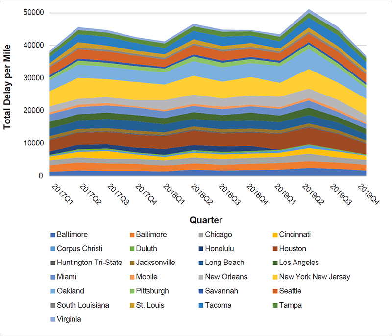
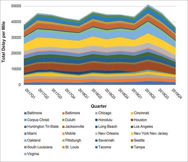
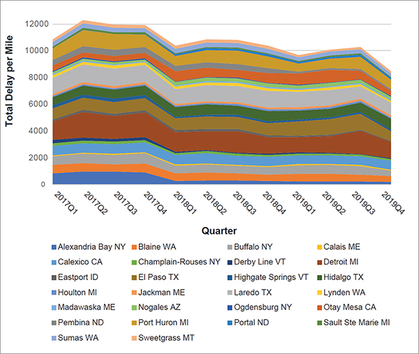
Similar to national results, port areas follow the same trend for delay per mile on surrounding NHS routes (figure 50). Most ports have increases in the second quarter and downturns in the fourth quarter of 2019. Table 28 provides the quarterly delay per mile for port areas as shown in figure 50.
Source: FHWA
Note: Hawaii data are not available for 2019.
Figure 50. Graph. Quarterly port access performance for delay per mile.
Table 28. Port area access delay per mile by quarter.
| Port Area |
2017
Q1 |
2017
Q2 |
2017
Q3 |
2017
Q4 |
2018
Q1 |
2018
Q2 |
2018
Q3 |
2018
Q4 |
2019
Q1 |
2019
Q2 |
2019
Q3 |
2019
Q4 |
| Baltimore |
1,206 |
1,616 |
1,510 |
1,456 |
1,387 |
1,809 |
1,570 |
1,681 |
1,857 |
2,377 |
2,172 |
1,634 |
| Baton Rouge |
2,261 |
2,508 |
2,405 |
2,305 |
1,846 |
2,172 |
1,920 |
2,060 |
2,223 |
2,225 |
2,029 |
1,899 |
| Chicago |
1,333 |
1,561 |
1,468 |
1,601 |
1,588 |
1,733 |
1,736 |
1,834 |
1,712 |
2,247 |
1,548 |
1,417 |
| Cincinnati |
1,168 |
1,751 |
2,254 |
1,229 |
1,084 |
1,430 |
1,412 |
1,322 |
1,288 |
1,755 |
1,728 |
1,293 |
| Corpus Christi |
305 |
331 |
362 |
371 |
340 |
379 |
402 |
395 |
683 |
800 |
426 |
165 |
| Duluth |
253 |
364 |
372 |
355 |
308 |
327 |
355 |
322 |
285 |
290 |
233 |
220 |
| Honolulu |
1,042 |
1,377 |
1,385 |
1,329 |
1,748 |
1,577 |
1,693 |
1,603 |
|
|
|
|
| Houston |
3,457 |
3,739 |
3,755 |
4,028 |
3,980 |
4,494 |
3,993 |
4,116 |
4,876 |
5,170 |
4,715 |
3,279 |
| Huntington Tri-State |
305 |
342 |
323 |
309 |
331 |
357 |
367 |
378 |
283 |
404 |
283 |
245 |
| Jacksonville |
874 |
915 |
872 |
922 |
791 |
894 |
822 |
827 |
824 |
901 |
935 |
785 |
| Long Beach |
2,404 |
2,440 |
2,815 |
2,833 |
2,469 |
2,319 |
2,428 |
2,476 |
2,476 |
2,529 |
2,360 |
1,859 |
| Los Angeles |
1,985 |
1,991 |
1,914 |
1,900 |
1,934 |
2,035 |
2,038 |
2,402 |
2,021 |
2,231 |
1,765 |
1,622 |
| Miami |
2,306 |
2,213 |
2,173 |
2,298 |
2,044 |
1,969 |
1,753 |
1,978 |
2,072 |
2,207 |
1,505 |
1,404 |
| Mobile |
551 |
718 |
778 |
493 |
491 |
689 |
755 |
513 |
577 |
779 |
717 |
412 |
| New Orleans |
1,883 |
1,855 |
1,870 |
1,866 |
2,997 |
2,745 |
2,622 |
2,801 |
3,153 |
2,828 |
2,952 |
2,431 |
| New York New Jersey |
4,618 |
6,356 |
5,486 |
5,497 |
4,713 |
5,767 |
5,089 |
5,592 |
4,231 |
6,000 |
5,352 |
4,989 |
| Oakland |
3,391 |
4,022 |
3,775 |
3,753 |
3,774 |
4,562 |
4,417 |
4,345 |
5,126 |
6,265 |
4,668 |
3,294 |
| Pittsburg |
858 |
1,260 |
1,171 |
1,087 |
1,042 |
1,331 |
1,363 |
1,269 |
1,032 |
1,313 |
1,238 |
1,002 |
| Savannah |
633 |
708 |
714 |
703 |
610 |
645 |
618 |
596 |
600 |
670 |
666 |
606 |
| Seattle |
2,440 |
2,735 |
2,732 |
2,608 |
2,293 |
2,902 |
2,854 |
2,505 |
2,395 |
2,644 |
2,887 |
2,513 |
| South Louisiana |
542 |
547 |
550 |
528 |
501 |
530 |
555 |
531 |
476 |
556 |
596 |
593 |
| St. Louis |
822 |
1,618 |
1,357 |
974 |
1,018 |
1,218 |
1,137 |
1,142 |
923 |
1,306 |
1,066 |
895 |
| Tacoma |
1,827 |
2,504 |
2,581 |
2,244 |
1,972 |
2,543 |
2,805 |
2,367 |
2,101 |
3,068 |
3,291 |
2,250 |
| Tampa |
1,230 |
1,314 |
1,301 |
1,297 |
1,381 |
1,464 |
1,459 |
1,340 |
1,434 |
1,488 |
1,545 |
1,291 |
| Virginia |
576 |
834 |
796 |
599 |
645 |
767 |
750 |
388 |
747 |
1,049 |
1,062 |
650 |
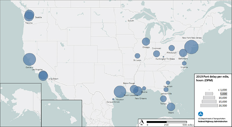
Figure 51 shows the delay per mile for areas surrounding ports, with larger circles representing higher delay per mile. The 2019 delay per mile results for each port area are in table 29.
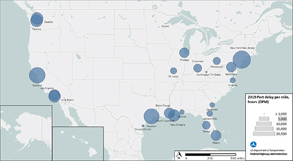
Source: FHWA
Note: Hawaii data are not available for 2019.
Figure 51. Map. Port area delay per mile in 2019.
Table 29. Port area access delay per mile in 2019.
Note: Hawaii data are not available for 2019.
| Location |
State |
2019 Delay Per Mile |
| New York New Jersey |
NJ |
20,292 |
| Miami |
FL |
7,423 |
| Oakland |
CA |
16,728 |
| Tacoma |
WA |
10,090 |
| Seattle |
WA |
9,843 |
| New Orleans |
LA |
9,542 |
| Pittsburg |
PA |
4,400 |
| Tampa |
FL |
5,067 |
| Los Angeles |
CA |
8,448 |
| Chicago |
IL |
7,055 |
| Baltimore |
MD |
6,908 |
| Virginia |
VA |
2,783 |
| Long Beach |
CA |
9,634 |
| Cincinnati |
OH |
5,289 |
| Houston |
TX |
15,488 |
| Savannah |
GA |
2,489 |
| Baton Rouge |
LA |
7,759 |
| Jacksonville |
FL |
3,126 |
| Duluth |
MN |
1,035 |
| Mobile |
AL |
2,440 |
| St. Louis |
MO |
3,664 |
| Huntington Tri-State |
WV |
1,176 |
| Corpus Christi |
TX |
1,335 |
| South Louisiana |
LA |
2,252 |
| Honolulu |
HI |
0 |
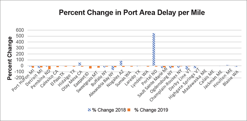
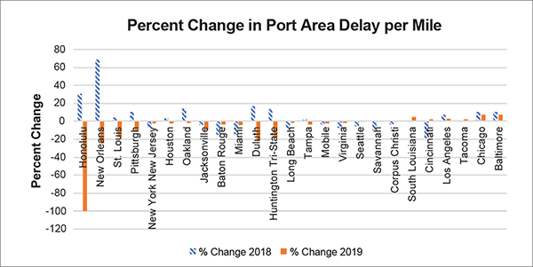
Figure 52 shows the access to port areas that improved or worsened from 2017 to 2018 and 2018 to 2019 based on delay per mile. Ports that showed access improvements for 2019 are Duluth, MN, Huntington (WV) Tri-State, New Orleans, LA, Saint Louis, MO, and Pittsburgh, PA. Those with noticeable worsening include Baltimore, MD, Chicago, IL, and South Louisiana, LA.
Source: FHWA
Note: No data are available for Honolulu in 2019.
Figure 52. Graph. Percent change in port area delay per mile.
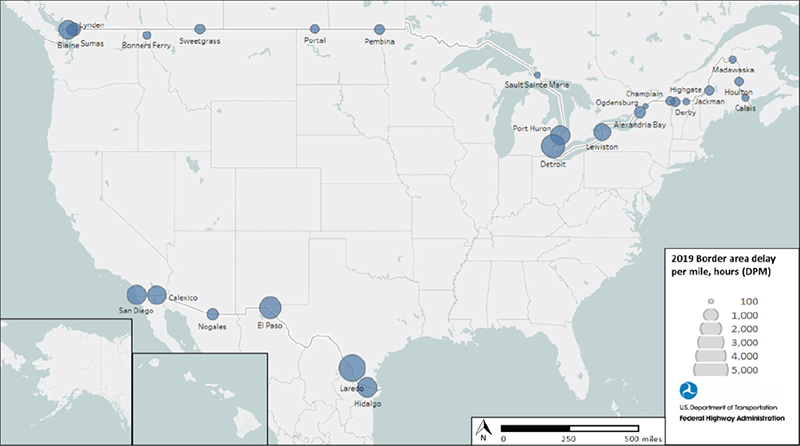
Border Areas
Table 30 shows border areas scoring highest for the FMT indicators. Only Hidalgo, TX, and Calexico, CA, are in the highest group for all indicators. Laredo, TX, is in the ten highest for five of the six indicators.
Table 30. The 10 highest border area results for the Freight Mobility Trends performance indicators in 2019.
Note: Border areas highest in most of the indicators are colored orange and have bold font.
| Border Area |
DPM
(Hours/ Mile) |
BorderArea |
Total Delay
(Annual Truck Hours) |
Border Area |
TTI |
Border Area |
PTI |
Border Area |
TRI |
Border Area |
BI Percent |
| Laredo, TX |
4,669 |
Detroit, MI |
473,072 |
Calexico, CA |
1.69 |
Portal, ND |
3.99 |
Highgate Springs, VT |
2.05 |
Portal, ND |
136 |
| Detroit, MI |
3,628 |
Laredo, TX |
262,160 |
Portal, ND |
1.69 |
Calexico, CA |
3.54 |
Portal, ND |
1.88 |
Calexico, CA |
99 |
| El Paso, TX |
3,114 |
El Paso, TX |
233,918 |
Hidalgo, TX |
1.51 |
Hidalgo, TX |
2.94 |
Jackman, ME |
1.62 |
Hidalgo, TX |
96 |
| Hidalgo, TX |
2,586 |
Buffalo, NY |
232,777 |
Alexandria Bay, NY |
1.48 |
Alexandria Bay, NY |
2.54 |
Calais, ME |
1.61 |
Eastport, ID |
69 |
| Port Huron, MI |
2,550 |
Otay Mesa, CA |
141,791 |
Laredo, TX |
1.44 |
Derby Line, VT |
2.41 |
Derby Line, VT |
1.56 |
Derby Line, VT |
69 |
| Otay Mesa, CA |
2,490 |
Hidalgo, TX |
102,247 |
Jackman, ME |
1.43 |
Laredo, TX |
2.41 |
Hidalgo, TX |
1.54 |
Calais, ME |
66 |
| Calexico, CA |
2,324 |
Port Huron, MI |
98,405 |
Madawaska, ME |
1.37 |
Jackman, ME |
2.37 |
Calexico, CA |
1.50 |
Jackman, ME |
66 |
| Blaine, WA |
2,269 |
Calexico, CA |
92,981 |
Eastport, ID |
1.37 |
Eastport, ID |
2.33 |
Eastport, ID |
1.49 |
Laredo, TX |
66 |
| Buffalo, NY |
1,900 |
Houlton, MI |
59,041 |
Derby Line, VT |
1.36 |
Calais, ME |
2.20 |
Madawaska, ME |
1.48 |
Alexandria Bay, NY |
59 |
| Sumas, WA |
1,162 |
Blaine, WA |
33,323 |
Calais, ME |
1.32 |
Pembina, ND |
2.16 |
Houlton, MI |
1.41 |
Lynden, WA |
55 |
Key: delay per mile (DPM), travel time index (TTI), planning time index (PTI), truck reliability index (TRI), buffer index (BI)
Figure 53 shows the border area delay per mile performance by quarter for access to each facility. Border areas appear to show decreasing delay but still follow the national trend. Border areas of Detroit, MI, and Laredo, TX, show the most hours of delay per mile for the surrounding NHS.
Table 31 provides the quarterly delay per mile as shown in figure 53.
Source: FHWA
Figure 53. Graph. Quarterly border area performance for delay per mile.
Table 31. Border area access delay per mile by quarter.
| Border Area |
2017
Q1 |
2017
Q2 |
2017
Q3 |
2017
Q4 |
2018
Q1 |
2018
Q2 |
2018
Q3 |
2018
Q4 |
2019
Q1 |
2019
Q2 |
2019
Q3 |
2019
Q4 |
| Alexandria Bay NY |
852 |
958 |
959 |
913 |
259 |
314 |
289 |
262 |
230 |
246 |
231 |
200 |
| Blaine WA |
632 |
649 |
535 |
677 |
577 |
579 |
553 |
483 |
560 |
554 |
512 |
423 |
| Buffalo NY |
642 |
697 |
731 |
758 |
576 |
621 |
572 |
549 |
665 |
669 |
634 |
423 |
| Calais ME |
68 |
78 |
82 |
77 |
83 |
72 |
77 |
83 |
88 |
82 |
87 |
70 |
| Calexico CA |
688 |
704 |
697 |
709 |
704 |
771 |
654 |
715 |
639 |
626 |
634 |
657 |
| Champlain-Rouses NY |
187 |
204 |
206 |
198 |
139 |
148 |
157 |
131 |
129 |
141 |
134 |
125 |
| Derby Line VT |
272 |
215 |
215 |
217 |
104 |
78 |
66 |
99 |
106 |
57 |
57 |
76 |
| Detroit MI |
1,383 |
1,921 |
1,688 |
1,856 |
1,492 |
1,418 |
1,622 |
1,235 |
1,143 |
1,240 |
1,737 |
1,195 |
| Eastport ID |
145 |
166 |
171 |
156 |
157 |
143 |
149 |
142 |
106 |
91 |
79 |
71 |
| El Paso TX |
841 |
907 |
892 |
916 |
876 |
949 |
927 |
886 |
1,045 |
1,196 |
1,196 |
758 |
| Highgate Springs VT |
220 |
239 |
242 |
229 |
105 |
125 |
154 |
133 |
162 |
118 |
113 |
125 |
| Hidalgo TX |
599 |
664 |
687 |
708 |
720 |
766 |
689 |
779 |
655 |
644 |
730 |
797 |
| Houlton MI |
105 |
102 |
102 |
105 |
114 |
111 |
131 |
119 |
117 |
125 |
135 |
100 |
| Jackman ME |
135 |
151 |
150 |
144 |
135 |
144 |
139 |
144 |
143 |
148 |
152 |
163 |
| Laredo TX |
1,201 |
1,313 |
1,321 |
1,275 |
1,107 |
1,194 |
1,203 |
1,255 |
1,134 |
1,137 |
904 |
955 |
| Lynden WA |
200 |
215 |
223 |
201 |
178 |
219 |
216 |
197 |
156 |
184 |
170 |
135 |
| Madawaska ME |
74 |
87 |
89 |
82 |
81 |
81 |
93 |
86 |
83 |
88 |
91 |
81 |
| Nogales AZ |
149 |
140 |
139 |
133 |
247 |
256 |
255 |
265 |
254 |
258 |
245 |
225 |
| Ogdensburg NY |
93 |
97 |
97 |
97 |
65 |
58 |
59 |
57 |
45 |
46 |
46 |
49 |
| Otay Mesa CA |
413 |
379 |
403 |
389 |
756 |
680 |
585 |
715 |
836 |
914 |
611 |
364 |
| Pembina ND |
417 |
460 |
469 |
441 |
395 |
405 |
416 |
383 |
152 |
134 |
138 |
141 |
| Port Huron MI |
858 |
1,213 |
1,143 |
948 |
736 |
921 |
995 |
857 |
601 |
731 |
898 |
696 |
| Portal ND |
22 |
25 |
23 |
23 |
141 |
153 |
156 |
154 |
120 |
130 |
185 |
143 |
| Sault Ste Marie MI |
123 |
128 |
134 |
125 |
83 |
83 |
81 |
84 |
75 |
74 |
97 |
64 |
| Sumas WA |
321 |
330 |
334 |
324 |
310 |
338 |
346 |
327 |
278 |
305 |
300 |
272 |
| Sweetgrass MT |
212 |
233 |
238 |
240 |
227 |
238 |
234 |
228 |
153 |
156 |
162 |
156 |
Figure 54 depicts a map of border areas, with larger circles representing higher delay per mile on the surrounding NHS, matching the results shown in table 31. 2019 delay per mile for each border area is provided in table 32.
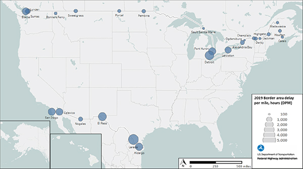
Source: FHWA
Figure 54. Map. Border area delay per mile in 2019.
Table 32. Delay per mile for border areas in 2019.
| Location |
State |
2019 Delay Per Mile |
| Alexandria Bay |
NY |
868 |
| Blaine |
WA |
2,269 |
| Lewiston |
NY |
1,900 |
| Calais |
ME |
331 |
| Calexico |
CA |
2,324 |
| Champlain |
NY |
540 |
| Derby |
VT |
300 |
| Detroit |
MI |
3,628 |
| Bonners Ferry |
ID |
402 |
| El Paso |
TX |
3,114 |
| Highgate |
VT |
566 |
| Hidalgo |
TX |
2,586 |
| Houlton |
ME |
499 |
| Jackman |
ME |
578 |
| Laredo |
TX |
4,669 |
| Lynden |
WA |
749 |
| Madawaska |
ME |
359 |
| Nogales |
AZ |
874 |
| Ogdensburg |
NY |
193 |
| San Diego |
CA |
2,490 |
| Pembina |
ND |
659 |
| Port Huron |
MI |
2,550 |
| Portal |
ND |
524 |
| Sault Sainte Marie |
MI |
248 |
| Sumas |
WA |
1,162 |
| Sweetgrass |
MT |
669 |
Figure 55 shows the border areas that improved or worsened from 2017 to 2018 and 2018 to 2019 based on delay per mile. Most border areas improved, and only a few northern border areas worsened slightly.
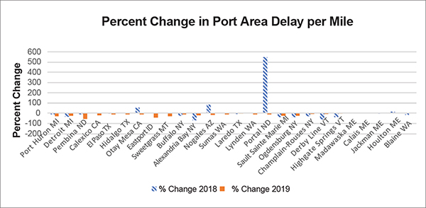
Source: FHWA
Figure 55. Graph. Percent change in border area delay per mile.
Border Crossings
Another common measure of border crossing performance is the average minutes per mile of the actual segments into and out of Canada and Mexico. Table 33 shows the minute-per-mile rates.
Table 33. National border crossing minutes per mile.
| Location |
2017 |
2018 |
Average |
| National (weighted) |
2.4 |
2.4 |
2.4 |
| National (not weighted) |
3 |
3 |
3 |
| Direction (weighted) into Canada |
2 |
2 |
2 |
| Direction (weighted) into Mexico |
1.9 |
1.9 |
1.9 |
| Direction (weighted) into United States |
2.1 |
2.1 |
2.1 |
| Direction (not weighted) into Canada |
3 |
3 |
3 |
| Direction (not weighted) into Mexico |
2.8 |
2.6 |
2.7 |
| Direction (not weighted) into United States |
3.1 |
3.2 |
3.1 |
|