Approaches to Presenting External Factors with Operations Performance MeasuresCHAPTER 3. RECOMMENDATIONS FOR PRESENTING EXTERNAL FACTORSThis chapter provides recommendations for presenting external factors with operations performance measures. The statistical analysis described in Chapter 2 found six relevant external factors that are were most correlated with system performance measures in FHWA's Urban Congestion Report. While these external factors are important at an aggregate national level, there may be others that are statistically significant and important to individual States or regions. States and regions may choose to track other factors that may be of particular importance to them. WHAT OTHERS HAVE DONE ALREADYMany States, cities, and regional entities have already chosen to begin some sort of external factors tracking, posting various types and styles of dashboards and display types both in print and on the internet. Seeing how other regions choose to display external factors in relation to transportation performance measures can spur ideas and provide good (and bad) examples and principles by which to follow in the development of new visualizations. Using tools other than Excel, such as Tableau or HighCharts, may help regions assess and determine which external factors are most meaningful and spur creativity and thought about how best to display external factors in relation to transportation performance measures. Ideally, these visualizations will provide a clear, concise, and meaningful message to an intended audience. San Francisco's Metropolitan Transportation Commission's Vital Signs project (http://www.vitalsigns.mtc.ca.gov/) offers one good example of displaying external factors as an interactive, though if viewed statically, would not be ideal. Figures 2 through 5 offer examples of chart designs that follow many good analysis and design principles. Each of these figures presents charts that use a simple and effective visual design aesthetic that allows the viewer to focus on the information. Note that these examples may not be ideal to fit your data or message and could still be improved to increase usability and clarity. 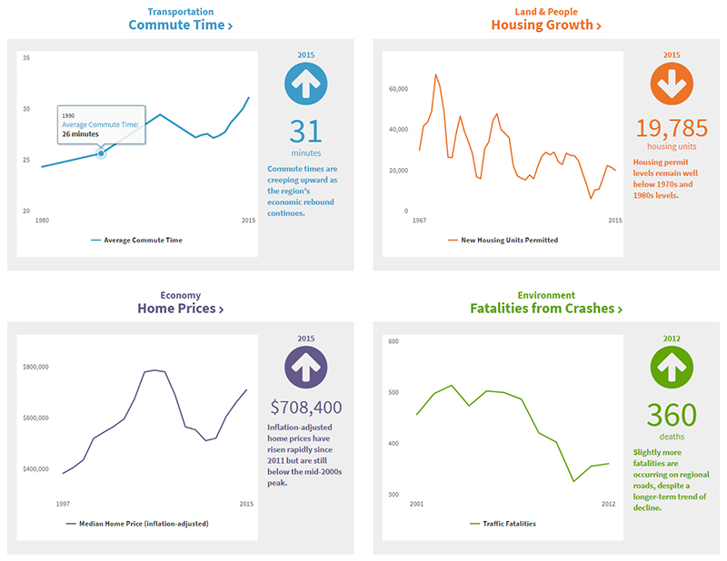 Figure 2. Chart. San Francisco MTA's Vital Signs Dashboard Segment. Figure 2 is an effective illustration of external factors because:
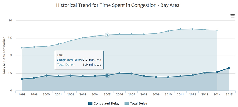 Figure 3. Chart. San Francisco MTA's Vital Signs Deep Dive Page. Figure 3 is an effective illustration of external factors because:
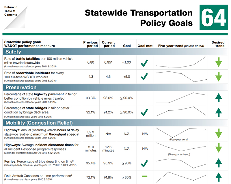 Figure 4. Graphic. Washington DOT's Grey Notebook. Figure 4 is an effective illustration of external factors because:
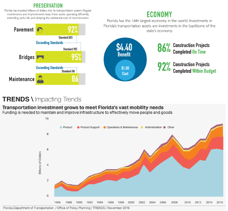 Figure 5. Graphic. Florida DOT's Fast Facts Examples. Figure 5 is an effective illustration of external factors because:
The primary goals of displaying external factors is to convey a particular message about those factors and their relationship to transportation. These examples do a good job visually with conveying information and visually retain the reader's interest. However, they do not necessarily to a good job making a connection between transportation and the external factor (or other element as some are unrelated to external factors). Success will be largely based on how you present your data and how well your message is understood by your audience. CONSIDERATIONS FOR DISPLAYING EXTERNAL FACTORSRegardless of which external factors states or regions may select to follow with transportation performance measures, they should consider several broad factors early in the process before any measures are displayed on a website. These considerations represent a cohesive, big-picture view that will maximize the effectiveness and reach of the effort. Think About Your AudienceLikely the most important factor to consider when making any graphic or data visualization is to consider who the audience or consumer of the information will be. Understanding who will be consuming the information will provide insight into what information is relevant, how timely that information should be, and how they might best consume the information. For example, if the primary consumer of your audience is working professionals in the same field, what the visualization looks like and what it contains could be considerably different than if the primary consumer is the general public with little knowledge on the topic. Understanding your audience—their knowledge level on the topic, what interests them and why, and other behavioral elements—will increase the effectiveness of your message. In general, all visualizations should be simple, but with a knowledgeable audience, information that is more technical can be conveyed. This naturally leads to the second, and likely equally important guideline. What Message Do You Want to Convey?Understanding who your audience is will greatly inform not only what your message is, but how it will be conveyed. With external factors affecting transportation, is the message to simply show how different factors correlate with transportation performance measures, or are there facts and revelations that need to be conveyed to specific groups? When your target audience views the visualization, the focus should be the one to three messages that, if they gleaned nothing else, would be most crucial to their deeper understand of the topic. This generally means that in any visualization, descriptive text, or narrative, instructions that guide the consumer should be included to leave nothing to chance when viewing the visualization. Good graphics should allow your primary message to be conveyed easily and quickly, but also allow those who are curious to dive deeper into the data and make discoveries and connections on their own. Doing this will actively engage your audience, keep their attention and interest longer, and allow them to think creatively about the message you are conveying. Be careful to consider alternate messages that might come from your visualization. These unintended messages can shift the conversation away from the desired dialogue to one that is either unimportant or irrelevant to the intended message. How Will Your Audience Use Your Visualization?How your audience will use your visualization and the information it provides is the summation of the two guidelines previously discussed. In this case, now that your audience is more informed about which external factors affect transportation, what action should they take next? Should they share your visualization on social media or other similar outlets? Should they use this information in discussion, planning, or policymaking (and if so, how would this best be accomplished in each case)? Placing specific thought in how your audience may use your visualization and ultimately your message—why you are displaying these particular external factors in the first place—will broaden the reach of your message and visualization. Ultimately, your goal should be that your identified audience should be able to grasp the primary message from your visualization in about five seconds or less and then remain interested enough to dig deeper into the information to glean at least one additional piece before moving their attention span elsewhere. OTHER CONSIDERATIONS IN VISUALIZING EXTERNAL FACTORSFrom a macro-perspective, understanding who will be using the visualizations of external factors and how they will be used in addition to understanding and clearly conveying your own message is a critical first step. However, once your audience, message, and intended use are set, actually creating the visualization takes careful thought and consideration. Several difficulties lie in the path to creating an engaging and meaningful comparison between external factors and transportation performance measures. These include:
Additionally, there are other, more practical, hurdles to overcome in the analysis and assessment of external factors that make addressing the previous three hurdles difficult. The following tips will help in addressing these and other hurdles to ensure that any visualization of external factors maximizes the ability to convey the intended message to your audience. Carefully Choose How External Factors Are AssessedSelecting which external factors to use may seem obvious and inherent in this process, but choosing how those external factors are displayed can make a considerable difference in conveying a message about that factor and making it easier to understand. For example, unemployment is a reasonable factor to consider in terms of transportation performance measures and may show a high degree of correlation with congestion. However, it may make more sense to display employment gains in real numbers with transportation performance measures. This is beneficial for a couple reasons. First, unemployment and transportation measures may be inversely (or negatively) correlated—an increase in unemployment means a decrease in congestion—creating an X-looking line on a chart. These types of relationships can be difficult for readers to fully grasp quickly compared to positive correlations (parallel lines on a chart). Transforming data and placing trend lines in a positive correlation/relationship will greatly increase the readability and interpretability of your visualization. Second, putting an external factor in different terms may help make interpreting the results of your analysis and creating a meaningful message from your visualization simpler. In the same example, it is much easier and makes more sense to say, "As employment increases by X, [traffic congestion] increases by Y," than the alternative of "As unemployment decreases by X, [traffic congestion] improves by Y." This is partially due to the use of negatives in voice, but also relates back to the negative correlation. Determine If External Factors Require Seasonal AdjustmentSimilar to the previous discussion, careful thought should be given to if the external factors (or transportation performance measures other than the performance measures required under 23 USC 150(c)) should be seasonally adjusted. Many times, plotted data may look erratic with several peaks and valleys over time that make determining the direction and scale of a trend nearly impossible. In this case, one should consider seasonally adjusting the data before performing the correlation analysis. There are other benefits to seasonal adjustment that might not be as obvious. Most importantly, seasonally adjusting data will allow the user and audience to make month-to-month comparisons (e.g., compare July data with June data). Without seasonal adjustment, these comparisons are not appropriate because an up or down tick in the trend line may be heavily influenced due to seasonality. Instead, users would have to compare the same month year over year in order to accurately compare data. Using the unemployment example, this data set is highly seasonal, often seeing drops in unemployment around the holiday season as companies hire temporary workers. Seasonal adjustment removes that influence, allowing a comparison of December to January. Another benefit to seasonal adjustment is that changes in trend direction (or severity) can be more quickly determined through month-to-month comparison. Without the adjustment, it would take over a year or more to discover the same trend. When comparing against transportation performance measures, this rapidity of response would allow the audience to make more accurate and timely decisions when using any visualization created with the data. Be Thoughtful about How Data Is DisplayedOnce the external factors have been thoroughly transformed and analyzed, displaying the factors in such a way as to make your message clear to your audience is crucial. There are several basic techniques that should be used to ensure that any visualization made will be readable and understandable to your audience. Make sure that you plot both the external factor and the transportation performance measure on the same graph. This may seem obvious, but often times (and as seen earlier in other examples), this does not happen. Placing two lines on the same chart introduces some challenges, but can also be powerful in conveying your message. It will be much easier for your audience to assess the trend if the lines lie together. However, this requires additional effort on the part of the creators of the visualization to think about what the relationship they are charting actually means. Does it make intrinsic sense? When creating charts with two lines, there are a few key design techniques worth noting.
In summary, when tracking, visualizing, and publishing external factors in comparison with transportation performance measures, State and local agencies should carefully consider not only the analysis in preparing the data, but also in how they present the data. TYING IT ALL TOGETHERUnderstanding and applying these principles will allow visuals of external factors to be much more effective and meaningful. Figure 6 illustrates an external factor (employment) found to be statistically related to the travel time index (TTI) in Austin, Texas, in a format typical of Microsoft Excel chart defaults. Note how, even with trend lines drawn, it is difficult to glean any meaningful information from the chart. There are many issues with this visualization:
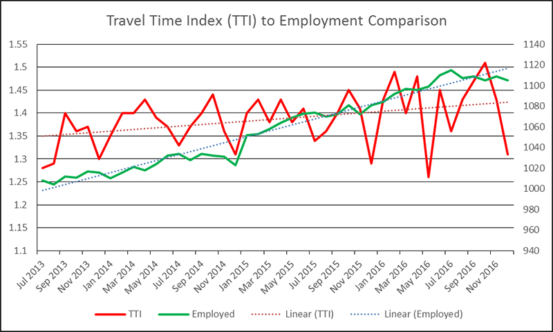 Figure 6. Chart. Default Excel Chart Formatting. Without proper analysis and thought into what the analysis means, simply displaying the results will likely degrade the credibility of the analyzer. While it is easily the most difficult task, ascribing some sort of meaning to the results of the analysis is crucial to progressing any discussion on the topic. Figure 7, however, illustrates the same data thoughtfully developed into a visualization that is easily digestible and clearly conveys the message the authors intended. Note that in this graphic, the data has been seasonally adjusted to more clearly and accurately show trend information. Additionally, both the title and supporting text clearly interpret the chart's meaning for the reader, yet still allowing the reader to examine the data more carefully. Superfluous information has been removed or greyed, colors coordinate with one another, and each element on the chart has some meaning for the reader. By clearly defining what the creator of the chart found in the deeper analysis, confusion and potential misinterpretation has been nearly eliminated from the external factor comparison with the performance measure. Additionally, the added text message interpreting what the data represent provides accurate and controlled messaging for the reader to take and reuse in other places, like media outlets, reports, or briefings. The entire graphic could also be used, if desired by the reader, to add further depth to their use. 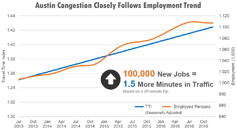 Figure 7. Chart. Same Data as Figure 6, but Improved Visual. Figures 8 and 9 explain in more detail the negative and positive results, respectively, of chart design/features chosen to display. In this explanation, nuances about the visualization itself have been explained that could help improve any similar illustration of external factors compared with transportation performance measures. A more detailed discussion of the use of color, size, spacing, axes, and design can be found in the Appendix. 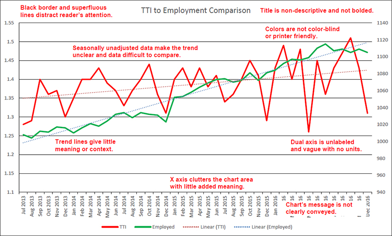 Figure 8. Chart. Detracting Elements from a Bad Example. 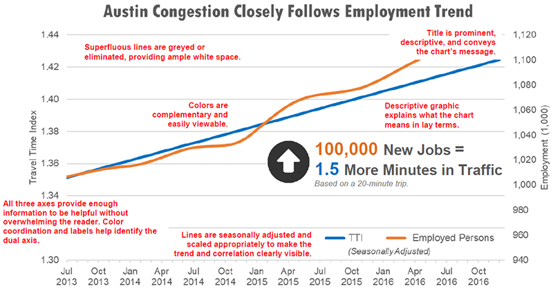 Figure 9. Chart. Elements of What Makes a Good Visualization. Note that this example does not provide an end-all format for creating visuals, but it does convey a measure of graphic best practices that should be followed in order clearly disseminate information of any type. One of the best ways to develop your graphic skills is to frequently examine what others have done, both with good and poor examples. Additionally, look at other non-transportation resources for graphic and chart design ideas, paying specific attention to how the message and point of the visualization is being conveyed to the reader. REFERENCES FOR CHAPTER 3
You may need the Adobe® Reader® to view the PDFs on this page. |
|
United States Department of Transportation - Federal Highway Administration |
||