Approaches to Presenting External Factors with Operations Performance MeasuresAPPENDIX. IDENTIFYING AND PRESENTING EXTERNAL FACTORSThis Appendix documents a state-of-the-practice review and statistical analysis conducted to identify key external factors that influence transportation system performance measures. The Appendix also presents key principles for information and visualization design. STATE-OF-THE-PRACTICE REVIEWTable 5 summarizes a sample of agencies that collect performance measures and have in recent performance reports or web based dashboards reported external factors broadly grouped into the categories listed above. While there are more examples available, this selection is highlighted because they represent more complete sets of measures or attributes that are readily available and produced in a single document or dashboard. Private sector freight and airline companies also plan for external factors however there is limited detailed information on the process and procedures or the measures they actually use documented in the literature. Washington State DOT has published the Gray Notebook quarterly since 2001. This document records selected performance measures from across the State as well as local areas of interest. In 2010, six statewide transportation policy goals were reaffirmed in statute to guide the planning for operation and performance of and investment in the state's transportation system. These six goals were in the areas of Preservation, Safety, Mobility, Environment, Stewardship, and Economic Vitality. Biennial Transportation Attainment Reports along with the quarterly Gray Notebook assess progress toward the goals and contribute to the overall performance of the transportation system. Florida DOT's Planning Division tracks transportation-related "Trends" described as information that could pose threats to successful implementation of the Florida Transportation Plan. This information can be used by Florida's decisionmakers, transportation professionals and the interested public to assist in understanding transportation-related issues and making wise and informed decisions. Travel demand is measured with vehicle miles travelled and freight volume. Other external factors presented include population, transportation funding, tourism, fatalities, housing, energy consumption, and mode of travel.
The Metropolitan Transportation Commission (MTC) is the transportation planning and coordinating agency for the nine-county San Francisco Bay area. MTC developed Vital Signs, an interactive website that tracks factors related to transportation land use, the environment, the economy, and social equity. Travel demand is measured with daily miles traveled and the site also tracks other factors such as population, mode of travel, unemployment, fatalities, home prices, income, and economic output (regional domestic product). The Chicago Metropolitan Agency for Planning (CMAP) is the regional planning organization for the Northeastern Illinois counties of Cook, DuPage, Kane, Kendall, Lake, McHenry, and Will. As a part of their comprehensive regional plan the agency develops coordinated strategies that help address issues related to transportation, housing, economic development, and other quality of life issues. The CMAP website has multiple pages of statistics that track or provide a recent history of factor areas such as household income, unemployment, education, workforce participation, congestion, and freight. South Carolina DOT produces a performance dashboard that displays statistics of different measures in the areas of economy, mobility, preservation, safety, and strategic planning. Specific measures include, freight reliability and delay, interstate reliability and delay, fatalities and serious injuries, bicycle and pedestrian fatalities. Southern California Association of Governments published a list of performance measures as an appendix to their Regional Transportation Plan/Sustainable Communities Strategy. The Plan is a long-range visioning plan that balances future mobility and housing needs with economic, environmental and public health goals. As a part of the vision, performance measures are identified as well as the measure definition and source. The greater Philadelphia area MPO, Delaware Valley Regional Planning Commission, as a part of their Comprehensive Economic Development Strategy, tracks performance measures in the areas of unemployment, income, population, construction, mode of travel, vehicle miles travelled, air quality, tourism, housing affordability, job growth, regional domestic product, and volume and tonnage of freight. STATISTICAL ANALYSIS OF POSSIBLE EXTERNAL FACTORSTo estimate the effect of external factors on highway performance measures both spatial and temporal dependencies need to be addressed accordingly. External factors such as social-economic changes or weather may be subject to spatial or geographical limitations. The temporal relationship between the change in an external factor and the manifestation of its effect in highway performance measures, as well as the persistence or duration of the effect, is another aspect. External factors may affect highway performance immediately, or may only have an effect after a lag time or after a period of persistent stimulus. Such a relationship is referred as dynamic relationship. The researchers used several statistical tools to address the multivariate dynamic process to:
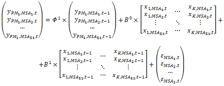
Multivariate methods for time series analyses such as vector autoregressive and state space models are widely used in econometrics. In addition to describing the time-varying response of dependent highway performance variables, these techniques enable a researcher to quantify the time-dependent effects of exogenous (input) factors on the endogenous (output) variables. Endogenous variables are the processes that are determined inside of the system of interest while the exogenous (or independent) variables are determined outside of the system. For example, the travel time index across the 51 metropolitan statistical areas is the multivariate endogenous factors, while the monthly traffic volume and gross domestic project of these areas are exogenous factors. The relationship between the performance measures in this study and external factors are formulated in the following way: Vector form: (1) Matrix form: (2) Where,
Modeling the multivariate dynamic models can become computationally costly. Therefore, the researchers applied several multivariate tools to make the process relatively easier to execute. The steps taken to conduct the statistical analysis are described in Figure 10. Researchers used PCA to reduce the data dimensionality.(1) After reducing the multivariate data researchers have conducted Granger causality test to identify the most influential external factors affecting the performance measures.(2) This analysis was conducted for each performance measure individually. As the result of this process the researchers obtained the preliminary list of the influential external factors. Each external factor's present and lagged effects were examined as well.  Figure 10. Chart. Statistical Analysis Methodology. To identify the final list of the influential external factors, the researchers selected the variables that were found to be influential for at least two performance measures. After identifying the list of five influential factors, authors conducted a Dynamic Panel Data (DPD) analysis of the three performance measures.(3) Figure 11 shows the performance measures in this study across the three MSAs: Austin, Baltimore and Chicago. The time series plots indicate similarities among the same performance measures across the MSAs while the correlation plots indicate that the performance measures of different MSAs are correlated. To observe the trend and seasonality, the time series were decomposed into the unobserved components using the state space models as shown in Figure 12. Note that the example only shows Austin data.  Figure 11. Chart. Time Series and Scatter Plots of Performance Measures. 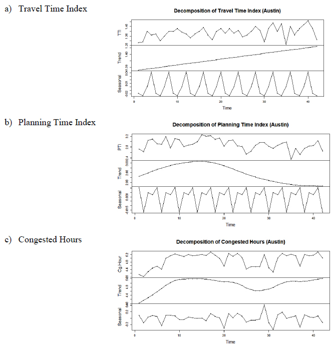 Figure 12. Chart. Trend and Seasonality Decomposition of Performance Measures (Austin). Selection of Most Influential External FactorsTo select the influential factors, the dimension of multivariate data was reduced using the principal components analysis. Granger causality method was later applied to identify the most influential factors and their lagged effects on each performance measure. PCA was used to reduce the dimension of the performance measures and the external factors. As shown in Figure 13, most of the variability in performance measures across the 51 MSAs are explained by the first and second PCA. Looking at the time series plots of the variances we can observe that the series are marginally stationary. 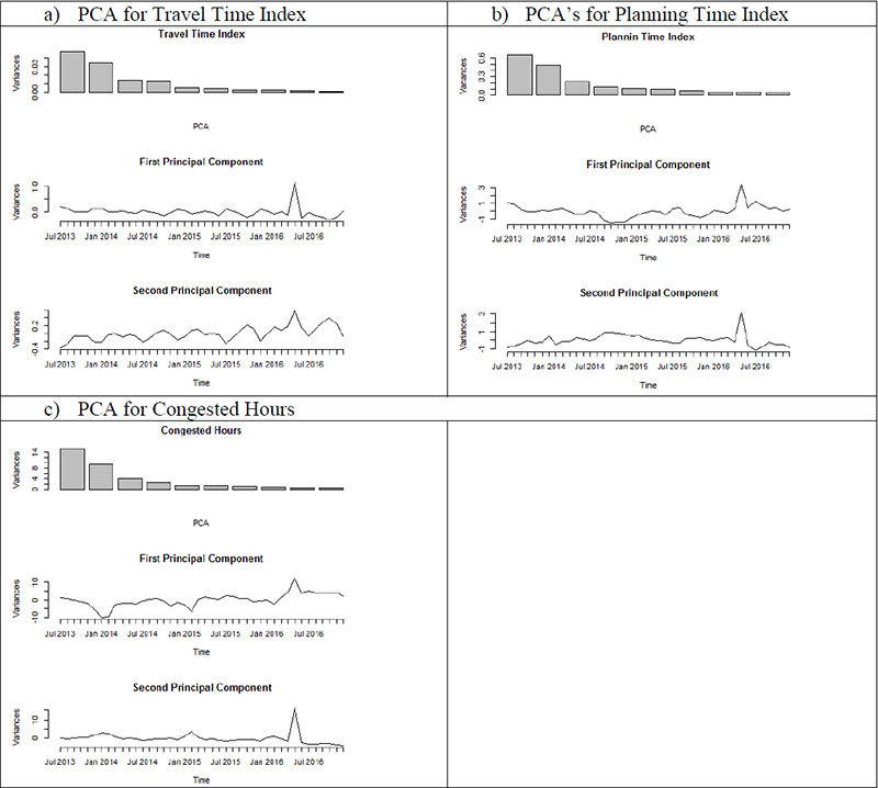 Figure 13. Chart. Principal Component Analysis of Performance Measures. The PCA of the external factors were computed using the natural logarithms to normalize the data. For the majority of the external factors, the first PCA is able to account for most of the variability among the external factors (Figure 14). 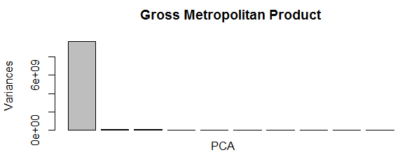 Figure 14. Graphic. PCA for GMP. For some other variables such as MADT, more than one PCA was found to be important to explain the correlation among the multivariate series (Figure 15). However, when inspecting the first four PCA's, it can be observed that the first PCA is a stationary series (i.e., the series oscillates around the mean). As the PCA order increases the series becomes less stationary and more stochastic thus indicating that the series can be reduced to one PCA only. As the conclusion, only the first order PCA of all variables was used for the empirical analysis. 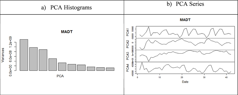 Figure 15. Chart. PCA Plots of MADT. Granger Causality was applied to identify the most significant influential factors. The effects of both current and lagged effects (up to three lags) of the external factors are examined using the Granger test. The results are shown in Table 6. In this table only the marginally significant (p − value < 0.5) results have been reported. As it can be observed among the most significant external factors, the variables MADT, economic conditions index, number of employed, fuel price index, rental vacancy rate and total building permits appear to influence all three performance measures significantly. Leading effects indicate that the effect takes place after the indicated number of months, e.g., any changes in the economic condition index of the MSA will affect the travel time after one to three months. The descriptive statistics of the selected variables are also shown in Table 6.
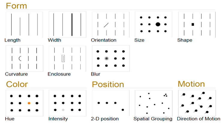
* External Factors selected for the analysis. Note: only significant factors are included in the table. The results of the causality analysis indicate that the variables MADT, economic conditions index, number of employed, fuel price index, rental vacancy rate and total building permits are the most influential external factors. The economic conditions and fuel price indices have a leading effect (1 to 3 months) on the performance measures. PRESENTATION AND CHART BEST PRACTICESWhen creating visuals, specifically charts, graphs, and dashboards, care should be given to not only what data and information is displayed to the reader, but also how the chart visually appears. Giving thought to the layout, design, coloring, and formatting of a chart will help to effectively communicate the desired message. The following principles should be followed to create visualizations that look professional, convey your particular message, and engage your identified audience. Understand How People Process InformationCreating good visualizations requires that one understands how humans generally process and interpret information, on both a conscious and subconscious level, and then leverages this knowledge into a graphic. First, we naturally approach visualizations with one of two primary goals: to explain or answer specific questions about something or to explore and glean valuable insights thereby increasing understanding.(4) In the latter, the viewer creates his own questions to answer based on the information seen. These two approaches are directly related to the type of audience and the intended message discussed earlier. Second, how we approach visualizations (what we see) is heavily influenced by memory. Our long-term memory makes us expect a visualization to work a certain way (e.g., the lowest value to be zero and each increment equally spaced). We expect things to flow from left to right or more important elements to be bigger, darker, or otherwise distinguished. Separately, our working memory continually breaks information into small chunks (usually about three at a time) to process.(5) Any more information than this at one time can lead to information overload and a loss or confusion of the message. In short, keep it simple. Third, our brains are trained to recognize patterns and differences. Psychologists have created two primary theories for how we do this. First are those things that catch our eye or ‘Preattentive attributes'.(6,7) These are subtle differences in patterns, colors, and position that the eye can perceive in about 10 milliseconds (see Figure 16). These attributes help our brains form patterns and organize information, leading to the second theory. The Gestalt Principle of grouping describes how our brains organize and describe information in groups similar to one another.(8) This principle also allows our brains to highlight important information and weed out noise that may distract from the primary message. Figure 17 illustrates the most common Gestalt principles. 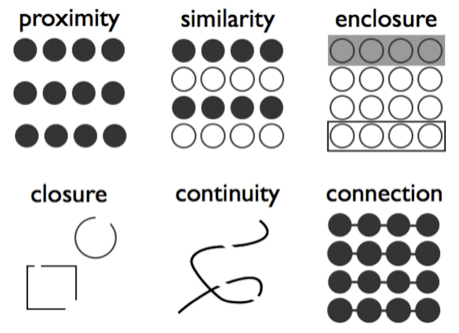 Figure 17. Graphic. Gestalt Principles of Grouping. Figure 18 illustrates how these abstract principles operate in a chart.(8) First, note how the primary points of interest are colored dots against the grey of the full data sets for three data series and each series uses a different color (color, similarity, and intensity). Second, each dot utilizes size to convey information about that point (size). The dots' positions also give information for the series, drawing the eye to variances (the large yellow dot above the grey line) to groupings or clusters (proximity and spatial grouping). This chart type effectively uses colors, spatial orientation, size, proximity, enclosure, and similarity to effectively convey a vast amount of information, even though you fundamentally don't know much about what the data represent. 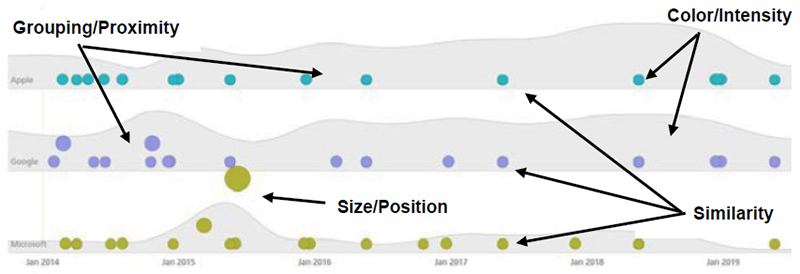 Figure 18: Graphic. Example of Preattentive Attributes and Gestalt Principles in Action. Keeping these three principles in mind will not only help you design engaging visualizations, but will also ensure that your message is properly conveyed. Choose the Right GraphicThe first and often most overlooked step in creating a visualization is to decide what type of graphic should be used. While in the case of external factors your options may be limited, there are several different types of graphics that can be used depending upon your intended use and message. Marketing professionals have understood this for years and offer recommendations based on what type of message and analysis is being made.(9) The following bullets present suggestions of chart types based on intent:
Note that this list is not exhaustive; there are several other types of charts that may also be used depending upon what information and message is desired. Avoid using pie charts, if possible, as they do not adequately allow the reader to comprehend the size differences if more than 3 or 4 categories are represented. Depending on the audience and intended use, other media such as graphic art, video, or infographics may also be a suitable choice. Regardless of chart type, making the right selection will likely be the biggest factor in increasing understandability and decreasing the chance of an unclear or mixed message. Do More with Less: Lines and ColorsBefore discussing the details of the data itself, addressing the graphic from a visual standpoint will help guide its creation as data are included. Note that the process of building a chart is iterative; there is a constant need to adjust the focus on the data and design to create a graphic that clearly conveys the message to the target audience. LinesWith all charts, use as few lines and elements as possible. If nothing else is followed, this one guiding principle should be paramount over any other. Default excel charts add superfluous lines, shapes, and visual noise that distract from the intended message. Carefully consider what lines actually are necessary and give meaning. If a line or element does not give specific meaning to the chart, eliminate it. This can include:
ColorUsing color is integral to creating engaging visualizations. Color can easily convey where data trends improved, worsened, or stayed neutral; can signify direction; or can classify groups and categories. However, there are a few simple concepts to ensure the use of color is maximized in a visualization.
Chart Elements, Legends, and LabelsChart elements are anything other than a legend or data/axis labels that are included in a chart. Chart elements may, for example, include equations, explanatory text, arrows, or other marks. In general, a similar rule applies as for lines: less is better, unless necessary. This rule also applies for legends and labels: every chart should have these, but eliminate unnecessary text. Keeping your chart focused, well organized, and clean will keep the reader on task and your message from being lost.(10, 11) AxesEvery chart should have both axes labeled with equally-spaced tick marks. Axis lines and major gridlines (if necessary for clarity) should appear in grey, allowing the data to pop. The vertical axis should always start at zero, with both axes maintaining appropriate aspect ratios. Distortion in width and height can make trends in the data appear more or less severe. In dual axis charts (with a set of bars and a line both meaning different things), extra consideration should be given to add clarity as to which data refer with which axis. LegendsEvery chart, no matter how intuitive, should have a legend of some kind. Legends can be free-floating in an open area or as labels directly adjacent to the lines or bars. Either way, it should be clear what each line or bar means and to what they correspond. LabelsData in charts should have labels, either directly next to the points or in a data table below the chart that corresponds with the information. Be careful not to overwhelm the reader with information; sometimes, it may be better to only include labels for relevant or important data points, depending upon your message. TitlesAll charts should have a title. Titles should be descriptive, succinct, and convey some or all of the message the reader should obtain. DataBefore creating a chart, be sure to sort the data in ascending or descending order, unless the order of the category matters. For time series data, ensure equal spacing, even if intermittent time periods are included (or consider excluding those periods). Consider seasonally adjusting data in order to make comparisons at intervals of less than one year. Without seasonal adjustment, only annual comparisons are appropriate, hindering the reader from understanding changes in the data. Round data labels and figures to the nearest significant figure. If in millions or billions, consider shortening or adding an "M" or "B" after a two-digit number. If data series are being stacked on the same graph, be sure to align each series with the other. The one exception to this is if there is a noted lead or lag that is part of the intended message. If so, this should be clearly and overtly displayed. REFERENCES FOR APPENDIX
You may need the Adobe® Reader® to view the PDFs on this page. | |||||||||||||||||||||||||||||||||||||||||||||||||||||||||||||||||||||||||||||||||||||||||||||||||||||||||||||||||||||||||||||||||||||||||||||||||||||||||||||||||||||||||||||||||||||||||||||||||||||||||||||||||||||||||||||||||||||||||||||||||||||||||||||
|
United States Department of Transportation - Federal Highway Administration |
||