Applying Archived Operations Data in Transportation Planning: A Primer5. PLANNING OPPORTUNITIES FOR ARCHIVED OPERATIONS DATA - BASIC TO INNOVATIVEThis chapter showcases five important planning activities that are enabled by archived operations data:
The sections below introduce each planning activity by identifying the need for archived operations data for this activity, the types of relevant data, analytical procedures that transform the archived data into useful information, and the impact that using archived operations data for that planning activity can achieve. Following the introduction to each planning activity, one or more case studies are provided to demonstrate, in detail, how archived operations data can be used and what agency outcomes were achieved. Each case study highlights the use of visualization and its influence on the planning activity. Problem Identification and ConfirmationNeed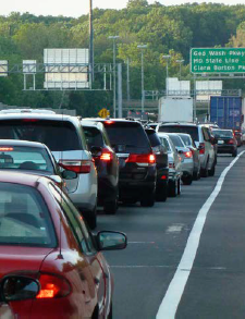 Figure 18. Photo. Congestion on freeway. Source: Thinkstock/tomwachs. All agencies have limited dollars available to improve mobility, safety, and aging infrastructure; therefore, most agencies attempt to identify the "worst" problems in their jurisdiction (i.e., problems that have the greatest impact, and most likely, the greatest potential for a high return on investment (ROI) should countermeasures be put into place). An agency needs an efficient way to identify, quantify, and rank safety and mobility issues, and to determine the cause of these issues. Because of the dynamic nature of transportation, it is important that an agency be able to perform these types of analysis efficiently and cost-effectively many times throughout a year to respond to external political influences and/or to public concern. The results of these analyses can then drive the long-range transportation plan (LRTP), influence funding decisions, or simply be used to respond to public concerns over why a particular project was chosen over another. Relevant DataHistorically, continuously collected permanent count station data and police accident reports would have been influential in this type of analysis. In some cases, temporary count station data may have been used, or density data may have been collected by aerial photography surveys. Both the count station and police accident data, while collected in real-time, will often have many months of lag between when the data is collected and when it becomes available to analysts. Aerial photography surveys may be collected only for a few hours once every few years, and only at select locations where problems have been anecdotally noted. Temporary count stations are deployed only once every few years on select roadways, and they rarely collect data for more than 1 week. Because these data sources are not collected continuously, agencies must rely on modeling and forecasting techniques, which may not account for seasonal variations, incidents, or other dynamic conditions. Archived operations data, however, can help to reduce or even eliminate some of the challenges associated with the above data sources. Real-time flow data can be collected from sensors, toll tag readers, license plate readers, or probe data from third-party vendors (e.g., HERE, INRIX, or TomTom). Advanced transportation management system (ATMS) platforms also collect real-time event data and lane closure information from construction events, disabled vehicles, accidents, and special events. Analytical ProceduresOperations data from probes or other high-density sensors can be used to identify congested areas or bottlenecks. When this data is integrated with ATMS event data, it becomes possible to identify if the congestion is recurring or non-recurring. Flow data from probes and dense sensor networks can sometimes be challenging to work with because of the sheer volume of data, complex linear referencing systems that might not match up with agency centerline road databases, and limited agency technical and resource capacity. Agencies with strong, integrated information technology (IT) departments, dedicated data analysts, sufficient data storage hardware, and access to statistical software, such as SAS (Statistical Analysis System), can handle this type of analysis given time and proper funding. However, many agencies subcontract their analysis to consultants, universities, or transportation departments, or they purchase off-the-shelf congestion analytics software and data integration services tailored for transportation planners. ImpactRegardless of the method used to analyze operations data, agencies often find that the use of operations data can allow them to identify problems based on more timely data, which helps to instill greater confidence in the decisions that are made as a result. Also, when probe-based data is used for the analysis, the data has greater coverage than traditional loop detectors. Therefore, there is more confidence that problem identification analysis is covering "all roads" instead of just detected roads. Lastly, agencies who purchase off-the-shelf congestion analytics software find that the speed of analysis increases so significantly that resources are freed up and the agency is able to respond to requests much faster. Case Study: Problem Identification and Confirmation at the New Jersey Department of TransportationOverview The New Jersey Department of Transportation (NJDOT) uses a combination of archived operations data and data processing and visualization tools to identify performance issues on the transportation system and develop easy-to-understand performance measures with visualization that speak to senior leadership, elected officials, and the public, in alignment with Fixing America's Surface Transportation (FAST) Act and organizational goals. NJDOT is leveraging a mixture of archived operations probe data, volume data, weather data, and event data to help identify congestion issues on the State's roadway network in part to create problem statements for consideration in its project delivery process. The archive of these data sets has been made available to NJDOT planners through a web-based visual analytics tool known as the Vehicle Probe Project (VPP) suite. This suite gives planners the ability, with minimal effort, to automatically detect and rank the worst bottleneck locations in a county or entire state, determine if the congestion is recurring or non-recurring, determine causality, measure the economic impact, and produce graphics that can be inserted into analysis documents and presentation materials to be used with decision makers. The VPP suite is an outcome of a project directed by the I-95 Corridor Coalition that began in 2008 with the primary goal of providing Coalition members with the ability to acquire reliable travel time and speed data for their roadways without the need for sensors and other hardware. The VPP has evolved since that time and now also provides tools to support the use of the data and integrates several vehicle probe data sources.22 Data NJDOT is using four archived data sets: probe, volume, event, and weather. The probe data is derived from a private-sector data provider and is archived at 1-minute intervals from a real-time feed that is originally used for travel time and queue estimation. The probe data is represented as the average speed across the length of a road segment for each 1-minute period. The volume data used by the agency is derived from Highway Performance Management System (HPMS) data that is also provided back to the agency through a third-party data provider. The event data derives from NJDOT's OpenReach system, which is their ATMS and 511 platform. Tis data is entered by operations personnel into their ATMS platform in real-time. Types of information recorded include the type of event (e.g., construction, accident, special event, disabled vehicle, police activity, etc.), location, and lane closure information. The weather data is a mixture of both weather alerts and radar that derives from freely available National Weather Service data feeds. All of the above-mentioned data sources are fed into the Regional Integrated Transportation Information System (RITIS) archive and the VPP suite of analytics tools housed outside of the agency. RITIS also began as a project under the I-95 Corridor Coalition and is an automated data fusion and dissemination system with three main components, including: (1) real-time data feeds, (2) real-time situational awareness tools, and (3) archived data analysis tools. Agency Process NJDOT identifies and analyzes congestion issues on the system and develops communication materials using the following basic process with the VPP suite of analytics tools:
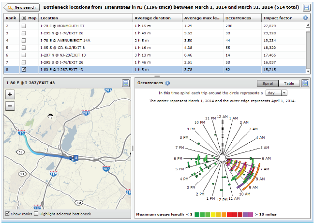 Figure 19. Screenshot. Ranked bottleneck locations for all of New Jersey during March 2014. Source: Bottleneck Ranking Tool from the Probe Data Analytics Suite. University of Maryland CATT Laboratory. The bottleneck ranking tool allows an agency to "rank" the worst congested locations in any geographic region (multi-state, state, county(ies), city, etc.) based on archived data (e.g., probe-based speed data, weather data, and ATMS incident logs), which informs users on certain statistics (e.g., on how significant each congested location is, when the congestion occurs, how it may have been affected by incidents and events, etc.). The graph in Figure 20 is one of the ways NJDOT views information on bottlenecks using the VPP suite. This graph shows the Monday through Friday pattern of congestion in the mornings (6:30AM through 10:30AM) with little to no congestion on the weekends. The spiral graphs are useful in identifying temporal patterns in the data. The repeated patterns that temporal data exhibits over longer time spans are often more illuminating than the linearity of the data and can be used in tandem with event and weather data to determine if the bottleneck location is recurring or non-recurring. The spiral graph renders data along a temporal axis that spirals outward at regular, user-defined intervals (e.g., days, weeks, or months). Bottleneck events are rendered as bands along the axis, creating visual clusters among data that contribute to patterns. The particular bottleneck shown in Figure 20 is rendered on a daily cycle—each revolution in the graph is a single day where the inner-most revolution is March 1, and the outermost revolution is March 31. Bottlenecks at this location are more prevalent in the morning between the hours of 6:30AM and 10AM, with a few less-severe bottlenecks occurring in the evening between 5PM and 6PM. The color denotes the maximum length of the bottleneck. The 5-day work week pattern also is shown in this bottleneck. 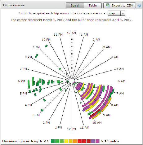 Figure 20. Chart. Time spiral showing when a bottleneck occurred and length during that time. Source: Bottleneck Ranking Tool from the Probe Data Analytics Suite. University of Maryland CATT Laboratory. The graph in Figure 21 is another way that identifies congestion issues based on archived data. The graphic depicts a 20-mile section of I-95 in the State of Maryland in which the right side represents northbound traffic while the left side represents southbound traffic. Green shading denotes uncongested conditions, while red and orange shadings represent more congested conditions. Daily occurrences of incidents and events are overlayed. Figure 21 shows a large number of events that contributed to abnormal (non-recurring) congestion in the northbound direction of travel during the morning. 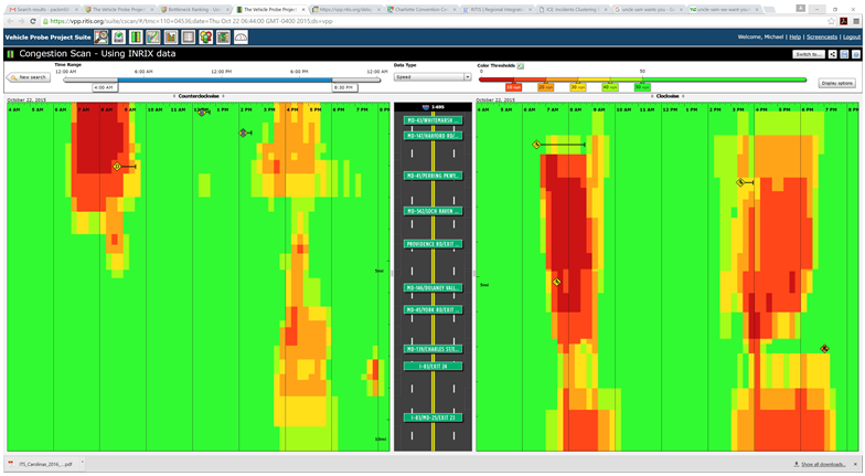 Figure 21. Graph. Congestion scan graphic for I-95. Source: Bottleneck Ranking Tool from the Probe Data Analytics Suite. University of Maryland CATT Laboratory. Figure 22 displays the user delay costs for I-295 in New Jersey that contribute to an economic impact study of congestion. Each cell represents 1 hour of the day on a particular day of the week. The cells are color coded to represent hourly user delay in thousands of dollars. Figure 23 provides a closer look at a summary report of delay costs for a Friday at 5pm. 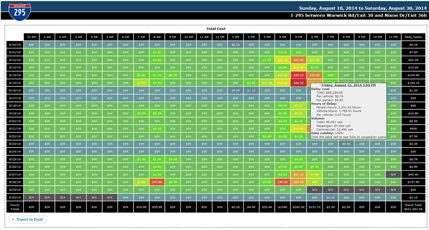 Figure 22. Screenshot. User delay costs for a 17-mile stretch of I-295 in New Jersey (both directions of travel). Source: User Delay Cost Table from the Probe Data Analytics Suite. University of Maryland CATT Laboratory. 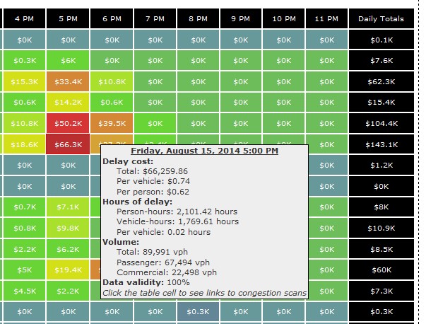 Figure 23. Screenshot. View of I-295 showing detailed statistics in a mouse tooltip for a particular hour of the day. Source: Probe Data Analytics Suite. University of Maryland CATT Laboratory. The following figures are examples of reports and facts sheets that NJDOT developed based on archived operations data to communicate to decision makers and the public about the problems on the system and the need for improvements.  Figure 24. Screenshot. Project confirmation presentation graphic to confirm a "high-need" signalized intersection in New Jersey. Source: New Jersey Department of Transportation.  Figure 25. Screenshot. Example of problem identification and project confirmation at New Jersey Department of Transportation. Source: New Jersey Department of Transportation. 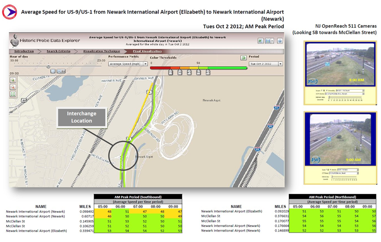 Figure 26. Screenshot. Example analysis from New Jersey Department of Transportation using the Vehicle Probe Project Suite, 511 New Jersey cameras, and the New Jersey Consortium for Middle Schools. Source: New Jersey Department of Transportation The evaluation in Figure 26 of the McClellan Street Interchange is part of the Port Authority of New York and New Jersey"s Southern Access Roadway Project. This location is not considered a high priority for the NJDOT from a congestion relief perspective. Tool The VPP suite allows the user to generate a congestion impact factor, which is a simple multiplication of the average duration, average maximum length, and the number of occurrences. The impact factor helps the user filter out high occurrence—but short duration and short length—bottlenecks that are of lower significance (e.g., those that might be a result of normal stoppages as a result of traffic signals on arterials). Once NJDOT identifies a candidate location for congestion reduction, it can conduct an economic analysis within the VPP suite. NJDOT can select a study region and use existing statistics on the regional value of time for both commercial and passenger vehicles. The suite produces a series of interactive tables that show hourly, daily, and total:
 Figure 27. Screenshot. Concept graphics explaining where high accident locations contribute to bottlenecks. Source: New Jersey Department of Transportation. After conducting their analysis within the VPP suite, NJDOT planners integrate some of the supporting graphics into slide shows, pamphlets, and posters that are used to help communicate with decision makers and the public. The embedded graphics are supported by explanatory text, call-out boxes, and other materials that combine to display all the information about the nature of the identified problem. Figures 24-27 are examples of some of these problem identification slides and pamphlets. It should be noted that many of these examples are taken from larger slide decks and other materials that, when combined, provide further background and backup materials to help explain the nature of a problem, and in some cases, recommended countermeasures. Calculations Behind the Visualizations The calculations behind all of the performance measures within the VPP suite are posted online.23 It is important to note that, as knowledge improves and technical capabilities mature, these calculations will frequently be updated and revamped within the suite to reflect the state of the art. One of the many advantages of using a web-based analytics tool is that the enhancements made to these calculations propagate instantaneously to every user, thus NJDOT and the relevant metropolitan planning organizations (MPOs) benefit from the new knowledge, and analysts are not burdened with having to re-implement complex functions multiple times within an organization. Another advantage is that these calculations are instantaneously and effectively standardized across multiple agencies and multiple departments, which makes it much easier to compare performance and ensure consistent and reliable analysis from state to state. Impact and Lessons Learned NJDOT has, within only a few short years, significantly increased the abilities of their own planning staff, their consultant partners, researchers, MPOs through the adoption of these archived data analytics tools. They are saving time and money while providing much-needed insights into mobility and the problem of congestion.
"Archived operations data may be the most important advance in data for planning purposes."
John Allen, Formerly of the NJDOT Planning Office With the advancements of these archived data tools, NJDOT can now answer difficult questions that were either previously unanswerable, or could have taken up to 1 year to analyze and report. As a result of this tool, NJDOT is able to operate more efficiently, respond to media and public inquiries rapidly, use a data-driven approach to problem solving, and focus more time and effort in identifying solutions to complex transportation problems, rather than chasing down other data. The improved analysis tools provide NJDOT with a stronger basis for the recommendations, and enable staff to bring a fresh perspective to previous studies, as appropriate. The VPP suite also is being used to evaluate projects in concept development to help decide whether projects should continue to advance through NJDOT's Project Delivery Process. This type of evaluation is used primarily for projects that were initiated outside of the normal problem statement or management systems screening processes and can be particularly helpful in ranking the priority of projects throughout a region so that political influences do not overly impact a project's likelihood of moving forward. The greatest lesson learned from NJDOT's experience with archived operations data is that data alone will not solve its problems. It needs tools that can empower a wide range of planners and analysts by removing the stress and burden of managing massive data sets and relying on external processing power to make them more efficient and proactive analysts. Development and Reporting of Mobility Performance MeasuresNeedPerformance measurement for mobility concerns is a key aspect of planning activities. It has been defined as a major step in the congestion management process (CMP) and is the basis for conducting sound performance management. In addition to fulfilling these requirements, undertaking performance measurement improves the quality of planning in several ways:
Performance measures should not be undertaken in isolation. Rather, they should be part of a process that relates to the strategic vision an agency has. That vision is embodied in goals and objectives and in performance measures that are used to monitor progress toward meeting them (Figure 28). Performance measures also should permeate all aspects of the planning process and planning products (Figure 29).24 A high degree of commonality in measures should exist across planning stages, recognizing some measures will be unique to specific stages. To the degree possible, however, consistency in performance measures across the different stages should be maintained. Documentation of past performance, through the production of performance reports, is the focus of this section. 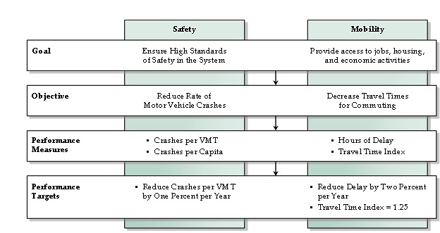 Figure 28. Diagram. Performance measures provide a quantifiable means of implementing goals and objectives from the transportation planning process. Source: Transportation Research Board, National Cooperative Highway Research Program. 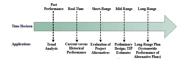 Figure 29. Diagram. Performance measures should be carried across planning applications throughout the entire time horizon. Source: Transportation Research Board, National Cooperative Highway Research Program. Archived data enables performance measures to track trends in system performance and to identify deficiencies and needs. Performance measures can be classified into different types:
Figure 30 shows an example of a "program logic model" adapted from the general performance measurement literature for incident management. The model breaks down the three above categories (outcome, output, and input measures) into additional categories. "External influences" relate to the forces that create changes in demand that are outside the control of transportation agencies (i.e., changes in economic activity and demographic and migration trends). The main point of Figure 30 is that a comprehensive performance management program includes performance measurement at all levels and that a clear linkage exists between successively higher levels. That is, a change in a level leads to a change in the higher levels. Performance measures for both congestion and reliability should be based on measurements of travel time. Travel times are easily understood by practitioners and the public, and are applicable to both the user and facility perspectives of performance. Reliability is a key aspect of mobility that should be measured. There are two widely held ways that reliability can be defined. Each is valid and leads to a set of reliability performance measures that capture the nature of travel time reliability. Reliability can be defined as:
In both cases, reliability (more appropriately, unreliability) is caused by the interaction of the factors that influence travel times: fluctuations in demand (which may be due to daily or seasonal variation, or by special events), traffic control devices, traffic incidents, inclement weather, work zones, and physical capacity (based on prevailing geometrics and traffic patterns). These factors produce travel times that are different from day-to-day for the same trip. 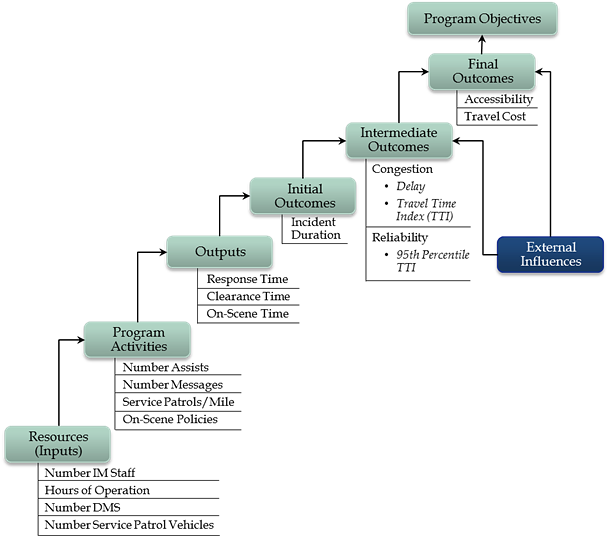 Figure 30. Diagram. Program logic model adapted for incident management. Source: Federal Highway Administration, Operations Performance Measurement Workshop Presentation. From a measurement perspective, travel time reliability is quantified from the distribution of travel times, for a given facility/trip and time period (e.g., weekday peak period), that occurs over a significant span of time; 1 year is generally long enough to capture nearly all of the variability caused by disruptions. Figure 31 shows an actual travel time distribution derived from roadway detector data, and how it can be used to define reliability metrics.25 The shape of the distribution in Figure 31 is typical of what is found on congested freeways; it is skewed toward higher travel times. The skew is reflective of the impacts of disruptions, such as incidents, weather, work zones, and high demand on traffic flow. Therefore, most of the useful metrics for reliability are focused on the right half of the distribution; this is the region of interest for reliability. Note that a number of metrics are expressed relative to the free-flow travel time, travel time under low traffic-flow conditions, which becomes the benchmark for any reliability analysis. The degree of unreliability then becomes a relative comparison to the free-flow travel time.26 Table 7 shows a suite of reliability metrics. All of these are based on the travel time distribution.27 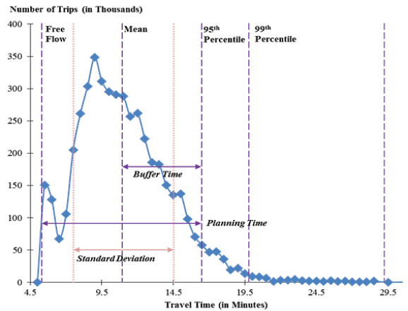 Figure 31. Graph. Travel time distribution is the basis for defining reliability metrics.28 Source: Transportation Research Board, Strategic Highway Research Program 2, Report S2-L08-RW-1.
Relevant DataPrior to the appearance of archived operations data, congestion performance report production by planning agencies was rare. Where they existed, they were based on results from travel demand forecasting (TDF) models or small sample "floating car" travel time runs. The measurement of reliability was non-existent. The data to accomplish performance reporting starts with field measurements of travel times or speeds from intelligent transportation system (ITS) roadway detectors or vehicle probes. At a basic level, this data can be used to produce mobility performance measures. However, more sophisticated and in-depth measures can be constructed with the integration of other data:
Analytical ProceduresData preparation. Routine quality control (QC) procedures need to be applied to the data. These are documented elsewhere.30 Travel time data is extremely voluminous and require special software to be processed. Incident data is much more manageable and can be analyzed with spreadsheets. Calculation methods. Detailed guidance on processing the raw travel time data into measurements, including QC, may be found in the literature.31 In their simplest form, the steps are as follows:
If results are desired at the facility level, a more statistically sound procedure is to compute the travel time over the entire facility by summing up the individual link travel times from Step 1 and using the aggregated travel times as the basis for travel time distribution. In this case, the weights become sum of the volumes for the links that comprise the facility. In both cases, the results achieved by volume-weighting will be different than not weighting. The difference will be more pronounced if both low volume and high volume periods are used in the calculation. The calculation of certain performance measures that are defined by exposure requires special treatment. For example, delay is the number of vehicles or persons exposed to the delay time. The most accurate way of computing these measures is from paired volume-travel time measurements, i.e., measurements that were collected at the same point in time and space. The current generation of privately-supplied vehicle probe data does not contain volume estimates—only speed or travel time. Computing exposure-based measures from this data requires using volume data from another source, namely, average traffic counts. Users should be aware that mixing average traffic counts with vehicle probe data produces only crude estimates for exposure-based measures. The analysis of incident, work zone, and weather characteristics data is much more straightforward; simple summaries usually suffice. Integrating incident and work zone data with travel time data is more problematic. First, the data must be matched temporally and spatially. The more difficult task is to assign congestion to a specific incident, work zone, or weather event. On facilities where recurring congestion rarely occurs, it is safe to assume that any congestion that occurs is due to an event. Where recurring congestion is routine, the assignment becomes much more difficult because some congestion would have occurred in the absence of the event. Display of results. A variety of methods are used to display performance measures, including the display of trends:
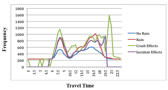 Figure 32. Graph. Mean travel times under rain, crash, or non-crash traffic incident conditions for I-5 southbound, North Seattle Corridor, Tuesdays through Thursdays, 2006.35 Source: Transportation Research Board, Strategic Highway Research Program 2, Report S2-L03-RR-1.  Figure 33. Graph. Reliability trends reported by the Metropolitan Washington Council of Governments. Source: Pu, Wenjing, Presentation at 5th International Transportation Systems Performance Measurement and Data Conference, June 1-2, 2015, Denver, Colorado. 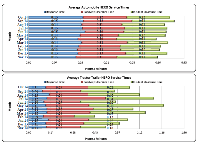 Figure 34. Charts. Incident timeline trends reported by the Georgia Department of Transportation for the Atlanta region. Source: Georgia Department of Transportation, H.E.R.O Monthly Statistics Report, Available at:More information available at: http://www.dot.ga.gov/DS/Travel/HEROs.
 Figure 35. Screenshot. Heat map of congestion on a corridor using the Performance Measurement System. California Department of Transportation, Performance Measurement System ImpactIn addition to demonstrating accountability, providing transparency, and promoting effective public relations, developing performance measures is the starting point for several other agency functions. These include:
Case Study: Tracking Performance Measures at Delaware Valley Regional Planning CommissionOverview The Delaware Valley Regional Planning Commission (DVRPC) is the metropolitan planning organization for the greater Philadelphia region. The region includes five counties in Pennsylvania and four in New Jersey. The most congested freeway miles in the region are along major routes into and out of the City of Philadelphia. DVPRC uses archived operations data to inform a variety of planning efforts, including problem identification and confirmation, calibrating regional and corridor models, conducting before and after studies, and developing and reporting transportation performance measures for the regional congestion management process (CMP) and long-range transportation plan (LRTP). Data DVRPC primarily uses the VPP data purchased by the I-95 Corridor Coalition for developing performance measures based on archived operations data. It is currently exploring other vehicle probe-based data sources, including the National Performance Measures Research Data Set (NPMRDS), particularly for tracking and reporting progress toward the system performance measures. However, given DVRPC's concerns with the quality of the NPMRDS data, DVRPC is working with its partners at the Pennsylvania DOT and NJDOT to use the VPP data instead. Incident data from agency-collected traffic management systems also are analyzed. Agency Process DVRPC uses archived operations data to track the performance of the regional transportation network, identify and prioritize congested locations, and justify funding the appropriate projects. In the MPO's 2015 CMP, DVRPC used two measures based on archived operations data: travel time index (TTI) and planning time index (PTI). DVRPC selected these measures because it anticipated that they were likely to become part of the FAST Act reporting requirements at the time of the CMP update. DVRPC used VPP data to analyze the TTI and PTI for all limited-access highway and arterial road segments with data coverage at the time of the update. It then used the results of TTI and PTI analysis, along with other performance measures, to identify congested corridors throughout the region. These congested corridors were used as a basis for selecting corridors for investment in ITS infrastructure through the Transportation Operations Master Plan.36 The designation of CMP corridor was also used as an evaluation criterion for projects to be programmed in the LRTP and TIP. In addition, DVRPC has developed several outreach documents based on archived operations data to communicate its approach to mitigating congestion with the general public and elected officials (See Figures 36 and 37 for an example). 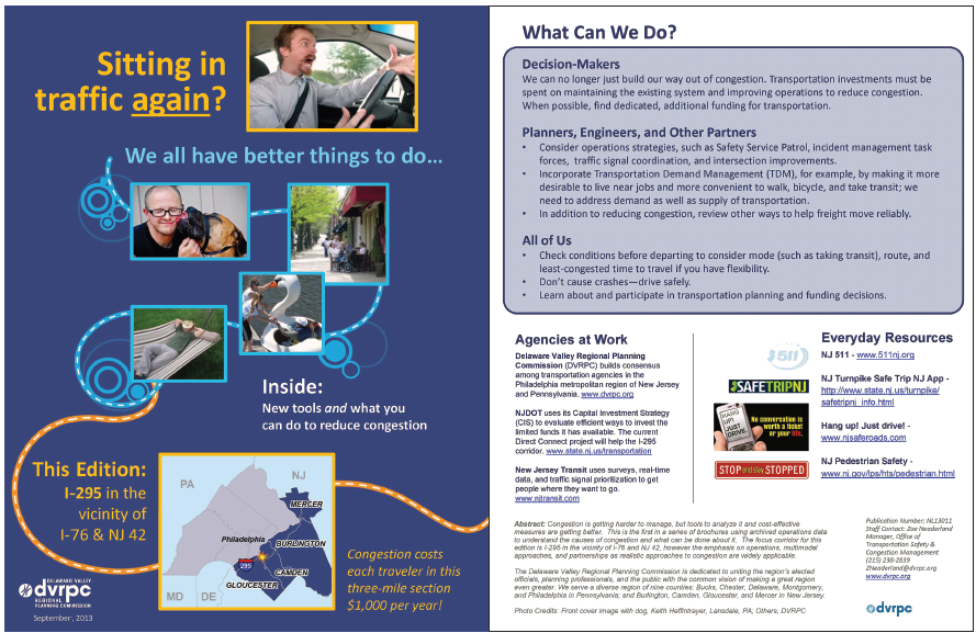 Figure 36. Image. Delaware Valley Regional Planning Commission's outreach document is based on archived data. Source: Delaware Valley Regional Planning Commission. Available at: http://www.dvrpc.org/reports/NL13011.pdf. 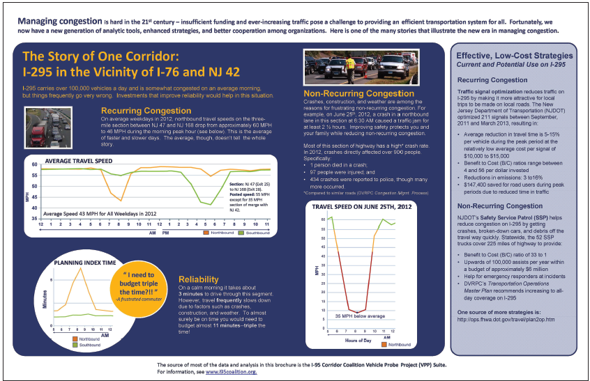 Figure 37. Image. Inside view of Delaware Valley Regional Planning Commission's outreach document. Source: Delaware Valley Regional Planning Commission. Available at: http://www.dvrpc.org/reports/NL13011.pdf. In addition to developing and reporting performance measures, DVRPC participated in an evacuation planning effort for the City of Philadelphia. The project involved extracting a microsimulation model of the city center from DVRPC's travel demand model, and then calibrating the model with the VPP's archived travel time data on key arterial, collector, and local roadways in the city. The model was used to analyze how to best evacuate buildings, which routes all modes would likely take, which intersections would cause major bottlenecks, and other factors that may impact efficient evacuation of the city during a major event. DVRPC also was using archived operations data to spot-check calibration of the regional model and has begun an effort to use it more extensively in calibration. Impact and Lessons Learned Overall, access to archived operations data has been a significant benefit to planning at DVRPC, especially because the DVRPC staff have access to a user-friendly interface through the VPP Suite. The VPP Suite allows for both quick analysis at the corridor level and more complex regional analyses. The archived operations data enhances the agency's knowledge of key travel attributes, including peak hour travel times and reliability, but DVRPC has had challenges. One challenge has been working with the Traffic Message Channel network on which the archived speed and travel time data is reported and translating data from the Traffic Message Channel network to the base GIS linework for analysis with other data sets. DVRPC manages eight traffic incident management task forces (IMTFs) throughout the region. Incident data is reported at quarterly meetings of these corridor-based IMTFs. Using data from TMCs, incident durations help the task forces identify which incidents should be discussed in more detail in post incident debriefs. Occasionally, the VPP data is used to show congestion impacts of incidents. DVRPC, a bi-state MPO, has several hurdles to overcome to report incident data on a regional basis. DVRPC would need to perform the non-standardized geospatial referencing of data, expend significant resources fusing data from two States, and clean up inconsistencies. The reporting of incident data would need to be standardized as well as geo-referenced across all corridors and agencies to support a complete regional picture. For example, incident duration, roadway clearance times, and other data may be entered differently depending on the agency, and NJDOT and Pennsylvania DOT—DVRPC's two primary resources for incident data—do not necessarily capture this data in the same way. DVRPC has considered cross-checking the incident data against police crash databases, although this data lags by 6 months or more and does not contain municipal crash reports. The integration of police CAD data with agency traffic incident data would help create regional incident data. DVRPC also faces challenges with inconsistent data reporting methods and formats with other types of archived operations data because it covers a bi-state area. Agencies in the region have various capabilities to collect, analyze, and share archived data, as well. The transit agencies in the region are an example of this discrepancy, which makes it difficult to perform an analysis for the entire region. Another barrier to using archived operations data is the sheer amount of data that needs to be processed. The probe data for the DVRPC region amasses nearly 3.4 billion records per year. Working with this data is extremely difficult without powerful tools and hardware. Use of Archived Operations Data for Input and Calibration of Reliability Prediction ToolsNeedIncluding travel time reliability as an aspect of mobility is becoming an important consideration for transportation agencies. Reliability is valued by users as an additional factor in how they experience the transportation system. Transportation improvements affect not only the average congestion experienced by users, but reliability as well. Therefore, adding reliability to the benefit stream emphasizes the positive impact of improvements. Archived operations data enables the direct measurement of reliability, and many agencies have added reliability as a key performance measure. However, the ability to forecast reliability has lagged behind the ability to measure it. Being able to predict the reliability impacts of improvements, in addition to traditional notions of performance, provides a more complete perspective for planners. It also provides continuity in tracking the performance of programs because the tracking includes measures of reliability. Fortunately, the Strategic Highway Research Program 2 (SHRP 2) produced several tools for predicting travel time reliability.37, 38 These tools require several inputs that can be developed from archived operations data and are used here to provide specific examples of how archived data can be used in conjunction with advanced modeling procedures. Several other modeling platforms—as well as those likely to emerge in the near future—will require similar levels of inputs. Relevant DataData for input and calibration of reliability prediction tools include travel time (or speed) data, preferably continuously collected; volume data; and incident characteristics data. Analytical ProceduresProcedures to predict travel time reliability are just now emerging in the profession (as of this writing). There are two basic approaches to predicting reliability: (1) statistical methods that develop predictive equations for reliability as a function of either congestion source factors (e.g., demand, capacity, incident characteristics, and weather conditions) or model-produced values for the average or typical condition, and (2) direct assessment of reliability by creating a travel time distribution that reflects varying conditions from day-to-day. ImpactReliability prediction tools are needed by analysts as a way to capture the impacts of operations strategies that are primarily aimed at improving travel time reliability. Many agencies have identified the need to improve reliability, yet have not had the means to predict it as a benefit of transportation improvements. Reliability tools provide a means for evaluating operations projects side-by-side with capacity expansion projects. When applied to planning activities, the tools will help transportation agencies better identify and implement strategies to reduce the variability and uncertainty of travel times for commuters and other travelers as well as the freight industry. Case Study: Developing Data for Reliability Prediction ToolsOverview A hypothetical MPO is embarking on an update to its LRTP. It has previously developed a scoring process for ranking potential projects in the plan, and it wants to add travel time reliability as one of the scoring factors. However, the MPO's TDF model only produces average speed estimates, and these estimates are artifacts of the traffic assignment process that are not reflective of actual speeds. Data The MPO has ITS detector data (volumes and speeds) on regional freeways available. It also has the NPMRDS travel time data for National Highway System (NHS) roadways in the region. Incident data on freeways is available via the State-run traffic management center. Agency Process The TDF model produces outputs by individual network link in a readable file. The time periods are a 2-hour AM peak and a 3-hour PM peak. Outputs include assigned traffic volumes, speeds, and delay for each of the periods. Specific activities that can be undertaken with archived operations data to improve reliability prediction models include:
The staff determined that operations strategies would best be handled by creating "bundles" of investments scenarios. These were combinations of strategies at different deployment intensity levels. Benefits and costs for multiple investment scenarios (bundles) were developed for further study. Then, the resulting system performance forecasts from the TDF model and the postprocessor were used as part of a public engagement program for the LRTP, asking citizens to choose their preferred level of investment and corresponding performance outcome. For example, travel time reliability was a performance measure in the operations bundles of projects. Investing in advanced traffic management systems does not produce a quantifiable benefit when using the TDF models alone, because it only considers demand, capacity, and recurring delay. Focusing instead on reliability produced a quantifiable benefit using the post processor. Those benefits were then paired with cost estimates for the ATMS and other operational improvements in the project scoring process. It also allowed the public and elected officials to make informed investment decisions when finalizing the project list. Developing Capacity Values (Freeways)Use of localized capacity values is extremely significant in enabling forecasting models to replicate field conditions. Data from ITS detectors that produces simultaneous measurements of volume and speed can be used in two ways to determine the capacity of roadway segments, especially bottlenecks. First, classic speed-flow plots can be constructed. For this exercise, we assume that the volume and speed measurements have been archived in 5-minute time intervals:
Figures 38 through 43 show the results obtained by applying the above procedure to data from I-4 in Orlando, Florida. Several observations can be made based on these plots:
Table 8. Upper end of speed-flow distribution, I-4, Orlando, Florida.
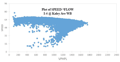 Figure 38. Graph. Plot of speed and vehicles per hour per lane on I-4 at Kaley Avenue, westbound.  Figure 39. Graph. Plot of speed and vehicles per hour per lane on I-4 at Michigan Avenue, westbound. 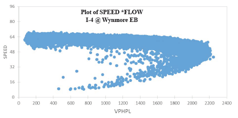 Figure 40. Graph. Plot of speed and vehicles per hour per lane on I-4 at Wynmore, eastbound. 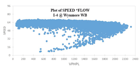 Figure 41. Graph. Plot of speed and vehicles per hour per lane on I-4 at Wynmore, westbound. 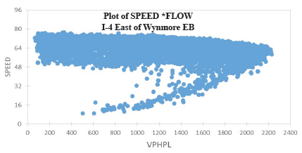 Figure 42. Graph. Plot of speed and vehicles per hour per lane on I-4 east of Wynmore, eastbound. 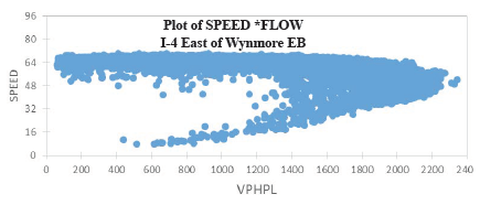 Figure 43. Graph. Plot of speed and vehicles per hour per lane on I-4 east of Wynmore, westbound. A second approach to determining capacity is heuristic: adjust (calibrate) the capacity value in the model to match local traffic conditions. Here, either speed data from ITS detectors or vehicle probes can be used; volumes are not used in the calibration but must be input in the models separately:
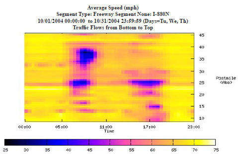 Figure 44. Graph. Speed contours from archived intelligent transportation system detector data are useful for identifying bottleneck locations. Source: System Metrics Group and Cambridge Systematics, unpublished presentation to California Department of Transportation, August 26, 2005. Determining Free Flow Speed (FFS)Both ITS detector and vehicle probe data can be used to determine the FFS of a facility. A variety of approaches can be used to determine the FFS. The first method uses only speed data and can be used on both freeways and signalized highways. It is based on selecting the 85th percentile speed under very light traffic conditions, defined as occurring morning hours on weekend days (e.g., from 6:00 AM to 10:00 AM). The second method uses freeway ITS detector volume and speeds. It determines the 85th percentile speed when volumes are low and speeds are relatively high (to weed out the low volumes that occur in extreme queuing conditions). Table 9 compares these approaches for the freeways in the Atlanta, Georgia, region. The values in this table are computed for the entire facility, which includes multiple segments. To calculate this value, the space mean speed (SMS) over the entire facility is first calculated by the smallest time interval in the data (in this case, 5 minutes). With detector data, because companion volumes are available, SMS is the facility vehicle-miles of travel (VMT) divided by the facility vehicle hours of travel. With probe data, SMS is the total distance divided by travel time in hours. Then, a distribution is developed from those facility space mean speeds.
FFS = free flow speed
Identifying Demand (Volumes)Data from ITS freeway detectors can be used to develop input volumes at the hourly or finer level. The main issue with using detectors on already-congested freeways is that, under queuing, the volume they measure is lower than the actual demand. If this is the case, then the following procedure can be used. It is based on moving upstream from where queues typically occur to locate a detector that is relatively free of queuing influence, but its traffic patterns are similar to the facility being studied. If a major interchange is present between the study detector and the facility, traffic patterns are likely to be different. If the study detector meets these criteria, it is used to develop hourly factors for extended peak periods that can be applied to volumes on the freeway facility. The extended period should cover times on either side of the peak where queuing is not normally a problem (i.e., 1 hour before the peak start and 1 to 2 hours after the peak end). The factors are computed as the hourly volume divided by the extended peak volume. These are then applied to the extended peak period volumes on the facility. Once demands have been created from the congested volumes, accurate temporal distributions can be created for the study section, such as the percent of daily traffic occurring in each hour. Also, the variability in demand can be established since some reliability prediction methods require knowledge about demand variability. Determining Incident CharacteristicsAdvanced modeling methods require basic data about incidents. For example, annual number and average duration of the following incident categories:
Two sources of data are used to develop these inputs: (1) traditional crash data, and (2) archived incident management data. Crash data hs details on crash severity; whereas, incident data may or may not. Conversely, crash data does not include duration information. One approach is to use state- or area-wide values for crash severity and then to rely on incident management data. The first step is to estimate incidents by type. Typical categories in incident management data are crashes, disabled vehicles, and debris. Table 10 shows data taken for I-66 in Virginia, from the I-495 Capital Beltway west for 30 miles.
Obs = observation
Source: Margiotta, Richard, unpublished internal memo for SHRP 2 Project L08, August 26, 2005 Impact and Lessons Learned To explore the various investment options preferred by the public, several financial scenarios were prepared for the MPO board's consideration. The scenarios varied by spending pattern and by whether they included new funding sources for transportation, such as mobility fees on new development or increases in the gas tax or sales tax. The final outcome of the process was that operations projects were successfully evaluated on an equal basis with traditional projects and are now part of the LRTP. Performance of Before and After Studies to Access Projects and Program ImpactsNeedA key component of performance management is the ability to conduct evaluations of completed projects and to use the results to make better-informed investment decisions in the future. State departments of transportation (DOTs) and MPOs routinely invest great effort in forecasting the impact of capital, operating, and regulatory improvements on general and truck traffic trips, but practitioners seldom have the opportunity to evaluate the outcomes of their investments, except in isolated cases where special studies are conducted. However, no standardized method for conducting before and after evaluations with these data sources exists, especially for operations projects. Although a rich history of evaluations has been accumulated, the vast majority of studies lack a consistent method; common performance measures; and, most problematic, controls for dealing with factors that can influence the observed performance other than the project treatment.39 A thorough treatment of an evaluation methodology is beyond the scope of this primer. Regardless of what a comprehensive methodology entails, at its core, it will be examining travel time and demand data. The remainder of this section focuses on the use of these data types. Relevant DataA comprehensive and statistically valid evaluation methodology will have to draw on a variety of data types to establish controls. Many factors can influence travel time besides an improvement project, including incidents, demand (e.g., day-to-day and seasonal variations and special events), weather, work zones, traffic controls, and general operations policies. Ideally, the influence of these factors is stable (or nearly so) in the before and after periods of project implementation, which allows for observed changes in travel times to be untainted. In theory, all of these data types can be obtained from archived operations data, although in practice, some operations may choose not to archive certain types of data. Analytical ProceduresDefine the Geographic Scope of the Analysis The geographic scope is driven by the target area of the project. For example, if an analysis is performed to pinpoint the safety benefits from the implementation of an incident management strategy over a stretch of a freeway, then the scope would be limited to that stretch. On the other hand, if the objective is to quantify safety improvements for an entire downtown area, then the scope would cover all arterials and roads in the downtown area. In operations evaluations, a "test location" typically means a roadway section that has implemented certain operations strategies or has seen the impacts of such strategies. For analysis, roadway sections are typically 5 to 10 miles in length. If a larger area is covered, it is advisable to break it up into multiple sections. Study sections should be relatively homogenous in terms of traffic patterns, roadway geometry, and operating characteristics. Define Analysis Period The temporal aspects that should be considered in before and after evaluations are:
Establish Travel Time Performance Measures Many different types of performance measures are available. Below is a non-exhaustive list that can be considered:
Develop Perormance Measures from the Data The following example illustrates the initial steps in conducting a before and after evaluation, recognizing that more sophisticated analysis using statistical controls should be done next. An operational improvement is made on a freeway section. It was implemented quickly, with minimal disruption to traffic. Travel time and volume data were available for 1 year prior to the completion of the improvement and 1 year after. VMT, mean TTI, and PTI were computed for each week and plotted (Figures 45 and 46). Also, incident lane-hours and shoulder-hours were computed (Table 11). 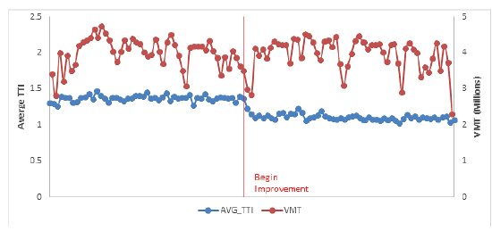 Figure 45. Graph. Hypothetical before and after case: mean travel time index and vehicle-miles of travel. 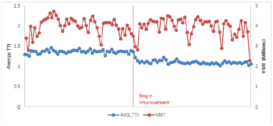 Figure 46. Graph. Hypothetical before and after case: planning time index and vehicle miles of travel.
The results show that the improvement reduced both the mean TTI and PTI and that VMT was roughly similar in the before and after periods. As expected, the PTI shows more volatility than the mean TTI because it measures extreme cases, which can vary greatly from week to week. Incident lane-hours lost is higher in the before period, while incident shoulder-hours lost are higher in the after period. A more thorough examination of incidents, as well as other factors, should be pursued to ensure that the congestion and reliability improvement are due to the project and not to other factors. ImpactDevelopment of an ongoing performance evaluation program enables planning agencies to make more informed decisions about investments. The results of evaluations can be used to highlight agency activities to the public and to demonstrate the value of transportation investments. The knowledge gained from evaluations can lead to development of impact factors for future studies, as well as an understanding of where and when certain types of strategies succeed or fail. These impact factors, tailored to an agency's particular setting, are useful for future planning activities when alternatives are being developed. For example, evaluations of the conditions under which ramp metering is effective can avoid future deployments in situations where they will not be successful. Case Study: Florida Department of Transportation Evaluation of the Port of Miami Tunnel ProjectOverview The Florida DOT (FDOT) used archived data to evaluate the impact tat the Port of Miami Tunnel project had on performance. The Port of Miami Tunnel project was built by a private company in partnership with FDOT, Miami-Dade, and the City of Miami. By connecting State Route A1A/MacArthur Causeway to Dodge Island, the project provided direct access between the seaport and highways I-395 and I-95, thus creating another entry to Port of Miami Tunnel (Figure 47). Additionally, the Port of Miami Tunnel was designed to improve traffic flow in downtown Miami by reducing the number of cargo trucks and cruise-related vehicles on congested downtown streets and aiding ongoing and future development in and around downtown Miami. 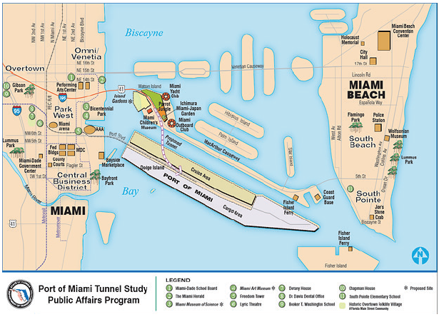 Figure 47. Map. The Port of Miami tunnel project. Source: Florida Department of Transportation, Port of Miami Tunnel, Project Maps. Available at: http://www.portofmiamitunnel.com/press-room/project-maps/. Data FDOT used travel time data from NPMRDS and traffic volume data from their own system to conduct the evaluation. Agency Process The purpose of this study is to examine the potential impacts to the transportation system resulting from the opening of the Port of Miami Tunnel. The study utilizes tabular and geospatial data from FDOT and the NPMRDS. Using Geographic Information System, these data sources are merged together spatially to create value-added information that would otherwise be unavailable. The resulting information provides FDOT with a better understanding of what impacts there are to the transportation system, the magnitude of these impacts, and where these impacts are occurring. Impacts considered in the study are:
This study compares the average weekday travel speeds during peak hours in August 2013 and August 2015. The speed data for August 2013, was collected prior to the opening of the Port of Miami Tunnel. Data for the corresponding month in 2015 was collected after the opening of the Port of Miami Tunnel (Figure 48). In Figure 48, the pie symbols represent differences in truck counts, with 2015 data shown in dark blue and 2013 data shown in light blue. The red and green lines represent a decrease in average weekday travel speed and increase in average weekday travel speed, respectively. Results from the evaluation showed:
Impact and Lessons Learned Analysis of the transportation system resulting from the opening of the Port of Miami Tunnel is just an example of how powerful value-added tabular and spatial data can be. The long-term vision is to empower planners, freight coordinators, consultants, and others throughout FDOT with value-added data and information that can assist with decision making and the achievement of federal guidelines. Although working with very large and complex data sets presents a number of challenges, including human resource, information technology (IT), and financial availability, the long-term benefits are expected to outweigh the challenges. Because much value-added data is generated via spatial analysis, disparate geometric (geographic information system) networks should be edited and aligned with each other in an ongoing fashion. With the various networks merged together, the attributes associated with these networks can work together via spatial coincidence. The value-added tabular and spatial information generated through a variety of complex mechanisms will be made available throughout FDOT, including Central Office in Tallahassee, Florida, and the District offices throughout the state. 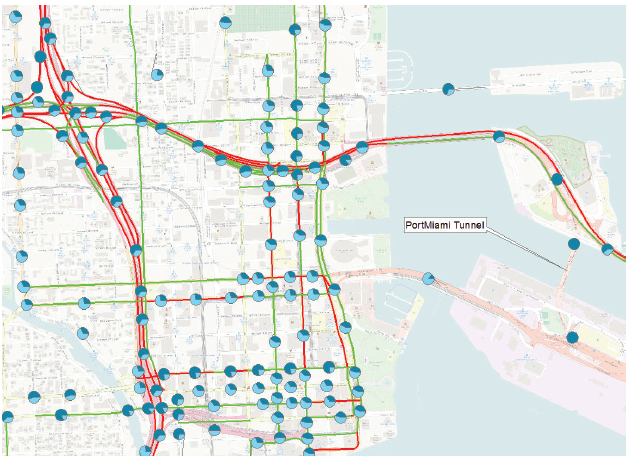 Figure 48. Map. Truck flow and speed impacts of the Port of Miami tunnel project. Source: O'Rourke, Paul, Florida Department of Transportation, 2016, Unpublished. ©OpenStreetMap and contributors, CC-BY-SA. Identification of Causes of CongestionNeedThe prior case study identifies how patterns in congestion can be identified, ranked, and prioritized. However, simply identifying locations with problems is not enough; analysts need to know "why" a problem is occurring regardless of whether it is a recurring problem or nonrecurring problem. Perhaps the congestion is related to a geometric issue with the road, or maybe it is incident or event related. Maybe it is simply a capacity issue. The analysis also can be reversed: if a large incident has just occurred, how can the impacts (environmental or otherwise) of the related congestion and delays be measured? In this case study, the following will be considered:
Relevant DataThe data required to identify patterns and investigate cause and effect is not that different from the FDOT Port of Miami Tunnel case study above. An agency will need a data source that first can identify the presence of congestion. This could be a dense network of point-sensor data (e.g., inductive loops, side-fired radar/microwave, video detection) or it could be probe-based speed and travel time data (from commercial third parties, such as HERE, INRIX, and TomTom, or from Bluetooth or WiFi detection systems). The above data helps to identify the presence of congestion. To identify the cause of the congestion, the following data sources may be of value: traffic management center ATMS event logs, police accident records, weather radar, road weather measurements, aerial photography, and volume data profiles. Analytical ProceduresOperations data from probes or other high-density sensors can be used to identify congested areas or bottlenecks. When these data are comingled with ATMS event data, it becomes possible to identify if the congestion is recurring or non-recurring. Each agency may define congestion slightly differently, but in its most basic sense, congestion is any time speeds and travel times drop below some desired threshold. For some, that threshold is the speed limit. For others, a segment of a road becomes congested when the space mean speed on it falls below some percentage of the speed limit. Queues can be measured on the roadway by simply adding adjacent road segments that meet the same condition. Flow data from probes and dense sensor networks can sometimes be challenging to work with because of the sheer volume of data, complex linear referencing systems that might not match up with agency centerline road databases, and agency technical and resource capacity. A relatively small state, Maryland, has nearly 12,000 road segments. With each segment providing data every minute, that comes to well over 6.3 billion data points every year. To conduct a causality analysis, an agency must be able to associate the non-speed/flow data elements to the roadway. ATMS incident, event, or construction data and police accident data records will likely need to be assigned to a specific point on the roadway or a roadway segment. This could require some basic geospatial queries, but in certain cases, may be more complex. Some speed data from third parties is provided in a proprietary geospatial standard referred to as traffic message channel segments. This georeferencing system will likely be different than most agency centerline road networks. Furthermore, some police accident records only store their data in log-miles or other georeferencing systems. Aligning all of these different linear referencing systems can be time consuming. As with police incident and ATMS data, weather data will need to be merged with the congestion information so that the two can be correlated. Road weather data directly from road weather information systems (RWIS) stations can usually be linked in the same manner as ATMS records; however, RWIS stations are few and far between and do not offer great coverage. Weather data from the National Weather Service is fairly ubiquitous, but can be more complex to work with. Radar reflectivity data that represents precipitation rates or snowfall can be associated with road segments using geospatial queries. There are commercial third-party road weather data products for sale that can be used in a similar way. They are usually pre-processed to reflect conditions directly on the roadway, and will be associated with various road segments in the same manner as probe-based speed data. Once all of the disparate operations data are joined both geospatially and temporally, real analytics can begin. The analysis can range from big-data style correlation of coefficients—searching for any possible pair or set of variables to see if there might be a correlation between them. However, the analysis can be less complex: beginning with identifying a problem location, and then considering additional questions (what percentage of the time was the congestion at that location related to weather and/or incidents, and was the congestion greater when weather was a factor?). The opposite can occur; first identify major weather events, and then determine if congestion was worse in various locations during those events compared to normal. These types of analyses are discussed in the real-world case studies below. Agencies with strong, integrated IT departments, dedicated data analysts, sufficient data storage hardware, and access to statistical software such as SAS can handle this type of analysis given time and proper funding. However, many agencies simply subcontract their analysis to consultants or university transportation departments, or they purchase off-the-shelf congestion analytics software and data integration services tailored for transportation planners. ImpactWith the advancement of tools and technologies, roadway problems are more easily identified. However, significant effort is needed to effectively understand why a problem exists at a particular location—ultimately leading to the identification of solutions to the various problems. Impact and causality analysis are the end goal of archived operations data analytics. Impact analysis affords the opportunity to change a simple observation (e.g., last week's snowstorm caused significant delays in the region) into a more detailed observation (e.g., last week's snowstorm impacted 3 million travelers, costing some $45 million in user delay and excess fuel consumption, and resulting in 60 serious collisions that claimed the lives of three individuals in two separate families). Progressive agencies that use archived operations data can further justify their investment (e.g., while the impacts of last week's snowstorm were significant and deadly per the prior statement, the damage could have been worse. The roads were pre-treated with 100,000 tons of sodium chloride brine, which reduced the plowing cleanup time by nearly 9 hours. Furthermore, safety service patrols reduced the clearance time of the 60 serious collisions by over 20 hours. These actions saved area commuters $32.8 million in excess delay, wasted fuel, and the reduction of secondary accidents). These last two statements are only possible with a robust data archive. The results of such an analysis allow agencies to better plan decisions for future storms, better justify operating budgets, and respond to questions from the media and public officials in a more complete and timely manner. Case Study 1: Maryland State Highway Administration Examines Causes of Recurring and Non-Recurring CongestionOverview This case study determines the cause of both recurring and non-recurring congestion, by discussing existing tools, hiring a consultant, and doing the study in-house. The Maryland State Highway Administration (MD SHA) routinely evaluates the impacts of congestion on its roadways with a focus on understanding why congestion is occurring, how significant the congestion is in terms of measurable impacts (e.g., queues, user delay costs), determining potential solutions to the congestion (e.g., projects, operational strategies), and then measuring the effectiveness of the chosen solution. Data Five archived operations data sets are used by MD SHA to perform their analysis: probe speed, volume, ATMS event, police accident, and weather. The probe data is derived from a private sector data provider. This probe data is archived at 1-minute intervals from real-time. The probe data represents the average speed across the length of a road segment for each 1-minute period. The volume data is derived from two sources: HPMS-derived volume profiles and side-fired remote traffic microwave sensors (RTMS) detectors. The event data is derived from two sources: the MD SHA Coordinated Highways Action Response Team (CHART) ATMS platform, and police accident reports collected and digitized by the Maryland State Police in coordination with MD SHA. The ATMS data is entered by operations personnel into their CHART platform in real-time. The type of information recorded includes the type of event (e.g., construction, collision, special event, disabled vehicle, police activity), location, lane closure information, and number of responders on scene. The police accident reports contain additional details about the cause and nature of the incident, including the types of individuals involved and their conditions. Weather data is a mixture of both weather radar data (coming from freely available National Weather Service data feeds) and RWIS station data. The RWIS stations are installed and operated by a DOT and include measurements such as wind speed and direction, precipitation rates, visibility, salinity content of the moisture on the roadway, and barometric pressure. Agency Process As with the case study on problem identification and confirmation with NJDOT, MD SHA uses a suite of third-party data analytics tools to collect, fuse, archive, and visualize their archived operations data. To evaluate the cause of congestion, MD SHA first determines where congestion is occurring. This can be accomplished using the probe data analytics suite and by following the same general process as described for NJDOT above. Figure 49 shows an example of a bottleneck ranking query for September 2015 on all Maryland Interstates. By selecting the top-ranked congested location (I-270 southbound), the following can be determined:
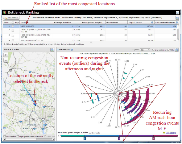 Figure 49. Screenshot. The bottleneck ranking tool. Source: Probe Data Analytics Suite. University of Maryland CATT Laboratory. Once a user determines when and where congestion is occurring, he or she can select additional tool overlays (e.g., construction, incident, special event) to map out data on top of the time spiral to help identify event causality. These event icons are interactive. Figure 49 shows a couple of afternoon outliers being the result of significant events. The one highlighted below happens to be an injury accident that occurred on a Saturday afternoon. 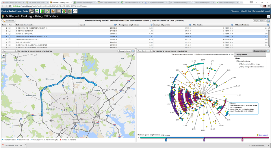 Figure 50. Screenshot. Congestion time spiral graphic with incidents and events overlaid. Source: Probe Data Analytics Suite. University of Maryland CATT Laboratory. In Figure 50, yellow diamonds denote incidents or disabled vehicles, red diamonds denote injury or fatality incidents, and orange diamonds denote construction or work zone events. Selecting the congestion lines then displays a congestion scan graphic of the speeds and travel times for that particular day and this particular corridor (as seen in Figure 57). For further study and use, the user can select the congestion event in the time spiral, which will create other graphics depicting additional elements.
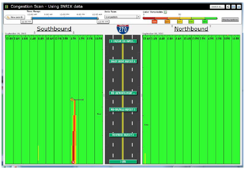 Figure 51. Screenshot. Congestion scan graphic of outlier congestion showing both north- and southbound traffic on I-270. Source: Probe Data Analytics Suite. University of Maryland CATT Laboratory. There is unusual congestion on a Saturday evening in the southbound direction. Incident overlays show that this was caused by an injury incident (bottom of the screen), and that a vehicle also became disabled towards the back of the queue. 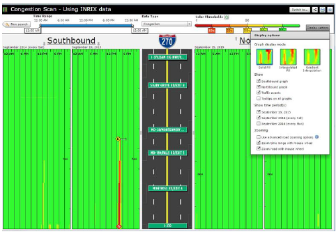 Figure 52. Screenshot. Congestion scan graphic including Saturdays. Source: Probe Data Analytics Suite. University of Maryland CATT Laboratory. Editing the display options, the analyst has now chosen to add an additional date range to the graphic. All Saturdays during the month of September are also drawn on the screen in the outside columns of data. Note that there is little or no congestion "normally" on Saturdays in the southbound direction. This analysis confirms that the congestion and incidents on September 19 (innermost columns) are non-recurring. The agency can use other analytic tools found within the RITIS platform to review safety data from police accident reports or ATMS event/incident reports to determine if incident hot spots exist that may be globally affecting congestion on the roads in question. Some of these tools allow extremely deep querying and causality analytics. Figure 53 shows how heat maps can be drawn overtop of the roadway to show when and where collisions, weather events, or construction projects are most likely to occur for any month, day of week, or other time range during the year. Figure 54 shows how the tool also can be used for deep analysis (e.g., correlation of coefficients, standard deviation of frequencies, number of outliers, maximum frequency, number of unique pairs, uniformity of the distribution) to further identify patterns, trends, and outliers within the data. The correlation of coefficients ranking function can be used to verify if any pair of variables within the data set might be affecting each other (e.g., does a wet road highly correlate with fatal collisions, or does the day of the week in which an incident occurs correlate with hazmat incidents or the number of vehicles involved?). 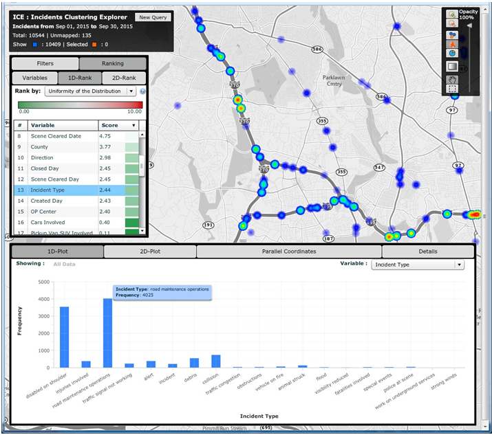 Figure 53. Screenshot. Heat maps function within incidents clustering explorer. Source: Incident Cluster Explorer, University of Maryland CATT Laboratory. In Figure 53, the heat maps in the upper right show where incidents have occurred over a given date range. A list of variables in the upper left is clickable, filterable, and interactive. Selecting a particular variable generates a histogram (bottom) that shows the breakdown of possible values for that variable. Here, the user has clicked on "incident type," which results in an interactive histogram depicting the number of each incident type occurring during the particular date range. Clicking on each bar of the histogram then highlights those incidents on the map above. 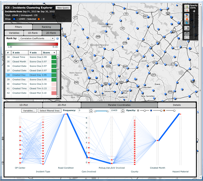 Figure 54. Screenshot. Correlation of coefficients ranking function in incidents clustering explorer. Source: Incident Cluster Explorer, University of Maryland CATT Laboratory. In Figure 54, the correlation of coefficients ranking function in the upper left allows a user to compare variable pairs to determine if any correlation exists. Clicking on any of these pairs of variables then brings up detailed two-dimensional histograms (not shown) that make it easy for users to do a deeper dive into the various relationships, trends, and statistics related to those variables. Impacts and Lessons Learned This type of analysis has historically been difficult for MD SHA to conduct, as their data sets have been unavailable. Creating a central data repository and developing tools that make it faster and more intuitive to ask questions has dramatically improved productivity and understanding within the organization. Historically, problems were identified through laborious studies that often involved dedicated data collection. These studies may have only been initiated if someone within the community complained enough about the congestion. Presently, with more ubiquitous data from probes and the integration of incident and event data from both law enforcement and the ATMS platforms, the agencies are able to identify problems, causality, and overall impact before the public raises concerns, and better respond when they do. In addition to answering these questions more quickly, NJDOT is more confident in the results of their studies. The ease of access to the data, coupled with the compelling visualizations, result in analysts being able to effectively communicate with different audiences. Case Study 2: Metropolitan Area Transportation Operations Coordination Examines Effects of Events, Incidents, and Policy Decisions on CongestionOverview Unlike the case study above, which first identified heavily congested locations and then tried to determine causality, this case study reviews how to examine the effect of events, incidents, or policy decisions on congestion. The Metropolitan Area Transportation Operations Coordination (MATOC) program is a coordinated partnership between transit, highway, and other related transportation agencies in the District of Columbia, Maryland, and Virginia, that aims to improve safety and mobility in the region through information sharing, planning, and coordination. MATOC is frequently called upon to help agencies perform after action reviews of major incidents, produce impact statements post-event for the media, or help agencies measure the impact of certain operations decisions (e.g., closing the federal government due to winter weather, closing certain roads, responding in a certain way to an event). This case study shows how MATOC used the archived operations data from the agencies that they support to help measure the impacts of delaying the opening of schools and the Federal government by 2 hours. Data The data for this case study are the same as that used for the case study discussion above; however, there is a greater emphasis on weather data—both RWIS and weather radar from the National Weather Service. Agency Process MATOC uses a series of tools found within RITIS for analyzing weather impacts, user delay cost, and travel times. After a winter weather event ends, MATOC is usually contacted by various groups (e.g., the media, transit agencies, DOTs, MPOs, legislators) to help answer questions about the impacts of a particular event on the region. MATOC follows this process to develop graphics, statistics, and reports:
Below are the outputs of each of the steps listed above. Steps 1 and 2 In Step 1, the MATOC analysts determined that the I-66 corridor leading into Washington D.C. would be a well-known corridor of significance. A 20-mile section of the corridor was selected, and a travel time query was run for the day of the 2-hour delayed opening. Simultaneously, a query was run for two similar days of the week during the same season. Figure 55 is the result of this query. Note that the travel time during normal rush hours is nearly double that of the travel times during the 2-hour delayed opening. Two hours later, a slightly larger rush hour occurred. Note that, in the evening, the rush hour travel times are nearly the same as the normal rush hour; however, this rush hour is only 1 hour later than normal instead of 2 hours later. Therefore, it appears that most individuals went to work 2 hours later than normal but only stayed 1 hour later. 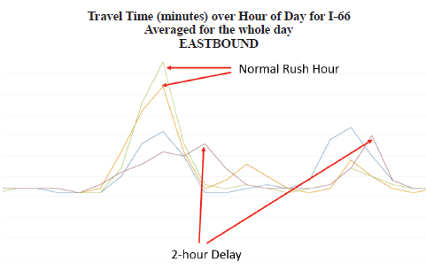 Figure 55. Graph. Plot of travel time by hour of day for I-66, created via Regional Integrated Transportation Information Systems Vehicle Probe Project Suite. Source: Metropolitan Area Transportation Operations Coordination (MATOC) Program Facilitator, Taran Hutchinson. Figure 56 depicts travel times along I-66 during normal rush hours compared to travel times when there was a winter weather event that resulted in a 2-hour delayed opening for most schools and the Federal Government. Step 3 To ensure that the analysis is based on accurate data, MATOC should verify that the other date ranges for which they are comparing the winter weather event are clear of other events (weather or incidents). This can be done via the probe data analytics suite by overlaying historic National Weather Service radar data and historic incident/event data on top of any date/time in the past (Figure 56). This visually confirms that a date or date range is safe for inclusion in the analysis.  Figure 56. Screenshot. Historical dates and times to visualize weather and incident details during that date and time. Source: University of Maryland, Probe Data Analytics Suite. In the tool shown in Figure 56, after the date is entered, the map redraws itself to show what was happening at that particular time including: weather radar, incidents and events, bottlenecks, and speeds. The left side of the screen shows a ranked list of all of the bottlenecks that were occurring at that time. Alternatively, MATOC can look at RWIS station data (if there is enough coverage) to see if road weather may have impacted travel conditions. This particular analytics tool from RITIS (seen in Figure 57) allows MATOC to select any date range and view weather conditions, such as precipitation rates, visibility, and surface conditions, while simultaneously viewing incident/event data, and flow data. This tool helps evaluate the effects of all forms of weather on congestion and incidents. This allows users to compare data from road weather information systems stations (e.g., precipitation rates, visibility, wind speeds, surface conditions) to other archived data (e.g., speeds, volumes, flow, incidents, events). 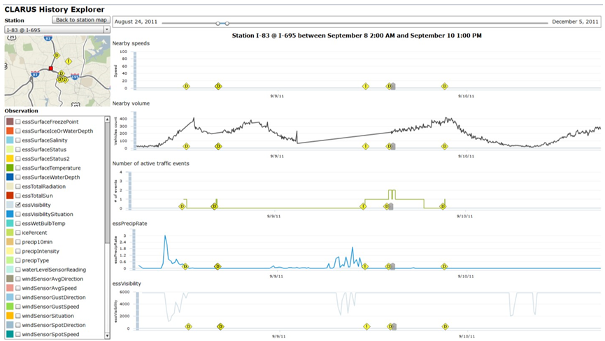 Figure 57. Screenshot. The road weather information systems history explorer. Source: Clarus History Explorer: University of Maryland CATT Laboratory. Step 4 In Step 4, MATOC runs a user delay cost query on the I-66 corridor to determine the financial impacts of the winter weather compared to normal user delay on the same corridor. Figure 58 shows the resulting user delay for the morning snow event discussed in this case study. Note how much higher the user delay is during the morning of the snow event compared to normal. 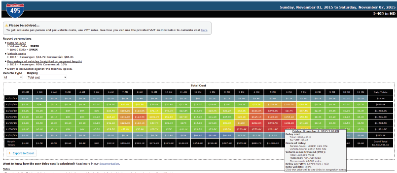 Figure 58. Screenshot. Visual representation of the cost of delay for both passenger and commercial vehicles. Source: University of Maryland Probe Data Analytics Suite. 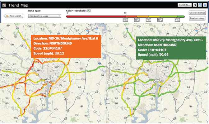 Figure 59. Screenshot. An interactive animated map showing conditions during a winter weather event (left) compared to conditions during normal days of the week (right). Figure 59. Screenshot. An interactive animated map showing conditions during a winter weather event (left) compared to conditions during normal days of the week (right).
Source: University of Maryland CATT Laboratory. Step 5 Here MATOC runs a similar query to that in Steps 1 and 2; however, the output is an animated trend map instead of a simple line chart. The animated trend map shows travel conditions on additional corridors and shows a side-by-side comparison of travel speeds during the event compared to normal (Figure 59). Step 6 Finally, the various statistics and visualizations previously mentioned are consolidated into a correspondence with a narrative description of the impacts of the event surrounding it. This narrative details the associated impacts of this weather event. Impacts and Lessons Learned MATOC's ability to efficiently produce these types of reports has allowed them to gain priority ranking for after action analysis and media requests, which helps secure their annual operating budget. MATOC now trains other agencies on how to perform their own analysis using these tools. 22 I-95 Corridor Coalition, Vehicle Probe Project web site. Available at: http://i95coalition.org/projects/vehicle-probe-project/. [ Return to note 22. ] 23 Go to https://vpp.ritis.org/suite/faq/#/how-are-bottleneck-conditins-tracked for information on bottlenecks, and https://vpp.ritis.org/suite/faq/#/calculations for information on user delay cost. [ Return to note 23. ] 24 Cambridge Systematics et al., Guide to Effective Freeway Performance Measurement: Final Report and Guidebook, Web-Only Document 97, Transportation Research Board, August 2006, Available at: http://onlinepubs.trb.org/onlinepubs/nchrp/nchrp_w97.pdf. [ Return to note 24. ] 25Kittelson & Associates et al., Incorporation of Travel Time Reliability into the Highway Capacity Manual, SHRP 2 Report S2-L08-RW-1,TRB, 2014. Available at: http://onlinepubs.trb.org/onlinepubs/shrp2/SHRP2_S2-L08-RW-1.pdf. [ Return to note 25. ] 26 Ibid. [ Return to note 26. ] 27Kittelson & Associates et al., Incorporation of Travel Time Reliability into the Highway Capacity Manual, TRB, 2014, Available at: http://onlinepubs.trb.org/onlinepubs/shrp2/SHRP2_S2-L08-RW-1.pdf. [ Return to note 27. ] 28 From SHRP 2 Report SR-L08-RW-1: Incorporation of Travel Time Reliability into the Highway Capacity Manual, Figure ES.2, p. 3. Copyright, National Academy of Sciences, Washington, D.C., 2014. Reproduced with permission of the Transportation Research Board. Available at: http://www.trb.org/Main/Blurbs/169594.aspx. [ Return to note 28. ] 29 From SHRP 2 Report SR-L08-RW-1: Incorporation of Travel Time Reliability into the Highway Capacity Manual, Table 2.1, p. 17. Copyright, National Academy of Sciences, Washington, D.C., 2014. Reproduced with permission of the Transportation Research Board. [ Return to note 29. ] 30 Cambridge Systematics, et al., Guide to Effective Freeway Performance Measurement: Final Report and Guidebook, Web-Only Document 97, Transportation Research Board, August 2006. Available at: http://onlinepubs.trb.org/onlinepubs/nchrp/nchrp_w97.pdf. [ Return to note 30. ] 31 For example: Cambridge Systematics et al., Guide to Effective Freeway Performance Measurement: Final Report and Guidebook, Web-Only Document 97, Transportation Research Board, August 2006, Available at http://onlinepubs.trb.org/onlinepubs/nchrp/nchrp_w97.pdf. Also: Cambridge Systematics, Inc. et al., Analytical Procedures for Determining the Impacts of Reliability Mitigation Strategies, The Second Strategic Highway Research Program, Report S2-L03-RR-1, Transportation Research Board (Washington, DC: 2013). [ Return to note 31. ] 32 The Texas Agricultural and Mechanical University's Urban Mobility Report demonstrates a method for deriving volumes to be used with vehicle probe data: http://mobility.tamu.edu/ums/rport/. [ Return to note 32. ] 33 Cambridge Systematics et al., Analytic Procedures for Determining the Impacts of Reliability Mitigation Strategies, SHRP 2 Report S2-L03-RR-1, Transportation Research Board, 2013. Available at: http://onlinepubs.trb.org/onlinepubs/shrp2/SHRP2_S2-L03-RR-1.pdf. [ Return to note 33. ] 34 For more information, see the Metropolitan Washington Council of Governments (MWCOG) Transportation Congestion Dashboard at: https://www.mwcog.org/congestion/. [ Return to note 34. ] 35 California Department of Transportation, Performance Measurement System. Available at: http://pems.dot.ca.gov/. [ Return to note 35. ] 36 Delaware Valley Regional Planning Commission, Transportation Operations Master Plan (Philadelphia: PA, 2009). Available at: http://www.dvrpc.org/Transportation/TSMO/MasterPlan/. [ Return to note 36. ] 37 Economic Development Research Group, Development of Improved Economic Analysis Tools Based on Recommendations from Project C03 (2), The Second Strategic Highway Research Program, Project C11, Transportation Research Board (Washington, DC: 2013). Available at: http://apps.trb.org/cmsfeed/TRBNetProjectDisplay.asp?ProjectID=2350. [ Return to note 37. ] 38 Kittelson & Associates et al., Incorporation of Travel Time Reliability into the Highway Capacity Manual, The Second Strategic Highway Research Program, Report S2-L08-RW-1, Transportation Research Board (Washington, DC: 2014). Available at: http://www.trb.org/Main/Blurbs/169594.aspx. [ Return to note 38. ] 39 United States Department of Transportation, Intelligent Transportation Systems (ITS) benefits database. Available at: http://www.itsbenefits.its.dot.gov/. [ Return to note 39. ] | |||||||||||||||||||||||||||||||||||||||||||||||||||||||||||||||||||||||||||||||||||||||||||||||||||||||||||||||||||||||||||||||||||||||||||||||||||||||||||||||||||||||||||||||||||||||||||||||||||||||||||||||||||||||||||||||||||||||||||||||||||||||||||||||||||||||||||||||||||||||||||||
|
United States Department of Transportation - Federal Highway Administration |
||