SIGNAL TIMING UNDER SATURATED CONDITIONS
3. Evaluation of Strategies
In this section, strategies that were subjected to simulation, field testing, or both are described in detail. For reasons of project budget and scope, not all strategies were subject to such testing, nor is testing required justification for all strategies. For those strategies, such as phase reservice where the benefits can be demonstrated directly, further investigation was not conducted. The sections below therefore focus on four issues and strategies with benefits that defy current beliefs or practice, or that are not fully supported by existing research or intuitively obvious. They include:
- Long green times and cycles in the congested regime.
- Using a single controller to operate two nearby intersections, when the needs of coordination between the intersections deserve higher priority than what might be provided by coordination. The example used in this work is a diamond interchange.
- The relationship between bus capacity, network topology, and cycle lengths in terms of bus queueing.
- Leading and lagging left turn phase sequences.
Long Green Times and Cycles
Introduction
In addition to the evaluation of strategies suggested previously, the review of the state of the practice revealed an effect that has not been previously studied in the context of saturated flow. The interviewees reported that stop line flow seemed to decrease after the first half minute or so of green, even if the flow is still being fed by an emptying queue. This was reported both as a qualitative effect, where one interviewee suggested that the second 15-second interval following onset of green showed the highest apparent flow, and as a quantitative effect, where an interviewee noted that his agency's SCATS system had to be detuned on approaches with unlimited queue because it tended to note a drop in density and incorrectly interpret it as a drop in demand.
A review of the literature reveals only two studies that look into the stability of stop-line flow directly. One was performed by Stan Teply for the Canadian Capacity Guide. Teply's data showed that flow peaked at around 2000 vehicle/hour in the interval between 15 and 30 seconds from start of green, and then after 30 seconds diminished to a value closer to 1800 vehicles/hour. These results would seem to confirm the impression of the interviewees.
(There was additional work done as part of the supporting work surrounding NCHRP 3-66, where Bullock and others looked at flow with respect to the end of green. But they were primarily studying the flow of cars at the point where the signal controller gapped out, not at the flow of vehicles being fed by a standing queue. This work was reported in the Transportation Research Record 1978, published in 2007.)
Karan Khosla, in a Master's Thesis at the University of Texas at Arlington (and partially summarized a paper also included in TRR-1978), studied the matter at four intersections in the Dallas/Fort Worth metropolitan area. Khosla found that the flow increased with time into green through about the first 20 seconds (the flows were reported in 10-second intervals), and then stabilized until the final one or two 10-second intervals, where it increased (presumably as an effect of rushing the clearance interval, and considering that not all green periods were the same). At two of the four locations, the flow diminished starting with the interval at 40 seconds into the green (excepting the final interval). Interestingly, the two intersections that showed a reduction had auxiliary turn lanes for both left and right turners, though the data were not collected from the lane adjacent to the turn lanes. In fact, the major weakness of the work is that data were collected for a single center lane only, and not for the whole approach.
Two causal mechanisms have been hypothesized to explain the effect of diminishing stop-line flow from an emptying queue, assuming it exists. One is that turning vehicles may be trapped in a long queue in the through lanes. They will depart the through lanes for the turning lanes during the green for the through vehicles, thus lessening the flow on the through lanes. A more severe cause of this effect is an approach that widens to additional through lanes as it approaches the intersection. As the departing queue works its way back to the narrower section, the stop line can only be fed by the cars stored in that narrower section, which would starve the capacity of the wider section at the stop line by some amount.
The second mechanism might be that drivers are no longer able to respond to the displayed green light, because their position in the queue puts them too far to see the signal. For example, if the flow begins to drop after 40 seconds from the start of green, the vehicles being serviced at that time were about 20 cars back from the stop line, or about 400' from the intersection. If the drivers cannot see the signal, their perception-reaction time may no longer overlap with the vehicles in front of them as characterized originally by Greenshields. If they are reacting instead to the brake lights of the cars in front of them, or to movement in an adjacent lane, some of the perception-reaction time might be added back into their initial headway. As they speed up to try and close this larger gap, they create shock waves as with a freeway queue resuming its normal speed in a bottleneck. It was unknown at the outset of this study whether this effect would reduce the stop-line flow measurably.
The relevance of this issue is significant for saturated networks. One operating assumption common among practitioners is that intersection total throughput increases as cycle length increases, because the phase change lost time, which is constant, diminishes as a percentage of the cycle. This assumption apparently conflicts with the anecdotal observations summarized above, and with Teply's research and partially with Khosla's research.
The common practice of increasing cycle length to increase capacity is based in part on the assumption that saturation flow remains constant once the initial lost time has been accommodated, and the effect of traffic departing from through lanes for turn lanes is ignored.
If this assumption turns out to be false, or if the effect of departing turn traffic is significant, then the common practice might not have the effect of increasing throughput. As we have established previously, maximizing throughput is the primary objective function for optimizing saturated intersections.
A comprehensive study designed to model the change of saturation flow through long greens is beyond the scope of the project. However, the researchers evaluated one location with field studies and simulation to evaluate the effect of the two postulated causes, and considered the impact of these effects on throughput as the basis for developing a throughput-based cycle length recommendation to practitioners.
Study Site
One intersection in Northern Virginia provided an excellent opportunity to evaluate this issue. Route 28 in Fairfax and Loudoun Counties connects I-66 in the vicinity of Manassas to Dulles International Airport and Route 7, which is the primary arterial facility running parallel to the Potomac River in the western suburbs of Washington, DC. Route 28 serves many large traffic generators, including the National Reconnaissance Office, the headquarters campus of AOL Time-Warner, Verizon's regional headquarters (in the former MCI-Worldcom campus), and a host of others. The Virginia Department of Transportation has been systematically replacing at-grade signalized intersections along Route 28 with grade-separated interchanges, elevating Route 28 to expressway status.
The intersection of Route 28 and Frying Pan Road is one of the few remaining at-grade intersections controlled by a traffic signal. The next signalized intersections both upstream and downstream from Frying Pan are about five miles away, and in both directions major facilities freely interchange with Route 28 before reaching those at-grade intersections. Thus, demand from upstream is little affected by traffic signals and there are no constraints on traffic downstream from the location.
Demand at the intersection is very high, about 875 vehicles actually served on the northbound approach in the peak 15 minutes of the study. This corresponds to an hourly flow of roughly 3500 vehicles per hour. Note that these vehicles crossed the stop line, and the queue at the beginning of the field study exceeded four miles. Thus, actual demand is significantly higher than 3500 vehicles per hour during the morning rush when the study was conducted. Route 28 carries this traffic on three basic lanes in the northbound direction, adding a right-turn lane about 500 feet upsteam from the stop line. Frying Pan Road is a TEE intersection with no northbound left turn.
Signal operation at the intersection was fixed, by observation. Green times were measured to be 180 seconds in a cycle of 270 seconds.
Figure 3-1 shows the intersection of Route 28 and Frying Pan Road.
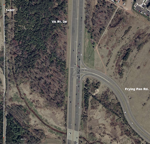
Figure 3-1. Aerial phot showing Virginia State Route 28 intersecting Frying Pan Road. Route 28 is shown with three through lanes in each direction, with a 500-foot right-turn lane in the northbound direction and a two-lane left turn bay in the southbound direction. The northbound direction is the direction under consideration in the study. Frying Pan Road approaches the intersection from the east only and the intersection is a TEE.
Figure 3-1. Virginia Route 28 at Frying Pan Road (North is up, which is the direction under consideration).
Field Data
The researchers developed a software program that allowed a field observer to record the time each vehicle crossed the stop line. The observer first noted (by key press) the start of green, and then pressed the 1, 2, or 3 key each time a vehicle in the corresponding lane crossed the stop line. Key-press times were recorded to the nearest millisecond. The observer was located on the downstream side of the intersection in the east right of way, on a small embankment that provided a good view of the northbound approach. The software recorded the time of each key press in a comma-delimited text file which was imported into Excel for subsequent processing.
The observation method is subject to systematic errors based on the skill of the observer. The observer noted potential errors of up to around a half second in recording the crossing time of vehicles. The observer reported no expectation of actually missing any vehicles greater than one or two per cycle (well under 1%, given the average flow in each cycle of approximately 270 vehicles). Thus, the data cannot be used to develop or evaluate car-following relationships between individual pairs of vehicles, but this was not the objective of the field study.
In order to filter out the noise induced by any flaws in the observation technique, vehicles were grouped in ranks of five vehicles and the headways between them were averaged. An error of half a second would be one quarter of a typical two-second headway, but when averaged across a succession of five vehicles, would be closer to 5% of the true headway, on average. Given that no more rigorous data collection method was attempted or allowed by project resources, a more rigorous evaluation of data-collection error was not attempted. However, as we will see, each rank of five vehicles in each lane represents 40-55 actual headway measurements, and data collection error is assumed to average out to become unimportant to the conclusions of the study.
Data were collected over 11 consecutive cycles during one morning peak period in March of 2008. Flow in each lane ranged from 58 to 101 vehicles during the green. Initially, the data were only evaluated for the first 60 vehicles crossing the stop line in each lane. This decision was made for two reasons. One is to avoid having to deal with more than one instance where a lane did not serve that many cars during the study period. The other was a recognition that the first 60 cars were all that were needed to test the two effects being studied. Using conventional assumptions, 60 vehicles would require slightly less than 120 seconds of green time to serve, which is already an extraordinarily long green time.
The headways between the first 60 vehicles in each lane were first evaluated to test for correlation to the cycle number. Such correlation would indicate that conditions changed during the course of the data collection, which would need explanation. The data showed that the headways of vehicles from queue positions 40 to 60 were longer during the last three cycles of the study than during the first eight. These cycles were at the end of the AM peak period, and the explanation seems to be lessening demand and gradual clearing of the residual queue. Therefore, headways after the first 40 vehicles were ignored for the last three cycles. As a result, 11 cycles were used for the first 40 vehicles crossing the stop line, and 8 were used for the next 20. A total of 1800 vehicle headways were included in subsequent analysis. Figure 3-2 shows these headways plotted by lane and cycle number. Lines connecting dots represent successive vehicles.
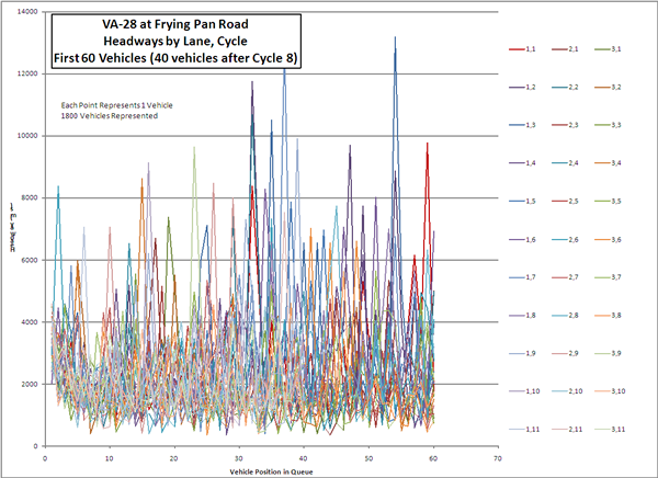
Figure 3-2. Chart of individual headways of the 1800 vehicles included in the analysis. The chart shows considerable variation in headways, approximately trending around 2000 milliseconds, but with many outliers extended as long as 13000 milliseconds. The intent of the chart is to show the large volume of headways included in the study, and not to show any specific results.
Figure 3-2. Individual Headways of 1800 Vehicles Included in Study.
The 1800 vehicles included do not show correlation by cycle numbers, as is shown in Figure 3-3. Note that for all evaluations of headway, the first five ranks of vehicles were ignored to eliminate the effects of startup lost time. This effect is clearly visible in Figure 3-2.
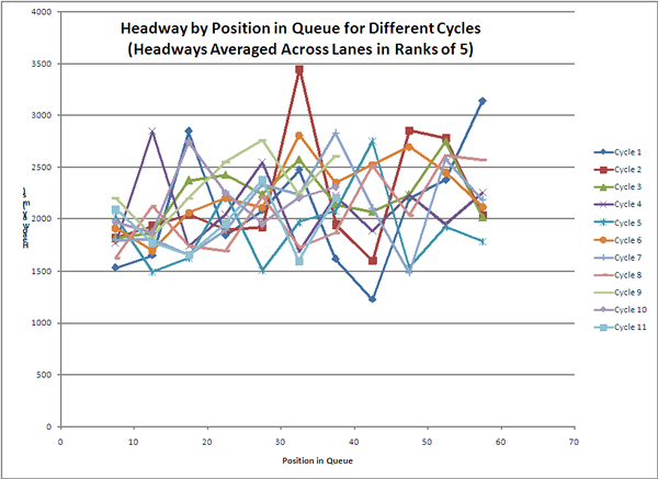
Figure 3-3. Chart showing headways by position in queue, with each point representing the average headway across three lanes for the fifth througuh ninth rank of vehicles, the tenth through fourteenth rank of vehicles, and so on through the 60th rank. The points are connected by lines representing each of 11 cycles. The connected series of point for cycles 9-11 only extend thorugh the 40th rank. The plotted data shows no correlation between the cycle number and the plotted headways
Figure 3-3. Headways Compared to Cycle Number.
Another way to display these data is to show vehicle stop line crossing by time into green. Figure 3-4 shows time-into-green crossing by lane and cycle. The thick line on the chart shows the Greenshields model with an assumption of four seconds lost time and a saturation flow of 1900 vehicles per hour of green. One interesting immediate observation is that the Greenshields relationship using currently accepted numbers proved to be an ideal not often exceeded by the field data.
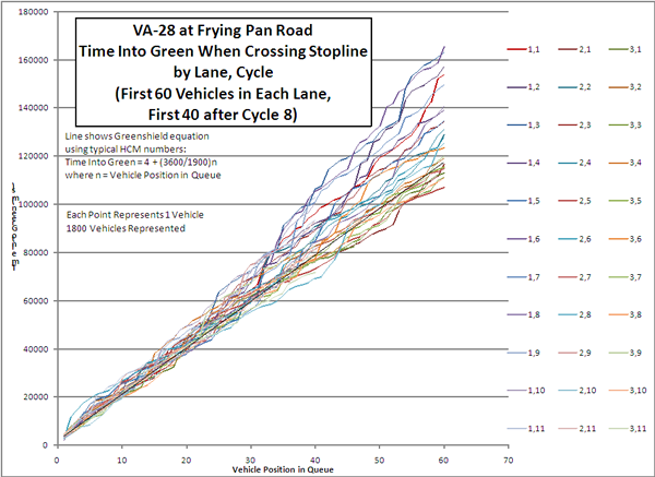
Figure 3-4. Chart showing stop line crossing times for vehicles in each lane and cycle. Points represent one vehicle, and are connected for successive vehicles in each lane and cycle. The lines connecting these series of points are colored uniquely for each lane and cycle combination. A solid black line shows Greenshields model, with 60th car crossing at 118 secondsl. Most curves are above this line. The longest time required for the 60th car to cross the stop line was over 160 seconds, and the shortest time 105 seconds.
Figure 3-4. Crossing Times by Lane and Cycle.
The results of primary interest are shown in Figure 3-5. This chart shows average headways by lane (and across all lanes) averaged in groups that include five ranks of vehicles, from the 6th to the 60th vehicle in the departing queue (40th vehicle for the last three cycles).
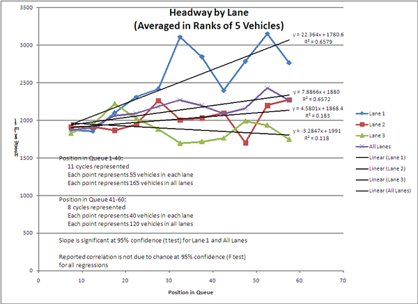
Figure 3-5. Chart showing that average headways did not change with position in queue for the left and middle lanes, but change significantly for the right lane and for the agerage across all lanes, as reported in the text.
Figure 3-5. Headway by Lane
Analysis of Field Data
Linear regressions were conducted for headways (in ranks of 5) for each lane and for all lanes. The regressions provide an assessment of changing headway (the slope of the line) and correlation between queue position and headway. Correlation alone is insufficient to show that headways increase, statistical testing is also required on the coefficient of the position in queue parameter (which is the slope of the line) to determine that the slope is significant.
Thus, a two-tailed test of the t statistic was performed on the slope parameter. The linear regression for the headways in the right through lane was:
 (1)
(1)
With 11 data points in the regression, the calculated t statistic was 4.16. With 9 degrees of freedom, the value greater than which one rejects the hypothesis that the slope value is due to chance at a confidence of 95% is 2.26. Thus, for the right lane, the slope is significantly non-zero.
Similar calculations were made with the middle and left lanes, but the slopes of those lanes were not sufficiently different from zero to reject the hypothesis that they are caused by chance.
The conclusion is that the right lane saw increasing headways, but the center and left lanes did not. Total headways, averaged across all lanes, did show significant slope, based on the influence of the right lane in the average.
The left lane was an ideal test for evaluating the hypothesis that driver reaction time starts later and adds to the headway beyond a certain distance from the stop line. Yet headways did not increase with position in queue in the left lane. Thus, the data do not support this hypothesis.
The right lane was an ideal test for evaluating the effect of turning traffic leaving the through lane. The right-turn lane is about 500 feet long. Approximately 25-30 vehicles would be expected to fill a 500-foot queue, so one can assume that few right-turners will be in the first 25 or 30 cars because they would have already been able to move into the right turn lane. Thus, we expect to see headways mimic the center and through lanes through a position in queue of 25 or 30. The data do show a slight increase in headway through that much depth of queue, but then jump significantly thereafter to a peak at a queue position of 30 to 35. After that peak, the headway drops back down around the 45th vehicle, and then peaks again at the 55th vehicle.
A possible explanation for this behavior is that the departing traffic empties the queue to a point beyond the opening of the right-turn lane, allowing right-turners to leave the right through lane to make their maneuver. As the right-turners leave the through traffic stream, they leave gaps. Drivers behind them may accelerate to fill those gaps, but are unable to catch up to the gap by the time they reach the stop line. The opening creates a shock wave, and flow increases again, resulting in shorter headways, as the shock wave emerges. After the shock wave passes, headways increase again. This type of behavior is well-known from freeway traffic.
To test this possible explanation, the intersection was simulated to see if the shock wave would be visible, which is reported in the next section.
The middle lane showed growing headways to a greater extent than the left lane, though this was not found to be statistically significant. If it does, however, then this could be explained by some vehicles in the middle lane moving into gaps created by departing right turners in the right lane before reaching the stop line.
Correlation was also tested. Some correlation was seen in all cases, but the correlation coefficients range from moderate to low. The F statistic was used to evaluate whether these correlations could be attributed to chance, and in all cases, the F statistic exceeded the 95% critical value on the F distribution, meaning that the reported correlation is probably not due to chance.
Given the low correlation coefficients, however, it is not recommended that the linear regressions be used as a model to characterize headways.
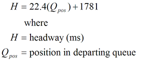
One question to be evaluated is the effect of the headways on various assumptions pertinent to calculating greens times at saturated intersections. One such is the assumption that the capacity of the green time can be characterized by the equation
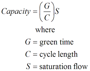 (2)
(2)
This equation makes the assumption that saturation flow is a constant. The Greenshields relationship was traditionally
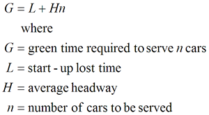 (3)
(3)
In this equation, L is the amount of lost time used up by the first several vehicles, and H is the amount needed by each car thereafter. Greenshields suggested numbers of 3.8 seconds for lost time and 2.1 seconds for headways. Thus, 2.1 seconds headway, when inverted to flow, constitutes the saturation flow, which is traditionally measured as the flow required from the 4th through the 10th vehicle in a departing queue. The inverse of 2.1 seconds is 1714 vehicles per hour. Greenshields has been updated with new measurements of saturation flow, and the Highway Capacity Manual now recommends a value of 1900 vehicles per hour of green. This corresponds to a headway of just under 1.9 seconds per vehicle.
Also, most practitioners estimate lost time at four seconds, which is a number considered to be reasonable in the absence of more specific data.
Thus, the 60th car in a departing platoon should reach the stop line in 118 seconds, which is 4 seconds lost time plus 1.89 seconds headway multiplied by 60 vehicles.
Does the field data support this calculation? Figure 3-6 shows the average time required to serve cars at each rank in the departing queue. The numbers were calculated by averaging the time into green for all the cars in that rank and lane (or across all lanes).
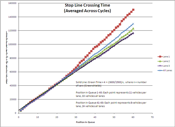
Figure 3-6. Chart showing stop line crossing times averaged across all cycles, with a separate curve for each lane and one for all lanes. A solid line shows the Greenshields model as described in Equation 3. Middle and left lanes stay within about 10 seconds of the Greenshields model. The right lane fell about 35 seconds behind, starting about 25 seconds into the green. The average across all lanes ended up about 20 seconds behind Greenshields at the 60th departing vehicle.
Figure 3-6. Time Into Green by Rank and Lane
The solid line in Figure 3-6 illustrates the Greenshields model with modern parameters.
The left lane corresponded very closely to the Greenshields model, and the middle lane was close, with an accumulated error of about five seconds by the 60th rank of vehicles.
The right lane, however, fell behind the ideal by around 35 seconds. Note, however, that the right lane closely corresponded to the ideal through about the 25th rank. This is the point where headways spiked in response to the queue clearing back to the point where right turners would again be in the through lane.
Field Data Conclusions and Further Discussion
The field data constitutes a single condition and location, and consequently cannot be used to construct models. But the data do show that lanes adjacent to turning lanes will show significantly increased headways and reduced stop-line flow once the queue has cleared to the upstream end of the turning lane. The field data showed only the effects of right turners, which always receive green at the same time as through vehicles. We would expect the effect to be more pronounced with left turns, for these reasons:
- Left-turn bays are often shorter than the right-turn bay at the study site.
- Left-turners are usually separately signalized at congested intersections, and thus may back into the left through lane, causing a blockage.
Even the effect of a right lane, however, was sufficient to cause a significant increase in average headway across all lanes, and an accumulated error in predicted required green time of about 15 seconds.
Headways were not affected by turning traffic downstream of the turn lane entrance. This suggests that maximum throughput is served when green times make use of the ability to feed the stop line with maximum flow.
We can turn the analysis around. We have been asking how much time is needed to serve a given number of vehicles. To evaluate throughput, however, it is useful to ask how many vehicles can be served by a given green time. For example, Figure 3-6 tells how many vehicles can be served in 118 seconds of green. The average across all lanes was 54, or 162 vehicles in total.
We can also ask, how many vehicles can be served in, say, 48 seconds? From the data, the average across lanes is about 23, or 66 vehicles in total, on average per green period.
If, hypothetically, the 118-second green were two-thirds of the cycle (as is the 180-second green in a 270-second cycle as observed in the field), the cycle would be 177 seconds. The hourly throughput would be 3295 vehicles (20.339 cycles/hour times 162 vehicles/cycle).
On the other hand, if a 48-second green time was also two-thirds of a cycle, the cycle length would be 72 seconds, of which 50 could be operated in an hour. The total throughput for that hypothetical scenario would be 3300 vehicles. The significance of 48 seconds is that this is about the green time required to serve the vehicles that can queue up downstream of the turn lane entrance.
(Note that a 72-second cycle is impractically short at this location because of the very short times that would be available for the other movements. One advantage to lengthening the cycle is that it allows long enough greens so that they can be assigned based on traffic rather than being forced by minimum-green considerations unrelated to traffic volume. This has been temporarily ignored in this discussion to evaluate the cycle-length-vs.-throughput issue directly.)
Thus, by keeping the green time down to the point where only the queue to the upstream end of a 500-foot turn lane was served in each cycle, flow at the stop line is maintained close to ideal saturation and the overall throughput does not decrease. We conclude, therefore, that the common belief that longer cycle lengths can be assumed to result in greater capacity cannot be supported by behavior at (at least one) real intersection.
The actual signal timing at the intersection was 180 seconds of green in a cycle of 270 seconds. The measured flow during the first eight cycles, which were observed to have maintained queue-departure flow for the entire green time, was 1986 vehicles in 2160 seconds, for an hourly throughput of 3310 vehicles. Again, increasing the cycle does not result in greater throughput.
Thus, the reduction in lost time as a percentage of the cycle does not overcome the reduced flow caused by turning vehicles leaving the through lanes in very long greens.
In the next section, we will test this thought experiment with simulation of the three signal timing alternatives.
One final point should be made. This intersection was only affected by a very long right turn lane. Most intersections include both right and left turners, and usually with shorter left turn lanes and many times no right turn lanes. Thus, we would expect these results to be even more pronounced at more typical arterial intersections.
Simulation
For analyzing optional control approaches, VISSIM v. 4.3 was used to provide microscopic simulation. Setting up VISSIM to model the condition with reasonable realism required many iterations and adjustments to the link and connector geometry. In particular lane changes were a problem in queued traffic. Motorists in the real world have prior expectations of congestion and find a way to edge into the desired lane usually before being forced to block traffic for an extended period of time. Even those drivers who do wait to the last minute will usually give up on making the lane change, or will benefit from a charitable driver in the lane into which they are moving, or will force their way in more aggressively than VISSIM was prepared to simulate. VISSIM would simulate right turners, for example, waiting in the middle lane adjacent to the upstream end of the right turn lane for the entire 60 seconds that VISSIM would allow such waiting before eliminating the vehicle from the simulation and reporting an error. To prevent these behaviors, we set up the VISSIM network such that right turners started in the right lane at the outset, to prevent such lane changes altogether. The assumption we were forced to make was that these lane changes would not affect headways at the stop line.
We also provided two parallel links covering the length of the right-turn lane. One link served the left two lanes and the other served the right through lane and the right-turn lane. This configuration made it possible for right-turners to move into the right-turn lane at any point along its length. At the right-turn island gore, the two parallel links connect to a single link serving the three through lanes.
Input volumes were chosen to ensure that the network was oversaturated, with an approach hourly volume of 6000, 750 of which turned right. The 6000 entering vehicles were divided equally among the three lanes. Approach links were made as long as the license of the copy used permitted, about 8000 feet. The queue overflowed the approach links throughout the simulation, but this caused no visible effect at the intersection. The simulation was run for 4000 seconds, and data were collected starting 1080 seconds into the simulation (four cycles). The signal timing was the same as was observed in the field study. The simulation stopped during a red period, so data were collected from ten consecutive departing queues.
Figure 3-7 shows the layout of the VISSIM network, with links and connectors shown only by their centerlines.
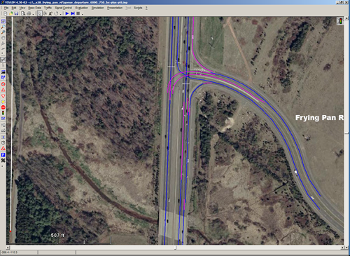
Figure 3-7. VISSIM Network, VA28 at Frying Pan Road
We used the Wiedemann 74 car-following model in VISSIM. That model describes the distance, d, between cars as
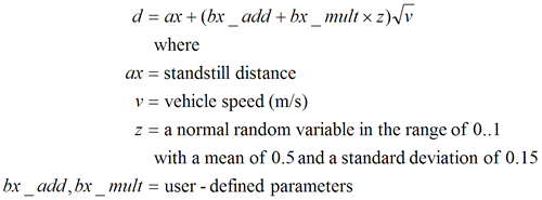
Equation 4, the Wiedermann-74 car-following model used in VISSIM: Distance between cars is the standstill distance plus a user-defined combination of parameters times the square root of vehicle speed. The user-defined combination of parameters includes the sum of an additive parameter, bx_add, and a multiplicative parameter, bx_mult. The multiplicative parameter is multiplied by a random variable ranging from zero to one.
(4)
The user-defined parameters are suggested in the VISSIM documentation to be the preferred choice for adjusting the saturation flow. Several values were tried, and the resulting headway and time-into-green performed best, based on a visual evaluation of the charts, using a bx_add of 2.6 and a bx_mult of 3.6. These values compare to the default values of 2.0 and 3.0, respectively. The standstill distance was left at the default two meters.
VISSIM was configured to export raw data for detector zones at the stop line. The data were manually filtered to include only records that indicate a vehicle first entering a detector. These records were then evaluated in an Excel spreadsheet similarly to data collected in the field. Figure 3-8 shows headways as recorded in the simulation. As with the field data, the headways were averaged across ranks of five departing vehicles.
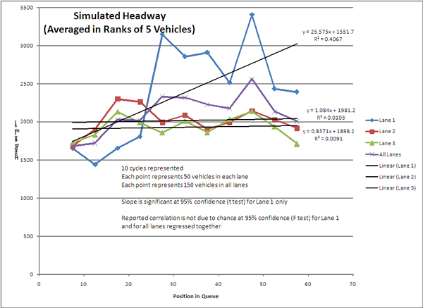
Figure 3-8. Chart showing headways averaged in ranks of 5 from the simulation results. The plotted results are similar to the field data, in that headway did not change in the middle and left lane, but changed significantly in the right lane, particularly after about 25 seconds.
Figure 3-8. Simulated Headways by Position in Queue.
The simulated data show a similar shape to the field data, in that headways remain the same with respect to queue position for the middle and right lanes, but lengthen as a result of departing right-turners in the right through lane. The simulation also shows a sudden increase in headway in the right lane just upstream from the entrance to the right-turn lane, followed by a return to shorter headways, and then followed by another hump. No simulation values were found that matched the field-measured y-intercept of the linear regression for the right lane, but the slope was similar and the range of values were similar. Also, the sudden increase in headways at the upstream end of the right turn lane happened earlier in the departing queue by a few cars. The simulated headways in the right lane were just a bit short overall, but were judged close enough to the field data to provide a reasonable means for comparing alternative strategies.
Figure 3-9 shows the time into green, again with a solid line representing the Greenshields equation with modern values, as pictured in Figure 3-6.
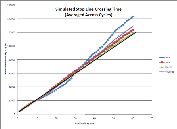
Figure 3-9. The time require to cross the stop line for vehicles through the 60th rank, as simulated. The simulation results were similar to field data, in that the middle and left lanes stayed close to the Greenshields model, but the right lane fell behind that model, particularly after 25 seconds of green at elapsed.
Figure 3-9. Simulated Stop Line Crossing Time
Comparing Alternatives
The main purpose of the field study at Frying Pan Road was to observe whether throughput does actually increase or decrease as a result of very long greens and cycles. In the foregoing discussion, however, the existing data were used to suggest the throughput attainable using shorter cycles. This option was not available for field trial, but having a reasonable simulation made exploring the question possible.
Evaluating the improvement, however, requires a means of characterizing the operation of the intersection with respect to throughput. The simulation was repeated to compare the offered load (demand) to the served load (throughput) on the northbound approach for a range of input volumes. All simulation parameters were kept the same except input volume. Right turns were kept at the same percentage of the total approach traffic, which was 12.5%.
Offered load is the total input volume that VISSIM was asked to process that was routed onto the northbound through lanes (right turners are excluded in order to provide a comparison to field data, which measured only through cars on a cycle-by-cycle basis). Because the residual queue spilled out of the simulation network (the size of which was constrained by the limited VISSIM license), it was not possible to characterize demand upstream from the queue. Thus, it was necessary to determine whether VISSIM’s stochastic traffic generator followed sufficiently close to the nominal traffic volumes to allow the use of the nominal values in the evaluation. A comparison was therefore made between nominal volume as programmed in the VISSIM input file and actual volume presented to the approach in the simulation to determine how subject the value was to stochastic processes within the simulation. The numbers were found to be within a few percentage points in all cases where the residual queue did not spill out of the network. Thus, the offered load was assumed to be the hourly demand that was nominally programmed into the simulation.
Table 3-1 shows the relationship between nominal programmed demand and volume measured at the upstream end of the entry links. For values up to the maximum throughput, the nominal demand and the actual demand were very close.
Nominal Programmed Demand (vph) |
Actual Simulated Demand (vph) |
Error (%) |
1000 |
1016 |
1.6 |
1500 |
1473 |
1.8 |
2000 |
2024 |
1.2 |
2500 |
2468 |
1.3 |
3000 |
2959 |
1.4 |
3500 |
3471 |
0.8 |
4000 |
3979 |
0.5 |
5000 |
4008 |
19.8 |
6000 |
4019 |
33.0 |
Table 3-1. Nominal and Actual Simulated Volumes
If demand sufficiently exceeded the maximum throughput at the stop line, the approach would overflow, but VISSIM would still be attempting to feed vehicles into the network at the programmed rate. The served throughput was the total volume of traffic measured at data collection points in the through lanes at the stop line, as recorded from VISSIM.
Figure 3-10 shows offered versus served loads at the simulated intersection. For an intersection that is able to serve all the demand presented to it, the chart should show a one-to-one relationship between offered and served loads. When the intersection reaches the point where additional loads cannot be served, the curve relating the two flattens to a horizontal line that represents maximum throughput.
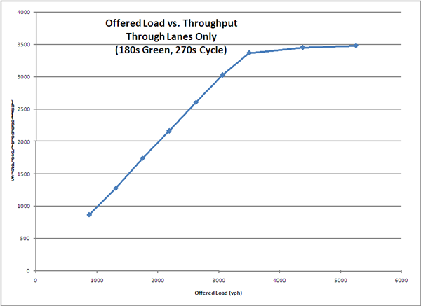
Figure 3-10. Chart showing offered load versus served load on the northbound approach at Frying Pan Road and Route 28. The offered and served loads should be the same if capacity is not being exceeded, and the curve should follow an angle that bisects the axes. The plotted curve will go to horizontal at the point were additional offered load cannot be served. This diagram, showing signal timings of 180 seconds green in a 270-second cycle, showed a maximum served load (throughput) of a little less than 3500 vehicles/hour.
Figure 3-10. Offered Load vs. Throughput, from Simulation
The figure shows that throughput tracks demand in the absence of growing residual queues, as expected, until the maximum throughput is reached. At that point, additional demand cannot be accommodated and the served throughput reaches a ceiling. In the simulation, the maximum throughput was a little less than 3500 vehicles per hour, which corresponded reasonably well to the maximum observed throughput of about 3300 vehicles per hour reported in the field data. The difference can be explained by the slightly reduced headways as simulated versus observed.
This approach in identifying the maximum throughput by comparing offered and served load provides a means of evaluating alternative strategies for minimizing congestion on the basis of the throughput objective. For this site, the main alternative under consideration is related to the assumption that increased cycle lengths increase throughput, so the curve in Figure 3-10 will be reproduced at several cycle lengths to determine if cycles affect maximum throughput.
The simulations were repeated at two other sets of signal timing, to correspond to the thought experiment in the discussion of the field results. In addition to the field case of a 180-second green within a 270-second cycle, simulations were conducted with a 48-second green in a 72-second cycle, and a 118-second green in a 177-second cycle. Cycle-by-cycle summary data were collected for each case.
It should be noted again that the 72-second cycle is impractically short for an intersection such as this one. It is included because the green time matches the time required to clear the queue back to the upstream end of the right-turn bay. Even so, including it in this evaluation is reductio ad absurdum. At the 72-second cycle, the side-street and opposing left-turn movements would be ridiculously short (about 3 seconds of green). In the simulation, however, the 3-second greens were able to serve typically two cars in each lane on the minor movements per cycle. The short cycle comes more often, and, with 50 cycles per hour, the two-lane minor movements would be expected to serve around 200 vehicles per hour each. The demand exceed these values, but not overwhelmingly so. Even in this rather extreme case, the minor movements might leave 300 vehicles queued at the end of an hour, with approach volumes on the side street of about 300 and about 400 on the left turn opposing the movement under consideration. But northbound through traffic typically must wait through three cycles to clear the intersection, and this was experienced by the data collector on the morning the field study. With a 180-second green, three cycles of delay means over 800 vehicles in the queue. Even blocking the minor movements completely would create less congestion than that. Of course, the public would not accept such draconian measures, let alone be able to maintain safe operation. And public pressure would compel the practitioner to increase the green time on the minor movements, which would reduce the percentage of the cycle given to the congested through movement. That would substantially decrease throughput.
The 177-second cycle, on the other hand, provides green times for the minor movements of 21 seconds, which are long enough to provide adequate minimum greens even at an intersection with demand as lopsided in favor of one movement as this one. In the simulation of the 177-second cycle, there was no congestion on the other movements, and the regular queues were shorter than for the 270-second cycle, as would be expected. Minor-movement motorists would see a noticeable reduction in delay.
Figure 3-11 shows the maximum throughput curves for the three timing scenarios.
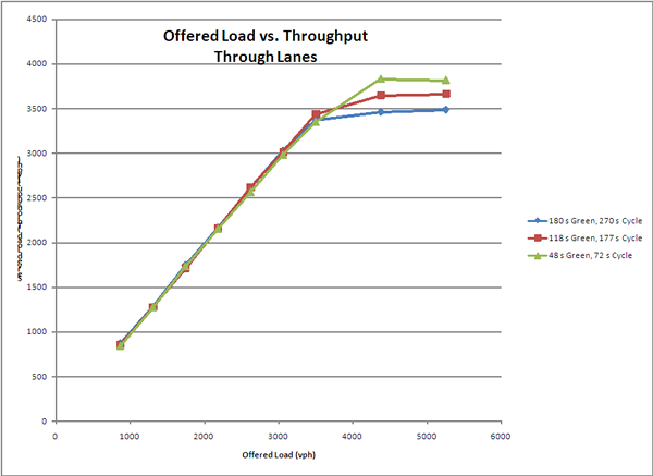
Figure 3-11. Chart showing simulated offered load versus served load on the northbound approach at Frying Pan Road and Route 28. This diagram shows three signal timing scenarios, including a 180-second green time in a 270s cycle, a 118s green time in a 177s cycle, and a 48s green in a 72s cycle. The maximum served load (throughput) for the 270s cycle was just under 3500 vehicles per hour. The 72s cycle provided a maximum throughput of about 3800 vehicles per hour. The 118s cycle maximum throughput fell between these.
Figure 3-11. Simulated Maximum Throughput for Three Signal Timing Scenarios
Discussion and Conclusion
Two influences on the throughput compete against one another. The first is the effect of phase-change lost time. The clearance intervals were set to six seconds in all timing scenarios, and the three conflicting signal phases in the intersection each contributed six seconds of clearance intervals. Lost time is usually assumed to be about four seconds, but again it is constant. The clearance intervals are only 6.7% of the 270-second cycle, but are a full 25% of the 72-second cycle. Lost time is 4.4% of the longer cycle and 17% of the short cycle. As was mentioned at the outset, the consumption of the cycle by lost time is the usual motivation for using longer cycles in the presence of capacity problems and congestion, based on the assumption that the longer cycle is less consumed by lost time and therefore more efficient.
The competing influence is the effect of the right turn. As we saw in both the field data and the simulation, the headways and saturation flow of the right lane was similar to the middle and left lanes, and also fairly constant, until the queue emptied to a point adjacent to the right-turn bay entrance. In that section of roadway, all the vehicles in the right lane are through vehicles, because right turners have already moved into the right-turn lane. Upstream from the right-turn lane entrance, however, the right through lane contains all the right turners who are unable to reach the right turn lane because of the residual queue. Once the queue clears back to the point where right turners are present in the queue, their departure into the right-turn lane as the queue clears will leave gaps in the through traffic. Through cars attempt to fill the gap, partly from further back and partly from the middle lane, and a shock wave develops. Headways spike, recover, but then spike again as the shock wave crossing the stop line, as was seen in both the field data and the simulation.
At the field site, the effect of the right turn was sufficiently dominant to have a significant effect on the overall average headway on the approach.
Looking in the field data at the number of vehicles served, on average, across all three lanes at three sample green times of 48 seconds, 118 seconds, and 180 seconds, and then converted to hourly flows, showed that all three timing scenarios provided about the same throughput.
Given that the 48-second green time serves only cars queued downstream of the entrance to the right turn lane, we expect the headways to be uniformly short and unaffected by right turners. The simulation showed this by indicating that the 48-second green time provided the highest maximum throughput, assuming that the green percentage of the cycle was held constant.
The simulation also indicates that the larger the percentage of the green that can be consumed by flows unaffected by turning traffic, the higher the throughput. The medium cycle in the simulation provided higher throughput than the longest cycle, but not as high as the shortest cycle. This result is the opposite of the assumption made by most practitioners, and indicates that in this simulated case, at least, the effect of turning traffic on overall throughput overcomes the reduced cycle efficiency caused by lost time. The simulation was perhaps more optimistic than the field data, though the field data represented only the longest cycle, and was manipulated to suggest what might be the performance of shorter cycles. In any case, a safe conclusion is that at this site, the longer cycle is not increasing throughput.
In conclusion, the field data did not support the hypothesis that lost time builds back into the traffic stream as queues empty through very long greens. But turning traffic leaves gaps in the through lanes, and the data at this site show that those gaps do result in a significant decrease in throughput. Simulation of the intersection suggests that decrease is more pronounced the when the green is long enough such that a significant portion of it serves queue containing turning vehicles. The less green time is used to serve a queue containing turning vehicles, the greater the throughput in the through lanes.
The problem with short cycles is not that they are inefficient, but that they run afoul of external complaints and constraints that result in green time being distributed unfairly to minor movements. Thus, the study of this site confirms the recommendation that emerged in the state of the practice to find the right cycle, which in this case should be just long enough to allow green times to be assigned equitably based on traffic demand.
Cycle Length and Bus Capacity
Introduction
One of the strategies that emerged when researching the state of the practice was the relationship between bus flow and cycle length. The scenario described was in a tight grid network, such as a central business district, where a cycle that did not resonate with the normal stop time of buses causes those buses to build a queue, which in turn propagated into the general traffic stream. This case was observed some years ago in the San Antonio business district, particularly on Commerce Street, which is a one-way street in a tight grid network. A very popular bus stop on Commerce at Soledad served high bus volumes of about 85 per hour. With the 100-second cycles that were existing at the time, buses frequently queue through upstream intersections. A change in cycle length to 60 seconds (which was general resonant in most portions of that network) eliminated these bus queues. The resulting experience suggests that the capacity of bus traffic through an intersection is one bus per cycle, and with shorter cycles, more buses per hour can be served. The researchers investigated this suggestion using simulation.
The simulated scenario used the section of Commerce Street in downtown San Antonio where the original observations had been made.
In the aerial photo below, the intersection of Commerce and Soledad is in the upper left, and two upstream intersections are shown, including St. Marys and Navarro. Soledad is one-way northbound, St. Marys is one-way southbound, and Navarro is one-way northbound. Commerce extends to the right (east) from that upper-left intersection. The modeled network would include these three intersections. Commerce Street is one-way westbound. The location is not generally congested, but the bus flows approaching the stop on the Commerce approach to Soledad are quite high. In the simulation, the researchers used higher than realistic volumes to create congestion. (The photo shows a bus at this stop, and two more turning into Commerce from southbound St. Marys).
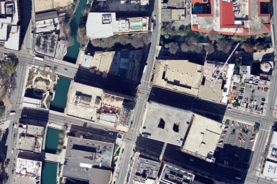
Figure 3-12. Commerce Street at Soledad, St. Marys, and Navarro, San Antonio
Modeled Operation
Signal Operation
The network was configured with three pre-time controllers. In all cases, the intersections, which are about 500 feet apart, were set up with offset of 12 seconds behind the preceding intersection. Thus, the green at St. Marys started 12 seconds following the start of green at Navarro, and the green at Soledad started 12 seconds later still. This provided perfect one-way progression along Commerce Street at a speed of a little under 30 mph.
To meter traffic into the test network, the green time (including clearance) along Commerce at Navarro was constrained to 50% of the cycle. Commerce was given 80% of the cycle at St. Marys and at Soledad. With the first intersection metering traffic into the network, any change in queuing upstream from that point would be caused by a significant effect at the two downstream intersections. In other words, the constrained green time at the first intersection reduced the sensitivity of the queue formation upstream from that point to changes in the throughput at the downstream locations. This had the effect of filtering the noise of insignificant effects.
Cycle lengths were varied over a wide range, from 25 seconds (which is acknowledged to be unfeasibly short because it violates pedestrian crossing requirements) to 100 seconds.
Demand
A base condition of 5200 vehicles per hour formed the simulated volume in the study. This volume caused significant congestion, the extent of which was the object of measurement The volumes are shown in the table below:
Entry Point |
Volume |
WB Commerce at Navarro |
3000 |
NB Navarro |
400 |
SB St. Marys |
600 |
NB Soledad |
1200 |
Total |
5200 |
Table 3-2. Traffic Volume Scenario
Bus demand was modeled in a range of conditions, varying from the base bus demand of 50 buses/hour entering on St. Marys and 35 buses/hour entering on Commerce to 120% of those values. Bus stops were modeled with a 20-second stop period for passenger loading and unloading.
Simulation
In VISSIM, Commerce street was modeled with a very long external approach to provide a large storage space for measuring the extent of queue formation. All simulated scenarios were replicated for five simulation runs. Figure 3-13 shows the VISSIM network in the vicinity of the signalized intersections, and Figure 3-14 shows the overall VISSIM network with the long approach for storing the residual queue.
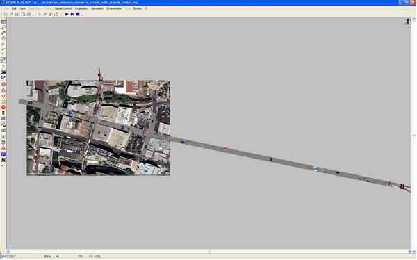
Figure 3-13. Entire VISSIM Network, Including Queue Storage
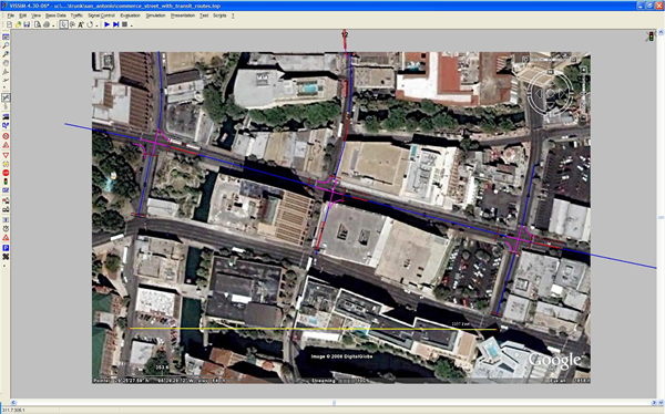
Figure 3-14 VISSIM Network Showing Signalized Intersections and Links
In the simulation, the queues built for the first hour of simulation, and the demand was dropped to a small fraction of the original demand to determine how quickly the network would be able to empty the queue that had been formed. Two results were therefore anticipated:
- The total number of vehicles in the system in one hour of traffic demand
- The effectiveness of the network in emptying traffic after demand was removed.
Additionally, a test was conducted with a range of bus volumes to determine if varying bus volumes affected the underlying throughput of the street.
Simulation Results
In comparing the served load versus the offered load no change was noted as a result of varying bus demand. With non-bus demand at 5200 total vehicles entering the network over an hour, and bus demand varying to 120% of the base condition. This was at the longest cycle length of 100 seconds to maximize the effect of buses on the traffic stream.
Cycle Length
The effect of cycle length, on the other hand, was significant.
Given perfect progression on the one-way street, the question of the resonance of the cycle has been rendered moot. The concept of cycle length resonance looks for the relationship between signal spacing, cycle length, and speed to find progression in both directions of an arterial or in all directions in a grid. With only a one-way street, the downstream intersections merely need to be delayed by the travel time from the upstream intersection to provide green time for every arriving car, assuming those cars are not impeded by buses. This is especially true given that traffic was metered into the network by constraining the green time at the first signal.
Thus, any effect related to changing cycle length can only be explained by the effect of the cycle length on the buses, and the resulting effect of the buses on the traffic stream. The research has already shown that variations in bus demand alone do not explain changes in the queue performance of the congested traffic stream.
Figure 3-15 shows the accumulation of vehicles (i.e. the number of cars being served plus the residual queue) during the course of the simulated scenarios. Each point on each curve represents 60 seconds of simulated time. The point at which the demand is reduced is at 3600 seconds into the simulation. All scenarios recovered at the same rate after the demand was removed, though those that started with a larger residual queue took correspondingly longer to clear.
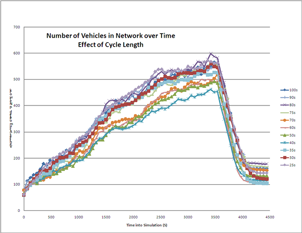
Figure 3-15. Chart showing the number of vehicles in the network over the time of the simulation. The chart shows curves for eleven cycles covering a range of 25 to 100 seconds. The area under the curve is delay. The 40-second cycle showed the least delay, with cycles of 50-70 seconds slightly above. Cycles shorter than 40 and longer than 70 seconds were higher, showing more delay and a larger residual queue. The residual queue peaked at about 360 cars for the 40-second cycle and 600 cars for the 80-second cycle.
Figure 3-15. Effect of Cycle Length on Network Loading
The figure shows two important features. The first is that the cycles that stored the least number of vehicles were in the middle of the range, with the best scenario storing a maximum of about 450 cars at the end of the hour of loading, compared to about 600 vehicles for the worst cycle, for a one-third decrease in network loading. The cycle lengths ranging from 50 to 70 seconds was only a little worse than the best cycle, which was 40 seconds. That the 40-second cycle would perform best is plausible in addition to being observable: That cycle was the shortest (and therefore most frequent) that provided enough time to reliably load and unload one bus. Shorter cycles might require some buses to wait two cycles because their loading time extended beyond the available green, while much longer cycles might trap buses long enough such that another bus might have been able to process through the stop had the signal not been red so long.
The 80-second cycle showed the worst performance. For longer cycles, the green time could sometimes accommodate two buses, which to some extent offset the effect of fewer cycles per hour.
The other feature of the graph above is that the area under each curve represents the total delay in the network. Delay is measurable only because the queue is allowed to dissipate fully, and because the total time is the same for all scenarios. This would not be the case in most field situations without the ability to shut off demand completely to allow the queue to dissipate.
The area under each curve represents the total delay, and this can be converted to average delay by dividing this area by the total demand on the network during the simulation. Average delay is not meaningful in any specific case, because as the residual queue grows, delay grows with it. Average delay is therefore just a surrogate for the performance of that scenario rather than a model that can be used to predict what any one driver might see. Figure 3-16 shows delay for each individual simulation run at each cycle length as a point, and the average of these replications as a curve.
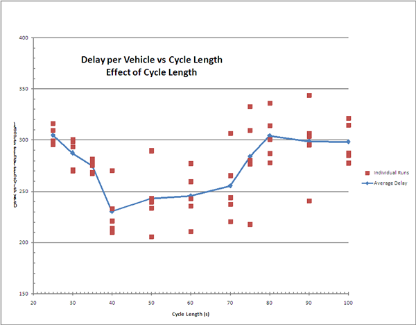
Figure 3-16. Chart showing average delay for all the simulation repititions at all cycles. The average value for each cycle is represented by a point on a curve, and the curve therefore represents the average of the average vehicle delay at each cycle. The curve dips at 40 seconds, with an average delay of about 230 seconds/vehicle. Delay stayed near or below 250 seconds per vehicle in the range of 40-70 seconds. The worst delay was a little over 300 seconds, at both a 25-second cycle and an 80-second cycle.
Figure 3-16. Average Delay Over a Range of Cycles
The figure reinforces the result that the 40 second cycle, which provides the most number of cycles per hour that can reliably serve at least one bus, performs the best. And the 80-second cycle, which is the longest cycle that can reliably serve only one bus, performs the worst.
Conclusion
In addition to providing a proper cycle length for progression resonance within a coordinated network, another resonance with bus loading times may also affect the cycle length decision. Cycles that are long enough to reliably serve one bus, but no longer, provide the best overall operation on congested routes that are affected by large bus volumes.
Bus volumes affect congested operation disproportionately to their numbers. A change in bus volumes has little effect on the congested network, but bus volumes that are only one or two percent of the total network flow can significantly affect the development of residual queues in a congested network.