|
|
|
Travel Time Reliability:
Making It There On Time, All The Time
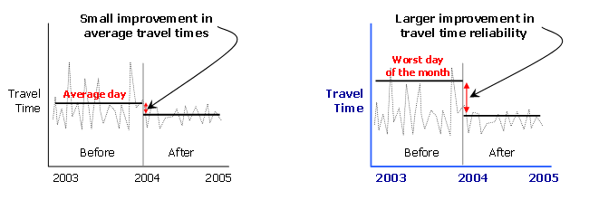
This figure shows two line charts, each depicting daily travel times over a two-year period, with the first year representing travel times before a traffic management improvement and the second year representing travel times after a traffic management improvement. In the first chart, the improvement in average travel times is shown, and this improvement in average travel time is quite small. In the second chart, the improvement in travel time reliability is shown (based on the worst day of the month), and this reliability improvement is much better than the improvement in average travel time.
Figure 3. Reliability measures capture the benefits of traffic management
