Chapter 3. Specific City FindingsThe use cases provide baseline information for each location, followed by a comparison to the baseline. The Washington, DC, and Atlanta cases rely on processed output from the third-party GPS aggregator. The aggregator analyzed its data for trips and cruising trips using the system developed by the Federal Highway Administration (FHWA) and this project team. The research team specified 15,000 geographies (i.e., streets or aggregations of streets—in this case, sometimes census block groups). The limit was a contract condition of the aggregator/processor. Thus, individual results for each street face were unobtainable. Instead, street faces of particular interest were specified with other results aggregated to the census block group level. For the Washington, DC, and Atlanta cases, the data are therefore presented at the block group level with more detailed analysis into the areas where street faces have been specified. The Chicago analysis uses raw location data that were processed by the project team. In the Chicago case, data are available at the street-face level for wherever trips have been made. The Seattle case includes processed output by the third-party GPS aggregator and analysis based on individual location data provided by a data broker. The approach in Seattle was designed to facilitate comparisons between the two different data sources. Each case answers certain questions, but also raises questions related to data sources and interpretation that can be mediated in future analyses. For example, the Seattle case shows an increase in cruising on metered blocks after a price change. Given that the analysis is based on locations of trip ends and not cruising paths, the meaning of that finding is unclear. From the trip end locations alone, the analyst knows with certainty where the trip ends, but not the process of parking search. The following possible interpretations are listed in order of likelihood, based on professional judgment:
Similarly, in the Chicago case, data were analyzed for the month of June across 3 years. Data for the third year were poor quality and were not useful for the analysis. The analysis shows potentially important differences between the 2 years for which there are good data. However, given the experiment, whether the observed differences are true differences or sampling differences is unclear. Had the analysis been strictly an analysis of Chicago, rather than a study of use cases for broad application, the recommended approach would be to acquire additional data to corroborate the findings. Instead, the analysis is presented with these caveats. While the results are potentially interesting, caution should be exercised when drawing conclusions as abstraction may not be justified on the basis of this analysis. The following sections show baseline and comparative case conditions for Washington, DC; Atlanta; Chicago; and Seattle in that order. The Seattle case comprises multiple analyses showing a business-as-usual meter price adjustment—a special case wherein all metered pricing is revoked, and a data comparison showing the benefits and shortcomings of two different data sources. Washington, DC: Cross-Sectional Analysis Focus on Metrorail StationsWashington, DC, has a varied landscape with respect to density, activity type, and transportation infrastructure. The focus in this case study is cruising for parking across Washington, DC. Special attention is focused on three sports stadiums, and when the stadiums have and do not have events planned. The analysis also emphasizes cruising in the areas around Metrorail stations. Washington, DC, data span January 1–December 3, 2018. In lieu of a specific policy change that would lead to a before/after analysis, the findings here are cross-sectional, illustrating different cruising patterns for different urban forms: specifically proximate to Metrorail versus beyond the Metrorail catchment areas. The data have been processed by a third-party data consolidator. This analysis is based on a data set of trip ends by time of day. Figure 9 illustrates the study area indicating the streets for which street-level data are available. 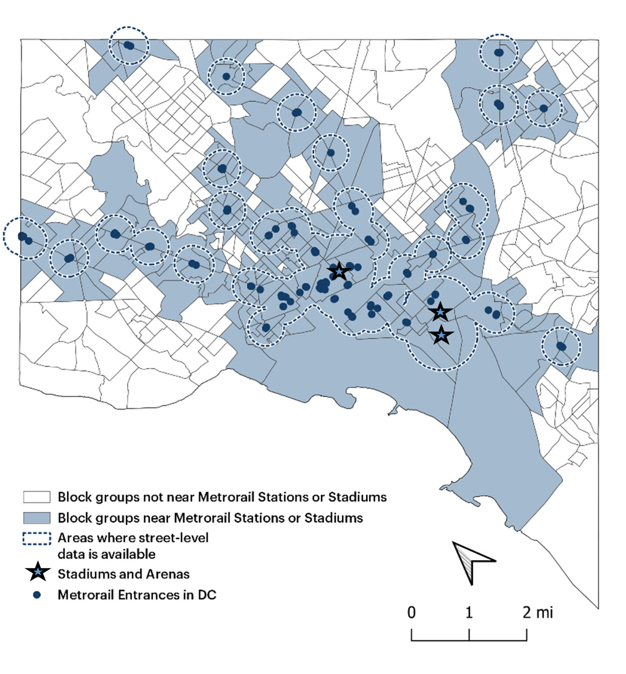
Source: FHWA. Figure 9. Map. Washington, DC, study area.
This map includes a mesoscopic-level overlay of the Washington, DC, study area, with microscopic overlays of street-level data in areas surrounding metro entrances, represented by dots, as well as a set of three stadiums and arenas, represented by stars. The color-coded map indicates the locations of DC block groups near Metrorail stations or stadiums and block groups not near Metrorail stations or stadiums.
Where Cruising OccursCruising is higher in the areas around Metrorail stations where there is an overall higher concentration of trips relative to street length. The streets in the Metrorail catchments comprise 23 percent of Washington, DC, street length and account for 45 percent of trip ends. Thus, the trip intensity in the Metrorail catchment area is almost twice what it would be if trips were evenly distributed throughout the street network. Cruising is almost evenly split between the Metrorail catchment areas and the rest of the city (51/49), meaning that half of the cruising is concentrated on about one-quarter of the streets. In comparing trips, cruising trips are slightly disproportionately represented near the Metrorail stations (45 percent of trips and 51 percent of cruising trips) and heavily concentrated there on a street-length basis (51 percent of cruising trips and 23 percent of street miles). Washington, DC, has an aggregate cruising rate of 5.8 percent and 6.6 percent around Metrorail stations where the concentration of all trips (cruising or not) is very high. Figure 10 shows cruising frequency by block group. To avoid the potential problem of statistical outliers, areas with fewer than 30 observations are not shown. 
Source: FHWA. Figure 10. Map. Washington, DC, cruising frequency.
This map illustrates a mesoscopic view of Washington, DC, sectioned by block groups. Each color-coded block group represents data corresponding to cruising frequency, with the majority representing 4 to 8 percent or greater frequency. Stars on the map represent stadiums and arenas, and dots represent Metrorail entrances. These locations are typically in the higher cruising frequency percentage range.
The amount of time spent cruising and the distance cruised are also important urban concerns. The average length of a cruising trip is just over 2 minutes, but the time can vary substantially. Figure 11 captures and ranks cruising in Washington, DC, by showing the aggregate time spent cruising in each block group. The block group average cruise time is weighted by the number of trips for which cruising is a component; this aggregate is divided by the street length of each block group to account for differences in size (i.e., if one block group has twice as much land area and corresponding street length than another, more trips relative to the smaller block group are expected). The modified measure is average time spent cruising per block within each block group. 
Source: FHWA. Figure 11. Map. Washington, DC, cruising impact.
This map depicts a mesoscopic view of Washington, DC, with color-coded blocks representing aggregate time spent cruising in each group of blocks. Stars represent stadiums and arenas, and dots represent Metrorail entrances. The map illustrates aggregate cruising time per Kilometer of street and shows higher cruising times in the Metro Center area, where the concentration of Metrorail access locations is highest.
When Cruising OccursFigure 12 shows the diurnal distribution of all trips and trips that include cruising. Cruising trip intensity lags trip making. This can be interpreted as resulting from earlier trips using available parking leaving fewer spaces open for later trips, which can show up as cruising. Other ways of looking at the data follow; the primary hypothesis holds. Figure 13 shows the diurnal pattern of trip making with traditional morning and afternoon peaks, superimposed on the rate of cruising (number of cruising trips/number of trips). The rate of cruising is highest in the hours just past midnight, although that coincides with the time of lowest trip making and fewest absolute cruising trips (see Figure 14 for cruising trips by time of day). Cruising is lowest during the morning peak travel period and increases as the day wears on. A probable explanation for higher levels of cruising during midday and early dawn is that most people will have reached their destinations and parked at those times, leaving a relative scarcity of available spaces. This is the same phenomenon shown in Figure 12 as a lag. Early arrivers get the spaces, which leaves none for those who come after. At the same time, there is likely both more turnover and more availability during the traditional travel peaks, as some travelers are departing, others arriving, and many others en route somewhere. 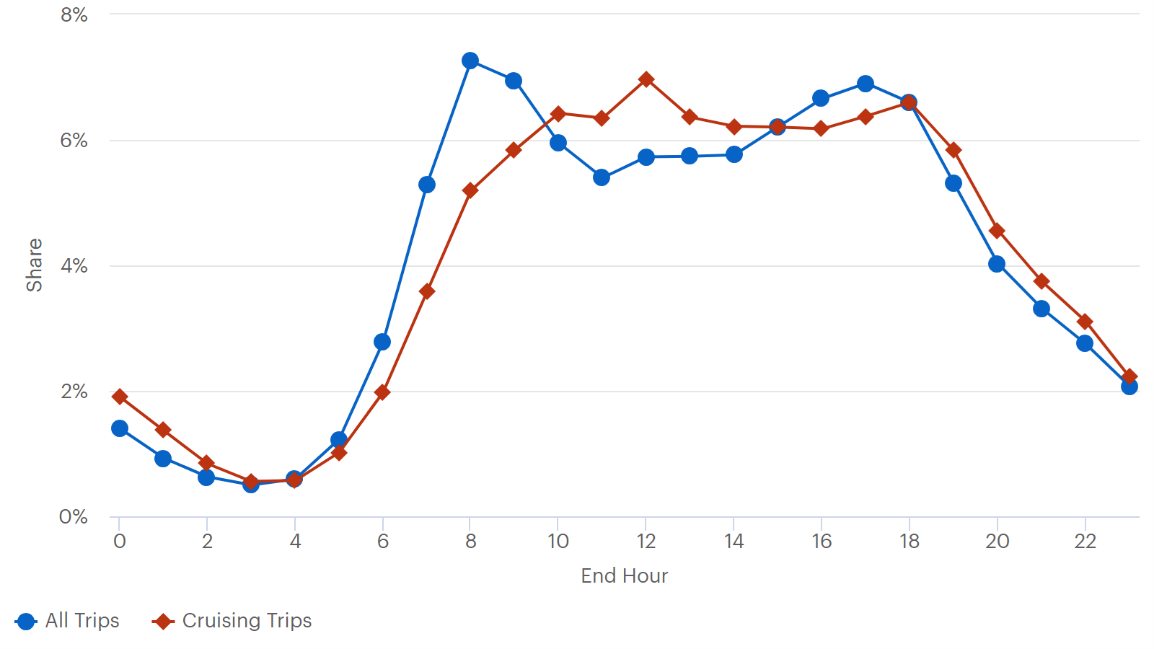
Source: FHWA. Figure 12. Graph. Diurnal distirbution of all trips and cruising trips.
This line graph plots all trips and cruising trips. The y-axis is labeled “Share” and ranges from 0 to 8 percent. The x-axis is labeled “end hour” and ranges from 0 to 24 hours. The all-trips line starts at 1.5 percent share at 0 hours and decreases to a minimum of .5 percent share at 3 hours. It then sharply rises, peaking at 7.5 percent around hour 8. The all-trips line then declines to 5.5 percent around hour 11 and levels out before gradually ascending to 7 percent at hour 17. It then sharply declines and ends at just over 2 percent share in hour 23. The cruising trips line starts at 2 percent share in hour 0 then drops, hitting a minimum of .5 percent between hours 3 and 4. It then sharply rises, peaking at 7 percent in hour 12. The all trips line slightly decreases to around 6.3 percent and remains flat until hour 16, when it peaks again at 6.6 percent. From there, it sharply drops and ends at 2 percent in hour 24.

Source: FHWA. Figure 13. Graph. Cruising frequency and overall trip making.
This line graph plots all trips and cruising frequency in Washington, DC. The left y-axis is labeled “cruising frequency” and ranges from 0 to 10 percent. The right y-axis is labeled “total trips” and ranges from 0 to 40,000, corresponding with the left y-axis. The x-axis is labeled “End Hour” and ranges from 0 to 24 hours. The all-trips line starts and just below 2 percent and slowly decreases before hitting a minimum of about .7 percent and about 3,000 total trips at 3 hours. It then sharply rises, peaking at 9 percent and about 38,000 total trips at 8 hours before declining to 7 percent and about 28,000 total trips at hour 11. The all-trips line then steadily climbs to a peak of about 8.8 percent and about 35,000 total trips at hour 17. It then sharply declines and ends at 2.5 percent and just over 24,000 trips at hour 24. The cruising frequency line starts at 8 percent and 32,000 total trips, peaks around 8.7 percent and about 34,000 total trips at hour 1 before sharply declining to 4 percent and 16,000 total trips at hour 7. It then climbs to 7 percent and about 30,000 total trips at hour 12 before slowly decreasing to 5.3 percent and about 22,000 total trips at hour 17. It increases slightly again up to 6.5 percent and about 26,000 total trips at hour 20, where it remains steady before dipping down slightly and ending at just above 6 percent and about 24,500 total trips at hour 24.
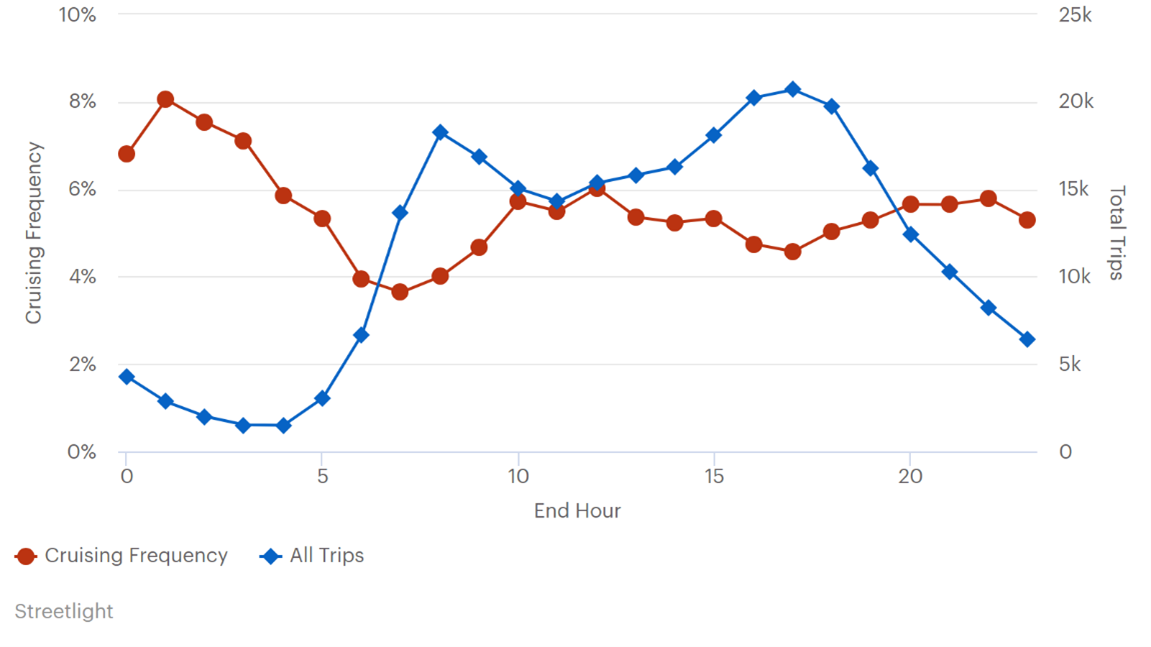
A close look at the Metrorail catchment areas shows a similar pattern. Trip making is highest in the morning peak period, when the proportion of cruising trips is low. As more trips have been completed and more parking spaces used, the relative difficulty of parking increases and cruising trips as a proportion of all trips begins to rise. As more trips are made in the traditional afternoon peak, parking eases—demand may drop at the same time that supply increases—and cruising as a proportion of all trips declines. Cruising as a percent of all trips is relatively stable in the Metrorail catchment area, climbing between 8 and 11 a.m. and remaining between 6 and 8 percent through the afternoon and evening. 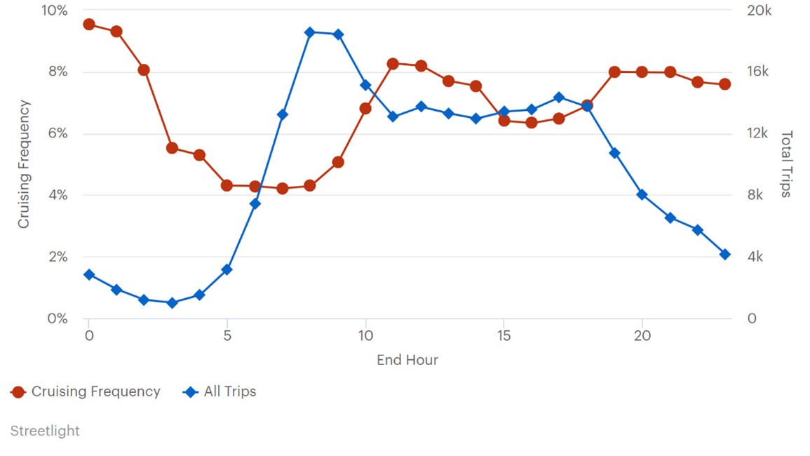
Source: FHWA. Figure 14. Graph. Cruising frequency and total trips, Metrorail catchment area.
This line graph plots all trips and cruising frequency by hours within 500 meters of Metrorail stations in Washington, DC. The left y-axis is labeled “cruising frequency” and ranges from 0 to 10 percent. The right y-axis is labeled “total trips” and ranges from 0 to 20,000. The x-axis is labeled “end hour” and ranges from 0 to 24 hours. The all-trips line starts at approximately 1.8 percent and about 3,000 total trips at hour 0 and slowly decreases to .5 percent and about 1,000 total trips at hour 3. It then sharply increases to 9 percent and about 19,000 total trips at hour 8, where it remains flat through hour 9 then sharply decreases to 6.5 percent and about 14,000 total trips at hour 11. It remains steady until hour 16, where it slightly increases to 7 percent and about 15,000 total trips at hour 17. It then declines steadily, ending at just over 2 percent and 4,000 total trips at hour 24. The cruising frequency line starts at 9.5 percent and about 19,500 total trips and sharply decreases to 5.5 percent and about 11,000 total trips at hour 3. It continues to decline to 4.2 percent and 8,000 total trips at hour 5 and remains steady until hour 8. It then sharply increases to 8.2 percent and about 16,500 total trips at hour 11 before decreasing to 6.5 percent and about 13,000 total trips at hour 15. It remains stable until hour 18, at which time the cruising frequency line slightly increases to 7 percent and about 13,500 total trips at hour 18 before sharply increasing to 8 percent and 16,000 total trips at hour 19. It remains steady before gradually decreasing slightly to 7.5 percent and about 15,000 total trips at hour 24.
Source: FHWA. Figure 15. Graph. Cruising frequency and total trips, outside Metrorail catchment.
This line graph plots cruising frequency and all trips over 24 hours. The left y-axis is labeled “cruising frequency” and ranges from 0 to 10 percent. The right y-axis is labeled “total trips” and ranges from 0 to 25,000. The x-axis is labeled “end hour” and ranges from 0 to 24 hours. The cruising frequency line starts at just below 7 percent and about 17,000 total trips and jumps to 8 percent and 20,000 total trips at hour 1. It then steadily declines to just under 4 percent and 9,500 total trips at hour 7. It climbs up steadily peaking at 6 percent and 15,000 total trips at hour 12. It declines slightly to 4.5 percent and 11,000 total trips at hour 17 then increases to 6 percent and 15,000 total trips at hour 23 and ending at just over 5 percent and about 14,000 total trips at hour 24. The all-trips line starts at just under 2 percent and 4,500 total trips and declines steadily to a nadir of .8 percent and about 1,000 total trips at hour 4. It then sharply increases, peaking at 7.5 percent and about 19,000 total trips at hour 8. It declines slightly again, decreasing to just under 6 percent and 14,500 total trips at hour 11. The all-trips line then steadily increases, peaking at 8.2 percent and about 21,000 total trips at hour 17 before declining to about 2.5 percent and about 6,000 total trips at hour 24.
Figure 16 shows what time of day cruising trips occur, superimposed with the frequency relative to all trip making. From the perspective of when cruising occurs in Washington, DC, the highest occurrence is during traditional business hours. Cruising trips are increasing as a proportion of total trips and in absolute numbers from 8 a.m. to about noon; thereafter, the hourly rate of cruising remains relatively steady until about 6 p.m., when it begins to drop off sharply. However, as a percent of all trip making, cruising trips decline from noon to about 5 p.m., at which time they increase again relative to all trip making. Most noteworthy is the late afternoon/early evening period when absolute cruising is near its highest but as a percentage of trips it is relatively low. 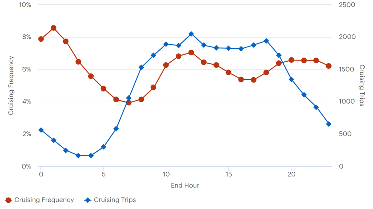
Source: FHWA. Figure 16. Graph. Diurnal distribution of cruising and cruising as percent of all trips.
This line graph plots cruising frequency and cruising trips in Washington DC. The left y-axis is labeled “cruising frequency” and ranges from 0 to 10 percent. The right y-axis is labeled “cruising trips” and ranges from 0 to 2,500. The x-axis is labeled “end hour” and ranges from 0 to 24 hours. The cruising frequency line begins at 8 percent and 2,000 total trips and increases slightly to 8.5 percent and about 2,100 total trips at hour 1 before decreasing to 4 percent and 1,000 trips at hour 7. It then steadily increases to 7 percent and about 1,750 total trips at hour 12 before gradually decreasing to 5 percent and about 1,400 trips at hour 17. The cruising frequency line increases to 6.5 percent at hour 20 and about 1,600 total trips and remains steady until hour 22, when it declines slightly, ending at just above 6 percent and 1,500 total trips at hour 24. The cruising trips line starts at just above 2 percent and about 600 total trips and declines steadily to less than 1 percent and about 100 trips at hour 4. It then rapidly increases, peaking at just over 8 percent and about 2,000 trips at hour 12. It declines slightly to 7.5 percent and about 1,900 total trips at hour 15 and remains steady before increasing back to just under 8 percent and 2,000 total trips at hour 18. From there, the cruising trips line sharply decreases, ending at 2.5 percent and about 600 total trips at hour 24.
The team hypothesized that cruising on stadium event days might be more intense than on other days, but the analysis does not support that finding. All Washington, DC, stadiums are relatively easily accessed by Metrorail, and additional impacts were not detected. SummaryOverall cruising rates in Washington, DC, tend to the national average at around 5.8 percent of trips. Both trip making and cruising are highly concentrated on the streets surrounding Metrorail stations. These streets comprise about 23 percent of street miles. However, 45 percent of trips end on streets in the Metrorail catchment and 51 percent of cruising trips end on streets in the Metrorail catchment areas. This disproportion puts the cruise rate for trips ending near Metrorail at 6.6 percent. Cruising impact is further concentrated in the area considered downtown Washington, DC. The diurnal distribution of cruising trips is similar to findings in other cities in that there is a trip-making lag. Cruising for parking as a proportion of trips is at its lowest during the morning commute hours and steadily builds from there, peaking at midday. Cruising as a percent of all trips hits a local minimum during the afternoon commuting peak, increasing into the evening. Finally, it appears from these data that cruising is not exacerbated by events held at the Washington, DC, stadiums, which are relatively well served by transit. Atlanta, Georgia: Longitudinal Analysis and Mixed-Use FocusIn this case study, the research team explored the geography of cruising across two different time periods. To the extent possible, the research team looked at the differences in single use versus mixed use areas. The data span from October 2019 to September 2020 and covered the areas of Atlanta located in Fulton County. There are two defined periods within this time frame:
The data are processed by a third-party data broker and results are reported at census block group level for much of the city in Figure 17). Street level outputs are available for the areas outlined and shown in green; these streets are characterized as mixed use. The data reported refer to the end locations of cruising trips. The area of detail (i.e., mixed use areas) includes downtown Atlanta and Buckhead. 
Source: FHWA. Figure 17. Map. Atlanta study area.
This map depicts the city of Atlanta as divided by block groups. It illustrates mixed use areas, which are defined by dotted lines flowing along block group borders. Eastern portions of the city are outside the study area.
Where Cruising OccursFigure 18 shows cruising frequency by census tract. Tracts that had fewer than 30 trips were excluded from the analysis The outline delineates the areas for which street-level output is available. These subareas are examined in greater detail later in this chapter. The baseline average weekday cruising rate in Atlanta is 4.9 percent of trips; the 75th percentile rate for block groups is 6.5 percent, suggesting very little variation. In mixed use neighborhoods, those for which the project team was able to analyze street-level data, baseline cruising averages 7.4 percent. 
Source: FHWA. Figure 18. Map. Baseline cruising Atlanta.
This map represents the Atlanta as defined by its city limits. It is divided into block groups, which are shaded to indicate cruising frequency on a range of 0 to 8 percent or greater. Dotted lines outline mixed-use areas. Downtown Atlanta contains the greatest frequency of cruising, with most block groups being in the 6 to 8 percent or greater range. Areas of similar congestion appear north of the downtown but south of Buckhead and to the southwest of the downtown proper.
Not all cruising is equal, and although the mean time spent looking for parking among cruising trips is under 2 minutes, it can vary. Figure 19 shows total cruising time for each block group by weighting the average cruising time by the number of cruising trips that occur. To account for the different sizes of block groups, the result is normalized by the street length within each block group. The darkest areas in figure 3 indicate the areas of Atlanta with the most severe cruising concern. 
Source: FHWA. Figure 19. Map. Cruising impact.
This map represents the Atlanta as defined by its city limits. It is divided into block groups, which are shaded to indicate cruising frequency on a scale of 0 to 8 percent or greater. Dotted lines outline mixed-use areas. The map illustrates the impact of cruising on a block group bases, using darker shading to indicate higher cruising impacts. The highest level of cruising impact is illustrated in the immediate areas of downtown, but areas north of the city and south of Buckhead also see higher impacts, as do several areas south and southwest of the downtown area.
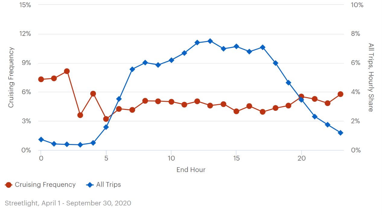
When Cruising OccursFigure 20 illustrates cruising over the course of an average weekday in Atlanta. As occurs in other cities, cruising tends to lag trip making—the first arrivers would easily find parking. Cruising disproportionately occurs starting around 6 a.m., earlier than is seen in other cities, but possibly due to the relative paucity of on-street parking. The proportion of cruising trips drops sharply along with all trips after 7 p.m. Cruising, as a proportion of all trips, is relatively stable, remaining between 4 and 6 percent of trips throughout the day. There is a small spike at around 1 a.m., as is documented in other cities, when trip making is at its lowest. This is illustrated in Figure 21. 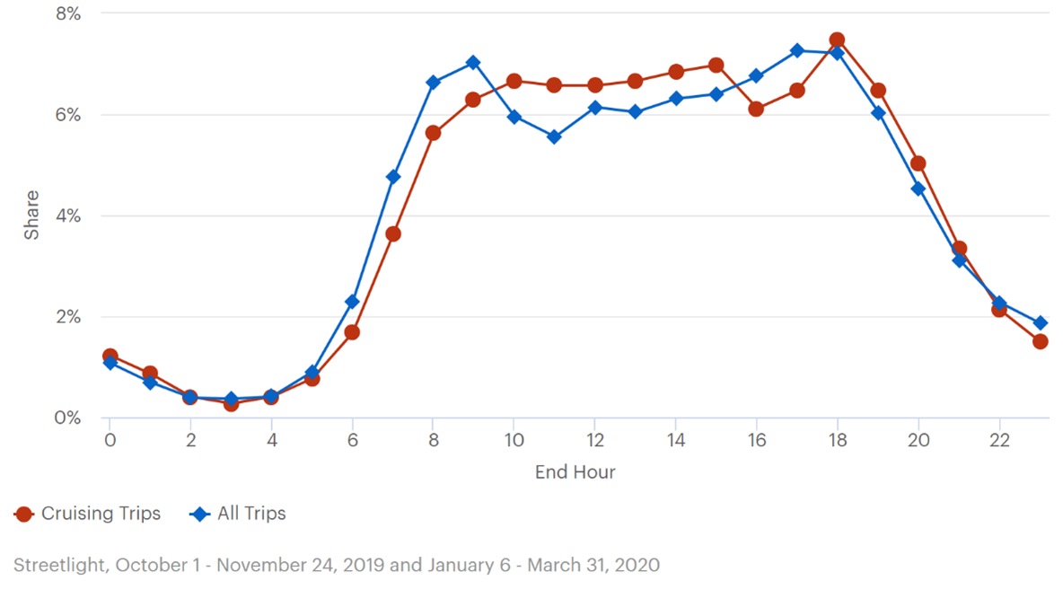
Source: FHWA. Figure 20. Graph. Diurnal distirbution of all trips and cruising trips.
This line graph plots cruising trips and all trips in Atlanta. The left y-axis is labeled “share” and ranges from 0 to 8 percent. The x-axis is labeled “end hour” and ranges from 0 to 24 hours. The cruising trips line starts at slightly more than 1 percent and dips down to .2 percent at hour 3. It then sharply increases, peaking at 6.5 percent at hour 10. It remains steady until hour 13 where it increases slightly to 7 percent at hour 15. It drops down to 6 percent at hour 16 and then rapidly increases to 7.5 percent at hour 18. It then steadily decreases, ending at 1.7 percent at hour 24. The all-trips line starts at 1 percent and gradually decreases, reaching a minimum of .5 percent at hour 4. It then sharply increases peaking at 7 percent at hour 9. It decreases sharply to 5.6 percent at hour 11 and steadily increases, peaking again at 7 percent at hour 17. It then steadily decreases ending at 2 percent at hour 24.

Source: FHWA. Figure 21. Graph. Cruising frequency and overall trip making.
This line graph plots cruising trips as a proportion of all trips in Atlanta. The left y-axis is labeled “cruising frequency” and ranges from 0 to 15 percent. The right y-axis is labeled “all trips, hourly share” and ranges from 0 to 10 percent. The x-axis is labeled “end hour” and ranges from 0 to 24 hours. The cruising frequency line starts at just under 6 percent and climbs slightly to 6 percent (4 percent hourly share of all trips) at hour 1 before decreasing rapidly to just over 3 percent (2.5 percent hourly share of all trips) at hour 3. It increases to 5 percent (3.5 percent hourly share of all trips) at hour 4 before decreasing to 4 percent at hour 6, where the line remains relatively steady until hour 8. At hour 8, the line begins to increase to just under 6 percent (4 percent hourly share of all trips) at hour 11. The cruising frequency line declines slightly to 5 percent (3.5 percent hourly share of all trips) at hour 12, remaining steady until hour 15. At hour 16 the line dips to 4.5 percent before gradually increasing back up to 5 percent at hour 18, where it remains relatively flat until hour 21. It then decreases gradually and ends at 4 percent at hour 24. The all-trips line starts at 2 percent (about 1 percent hourly share of all trips) and decreases to less than 1 percent at hour 2 where it remains stable until hour 4. At hour 5 it increases sharply, peaking at 11 percent (about 7 percent hourly share of all trips) at hour 9. It decreases to just under 9 percent (just under 6 percent hourly share of all trips) at hour 11 and increases slightly to 9 percent at hour 13. It then gradually increases, peaking at 11 percent again at hour 17 and 18 before steadily declining, ending at 3 percent (2 percent hourly share of all trips) at hour 24.
Downtown and BuckheadThe analysis in this section is of street-level data; it provides a close up of what is happening in downtown Atlanta and Buckhead. The streets were selected for the characteristic of having mixed land use. Figure 22 exploits the block-specific trip end data to show, for the smaller area, where trips end. The highest trip density is heavily concentrated in the center of downtown. Figure 23 shows the frequency of cruising. Almost no cruising occurs where the most trips end; instead, there are small pockets of high-intensity cruising scattered throughout downtown with some of the most intense cruising hot spots located in Buckhead. The baseline average weekday rate of cruising in the sub area is 7.4 percent. The average time spent looking for parking is about 2 minutes. 
Source: FHWA. Figure 22. Map. Atlanta area of detail trip ends.
This map depicts the city of Atlanta within its city limits. It illustrates the density of trip ends. Inside the city, dotted lines illustrate mixed use zones, which contain variations in shading to represent low to high trip end density. The highest concentration of trip end density is located in the downtown area. Some areas of the map within a 2-mile radius of the downtown area indicate medium trip end density, although several areas show low trip end density.

Source: FHWA. Figure 23. Map. Atlanta area of detail cruising trip ends.
This map represents the Atlanta as defined by its city limits. It is divided into block groups, which are shaded to indicate cruising frequency on a scale of 0 to 8 percent or greater. Dotted lines outline mixed-use areas. The map illustrates the impact of cruising on a block group bases, using darker shading to indicate higher cruising impacts. Both downtown and Buckhead are labeled on the map. There are three areas of high cruising frequency on the map, one slightly to the north of Buckhead, and two in between downtown and Buckhead.
Downtown Atlanta cruising follows a similar pattern to citywide cruising, showing a slight lag in the morning. Both trips and cruising trips peak in the morning, slowly decline at midday, and reach a muted peak in the afternoon (Figure 24). The data are presented using a rolling average to allow an easier visualization in an otherwise more erratic presentation that would have been due to the smaller data set. 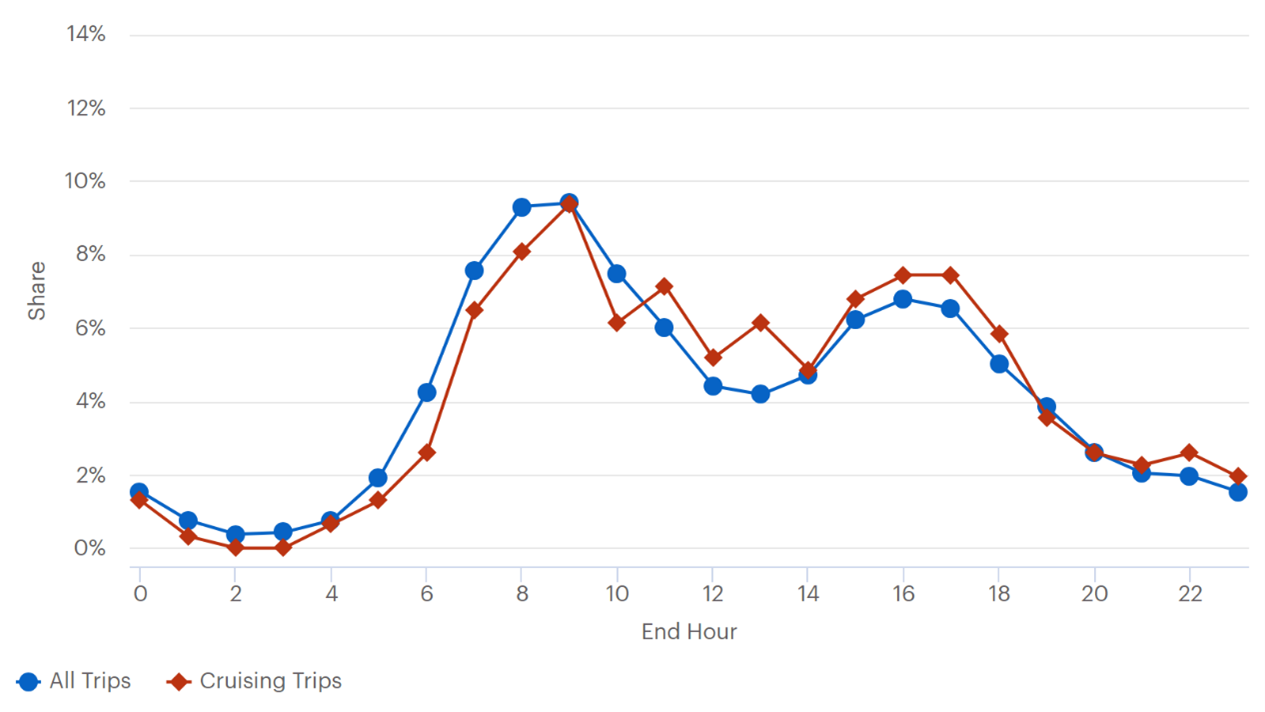
Source: FHWA. Figure 24. Graph. Diurnal distribution of trips.
This line graph plots all trips and cruising trips through an average day in Atlanta. The left y-axis is labeled “share” and ranges from 0 to 14 percent. The x-axis is labeled “end hour” and ranges from 0 to 24 hours. The all-trips line starts at just under 2 percent and declines steadily to just under 1 percent at hour 3. It then sharply increases to 9.5 percent at hour 9. It decreases steadily hitting a minimum at just over 4 percent at hour 13. It sharply increases to 7 percent at hour 16 before steadily decreasing to just under 2 percent at hour 24. The cruising trips line starts at 1.5 percent and decreases to 0 percent at hour 2 and stays there until hour 3. It then sharply rises to 9.5 percent at hour 9 before dropping down to 5 percent at hour 14. It rises sharply to 7.5 percent at hour 17 and steadily drops, ending at 2 percent at hour 24.
Figure 25 shows the diurnal distribution of trips, with a line showing the proportion of trips that are cruising throughout the day. The cruising rate in downtown Atlanta and Buckhead is relatively flat, ranging from around 6 to almost 9 percent of trips. This is shown in Figure 25. 
Source: FHWA. Figure 25. Graph. Proportion of trips cruising.
This line graph plots cruising frequency and all trips in Atlanta. The left y-axis is labeled “cruising frequency, rolling average” and ranges from 0 to 15 percent. The right y-axis is labeled “all trips hourly share, rolling average” and ranges from 0 to 10 percent. The x-axis is labeled “end hour” and ranges from 0 to 24 hours. The cruising frequency line begins at 8 percent average cruising frequency (5.5 percent average hourly share of all trips) and sharply decreases to just above 6 percent average cruising frequency (4 percent average hourly share of all trips) at hour 2. It then steadily rises to 7.5 percent average cruising frequency at hours 4 and 5. It drops to just below 6 percent average cruising frequency at hour 6 before gradually raising to 8 percent average cruising frequency (5.5 percent average hourly share of all trips) at hour 11. It gradually decreases to 7 percent average cruising frequency at hour 14, spikes to 7.5 percent at hour 15, then decreases back to 7 percent at hours 16 and 17. The cruising frequency line steadily rises to just under 9 percent (5.5 percent average hourly share of all trips) at hour 20 then slowly decreases to 7.5 percent at hour 22 before finishing at 8 percent at hour 24. The all-trips line begins at 2 percent average cruising frequency (about 1.8 percent average hourly share of all trips) and gradually decreases to .5 percent at hour 3. It sharply rises to 11 percent average cruising frequency (about 7 percent average hourly share of all trips) at hour 9 and decreases to 8 percent average cruising frequency (about 5.5 percent average hourly share of all trips) at hour 12. The all-trips line steadily increases to 11 percent average cruising frequency (about 7 percent average hourly share of all trips) at hour 17 before sharply dropping, ending at 3 percent average cruising frequency (2 percent average hourly share of all trips) at hour 24. All percentages refer to the left y-axis.
Comparison Case: April 1–September 30, 2020After mid-March 2020, many U.S. cities instructed their residents that only trips defined as essential travel should be taken. Trip making was highly curtailed. The next section compares travel during this period with the baseline described above. As illustrated in figures 26, 27, 28, and 29 during the comparison period, different patterns for trip destinations and cruising emerged. Even with patterns shifting, cruising remained relatively stable, at 4.7 percent, citywide (compared to 4.9 percent) and 7.9 percent in the area of detail (an apparent, but statistically insignificant, increase from the baseline 7.4 percent) in the mixed use areas of downtown and Buckhead. Figure 26 corresponds to the baseline representation of Figure 18 to show cruising by census tract in the April–September period. Figure 27 corresponds to Figure 19 illustrating cruising impact (i.e., cruising trips weighted by the amount of time spent cruising and normalized by street length for block groups). Compared to the baseline maps, there are some visible shifts. The primary differences appear in the downtown area and in Buckhead. After a presentation of citywide trip-making and cruising summaries, a closer look is taken in these areas using the street-level data. 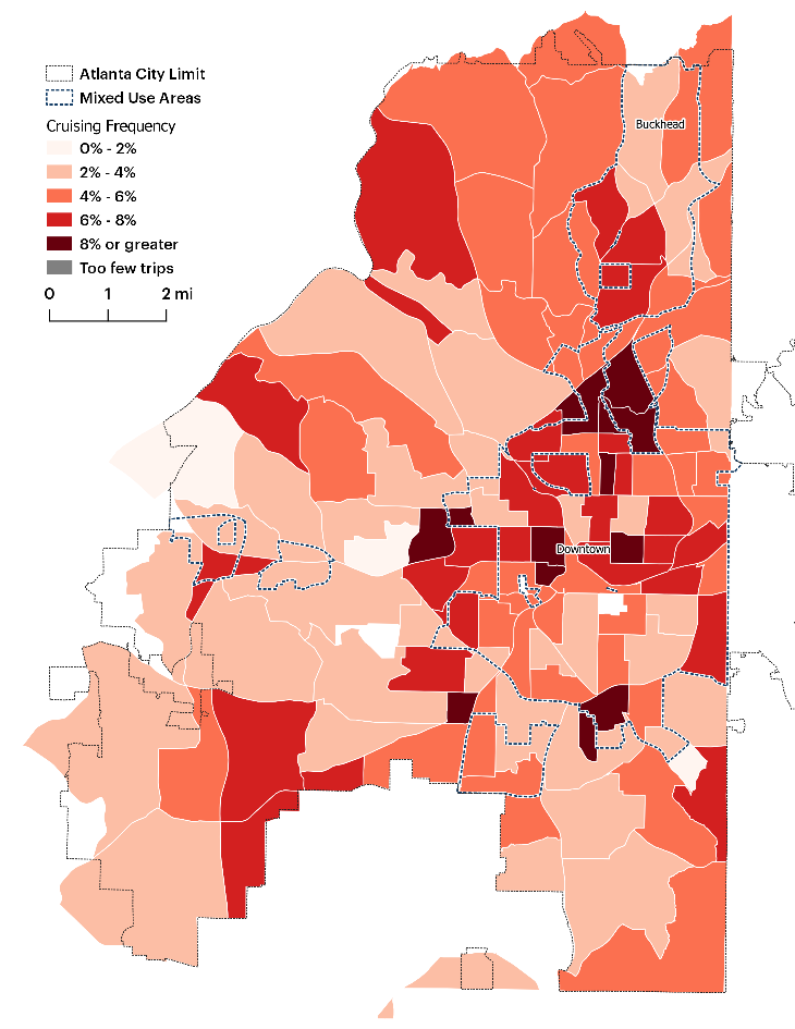
Source: FHWA. Figure 26. Map. Cruising trip ends, April–September, 2020.
This map of the Atlanta city limits is divided into block groups. Mixed-use areas are illustrated using a dotted line. Downtown and Buckhead are labeled on the map. The block groups are shaded to illustrate cruising frequency. The highest areas of cruising frequency are located to the north of Downtown with small sections of high frequency to the west and east of Downtown.

Source: FHWA. Figure 27. Map. Cruising impact, April–September, 2020.
This map of Atlanta is divided into block groups. Downtown and Buckhead are labeled on the map. Mixed use areas are illustrated with dotted lines. Block groups are shaded to show the impact cruising has on a low to high scale. The areas with the highest impact are within 2 miles of downtown, to the south and southwest of downtown, and scattered between downtown and Buckhead.
In the period of initial restricted travel, the diurnal distributions of trips and cruising trips line up quite closely. This is shown in Figure 28. Unlike the historical pattern of a morning and an afternoon travel peak, the Atlanta data show trip making increases sharply in the morning from 5 or 6 to around 8 a.m. Thereafter, trip making remains relatively steady, displaying a somewhat flat distribution until around 6 p.m., when the share of trips made declines quite steadily. Figure 33 superimposes cruising trip rates with time of trip making. Except from midnight to approximately 4 a.m., where the proportion of trips cruising is relatively high, the proportion remains relatively stable throughout the day, staying consistently between 3 and 6 percent of trips. 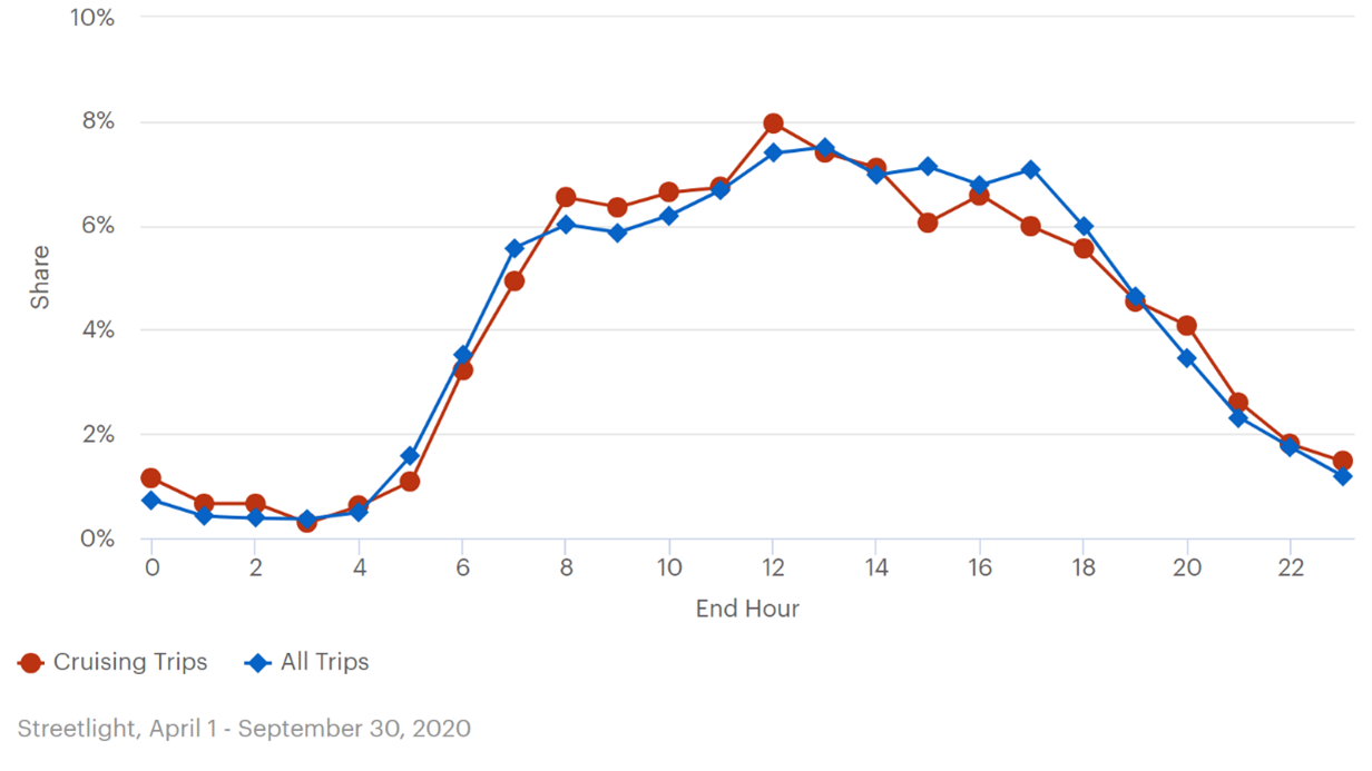
Source: FHWA. Figure 28. Graph. Diurnal distribution of trips and cruising trips, April–September, 2020.
This line graph plots cruising trips and all trips. The y-axis is labeled “share” and ranges from 0 to 10 percent. The x-axis is labeled “end hour” and ranges from 0 to 24 hours. The cruising trip line begins at just over 1 percent and declines gradually to .2 percent at hour 3. It gradually rises to 1 percent at hour 5 and sharply rises to 6.5 percent at hour 8. It remains steady at 6.5 percent until hour 11 and spikes to 8 percent at hour 12. It then decreases to 6 percent at hour 15 before slightly raising to 6.8 percent at hour 17. It then steadily declines to 1.5 percent at hour 24. The all-trips line starts at just under 1 percent and decreases to .5 percent at hour 1 and remains steady until hour 4. It then sharply rises to 6.5 percent at hour 8, remaining steady until hour 11, then peaking at 8 percent at hour 12. It steadily declines to 6 percent at hour 15 then raise slightly to 6.5 percent at hour 17. It steadily declines and ends at just under 2 percent at hour 24.
Source: FHWA. Figure 29. Graph. Diurnal distribution of trips and rate of cruising, April–September, 2020.
This line graph plots cruising frequency and all trips. The left y-axis is labeled “cruising frequency” and ranges from 0 to 15 percent. The right Y axis is labeled “all trips, hourly share” and ranges from 0 to 10 percent. The x-axis is labeled “end hour” and ranges from 0 to 24 hours. The cruising frequency line starts at 7.5 percent (5 percent hourly share of all trips) and gradually rises up to 8.5 percent at hour 2. It then sharply decreases to 3.5 percent (2.5 percent hourly share of all trips) at hour 3 and jumps back up to 6 percent (4 percent hourly share of all trips) at hour 4. It decreases to just over 3 percent (2 percent hourly share of all trips) at hour 5, and gradually increases to 5 percent (3 percent hourly share of all trips) at hour 8. The cruising frequency trendline remains relatively steady between 4 and 5 percent (about 3 percent hourly share of all trips) through hour 17, when it begins to increase just under 6 percent at hour 20, drops slightly to 5 percent at hour 24, and finishes at 6 percent (4 percent hourly share of all trips) at hour 24. The all-trips line starts at slightly under 1 percent and decreases to .5 percent an hour 2 (around 1 percent hourly share of all trips), where it remains until hour 4. It then sharply rises to 9 percent (6 percent hourly share of all trips) at hour 7, and continues to gradually rise, peaking at 11.5 percent (just under 8 percent hourly share of all trips) at hour 13. It remains generally steady through hour 17, when it begins to steadily decline to 2 percent (1 percent hourly share of all trips) at hour 24.
Relative to the baseline, the trips in the comparison period are far more evenly dispersed across the area of detail (Figure 30). The intense destination indicated in the center of downtown in the baseline map (Figure 22) no longer exists. Looking at Figure 31, which illustrates cruising hot spots, it appears that problematic locations for cruising in the baseline have also redistributed to the periphery of the downtown area. 
Source: FHWA. Figure 30. Map. Trip ends area of detail, April–September, 2020.
This map represents the Atlanta as defined by its city limits. It is divided into block groups, which are shaded to indicate cruising frequency on a scale of 0 to 8 percent or greater. Mixed use areas are illustrated with dotted line borders. This map illustrates trip end density within mixed use areas. Density is low to medium in all the shaded areas on the map.

Source: FHWA. Figure 31. Map. Cruising area of detail.
This map depicts the city of Atlanta within its city limits. It is divided into block groups, and a dotted line defines mixed-use areas. Most mixed-use areas are shaded to indicate trip end density. Density is greatest in the western downtown area as well as to the southwest of the downtown area. Areas of high cruising frequency are also depicted in the area north of downtown but south of Buckhead.
The final section in this use case looks at the diurnal distribution of trips and cruising trips, and the rate of cruising on the mixed use streets in Atlanta. When focusing on the mixed use streets, it appears that trip making follows the citywide pattern, in that traditional peaks are blunted with one peak period lasting from around 6 a.m. to around 6 p.m. The existence of this peak does not imply congested streets for the period—as peak often implies—rather, that trips are concentrated in this time block with no apparent other peaking feature. Cruising trips are tracking exactly with all trips until about 8 a.m., after which they are more highly concentrated. At about 1 p.m. the daily share of cruising trips begins to fall below the rate of all trips, though both are declining. Figure 32 shows a pattern of greater variation in the cruising rate, compared to the same geography in the baseline and compared to the citywide averages. Figure 33 shows the diurnal distribution of trips with cruise rate superimposed. 
Source: FHWA. Figure 32. Graph. Diurnal distribution of trips and cruising trips, April–September, 2020.
This line graph plots cruising trips and all trips. The y-axis is labeled “share” and ranges from 0 to 10 percent. The x-axis is labeled “end hour” and ranges from 0 to 24 hours. The cruising trip line starts at just above 1 percent, and gradually decreases to .5 percent at hour 3. It then steadily rises, reaching 7.5 percent at hour 9. It dips down to just below 7 percent at hour 10 then raise to 8 percent at hour 11. It gradually declines to 7 percent at hour 13, Then sharply drops to just above 6 percent at hour 14. It remains at just above 6 percent until hour 16, where it steadily drops to just below 4 percent at hour 18. It then gradually declines to 2 percent at hour 24. The all-trips line starts at just below 1 percent and decreases to .5 percent at hour 3. It then rises slightly to 1 percent at hour 4, before sharply raising to just above 6 percent at hour 8. It gradually increases to 6.5 percent at hour 11, then rises to 7 percent at hour 12. It remains steady at 7 percent until hour 16, when it steadily declines, ending at 1.5 percent at hour 24.

Source: FHWA. Figure 33. Graph. Diurnal distribution of trips with cruise rate superimposed, April–September, 2020.
This line graph plots cruising frequency and all trips. The left y-axis is labeled “cruising frequency, rolling average”, and ranges from 0 to 15 percent. The right y-axis is labeled “all trips hourly share, rolling average”, and ranges from 0 to 7.5 percent. The x-axis is labeled “end hour” and ranges from 0 to 24 hours. The cruising frequency line starts at just under 12 percent average cruising frequency (6 percent average hourly share for all trips) at hour 0, it then sharply declines to 8 percent (about 4 percent average hourly share for all trips) an hour 3. It then jumps up to 10 percent average cruising frequency at hour 5, and remains in the 9 percent range (about 4.5 percent average hourly share for all trips) before steadily declining to just under 6 percent at hour 18 (3 percent average hourly share for all trips). It then steadily rises ending at 12 percent average cruising frequency (6 percent average hourly share for all trips) at hour 24. The all-trips line starts at 1.5 percent average cruising frequency and gradually decreases to just under 1 percent average cruising frequency at hour 3. It then sharply rises to 13 percent average cruising frequency at hour 8 and remains in the 13 to 14 percent average cruising frequency (about 7 percent average hourly share for all trips) from hour 9 through hour 16 before steadily declining and ending at just under 1.5 percent (1.5 percent average hourly share for all trips) at hour 24.
SummaryThis section described trip making and cruising in Atlanta, focusing on mixed use areas and a comparison between the October 2019–March 2020 and April–September 2020 time periods. There is no particular policy intervention that had been implemented in the time frame. The study team looked instead at areas characterized as mixed use, relative to the rest of the city, and two distinct time periods marked by a change in direction with respect to essential travel. Top line findings indicate:
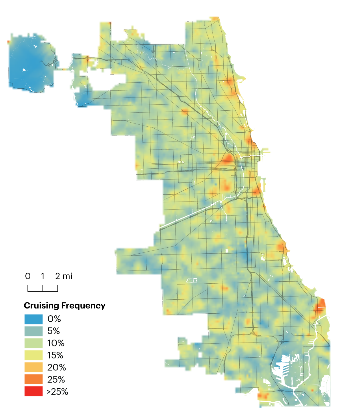
Chicago, Illinois: Year Over Year and Time of DayFor the Chicago use case, raw location data were purchased for June 2019, 2020, and 2021. From the location data, trips were inferred and analyzed as described earlier in this report. Differences are expected from the pre-COVID to the early COVID periods and additional differences to late COVID. Unfortunately, the data for June 2021—the late COVID period—were of insufficient quality to include in the final analysis. This provides an important caution for users of the tool. The deficiency was not important for illustration of a use case, but cautionary where the analysis is centered on the geography, in this case Chicago. Additional data should be acquired to perform the additional desired or required analysis. The analysis proceeds here with a focus on the 2 years for which data are of sufficient quality. Where Cruising OccursWith the full data set of mapmatched and cruising-identified traces, high cruising areas can be identified. Figure 34 and Figure 35 show the cruising rate for each street segment for the 2 months of data. In other words, the figures show for each trip that traveled along a street segment, what percentage of those were cruising trips. Overall, many of the same areas stand out, such as the West Loop, Pilsen, Lakeview, Hyde Park, and the area around the convention center. A couple high cruising areas located on the periphery of the city, such as the hot spots in South Chicago and Riverdale neighborhoods, appear to be noise due to a low quantity of trips in the data set. 
Source: FHWA. Figure 34. Map. Cruising 2019.
This map depicts the city of Chicago and is overlaid with block groups. The map illustrates cruising frequency in 2019 and shows that location blocks within 2 to 4 miles of the central downtown area have the highest cruising frequency, in the 15 to 25 percent range, with many mid-range (15 percent) areas clustered along the lake on the city’s eastern edge. Many areas in the 10 to 15 percent frequency range are scattered through the city also.
Source: FHWA. Figure 35. Map. Cruising 2020.
This map depicts the city of Chicago and is overlaid with block groups. The map illustrates cruising frequency in 2020 and shows that location blocks within 2 to 4 miles of the central downtown area have the highest cruising frequency, in the 15 to 25 percent range, with many mid-range (15 percent) areas clustered along the eastern edge of the city limits (along the lake). Additional hotspots appear at the southern edge of the city limits and south and north of the downtown area along the lake on the city’s eastern edge. Many areas in the 10 to 15 percent frequency range are scattered through the city also.
The year-over-year comparison is complicated by the fact that the distribution of trips across the 2 years suggests a different geographic market penetration of the applications from which data are collected as well as differences in trip patterns. There are about 40 percent more trips in the 2020 data set (115,000 in June 2019 and 165,000 in June 2020). As Figure 36 shows, the location of trip ends is quite different. In June 2019, trips were heavily concentrated downtown, the Near North Side, and Northwest Side; all are predominantly white and affluent areas. While the pandemic may explain fewer trips into downtown or to points of interest in some North and Northwest Side neighborhoods, it would not explain why so many more trips are occurring in other neighborhoods. It is likely, therefore, that the year-over-year differences between June 2019 and June 2020 are likely biased by the mix of unknown apps present in the data. The broader distribution of trips in 2020 suggests a more distributed data collection base. 
Source: FHWA. Figure 36. Map. Comparison of trip ends 2019 and 2020.
This figure is made of two mesoscopic maps of Chicago with overlays of blocks and major roadways. The map on the left illustrates trip end locations in 2019. The map on the right illustrates trip ends in 2020. The concentration of trip ends is clustered around the downtown area, and the 2020 map indicates a clear reduction in the number of trip ends compared with 2019.
With the caveat noted, Figure 37 shows the neighborhood changes in frequency from 2019 to 2020. 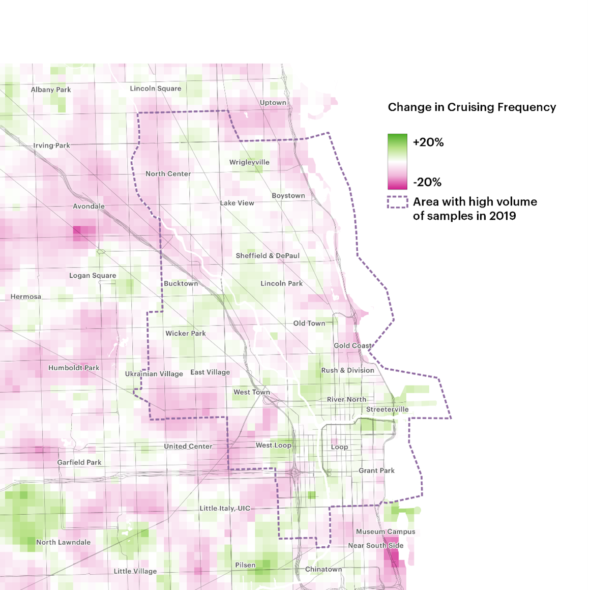
Source: FHWA. Figure 37. Map. Change in cruising frequency.
This map is a mesoscopic view of a section of Chicago spanning from Uptown in the north to Chinatown in the south and from Ukrainian Village in the west to Streeterville in the east. Several additional neighborhoods are labeled on the map. The map is overlayed with blocks and major roadways. A dotted line illustrates the borders of an area with a high volume of samples in 2019. Within the area surrounded by the dotted line, changes in cruising frequency range from plus 20 to minus 20 percent, with much of the downtown area in the plus 20 percent range, while several of the northern neighborhoods show a 20 percent drop.
When Cruising OccursCitywide, cruising remains between approximately 6.5 and 7.5 percent for most of the day. For trips ending on metered streets, which was 67 percent of trips in 2019 and 60 percent in 2020, the rate is between 8 and 9 percent between 10 a.m. and 8 p.m., with a dip to 7 percent at 1 p.m. For trips ending on non-metered streets, after a peak of 7.5 percent cruising between 8 and 9 a.m., cruising stays between 5 and 6 percent for most of the day. The volatility observed in the early morning hours is likely due to the low number of samples during those times. The higher variance noted in Figure 38, Figure 39, and Figure 40 supports that hypothesis; that figure set illustrates cruising frequency and overall trip making citywide, on metered streets and on non-metered streets, respectively. 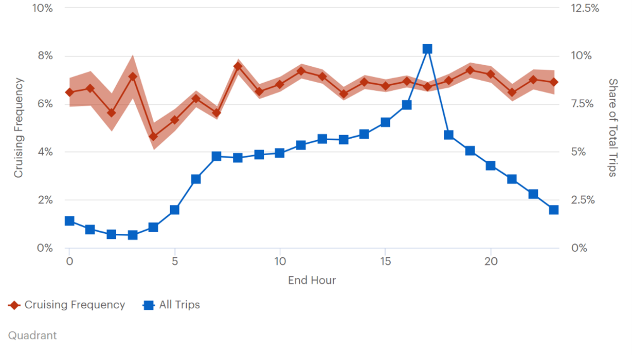
Source: FHWA. Figure 38. Graph. Diurnal distribution of trips and cruising trips.
This line graph plots cruising frequency and all trips. The left y-axis is labeled “cruising frequency”, and ranges from 0 to 10 percent. The right y-axis is labeled “share of total trips” and ranges from 0 to 12.5 percent. the x-axis is labeled “end hour” and ranges from 0 to 24 hours. The cruising frequency line has shading both above and below illustrating higher variance levels. The cruising frequency line starts at 6.5 percent (about 8 percent share of total trips) at hour 0. It rises slightly to 7 percent (about 9 percent share of total trips) at hour 1 and drops to 5.6 percent (about 6 percent share of total trips) at hour 2. It then rises to just above 7 percent at hour 3 and dips down to 4.5 percent (about 6 percent share of total trips) at hour 4. It steadily climbs to just above 6 percent at hour 6 then drops to just below 6 percent at hour 7 before rising to 7.7 percent (about 9.5 percent share of total trips) at hour 8. It then drops to 6.5 percent at hour 9 gradually increases to 7.5 percent at hour. Between hours 10 and 20, the trendline fluctuates in the 6.5 to 7.5 percent range (8 to 9 percent share of total trips) with a minor dip to about 6 percent (8 percent share of total trips) at hour 21 before ending at 7.5 percent (8.5 percent share of total trips)at hour 24. The all trips line starts at 1 percent and gradually decreases to .5 percent at hour 3. It then steadily rises to just under 4 percent at hour 7 and gradually increases to just over 5 percent at hour 15. It Spikes up to just above 8 percent at hour 17, and sharply decreases to 4.5 percent at hour 18. It steadily decreases to just under 2.5 percent at hour 24. All percentages are in correlation to the left y-axis.
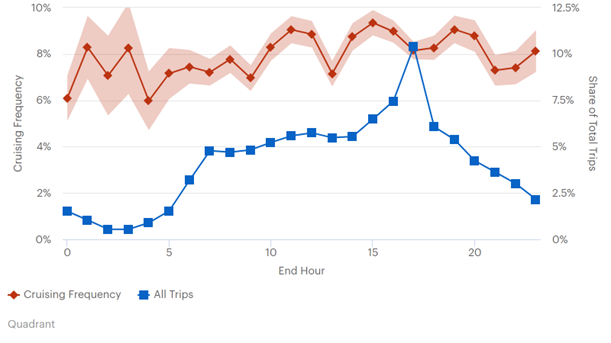
Source: FHWA. Figure 39. Graph. Diurnal distribution of trips and cruising trips ending on metered streets.
This line graph plots cruising frequency and all trips. The left y-axis is labeled “cruising frequency” and ranges from 0 to 10 percent. The right y-axis is labeled “Share of Total Trips” and ranges from 0 to 12.5 percent. The x-axis is labeled “end hour” and ranges from 0 to 24 hours. The cruising frequency line is shaded above and below to illustrate higher variance levels. The cruising frequency line starts at 6 percent at hour 0 and jumps up to just above 8 percent at hour 1. It then drops to 7 percent at hour 2 and jumps back up to just above 8 percent at hour 3. It then drops to 6 percent at hour 4 and steadily increases to just below 8 percent at hour 8. It then drops to 7 percent at hour 9 steadily rises to 9 percent at hour 11. It sharply decreases to 7 percent at hour 13, and sharply rises to 9 percent at hour 15. It steadily declines to 8 percent at hour 17 then steadily rises to 9 percent at hour 19. It then steadily drops to 7.5 percent at hour 21 and rises to just above 10 percent at hour 24. The all-trips line starts at just above 1 percent (2 percent share of total trips) at hour 0 and steadily falls to .5 percent at hour 3 before climbing to just under 4 percent (5 percent share of total trips) at hour 7. The trendline gradually increases from 4 percent to 6 percent (5 to 7.5 percent share of total trips) between hours 6 and 16, at which point it jumps sharply from 6 percent to more than 8 percent (10.5 percent share of total trips) at hour 17 before dropping to just under 5 percent (about 6 percent share of total trips) at hour 18. It continues to deline steadily and ends at just under 2 percent (2.5 percent share of total trips) at hour 24.

Source: FHWA. Figure 40. Graph. Diurnal distribution of trips and cruising trips ending on unmetered streets.
This line graph plots cruise frequency and all trips. The left y-axis is labeled “cruising frequency” and ranges from 0 to 10 percent. The right y-axis is labeled “share of total trips” and ranges from 0 to 12.5 percent. percent. The x-axis is labeled “end hour” and ranges from 0 to 24 hours. The cruising frequency line is shaded above and below to illustrate higher variance levels. The cruising frequency line starts at 6.5 percent (about 8 percent share of total trips) at hour 0 and drops to 5 percent (about 7 percent share of total trips) at hour 2 before rising to 7 percent (about 9 percent share of total trips) at hour 3 and dropping sharply to just above 4 percent (about 5.5 percent share of total trips) at hour 4. It sharply rises to just below 6 percent at hour 6 before dipping to 5 percent at hour 7. It spikes to 7.5 percent (about 9.9 percent share of total trips) at hour 8, then decreases to slightly 6.5 percent at hour 9. It remains between 6 percent and 7 percent (about 7.5 and 8.5 percent share of total trips) until hour 21, when it jumps to slightly above 7 percent at hour 22 before ending at 6.5 percent (just over 7.5 percent share of total trips) at hour 24. The all-trips line starts at 1 percent (about 2 percent share of total trips) at hour 0 and gradually decreases to .5 percent at hour 3. It rises to just below 4 percent (5 percent share of total trips) at hour 7 and remains flat until hour 10, when it gradually increases from just over 4 percent at hour 11 to 6 percent (7.5 percent share of total trips) at hour 16. The all trips trendline sharply rises to just above 8 percent (about 10 percent share of total trips) at hour 17. It then sharply drops to 4.5 percent at hour 18. From there, it steadily decreases to 1.5 percent (about 2 percent share of total trips) at hour 24.
Just as with the geographic distribution of trips, the differences in the diurnal distribution of trips between June 2019 and June 2020 may be genuine or may be caused by differences in the underlying data sources. In June 2019, the data show a sharp peak in overall weekday trips at 5 p.m., while in June 2020, the peak is more spread out, from 2 to 5 p.m. (Figure 41). 
Source: FHWA. Figure 41. Graph. Diurnal distribution of weekday trips.
This line graph plots weekday trip data in June 2019 and June 2020. The y-axis is labeled “share of weekday trips” and ranges from 0 to 0.08. The x-axis is labeled “end hour” and ranges from 0 to 24 hours. The June 2019 line starts at just above 0 at hour 0 and remains flat until hour 3. It steadily increases to 0.02 at hour 7 and gradually decreases to just below 0.02 at hour 10. It steadily increases to 0.03 at hour 15 and sharply increases to just above 0.04 at hour 17. It then rapidly decreases to 0.025 at hour 18 and steadily decreases to 0.01 at hour 24. The June 2020 line starts at just above 0 at hour 0 and remains flat until hour 3. It then steadily rises to 0.03 at hour 9 and dips to 0.025 at hour 10. It steadily rises to 0.035 at hour 13 and sharply rises to 0.07 at hour 17. It rapidly decreases to 0.025 at hour 18 and gradually decreases to 0.005 at hour 24.
Cruising frequency remains relatively constant throughout the day in both June 2019 and June 2020, though it is slightly higher in June 2020 (Figure 42). Despite a lower frequency of cruising trips in June 2019, however, as shown in Figure 43, the mean cruising time is consistently higher in June 2019 than in June 2020. This finding suggests that, as trips are more distributed, cruising locations are more distributed and have less intensity. 
Source: FHWA. Figure 42. Graph. Cruising frequency by time of day 2019 and 2020.
"This line graph plots cruising frequency by time of day in June of 2019 and June of 2020. The y-axis is labeled “cruising frequency” and ranges from 0 to 0.1. The x-axis is labeled “end hour” and ranges from 0 to 24 hours. The June 2019 line starts at 0.065 at hour 0 and rises to 0.07 at hour one. It then decreases to 0.05 at hour 2 and decreases to a minimum 0.047 at hour 4. It steadily increases to 0.08 at hour 8 and decreases to 0.065 at hour 9. It remains between 0.06 and 0.07 and ends 0.065 at hour 24. The June 2022 starts at just above 0.08 at hour 0, then sharply declines to 0.04 at hour 3 and steadily rises to just above 0.08 at hour 10. It decreases to 0.07 at hour 12 and gradually increases to just above 0.08 at hour 14. It remains between 0.08 and 0.09 until hour 22 and sharply declines to just below 0.07 at hour 24.

Source: FHWA. Figure 43. Graph. Mean cruising time 2019 and 2020.
This line graph plots mean cruising time data in June 2019 and June 2020. The y-axis is labeled “seconds” and ranges from 50 to 300. The x-axis is labeled “end hour” and ranges from 6 to 24 hours. The June 2019 line starts at 140 seconds at hour 6 and rises to 190 seconds at hour 7. It decreases to about 150 seconds at hour 8 and increases to around 190 seconds at hour 9. It decreases to 160 seconds at hour 10 and remains stable until hour 13. It gradually decreases to just below 150 seconds at hour 16 and spikes to 185 seconds at hour 17. It sharply drops to 120 seconds at hour 18 and climbs to just over 200 seconds at hour 21. It sharply drops to 160 seconds at hour 22 and sharply rises to end at 270 seconds at hour 24. The June 2020 line starts at just under 100 seconds at hour 6 and gradually rises to 125 seconds at hour 10. It gradually decreases to 90 seconds at hour 15 then rises to 125 seconds at hour 20. It gradually decreases to 75 seconds at hour 24.
Do Cruising Patterns Change throughout the Day?To mitigate concerns about the respective data sources for different years, the unaggregated data from Chicago allow for a high-resolution analysis of diurnal patterns within the same data set; the following analyses rely on the 2020 data set. Trips are classified into three time frames corresponding to traditional morning and evening peak periods and a midday period. The periods are: morning (7–10 a.m.), midday (11 a.m.–3 p.m.), and evening (4–7 p.m.). For the following analysis, the more evenly distributed June 2020 data are used. While some areas experienced similar levels of cruising throughout the day, in general cruising tended to be more concentrated to specific destinations in the morning, and most dispersed at midday (Figure 44). The same mapping analysis is shown below for the West Loop (Figure 45); River North (Figure 46) Hyde Park (Figure 47), and Lakeview (Figure 48). 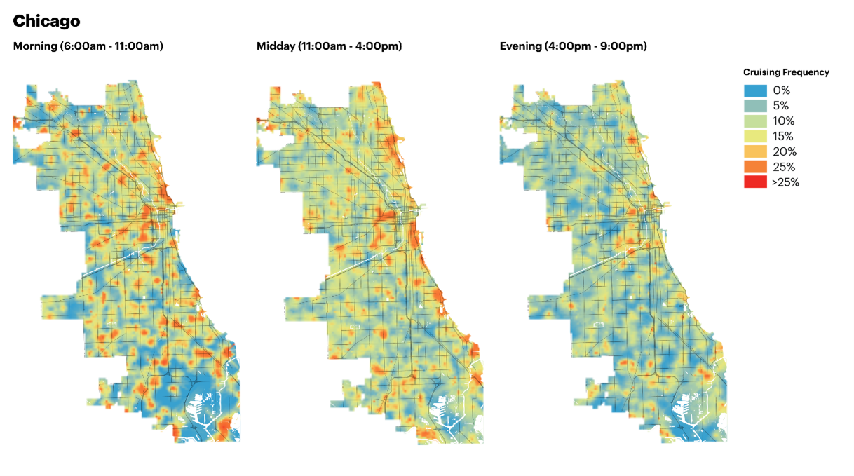
Source: FHWA. Figure 44. Map. Peak and midday comparison of cruising.
This figure comprises three mesoscopic-level street maps of Chicago. The maps illustrate cruising frequency in the morning from 6:00 am to 11:00 am, at midday, from 11:00 am to 4:00 pm, and in the evening, from 4:00 pm to 9:00 pm. While some areas experienced similar levels of cruising throughout the day, cruising tends to be more concentrated to specific destinations in the morning, and most dispersed at midday. The evening period shows the lowest levels of overall cruising frequency.

Source: FHWA. Figure 45. Map. West Loop cruising peak and midday.
This figure comprises 3 microscopic-level street maps of West Loop, Chicago. Dots represent parking meters. The maps are shaded to illustrate cruising frequency ranging from 0 to greater 25 percent. The maps show the morning data, from 6:00 am to 11:00 am, the midday data, from 11:00 am to 4:00 pm, and the evening data, from 4:00 pm to 9:00 pm. The central area of each map maintains a cruising frequency above 25 percent, although the period of most geographically widespread cruising frequency occurs at midday.
The West Loop, a neighborhood home to both wholesale food distributors and trendy restaurants and only one train stop, experienced some of the highest rates of cruising across the board. Parking is largely unregulated in the area, except along Madison Street, which can be identified by the series of meters running the length of the street, and in the southeast corner of the neighborhood, where cruising is lower. 
Source: FHWA. Figure 46. Map. River North cruising peak and midday.
This figure comprises of three microscopic-level street maps of River North, Streeterville, and Gold Coast, Chicago. Dots on the maps represent parking meters. The maps are shaded to illustrate cruise frequency ranging from 0 to greater than 25 percent. The maps show morning data, from 6:00 am to 11:00 am, midday data, from 11:00 am to 4:00 pm, and evening data, from 4:pm to 9:00 pm. At this location, the areas near the eastern edge of the maps experience the most widespread cruising frequency during the morning period, followed by the evening period, with the lowest levels of cruising frequently occurring at midday.
The neighborhoods north of the Loop have some of the highest densities of retail, office, and residential space in the city. Most of these areas have metered streets, with the exception of the relatively more residential areas of Streeterville and the Gold Coast. The diurnal pattern of cruising here would be consistent with an influx of workers in the morning looking for free and/or all-day parking in non-metered areas near their workplaces, and, in the evening, Gold Coast residents returning home and competing over limited street parking. 
Source: FHWA. Figure 47. Map. Hyde Park cruising peak and midday.
This figure comprises 3 microscopic-level street maps of Hyde Park, Chicago. Dots represent parking meters. The maps are shaded to represent areas cruising frequency with a range of 0 to greater than 25 percent. The maps show morning data, from 6:00 am to 11:00 am, midday data, from 11:00 am to 4:00 pm, and evening data, from 4:00 pm to 9:00 pm. Throughout the day, cruising remains high along the northeast lakefront section of the neighborhood. The center of the neighborhood also has high rates of cruising during midday and evening hours. In the morning, high cruising can be found in the southern part of the neighborhood near the University of Chicago.
In Hyde Park, the diurnal patterns show that throughout the day, cruising remains high along the northeast lakefront section of the neighborhood—an area of concentrated high-rise apartments, in contrast to the three-story multifamily buildings found throughout most of the neighborhood. The commercial center of the neighborhood around 53rd Street, East Hyde Park Boulevard, and Lake Park Avenue, also has high rates of cruising during midday and evening hours. In the morning, high cruising can be found in the southern part of the neighborhood near the University of Chicago, and in particular the University of Chicago Laboratory School, a private school serving students from kindergarten to 12th grade, which may reflect parents dropping off children, or university faculty and staff searching for parking. 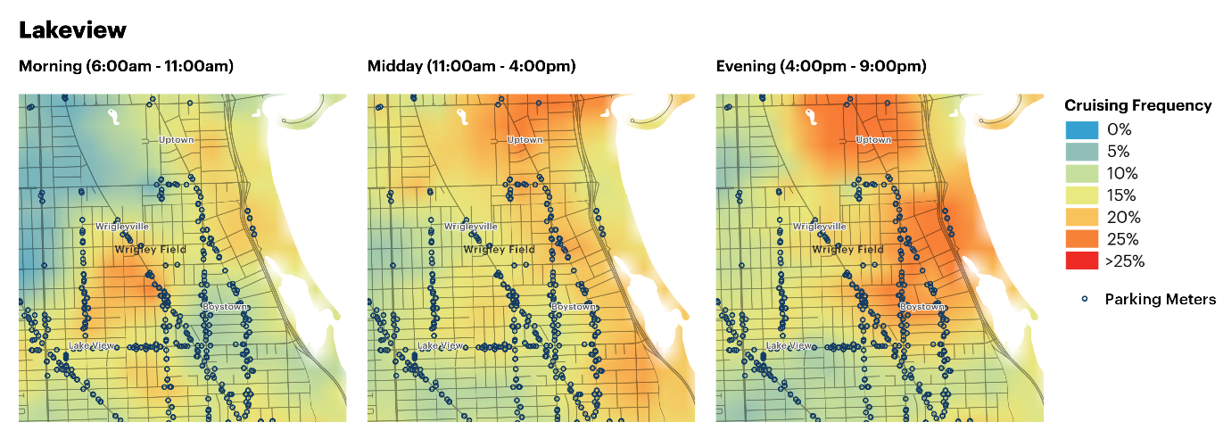
Source: FHWA. Figure 48. Map. Lakeview cruising peak and midday.
This figure comprises 3 microscopic-level street maps of Lakeview, Chicago. Dots represent parking meters. The maps are shaded to show areas of cruising frequency ranging from 0 to greater than 25 percent. The maps show morning data, from 6:00 am to 11:00 am, midday data, from 11:00 am to 4:00 pm, and evening data, from 4:00 pm to 9:00 pm. Cruising is highest in the evening in the areas at the east edges of the neighborhood. Cruising is also high to the north. Higher levels of cruising during the morning period are limited to the central part of the neighborhood, whereas high frequencies of cruising occur mostly in the north at midday, with moderate cruising frequency along the eastern edge of the neighborhood.
In Lakeview, cruising is highest in the evening near the busy entertainment corridor of North Halsted Street and North Broadway. Cruising is also high to the north in the Uptown neighborhood, where higher density housing is found. Metered StreetsChicago has metered parking along most commercial corridors throughout the city. In the 2020 data set 60 percent of trips and 55 percent of cruising trips ended on metered streets. For those trips ending on metered streets, 55 percent of cruising vehicle miles traveled were done on metered streets. For cruising trips ending on non-metered streets, only 9 percent of cruising miles accrued to metered streets. This could indicate that cruising drivers with trips ending on metered blocks are looking for open metered spaces, and not necessarily searching for non-metered spaces. Likewise, cruising drivers ending their trips on non-metered streets are likely looking for non-metered spots. At a citywide scale, the relationship between cruising and metered parking may depend on the neighborhood-specific land use context. In specific neighborhoods, such as the West Loop, Streeterville, and Gold Coast, areas with high frequency of cruising can be seen in unmetered areas adjacent to metered areas. These areas are both adjacent to, or even part of, the central business district (CBD), where the majority of streets are metered, rather than just the main commercial corridors. In neighborhoods farther out, such as Hyde Park, high rates of cruising along metered streets may indicate the high demand for parking that the meters are there to regulate. Another temporal filter can be applied to examine cruising during hours when Chicago’s parking meters are turned on and off. Chicago has different meter hours depending on the neighborhood, and parking meters in the Loop are in operation 24 hours per day. Figure 65 shows cruising frequency when trips end in places and at times meters are turned on, and in places and at times when they are turned off. When meters are turned on, cruising is highest in the two adjacent areas to the north and west of the CBD where there are fewer meters present. This could indicate people specifically avoiding metered areas and parking as close as possible to the core, or it could indicate that a lack of parking regulation in these areas is causing a higher demand than it might be if more meters were present. When meters are turned off, the highest cruising is found in metered areas in River North and just south of the Loop that is not present when meters are turned on. 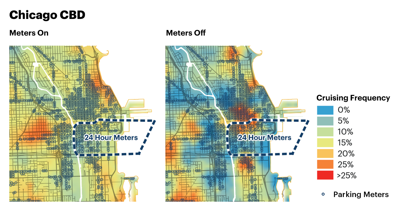
Source: FHWA. Figure 49. Loop cruising meters on and meters off.
This figure is comprised of two microscopic-level street maps of Chicago’s central business district (CBD). There is an overlay of the city streets and pings represent parking meters. A dotted border line represents an area in the eastern part of the CBD with 24-hour parking meters. The two maps illustrates cruising data when the parking meters are turned on and when they are turned off. The maps are shaded to illustrate cruising frequency with a range of 0 to greater than 25 percent. When meters are turned on, the highest cruising is found in metered areas in the northeastern part of the CBD and the central western part. When meters are turned on, the most frequent cruising occurs in pockets in the eastern central area, the north and northeast, and the west and southwest part of the CBD, although there is also little or no cruising in substantial sections throughout the CBD.
SummaryThe Chicago case is based on raw location data that the project team analyzed directly. Having the individual trip trajectories allows a more complex study of the cruising paths taken, rather than simply basing findings on where trips end. The overall cruising rate in Chicago fluctuates between 6.5 and 7.5 percent, with higher concentrations in the denser and mixed use areas. The cruising rate is relatively stable throughout the day in both years analyzed, but shows some geographic variation across the day: it is more evenly distributed throughout the city in the morning period and more geographically concentrated in the afternoon. Finally, cruising has increased in duration in June 2020 relative to 2019. Two important cautions arise from this part of the project. First, flexibility and adaptability in research design are a prerequisite for creating and presenting impactful analysis. The Chicago analysis was meant to be of 3 consecutive years’ worth of data. Poor data quality in the final year prevented a complete analysis. Had this been a policy study, additional data should have been sought or a different time period substituted. Second, the close analysis of raw data over a relatively abbreviated time frame indicates there are likely biases due to data collection strategy. If collection is via particular applications that have more popularity among certain demographic groups that will likely also show geographic biases in the location of trip making and trip ends. With these kinds of biases an analyst may be unable to identify the worst locations for cruising, but could get a critical sense of cruising dynamics in particular areas. Apparent missing data could inform data acquisition strategies. Seattle, Washington: Two Meter PoliciesSeattle has adopted a performance pricing policy for its metered parking streets. Using annual surveys to estimate vehicle occupancy, the Seattle Department of Transportation (SDOT) raises, lowers, or leaves the same the parking meter prices in order to hit an occupancy/vacancy target. The first Seattle case examines cruising before and after price changes to the city’s metered parking. The business-as-usual case is examined wherein SDOT does a regularly scheduled meter price adjustment. SDOT made a price adjustment on January 28, 2020; the period of review is before and after the price change. The second case examines cruising in the 2 weeks before and after SDOT temporarily suspended all parking meters on April 4, 2020. The city decided to suspend meters to ease the travel burden on essential workers. For the purposes of both analyses the city was divided into metered streets, near-metered streets—on the assumption that meter policy can have spill-over effects on other streets—and non-metered areas. Due to the data agreement with the third-party processor, one of the Seattle data sources, the number of geographies was limited to 15,000, so trips not ending within 0.5 miles of metered streets were aggregated to the census block group level. Figure 50 shows Seattle’s block groups along with metered and near-metered streets. Most of the analysis in this case uses output created by the third-party processor. Raw location data for Seattle were also obtained and used in these use cases only where noted. Additional discussion related to the use of different data sources generally, and in Seattle specifically, is provided in Chapter 4 and Appendix A. This section discusses the following:
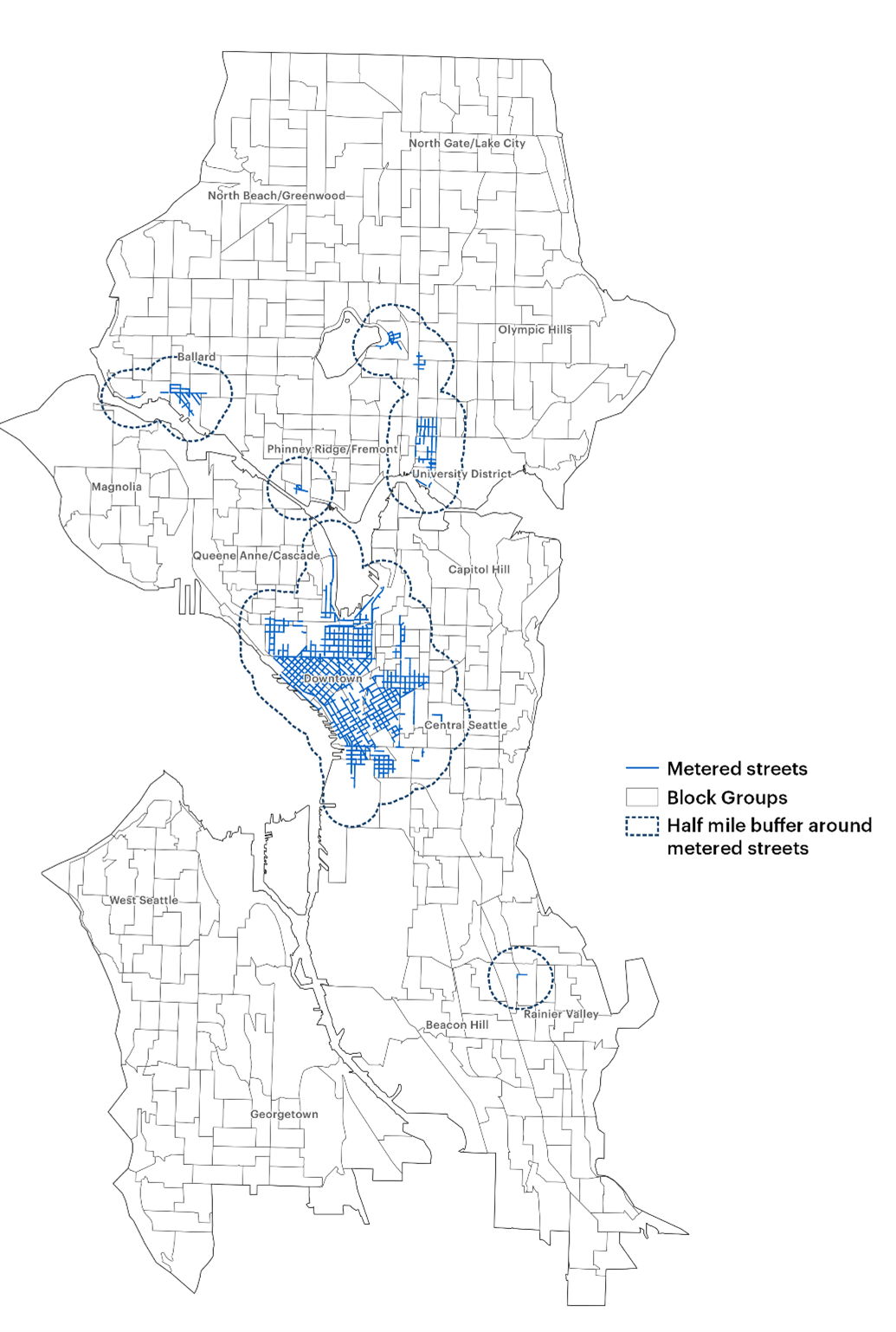
Source: FHWA. Figure 50. Map. Seattle study area.
This mesoscopic-level street map of Seattle contains dotted lines that surround areas on the map that include a microscopic overlay of streets with parking meters. The dotted lines represent half mile buffers around metered streets. These areas are the University District in the northeast, the Ballard neighborhood in the west, Phinney/Ridge/Fremont between the two, Downtown Seattle in the center of the map, and Rainier Valley to the southeast.
Where Cruising OccursCensus block groups with the highest density of cruising trips tend to be in metered districts (shown in outline) in or near the commercial business district, university district, and the neighborhoods of Adams, and Fremont. High rates of cruising are also found in parts of west Seattle, neighborhoods along Martin Luther King Jr. Way South, and in Lake City. Trips in these areas tend to be of shorter duration as proximate parking is likely easier to find (Figure 51). 
Source: FHWA. Figure 51. Map. Cruising frequency.
This mesoscopic-level street map of Seattle is divided into block groups. Half-mile buffers around metered streets are represented by dotted border lines. Block groups are shaded to represent cruising frequency, ranging from 0 to 8 percent or greater. All areas with metered streets contain significant numbers of block groups with cruising frequency in the 8 percent or greater range.
Not all cruising trips are the same. A cruising trip could take drivers a little out of their way or far out of their way; thus, time spent cruising should be considered along with cruising frequency. Figure 52 shows the aggregate level of cruising as aggregate time spent cruising for trips that end in each block group, normalized by the length of street in each block group. When considering total time spent cruising the problem areas align well with metered areas, suggesting that Seattle has appropriately placed its meters where pricing is needed as a curb management strategy. In this case, the map reflects where trips end, not the paths taken by drivers; though it appears counterintuitive, a plausible interpretation is that trips with a circuitous component are ending on metered blocks with greatest frequency. This could be that drivers are finding vacant spaces on metered blocks where they had not on other blocks. This is an affirmation of the meter policy that could be abstracted to the blocks where people prefer to park. It could also mean that drivers are looking for bargain parking, and when they cannot find it, drivers take paid parking as a second choice. Alternatively, this could be a result of cruising occurring in the metered areas where, policy goals notwithstanding, meter rates may have been too low to bring demand down to the level of supply. 
Source: FHWA. Figure 52. Map. Cruising impact area.
This mesoscopic-level map of Seattle is divided into block groups. Dotted border lines represent half-mile buffers around metered streets. Block groups are shaded to represent the impact of cruising, ranging from low, to high. The map areas with metered streets are consistently shaded to indicate significant areas with medium to high cruising impacts.
There is also a potentially important boundary effect. With the exceptions of cruising hot spots that are completely contained within the metered area, proximate to Pike Place Market and south of Lake Union, most of the commercial business district cruising is at the boundary of the metered and non-metered areas. This observation could warrant further thought regarding expansion of metered areas to discourage bargain hunting that may occur. 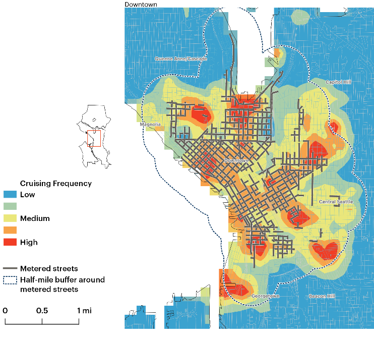
Source: FHWA. Figure 53. Map. Cruising for parking boundary effects.
Cruising for parking boundary effects. This map is a microscopic view of central Seattle, with an overlay of metered streets and dotted border lines representing a half mile buffer around metered streets. The map is shaded to show cruising frequency with a range of low to high.
When Cruising OccursCitywide, cruising trips follow a similar diurnal distribution to overall trips (Figure 54), with morning and evening peaks. Cruising trips, as a proportion of all trips, ranged between 4.5 and 8.5 percent throughout the day, with peaks at midday and in the early evening toward the end of the evening peak travel period (Figure 55). Both peaks follow the two peaks in the overall trip numbers, suggesting that as morning commuters park near their workplaces and evening commuters park near their homes or near evening activities, available parking spaces fill up, leading to higher rates of cruising for parking. 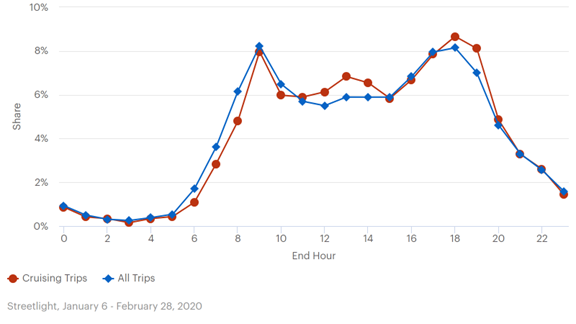
Source: FHWA. Figure 54. Graph. Diurnal distribution of trips and cruising trips.
Diurnal distribution of trips and cruising trips. This line graph plots cruising trips and over all trips. The y-axis is labeled “share” and ranges from 0 to 10 percent. The x-axis is labeled “end hour” and ranges from 0 to 24 hours. The cruising trips line starts at just below 1 percent and decreases to just above 0 percent at hour 3. It then gradually increases to just above 1 percent at hour 6 and sharply increases to 8 percent at hour 9. It sharply decreases to 6 percent at hour 10 and gradually increases to 7 percent at hour 13. It steadily decreases to 6 percent at hour 15 and sharply increases to 8.5 percent at hour 18. It sharply decreases to 5 percent at hour 20 steadily decreases to 1.5 percent at hour 24. The all-trips line starts at 1 percent at hour 0 and decreases to .5 percent at hour 3. It then gradually increases to .75 percent at hour 5 and sharply increases to just above 8 percent at hour 9. It then steadily decreases to 5.5 percent at hour 12 and increases to 6 percent at hour 13. It remains flat until hour 15 and it steadily increases to just above 8 percent at hour 18. It sharply declines to 1.5 percent at hour 24.

Source: FHWA. Figure 55. Graph. Diurnal distribution of trips and cruising as percent of trips.
This line graph plots cruising frequency and all trips. The left y-axis is labeled cruising frequency and ranges from 0 to 15 percent. The right y-axis is labeled all trips, hourly share and ranges from 0 to 10 percent. The x-axis is labeled end hour and ranges from 0 to 24 hours. The cruising frequency line starts at 7 percent (about 4.5 percent hourly share of all trips) at hour 0 and dips to 6 percent at hour 1 before rising to 8 percent (about 5.5 percent hourly share of all trips) at hour 2. It then drops to 4.5 percent at hour 3 (about 3 percent hourly share of all trips) and rises back to just above 6 percent at hour 4. It steadily declines to 5 percent at hour 6. It steadily rises to just under 9 percent (6 percent hourly share of all trips) at hour 13 and declines to 7 percent at hour 15. The cruising frequency line remains relatively steady until hour 17, when it gradually builds to 8 percent (about 5.5 percent hourly share of all trips) at hour 19, then steadily declines to 5 percent (about 4.5 percent hourly share of all trips) at hour 24. The all-trips line starts at 1.5 percent (about 1 percent hourly share of all trips) and decreases to .5 percent at hour 3. It increases to 1 percent at hour 5 and rapidly increases to just above 12 percent (8 percent hourly share of all trips) at hour 9. It decreases to 8.5 percent (about 5.5 percent hourly share of all trips) at hour 12 and increases to 9 percent (6 percent hourly share of all trips) at hour 13. It remains flat until hour 15, then it increases to just above 12 percent (8 percent hourly share of all trips) at hour 18 before sharply decreasing to 2.5 percent (about 1.5 percent hourly share of all trips) at hour 24.
In the metered and near-metered areas shown in Figure 56, the cruising lag is more pronounced than it is across the city. As shown in Figure 57, the rate of cruising is at its highest around noon, remaining high (between 9 and 12 percent of trips) until around 10 p.m. 
Source: FHWA. Figure 56. Graph. Diurnal trips and cruising on metered and near-metered streets.
This line graph plots cruising trips and all trips. The y-axis is labeled “share” and ranges from 0 to 14 percent. The x-axis is labeled “end hour” and ranges from 0 to 24 hours. The cruising trips line starts at 1 percent at hour 0 and gradually decreases to .5 percent at hour 5. It then sharply rises to 9.5 percent at hour 9 and sharply decreases to 7 percent at hour 10. It then gradually decreases 6.5 percent at hour 14 and sharply decreases just below 5 percent at hour 15. It steadily increases just below 8 percent at hour 18 and steadily decreases to 1.5 percent at hour 24. The all-trips line starts at 1 percent at hour 0 and decreases to .5 percent at hour 5. It then sharply rises to 11.5 percent at hour 9 and sharply decreases to 5.5 percent at hour 12. It then gradually decreases to just below 5 percent at hour 15 before steadily rising to 6.5 percent at hour 18. It steadily decreases and ends at 1.5 percent at hour 24.

Source: FHWA. Figure 57. Graph. Diurnal distribution of trips and cruising frequency on metered and near metered streets.
This line graph plots cruising frequency and all trips. The left y-axis is labeled “cruising frequency” and ranges from 0 to 15 percent. The right y-axis is labeled “total trips” and ranges from 0 to 7,500. The x-axis is labeled “end hour” and ranges from 0 to 24 hours. The cruising frequency line starts at 9 percent (4,500 total trips) at hour 0 and sharply decreases to 6 percent (3,000 total trips) at hour 3. It then jumps back up to 9 percent at hour 4 before sharply decreasing to 5.5 percent (about 2,800 total trips) at hour 6. From there it steadily increases to 7 percent (about 4,000 total trips) at hour 9 and rapidly increases to just under 12 percent (6,000 total trips) at hour 12. The line remains flat until hour 14, when it sharply drops to just above 9 percent (4,500 total trips) at hour 15. It then steadily rises to just above 12 percent (more than 6,000 total trips) at hour 19 before dropping off and ending at 8 percent (about 4,000 total trips) at hour 24. The all-trips line starts at 1 percent (about 800 total trips) at hour 0 and gradually declines to .5 percent at hour 5. It then jumps to 13 percent (about 6,200 total trips) at hour 9 before rapidly declining to 6 percent (3,000 total trips) at hour 12. It remains relatively flat through hour 17, rises to 7.5 percent (about 3,800 total trips) at hour 18, then steadily drops to 1.5 percent at hour 24 (about 1,000 total trips).
For trips that end more than 0.5 miles from metered streets (i.e., non-metered areas hypothesized to be largely immune to meter pricing policy and the demands of metered and near-metered areas), the midday and evening peaks observed in other areas do not materialize. Between 9 a.m. and midnight, cruising frequency on non-metered streets hovers around 6 percent, varying only by just over 1 percent (Figure 58). 
Source: FHWA. Figure 58. Graph. Diurnal distribution of trips and cruising frequency in non-metered areas.
This line graph plots cruising frequency and all trips. The left y-axis is labeled “cruising frequency” and ranges from 0 to 15 percent. The right y-axis is labeled “total trips” and ranges from 0 to 12,500. The x-axis is labeled “end hour” and ranges from 0 to 24 hours. The cruising frequency line starts at just below 6 percent (5,000 total trips) at hour 0, and dips to 4.5 percent at hour 1. It then jumps to 8 percent (7,000 total trips) at hour 2 before dipping to 3.5 percent at hour 3. It then increases to 5.5 percent (4,800 total trips) at hour 4 before gradually declining to 4 percent at hour 6. It then steadily rises to just over 6 percent (5,000 total trips) at hour 9, where it remains relatively steady between 6 and 7 percent (5,000 to 6,000 total trips) throughout the remainder of the period. The all-trips line starts at 1.5 percent at hour 0 and remains in the 0 to 1 percent cruising frequency (100-800 total trips) rate at hour 5. It then begins to climb steadily to 9.5 percent (8,000 total trips) at hour 9. It dips to 7.5 percent at hour 10 before gradually increasing to peak at just over 13 percent (11,000 total trips) at hour 17 before dropping to 2.5 percent (2,000 total trips) at hour 24.
A disproportionate number of all trips, as well as cruising trips, end on metered streets (Table 2). Metered streets make up only 2 percent of overall streets in Seattle, yet account for 14 percent of trip ends and 18 percent of cruising trip end points. Near-metered streets are 10 percent of all streets, 19 percent of trip ends, and 24 percent of cruising end trips. Calculating the ratio of cruising trips to all trips, metered and near-metered streets show similar ratios of 1.24 and 1.22, respectively. This is unsurprising since metered streets are located where there is a higher density of destinations and a greater demand for parking.
As shown in Table 3, vehicles cruising in the non-metered area, a relatively rare event, spend, on average, under a minute searching for parking. On the other hand, a cruise trip which is more prevalent in the metered areas, takes longest there, with near-metered areas running a close second.
Metered and near-meter streets have average cruising times 2–3 times higher than cruising trips that end on non-meter streets. Comparison: Before versus after Business-as-Usual Meter Price ChangeConsistent with SDOT policy, the January 28, 2020, meter price change entailed either a 50-cent increase, 50-cent decrease, or no change, depending on the observed occupancy on a particular block.23 This case examines whether this price change had an effect on cruising behavior. The date range representing the before condition is January 6–27, 2020. The period of analysis representing the after condition is February 5–28. 2020. Figure 59 shows the frequency and changes in frequency of cruising on metered, near-metered and non-metered blocks. Metered blocks are divided according to whether the price was increased, decreased, or held constant. Near-metered streets were classified for price increases, decreases, or being held constant based on the policy treatment of the metered block to which they are nearest. Figure 60 shows the time spent cruising in the metered, near-metered, and non-metered areas. The working hypothesis for non-metered areas (i.e., those beyond half a mile of a parking meter) is that travel behavior would not be affected by meter price changes. Supporting that hypothesis, Figure 60 shows there is no change in frequency of cruising trips ending on blocks in non-metered areas across the price change. The changes in cruising on streets where prices either increased or decreased were small. Where meter prices were reduced in Seattle and on near-metered streets proximate to streets with metered price drops, the frequency of cruising trip ends also decreased. The decreases are small, and likely due to sampling error. The error bars in Figure 59 show the potential statistical overlap. On streets where the price was increased—in theory, creating more vacancies—the number of trips cruising also increased. This should not be interpreted to mean that price increases stimulated additional cruising, but rather that more cruising trips are ending on streets where prices were increased because there is more turnover and related availability on those streets. In both cases (i.e., whether meter prices were increased or decreased), the amount of time a driver spent cruising decreased. Limitations of the data only allow observation of where the trip ends. A plausible interpretation is that with increased vacancy, more trips that would have been cruising before the price adjustment no longer were—those cruising trips would have ended on other blocks or would have taken a longer time. The increase in cruising trips that ended on metered streets with price increases is statistically significant; this suggests a real change had been measured. Streets proximate to metered streets that had price increases show a decrease in cruising trips, which, again, suggests parking demand is being better accommodated on metered blocks. 
Source: FHWA. Figure 59. Graph. Change in cruising by meter price change and area type.
This bar graph illustrates cruising frequency and standard deviation. Solid bars represent before price change, and striped bars represent after price change. The y-axis is labeled cruising frequency and ranges from 0 to 0.15. The x-axis defines whether the data are for increases, decreases, or no change at a meter, near a meter, or in a non-meter area. The decrease (meter) category shows a before value of around 0.09, with a standard deviation from 0.11 to 0.08. It shows an after value of 0.0875, with a standard deviation of 0.095 to 0.08. The decrease (near meter) shows a before value of slightly over 0.1, with a standard deviation of around 0.115 to 0.085. It shows an after value around 0.0875, with the standard deviation between 0.09 and 0.08. The increase (meter) category shows a before value of approximately 0.0105, with a standard deviation value ranging from approximately 0.12 to 0.085. It shows an after value of 0.13, with a standard deviation between approximately 0.12 and 0.135. The increase (near meter) category shows a before value of approximately 0.0625, and a standard deviation between 0.075 and 0.055. It shows an after value of approximately 0.055 with a standard deviation value between 0.065 and 0.05. The no change (meter) category shows a before value of 0.07, with a standard deviation between 0.075 and 0.065. It shows an after value of approximately 0.08, with a standard deviation between 0.085 and 0.078. The no change (near meter) category shows a before value of 0.0825 with a standard deviation between 0.08 and 0.0875. It shows an after value of .075 with a standard deviation between 0.0775 and 0.0725. The non-meter area category shows a before value of 0.0625 with a standard deviation between 0.0625 and 0.065. It shows an after value of approximately 0.065 with a standard deviation between 0.065 and 0.0675.

Source: FHWA. Figure 60. Graph. Time spent cruising by meter price change.
This bar graph illustrates mean cruising time by meter price change. Each entry on the x-axis has a solid bar representing the before data, and a striped bar representing the after data. The y-axis is ranged between 0 and 250. The x-axis defines whether the data are for increases, decreases, or no change at a meter, near a meter, or in a non-meter area. The decrease (meter) category shows a before value of approximately 185 with a standard deviation between 210 and 160. It shows an after value of approximately 105 with a standard deviation between 125 and 90. The decrease (near meter) category shows a before value of approximately 105 with a standard deviation of between 120 and 95. It shows an after value of slightly below 120 with a standard deviation between 130 and 100. The increase (meter) category shows a before value of approximately 175 with a standard deviation between 210 and 145. It shows an after value of approximately 145 with a standard deviation between 155 and 130. The increase (near meter) shows a before value of approximately 125, with a standard deviation between 150 and 105. It shows an after value of approximately 105 with a standard deviation between 130 and 90. the no change (meter) category shows a before value of approximately 105 with a standard deviation between 115 and 100. It shows an after value of approximately 105 with a standard deviation between 110 and 100. The no change (near meter) category shows a before value of approximately 110 with a standard deviation between 115 and 105. It shows an after value of approximately 100 with a standard deviation between 105 and 95. The non-meter area category shows a value of slightly above 50 with a standard deviation between 55 and slightly above 50. It shows an after value of slightly below 50 with a standard deviation between 50 and slightly below 50.
As the differences are small, albeit consistent, it can take several adjustments before a travel behavior change registers. A study of San Francisco showed a change in cruising behavior only after eight price changes.24 Although the change in cruising frequency is not significant, the fact that cruising frequency is higher in areas that had a price increase confirms SDOT’s information on where and when there is higher demand for parking. Cruising Pattern Changes in Response to Meter DecommissioningIn the earliest days of the pandemic, travel patterns changed substantially. In the pre-pandemic period, trips followed the expected diurnal distribution with pronounced peaks in the morning and late afternoon. By late March–April 2020, however, travel was substantially curtailed and it also showed minimal peaking. Trips were low at night and in the early morning, but relatively flat between 8 a.m. and 3 p.m., dropping off sharply from there. In response to the COVID pandemic, SDOT temporarily suspended all parking meters and time limits, except for residential permit zones. This section focuses on an analysis of cruising and travel patterns in the 2 weeks before and after the meter suspension on April 4, 2020. To set the context for the meter decommissioning, this section first covers the changes in cruising behavior after the initial COVID-19 lockdown in March, 2020. Figure 61 shows the diurnal distribution of trips before the Government’s guidance to social distance and restrict travel and the distribution of trips after that guidance. Figure 62 shows the traditional morning and evening peaks for cruising in the before period and the reduced and flattened pattern in the after period. 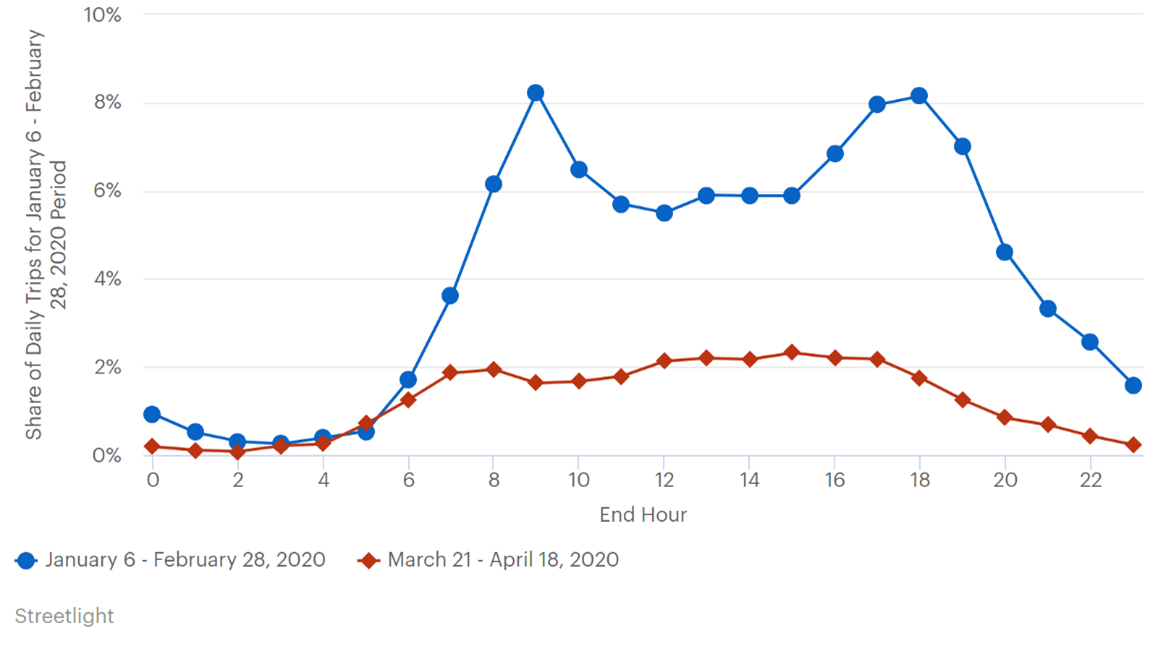
Source: FHWA. Figure 61. Graph. Diurnal distribution of baseline trips and early lockdown trips.
This line graph plots data from January 6, 2020, to February 28, 2020, and data from March 21, 2020, to April 18, 2020. The y-axis is labeled Share of Daily Trips for January 6-February 28, 2020 Period and ranges from 0 to 10 percent. The x-axis is labeled end hour and ranges from 0 to 24 hours. The January 6th to February 28th of 2020 line starts at 1 percent at hour 0. It then gradually decreases to just above 0 percent at hour 3 and marginally increases to .5 percent at hour 5. It then sharply increases to just above 8 percent at hour 9 before steadily falling to 5.5 percent at hour 12. It rises slightly to 6 percent at hour 13 and remains steady till hour 15. It then jumps, peaking at just above 8 percent at hour 18 before steadily falling and ending at 1.5 percent at hour 24. The March 21 to April 18th 2020 line starts at just above 0 percent at hour 0 and declines even closer to 0 percent at hour 2. It then steadily increases to 2 percent at hour 8 and remains relatively stable until hour 17. It then steadily declines and ends right above 0 percent at hour 24.
Even at one-third of pre-pandemic trips, cruising frequency was curiously consistent. The percentage of trips that included a cruising component in the January–February 2020 time period ranged from 4 to 8 percent, with an average daily rate of 7.1 percent. During the early pandemic, frequency of cruising trips ranged between about 4 and 8 percent, with an average daily rate of 6.1 percent. This represents a statistically significant decline, but only of 1 percent. 
Source: FHWA. Figure 62. Graph. Cruising frequency in early 2020 and in early spring 2020.
This line graph plots frequency of cruising trips between January 6th and February 28th of 2020, and between March 21st and April 18th of 2020. The y-axis is labeled Frequency of Cruising Trips and ranges from 0 to 10 percent. The x-axis is labeled end hour and ranges from 6 to 24 hours. The January 6th to February 28th of 2020 line starts at approximately 4.5 percent at hour 6 and steadily increases, peaking at 8.5 percent at hour 13. It then gradually decreases to 7 percent at hour 15 and remains steady until hour 17. It then sharply rises and peaks again 8.5 percent at hour 19. It then steadily declines to 6.5 percent at hour 24. The March 21st to April 18th of 2020 line starts at approximately 6.5 percent at hour 6 and increases rapidly to just below 8 percent at hour 8. It then decreases to 5.5 percent at hour 10 before gradually increasing to 6 percent at hour 12. It then dips to a minimum of 4.5 percent at hour 13 before steadily rising back to 6 percent at hour 16. It drops to 5 percent at hour 17 and steadily rises back to 6 percent at hour 19. It then drops again to 4.5 percent at hour 21 before sharply increasing and ending at 8 percent at hour 24.
The disaggregated data allow for a detailed spatial snapshot of cruising patterns, and how they shifted between winter and spring 2020. Figure 63 shows the rate of cruising along street segments in the winter time period (January 6–February 28) and in the spring time period (March 21–April 18). Mirroring the aggregated output shown above, cruising rates are only slightly lower in the spring, despite the large decrease in overall trips. While many residential areas, in addition to areas near the University of Washington and east of downtown (home to several hospitals), maintained similar cruising rates, neighborhoods with more jobs than residents (downtown and the heavily industrial areas south of downtown) saw cruising decrease significantly. 
Source: FHWA. A. Seattle cruising hot spots,
January–February 2020. B. Seattle cruising hot spots,
March–April 2020. Figure 63. Comparison of cruising hot spots.
A. Seattle cruising hot spots, January to February 2020. This figure comprises a map of Seattle. Dotted lines encircle areas with metered streets with a half-mile buffer. The maps are shaded to illustrate cruising frequency ranging from 0 to greater than 25 percent. The map illustrates cruising hot spot data from January 2020 to February 2020, with most hot spots located within the areas encircled with dotted lines. B. Seattle cruising hot spots, March to April 2020. This figure comprises a map of Seattle. Dotted lines encircle areas with metered streets with a half-mile buffer. The maps are shaded to illustrate cruising frequency ranging from 0 to greater than 25 percent. The map illustrates cruising hot spot data from March to April 2020. The right map illustrates cruising hot spot data from March 2020 to April 2020. with most hot spots located within the areas encircled with dotted lines
On April 4, 2020, SDOT temporarily suspended all parking meters as a relief measure for essential workers. SDOT also temporarily lifted existing time constraints on parking at the meters and generally throughout the city. The exception was in residential permit parking areas where time limits continued to be enforced. 
Source: FHWA. Figure 64. Graph. Cruising rates before and after meter suspension.
This line graph plots data for the before period defined as March 21 to April 3, 2020 and the after period defined as April 4 to April 18, 2020. The y-axis is labeled frequency of cruising trips and ranges from 0 to 10 percent. The x-axis is labeled end hour and ranges from 6 to 24 hours. The before line starts at just under 6 percent that hour 6 before jumping to 8 percent at hour 7. It then steadily declines to 5.5 percent at hour 11 and jumps up to 7.5 percent at hour 12. Then decreases to 5 percent at hour 13 and steadily rises to just about 6 percent at hour 16. It then sharply declines to 4.5 percent at hour 18, jumps back up to five percent at hour 19 and gradually falls to 4 percent at hour 21. It then rapidly rises above 10 percent at hour 24. The after line starts at 7 percent at hour 6 and rises to 9 percent at hour 8. It then rapidly decreases to 5.5 percent at hour 10 before slightly raising to 6 percent at hour 11 and dropping farther to 4 percent at hour 13. It then jumps to 6 percent at hour 14 before steadily declining to 4.5 percent at hour 17. It rapidly jumps to 7 percent at hour 18 and steadily declines to 5.5 percent at hour 21. It jumps to 7.5 percent at hour 22 and ends at just above 6 percent at hour 24.
The frequency and time spent cruising before and after the suspension were compared. Citywide, the decision to decommission the parking meters in this period had no discernible impact on cruising frequency. As before, there was no change in average cruising time in the non-metered areas, which serves as a control. Average cruising time decreased slightly on both metered and non-metered streets once the meters were decommissioned. However, the difference is not statistically significant (Figure 65). It is possible that travel and cruising behavior were not responding to meter prices during such an acute point in the early pandemic. 
Source: FHWA. Figure 65. Graph. Average time spent cruising before and after meter suspension.
This bar chart illustrates the average cruising time by trip end location in a baseline and after meter suspension. The y-axis is labeled seconds and ranges from 0 to 150. The x-axis defines the datasets showns as metered street, near-meter street, and non-meter street. Each entry on the x-axis consists of a solid bar representing baseline data, and a striped bar representing after meter suspension data. The metered street dataset shows a baseline value of 120 seconds with a standard deviation between 135 and 110 seconds. It shows an after meter-suspension value of approximately 112 seconds with a standard deviation between 130 and 90 seconds. The near-meter streets dataset shows a baseline value of 120 seconds with a standard deviation between 130 and 110 seconds. It shows and after meter suspension value of approximately 107 seconds with a standard deviation between 125 and 90 seconds. The non-meter street dataset shows a baseline value of approximately 80 seconds with a standard deviation between 90 and 75 seconds. It shows an after meter-suspension value of approximately 80 seconds with a standard deviation between 90 and 75 seconds.
SummaryTwo parking meter policies were analyzed in this section. First, a business-as-usual case was considered in which SDOT adjusted meter prices according to an annual occupancy survey. Second, meter suspension was implemented as part of the city’s response to the pandemic. In the first case, there was a consistent decrease in the amount of time a cruising vehicle spent looking for parking after the meter rates had been adjusted. In the second case, even though trip-making rates had been substantially lowered, compared with the baseline, cruising was consistent, and differences before and after the meter suspension were indiscernible. The Seattle analysis relies on aggregated data outputs of the third-party processor supplemented with raw location data from the data aggregator. The two approaches are taken to showcase the relative strengths of each. The third-party data are more abundant providing greater statistical confidence. The location data allow for more complex analyses of paths taken. Each has a potential function. A comparison of the data sources is provided in appendix A. Finally, with respect to the apparent lack of difference in trip making and in cruising following the meter policy changes, it is possible that a 2- or 3-week period before and after a policy change may be insufficient time in which the market adjusts and differences can be observed. 21 A. Millard-Ball, R. Weinberger, and R. Hampshire. 2014 “Is the Curb 80% Full or 20% Empty? Assessing the Impacts of San Francisco’s Parking Pricing Experiment” Transportation Research Part A Vol.63, 2014, pp. 76-92. [ Return to Note 21 ] 22 A. Millard-Ball, R. Weinberger and R.C Hampshire. 2013. “Comment on Pierce and Shoup, Evaluating the impacts of performance-based parking” Journal of the American Planning Association, 79(4) 330-336. [ Return to Note 22 ] 23 S. Davis, Seattle Department of Transportation, SDOT Blog, “Paid parking rate changes are coming your way, January 31, 2020. Available at: https://sdotblog.seattle.gov/2020/01/31/paid-parking-rate-changes-are-coming-your-way/. [ Return to Note 23 ] 24 Adam Millard-Ball, Rachel Weinberger, and Robert C. Hampshire, “Is the Curb 80% Full or 20% Empty? Assessing the Impacts of San Francisco’s Parking Pricing Experiment,” Transportation Research Part A: Policy and Practice 63 (2014): 76–92. [ Return to Note 24 ] | |||||||||||||||||||||||||||||||||
|
United States Department of Transportation - Federal Highway Administration |
||