Approaches for Communicating Third Performance Management Rule Measures, Metrics, and Targets
Chapter 4. Approaches for Communicating Third Performance Management Rule Measures, Metrics, and Targets
This chapter presents key messaging and approaches for communicating with specific audiences about PM3 measures, metrics, and targets.
Reliability
PM3 measures of reliability include NHPP reliability and freight reliability. PM3 metrics for reliability include LOTTR and TTTR (see more below). The two NHPP reliability measures include one that covers the Interstate system and the other that covers the non-Interstate NHS. The NHPP reliability measures are the percentages of PMT statewide that are reliable based on the results of the LOTTR calculation. LOTTR is the ratio of the 80th percentile travel time to the 50th percentile travel time over the course of a year. Average travel time data are collected every 15 minutes during all time periods other than 8 p.m. to 6 a.m. local time, and a segment of the highway system is reliable if all the periods have LOTTRs that are less than 1.50. PMT for a segment is computed by multiplying the annual average daily traffic on a segment by vehicle occupancy and length.
NHPP reliability are statewide measures reported to FHWA, and it is useful for comparison across years and regions. States use the NHPP reliability measures to set 2- and 4-year targets. The LOTTR metric, on the other hand, can provide agencies with more detailed information on their systems’ performance. This insight could include assessing NHPP reliability on corridors or segments of corridors down to the level of one or several TMCs. The granular nature of NPMRDS data also allows organizations to analyze LOTTR across seasons, across periods of the day, or in a histogram to visualize the overall distribution across days.
Key messages for PM3 measures of reliability are as follows:
- The two NHPP reliability measures are statewide measures, and they are useful as part of a trend analysis over time or to compare between States. While the measure is based on data that can be compiled at the corridor level and compared across corridors or days or weeks, the Federal measure is intended to allow Congress to compare States with the national average and assess the impact of its investments in the transportation network.
- LOTTR is a ratio of two variable values—the 80th percentile and 50th percentile travel times. LOTTR measures the variability of travel times on a corridor over a period of time, and the higher the variability, the less reliable. If these values are close together (technically LOTTRs below 1.5), as they would be if a road is operating reliably, LOTTR can be low even where the base congestion level is significant.
Because NHPP reliability measures are presented as statewide percentages, it may be challenging for the traveling public to understand. The audience for NHPP reliability includes internal State DOT and MPO staff, managers, stakeholders, board members, and legislators. State DOTs are required to report on reliability22, so it falls on them to be the messengers.
Table 1. Communicating reliability to different audiences.
| Audience |
Messages |
| Technical Advisers and Colleagues |
NHPP reliability measures the extent of users’ unexpected variability in travel times: The greater the variability, the more time necessary to plan a trip. The PM3 NHPP reliability measure is the percentage of PMT statewide that are reliable based on the results of the LOTTR metric calculation.
The base congestion level is not correlated directly to NHPP reliability. It is important to understand that an LOTTR has both a variable numerator and a variable denominator. Consequently, corridors where congestion is more prevalent may have low LOTTR even if congestion is severe. For example, in an extreme case, it is possible that consistently congested corridors may be reliable (do not exceed the 1.50 threshold). |
| Executives and Knowledgeable Decisionmakers |
LOTTR may be a difficult metric for the public to grasp, as it is a ratio dependent on statistical principles (i.e., percentiles). The 80th percentile is most simply explained as representing longer travel times that occur on a road segment, while the 50th percentile represents normal travel times on a segment. |
| Decisionmakers and the Public |
The NHPP reliability measures are most useful for consistent national reporting. In contrast, the LOTTR metric provides more-useful, detailed, and local information.
NHPP reliability in general represents how much extra time you need to plan for when making a trip. If it takes you 30 minutes to make a trip on a typical day, but once per week it takes you an hour, you will need to plan 30 minutes extra into your trip if you want to be guaranteed to make it in time. LOTTR represents the additional time needed to make a trip versus the normal travel time. In this case, the LOTTR would be 60 minutes divided by 30 minutes, or 2.0. |
NHPP reliability can be visualized through a line chart over time—potentially with contextual data—as shown in the concept in figure 3.
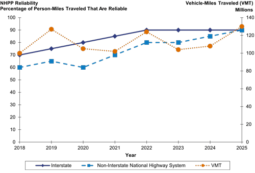
Figure 3. Chart. Conceptual line chart of National Highway Performance Program reliability, with vehicle-miles traveled shown for context.
(Source: FHWA.)
LOTTR can be visualized in many ways. It can be mapped as shown in figure 4, charted by time of day as in figure 5, or displayed in a histogram as in figure 6. Note that in these figures, the time periods for which LOTTR is calculated do not correspond to the federally defined time periods but have been selected for an agency’s own use.
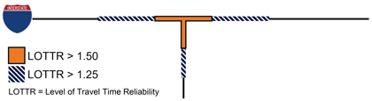
Figure 4. Diagram. Conceptual heatmap of Level of Travel Time Reliability on highway segments.
(Source: FHWA.)
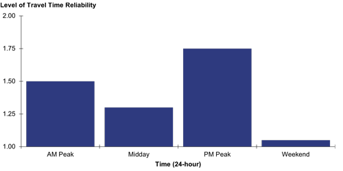
Figure 5. Chart. Conceptual chart of Level of Travel Time Reliability on a highway segment by time of day.
(Source: FHWA.)
The Level of Travel Time reliability on a highway segment is displayed in a column chart in which the columns represent four periods: AM peak period, midday, PM peak period, and weekend. Values in this graphic are hypothetical and are not meaningful in and of themselves.
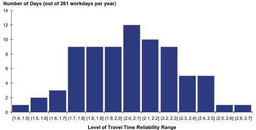
Figure 6. Chart. Conceptual histogram of Level of Travel Time Reliability for the PM peak hour.
(Source: FHWA.)
Freight
There are a number of approaches for communicating the PM3 measure for freight reliability and its associated metric, TTTR. TTTR is the ratio of the 95th percentile travel time to the 50th percentile travel time for trucks on a segment or the longest travel time versus normal travel time.
Freight reliability is derived from TTTR for five time periods on Interstate segments: AM peak, midday, PM peak for weekdays, weekends, and overnight for all days. The measure is a weighted average of the Interstate system by length, wherein a segment’s highest value across the five periods is multiplied by the segment’s length. The sum of all of these across the Interstate system is divided by the system’s total length. Freight reliability is a statewide measure reported to FHWA, which means that it is useful for comparisons across years and regions.
TTTR can be used by State DOTs and MPOs in many ways: to assess Travel Time Reliability on corridors or segments of corridors down to the level of a TMC or several TMCs. The granular nature of NPMRDS data also allows organizations to analyze TTTR across seasons, across periods of the day, or in a histogram to visualize the overall distribution across days.
Key messages for freight reliability and TTTR are the following:
- The TTTR metric measures variability in travel times. When there is less variability, the better the freight reliability—meaning, less delay that freight travelers will need to plan for.
- TTTR is a ratio of two variable values: The 95th percentile (longest) and the 50th percentile (normal) truck travel times. TTTR measures the reliability of travel time on a corridor and the extra time a truck driver needs to build into the day to account for variability in travel time. This extra time is more significant for freight operators because time is truly money. If these values are close together, as they would be if a road is frequently highly congested, TTTR can be low even where congestion is significant.
- Freight reliability is not a measure of the Interstate system at its most congested but at its most unreliable. The measure is a length-weighted sum of TTTR by Interstate segment, as measured in the worst of five periods of the day: AM peak, midday, and PM peak for weekdays, all day for weekends, and overnight over all days. The period with the worst TTTR will vary by segment. On less congested segments, it may occur overnight if trucks reduce speed in darkness.
Table 2. Communicating freight reliability to different audiences.
| Audience |
Messages |
| Technical Advisers and Colleagues |
Despite the similar nature of the abbreviations, TTTR and LOTTR are very different. TTTR focuses on freight travel times only (when available), while LOTTR includes all vehicles. TTTR uses the 95th percentile (longest travel time) in the numerator, while LOTTR uses 80th percentile (longer travel time) in the numerator. LOTTR uses the 80th percentile because this is a better level to determine operational solutions that will work. Freight, in contrast, focuses on just-in-time deliveries, so it is important to know what the most-variable times will be.
TTTR—and thereby freight reliability—has both a variable numerator and a variable denominator. This means that on corridors where congestion is more prevalent, TTTR may be low even if congestion is severe. On the other extreme, as was shown in figure 5, it is possible on shorter segments for periods of light congestion (i.e., very short travel times) to have a TTTR that exceeds periods of high congestion (i.e., longer travel times) because the ratio of the two shorter times will be higher. This issue will not appear if TTTR is used on its own but will appear during period comparisons for the statewide freight reliability measure. |
| Executives and Knowledgeable Decisionmakers |
Explain the measure and the metric in the simplest way possible. The performance measure related to freight movement on the Interstate uses truck travel time data (when available) to calculate the TTTR for the Interstate system. This measure can be used to identify and quantify major freight truck bottlenecks along Interstate highways.1 The freight measure is weighted by the worst TTTR metric for each Interstate segment weighted by segment length. |
| Decisionmakers and the Public |
Explain the measure using day-to-day examples such as: think of a run you make frequently: how long does it usually take, and what is the longest it takes? You (or your employer) plan extra time into the schedule to accommodate this potential scenario. TTTR represents this extra time and cost. |
Freight reliability and TTTR can be visualized in the same ways as general reliability (figure 3, figure 4, figure 5, and figure 6). In addition, it may be helpful to visualize TTTR in the five required time periods, as shown in figure 7. Note that in this case, TTTR is highest on the segment overnight, even though the travel times are lower than during the day.
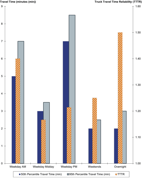
Figure 7. Chart. Example bar chart showing travel time and Truck Travel Time Reliability.
(Source: FHWA.)
Peak Hour Excessive Delay
This section discusses approaches for communicating the PM3 measure for CMAQ traffic congestion, annual hours of PHED per capita, and the related metrics, excessive delay, and total excessive delay.
The first step in calculating the measure of excessive delay is the difference between observed travel time and either (a) travel time at 20 miles per hour (mph) or (b) 60 percent of the travel time at the posted speed limit, whichever is greater for each segment of the NHS in an urbanized area. The total excessive delay metric is the product of excessive delay, average daily traffic, and average vehicle occupancy (to get units of person-hours). The reported PHED measure divides the total excessive delay for AM and PM peak periods by the population for a given urbanized area to get hours per capita.
Excessive delay and total excessive delay can be used by State DOTs and MPOs in a variety of ways at the corridor, regional, or statewide level. As an example, total excessive delay can be multiplied by a value of time to monetize excessive delay.
Key messages related to PHED and total excessive delay include the following:
- Excessive delay means travel times that are longer than normal. More specifically, it means that travel times exceed a specific travel time threshold (the greater of either (a) 60 percent of the posted speed limit or (b) 20 mph).
- The cost of congestion can be balanced against economic benefits. In other words, congestion can be a sign of a healthy, growing economy. Agencies mentioned that total excessive delay is one of the most accessible real-world expressions of congestion, and using value of time, it can be monetized, making it even more powerful for decisionmakers focused on return on investment. With that said, some agencies have preferred to express the value of time spent in excessive delay as a cost to balance against the benefits of economic growth rather than as a wasted value.
Table 3. Communicating excessive delay to different audiences.
| Audience |
Messages |
| Technical Advisers and Colleagues |
Technical staff may find visualizations of excessive delay as useful ways of understanding the nature and causes of delay along specific NHS corridors. As a result, visualizations can help technical staff identify targeted investments that can decrease the amount of excessive delay. |
| Executives and Knowledgeable Decisionmakers |
Because PHED is an understandable concept to the layperson, it may garner the most questions from the public. One important concept for decisionmakers to understand in responding to questions is that excessive delay is not the same thing as perceived delay. In some areas, not being able to drive at free-flow speeds may feel like rush hour, but on a 65-mph road, a 40-mph flow does not represent excessive delay.
It also is important to note that PHED includes only NHS roads. Delay experienced on local and connector roads does not count toward the metric. |
| Decisionmakers and the Public |
Example: In a two-person household, Daniel drives to and from work and drops off and picks up his toddler, Katy, at daycare on the way.
Daniel and Katy represent two person-trips. Their trip in each direction takes 36 minutes, of which 6 are spent on local streets and 30 are spent on a major highway with a 65-mph speed limit.
Of the 30 minutes of the trip on the major highway, 17 are spent traveling at 65 mph or higher, 8 are spent traveling at 40 mph or higher, and 5 are spent traveling at less than 39 mph (60 percent of the speed limit).
Daniel and Katy experience 5 minutes of excessive delay per trip. Two trips per day and two people in the car gives their family unit 20 person-minutes per day. Following this routine 240 days per year gives them 80 person-hours per year, or 20 hours of PHED.1 |
PHED can be displayed as a line chart over time in figure 3. Because it is a per-capita measure, it also can be compared apples to apples across MPOs in a map like the one shown in figure 8 (for a hypothetical State with multiple large urban regions).
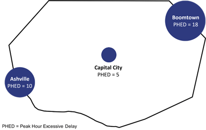
Figure 8. Diagram. Regional statewide Peak Hour Excessive Delay graphic with area proportional to the amount of Peak Hour Excessive Delay.
(Source: FHWA.)
Visualizing areas of excessive delay along a corridor, as in figure 9, maybe be helpful to personalize the excessive delay metric.
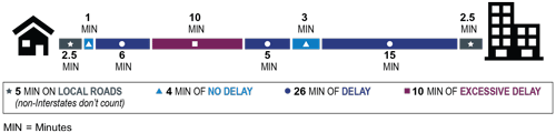
Figure 9. Infographic. Excessive delay map for a hypothetical trip.
(Source: FHWA.)
Both PHED and total excessive delay also can be presented in column charts as shown in figure 3 and histograms as shown in figure 4.
Non-Single Occupancy Vehicle Share
This section discusses approaches for communicating the PM3 measure for CMAQ traffic congestion, non-SOV share. The non-SOV share measure represents the share of travel that is not SOV trips. The base source of this information is American Community Survey (ACS) Journey to Work data. Agencies are also permitted to use their own travel surveys or count data to produce the measure. The measure includes non-SOV modes such as walking, bicycling, and public transportation and those who telecommute (i.e., work from home).
Key messages related to the non-SOV share measure include the following:
- The data source for non-SOV share is the ACS Journey to Work data. The ACS, while conducted by the U.S. Census Bureau, does not include all Americans, since roughly 3.5 million households respond annually. Because this may not be enough of a sample to ensure coverage of smaller geographies, multiple years of ACS data are often used at once; the non-SOV share measure uses 5-year-rolling-average data from ACS. Journey to Work surveys collect information on travel from home to work. Related questions include travel time, means of transportation, time of departure for work, vehicles available, expenses associated with the commute, and geographic location of the workplace.
Table 4. Communicating non-Single Occupancy Vehicle share to different audiences.
| Audience |
Messages |
| Technical Advisers and Colleagues |
Non-SOV share is a regionwide measure, and because it is usually sourced from the ACS, it should not be viewed at the corridor level. It may add insight to place non-SOV share in the context of transit ridership and investment, bicycle and pedestrian usage rates and investment, or telecommuting rates (available from ACS). |
| Executives and Knowledgeable Decisionmakers |
The non-SOV share measure represents the share of travel that is not SOV trips. Similar to communications with technical advisers and colleagues, it may be helpful to contextualize this value with information on transit ridership and investment, bicycle and pedestrian usage rates and investment, or telecommuting rates. |
| Decisionmakers and the Public |
Moving this measure may rely greatly on transportation demand management approaches; many investments such as transit, high-quality sidewalks, or bike lanes improve quality of life while providing incentives not to drive alone.
There are many benefits to reducing SOV use: reduced congestion, improved air quality, and improved health. |
One effective method of displaying non-SOV share is in a pie or donut chart displaying the observed quantity of each mode type. Non-SOV share also can be visualized in a line chart over years (figure 10).
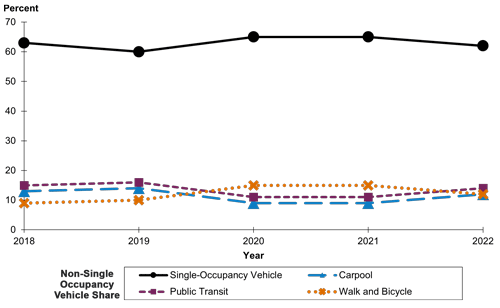
Figure 10. Chart. Non-Single Occupancy Vehicle share line chart example.
(Source: FHWA.)
Congestion Mitigation and Air Quality Total Emissions Reduction
This section discusses approaches for communicating the CMAQ total emissions reduction measure. The measure consists of the 2- and 4-year cumulative reported emission reduction for all projects funded by CMAQ funds for five pollutants:
- Particulate matter under 2.5 micrometers (PM2.5)
- Particulate matter under 10 micrometers (PM10)
- Carbon monoxide (CO)
- Volatile organic compounds (VOCs)
- Nitrogen oxide (NOx)
Table 5. Communicating Congestion Mitigation and Air Quality total emissions reduction to different audiences.
| Audience |
Messages |
| Technical Advisers and Colleagues |
The measure records all emissions reduced by a project in the first year the project is obligated. |
| Executives and Knowledgeable Decisionmakers |
This measure may not reflect overall environmental impact. This limited scope is reflected both in the senses (1) that the measure captures only emissions reduction from CMAQ projects and (2) that the reduction is recorded all at once and only once—the first year the project is obligated. |
| Decisionmakers and the Public |
The measure includes only emissions reduced due to projects funded with CMAQ funds provided to States. While this provides valuable insight in assessing the benefits of CMAQ, it should not be misconstrued as a measure of overall emissions reduction from a MPO’s overall improvement program. |
CMAQ total emissions reduction can be visualized as a line chart with funding on a second axis for context (as shown in figure 11). Note that because of scale differences among pollutants, it may be desirable to show only one pollutant per chart.
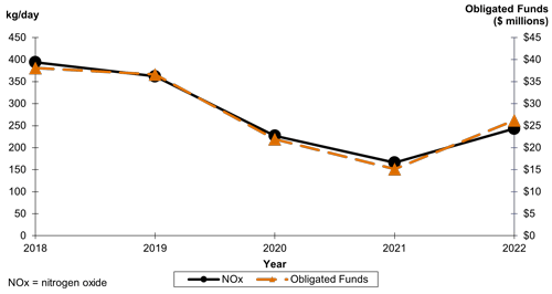
Figure 11. Chart. Congestion Mitigation and Air Quality total emissions reduction line chart example.
(Source: FHWA.)
It may also be useful to create a map comparing regions across a State or to break down total emissions reduction across projects receiving CMAQ funds by using a treemap (figure 12).
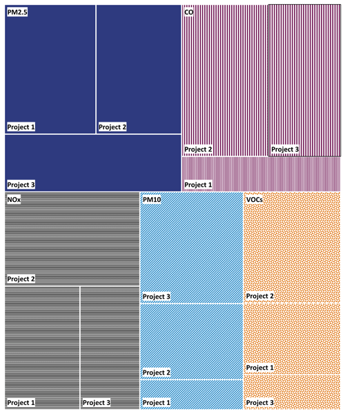
Figure 12. Chart. Example of a “treemap” chart that displays Congestion Mitigation and Air Quality emissions reduction by project and pollutant/precursor.
(Source: FHWA.)