2021 Urban Congestion TrendsPrintable version [PDF 6.7 MB]
U.S. Department of Transportation FHWA-HOP-22-028 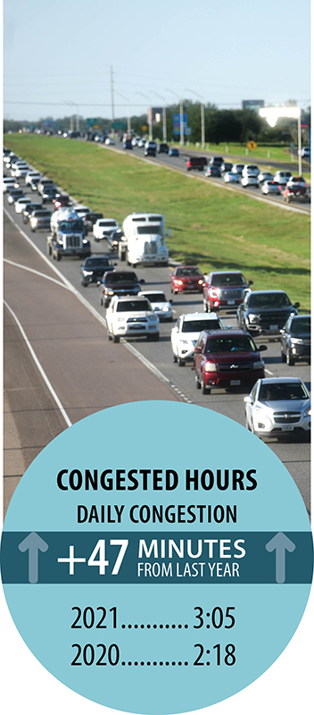 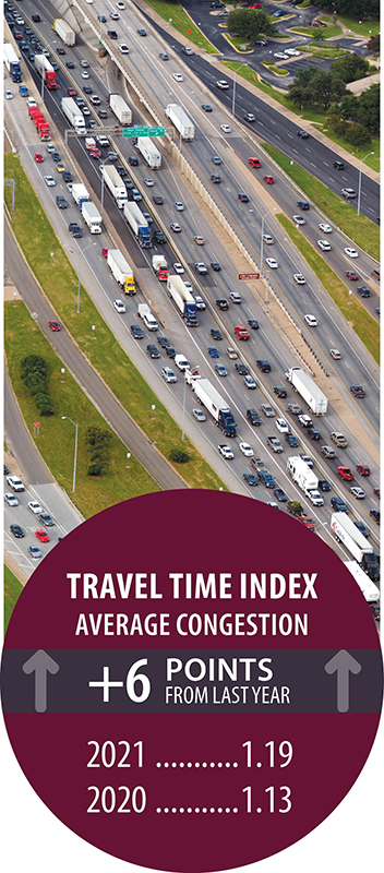 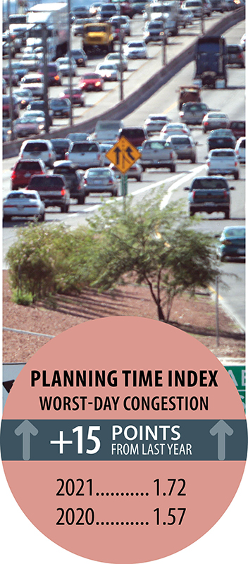 Photos credit: Texas A&M Transportation Institute Communications For more 2021 trend information, see Summary of Performance Measure Trends for Calendar Year 2021. Congestion Measure DefinitionsCongested Hours—average amount of time in hours when freeways operate in congested conditions during a day (congested conditions means at less than 90 percent of free-flow speed between 6 a.m. and 10 p.m.). Travel Time Index (TTI)—time penalty for a trip on an average day. A TTI of 1.30 indicates a 20-minute free-flow trip takes 26 minutes (20 × 1.30) in the rush hours (weekdays 6 a.m. to 9 a.m. and 4 p.m. to 7 p.m.). Planning Time Index (PTI)—time penalty for a trip to be on time for 95 percent of trips (e.g., late for work on one day per month). A PTI of 1.60 indicates a 20-minute free-flow trip takes more than 32 minutes (20 × 1.60) 1 day per month. 
Photo credit: Texas A&M Transportation Institute Communications 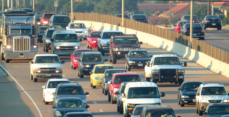
Photo credit: Texas A&M Transportation Institute Communications 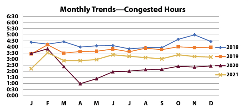 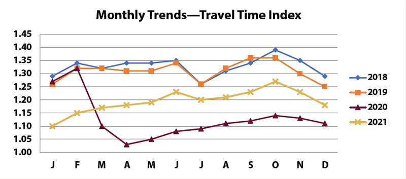 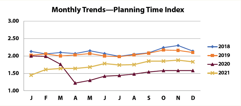 Chart Source: FHWA Urban Congestion Trends 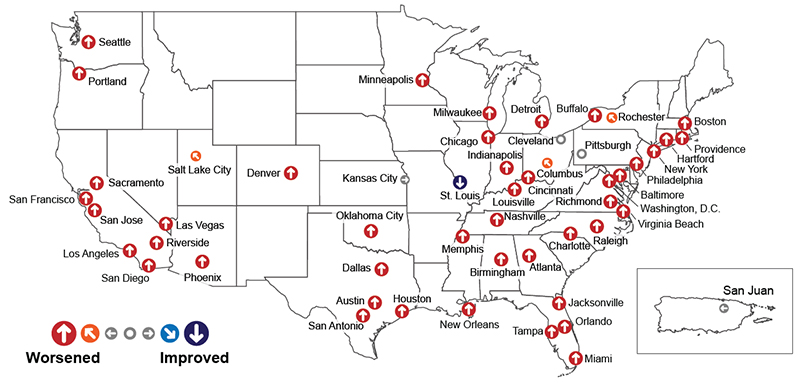
Source: FHWA Congestion Facts
Photo credit: Texas A&M Transportation Institute Communications National Performance Management Research Data Set (NPMRDS) ApplicationsDifferent agencies use NPMRDS data in myriad ways. One such example is from the North Carolina Department of Transportation (NCDOT) Freight and Logistics Program. The Program has an application to determine congestion costs on its Priority Freight Highway Network, a network of 3,900 miles identified as important to freight transportation including interstates, State roads, and other key freight corridors. The program uses NPMRDS data and internal tools to track congestion costs, reviews, and reports freight congestion metrics, and then shares the information with the relevant highway divisions within the agency and externally with industry partners. Figure 1 shows an example of the commercial cost of delay on the Priority Freight Highway Network with percentage change year over year. The program also produces dashboards that help articulate the impact of congestion, and provides further dissemination through freight-focused bulletins and updates for both internal and external stakeholders. 
Photo credit: Ken Schulze/Shutterstock.com 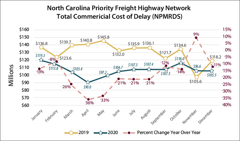
Figure 1. Commercial Cost of Delay on Priority Freight Highway Network. For more information about the North Carolina Freight and Logistics Program, contactDana A. Magliola, Program Manager, Freight + Logistics NCDOT Rail Division, damagliola@ncdot.gov. The NPMRDS includes actual, observed travel times on the National Highway System (NHS) for freight vehicles, passenger vehicles, and all vehicles. The NPMRDS is available for State departments of transportation and metropolitan planning organizations to use for their performance management activities. The travel time data have been used to calculate congestion and reliability metrics for the Federal Highway Administration (FHWA) Urban Congestion Report (UCR) since 2013. Green Light Lincoln: Optimized Traffic Signal Timing in Lincoln, NEThe overall purpose of the Green Light Lincoln project was to prepare and implement optimized traffic signal timing plans in Lincoln, NE, and to quantify the changes in traffic operations that resulted from signal equipment upgrades and signal timing changes with before and after performance measures. Several key components of Green Light Lincoln are connected to the Lincoln Transportation and Utilities Traffic Management Master Plan. Since 2018, each of the four phases of the project has consisted of improvements to signal equipment and signal timing at the 410-plus signals across the city. Data analysis and travel time studies conducted after the new signal timings were implemented showed a decrease in travel times from the previous conditions for over 30 corridors. Additionally, updates to pedestrian and vehicle clearance times at study intersections enhanced safety at those locations. 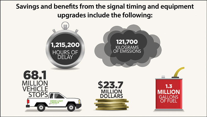
Source: City of Lincoln, NE The reductions to delay incurred and fuel consumed are estimated to save Lincoln motorists over 1.2 million hours of delay and nearly 1.3 million gallons of fuel across the four phases of the project, equating to $23 million in savings. The benefit-to-cost ratio over a 5-year period (the FHWA-recommended period between retiming efforts) is 17:1. These savings only included travel time and fuel consumption; safety and emissions benefits were not monetized. A more detailed summary of benefits and costs broken out across the phases of the traffic signal system optimization effort is shown in table 1.
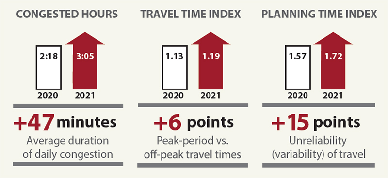
1 Savings based on reductions in delay and fuel, and local demographic information. FHWA recommends updating signal timings every 5 years. Based on FHWA’s recommendation and assumptions, Green Light Lincoln is expected to deliver these benefits annually. The total annual savings resulting from the project to date are expected to be $23.7 million. For more information on Green Light Lincoln, seeFor more information on signal timing, seeFHWA’s Office of Operations Arterial Management webpage: https://ops.fhwa.dot.gov/arterial_mgmt/traffic_sig.htm. Summary of Performance Measure Trends for Calendar Year 2021Traffic performance measures calculated for this report at the national level all worsened in 2021. This may be an indicator that the impact of the pandemic has decreased and the traffic is returning to normal. Traffic volumes increased for much of the year, and as shown in this report, speeds were lower and travel time variability increased, which resulted in the higher congestion measures across the MSAs. Hours of congestion across the MSAs also increased an average of 47 minutes compared with 2020 but are still down 42 minutes when compared with the 2019 congested hours measure. Based on the TTI and a 20-minute trip at free flow for comparison purposes across years, travel time was up by about 1 minute in 2021 compared with 2020 but still down compared with 2019. Similarly, based on the PTI and a 20-minute free-flow trip out of 20 trips taken in 2021, the longest trip would have taken more than 34 minutes. In 2019, out of 20 trips taken, the longest trip would have taken more than 41 minutes. 
Photo credit: Nicole Glass Photography/Shutterstock.com The continued collection of data and measures from the UCR program allows for trend analysis of the three congestion measures. Trend analyses show 2020 to be an outlier, while 2021 indicates that congestion measures are approaching 2018 and 2019 average levels. The FHWA 2021 Urban Congestion Trends details trends and the current state of congestion and reliability on the NHS in 52 of the largest metropolitan areas in the United States. This report also includes examples of how agencies are using the NPMRDS for performance reporting and analysis, as well as for operational strategy evaluation and benefit calculation. This document is disseminated under the sponsorship of the U.S. Department of Transportation in the interest of information exchange. The U.S. Government assumes no liability for the use of the information contained in this document. The U.S. Government does not endorse products or manufacturers. Trademarks or manufacturers’ names appear in this document only because they are considered essential to the objective of the document. They are included for informational purposes only and are not intended to reflect a preference, approval, or endorsement of any one product or entity. The contents of this document do not have the force and effect of law and are not meant to bind the public in any way. This document is intended only to provide information to the public regarding existing requirements under the law or agency policies. However, compliance with applicable statutes or regulations cited in this document is required. 
Photo credits: (top) Texas Department of Transportation and (bottom) Texas A&M Transportation Institute Communications Contact InformationVisit the Operations Performance Measurement Program Urban Congestion Reports web page for quarterly congestion trend updates: https://ops.fhwa.dot.gov/perf_measurement/ucr/index.htm. | |||||||||||||||||||||||||||||||||||||
|
United States Department of Transportation - Federal Highway Administration |
||