Chapter 5. Chicago Case StudyChicago Testbed Network CharacteristicsThe Chicago testbed network is extracted from the greater Chicago metropolitan area to evaluate the impact of citywide weather-related strategies (figure 12). This partial network includes the Chicago Loop in the bottom right, O’Hare International Airport (O’Hare) in the far left, and Evanston, Illinois, at the top. The road network in the area consists of Kennedy Expressway on Interstate 90 (I–90), Edens Expressway on Interstate 94 (I–94), Eisenhower Expressway on Interstate 290 (I–290), and Lake Shore Drive. The testbed network is bounded on the east by Lake Michigan and on the west by Cicero Avenue and Harlem Avenue. Roosevelt Road and Lake Avenue bound the testbed network from the south and north, respectively. Table 10 summarizes characteristics of the network. 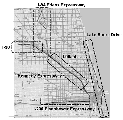
I–90/94 = Interstate 90/94. I–290 = Interstate 290. Original map: © 2017 Google® Maps™. Map overlay: FHWA (see Acknowledgments). This is a map of the Chicago area with five areas surrounded with dotted rectangles: Lake Shore Drive on the east; Interstate 290 Eisenhower Expressway near the bottom; Interstate 90 and 94 Kennedy Expressway in the middle of the map; Interstate 90 on the right of the map; and Interstate 94 Edens Expressway in the upper part of the map.
Road Weather Connected Vehicle Application in Road Weather ResponseThis section describes the analysis framework and a proposed framework of road weather connected vehicle (RWCV) application in snowplow operations. Analysis Modeling Framework of Road Weather Connected Vehicle ApplicationAnalysis, modeling, and simulation (AMS) implementation for RWCV applications is designed to address the following questions of this study:
In the proposed modelling framework for RWCV applications, CV data provide additional input of real-time localized traffic information in the decision support system of road weather response. Figure 13 presents the analysis framework, guiding the application of AMS tools to CV-enabled WRMS. The analysis framework is designed to simulate operational strategies and decision-making processes in the traffic management center (TMC) under winter weather conditions, and describe main process detection; CV data collection, communications, and control/advisory information dissemination technologies; and system management decisions. 
ATDM = active traffic demand management. DMA = dynamic mobility application. Source: FHWA This diagram shows two main sections: systems manager decisions emulator and performance measure. Under systems manager decisions emulator is a box labeled simulations of algorithms and new strategies. This contains two boxes: active traffic demand management strategies and dynamic mobility application applications and bundles. Under performance measure is a box labeled simulations and emulations as the current state of the art. This contains five boxes: weather conditions, travel demand simulator, information, connected vehicles flow attributes, and transportation network vehicular flow simulator. Arrows are drawn between all the mentioned components. The following indicates the flow out for each component: Systems manager decisions emulator out to active traffic demand management strategies, dynamic mobility application applications and bundles, and transportation network vehicular flow simulator; active traffic demand management strategies out to transportation network vehicular flow simulator; dynamic mobility application applications and bundles out to transportation network vehicular flow simulator; weather conditions out to transportation network vehicular flow simulator and travel demand simulator; travel demand simulator out to performance measure and transportation network vehicular flow simulator; information out to transportation network vehicular flow simulator, connected vehicles flow attributes, and travel demand simulator; connected vehicles flow attributes out to information and transportation network vehicular flow simulator; transportation network vehicular flow simulator out to performance measure, Systems manager decisions emulator, active traffic demand management strategies, and dynamic mobility application applications and bundles.
Road Weather Connected Vehicle Application in Snowplow OperationIn the Chicago testbed, AMS tool development and application are not limited to traffic operations; they also extend to various control strategies that can leverage the predictive capabilities of the tools and vehicle-to-infrastructure (V2I) connectivity under adverse weather. For implementing AMS tools for the RWCV application in snowplow operation, additional modules were developed to estimate and predict conditions and capacities of road sections across the testbed network affected by snow accumulation. The network traffic states are estimated and predicted by processing data from CVs running in the network. The Snowplow Command module uses the information to generate snowplow routes to minimize the weather impact on traffic. Figure 14 shows the RWCV application framework specialized for snowplow operations in the current operation scheme. 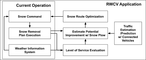
RWCV = road weather connected vehicle. Source: FHWA This diagram outlines information flow for the road weather connected vehicle application. Under current operation there are three components: snow command, snow removal plan execution, and weather information system. Other components outside current operation are: snow route optimization, estimate potential improvement with snow plow, level of service evaluation, and traffic estimation and prediction with connected vehicles. Arrows are drawn to show the flow of information. These are: snow command out to snow removal plan execution; snow removal plan execution out to estimate potential improvement with snow plow and level of service evaluation; weather information system out to snow command and level of service evaluation; snow route optimization out to snow command; estimate potential improvement with snow plow out to snow route optimization; level of service evaluation out to estimate potential improvement with snow plow; and traffic estimation and prediction with connected vehicles out to estimate potential improvement with snow plow.
To evaluate the marginal benefit of additional layers of CV data input and route optimization, three scenarios of snowplow operation under identical weather conditions are evaluated: (0) do nothing, (1) execute predefined snowplow route plan, and (2) execute snowplow route plan optimized with CV data. While a predefined snowplow plan is initiated based on network-level evaluation of snow severity, an optimized snowplow plan is generated by utilizing link-level traffic states and weather conditions. For a meaningful comparison, both snowplow operations are bounded by the same constraints of vehicle-working hours, number of vehicles, depot locations, and plow capacity. Data DescriptionThis section describes the data used for setting up quantitative input of weather scenarios and snowplow route plans in this project. The remainder of this section outlines a list of data in use and sources, followed by data analysis results. Data Sources and DescriptionData on traffic and weather conditions, as well as real-time data from CVs are needed for the implementation of AMS tools for RWCV applications. Specific weather-related and CV applications, such as snowplow routing and variable speed limits (VSL), require additional data from CVs that can complement data from legacy systems to allow for improved performance. To reproduce a network condition affected by adverse weather conditions and an impact of an actual snowplow plan executed by the City of Chicago, a real-world weather data and snowplow route tracker are used in the project. For the purpose of integrating CV data into weather-related strategy, traffic data was synthesized from DYNASMART. An interval from 00:00 to 23:59 on November 26, 2018, was selected as a test period in consideration of adverse weather conditions that initiated a citywide snowplow plan. A major early season winter storm affected the Midwest November 25–26. The City of Chicago released the snowplow tracker data including the locations of road treatment vehicles from November 25–28. Snow precipitation and visibility measurement data collected during the snowfall were used for generating input of weather and the predetermined snowplow route plan. Weather DataThe Automated Surface Observing Systems (ASOS) data with resolutions of one minute and five minutes are available at the National Oceanic and Atmospheric Administration (NOAA) National Climatic Data Center (NCDC) FTP server (ftp://ftp.ncdc.noaa.gov/pub/data/). Weather observation data from the ASOS station at O’Hare (International Civil Aviation Organization [ICAO] code KORD), which is six miles west of the center of test network, are used for this report. Weather observation data from 2000 to today are available from the station. In real life, the severity of snow events is the complex outcome of air/pavement temperature, snowfall, and wind speed; however, for the sake of simplicity, only the precipitation rate was used to estimate cumulative snow depth in this project. The November 25–26 snowfall that had started late in the night on November 25 had let up in the following afternoon. The snow precipitation measurement from the ASOS station at O’Hare is plotted in figure 15. 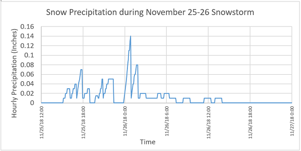
Source: FHWA This graph shows snow amounts over time with the x-axis from 12:00 noon on November 25, 2018 to 12:00 midnight November 27, 2018. The y-axis is hourly precipitation in inches from 0 to 0.16. Periods of snow extend from 3:00 PM to 8 PM on November 25, with peaks of 0.03, 0.04, 0.07 and 0.03 at 4, 5, 6, and 7 PM. Then from 8 PM to 10 PM on November 25 with peaks of 0.01, 0.05, and 0.05 at 8:30, 9, and 10. On November 26 there was precipitation from 1 AM to 8 PM with peaks of 0.14, 0.08, 0.02, 0.02, 0.02 at 1, 2, 3, 5, and 6 AM. Then minor peaks of 0.01 at 9 AM 12 PM and 1 PM. No precipitation occurred after this time.
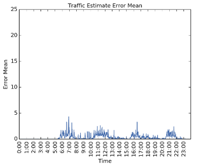
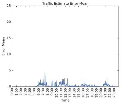
City of Chicago Plow TrackerThe City of Chicago’s snowplow trucks are equipped with global positioning system (GPS) trackers that share on the web the location of trucks in operation (https://www.chicago.gov/city/en/depts/streets/supp_info/plowtracker.html). The data released by the City of Chicago in the plow tracker app include information on the location specified in terms of latitude and longitude, date and time of the observation, and track number. In addition to tracking real-time vehicle locations, predetermined snowplow route patterns can be extracted from the archived data sets. The snowplow data archive collected contains plow activity for 54 snow events in Chicago since January 2012. It is reported that the City of Chicago had dispatched 287 large trucks and 26 pick-ups to respond to the November 26, 2018, snowstorm. GPS data from active snowplow trackers had been recorded from the late night of November 25 to the afternoon of November 28. To generate DYNASMART input, GPS points collected within the network coverage were extracted and analyzed to find the executed snowplow routes, depot locations, number of vehicles operated in the range of the test network, total vehicle operation hours, and plowing vehicle speeds. Integration of Connected Vehicle Data into Road Weather Connected Vehicle ApplicationOne of the main research questions is how data from CVs can be combined to a legacy system for real-time traffic estimation and prediction. This section explains possible integration of data from CVs and roadside detection systems in an AMS implementation and illustrates the integration plan of CV data in real-time traffic estimation and prediction. Integration of Traffic Data for Real-Time Traffic Estimation PredictionTimely observations of unfolding traffic conditions are an important input in operating a prompt weather-responsive traffic management (WRTM) system. Most common traffic surveillance systems collect data from stationary detectors mounted on/above the selected road sections. Relying on this type of traffic monitoring system for real-time traffic state estimation introduces two problems: uncertain data reliability and limited network observability. First, transmitted sensor data may be temporarily or permanently missing or corrupted. Second, in general, detector stations are sparsely located due to budget constraints, providing only limited network observability. The sparse data coverage can be compounded by temporary or permanent failure of detectors. The primary benefit of CV trajectories is that traffic measurements become available on every road section a CV is traversing. This additional source of data can boost real-time network observability of traffic management systems. However, it can be challenging to estimate traffic parameters only with CV data if CV market penetration rate (MPR) is not high enough to represent the overall traffic population. This study developed a method to use data from CVs and stationary detectors to estimate and predict real-time network traffic conditions using low CV MPR and the limited number of available detectors in the network of interest. In the AMS tool for RWCV application, this networkwide traffic estimation is the primary input for diagnostic assessment that initiates traffic control strategies or road management plans. Real-Time Traffic SpeedTraffic speed is defined as a ratio of total length that vehicles travel in a spatial range of interest to total travel time of the vehicles. At a fixed point, vehicle speed is estimated by measuring how long it takes for the vehicle to pass the target point. If multiple vehicles travel the location, traffic speed is a harmonic mean speed of the vehicles. On the other hand, speed of a vehicle trajectory is measured by how far the vehicle traveled for a given time range. Thus, traffic speed of multiple trajectories becomes space-mean of the speed of all corresponding vehicles. To measure the accuracy of the traffic state estimation with data from CVs that account only for a fraction of the total vehicle population, traffic estimation with various CV MPRs were compared to traffic estimation with full information (figure 16). Figures 16A, 16B, and 16C show the traffic speed estimation error with 1, 5, and 10 percent CV MPR, respectively. The estimation error is compared in table 11. According to the results, traffic estimation with more than 5 percent CV MPR can provide an acceptable level of accuracy. 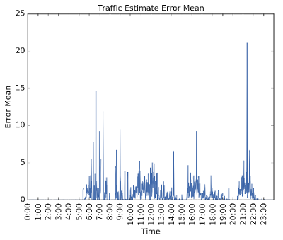
Source: FHWA Graph plots time on the x-axis from 0:00 to 24:00, and error mean from 0 to 25 on the y-axis. Graph A is for traffic speed estimation error with a 1 percent connected vehicle market penetration rate. The graph shows periods of sharp peaks and sharp ups and downs of from 5:00 to 8:00, from 9:00 to 14:00, 16:00 to 19:00, and 21:00 to 22:00. The significant peaks are: 15 at 7:00, 12 at 7:30, 10 at 9:00, 5 at 12:00, 8 at 14:00, 3 at 18:00, and 22 at 22:00.
Source: FHWA Graph plots time on the x-axis from 0:00 to 24:00, and error mean from 0 to 25 on the y-axis. Graph B is for traffic speed estimation error with a 5 percent connected vehicle market penetration rate. The graph shows periods of peaks and sharp ups and downs from 6:00 to 8:00, 10:00 to 13:00, 16:00 to 18:00, and 21:00 to 22:00. The peaks reach maximums of 4 in the 6:00 to 8:00 time period, 2 in the 10:00 to 13:00 time period, 3 in the 16:00 to 18:00 time period, and 2 in the 21:00 to 22:00 time period.
Source: FHWA Graph plots time on the x-axis from 0:00 to 24:00, and error mean from 0 to 25 on the y-axis. Graph C is for traffic speed estimation error with a 10 percent connected vehicle market penetration rate. The graph shows periods of peaks and sharp ups and downs from 6:00 to 8:00, 9:00 to 13:00, 16:00 to 18:00, and 21:00 to 22:00. The peaks reach maximums of 4 in the 6:00 to 8:00 time period, 3 in the 10:00 to 13:00 time period, 3 in the 16:00 to 18:00 time period, and 3 in the 21:00 to 22:00 time period.
Figure 16. Charts. Traffic speed estimation error with market penetration rate of 1 percent, 5 percent, and 10 percent.
Real-Time Traffic FlowAs for traffic flow, a roadside detector can directly measure traffic flow as the number of vehicles that pass the detector per unit time. However, traffic surveillance systems are mainly implemented on freeways rather than arterial roads, although the latter account for a significant portion of the overall lane-miles to be managed in weather-responsive programs. Meanwhile, CV data with low MPRs may not be sufficient to provide complete and accurate information on prevailing traffic states. In this study, statistical information about the CV population is extracted where data from both sources are available; this information provides the basis to use CV data to estimate traffic flow rates where no roadside detectors are installed. If CVs are randomly mixed in traffic, the ratio of traffic volume of CVs to traffic volume of total vehicles on the same link would be the expected value of probability that a randomly selected vehicle in traffic is a CV. If statistical properties of this probability are identical across the network, total traffic flow rate can be inferred in any part of the network as long as the CV traffic flow rate is available. In the study, it is assumed the inverse CV ratio is a random variable for which the probability distribution is unknown in advance. The CV ratio was estimated on 87 preselected links where stationary detectors are located, and the estimation is updated as new data are collected. The ratio is applied to all 4,805 links to estimate traffic flow with CV data. To understand the accuracy of the method, three scenarios with different MPRs are compared: 1 percent, 5 percent, and 10 percent. In each scenario, CVs are randomly generated with the given MPR. The estimation results are presented in figure 17 and table 12. Figures 17A, 17B, and 17C show the traffic flow estimation with 1, 5, and 10 percent CV MPR, respectively. 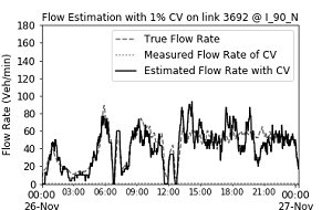
A. Graph. Traffic flow estimation with 1 percent connected vehicle market penetration rate. Graph shows x-axis of time from 0:00 on November 26 to 0:00 on November 27, and y-axis of flow rate of vehicles per minute from 0 to 180, and plots true flow rate, measured flow rate of connected vehicles, and estimated flow rate of connected vehicles. Graph A is for Traffic flow estimation with 1 percent connected vehicle market penetration rate. The three curves follow the same trends. The measured and estimated flow rate curves are very jagged across the graph, with high points of: 50 vehicles per minute at 1:30; 80 vehicles per minute at 6:00; 70 vehicles per minute at 9:00; 100 vehicles per minute at 15:00; 90 vehicles per minute at 18:00 and 20:00; and 70 vehicles per minute at 22:00. The measured and estimated flow rate curves are very jagged across the graph, with low points of: 0 vehicles per minute at 0:00; 10 vehicles per minute at 4:00; 0 vehicles per minute at 7:00; 0 vehicles per minute at 12:00; 20 vehicles per minute at 21:00; 70 vehicles per minute at 22:00. The true flow rate follows the connected vehicle rates very closely, but is less extreme in the fluctuations.
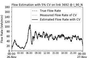
B. Graph. Traffic flow estimation with 5 percent connected vehicle market penetration rate. Graph shows x-axis of time from 0:00 on November 26 to 0:00 on November 27, and y-axis of flow rate of vehicles per minute from 0 to 180, and plots true flow rate, measured flow rate of connected vehicles, and estimated flow rate of connected vehicles. Graph B is for Traffic flow estimation with 5 percent connected vehicle market penetration rate. The measured and estimated flow rate curves are jagged across the graph, but do not show as much variability over the graph. The high points are: 45 vehicles per minute at 1:30; 110 vehicles per minute at 6:00; and then vary between 50 and 80 over the range from 9:00 to 23:00. The measured and estimated flow rate curves are jagged across the graph, with low points of: 10 vehicles per minute at 0:00; 10 vehicles per minute at 4:00; and 30 vehicles per minute at 7:00. The true flow rate follows the connected vehicle rates very closely.
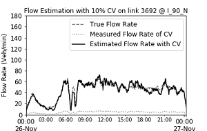
C. Graph. Traffic flow estimation with 10 percent connected vehicle market penetration rate. % = percent. CV = connected vehicle. I–90 N = Interstate 90 North. Nov = November. veh/min = vehicle per minute. Graph shows x-axis of time from 0:00 on November 26 to 0:00 on November 27, and y-axis of flow rate of vehicles per minute from 0 to 180, and plots true flow rate, measured flow rate of connected vehicles, and estimated flow rate of connected vehicles. Graph C is for Traffic flow estimation with 10 percent connected vehicle market penetration rate. The measured and estimated flow rate curves are jagged across the graph, with high points of: 40 vehicles per minute at 1:30; 60 vehicles per minute at 6:00; 60 vehicles per minute at 9:00; and then vary between 50 and 70 over the range from 9:00 to 23:00. The measured and estimated flow rate curves are very jagged across the graph, with low points of: 10 vehicles per minute at 0:00; 10 vehicles per minute at 4:00; 10 vehicles per minute at 7:00; 20 vehicles per minute at 8:00; and then vary between 50 and 70 over the range from 9:00 to 23:00. The true flow rate follows the connected vehicle rates very closely.
Solving the Dynamic Snowplow Route ProblemThis section describes the snowplow route optimization problem and the algorithm to find the solution. Figure 18 shows the objective function and constraints for the snowplow routing problem formulation. Objective functions for a snowplow route optimization might be to minimize total working hours or total salt consumption to plow all links in the network in order to meet annual snow program budgets. In this project, working hours are assumed to be given by the predetermined route plans. The goal is to determine snow routes that maximize the snowplow impact in terms of minimizing traffic flow disruptions during and after the snowfall (equation 2). With traffic information from CVs, the optimization problem is designed to prioritize the road sections with higher traffic demand in the order of plow routes. The formulation recognizes that weather forecasts and link traffic flow predictions from CV data are available for each planning horizon. When new forecasts and predictions are available, the snowplow plans are extended with additional road routes to maximize snowplow impact in the next planning horizon. The process repeats until the end of the simulation horizon. As for snowplow capacity, it is assumed the snowplow vehicle can plow one lane at a time, even if a link may have multiple lanes (equation 7). After a lane is plowed, the post-effect of plowing can vary with several factors, such as road surface temperature, wind speed, precipitation rate, etc. Modelling the post-effect of plowing is out of scope of this report. In this problem, an expected duration of plowing effect is given as a networkwide constant in order to estimate snowplow impact on a given link. Therefore, a certain lane of a link would desirably be plowed once in a given prediction horizon, but multiple times during the whole simulation period. At each iteration, snow depth on each link is calculated considering the effect of snowplowing planned up to the time. If a link has multiple lanes, snow depth on each lane is calculated independently (equation 3). Link capacity is determined by the snow depth on the specific link. When a snowplow vehicle traverses a link, it follows the link-specific speed. In order to penalize unnecessary U-turns, additional travel time is added if a vehicle needs to turn around. As a result, total working time of a snowplow vehicle is equal to the sum of link travel time of all the links the vehicle needs to traverse, additional turnaround time, time to reach the first link to be served from the closest depot, and time to come back to the closest depot from the last link to be plowed. The total working hour duration cannot exceed predetermined working time window of the vehicle (equation 4). The problem solution determines whether or not a vehicle plows a lane of a specific link at a given time (equation 5) and whether or not a vehicle needs to turn around in order to move to the next link (equation 6). The mathematical model of the optimization problem is described in the following section. Mathematical Model
Objective Function: 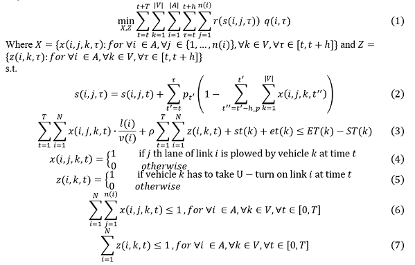
Source: FHWA Heuristic AlgorithmThis section describes the heuristic algorithm developed to find the solution of the snowplow optimization problem. The algorithm is designed to globally search the road segments that can maximize snowplow impact from a current vehicle location and extend its route plan while it meets time window constraints for every vehicle in operation. <Heuristic Algorithm for Real-Time Snowplow Route Optimization Problem>
For time t<T
Test ResultsIn this section, simulation results under three different plowing strategies are presented: (1) do nothing, (2) plow with predetermined routes (snowplow GPS tracks), and (3) plow with routes optimized with CV traffic information. Three simulation runs were executed under the same snowstorm scenario emulating November 26, 2018, but with different plowing strategies. For a fair comparison between strategy two and strategy three, the same number of plow trucks and the same total operation hours are used in both strategies. For strategy three, the snowplow route for each truck was determined by the heuristic algorithm in the previous section. The values given to predetermined variables are presented in table 13. Starting points and ending points of GPS tracks were used as depot locations. Capacity reduction in an adverse weather event is an outcome determined by complex interaction of road surface temperature, air temperature, wind speed, snow intensity, duration, etc. In this demonstration, snow capacity reduction rates were arbitrarily determined in proportion to snow accumulation. To see the impact of the capacity reduction rates on plowing effect, the moderate reduction scenario and severe reduction scenario are both tested to compare the snowplow impact of predetermined routes and optimized routes.
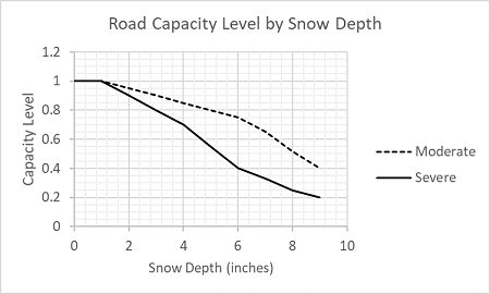
Source: FHWA This graph shows snow depth in inches from 0 to 10 on the x-axis and capacity level from 0 to 1.2 on the y-axis. Two curves are plotted for moderate and severe. The moderate curve starts at capacity level of 1 for 0 inches of snow depth and decreases to a capacity of 0.4 at a snow depth of 9 inches. The severe curve starts at capacity level of 1 for 0 inches of snow depth and decreases to a capacity of 0.2 at a snow depth of 9 inches.
As shown in figure 19, in the test, road capacity drops 40 percent at the worst condition of moderate reduction scenario (dashed line in figure 19) while it declines 80 percent in severe reduction scenario (solid line in figure 19). To evaluate the performance of the network under different strategies and scenarios, link speed and flow are compared by time. For spatial comparison, all links are classified into one of seven groups: eastbound of main freeways (Interstate 90 North [I–90 N], Interstate 90 South [I–90 S], Interstate 290 East [I–290 E], Interstate 290 West [I–290 W]), northbound and southbound of Lake Shore Drive, and arterials. Performance ComparisonSimulation results are plotted in figure 20 and figure 21. Each subfigure shows the simulated traffic of DYNASMART with three different plowing strategies: do nothing, plowing with predefined routes, and plowing with optimized routes. The traffic results are presented for corridor groups (from top to bottom) I–90 N and I–290 E. The results with severe and mild road capacity scenarios are presented on the left and right columns, respectively. Lower traffic speed values mean the traffic in the corridor experienced more severe speed drops. In the same sense, lower traffic flow after the beginning of peak hours (5:30) implies the traffic in the corridor experienced more severe capacity drops. Despite different extents, the network managed with the optimized snowplow plan consistently performed better than two other cases of doing nothing and running a predefined plan in every part of network. Under severe capacity reduction scenario, network traffic without any snowplow eventually comes to a near standstill while the network remains functional with snowplow operations. In comparison of the two capacity reduction scenarios, the snowplow optimization impact in improving the default plan is more substantial if the accumulated snow on a road network reduces its capacity by a larger extent. With the test results, it can be concluded that if snowplow routes are optimized with incoming weather and traffic information, disruption of the network traffic can be effectively prevented, and the network can maintain its capacity to serve demand with more desirable levels of service even during severe weather events. Speed ComparisonSevere Reduction Scenario 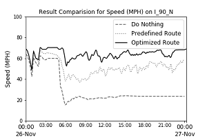
A. Graph. Traffic speed of DYNASMART results on I–90 N for three plowing strategies with severe capacity reduction scenario. Graph's x-axis shows of time from 0:00 on November 26 to 0:00 on November 27, and y-axis shows speed in miles per hour from 0 to 100. Three curves plotted showing do nothing, predefined route, and optimized route. Graph A plots traffic speed of DYNASMART results on Interstate 90 N for three plowing strategies with severe capacity reduction scenario. The Do nothing curve begins at 65 miles per hour at 0:00 on November 26, dips to 40 miles per hour at 1:00, increases to 60 miles per hour over the range from 2:00 to 5:00 and then drops to about 20 miles per hour at 6:00 and remains at this level until 0:00 November 27. The pre-defined route curve begins at 65 miles per hour at 0:00 on November 26, dips to 40 miles per hour at 1:00, increases to 65 then decreases to 40 miles per hour at 6:00. From here, the curve shows variation of about 5 miles per hour while the overall curve increases slowly to 60 miles per hour at 0:00 November 27. The optimized route curve begins at 70 miles per hour at 0:00 on November 26, dips to 50 miles per hour at 1:00, increases to 70 miles per hour over the range from 2:00 to 5:00, then decreases to 55 miles per hour at 6:00. From here, the curve shows variation of about 10 miles per hour while the overall curve increases slowly to 70 miles per hour at 0:00 November 27.
Moderate Reduction Scenario 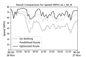
B. Graph. Traffic speed of DYNASMART results on I–90 N for three plowing strategies with moderate capacity reduction scenario. Graph's x-axis shows of time from 0:00 on November 26 to 0:00 on November 27, and y-axis shows speed in miles per hour from 0 to 100. Three curves plotted showing do nothing, predefined route, and optimized route. Graph B plots traffic speed of DYNASMART results on Interstate 90 N for three plowing strategies with moderate capacity reduction scenario. The Do nothing curve begins at 75 miles per hour at 0:00 on November 26, dips to 40 miles per hour at 1:00, increases to between 70 and 65 miles per hour over the range from 2:00 to 5:00 and then drops to about 30 miles per hour at 8:00. The curve increases to 50 miles per hour between 9:00 and 11:00, decreases to 40 at 12:00, and then increases slowly to 60 at 0:00 November 27, with variation of up to 10 miles per hour between the high and low peaks and valleys of the curve. The predefined route curve begins at 75 miles per hour at 0:00 on November 26, dips to 60 miles per hour at 1:00, increases to between 75 and 70 miles per hour over the range from 2:00 to 5:00 and then drops to about 55 miles per hour at 8:00. The curve increases to 65 miles per hour between 9:00 and 11:00, decreases to 55 at 12:00, and then increases slowly to 70 at 0:00 November 27, with variation of up to 10 miles per hour between the high and low peaks and valleys of the curve. The predefined route curve begins at 75 miles per hour at 0:00 on November 26, dips to 60 miles per hour at 1:00, increases to about 75 miles per hour over the range from 2:00 to 5:00 and then drops to about 60 miles per hour at 8:00. The curve increases to 75 miles per hour between 9:00 and 10:00, decreases to 65 at 12:00, and then remains at around 65 miles per hour up to 0:00 November 27, with variation of up to 15 miles per hour between the high and low peaks and valleys of the curve.
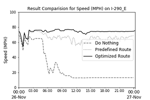
C. Graph. Traffic speed of DYNASMART results on I–290 E for three plowing strategies with severe capacity reduction scenario. Graph's x-axis shows of time from 0:00 on November 26 to 0:00 on November 27, and y-axis shows speed in miles per hour from 0 to 100. Three curves plotted showing do nothing, predefined route, and optimized route. Graph C plots traffic speed of DYNASMART results on Interstate 290 E for three plowing strategies with severe capacity reduction scenario. The Do nothing curve begins at 65 miles per hour at 0:00 on November 26, dips to 50 miles per hour at 1:00, increases to 60 miles per hour over the range from 2:00 to 5:00 and then drops to about 20 miles per hour at 6:00, increases briefly to 30 miles per hour and then decreases to 20 miles per hour at 9:00 and remains at this level until 0:00 November 27. The pre-defined route curve begins at 65 miles per hour at 0:00 on November 26, dips to 50 miles per hour at 1:00, increases to 75 over the range from 2:00 to 6:00 then decreases to 65 miles per hour at 7:00. From here, the curve shows variation of about 5 miles per hour while the overall curve remains at about 60 miles per hour up to 0:00 November 27. The optimized route curve begins at 70 miles per hour at 0:00 on November 26, dips to 50 miles per hour at 1:00, then increases to 75 miles per hour until 0:00 November 27.
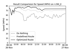
D. Graph. Traffic speed of DYNASMART results on I–290 E for three plowing strategies with moderate capacity reduction scenario. Graph's x-axis shows of time from 0:00 on November 26 to 0:00 on November 27, and y-axis shows speed in miles per hour from 0 to 100. Three curves plotted showing do nothing, predefined route, and optimized route. Graph D plots traffic speed of DYNASMART results on Interstate 290 E for three plowing strategies with moderate capacity reduction scenario. The Do nothing curve begins at 75 miles per hour at 0:00 on November 26, dips to 60 miles per hour at 1:00, increases to 70 miles per hour at 3:00 then declines to 50 miles per hour at 6:00 until 7:00. Then the curve increases to 65 at 12:00 and then remains at this range, plus or minus about 10 miles per hour until 0:00 November 27. The pre-defined route curve begins at 75 miles per hour at 0:00 on November 26, dips to 60 miles per hour at 1:00, increases to 75 over the range from 2:00 to 6:00 then slowly decreases to 70 miles per hour at 0:00 November 27. The optimized route curve begins at 75 miles per hour at 0:00 on November 26, dips to 60 miles per hour at 1:00, increases to 78 miles per hour and stays above 75 miles per hour from 3:00 to 0:00 November 27.
I–90 N = Interstate 90 North. I–290 E = Interstate 290 East. mph = mile per hour. Nov = November. Flow ComparisonSevere Reduction Scenario 
A. Graph. Traffic flow of DYNASMART results on I–90 N for three plowing strategies with severe capacity reduction scenario. Graph's x-axis shows time from 0:00 on November 26 to 0:00 on November 27, and y-axis shows flow in vehicles per minute from 0 to 180. Three curves plotted show do nothing, predefined route, and optimized route. Graph A plots traffic speed of DYNASMART results on Interstate 90 N for three plowing strategies with severe capacity reduction scenario. The do nothing curve increases to 40 vehicles per minute at 1:00, decreases to 15 vehicles per minute at 3:00, increases to 25 vehicles per minute at 5:00, then decreases to zero at 12:00 and remains at this level until 0:00 November 27. The predefined route curve increases to 40 vehicles per minute at 1:00, decreases to 15 vehicles per minute at 3:00, increases to 65 vehicles per minute at 6:00, then decreases to 10 vehicles per minute at 8:00, and from here slowly increases to 40 vehicles per minute at 17:00, decreases to 20 vehicles per minute at 19:00, and increases to about 35 vehicles per minute at 0:00 November 27. The optimized route curve is highly variable over the graph. It increases to 40 vehicles per minute at 1:00, decreases to 15 vehicles per minute at 3:00, increases to 100 vehicles per minute at 6:00, and then decreases to 20 vehicles per minute at 8:00. From here the curve increases to about 80 vehicles per minute from 9:00 to 11:30, decreases to 30 vehicles per minute at 1:00 then increases to around 80 vehicles per minute from 15:00 to 22:00, with variations of plus or minus 20 vehicles per minute.
Moderate Reduction Scenario 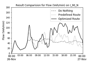
B. Graph. Traffic flow of DYNASMART results on I–90 N for three plowing strategies with moderate capacity reduction scenario.
Graph's x-axis shows time from 0:00 on November 26 to 0:00 on November 27, and y-axis shows flow in vehicles per minute from 0 to 180. Three curves plotted show do nothing, predefined route, and optimized route. Graph B plots traffic speed of DYNASMART results on Interstate 90 N for three plowing strategies with moderate capacity reduction scenario. The do nothing curve increases to 50 vehicles per minute at 1:00, decreases to 20 vehicles per minute at 3:00, increases to 60 vehicles per minute at 5:00 and remains at this level until 0:00 November 27. The predefined route curve increases to 50 vehicles per minute at 1:00, decreases to 20 vehicles per minute at 3:00, increases to 80 vehicles per minute at 6:00, then decreases to 30 vehicles per minute at 8:00, increases to 90 vehicles per minute at 12:00, decreases to 30 vehicles per minute at 1:00, increases to 80 vehicles per minute at 14:00, decreases to 60 vehicles per minute at 15:00, increases to 80 vehicles per minute at 17:00, decreases to 50 vehicles per minute at 20:00, increases to 70 at 22:00 and decreases to 30 vehicles per minute at 0:00 November 27. The optimized route curve is highly variable over the graph. It increases to 50 vehicles per minute at 1:00, decreases to 20 vehicles per minute at 3:00, increases to 110 vehicles per minute at 6:00, then decreases to 20 vehicles per minute at 8:00, increases to 80 vehicles per minute at 11:00, decreases to 30 vehicles per minute at 13:00, increases to 100 vehicles per minute at 14:00, increases to 120 vehicles per minute at 17:00, decreases to 80 vehicles per minute at 20:00, increases to 110 vehicles per minute at 21:00, and decreases to 40 vehicles per minute at 0:00 November 27.
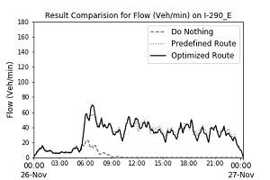
C. Graph. Traffic flow of DYNASMART results on I–290 E for three plowing strategies with severe capacity reduction scenario.
Graph's x-axis shows time from 0:00 on November 26 to 0:00 on November 27, and y-axis shows flow in vehicles per minute from 0 to 180. Three curves plotted show do nothing, predefined route, and optimized route. Graph C plots traffic speed of DYNASMART results on Interstate 290 E for three plowing strategies with severe capacity reduction scenario. The do nothing curve increases to 10 vehicles per minute at 1:00, increases to 20 vehicles per minute at 6:00, then decreases to 0 vehicles per minute at 9:00 and remains at this level until 0:00 November 27. The pre-defined and optimized route curves are coincident over the graph. These curves increase to 10 vehicles per minute at 1:00, increase to 70 vehicles per minute at 7:00, then decreases and remain at about 40 vehicles per minute from 9:00 to 22:00, with variations of plus or minus about 10 vehicles per minute over this range and decrease to 0 vehicles per minute at 0:00 November 27.
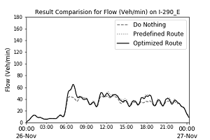
D. Graph. Traffic flow of DYNASMART results on I–290 E for three plowing strategies with moderate capacity reduction scenario.
Graph's x-axis shows time from 0:00 on November 26 to 0:00 on November 27, and y-axis shows flow in vehicles per minute from 0 to 180. Three curves plotted show do nothing, predefined route, and optimized route. Graph D plots traffic speed of DYNASMART results on Interstate 290 E for three plowing strategies with moderate capacity reduction scenario. The do nothing curve and the pre-defined and optimized route curves are coincident over the graph, although there are minor variations for the do nothing curve. These curves increase to 10 vehicles per minute at 1:00, increase to 60 vehicles per minute at 7:00, but the do nothing curve increases only to 50 at this time. Then the curves decrease to 35 vehicles per minute at 10:30, increase to 50 vehicles per minute at 11:00, then slowly decrease to 40 vehicles per minute until 22:00, with variations of plus or minus about 5 to 10 vehicles per minute over this range. The curves then decrease to 10 vehicles per minute at 0:00 November 27.
I–90 N = Interstate 90 North. I–290 E = Interstate 290 East. Nov = November. veh/min = vehicle per minute. | ||||||||||||||||||||||||||||||||||||||||||||||||||||||||||||||||||||||||||||||||||||||||||||||||||||||||||||||||||||||||||||||||||||||||||||||||||||||||||||||||||||||||||||||||||||
|
United States Department of Transportation - Federal Highway Administration |
||