CHAPTER 6. CASE STUDY
Note: Unless accompanied by a citation to statute or regulations, the practices, methodologies, and specifications discussed below are not required under Federal law or regulations.
The objective of this case study is to conduct a proof-of-concept test of the proposed framework. The focus is on the implementation of the major components of the calibration framework. As explained in the previous chapter there is an association between the library of parameters and the agents introduced into the model. Therefore, instead of sampling from the distribution of parameters and running a microsimulation tool, different types of agents were developed considering the correlation between the behavioral model parameters. The study uses an integrated traffic telecommunication tool that was developed at Northwestern University to evaluate the operational performance impacts of different agents in a mixed traffic environment at different market penetrations of the agents (Talebpour, Mahmassani and Bustamante 2016).
The microsimulation tool is a special-purpose platform for simulating mixed traffic conditions on freeways with the possibility of including connected vehicles and autonomous vehicles in the system. In the current case study, three types of drivers (agents) were considered: regular vehicles, connected vehicles, and automated vehicles. As will be discussed later, two agent types, namely, aggressive drivers and conservative drivers, were introduced by changing some of the parameters of the regular vehicles. The testbed uses a 3.5-mile section of I-290 in Chicago, Illinois (shown in figure 49). The following sections discuss the behavioral models embedded in the simulation tool.
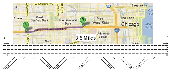
Source: FHWA.
Figure 49. Illustration. I-290E study segment in Chicago, IL.
The figure contains a Google map screenshot of the study area. The beginning and ending of the study segment are marked on I-290 in Chicago, Illinois, at around the west side of the West Garfield Park area and at around the east side of the East Garfield Park area. The study segment is marked in light purple. The figure also includes a schematic representation of the 3.5 miles study segment. The segment has four main lines, 4 on-ramps, and 3 off-ramps.
ACCELERATION (CAR FOLLOWING) FRAMEWORK
In the simulation platform, distinct car-following models are defined to specify the behavior of each agent: (1) isolated-manually driven vehicles (regular vehicles), (2) connected-manually driven vehicles (connected vehicles), and (3) isolated-automated vehicles (automated vehicles).
ISOLATED-MANUALLY DRIVEN VEHICLES
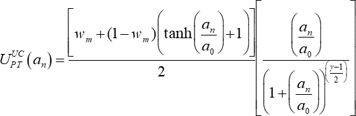
In the microsimulation platform, isolated-manually driven vehicles use the acceleration model first developed by Hamdar et al. (2008) and extended by Talebpour et al. (2011). The model was formulated based on Kahneman and Tversky’s prospect theory. Two value functions, one for modeling driver behavior in congested regimes and the other for modeling driver behavior in uncongested regimes, were introduced. The following formula shows the value function for the uncongested regime:
Figure 50. Formula. Value function for the uncongested regime.
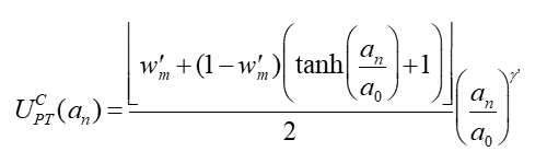
Where  denotes the value function for the uncongested traffic conditions. γ>0 and wm are parameters to be estimated and calibrated and ao = 1 m/s2 is used to normalize the acceleration. On the other hand, the following formula shows the value function for the congested regime:
Figure 51. Formula. Value function for the congested regime.
Where  denotes the value function for the congested traffic conditions. γ′>0 and w′m
are parameters to be estimated and calibrated. At each evaluation time step, the driver evaluates the gain from a candidate acceleration selected from a feasible set of values. The surrounding traffic condition is taken into consideration by the driver throughout the acceleration evaluation process. The driver utilizes the following binary probabilistic regime selection model to evaluate each acceleration value:
denotes the value function for the congested traffic conditions. γ′>0 and w′m
are parameters to be estimated and calibrated. At each evaluation time step, the driver evaluates the gain from a candidate acceleration selected from a feasible set of values. The surrounding traffic condition is taken into consideration by the driver throughout the acceleration evaluation process. The driver utilizes the following binary probabilistic regime selection model to evaluate each acceleration value:
Figure 52. Formula. Binary probabilistic regime selection model.
Where UPT, P(C), and P(UC) denote the expected value function, the probabilities of driving in a congested traffic condition, and the probability of driving in uncongested traffic condition, respectively. After calculating the expected value function, the total utility function for acceleration could be written as follows:
Figure 53. Formula. Total utility function for the choice of acceleration.
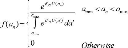
Where Pn,i is the crash probability. Finally, the following probability density function is used to evaluate the stochastic response of the drivers:
Figure 54. Formula. Probability density function for the evaluation of drivers’ stochastic response.
Where βPT is the sensitivity of choice to the utility U(an).
CONNECTED-MANUALLY DRIVEN VEHICLES
These vehicles are capable of exchanging information with other vehicles and infrastructure-based equipment. The information is exchanges through the vehicle-to-vehicle (V2V) and vehicle-to- infrastructure (V2I) communications networks. As a result, the driver receives information about other connected vehicles as well as updated information containing transportation management center decisions (e.g., real-time changes in speed limit). The drivers’ behavior may change based on the information conveyed to the driver. The reliability and the frequency of the information received by the driver plays a significant role in the drivers’ behavior and on the overall performance of the traffic network.
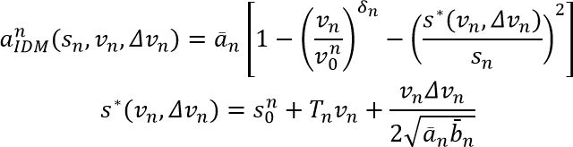
An active V2V communication network allows the drivers to be aware of other drivers’ behavior, the driving environment, road condition, and weather condition. As a result, the driving behavior could be modeled using a deterministic acceleration modeling framework. The simulation tool utilizes the Intelligent Driver Model (IDM) to model this connected environment. Because the IDM is able to capture various congestion dynamics and provides greater realism than most of the deterministic acceleration modeling frameworks.
The acceleration model specified by the IDM entails the vehicle’s current speed, the ratio of the current spacing to the desired spacing, the difference between the leading and the following vehicles’ velocities, and subjective parameters such as desired acceleration, desired gap size, and comfortable deceleration.
Figure 55. Formula. The intelligent driver acceleration model.
Where δn is the free acceleration exponent; Tn is the desired time gap; an is the maximum acceleration; bn is the desired deceleration;  is the jam distance; and
  is the desired speed. These parameters need to be calibrated to better capture the behavior of connected vehicles.
If the V2V communication network is inactive, the driving behavior of connected vehicles would be similar to that of isolated-manually driven vehicles. In the presence of V2I communications, the TMC decisions, such as the speed limits in the case of speed harmonization, could be transferred to the drivers. However, their reaction times would still be like regular drivers.
ISOLATED-AUTOMATED VEHICLES
Automated vehicles can continuously monitor other vehicles in their vicinity, which results in a deterministic behavior in interacting with other drivers. Furthermore, they can quickly react to any perturbations in the driving environment. Therefore, the car-following behavior of automated vehicles could be specified by a deterministic modeling framework. Talebpour and Mahmassani (2016) developed a car-following model for automated vehicles based on the previous simulation studies by Van Arem et al. (2006) and Reece and Shafer (1993). They simulated similar individual sensors installed on the automated vehicles in order to generate the input data for the acceleration model. Figure 56 shows the sensor formation of an automated vehicle with the following specifications:
- Smart Micro Automotive Radar (UMRR-00 Type 30) with 90m ±2.5 percent detection range and ±35 degrees horizontal field of view.
- The sensing information is updated every 50 ms.
- The sensors are capable of tracking 64 objects.
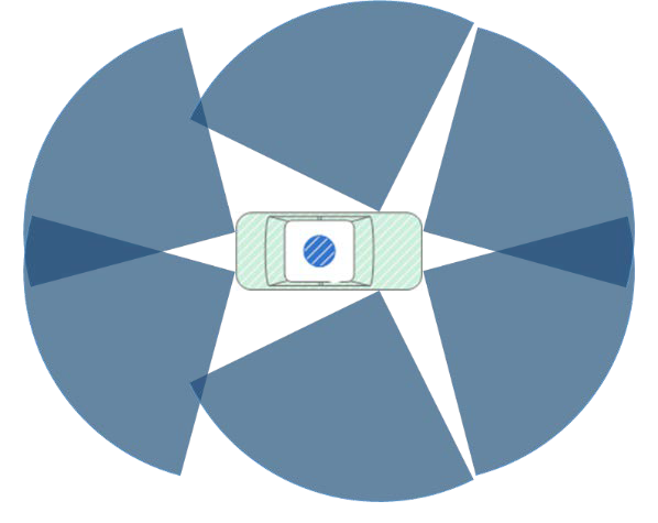
© Talebpour and Mahmassani, 2016.
Figure 56. Illustration. Radar sensor formation on an automated vehicle.
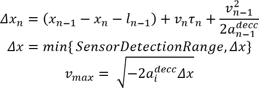
Considering the sensor range and limitations in accuracy, it is important for automated vehicles to be ready to react to any situation outside of their sensing range once it is detected (e.g., a vehicle at a complete stop right outside of the sensors detection range). Furthermore, if a leader is spotted, the speed of the automated vehicle should be adjusted in a way that allows it to stop if the leader decides to decelerate with its maximum deceleration rate and reach a full stop. Considering different situations that involve immediate reaction of the automated vehicle, the maximum safe speed can be calculated using the following equations:
Figure 57. Formula. Maximum speed of automated vehicles.
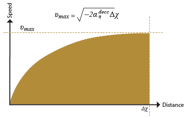
Where n and n−1 represent the automated vehicle and its leader, respectively; xn is the position of vehicle n; l;n is the length of vehicle n; vn is the speed of vehicle n; τn is the reaction time of vehicle n; and  is the maximum deceleration of vehicle n. Figure 59 represents the concept of maximum safe speed; any speed below the curve is considered to be safe.
Besides the safety constraint, the following formula, adopted from the model proposed by Van Arem et al. (2006), updates the acceleration of the automated vehicle at every decision point:
Figure 58. Formula. Acceleration model for automated vehicles.
Adapted from Reece and Shafer, 1993.
Figure 59. Diagram. Maximum safe speed curve.
The graph plots the distance (deltas x) (x-axis) against the speed (y-axis). The relationship is shown by a concave curve which starts from zero for both axes and asymptotically reaches the maximum speed (v subscript max) as the distance grows unbounded. The formula for the maximum speed is as follow: maximum speed (v subscript max) equals the square root of the result of multiplying minus 2 by the maximum deceleration of vehicle n (a superscript decc subscript n) by the distance (delta x).
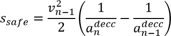
Where  is the acceleration of vehicle n, and ka, kv, and kd are model parameters that need to be calibrated. sn is the spacing and sref is the maximum between the minimum distance (smin), following distance based on the reaction time (ssystem), and safe following distance (ssafe). In this study, the minimum distance is set at 2.0 m and is calculated according to the following formula:
Figure 60. Formula. Safe following distance formula.
The safe following distance (s subscript safe) equals the square of the leader’s speed (v subscript n minus 1) over 2 times (open parenthesis) 1 over the follower’s maximum deceleration (a superscript decc subscript n) minus 1 over the leader’s maximum deceleration (a superscript decc subscript n minus 1) (close parenthesis).
Finally, the acceleration of the automated vehicle can be calculated using the following equation:
Figure 61. Formula. Acceleration of automated vehicles.
"The acceleration at a specified time (a subscript n (open parenthesis) t (close parenthesis)) equals the minimum between the acceleration defined in figure 58 (a superscript d subscript n (open parenthesis) t (close parenthesis)) and the result of multiplying a model parameter (k) by difference between the maximum safe speed defined in figure 59 (v subscript max) and the automated vehicle speed at the specified time (v subscript n (open parenthesis) t (close parenthesis)).
Where k is a model parameter. Van Arem et al. (2006) suggested using the following values for the model parameters: k=1, ka=1, kv=0.58 and kd=0.1
LANE-CHANGING MODEL
The lane-changing behavior in a multilane traffic, as an essential element in a microsimulation model, is prone human error, particularly at high speed in high-density environments. In a connected and automated environment, the lane changing behavior is expected to occur with lower risk and to incorporate fewer abrupt maneuvers than human-negotiated cases.
Talebpour et al. (2016) developed a game-theoretic lane-changing model that captures the dynamic interactions between drivers during discretionary and mandatory lane-changing maneuvers and introduced a game structure to model the behavior when drivers are not aware of the nature of the lane-changing maneuver (i.e., mandatory vs. discretionary). They proposed two game types:
- A two-person non-zero-sum non-cooperative game under complete information to model lane-changing decisions when drivers/automated vehicles are aware of the nature of lane- changing maneuver.
- A two-person non-zero-sum non-cooperative games under incomplete information to model lane-changing decisions in the absence of such knowledge.
The target vehicle (i.e., that is changing lane) is assumed to have two pure strategies (change lane, wait), while the lag vehicle (i.e., the new follower after the lane-changing maneuver) has three pure strategies (accelerate, decelerate, and change lane). Table 8 and table 9 define the structure of the mandatory and discretionary lane-changing games.
Table 8. Discretionary lane-changing game with inactive vehicle-to-vehicle communication in normal form.
Action |
Target Vehicle |
A1 (Change Lane) |
A2 (Do not Change Lane) |
| Lag Vehicle |
B1 (Accelerate) |
(P11, R11) |
(P12, R12) |
| B2 (Decelerate) |
(P21, R21) |
(P22, R22) |
| B3 (Change Lane) |
(P31, R31) |
(P32, R32) |
Source: Talebpour, Mahmassani, and Bustamante, 2016.
Table 9. Mandatory lane-changing game with inactive vehicle-to-vehicle communication in normal form.
Action |
Target Vehicle |
A1 (Change Lane) |
A2 (Do not Change Lane) |
| Lag Vehicle |
B1 (Accelerate) |
(P11, Q11) |
(P12, Q12) |
| B2 (Decelerate) |
(P21, Q21) |
(P22, Q22) |
| B3 (Change Lane) |
(P31, Q31) |
(P32, Q32) |
Source: Talebpour, Mahmassani, and Bustamante, 2016.
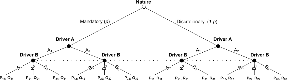
Under uncertainty about the nature of the lane-changing maneuver, the approach developed by Harsanyi (1967) was utilized in order to transform a game of in incomplete information to a game of imperfect information. This method introduces “nature” as a player who characterizes the nature of the lane-changing maneuver with a specific probability. Figure 62 illustrates the extended form of the transformed game. Further information about the calibration and validation of these game structures could be found in Talebpour et al. (2016).
© Talebpour, Mahmassani, and Bustamante, 2016.
Figure 62. Chart. Extended form of the lane-changing game with inactive vehicle-to-vehicle communication.
CASE STUDY SCENARIOS AND AGENTS
In the following sections, three sets of scenarios were analyzed. The scenario sets serve as a small-scale experiment for implementing the proposed methodology. The proposed scenario sets are as follows:
- Demand scenarios
- Driver aggressiveness scenarios
- Mixed traffic scenarios
Besides generating the scenarios, an important step in the methodology is to generate the agents that are interacting in the simulated environment. As mentioned earlier, five different agents were considered in the study. The behavior of each agent should be determined by selecting appropriate microsimulation models. Here the models that should be selected for each agent are the car- following and lane-changing models. Once the behavioral models are selected for an agent, in order to generate an instance of the agent type, the associated model parameters are sampled from the joint probability distributions of the model parameters stored in the model libraries.
DEMAND SCENARIOS
Based on the layout of the road segment shown in figure 49, there are 15 paths that could be specified for the vehicles who enter the study area. Within the simulation tool, vehicles were assumed to enter the simulated environment following a Poisson process (O-D pair) that was calibrated based on the I-290 traffic flow data. In the current case study, in order to produce different demand levels, the interarrival time of the vehicles in each path was changed to produce different demand scenarios. A probability of occurrence was assigned to each demand scenario. In order to develop an accurate analysis of different demand scenarios under the proposed methodology, the selected highway segment should be monitored over a longer time period to acquire information about the traffic flow during peak hours of different days. Such observation would help to construct a better probability distribution for the vehicle entry and more accurate probabilities for the occurrence of the peak demand scenarios.
The following demand scenarios were examined in this section:
- Scenario 1 – The interarrival time increased by 20 percent for each path (with a probability of 0.1).
- Scenario 2 – Base case scenario (interarrival process calibrated based on the I-290 traffic flow data) (with a probability of 0.25).
- Scenario 3 – The interarrival time decreased by 20 percent for each path (with a probability of 0.2).
- Scenario 4 – The interarrival time decreased by 40 percent for each path (with a probability of 0.2).
- Scenario 5 – The interarrival time decreased by 60 percent for each path (with a probability of 0.15).
- Scenario 6 – The interarrival time decreased by 80 percent for each path (with a probability of 0.1).
In this case, it was assumed that enough information is available to establish the probability distribution of the different scenarios. Therefore, the proposed scenario-based approach could be utilized to analyze the system and combine the performance metrics of the system under the specified scenarios.
Figure 63 shows the fundamental diagrams corresponding to the abovementioned scenarios. As expected, as the demand level increases, the system performance deteriorates; however, the decline in the system performance is not exactly proportional to the changes in the interarrival time. This disproportion occurred because of the complexity of the system as there are 15 different paths that are not fully independent of each other. Furthermore, some of the interarrival times generated by the model were overwritten based on the safe interarrival time between two consecutive vehicles. The dashed line on the plot was derived by combining the fundamental diagram of the scenarios using their respective probabilities.
Figure 65 represents the travel time distributions on the mainline of the highway for each scenario. A decrease in the demand level results in an improvement in the travel time as seen by the shift in the distribution towards the lower travel time bins. From the fifth scenario, the improvement becomes insignificant because the vehicle should obey the safety headway instead of the headway generated according to the interarrival distribution. Moreover, as the demand on the highway segment increases, the system becomes more unstable by possessing a larger standard deviation in the travel time values. The overall performance of the system could be defined by combining the average travel time of the scenarios using the scenario probability of occurrence.
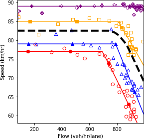
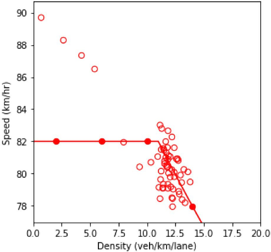
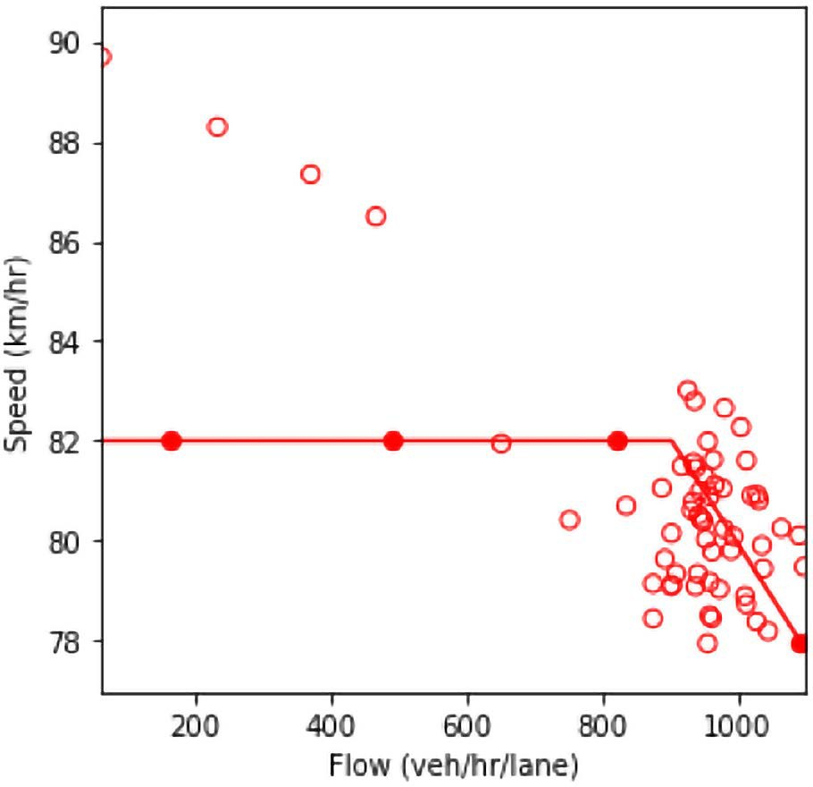
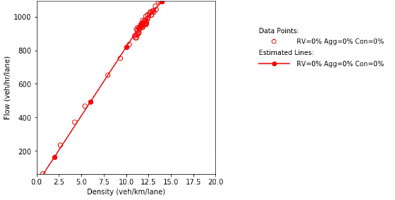
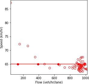
a) Speed and density.
b) Speed and flow.
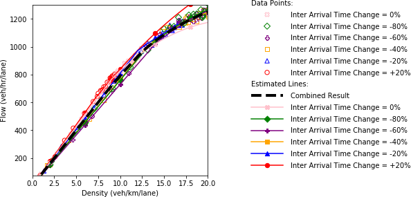
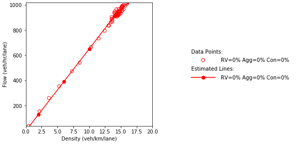
c) Flow and density.
Source: FHWA, 2019.
Figure 63. Diagrams. Compound figure depicts fundamental diagrams for different demand levels.
Figure 64. Equation. Weighted average travel time of the scenarios.
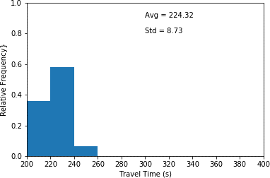
This histogram plots travel time in seconds (x-axis) and relative frequency (y-axis) for scenario 1 which the interarrival time has been increased by 20 percent. This histogram illustrates the highest relative frequency (approximately 0.58) for travel times between 220 and 240 seconds. Furthermore, it shows the lowest relative frequency (approximated 0.07) for travel times between 240 and 260 seconds. An average travel time of 224.32 seconds as well as a standard deviation of 8.73 seconds are associated with the plot.
a) 20 percent increase in interarrival time. (scenario 1)
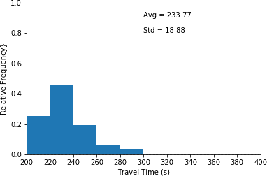
This histogram plots travel time in seconds (x-axis) and relative frequency (y-axis) for scenario 2 which the interarrival time has not been changed. This histogram illustrates the highest relative frequency (approximately 0.48) for travel times between 220 and 240 seconds. Furthermore, it shows the lowest relative frequency (approximated 0.03) for travel times between 280 and 300 seconds. An average travel time of 233.77 seconds as well as a standard deviation of 18.88 seconds are associated with the plot.
b) Base case. (scenario 2)
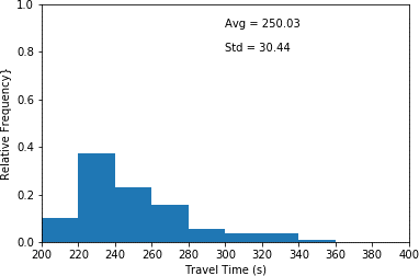
This histogram plots travel time in seconds (x-axis) and relative frequency (y-axis) for scenario 3 which the interarrival time has been decreased by 20 percent. This histogram illustrates the highest relative frequency (approximately 0.39) for travel times between 220 and 240 seconds. Furthermore, it shows the lowest relative frequency (approximated 0.01) for travel times between 340 and 360 seconds. An average travel time of 250.03 seconds as well as a standard deviation of 30.44 seconds are associated with the plot.
c) 20 percent decrease in interarrival time. (scenario 3)
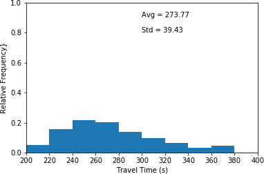
This histogram plots travel time in seconds (x-axis) and relative frequency (y-axis) for scenario 4 which the interarrival time has been decreased by 40 percent. This histogram illustrates the highest relative frequency (approximately 0.23) for travel times between 240 and 260 seconds. Furthermore, it shows the lowest relative frequency (approximated 0.04) for travel times between 340 and 360 seconds. An average travel time of 273.77 seconds as well as a standard deviation of 39.43 seconds are associated with the plot.
d) 40 percent decrease in interarrival time. (scenario 4)
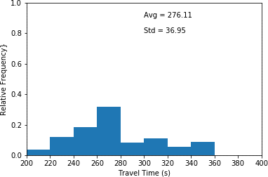
This histogram plots travel time in seconds (x-axis) and relative frequency (y-axis) for scenario 5 which the interarrival time has been decreased by 60 percent. This histogram illustrates the highest relative frequency (approximately 0.33) for travel times between 260 and 280 seconds. Furthermore, it shows the lowest relative frequency (approximated 0.04) for travel times between 200 and 220 seconds. An average travel time of 276.11 seconds as well as a standard deviation of 36.95 seconds are associated with the plot.
e) 60 percent decrease in interarrival time. (scenario 5)
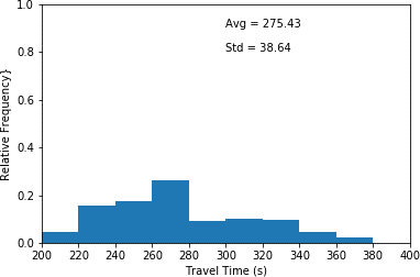
This histogram plots travel time in seconds (x-axis) and relative frequency (y-axis) for scenario 6 which the interarrival time has been decreased by 80 percent. This histogram illustrates the highest relative frequency (approximately 0.27) for travel times between 260 and 280 seconds. Furthermore, it shows the lowest relative frequency (approximated 0.03) for travel times between 360 and 380 seconds. An average travel time of 275.43 seconds as well as a standard deviation of 38.64 seconds are associated with the plot.
f) 80 percent decrease in interarrival time. (scenario 6)
Source: FHWA, 2019.
Figure 65. Charts. Compound figure depicts travel time distribution for mainline vehicles under different interarrival time scenarios.
DRIVER AGGRESSIVENESS SCENARIOS
One of the major components in the proposed calibration methodology is the library of model parameters and the capability to generate simulation agents using the values stored in these libraries. Aggressiveness is one of the behavioral aspects of driving that has been extensively studied by modeling different types of drivers such as aggressive drivers, conservative drivers and neutral drivers (Papaioannou 2007, Herman, Malakhoff and Ardekani 1988, Tang, et al. 2012, Chen and Zhan 2008).
There are several ways to develop agents with different level of aggressiveness. The first approach is to initially determine the model parameters for a given dataset. Then, agents with different levels of aggressiveness could be generated by tweaking the model parameters. Another approach is to collect data from different groups of drivers knowing that each group, in general, behaves differently than the other groups in terms of the aggressiveness level. For the third approach, one might observe the vehicle trajectories and based on a predefined set of criteria distinguish between aggressive and conservative drivers. In this section the first and the third approaches were utilized.
As shown in section 2.1, there are various parameters that need to be estimated and calibrated when a regular vehicle is modeled. Two parameters that were tweaked in this study are the weighing factor for accidents (wc) and the maximum anticipation time horizon (τmax) which is used by a driver when estimating the probability of a rear-end collision. Basic statistics of the values of these parameters which were calibrated based on the NGSIM vehicle trajectory dataset are listed in table 10.
Table 10. Basic statistics of the weighing factor for accidents (wc) and the maximum anticipation time horizon (τmax) parameters.
Basic Statistics |
τmax(s) |
wc |
| Average |
5.11 |
115657 |
| Standard Deviation |
2.43 |
94195 |
For the first approach, these parameters were changed in order to create new agents which would be categorized as conservative or aggressive. All the other parameters of the drivers were kept unchanged. This means that as a simplifying assumption it was assumed that the two selected parameters are independent of all other parameters in the model. In order to generate aggressive drivers, one second was subtracted from the maximum anticipation time horizon and the weighing factor for accidents was divided by 10. In contrast, to create conservative drivers, one second was added to the maximum anticipation time horizon and the weighing factor for accidents was multiplied by 10.
After characterizing the agents’ behavioral model framework and their associated parameters, a set of feasible scenarios should be defined. Four different scenarios were considered in this example as follows:
- Scenario 1 – Fully conservative driving environment.
- Scenario 2 – Partially aggressive driving environment (67 percent conservative drivers and 33 percent aggressive drivers).
- Scenario 3 – Base case calibrated based on the NGSIM data.
- Scenario 4 – Fully aggressive driving environment.
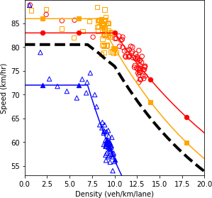
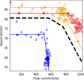
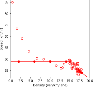
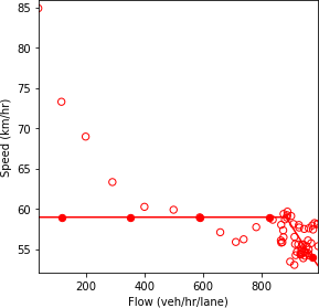
Figure 66 shows the fundamental diagrams under the four specified scenarios. The dashed line is a simple average of all the fundamental diagrams. This line is equivalent to the output of the scenario-based analysis if the scenarios occur with equal probability. It is also equivalent to the output of the robustness-based analysis if the Laplace’s principle of insufficient reason metric is utilized.
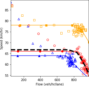
The results show that as more conservative drivers are introduced in the system, the speed throughout the road segment decreases. The aggressive drivers can traverse the segment faster due to their higher speed and their ability to react more rapidly to perturbation in the system. Therefore, without any changes in the demand level, as more aggressive drivers enter the system, the range of values for density decreases. Furthermore, the less scatter in the data points for the fully aggressive driving condition indicates the stability of the system.
Figure 67 illustrates the travel time distribution on the mainline of the highway for each scenario. As could be seen in the figures, as the proportion of aggressive divers increases, the distribution shifts more toward lower travel time bins, which results in a decrease in the average and variance of the travel time on the mainline. The average travel time of all the scenarios is equal to 245.45 seconds.
An issue with the approach of generating artificial agents by changing the model parameters is that the results of analyzing the scenarios developed when these agents are in the system could be unreliable. To address this reliability concern, a different method of generating drivers should be selected.
The other approach which was mentioned as a way of generating drivers with various level of aggressiveness is to separate the distribution of the NGSIM drivers into regular, conservative, and aggressive subgroups. In order to split the drivers, the weighing factor for accidents (wc) and the maximum anticipation time horizon (τmax) were sorted. The drivers who possessed the highest (lowest) 15 percent combined values of these two parameters were considered in the conservative (aggressive) subgroup. Such categorization of the drivers resulted in a 22 percent decrease in the average wc and a 56 percent decrease in the average τmax for aggressive drivers. On the other hand, for conservative drivers, the average wc was increased by 11 percent and the average τmax was increased by 72 percent.
a) Speed and density.
b) Speed and flow.b
c) Flow and density.
Source: FHWA, 2019.
Figure 66. Charts. Compound figure depicts fundamental diagrams for different levels of aggressiveness in driving behavior.
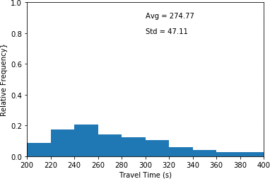
This histogram plots travel time in seconds (x-axis) and relative frequency (y-axis) for scenario 1 which only conservative drivers are in the network. This histogram illustrates the highest relative frequency (approximately 0.20) for travel times between 240 and 260 seconds. Furthermore, it shows the lowest relative frequency (approximated 0.03) for travel times between 380 and 400 seconds. An average travel time of 274.77 seconds as well as a standard deviation of 47.11 seconds are associated with the plot.
a) Fully conservative driving environment (scenario 1).

This histogram plots travel time in seconds (x-axis) and relative frequency (y-axis) for scenario 2 which a combination of conservative and aggressive drivers is in the network. This histogram illustrates the highest relative frequency (approximately 0.32) for travel times between 220 and 240 seconds. Furthermore, it shows the lowest relative frequency (approximated 0.01) for travel times between 360 and 380 seconds. An average travel time of 254.10 seconds as well as a standard deviation of 34.55 seconds are associated with the plot.
b) Partially aggressive driving environment (scenario 2).
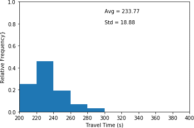
This histogram plots travel time in seconds (x-axis) and relative frequency (y-axis) for scenario 3 which is the base case scenario. This histogram illustrates the highest relative frequency (approximately 0.48) for travel times between 220 and 240 seconds. Furthermore, it shows the lowest relative frequency (approximated 0.03) for travel times between 280 and 300 seconds. An average travel time of 233.77 seconds as well as a standard deviation of 18.88 seconds are associated with the plot."
c) Base case (scenario 3).
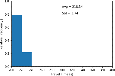
This histogram plots travel time in seconds (x-axis) and relative frequency (y-axis) for scenario 4 which only aggressive drivers are in the network. This histogram illustrates the highest relative frequency (approximately 0.76) for travel times between 200 and 220 seconds. Furthermore, it shows the lowest relative frequency (approximated 0.21) for travel times between 220 and 240 seconds. An average travel time of 218.34 seconds as well as a standard deviation of 3.74 seconds are associated with the plot.
d) Fully aggressive driving environment (scenario 4).
Source: FHWA, 2019.
Figure 67. Charts. Compound figure depicts travel time distributions for mainline vehicles under different aggressive driving scenarios.
After characterizing the agents’ behavioral model framework, a set of feasible scenarios should be defined. Four different scenarios were considered in this example as follows:
- Scenario 1 – Absence of the conservative and aggressive drivers (NGSIM data with 30 percent of the agents removed).
- Scenario 2 – 25 percent aggressive drivers and 75 percent conservative drivers.
- Scenario 3 – 50 percent aggressive drivers and 50 percent conservative drivers.
- Scenario 4 – 75 percent aggressive drivers and 25 percent conservative drivers.
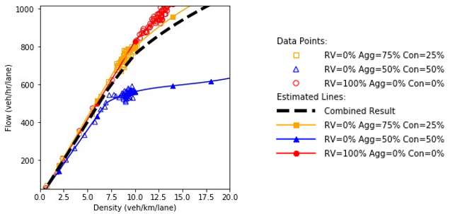
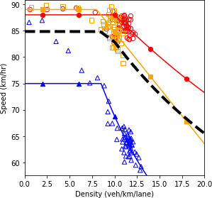
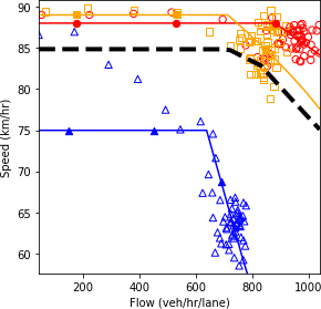
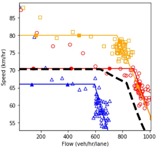
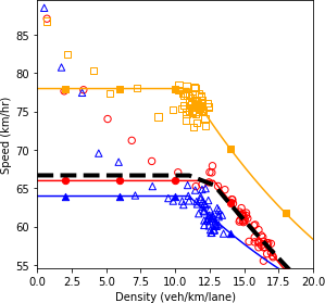
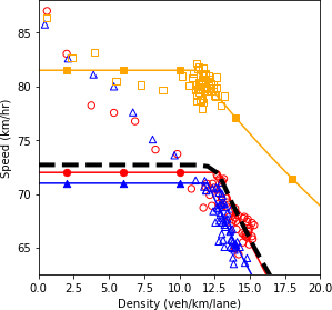
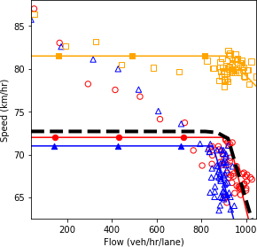
Figure 68 shows the fundamental diagrams under the four specified scenarios. The dashed line is a simple average of all the fundamental diagrams. This line is equivalent to the output of the scenario-based analysis if the scenarios occur with equal probability. It is also equivalent to the output of the robustness-based analysis if the Laplace’s principle of insufficient reason metric is utilized. Based on the fundamental diagrams, as more conservative drivers are introduced in the system, the speed of the vehicles in the uncongested regime decreases. As could be seen, the fundamental diagram of scenario 3 is closer to the diagram of scenario 2 than the diagram of scenario 4. Therefore, it could be concluded that the conservative drivers impose a higher impact in the system performance than the aggressive drivers. This makes the accumulation of conservative drivers in the system to act as a dynamic bottleneck in the system that deteriorates the system performance. Comparing the diagrams of scenario 1 and scenario 2 shows that in the presence of a high proportion of aggressive drivers, the system performs better in the uncongested regime. However, the system enters the congested regime at a lower density value compared to the case where there is no extreme behavior (aggressiveness or conservativeness) in the system. The existence of conservative drivers in scenario 2 causes the system to have a lower performance in the congested regime compared to scenario 1. The less scatter in the data points for the scenario with high level of aggressive driving behavior indicates the higher stability in the system and the higher robustness against perturbations.
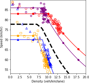
a) Speed and density.
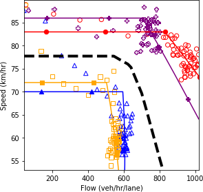
b) Speed and flow.
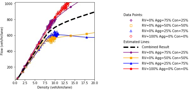
c) Flow and density.
Source: FHWA, 2019.
Figure 68. Diagram. Fundamental diagrams for different levels of aggressiveness in driving behavior.
The mainline travel time histograms for each scenario are shown in figure 69. As could be seen in the figures, introducing conservative drivers in the system increases the average travel time and the travel time variance significantly. As the proportion of aggressive divers increases, the distribution shifts more toward lower travel time bins which results in a decrease in the average and variance of the travel time on the mainline. The effect of aggressive drivers on the travel time becomes more tangible once the proportion of aggressive drivers is higher than the proportion of conservative drivers. The average travel time of all the scenarios is equal to 272.73 seconds.
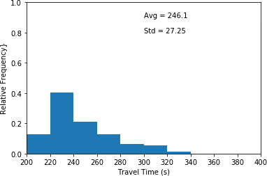
This histogram plots travel time in seconds (x-axis) and relative frequency (y-axis) for scenario 1 which neither aggressive nor conservative drivers are in the network. This histogram illustrates the highest relative frequency (approximately 0.40) for travel times between 220 and 240 seconds. Furthermore, it shows the lowest relative frequency (approximated 0.02) for travel times between 320 and 340 seconds. An average travel time of 246.10 seconds as well as a standard deviation of 27.25 seconds are associated with the plot.
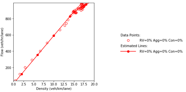
a) Aggressive = 0% and Conservative = 0% (scenario 1).
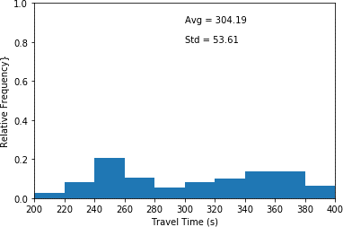
This histogram plots travel time in seconds (x-axis) and relative frequency (y-axis) for scenario 2 where a quarter of the drivers are aggressive, and the remainders are conservative. This histogram illustrates the highest relative frequency (approximately 0.21) for travel times between240 and 260 seconds. Furthermore, it shows the lowest relative frequency (approximated 0.03) for travel times between 200 and 220 seconds. An average travel time of 304.19 seconds as well as a standard deviation of 53.61 seconds are associated with the plot.
b) Aggressive = 25% and Conservative = 75% (scenario 2).
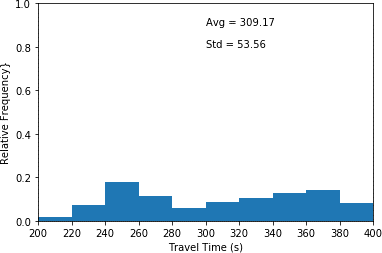
This histogram plots travel time in seconds (x-axis) and relative frequency (y-axis) for scenario 3 where half of the drivers are aggressive, and the other half are conservative. This histogram illustrates the highest relative frequency (approximately 0.18) for travel times between 240 and 260 seconds. Furthermore, it shows the lowest relative frequency (approximated 0.02) for travel times between 200 and 220 seconds. An average travel time of 309.17 seconds as well as a standard deviation of 53.56 seconds are associated with the plot.
c) Aggressive = 50% and Conservative = 50% (scenario 3).
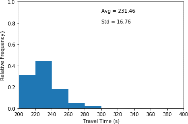
This histogram plots travel time in seconds (x-axis) and relative frequency (y-axis) for scenario 4 where a quarter of the drivers are conservative, and the remainders are aggressive. This histogram illustrates the highest relative frequency (approximately 0.44) for travel times between 220 and 240 seconds. Furthermore, it shows the lowest relative frequency (approximated 0.03) for travel times between 280 and 300 seconds. An average travel time of 231.46 seconds as well as a standard deviation of 16.76 seconds are associated with the plot.
d) Aggressive = 75% and Conservative = 25% (scenario 4).
Source: FHWA, 2019.
Figure 69. Charts. Compound figure depicts travel time distribution for the mainline vehicles under various aggressive driver and conservative driver mix scenarios.
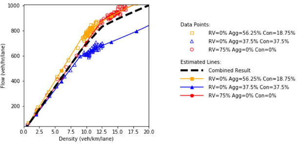
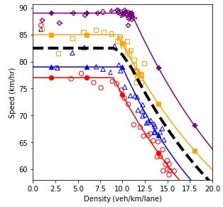
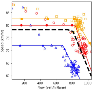
MIXED TRAFFIC SCENARIOS
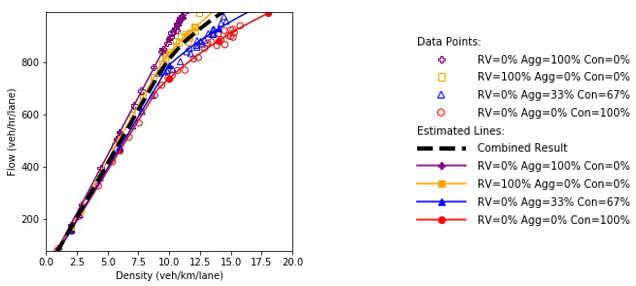
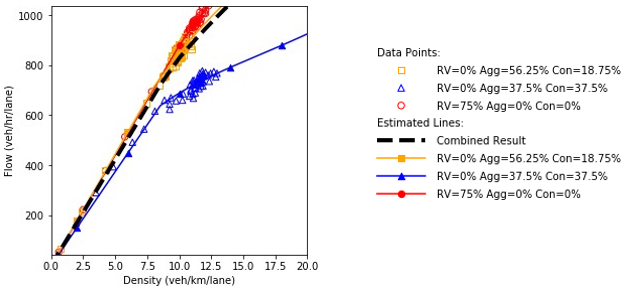
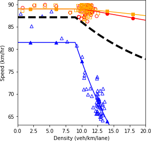
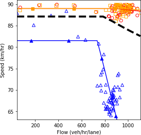
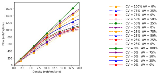
This section showcases the bi-level approach that combines the scenario-based and robustness- based analyses. Five different agents were introduced in the system, three of which were regular vehicles with various levels of aggressiveness. These agents enable the application of the scenario- based analysis assuming there is enough information to construct the probability of realizing each scenario. The connected and automated vehicles are the two agent types that impose deep uncertainty in the problem. Therefore, a robustness-based approach becomes useful. In total, 35 scenarios were considered as shown in table 11. The scenarios were generated by changing the market penetration rate of each agent type. As a simplifying assumption, it was assumed that the market penetration rates of connected vehicles and autonomous vehicles do not influence the regular vehicles’ behavior such as their aggressiveness parameters. Similar to the previous section, it was assumed that 65 percent of the times the regular vehicles behave like the vehicles in the NGSIM data without the aggressive and conservative vehicles. In 25 percent and 10 percent of the occasions, the regular vehicles were considered as a 50/50 and 75/25 percentage proportions of aggressive and conservative, respectively. The scenario identifier in the table was assigned in a way that scenarios with a “-” character would be combined in the robust analysis. For example, scenarios 1-1, 1-2, and 1-3 would be combined using their assigned probabilities in order to generate scenario 1.
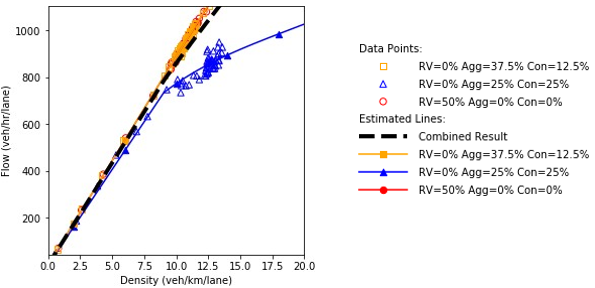
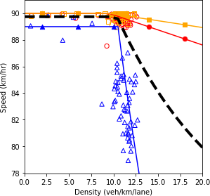
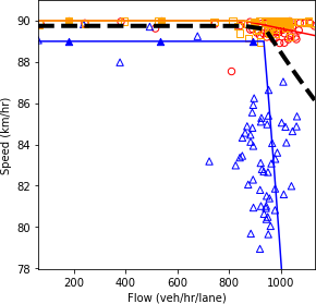
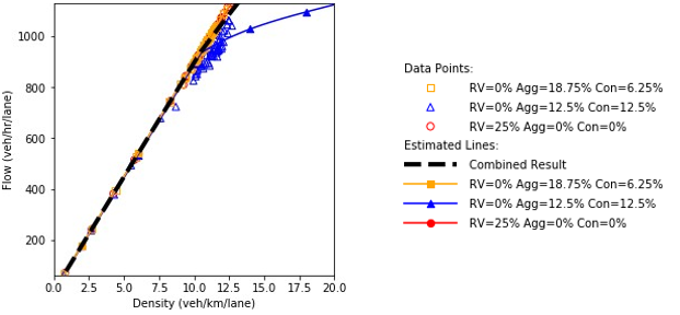
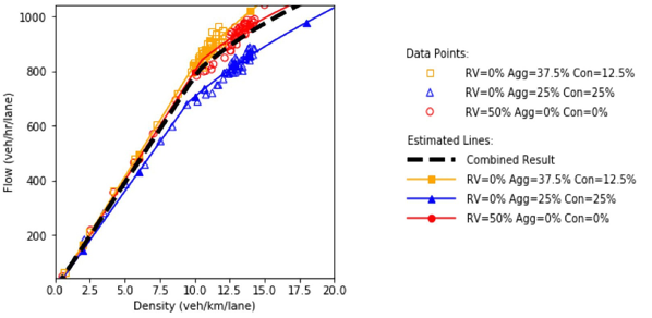
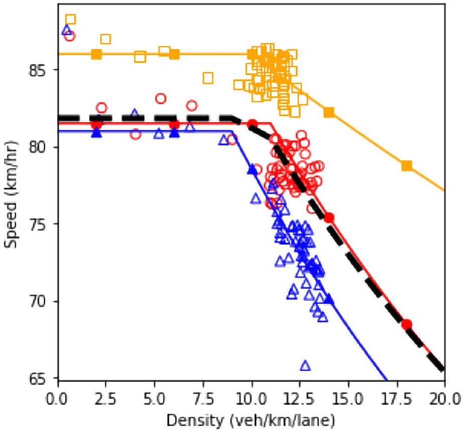
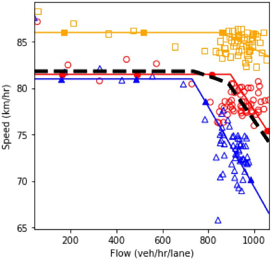
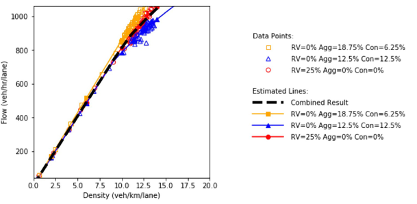
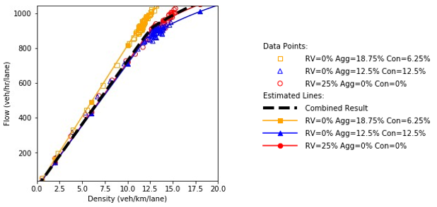
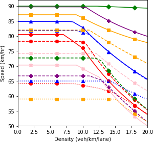
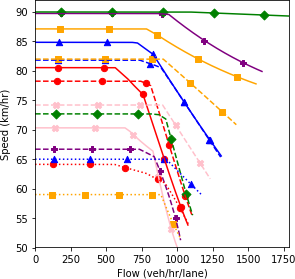
Figure 70 to figure 84 show the fundamental diagrams for the scenarios specified in table 10. Figure 74, figure 78, figure 78, figure 78, and figure 78 represent the scenarios where only connected and/ or automated vehicles are in the system. In the remainder of the figures, the three different levels of aggressiveness were plotted. The dashed line shows the result of the scenario-based analysis by combining the three scenarios using their relevant probabilities (65 percent, 25 percent, and 10 percent). Up to this point, the analysis performed for each pair of market penetration rates for connected vehicles and automated vehicles is similar to the analysis performed in the “driver aggressiveness scenarios” section.
Based on the fundamental diagrams, in the absence of connectivity in the system, the scenario with regular vehicles possesses a higher speed in a congested environment. As connected vehicles start entering the highway segment, the scenario which has a high proportion of aggressive drivers dominates the other scenarios at different congestion levels. Throughout all plots in the figures, the scenarios with equal market penetration rates of aggressive and conservative drivers have the lowest performance. The only exception is when 75 percent of the traffic flow is composed of connected vehicles and there are no automated vehicles in the system. The results show that in this case, the connectivity feature can overcome the negative influence of slow conservative vehicles to some extent.
Table 11. Scenarios with different market penetration percentages by agent..
Scenario ID |
Regular Vehicles |
Aggressive Vehicles |
Conservative Vehicles |
Connected Vehicles |
Automated Vehicles |
1-1 |
100 |
0 |
0 |
0 |
0 |
1-2 |
0 |
50 |
50 |
0 |
0 |
1-2 |
0 |
75 |
25 |
0 |
0 |
2-1 |
75 |
0 |
0 |
0 |
25 |
2-2 |
0 |
37.5 |
37.5 |
0 |
25 |
2-3 |
0 |
56.25 |
18.75 |
0 |
25 |
3-1 |
50 |
0 |
0 |
0 |
50 |
3-2 |
0 |
25 |
25 |
0 |
50 |
3-3 |
0 |
37.5 |
12.5 |
0 |
50 |
4-1 |
25 |
0 |
0 |
0 |
75 |
4-2 |
0 |
12.5 |
12.5 |
0 |
75 |
4-3 |
0 |
18.75 |
6.25 |
0 |
75 |
5 |
0 |
0 |
0 |
0 |
100 |
6-1 |
75 |
0 |
0 |
25 |
0 |
6-2 |
0 |
37.5 |
37.5 |
25 |
0 |
6-3 |
0 |
56.25 |
18.75 |
25 |
0 |
7-1 |
50 |
0 |
0 |
25 |
25 |
7-2 |
0 |
25 |
25 |
25 |
25 |
7-3 |
0 |
37.5 |
12.5 |
25 |
25 |
8-1 |
25 |
0 |
0 |
25 |
50 |
8-2 |
0 |
12.5 |
12.5 |
25 |
50 |
8-3 |
0 |
18.75 |
6.25 |
25 |
50 |
9 |
0 |
0 |
0 |
25 |
75 |
10-1 |
50 |
0 |
0 |
50 |
0 |
10-2 |
0 |
25 |
25 |
50 |
0 |
10-3 |
0 |
37.5 |
12.5 |
50 |
0 |
11-1 |
25 |
0 |
0 |
50 |
25 |
11-2 |
0 |
12.5 |
12.5 |
50 |
25 |
11-3 |
0 |
18.75 |
6.25 |
50 |
25 |
12 |
0 |
0 |
0 |
50 |
50 |
13-1 |
25 |
0 |
0 |
75 |
0 |
13-2 |
0 |
12.5 |
12.5 |
75 |
0 |
13-3 |
0 |
18.75 |
6.25 |
75 |
0 |
14 |
0 |
0 |
0 |
75 |
25 |
15 |
0 |
0 |
0 |
100 |
0 |
a) Speed and density.
b) Speed and flow.
c) Flow and density.
Source: FHWA, 2019.
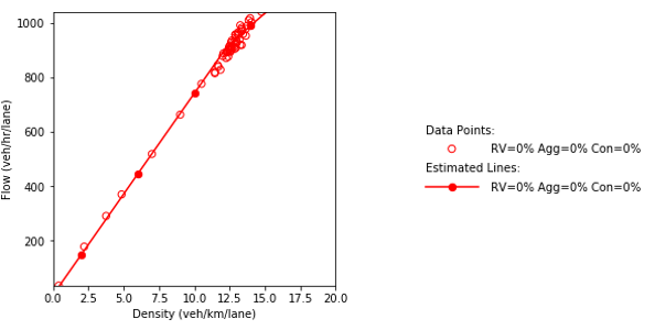
Figure 70. Charts. Compound figure depicts fundamental diagrams for a scenario in which the connected vehicle market penetration rate is 0 percent and the automated vehicle market penetration rate is 0 percent.
a) Speed and density.
b) Speed and flow.
c) Flow and density.
Source: FHWA, 2019.
Figure 71. Charts. Compound figure depicts fundamental diagrams for a scenario in which the connected vehicle market penetration rate is 0 percent and the automated vehicle market penetration rate is 25 percent.
a) Speed and density.
b) Speed and flow.
c) Flow and density.
Source: FHWA, 2019.
Figure 72. Charts. Compound figure depicts fundamental diagrams for a scenario in which the connected vehicle market penetration rate is 0 percent and the automated vehicle market penetration rate is 50 percent.
a) Speed and density.
b) Speed and flow.
c) Flow and density.
Source: FHWA, 2019.
Figure 73. Charts. Compound figure depicts fundamental diagrams for a scenario in which the connected vehicle market penetration rate is 0 percent and the automated vehicle market penetration rate is 75 percent.
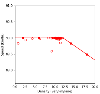
Combination of line graph and scatter plot charts density in vehicles per kilometer per lane (x-axis) against speed in kilometers per hour (y-axis). The line graph is the interpolation of the scatter points. When all the vehicles in the network are fully automated, the speed remains constant at about 90 kilometers per hour as the density increases until about the 11.8 vehicles per kilometer per lane point. Then, it gradually decreases to a speed of 89.3 kilometers per hour as the density reaches 20 vehicles per kilometer per lane.
a) Speed and density.
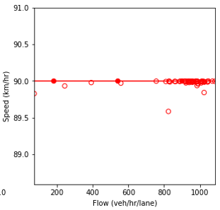
Combination of line graph and scatter plot charts flow in vehicles per hour per lane (x-axis) against speed in kilometers per hour (y-axis). The line graph is the interpolation of the scatter points. When all the vehicles in the network are fully automated, the speed remains constant at about 90 kilometers per hour as the flow builds up until about the 1080 vehicles per hour per lane point.
b) Speed and flow.
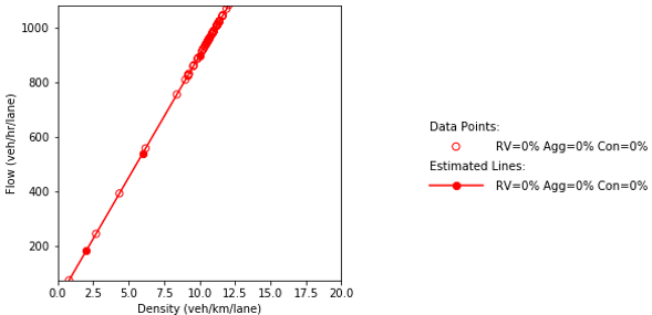
Combination of line graph and scatter plot charts density in vehicles per kilometer per lane (x-axis) against flow in vehicles per hour per lane (y-axis). The line graph is the interpolation of the scatter points. When all the vehicles in the network are fully automated, the flow is 100 vehicles per hour per lane when the density equals a single vehicle per kilometer per lane. Then, the flow builds up until about 1080 vehicles per hour per lane as the density increases to 12 vehicles per kilometer per lane.
c) Flow and density.
Source: FHWA, 2019.
Figure 74. Charts. Compound figure depicts fundamental diagrams for a scenario in which the connected vehicle market penetration rate is 0 percent and the automated vehicle market
a) Speed and density.
b) Speed and flow.
c) Flow and density.
Source: FHWA, 2019.
Figure 75. Charts. Compound figure depicts fundamental diagrams for a scenario in which the connected vehicle market penetration rate is 25 percent and the automated vehicle market penetration rate is 0 percent.
a) Speed and density.
b) Speed and flow.
c) Flow and density.
Source: FHWA, 2019.
Figure 76. Charts. Compound figure depicts fundamental diagrams for a scenario in which the connected vehicle market penetration rate is 25 percent and the automated vehicle market penetration rate is 25 percent.
a) Speed and density.
b) Speed and flow.
c) Flow and density.
Source: FHWA, 2019.
Figure 77. Charts. Compound figure depicts fundamental diagrams for a scenario in which the connected vehicle market penetration rate is 25 percent and the automated vehicle market penetration rate is 50 percent.
Combination of line graph and scatter plot charts density in vehicles per kilometer per lane (x-axis) against speed in kilometers per hour (y-axis). Each line graph is the interpolation of the scatter points. When the traffic composition in the network is as follow: 25% connected vehicles and 75% automated vehicles, the speed remains constant at about 82 kilometers per hour as the density increases until about the 10.9 vehicles per kilometer per lane point. Then, it gradually decreases to a speed of 77 kilometers per hour as the density reaches 14.7 vehicles per kilometer per lane.
a) Speed and density.
Combination of line graph and scatter plot charts flow in vehicles per hour per lane (x-axis) against speed in kilometers per hour (y-axis). Each line graph is the interpolation of the scatter points. When the traffic composition in the network is as follow: 25% connected vehicles and 75% automated vehicles, the speed remains constant at about 82 kilometers per hour as the flow builds up until about the 900 vehicles per hour per lane point. Then, it gradually decreases to a speed of 78 kilometers per hour as the flow reaches 1100 vehicles per hour per lane.
b) Speed and flow.
Combination of line graph and scatter plot charts density in vehicles per kilometer per lane (x-axis) against flow in vehicles per hour per lane (y-axis). Each line graph is the interpolation of the scatter points. When the traffic composition in the network is as follow: 25% connected vehicles and 75% automated vehicles, the flow is 100 vehicles per hour per lane when the density equals a single vehicle per kilometer per lane. Then, the flow builds up until about 1100 vehicles per hour per lane as the density increases to 13.9 vehicles per kilometer per lane.
c) Flow and density.
Source: FHWA, 2019.
Figure 78. Charts. Compound figure depicts fundamental diagrams for a scenario in which the connected vehicle market penetration rate is 25 percent and the automated vehicle market penetration rate is 75 percent.
a) Speed and density.
b) Speed and flow.
c) Flow and density.
Source: FHWA, 2019.
Figure 79. Charts. Compound figure depicts fundamental diagrams for a scenario in which the connected vehicle market penetration rate is 50 percent and the automated vehicle market penetration rate is 0 percent.
a) Speed and density.
b) Speed and flow.
c) Flow and density.
Source: FHWA, 2019.
Figure 80. Charts. Compound figure depicts fundamental diagrams for a scenario in which the connected vehicle market penetration rate is 50 percent and the automated vehicle market penetration rate is 25 percent.
Combination of line graph and scatter plot charts density in vehicles per kilometer per lane (x-axis) against speed in kilometers per hour (y-axis). The line graph is the interpolation of the scatter points. When the traffic composition in the network is as follow: 50% connected vehicles and 50% automated vehicles, the speed remains constant at about 74.2 kilometers per hour as the density increases until about the 12 vehicles per kilometer per lane point. Then, it gradually decreases to a speed of 67.5 kilometers per hour as the density reaches 15.7 vehicles per kilometer per lane.
a) Speed and density.
Combination of line graph and scatter plot charts flow in vehicles per hour per lane (x-axis) against speed in kilometers per hour (y-axis). The line graph is the interpolation of the scatter points. When the traffic composition in the network is as follow: 50% connected vehicles and 50% automated vehicles, the speed remains constant at about 74.2 kilometers per hour as the flow builds up until about the 895 vehicles per hour per lane point. Then, it gradually decreases to a speed of 68.5 kilometers per hour as the flow reaches 1045 vehicles per hour per lane.
b) Speed and flow.
Combination of line graph and scatter plot charts density in vehicles per kilometer per lane (x-axis) against flow in vehicles per hour per lane (y-axis). The line graph is the interpolation of the scatter points. When the traffic composition in the network is as follow: 50% connected vehicles and 50% automated vehicles, the flow is 100 vehicles per hour per lane when the density equals a single vehicle per kilometer per lane. Then, the flow builds up until about 900 vehicles per hour per lane as the density increases to 12 vehicles per kilometer per lane. Afterwards, the flow increases with a lower slope approaching a value of 1045 vehicles per hour per lane as the density reaches 15 vehicles per kilometer per lane.
c) Flow and density.
Source: FHWA, 2019.
Figure 81. Charts. Compound figure depicts fundamental diagrams for a scenario in which the connected vehicle market penetration rate is 50 percent and the automated vehicle market penetration rate is 50 percent.
a) Speed and density.
b) Speed and flow.
c) Flow and density.
Source: FHWA, 2019.
Figure 82. Charts. Compound figure depicts fundamental diagrams for a scenario in which the connected vehicle market penetration rate is 75 percent and the automated vehicle market penetration rate is 0 percent.
Combination of line graph and scatter plot charts density in vehicles per kilometer per lane (x-axis) against speed in kilometers per hour (y-axis). Each line graph is the interpolation of the scatter points. When the traffic composition in the network is as follow: 75% connected vehicles and 25% automated vehicles, the speed remains constant at about 65 kilometers per hour as the density increases until about the 14.1 vehicles per kilometer per lane point. Then, it gradually decreases to a speed of 61.5 kilometers per hour as the density reaches 17.5 vehicles per kilometer per lane.
a) Speed and density.
Combination of line graph and scatter plot charts flow in vehicles per hour per lane (x-axis) against speed in kilometers per hour (y-axis). Each line graph is the interpolation of the scatter points. When the traffic composition in the network is as follow: 75% connected vehicles and 25% automated vehicles, the speed remains constant at about 65 kilometers per hour as the flow builds up until about the 935 vehicles per hour per lane point. Then, it gradually decreases to a speed of 63.5 kilometers per hour as the flow reaches 1020 vehicles per hour per lane.
b) Speed and flow.
Combination of line graph and scatter plot charts density in vehicles per kilometer per lane (x-axis) against flow in vehicles per hour per lane (y-axis). Each line graph is the interpolation of the scatter points. When the traffic composition in the network is as follow: 75% connected vehicles and 25% automated vehicles, the flow is 100 vehicles per hour per lane when the density equals a single vehicle per kilometer per lane. Then, the flow builds up until about 1020 vehicles per hour per lane as the density increases to 16.3 vehicles per kilometer per lane.
c) Flow and density.
Source: FHWA, 2019.
Figure 83. Charts. Compound figure depicts fundamental diagrams for a scenario in which the connected vehicle market penetration rate is 75 percent and the automated vehicle market penetration rate is 25 percent.
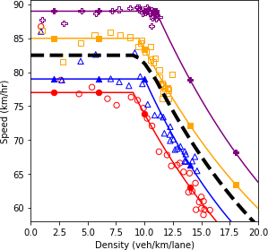
Combination of line graph and scatter plot charts density in vehicles per kilometer per lane (x-axis) against speed in kilometers per hour (y-axis). The line graph is the interpolation of the scatter points. When all the vehicles in the network are fully connected, the speed remains constant at about 59 kilometers per hour as the density increases until about the 15 vehicles per kilometer per lane point. Then, it gradually decreases to a speed of 52 kilometers per hour as the density reaches 19.5 vehicles per kilometer per lane.
a) Speed and density.
Combination of line graph and scatter plot charts flow in vehicles per hour per lane (x-axis) against speed in kilometers per hour (y-axis). The line graph is the interpolation of the scatter points. When all the vehicles in the network are fully connected, the speed remains constant at about 59 kilometers per hour as the flow builds up until about the 885 vehicles per hour per lane point. Then, it gradually decreases to a speed of 53 kilometers per hour as the flow reaches 995 vehicles per hour per lane.
b) Speed and flow.
Combination of line graph and scatter plot charts density in vehicles per kilometer per lane (x-axis) against flow in vehicles per hour per lane (y-axis). The line graph is the interpolation of the scatter points. When all the vehicles in the network are fully connected, the flow is 100 vehicles per hour per lane when the density equals a single vehicle per kilometer per lane. Then, the flow builds up until about 895 vehicles per hour per lane as the density increases to 15 vehicles per kilometer per lane. Afterwards, the flow increases with a lower slope approaching a value of 990 vehicles per hour per lane as the density reaches 18.7 vehicles per kilometer per lane.
c) Flow and density.
Source: FHWA, 2019.
Figure 84. Charts. Compound figure depicts fundamental diagrams for a scenario in which the connected vehicle market penetration rate is 100 percent and the automated vehicle market penetration rate is 0 percent.
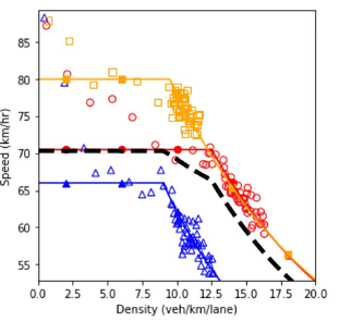
The second step in the bi-level approach is the robustness-analysis. In order to perform a robust analysis, the outputs of the scenario-based analysis should be plotted together. Therefore, all the dashed lines in the previous figures that possessed more than one scenario were plotted together in figure 86. The figure shows the fundamental diagram for various market penetration rates of connected vehicles and autonomous vehicles.
In an environment with only regular and automated vehicles, as the proportion of automated vehicles increases, the system performance enhances. However, this improvement occurs with a diminishing rate; resulting in the scenario with 75 percent automated vehicle proportion to possess a performance that is similar to the performance of a fully automated environment. The solid red line pertains to the scenario where all vehicles are manually driven without any connectivity feature. It could be seen that compared to the base case (red solid line), introducing connected vehicles in the system causes decay in the system performance. The main reason for this impact of connected vehicles is the different car-following model defined for this type of vehicle. Such a negative impact on system performance could be addressed by adding automated vehicles to the system. Although the inclusion of connected vehicles caused a decrease in the system performance when the system is in the free-flow regime, their presence becomes more beneficial as the system reaches the congested state. For a fixed level of automation in the system, as the market penetration rate of connected vehicles increases, the curvature of the speed-density and speed-flow diagram decrease. As a result, the robustness of the system against congestion increases and the breakdown density occurs at higher density values.
As could be seen in the figure, at an automation level of 25 percent, an increase in connected vehicles market penetration rate from 25 percent to 50 percent has a negligible effect on the system performance once the density on the mainline exceeds 12.5 vehicles per kilometer per lane (veh/ km/lane). Similarly, beyond a density of 11 veh/km/lane, the system performance difference between scenario 2 and scenario 8 is negligible.
After a general comparison of the graphs, in order to conduct the robustness-based analysis, the robustness measure should be selected. A variety of measures were introduced in the previous chapter including maximin, maximax, Laplace’s principle of insufficient reason, Hurwicz optimism pessimism rule, minimax regret, undesirable deviations, skewness, and peakedness. Some of these measures would be used in the current example. Based on the fundamental diagrams of figure 86, the scenario with full connectivity and the scenario with full automation are the scenarios selected using the maximin and maximax robustness measures, respectively. For the Laplace’s principle of insufficient reason measure, a simple average of all the 15 diagrams could be plotted. This would be similar to performing the scenario-based analysis with equal probabilities for the scenarios. Based on the definition of the Hurwicz optimism pessimism rule, the representative fundamental diagram is a weighted average of the full connectivity scenario and the full automation scenario. The weight is determined using the coefficient of pessimism.
Travel time is another performance measure that could be used to evaluate the system under different scenarios by performing the bi-level analysis. Comparing the distributions shows that in the absence of connected vehicles, the distribution is skewed toward lower values. As the proportion of connected vehicles increases, the mode of the distribution moves toward higher values of travel time and the distribution flattens resulting in an increase in the variance of travel time.
The scenario-based analysis was performed on the average travel time of the scenarios. The results are depicted in figure 87. Then, based on a selected robustness measure, the second step of the bi-level approach could be performed on the average travel time. For instance, the scenario with a 100 percent market penetration rate of connected vehicles is the worst-case scenario corresponding to the maximin robustness metric. Similarly, the scenario where all vehicles are automated possesses the lowest average travel time. Therefore, it represents the best-case scenario which relates to the maximax robustness metric. The average travel time for the Laplace’s principle of insufficient reason measure, as the average of all the values in the figure, is equal to 266.2 seconds. The average travel time under the Hurwicz optimism pessimism rule could be determined by the following formula:
Figure 85. Equation. Travel time based on the Hurwicz optimism pessimism rule.
Where is the coefficient of pessimism varies between 0 and 1.
a) Speed and density.
b) Speed and flow.
c) Flow and density.
Source: FHWA, 2019.
Figure 86. Diagram. Fundamental diagrams of mixed traffic scenarios.
The two performance measures (fundamental diagram and average travel time) could also be compared using regret-based metrics to show how not only the selection of the robustness metric but also the choice of the performance metric influences the result of the bi-level analysis. Therefore, the maximum regret of the speed for each scenario was calculated by taking the maximum difference between the speed in the scenario under consideration and the minimum speed in all scenarios. The maximum difference occurs at the highest density value shown on the plot (20 veh/km/lane). On the other hand, the regret summation equals the total area between the speed-density function of the scenario under consideration and the minimum values of speed for all scenarios (figure 88). For the average mainline travel time, both robustness metrics would deliver similar results which would be the difference in the average travel time of the desired scenario and the maximum average travel time among all the scenarios.
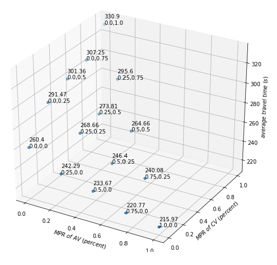
This three-dimensional scatter plot charts the average travel time of the vehicles in the mainline (z-axis) for different scenarios with various market penetration levels of automated vehicles (x-axis) and connected vehicles (y-axis). The values on the x and y axes vary between 0 and 1. The values on z-axis vary between 200 seconds and 340 seconds. The points shown in the graph are as follow (the x-axis, y-axis, and z-axis values are provided, respectively): Point 1) 1, 0, 215.97; Point 2) 0.75, 0, 220.77; Point 3) 0.5, 0, 233.67; Point 4) 0.25, 0, 242.29; Point 5) 0, 0, 260.4; Point 6) 0.75, 0.25, 240.08; Point 7) 0.5, 0.25, 264.4; Point 8) 0.25, 0.25, 268.66; Point 9) 0, 0.25, 291.47; Point 10) 0.5, 0.5, 264.66; Point 11) 0.25, 0.5, 273.81; Point 12) 0, 0.5, 301.36; Point 13) 0.25, 0.75, 295.6; Point 14) 0, 0.75, 307.25; Point 15) 0, 1, 330.9.
a) Data presented in chart format.
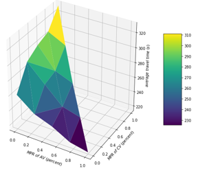
This three-dimensional heatmap plot charts the average travel time of the vehicles in the mainline (z-axis) for different scenarios with various market penetration levels of automated vehicles (x-axis) and connected vehicles (y-axis). The values on the heatmap are the same as the values in the previous plot.
b) Data presented in heat map format.
Source: FHWA, 2019.
Figure 87. Diagrams. Compound figure depicts average travel time at different market penetration rates for autonomous vehicles and connected vehicles on a selected segment of I-290.
Source: FHWA, 2019.
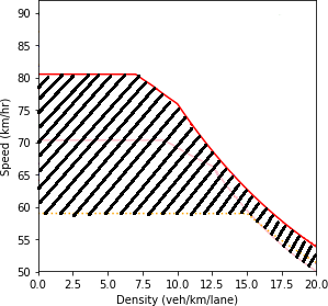
Figure 88. Diagram. Example for calculating the regret summation for the speed in the speed-density profile.
Line graph charts density in vehicles per kilometer per lane (x-axis) against speed in kilometers per hour (y-axis). When all the vehicles in the network are manually driven, the speed remains constant at about 81 kilometers per hour as the density increases until about the 6.9 vehicles per kilometer per lane point. Then, it gradually decreases to a speed of 76.5 kilometers per hour as the density reaches 10 vehicles per kilometer per lane. Then, the speed further decreases reaching a value of 54 kilometers per hour at a density of 20 vehicles per kilometer per lane. When all the vehicles in the network are fully connected, the speed remains constant at about 59 kilometers per hour as the density increases until about the 15 vehicles per kilometer per lane point. Then, it gradually decreases to a speed of 52 kilometers per hour as the density reaches 19.5 vehicles per kilometer per lane. The area between the curves of these two scenarios is hatched.
Figure 89 illustrates the two types of regret-based metrics (maximum regret and regret summation) calculated for the two performance measures. The new scenario IDs are also tabulated in table 12. Even though the general trends of the diagrams are similar to each other, the choice of the performance measure and the robustness metric is important in determining the order of preference between the scenarios.
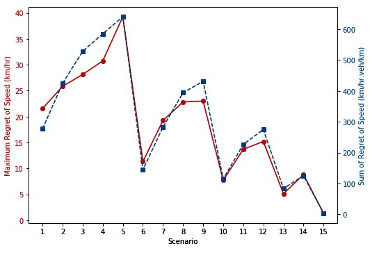
Line graph charts the maximum regret of speed in kilometers per hour (first y-axis) and sum of regret of speed in kilometers per hour times vehicles per kilometer (second y-axis) for various scenarios (x-axis). The values of the first y-axis vary between 0 and 40. The values of the second y-axis vary between 0 and 700. The points shown in the graph are as follow (the x-axis, first y-axis, and second y-axis values are provided, respectively): Point 1) 1, 21.62, 275.14; Point 2) 2, 25.87, 421.83; Point 3) 3, 28.24, 524.94; Point 4) 4, 30.84, 584.49; Point 5) 5, 39.45, 638.09; Point 6) 6, 11.41, 143.18; Point 7) 7, 19.43, 281.94; Point 8) 8, 22.86, 392.97; Point 9) 9, 23.10, 428.75; Point 10) 10, 7.79, 112.07; Point 11) 11, 13.81, 223.10; Point 12) 12, 15.23, 276.71; Point 13) 13, 5.22, 82.79; Point 14) 14, 9, 124.51; Point 15) 15, 1.47, 1.88.
a) Regret summation.
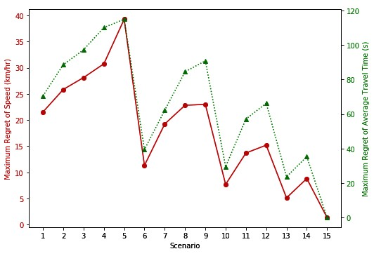
Line graph charts the maximum regret of speed in kilometers per hour (first y-axis) and maximum regret of average travel time in seconds (second y-axis) for various scenarios (x-axis). The values of the first y-axis vary between 0 and 40. The values of the second y-axis vary between 0 and 120. The points shown in the graph are as follow (the x-axis, first y-axis, and second y-axis values are provided, respectively): Point 1) 1, 21.62, 69.27; Point 2) 2, 25.87, 87.87; Point 3) 3, 28.24, 96.46; Point 4) 4, 30.84, 109.34; Point 5) 5, 39.45, 114.73; Point 6) 6, 11.41, 38.68; Point 7) 7, 19.43, 61.56; Point 8) 8, 22.86, 84.09; Point 9) 9, 23.10, 90.19; Point 10) 10, 7.79, 28.43; Point 11) 11, 13.81, 56.31; Point 12) 12, 15.23, 65.62; Point 13) 13, 5.22, 23.15; Point 14) 14, 9, 34.96; Point 15) 15, 1.47, 0.
b) Maximum regret summation.
Source: FHWA, 2019.
Figure 89. Diagram. Regret-based robustness metrics for different performance measures.
Table 12. New scenario identifiers.
Scenario ID |
Connected Vehicles |
Automated Vehicles |
1 |
0 |
0 |
2 |
0 |
25 |
3 |
0 |
50 |
4 |
0 |
75 |
5 |
0 |
100 |
6 |
25 |
0 |
7 |
25 |
25 |
8 |
25 |
50 |
9 |
25 |
75 |
10 |
50 |
0 |
11 |
50 |
25 |
12 |
50 |
50 |
13 |
75 |
0 |
14 |
75 |
25 |
15 |
100 |
0 |
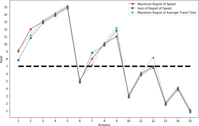
Figure 90 summarizes the ranking found for each scenario based on the selected set of performance measure and robustness metric. The rankings were assigned in a manner that a higher rank is equivalent to a higher value calculated based on the robustness metric. In other words, the scenario that has the worst performance (least regret) in terms of the robustness value is ranked 1st and the scenario that has the best performance (highest regret) is ranked 15th.
Under the minimax regret and minimum of regret summation, the recommended scenario is scenario 15 which refers to the scenario where all vehicles are fully connected (but without any automation feature). Compared to other scenarios, considering the system to be in a fully connected status would be a conservative choice with the least possible regret. In other words, if the highway segment was designed based on a fully connected environment, then the segment would be overdesigned once autonomous vehicles enter the system.
Comparing the three order sets generated by using the robustness metrics shows that the rankings are mostly consistent for different combinations of regret-based metrics and performance measures. However, there are some differences in the rankings. For example, if a 50th percentile minimax regret is considered (the horizontal dashed line on the graph in figure 90), scenario 7 would be selected based on the average travel time. In contrast, under the same percentile minimax regret, scenario 12 would be selected if the system is evaluated based on speed-density relationship. This shows the difference in the suggested scenario under the robust analysis if different performance measures were used. For scenario 1, the slight difference between the ranking provided by the maximum regret metric for both performance measures and the ranking assigned by the summation of regret metric shows the effect of the robustness metric choice on the result of the analysis. The combined influence of the choices for the regret-based robustness metric and the performance measure is visible in scenario 8 where the rankings provided by the three graphs are different from each other.
Source: FHWA.
Figure 90. Diagram. Scenario rankings for various regret-based robustness metrics and performance measures.
CONCLUSIONS
This chapter provided case study examples for the concepts of the proposed calibration methodology. Separate examples and combined examples of the scenario-based and robustness- based approaches were exhibited. Within the examples, the process of generating simulation agents and scenarios using the library of model parameters was explained. Agent trajectories constitute another important component of the methodology as well as the main output of the simulation platform. The trajectories were further processed to generate the performance measures such as the fundamental diagrams and the travel time distributions.
Once the feasible scenarios are evaluated, and a complete scenario-based and robustness-based analyses are performed, the outputs of the simulation tool could be stored. As more information becomes available through observing the real-world system, the probability distributions assigned to the scenarios could be updated using various methods such as Bayesian techniques. Furthermore, for cases where a robust analysis was performed due to lack of information regarding the correlations among the scenarios, as data becomes available, the joint probability distribution for the scenario set could be established. As a result, the scenarios could be combined using the scenario- based approach rather than the robustness-based approach. In summary, with the proposed calibration methodology, instead of recalibrating the entire model specifications and parameters, if a sufficient set of scenarios were considered in the calibration process, only the joint probability distribution of the scenarios would need to be adjusted over time.