Measures of Effectiveness and Validation Guidance for Adaptive Signal Control Technologies
Appendix D. Measures of Effectiveness Analysis and Findings
After the field data collection efforts were completed and the information was imported to the web system, analysis of the results was completed for each of the data sources. This chapter summarizes the results of the validation tests and presents some representative exhibits that illustrate key outcomes.
GPS Probe Travel Time Findings
Probe travel times are the most traditional method of validation of signal timing performance used by the traffic engineering community. As demonstrated in the following exhibits, average performance as recorded by the probe travel time runs does not distinguish between the ASCT operation and coordination for all of the routes. Table 11 summarizes the results for the eight travel routes for travel time, average speed, number of stops per mile, and the buffer time reliability metric for the three time of day periods (AM, PM, off-peak).
Table 11. Travel Time Performance Comparisons For GPS Probe Runs.
| Route Number |
Travel Time
(Runs Before) |
Travel Time
(Runs After) |
Average Speed (Runs Before) |
Average Speed (Runs After) |
Stops per Mile
(Runs Before) |
Stops per Mile
(Runs After) |
AM Buffer Index (Runs Before) |
AM Buffer Index (Runs After) |
AM Reliability Difference |
Midday Buffer Index (Runs Before) |
Midday Buffer Index (Runs After) |
Midday reliability difference |
PM Buffer Index (Runs Before) |
PM Buffer Index (Runs After) |
PM Reliability difference |
| Route 1 (25, 29) |
1:58 |
2:08 |
33 |
29 |
1.2 |
1.5 |
0.4 |
1.3 |
-0.9 |
0.3 |
0.3 |
0.0 |
0.2 |
1.3 |
-1.0 |
| Route 2 (20, 27) |
1:52 |
2:08 |
34 |
29 |
1 |
1.34 |
0.3 |
0.3 |
0.0 |
0.5 |
0.4 |
0.1 |
0.2 |
0.2 |
0.0 |
| Route 3 (21, 22) |
3:53 |
3:33 |
23 |
26 |
1.7 |
1.7 |
0.4 |
0.4 |
0.0 |
0.3 |
0.2 |
0.1 |
0.5 |
0.4 |
0.1 |
| Route 4 (17, 21) |
3:20 |
3:26 |
40 |
43 |
1.7 |
1.7 |
0.4 |
0.4 |
0.1 |
0.4 |
0.4 |
0.0 |
0.5 |
0.4 |
0.1 |
| Route 5 (24, 27) |
5:01 |
5:12 |
19 |
18 |
1.8 |
2 |
1.3 |
1.0 |
0.3 |
0.3 |
0.5 |
-0.1 |
0.6 |
1.4 |
-0.9 |
| Route 6 (26, 26) |
4:36 |
4:38 |
18 |
17 |
1.6 |
2 |
0.9 |
0.5 |
0.3 |
0.4 |
0.5 |
-0.1 |
0.8 |
0.5 |
0.3 |
| Route 7 (27, 28) |
2:48 |
2:55 |
18 |
17 |
2.2 |
2.1 |
0.9 |
1.4 |
-0.4 |
0.4 |
0.8 |
-0.5 |
0.2 |
0.1 |
0.0 |
| Route 8 (27, 30) |
2:39 |
2:42 |
18 |
18 |
2 |
2.5 |
1.4 |
1.0 |
0.3 |
0.4 |
0.5 |
-0.1 |
1.0 |
0.3 |
0.7 |
Figure 47 illustrates the comparison of the average speed versus distance for route #1. Coordinated mode is identified as the “before” condition and adaptive mode is identified as the “after” condition. Similar graphs for the other seven routes are presented in Appendix A.
Figure 47. Screen Shot. Comparison of Average Speed for Route 1.
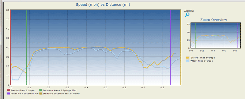
(Source: Kimley-Horn and Associates, Inc.)
Buffer Time Analysis
Figure 48 summarizes the differences between the buffer times for each of the eight routes. The x-axis represents each of the eight routes. The three bars for each route indicate the difference in the buffer time for the AM, mid-day, and PM peak periods. Bars above zero indicate that the ASCT produced more reliable travel times than coordinated operation. Bars below zero indicate that coordinated operation is more reliable than ASCT operation using all of the GPS trips for that time of day for that route.
Figure 48. Bar graph. Comparison of Buffer Times for the Eight Routes.
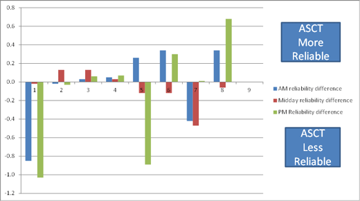
(Source: Kimley-Horn and Associates, Inc.)
Summary of GPS Probe Data Analysis
Table 12 summarizes both the average trip time and reliability performance from a qualitative perspective. As shown in the table, and referring to Figure 17 illustrating the route definitions, there is clearly a difference in the operating principles of coordination and the ASCT with respect to route travel reliability. Routes 1-4 do not manifest this difference, but Routes 5-8 identify a clear difference in the operating principle of the ASCT that is not immediately observable from the average travel times, which are more or less equal. Routes 2 and 3 showed a negligible improvement in the reliability of travel time during the off-peak when ASCT operation was in effect.
Routes 5 and 7 both include the section of Southbound Power Road, and routes 6 and 8 both include the section of northbound Power Road. The results for both pairs of routes indicate higher reliability for southbound travel when the ASCT is operating and higher reliability for northbound travel when in coordination. The city’s objective was to provide coordination in both directions, which is not achieved by the ASCT.
Table 12. Qualitative Comparison of Average Trip Time and Reliability – GPS Probe Data.
| Route |
Average Travel Time |
Buffer Time |
Combined Result |
| 1 |
Coordination slightly better |
Coordination much more reliable |
Coordination clearly better |
| 2 |
Coordination slightly better |
ASCT slightly more reliable |
Mixed |
| 3 |
ASCT better |
ASCT slightly more reliable |
ASCT slightly better |
| 4 |
No difference |
No difference |
No difference |
| 5 |
No difference |
Coordination more reliable in mid and PM |
ASCT favoring southbound travel on Power at the expense of northbound travel, relative to coordination |
| 6 |
No difference |
ASCT more reliable in AM and PM |
ASCT favoring southbound travel on Power at the expense of northbound travel, relative to coordination |
| 7 |
No difference |
Coordination more reliable |
ASCT favoring southbound travel on Power at the expense of northbound travel, relative to coordination |
| 8 |
No difference |
ASCT more reliable |
ASCT favoring southbound travel on Power at the expense of northbound travel, relative to coordination |
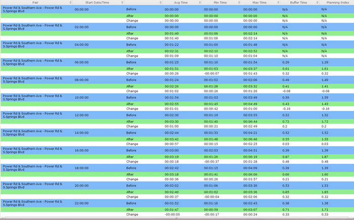
Findings Using Bluetooth Travel Time Detectors
Over the study period, over 4,000 vehicle re-identifications were recorded for each of the six Bluetooth route pairs almost continuously between October 15th and December 12th. As demonstrated in Table 13, negligible differences in average performance of coordinated and adaptive operation were identified. Figure 49 illustrates that coordination showed somewhat better reliability performance for two of the route pairs (3 and 4) and negligible differences in reliability between the other four route pairs. Note that the average travel time between the pairs is consistently less than the travel time measured using GPS probes. This is likely because the vehicles are identified as soon as they are within GPS range of the destination reader, in effect not including any delays due to queues or signal timing to complete the trip to the other side of the intersection.
Table 13. Summary of Travel Time Reliability Comparisons from 11/4-11/15 (adaptive) versus 11/16-11/21 (Coordination).
| Pair Number |
Travel Time AM
(Total Observations Before) |
Travel Time AM
(Total Observations After) |
Travel Time Off Peak
(Total Observations Before) |
Travel Time Off Peak
(Total Observations After) |
Travel Time PM
(Total Observations Before) |
Travel Time PM
(Total Observations After) |
AM Buffer Index
(Total Observations Before) |
AM Buffer Index
(Total Observations After) |
AM reliability difference |
Midday Buffer Index
(Total Observations Before) |
Midday Buffer Index
(Total Observations After) |
Midday reliability difference |
PM Buffer Index
(Total Observations Before) |
PM Buffer Index
(Total Observations After) |
PM Reliability difference |
Pair 1
(570, 642) |
1:58 |
2:08 |
33 |
29 |
1.2 |
1.5 |
0.4 |
1.3 |
-0.9 |
0.3 |
0.3 |
0.0 |
0.2 |
1.3 |
-1.0 |
Pair 2
(567, 653) |
1:52 |
2:08 |
34 |
29 |
1 |
1.34 |
0.3 |
0.3 |
0.0 |
0.5 |
0.4 |
0.1 |
0.2 |
0.2 |
0.0 |
Pair 3
(545, 627) |
3:53 |
3:33 |
23 |
26 |
1.7 |
1.7 |
0.4 |
0.4 |
0.0 |
0.3 |
0.2 |
0.1 |
0.5 |
0.4 |
0.1 |
Pair 4
(541, 591) |
3:20 |
3:26 |
40 |
43 |
1.7 |
1.7 |
0.4 |
0.4 |
0.1 |
0.4 |
0.4 |
0.0 |
0.5 |
0.4 |
0.1 |
Pair 5
(562, 661) |
5:01 |
5:12 |
19 |
18 |
1.8 |
2 |
1.3 |
1.0 |
0.3 |
0.3 |
0.5 |
-0.1 |
0.6 |
1.4 |
-0.9 |
Pair 6
(553, 645) |
4:36 |
4:38 |
18 |
17 |
1.6 |
2 |
0.9 |
0.5 |
0.3 |
0.4 |
0.5 |
-0.1 |
0.8 |
0.5 |
0.3 |
Figure 49. Bar graph. Buffer Time Differences for Each of the Six Bluetooth Pairs.
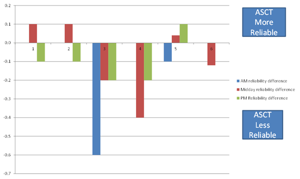
(Source: Kimley-Horn and Associates, Inc.)
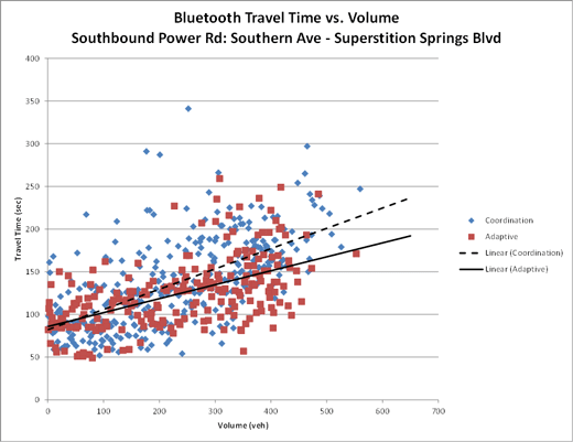
Correlation of Travel Times to Route Volumes
Figures 50 and 51 illustrate the relationship between the travel time recorded on Power Road north and southbound (pairs “1” and “2”, respectively) with the volume data collected at traffic counter “C”. These graphs correlate to the findings obtained with the GPS probe trips: the ASCT favors southbound travel at the expense of northbound travel. The reliability findings shown above in Figure 23 do not, however, identify the same strong indication of southbound bias. One possible explanation for this difference is that the GPS probe continues the trip all the way through both terminus intersections, whereas the Bluetooth data do not include this portion of the trip since the vehicle is identified before traversing the intersection. This also explains the difference in the average travel times (GPS routes 7 and 8 as compared to Bluetooth pairs 1 and 2), which differ by roughly 1 minute.
Figure 50. Line Graph. Comparison of Route Travel Times for Varying Volumes – Southbound.
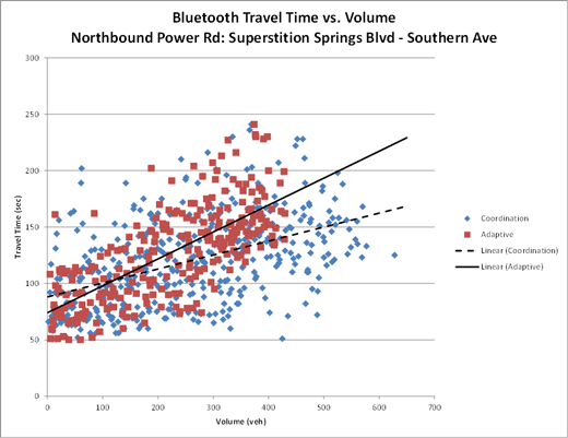
(Source: Kimley-Horn and Associates, Inc.)
Figure 51. Line Graph. Comparison of Route Travel Times for Varying Route Volume – Southbound.
(Source: Kimley-Horn and Associates, Inc.)
Summary of Bluetooth Travel Time Analysis
Table 14 summarizes the findings from comparison of coordinated operation and ASCT operation using the data from the Bluetooth travel routes. As indicated in the table, there is no strong indication that either system provides superior operation, or there a strong argument that a pipeline objective along Power Road is achieved. These findings also indicate that the underlying traffic patterns have not changed substantially since the ASCT was previously evaluated (at least the traffic patterns that would be identified by point-to-point travel times). The results of this data analysis are shown qualitatively in Table 13.
Table 14. Qualitative Comparison of Average Trip Time and Trip Reliability – Bluetooth Data.
| Bluetooth Pair |
Average Travel Time |
Buffer Time |
Combined Result |
| 1 |
ASCT better in mid-day and PM |
No difference |
ASCT better |
| 2 |
Coordination better |
No difference |
Coordination better |
| 3 |
ASCT better in mid-day and PM |
Coordination more reliable |
Mixed |
| 4 |
Coordination better |
Coordination more reliable |
Coordination better |
| 5 |
No difference |
No difference |
No difference |
| 6 |
No difference |
No difference |
No difference |
Endpoint to endpoint travel times are not particularly helpful for identifying where changes to signal timings can improve the operation, but they can be helpful in providing evidence that something is different. For example, Figure 52 illustrates the difference between the travel time on southbound Power Road on the day before Thanksgiving and the day after Thanksgiving (i.e., “Black Friday”). A few items are of note. First, the Bluetooth detectors identify enough travelers early in the morning to compute a travel time for those time periods on Black Friday, revealing a shift in departure times. Second, the buffer times and maximum travel times on Black Friday in some periods are significantly greater. If such changes can be identified close to real-time, signal control operations might be modified to improve the situation in the field.
Figure 52. Table. Comparison of Travel Times on Power Road Before and During Black Friday.
(Source: Kimley-Horn and Associates, Inc.)
Findings Using High Resolution Phase and Detector Data
Complete phase timing data were available for all six intersections for two periods during the validation study:
- October 15th to October 31st.
- November 21st and December 3rd.
Note that only intersection “2” (Power & Southern) has advanced loops, so all percent arrivals on green and platoon ratio performance exhibits are based on the north and southbound directions at this intersection.
Summary Results for Time of Day Analysis of GOR Performance
Table 15 illustrates a summary of the comparison of average GOR and standard deviation of GOR for Superstition Springs & Southern (intersection “1”). Similar tables are presented for all of the other intersections in the system in Appendix B. The results are summarized across all the valid days of data collection for each hour of the day between 7 am and 10 pm (10 pm is shown as 22 in the table, representing military time). The columns indicate the following for each phase:
- The average GOR value for that hour of the day.
- The difference between the average GOR value for ASCT versus coordinated operation; negative values indicate that the coordinated average GOR is higher than the ASCT average.
- The difference between the standard deviation of the GOR value for ASCT versus coordinated operation; negative values indicate that the standard deviation for coordinated operation is larger than for ASCT operation.
Table 15. Difference between ASCT and Coordination for GOR by Time of Day – Southern and Superstition Springs (Weekdays).
| Hour |
2 – Average of GOR |
2 –GOR Difference |
2 – StdDev Diff |
5 – Average of GOR |
5 – GOR Difference |
5 – StdDev Diff |
6 – Average of GOR |
6 – GOR Difference |
6 – StdDev Diff |
8 – Average of GOR |
8 – GOR Difference |
8 – StdDev Diff |
| 7 |
0.08 |
0.03 |
0.03 |
0.08 |
-0.01 |
-0.01 |
0.09 |
0.02 |
0.02 |
0.54 |
-0.04 |
-0.04 |
| 8 |
0.08 |
0.02 |
0.02 |
0.11 |
-0.02 |
-0.02 |
0.10 |
0.01 |
0.01 |
0.49 |
-0.05 |
-0.05 |
| 9 |
0.08 |
0.01 |
0.01 |
0.13 |
-0.02 |
-0.02 |
0.12 |
0.00 |
0.00 |
0.49 |
-0.04 |
-0.04 |
| 10 |
0.10 |
0.01 |
0.01 |
0.15 |
-0.03 |
-0.03 |
0.14 |
0.00 |
0.00 |
0.53 |
-0.03 |
-0.03 |
| 11 |
0.11 |
0.01 |
0.01 |
0.24 |
-0.02 |
-0.02 |
0.17 |
0.01 |
0.01 |
0.55 |
-0.04 |
-0.04 |
| 12 |
0.12 |
0.01 |
0.01 |
0.24 |
-0.04 |
-0.04 |
0.17 |
0.00 |
0.00 |
0.56 |
-0.05 |
-0.05 |
| 13 |
0.13 |
0.01 |
0.01 |
0.24 |
0.00 |
0.00 |
0.17 |
0.01 |
0.01 |
0.57 |
-0.04 |
-0.04 |
| 14 |
0.12 |
0.01 |
0.01 |
0.20 |
-0.05 |
-0.05 |
0.16 |
-0.01 |
-0.01 |
0.57 |
-0.04 |
-0.04 |
| 15 |
0.12 |
0.01 |
0.01 |
0.19 |
-0.05 |
-0.05 |
0.16 |
0.01 |
0.01 |
0.60 |
-0.05 |
-0.05 |
| 16 |
0.11 |
0.01 |
0.01 |
0.22 |
-0.02 |
-0.02 |
0.17 |
0.01 |
0.01 |
0.63 |
-0.04 |
-0.04 |
| 17 |
0.11 |
0.01 |
0.01 |
0.21 |
0.02 |
0.02 |
0.16 |
0.02 |
0.02 |
0.60 |
-0.05 |
-0.05 |
| 18 |
0.09 |
0.01 |
0.01 |
0.14 |
0.00 |
0.00 |
0.12 |
0.01 |
0.01 |
0.56 |
-0.04 |
-0.04 |
| 19 |
0.07 |
0.00 |
0.00 |
0.08 |
-0.04 |
-0.04 |
0.09 |
0.00 |
0.00 |
0.55 |
-0.04 |
-0.04 |
| 20 |
0.06 |
0.00 |
0.00 |
0.05 |
-0.08 |
-0.08 |
0.08 |
-0.01 |
-0.01 |
0.54 |
-0.05 |
-0.05 |
| 21 |
0.06 |
0.01 |
0.01 |
0.04 |
-0.09 |
-0.09 |
0.06 |
-0.01 |
-0.01 |
0.50 |
-0.06 |
-0.06 |
Summary Results for Time of Day Analysis of Percent Arrivals on Green
Tables 16 and 17 summarize the comparison of average percent arrivals on green and standard deviation of percent arrivals for intersection 2 (Power & Southern,) which is the only intersection with advanced detection. The results are summarized across all the valid days of data collection for each hour of the day between 7 am and 10 pm (10 pm is shown as 22 in the table, representing military time). Phase 4 is southbound and Phase 8 is northbound. Some times of day have been excluded from the table because of anomalies in the data collection process. The columns indicate the following for each phase:
- The average percent arrivals value for that hour of the day.
- The difference between the average percent arrivals value for ASCT versus coordinated operation; negative values indicate that the coordinated average percent arrivals is higher than the ASCT average.
- The difference between the standard deviation of the percent arrivals value for ASCT versus coordinated operation; negative values indicate that the standard deviation for coordinated operation is larger than for ASCT operation.
- The average platoon ratio value for that hour of the day.
- The difference between the average platoon ratio value for ASCT versus coordinated operation; negative values indicate that the coordinated average platoon ratio is higher than the ASCT average.
- The difference between the standard deviation of the platoon ratio value for ASCT versus coordinated operation; negative values indicate that the standard deviation for coordinated operation is larger than for ASCT operation.
Table 16. Difference between ASCT and Coordination for Percent Arrivals on Green by Time of Day – Power and Southern (Weekdays).
| Hour |
4 – Average of % Arrivals on Green |
4 – Difference of % arrivals |
4 – StdDev Diff |
4 – Average of PlatoonRatio |
4 – Difference of PlatoonRatio |
4 – StdDev Diff PlatoonRatio |
8 – Average of % Arrivals on Green |
8 – Difference of % arrivals |
8 – StdDev Diff |
8 – Average of PlatoonRatio |
8 – Difference of PlatoonRatio |
8 – StdDev Diff PlatoonRatio |
| 7 |
0.36 |
-0.08 |
0.01 |
1.01 |
-0.20 |
0.11 |
0.51 |
0.02 |
0.00 |
1.37 |
0.13 |
0.00 |
| 8 |
0.40 |
-0.03 |
-0.02 |
1.10 |
-0.09 |
-0.02 |
0.49 |
0.07 |
0.04 |
1.29 |
0.17 |
0.10 |
| 9 |
0.37 |
-0.05 |
-0.03 |
1.07 |
-0.15 |
-0.08 |
0.19 |
-0.19 |
-0.08 |
0.54 |
-0.53 |
-0.23 |
| 10 |
0.40 |
-0.03 |
-0.03 |
1.18 |
-0.14 |
-0.12 |
0.19 |
-0.21 |
-0.10 |
0.55 |
-0.63 |
-0.32 |
| 11 |
0.44 |
-0.03 |
0.02 |
1.37 |
-0.09 |
0.16 |
0.23 |
-0.18 |
-0.07 |
0.70 |
-0.54 |
-0.17 |
| 12 |
0.40 |
-0.06 |
0.02 |
1.32 |
-0.14 |
0.10 |
0.22 |
-0.19 |
-0.08 |
0.75 |
-0.52 |
-0.05 |
| 13 |
0.39 |
-0.08 |
0.02 |
1.25 |
-0.24 |
0.07 |
0.25 |
-0.18 |
-0.07 |
0.78 |
-0.52 |
-0.15 |
| 14 |
0.41 |
-0.05 |
0.00 |
1.29 |
-0.21 |
-0.04 |
0.26 |
-0.15 |
-0.04 |
0.80 |
0.55 |
-17.32 |
| 16 |
0.41 |
0.03 |
-0.01 |
1.29 |
0.13 |
-0.02 |
0.21 |
-0.21 |
-0.09 |
0.65 |
-0.60 |
-0.24 |
| 19 |
0.34 |
-0.01 |
-0.02 |
0.97 |
-0.12 |
-0.15 |
0.29 |
-0.15 |
-0.03 |
0.74 |
-0.41 |
-0.15 |
| 20 |
0.37 |
0.03 |
0.02 |
1.02 |
0.06 |
0.04 |
0.41 |
-0.02 |
0.04 |
1.00 |
-0.06 |
0.11 |
| 21 |
0.41 |
0.02 |
0.00 |
1.00 |
-0.04 |
-0.12 |
0.52 |
0.05 |
0.05 |
1.15 |
0.05 |
0.20 |
| 22 |
0.40 |
0.01 |
0.01 |
2.00 |
0.76 |
9.76 |
0.43 |
-0.03 |
0.03 |
-0.27 |
-1.13 |
10.81 |
Table 17. Difference between ASCT and Coordination for Percent Arrivals on Green by Time of Day – Power and Southern (Weekends).
| Hour |
4 – Average of % Arrivals on Green |
4 – Difference of % arrivals |
4 – StdDev Diff |
4 – Average of PlatoonRatio |
4 – Difference of PlatoonRatio |
4 – StdDev Diff PlatoonRatio |
8 – Average of % Arrivals on Green |
8 – Difference of % arrivals |
8 – StdDev Diff |
8 – Average of PlatoonRatio |
8 – Difference of PlatoonRatio |
8 – StdDev Diff PlatoonRatio |
| 7 |
0.40 |
0.11 |
0.00 |
0.97 |
0.05 |
-0.19 |
0.32 |
0.00 |
0.00 |
0.71 |
-0.21 |
-0.49 |
| 8 |
0.41 |
0.12 |
0.00 |
1.04 |
0.12 |
-0.10 |
0.29 |
-0.07 |
-0.03 |
0.69 |
-0.40 |
-0.30 |
| 9 |
0.36 |
0.05 |
0.02 |
1.07 |
-1.50 |
-16.73 |
0.22 |
-0.10 |
-0.05 |
0.60 |
-0.41 |
-0.25 |
| 10 |
0.38 |
0.00 |
0.02 |
1.12 |
-0.10 |
0.01 |
0.23 |
-0.14 |
-0.05 |
0.63 |
-0.52 |
-0.26 |
| 11 |
0.43 |
0.01 |
0.05 |
1.41 |
0.07 |
0.27 |
0.22 |
-0.19 |
-0.07 |
0.69 |
-0.62 |
-0.23 |
| 12 |
0.35 |
-0.08 |
0.02 |
1.32 |
-0.04 |
0.99 |
0.21 |
-0.18 |
-0.08 |
0.79 |
-0.42 |
0.25 |
| 13 |
0.35 |
-0.07 |
0.04 |
1.20 |
-0.14 |
0.15 |
0.24 |
-0.16 |
-0.08 |
0.81 |
-0.45 |
-0.21 |
| 14 |
0.34 |
-0.07 |
0.02 |
1.15 |
-0.18 |
0.07 |
0.28 |
-0.15 |
-0.06 |
0.92 |
-0.39 |
-0.21 |
| 16 |
0.34 |
-0.03 |
0.00 |
1.14 |
-0.08 |
0.07 |
0.24 |
-0.13 |
-0.05 |
0.79 |
-0.40 |
-0.12 |
| 19 |
0.39 |
0.10 |
0.00 |
1.04 |
0.03 |
-0.23 |
0.38 |
0.04 |
-0.02 |
0.94 |
-0.04 |
-0.14 |
| 20 |
0.39 |
0.09 |
0.02 |
0.99 |
-0.08 |
-0.20 |
0.54 |
0.14 |
-0.01 |
1.21 |
0.12 |
-0.41 |
| 21 |
0.44 |
0.16 |
0.01 |
1.04 |
0.08 |
-0.24 |
0.57 |
0.23 |
0.00 |
1.28 |
0.39 |
-0.03 |
| 22 |
0.46 |
0.10 |
0.03 |
2.68 |
-0.38 |
-5.30 |
0.54 |
0.12 |
0.03 |
0.37 |
-0.36 |
3.97 |
As indicated in other parts of this report, the data on percent arrivals on green does not indicate a strong conclusion that either type of operation provides a pipeline type operation on Power Road, particularly at this critical intersection. Both the percent arrivals on green and platoon ratio MOEs indicate that coordinated operation provides marginally better performance, but the coordinated operation also has a higher standard of deviation, indicating less reliable performance than ASCT for both weekday and weekend traffic conditions.
Examples of More Detailed Analysis of High-Resolution Phase Timing Data
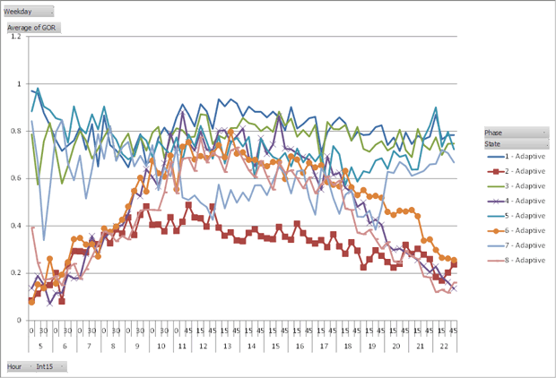
Figure 53 illustrates how the average GOR values change over a typical Saturday at intersection 2 when ASCT is in operation. A criterion one might use to determine if the ASCT is providing equity access is that the GOR values on each phase are approximately the same. This objective is clearly not the only objective being considered by the ASCT, since in particular phase 2 (eastbound through traffic) has a much lower GOR value than the other phases. The volumes on this phase are noticeably lower than the other through phases 4, 6, and 8. This is explained, possibly, by two facts. First, the ASCT is not allowed to modify the sequence in this deployment, so with leading left turns, phase 2 must terminate with phase 6 (which has higher volume), dragging phase 2 out longer than necessary due to barrier crossing requirements. Second, the movement experiences frequent pedestrian activity (more so on a Saturday in the middle of the day), which might extend the duration of phases 2 and 6 longer than necessary to serve vehicle demand.
Figure 53. Line Graph. Average GOR Over Time for ASCT Operation at Power and Southern on Saturdays.
(Source: Kimley-Horn and Associates, Inc.)
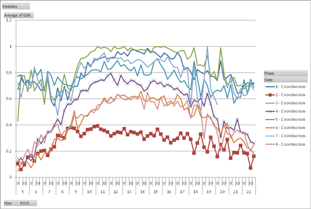
Contrast Figure 53 with Figure 54 below illustrating the average GOR values on Saturdays resulting from coordinated operation. The GOR values for left turn phases (1, 3, 5, 7) are noticeably higher under coordination. The ASCT has increased the cycle time and slightly decreased the splits for coordinated phases to drive the GOR values closer to a more reasonable value of ~0.8. This is what it is designed to do; thus, this artifact illustrates the ability of the ASCT to meet its operational objective of providing equity access.
Figure 54. Line Graph. Average GOR Values Over Time for Coordinated Operation at Power and Southern on Saturdays.
(Source: Kimley-Horn and Associates, Inc.)
Figure 55 further corroborates other findings that indicate that the ASCT focuses on northbound traffic at the expense of southbound traffic flows. While neither type of operation produces particularly impressive progression performance in the heaviest hours of the peak period, the ASCT reduces southbound progression performance even further to maintain equity access for other phases after 9 am. In and of itself, this appears to be a poor decision, but other modifications being made at adjacent locations must be considered as well.
Figure 55. Line Graph. Comparison of Average Platoon Ratio 7-10 AM on Representative Weekdays – North and Southbound at Power and Southern.
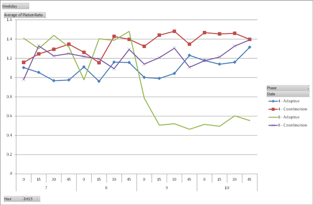
(Source: Kimley-Horn and Associates, Inc.)
Example of Pitfalls in Reporting and Consideration of Percent Improvement Data
While GOR and percent arrivals on green provide meaningful measures to compare signal operations, one must still be careful in using these measures. Figure 56 compares the GOR values between ASCT and coordinated operation for phases at intersection 1 (Southern and Superstition Springs, the intersection with the lowest total flows). The y-axis displays the percent difference between the GOR value for ASCT and coordination on Sundays during the study period. Values greater than zero indicate higher GOR for ASCT. Except for GORs that trend at 1.0, higher GOR generally indicates “snappier” operation as the signal control terminates the green phase earlier after vehicle demand has dissipated. At first glance, the improvements in the early morning and late evening indicate superior performance for the ASCT, with at times greater than 60% higher GOR.
Figure 56. Line Graph. Percent Differences in GOR between Adaptive and Coordination on Sundays at Intersection 1.
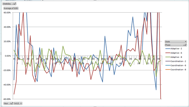
(Source: Kimley-Horn and Associates, Inc.)
Figure 57 illustrates the average GOR values for phases at intersection 1 on Sundays. As shown, the GOR values are very low, essentially indicating that one or two vehicles are arriving to be served and the system is timing the minimum green. This indicates that at very low volumes, the ASCT is better than the coordinated operation at terminating the phase early and moving on to the next phase with demand. This is certainly a reasonable benefit of ASCT application for individual drivers, but in aggregate the benefits are negligible. Percentages should always be taken with a grain of salt.
Figure 57. Line Graph. Average GOR Values on Sundays at Intersection 1.
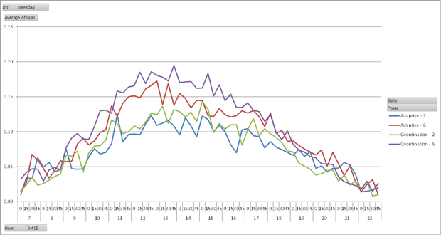
(Source: Kimley-Horn and Associates, Inc.)
Volume Counter Findings for Throughput Estimation
Volume counters were installed for measurement of flow at key entry and exit points to the major arterial, Power Road, from the east, west, and south. These measurement points were used to determine that the traffic flows were approximately the same during ASCT and coordinated operation, to match travel times with flows, and to measure throughput. The ability of a system to manage queues can be estimated from the total throughput at a certain point. Comparison of day of week and time of day flows did not show any significant differences in the distribution of peak periods or other differences between times when ASCT and coordination were in operation. This was not surprising, as an ON/OFF study was conducted over a compressed period of time (two months) with an approximately equal number of ON and OFF days and distribution of those days across days of the week.
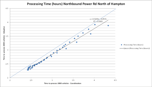
Throughput performance was analyzed by selecting a given count detector and identifying a target volume. The analysis algorithm calculates, to the nearest minute, the time it takes to accumulate the target volume from the starting time. Starting times are tabulated in 15 minute increments. Figure 58 illustrates a comparison of the processing time for ASCT on the y-axis and coordination operation on the x-axis for the eight dates when GPS travel time data runs were collected. The points shown begin at 6:00 am through 5:45 pm. The target volume was 3000 vehicles for this location. Other locations used different target volumes as shown in each graph in Appendix C.
Figure 58. Line Graph. Throughput Performance for ASCT versus Coordination – Volume Counter “C”, Northbound.
(Source: Kimley-Horn and Associates, Inc.)
As shown in the figure, ASCT shows a noticeable performance benefit for every starting time. The effect also appears to be amplified at later start times that also correspond to lower volumes. The ASCT achieves the target volume sooner than coordinated operation, indicating that it is more efficient at processing low volumes since at this time it operates more as if it is in “free” mode, reserving less time for the coordinated band. Since this counter is on the main arterial (Power Road), there is a strong indication that either (a) perhaps the system would be more efficiently operated in “free” mode earlier in the evening, or (b) the offset at Power Road is not set for northbound travel. This indication corroborates other findings such as the percent arrivals on green and platoon ratio metrics from the controller data that indicate poor coordination performance at Power and Southern.
Appendix E presents graphs of the throughput performance for the other traffic counters used in the study. Four show minor but measurable benefits for ASCT operation in throughput performance, and the other three indicate no significant difference in the two types of operation.