
More and more, transportation system operators are seeing the benefits of strengthening links between planning and operations. A critical element in improving transportation decision-making and the effectiveness of transportation systems related to operations and planning is through the use of analysis tools and methods. This brochure is one in a series of five intended to improve the way existing analysis tools are used to advance operational strategies in the planning process. The specific objective of developing this informational brochure series was to provide reference and resource materials that will help planners and operations professionals to use existing transportation planning and operations analysis tools and methods in a more systematic way to better analyze, evaluate, and report the benefits of needed investments in transportation operations.
The series of brochures includes an overview brochure and four case studies that provide practitioners with information on the feasibility of these practices and guidance on how they might implement similar processes in their own regions. The particular case studies were developed to illuminate how existing tools for operations could be utilized in innovative ways or combined with the capabilities of other tools to support operations planning (The use of the term “Tools” in this context is meant not only to include physical software and devoted analytical applications, but is also intended to encompass more basic analysis methods and procedures as well). The types of tools considered when selecting the case studies included:
Additional information on these existing tool types is presented in the overview brochure to this series.
In selecting the case studies to highlight in this brochure series, a number of innovative analysis practices and tool applications were considered. Ultimately, four different case studies were selected from among many worthy candidates. Each of these case studies represents an innovative use of one or more of the tool types listed above. Figure 1 presents the topics of the case studies and maps them to the related tool. Although individual case studies were not developed for each tool category, this should not be considered as a measure of indictment of the ability of any tool type to be used in innovative ways to support operations planning – there simply weren’t project resources to identify and document all the innovative practices being used. Likewise, the selection of a particular case study representing a specific tool should not be construed as the only manner in which to apply the particular tool. Instead, the case studies represent a sampling of the many innovative ways planners and operations personnel are applying these tools currently.
Figure 1. Analytical Methods/Tools and Related Case Studies Developed Under this Project
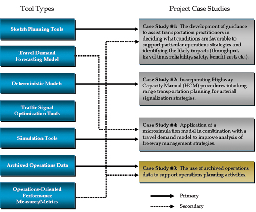 Figure 1 - flow chart - The figure shows that the four case studies represent a variety of the traffic analysis tool types. Each case study supports a primary tool type and several also support multiple case studies. Case study number three is highlighted to represent the contents of this document and it primarily supports the archived operations data tool type. It also includes operations-oriented performance measures/metrics as a secondary tool type.
This particular case study focused on the application of archived data as a tool for operations planning. Using archived data to conduct transportation operations analysis has multiple advantages, including the following:
This case study summarizes an effort involving the use of archived data for operations planning conducted by the Metropolitan Transportation Commission (MTC) in the San Francisco Bay Area.
The objective of this case study was to document the findings and results of an effort to use archived data for operations planning, and to summarize the successes and challenges associated with the work. The project used for this case study was MTC’s Freeway Performance Initiative (FPI), corridor studies that will be used to develop a roadmap for the selection of the best projects and operational strategies in the region based on performance and cost-effectiveness. The focus of the case study was on the use of archived data for the existing conditions portion of the FPI analyses. The results of this case study indicate opportunities in the use of archived data and how existing conditions analysis has been enhanced by the use of the data.
The participating agency for this case study was the Metropolitan Transportation Commission (MTC), the regional planning agency for the San Francisco Bay Area in California. MTC is responsible for planning, financing, and coordinating transportation projects for the nine counties in the Bay Area, including Alameda, Contra Costa, Marin, Napa, San Francisco, San Mateo, Santa Clara, Solano, and Sonoma Counties.
MTC launched the Freeway Performance Initiative (FPI) project in 2006 with the objective of developing a roadmap for the selection of the best projects and operational strategies based on performance and cost-effectiveness. The FPI project includes traffic analysis on major San Francisco Bay Area freeway corridors; a quantitative assessment of existing freeway conditions; and development and assessment of short–term and long–term congestion relief strategies and projects.
Figure 2 shows the FPI corridors with six primary corridors being analyzed first:
This case study includes findings on the use of archived data for the existing conditions analyses for these six corridors. The analyses were performed by four different consultant teams, with varying levels of archived data available, each extracting, compiling, and producing measures using different approaches. This provided MTC with the ability to obtain a variety of tabular and graphical representations of the results to determine which works best for their purposes.
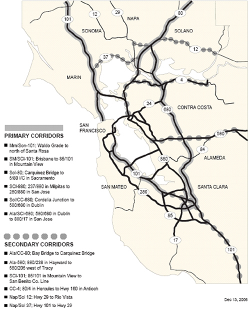 Figure 2 - map - The figure contains a map showing the Bay Area’s six primary Freeway Performance Initiative corridors highlighted with solid gray lines. The primary corridors include: Marin/Sonoma U.S. 101 from the Waldo Grade to north of Santa Rosa, San Mateo/Santa Clara U.S. 101 from Brisbane to 85/101 in Mountain View, Solano I 80 between the Carquinez Bridge and the 5/80 interchange in Sacramento, Santa Clara/Alameda I 880 in Milpitas to 280/880 interchange in San Jose, Solano/Contra Costa I 680 from the Cordelia Junction to 580/680 in Dublin, and Alameda/Santa Clara I 680 between 580/680 in Dublin to 880/17 in San Jose). Six secondary corridors are highlighted on the map with gray solid circles including: Alameda/Contra Costa I-80 from the Bay Bridge to the Carquinez Bridge, Alameda I-580 between the 880/238 interchange in Hayward to the 580/205 interchange west of Tracy, Santa Clara U.S. 101 from the 85/101 interchange in Mountain View to the San Benito County Line, Contra Costa SR-4 from I-80 in Hercules to Highway 160 in Antioch, Napa/Solono Highway 12 from Highway 29 to Rio Vista, and Napa/Solono 37 from U.S. 101 to Highway 29.
This case study focused on the quantitative assessment of existing conditions in the corridors using archived data to the extent possible. Due to time and budget constraints, the existing conditions analysis relied extensively on archived data. An overview of the existing conditions analysis, types of archived data used, and results generated are highlighted in the following sections.
The goal of the existing conditions analysis was to perform a comprehensive assessment of the existing traffic performance in the corridor, including the following:
Archived data were used for assessing the traffic performance in the existing conditions analyses on the FPI corridors to varying extents. The following summarizes the sources of archived data used.
Several types of archived data were used in the FPI project. They include the following:
The Freeway Performance Monitoring System (PeMS) (University of California, at Berkeley, California Department of Transportation, California Partners for Advanced Transit and Highways, and Berkeley Transportation Systems, 2008, Performance Measurement System, PEMS–available at https://pems.eecs.berkeley.edu/) is an Internet-based data archive system that collects historical and real-time freeway traffic data in California to compute freeway performance measures. It collects traffic data from freeway detectors such as counts and occupancies, and can automatically compute speeds, vehicle miles traveled (VMT), vehicle hours traveled (VHT), delay, travel time index, and productivity for every detector location every five minutes. Using the five-minute raw data of flow and occupancy, and the calculated values of speed and other performance measures, PeMS also aggregates several of the performance measures in time and space. Figure 3 presents a screenshot of the PeMS online system. Users can retrieve data using the standard query forms within the system.
The MTC’s 511 system (Metropolitan Transportation Commission, 2008, 511 San Francisco Bay Area [online] available at http://www.511.org) gathers traffic information from several data sources such as FasTrak toll tag transponders, PeMS, and fixed radar sites. This information is checked against several quality filters that help to ensure the data is as accurate as possible before it is used by the 511 system to provide traveler information to Bay Area travelers. This data source is good for obtaining supporting or reference information for other data sources. Figure 4 presents a screenshot of the 511 system.
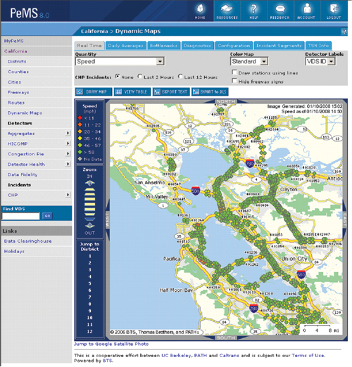
Source: PeMS, http://pems.eecs.berkeley.edu/.
Figure 3 - screenshot - The figure shows a screenshot containing a map view of real-time traffic speeds along the San Francisco region’s transportation network through the PeMS Online System. The traffic conditions at points along the corridor are represented with colored dots at locations on the roadway where there is detection. The green dots represent free flow speeds and red represents speeds below 11 miles per hour.
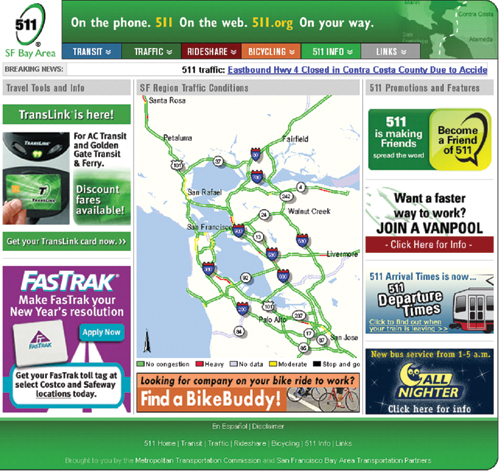
Source: Source: MTC, http://511.org.
Figure 4 - screenshot - The screenshot shows real-time speeds on a map along the San Francisco region’s transportation system through the MTC 511 online system. Traffic conditions along each freeway segment are represented with different colored segments: green is no congestion, red is heavy congestion, white is no data, yellow is moderate, and black is stop and go traffic conditions. Advertisements surround the map.
The “Predict-a-TripSM” (Metropolitan Transportation Commission, 2008, 511 San Francisco Bay Area Predict-a Trip – available at http://traffic.511.org/his_traffic_text.asp) feature of the 511 system provides “typical” travel time and speed information for user-selected routes based on historical information. The data is combined into 15-minute intervals for each day of the week and holiday defined in the system. For each 15-minute interval, a “typical” value is calculated based on historical information. The typical value is updated every day using the most recent data. The typical travel time is the historical average driving time between a starting and ending point for a particular day of the week and time of day. Predict-a-Trip uses an averaging scheme that gives more weight to data that is current so that the typical values are representative of current, seasonal traffic patterns.
The Highway Congestion Monitoring Program (HICOMP) (California Department of Transportation, 2008, Caltrans Highway Congestion Monitoring Program (HICOMP) – available at http://www.dot.ca.gov/hq/traffops/sysmgtpl/HICOMP/index.htm) report has been produced by Caltrans since 1987. The HICOMP report is produced annually and contains a compilation of measured congestion data reflecting conditions on urban freeways in California. Over the past few years, MTC has been producing the State of the System Report (Metropolitan Transportation Commission, 2008, State of the System – available at http://www.mtc.ca.gov/library/state_of_the_system/index.htm) and sharing this data with Caltrans for the HICOMP report. The data is collected by driving specially equipped vehicles along congested freeway segments during peak travel periods. Two times per year in the Bay Area, teams of drivers perform data collection runs along congested freeways. Because of budget constraints MTC has not been collecting data on all congested corridors. However, MTC has prioritized congestion monitoring corridors, so the segments with the most delay are those that continue to be monitored annually. In addition, Caltrans continues to perform floating car runs at least twice per year on freeway segments with high-occupancy vehicle (HOV) lanes.
Figure 5 shows congested segments on the San Mateo/Santa Clara U.S. 101 corridor between San Francisco and San Jose during the morning peak period. The HICOMP report includes maps illustrating the congested locations, the duration of congestion, and the hours of delay for each congested segment.
The Traffic Accident Surveillance and Analysis System (TASAS) is a traffic records system containing an accident database linked to a highway database. The highway database contains description elements of highway segments, intersections and ramps, access control, traffic volumes, and other data. TASAS contains specific data for accidents on state highways. Accidents on nonstate highways are not included (e.g., local streets and roads).
Table 1 shows the number of accidents and accident rate information obtained from a TASAS report for the San Mateo/Santa Clara U.S. 101 corridor.
Figure 5. HICOMP Congestion Map
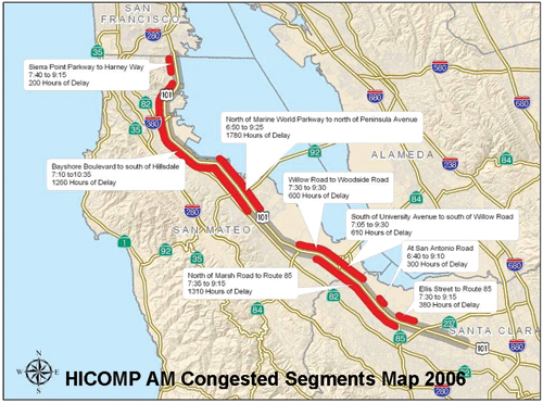 Figure 5 - map - The figure presents an example figure from the California Department of Transportation’s Highway Congestion Monitoring Program (HICOMP) report. It shows congestion along the US-101 from South San Francisco to Santa Clara. Congested portions are shown in red and uncongested portions are shown in gray. Each congested portion is captioned to describe the location, start and end times, and duration of the congestion.
Table 1. TASAS–Accidents and Accident Rate
From |
To | Fatalities | Injuries | PDO | Total | MVMT | Fatalities | Injuries | PDO | Total |
|---|---|---|---|---|---|---|---|---|---|---|
Northbound |
||||||||||
On-Ramp from SB Great America (SCL 42.947) |
SM/SCL County Line (SCL 52.550) | 2 |
225 |
696 |
923 |
928.13 |
0.002 |
0.242 |
0.750 |
0.994 |
SM/SCL County Line (0.000) |
On-Ramp from WB Whipple Ave (SM 6.666) | 4 |
169 |
508 |
681 |
708.99 |
0.006 |
0.238 |
0.717 |
0.961 |
On-Ramp from WB Whipple Ave (SM 6.666) |
North of Fashion Island Bl (SM 12.108) | 2 |
154 |
499 |
655 |
660.45 |
0.003 |
0.233 |
0.756 |
0.992 |
North of Fashion Island Bl (SM 12.108) |
On-Ramp from Old Bayshore (SM 16.790) | 2 |
125 |
324 |
451 |
617.88 |
0.003 |
0.202 |
0.524 |
0.730 |
On-Ramp from Old Bayshore (SM 16.790) |
SF/SM County Line (SM 26.106) | 2 |
119 |
353 |
474 |
1071.65 |
0.002 |
0.111 |
0.329 |
0.442 |
Southbound |
||||||||||
SF/SM County Line (SM 26.107) |
Off-Ramp to Millbrae (SM 18.151) | 3 |
151 |
365 |
519 |
901.2 |
0.003 |
0.168 |
0.405 |
0.576 |
Off-Ramp to Millbrae (SM 18.151) |
Between Harbor Bl and Holly St (SM 8.703) | 4 |
213 |
565 |
782 |
1213.97 |
0.003 |
0.175 |
0.465 |
0.644 |
Between Harbor Bl and Holly St (SM 8.703) |
SM/SCL County Line (0.000) | 6 |
241 |
673 |
919 |
943.68 |
0.005 |
0.255 |
0.713 |
0.974 |
SM/SCL County Line (SCL 52.550) |
Off-Ramp to SB Great America (SCL 43.034) | 2 |
196 |
610 |
808 |
920.77 |
0.002 |
0.213 |
0.662 |
0.878 |
To compare different investments within a corridor and among the various FPI corridor studies conducted by different consulting teams, a performance and analysis framework was established by MTC to enable consistent performance measurement for all FPI corridors. The framework established traffic analysis goals, set performance measures, and described expected output. As described previously, the performance measures used in the analysis included mobility, reliability, safety, and other measures appropriate for the corridor.
Mobility describes how well the corridor moves people and freight. The mobility performance measures are both readily measurable and straightforward for documenting current conditions, and also are forecastable, making them useful for future comparisons. Three primary measures are typically used to quantify mobility: travel time, speed, and delay. The FPI analysis also involved a focus on bottlenecks and their extent as a proxy for delay. Bottleneck identification and identifying the causes of the bottlenecks are critical components in determining appropriate congestion relief strategies.
Travel time is reported as the amount of time for a vehicle to travel between two points on a corridor. Figure 6 shows the peaking characteristics of travel along the San Mateo/Santa Clara U.S. 101 corridor. The blue line is northbound and orange southbound. The green dashed line shows the travel time at 60 mph and the red line at 35 mph. According to this chart, the AM peak period can be described as beginning at 7:00 a.m., and ending at 11:00 a.m. The PM peak period effectively ends at around 7:30 p.m. However, the southbound PM period start time is around 2:30 p.m., while the northbound PM peak starts two hours later. The peak PM travel time also shows dramatic differences from the AM travel times. This figure was prepared using data from PeMS.
Speed across the study corridor can be presented using speed contour plots which are essentially the compilation of speed plots across the corridor at a certain time interval (e.g., five minutes). Figure 7 presents a typical speed contour plot generated using PeMS data for the San Mateo/Santa Clara U.S. 101 freeway corridor in the northbound direction (traffic moving left to right on the plot) on a typical weekday in the month of August 2006. Along the vertical axis is the time period from 6:00 a.m. to 9:00 p.m. Along the horizontal axis is the corridor segment from SR 87 to I‑280. The various colors represent the average speeds corresponding to the color speed chart shown below the diagram. As shown, the dark blue blotches represent congested areas where speeds are reduced. The ends of each dark blotch represent controlling bottleneck areas, where speeds pickup after congestion, typically from 30 to 50 miles per hour in a very short stretch. The horizontal length of each blot is the congested segment, or queue extents. The vertical length is the congested time period. In this plot, 82 percent of the detector data was observed (actual data from good detectors), and 18 percent was imputed (calculated due to defective detection data). Since the defective detector stations were distributed among the good stations, the PeMS imputed algorithm is expected to be effective and provide reasonably accurate results.
Figure 6. Mobility–Travel Time
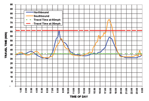 Figure 6 - graph - This figure shows the peaking characteristics of travel along the San Mateo/Santa Clara US-101 corridor through a graph containing travel times in minutes as a function of time of day. A blue line represents the northbound direction and orange southbound. A green dashed line shows were the travel time would be at 60 mph and red line at 35 mph. According to this chart, the AM peak period can be described as beginning at 7:00 AM and ending at 11:00 AM. The PM peak period effectively ends at around 7:30 PM. However, the southbound PM period start time starts around 2:30 PM while the northbound PM peak starts at least two hours later. The peak PM travel time also shows dramatic differences from the peak AM travel times. The northbound and southbound directions both average around 35 minutes, but peak the morning is 60 minutes northbound and 50 minutes southbound. The afternoon peak is approximately 55 minutes northbound and 75 minutes southbound.
Figure 7. Mobility–Speed Contour Plot
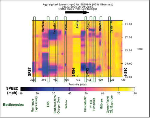 Figure 7 - chart - This figure presents a typical speed contour plot generated by PeMS for the San Mateo/Santa Clara US-101 freeway corridor in the northbound direction (traffic moving left to right on the plot) on a typical weekday in the month of August 2006. Along the vertical axis is the time period from 6:00 AM to 9:00 PM. Along the horizontal axis is the corridor segment from State Route 87 to Interstate 280. The various colors represent the average speeds ranging from less than 10 miles per hour colored in dark blue/black to blue at 30 miles per hour, pink at 50 miles per hour, and yellow at 70 miles per hour. The ends of each of the dark blotches represent controlling bottleneck areas, where speeds pickup after congestion, typically from 30 to 50 miles per hour in a very short stretch. The horizontal length of each blot is the congested segment or queue length. The vertical length is the congested time period. In this plot, 82% of the detector data was observed (actual data from good detectors), and 18% were imputed (calculated due to defective detection data).
Speed across the study corridor can also be assessed using probe vehicle runs, or tachometer (tach) runs. Similar to speed contour plots, controlling bottlenecks can be found at the end of a congested speed location where speeds pick up from about 30 to 50 miles per hour in a very short distance. Figure 8 illustrates typical runs for the San Mateo/Santa Clara U.S. 101 freeway corridor in the northbound direction in the AM peak conducted in 2006. As shown, the same bottlenecks appeared on each run: at Embarcadero, University, 3rd Avenue, and Peninsula. These bottleneck locations were also verified by field observations. It should be noted that there may also be other minor bottlenecks, often hidden behind major ones, as evident from these probe vehicle runs, at locations such as Middlefield and Kehoe.
Figure 8. Mobility–Probe Vehicle Runs
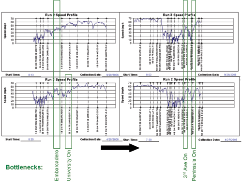 Figure 8 - chart - This graphic illustrates typical probe runs in the AM peak conducted on the U.S. 101 freeway in 2006. The graphs show actual speeds along the corridor for two tach runs. In the left-most two probe vehicle runs, bottlenecks occur at Embarcadero and the University on ramp. The right-most two runs show bottlenecks occur around the 3rd Ave on ramp and the Peninsula on ramp.
Delay is defined as the total observed travel time less the travel time under noncongested conditions, and is typically reported as vehicle-hours of delay. Both Figures 9 and 10 present delay for the San Mateo/Santa Clara U.S. 101 corridor using data from PeMS. Figure 9 presents a summary of the northbound average weekday hourly delay for the three years analyzed, 2004 to 2006. This exhibit is useful in that it shows the peaking characteristics of congestion and how the peak period is changing over time. It shows that the peak periods are shifting toward the midday period and that average delay is increasing. Figure 10 shows the three-year trend in overall weekday delay, excluding weekends and holidays, for the northbound direction. Gray is for the morning peak, light yellow is midday, orange is afternoon peak, and blue is night. Delay is in terms of vehicle hours at 60 mph.
Figure 9. Mobility–Average Weekday Hourly Delay
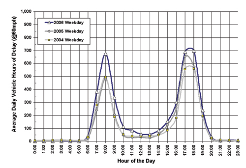 Figure 9 - graph - This figure is for the San Mateo/Santa Clara US-101 corridor using data from PeMS. It presents a summary of the northbound average weekday hourly delay for the three years analyzed, 2004 to 2006. 2004 data are shown in light gray, 2005 in dark gray, and 2006 in blue. This exhibit is useful in that it shows the peaking characteristics of congestion and how the peak period is changing over time. This graphic shows that the peak periods are shifting toward the midday period and that average delay is increasing. In each year, delay was near zero until 6:00 and after 20:00. The morning peak period was relatively unchanged from 2004-2005 at 500 hours, but rose to approximately 700 hours in 2006. The afternoon peak period changed slightly from 2004-2005, from approximately 580 to 650 hours, and higher still in 2006, to about 720 hours. Delay between the peak periods also increased over time, and were between 50 and 100 hours.
Figure 10. Mobility–Average Daily Delay
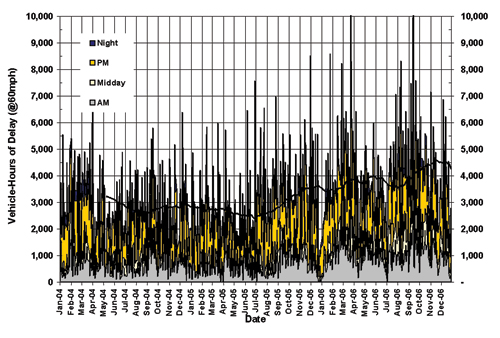 Figure 10 - graph - This figure is for the San Mateo/Santa Clara US-101 corridor using data from PeMS. It shows the three-year trend from January 2004 to December 2006 in overall weekday delay, excluding weekends and holidays, for the northbound direction. Gray is for the morning peak, pink is midday, orange is afternoon peak, and blue is night. Delay is in terms of vehicle hours at 60 mph. Overall, afternoon delays are consistently the highest.
As an important part of the FPI studies, freeway bottlenecks that create mobility constraints were identified and the causes were analyzed. Figure 11 presents an example showing bottlenecks identified on the Alameda/Santa Clara I‑680 corridor during the PM peak period using a variety of data sources such as PeMS, HICOMP, tach runs, and field observations.
Figure 11. Bottleneck Locations
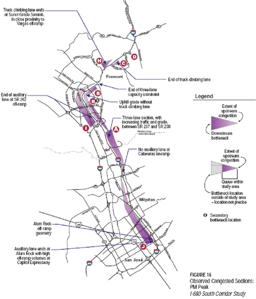 Figure 11 - map - This graphic presents bottlenecks identified on the I-680 south corridor between Freemont to San Jose during the PM peak period. In this case, limited archived data were available in PeMS and the study required the use of other data sources and field observations. Observed afternoon congestion is indicated with triangles shaded purple that extend along the freeway. The length of the triangle indicates the affected area, and the wide of the triangle indicates the magnitude of congestion.
Reliability captures the relative predictability of travel time. Unlike mobility, which measures how many people are moving at what rate, the reliability measure focuses on how much mobility varies from day to day.
The buffer index is often used to estimate reliability. The buffer index is defined as the extra time (or time cushion) that travelers must add to their average travel time when planning trips to ensure on-time arrival. On-time arrival assumes the 95th percentile of travel time distribution. The buffer index is fairly easy to communicate to the general public. It is presented as a percentage, which makes it comparable among the different corridors and modes. Figure 12 shows the buffer index for years 2004 through 2006 for the northbound direction of San Mateo/Santa Clara U.S. 101 corridor. It shows the additional time needed (in percentage) during each hour to ensure that a person is on time at least 95 percent of the time. As can be expected, the peak periods require the most additional time. This graphic was generated using data from PeMS and the 511 “Predict-a-Trip” tool. Knowing that the buffer index is a percentage of additional time needed to ensure that a person is on time for 95 percent of trips made, the percentages in Figure 12 can be converted into additional travel time needed.
Figure 12. Reliability–Buffer Index
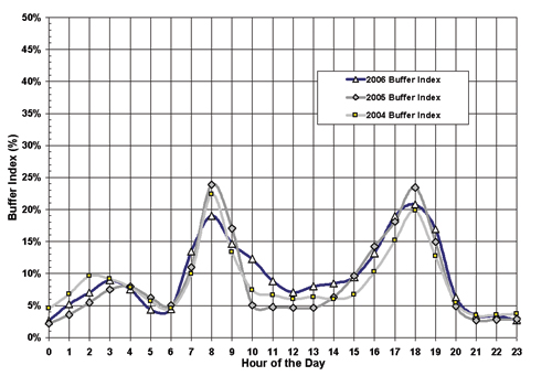 Figure 12 - graph - This graph shows the buffer index as a function of the hour of the day for years 2004 through 2006 for the northbound direction of San Mateo/Santa Clara U.S. 101 corridor. It shows the additional time needed in percentage during each hour to ensure that a person is on time at least 95 percent of the time. As can be expected, the peak periods require the most additional time. The index peaked slightly in the early morning between 2:00 and 4:00 AM and sharply in the regular morning and afternoon peak periods from 8:00 AM and 6:00 PM. 2004 data are shown in light gray, 2005 in dark gray, and 2006 in blue. During the morning peak, the buffer index peaked at approximately 24 percent in 2005. The afternoon peak was at 23% in 2005.
For the safety performance measure, the number of accidents and accident rates were generated from the Caltrans Traffic Accident Surveillance and Analysis System (TASAS). Figure 13 illustrates how one corridor presented the safety performance measure, the San Mateo/Santa Clara U.S. 101 corridor. It shows northbound accidents by month for three years for the entire 36-mile corridor. The monthly accidents are broken down by weekday and weekend accidents. On average, more than 75 percent of all monthly accidents reported by California Highway Patrol (CHP) occur on weekdays and there are about 100 accidents on average per month. Figure 14 presents another safety measure, accidents by type over three years for the Solano I‑80 corridor westbound, broken down by segment. Rear-end collisions are the predominant type, followed by hit object and sideswipe.
Figure 13. Safety–Accidents by Month
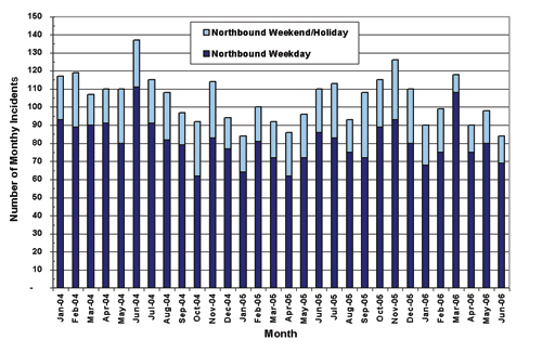 Figure 13 - graph - This chart shows a stacked bar chart for the San Mateo/Santa Clara US-101 corridor presenting northbound accidents by month for 3 years for the entire 36 mile corridor. The monthly accidents are broken down by weekday and weekend accidents. On average, more than 75 percent of all monthly CHP accidents occur on weekdays and there are over 200 accidents on average per month. Monthly weekday accidents range from 60-110, and monthly weekend accidents range from 10-40.
Figure 14. Safety–Accident Rates
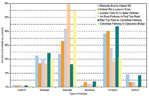 Figure 14 - graph - This figure represents percent westbound accidents by type over 3 years for the Solono I-80 corridor, broken down by segment and accident types including: head-on, sideswipe, rear end, broadside, hit object, and overturn. Rear-end collisions are the predominant type, followed by hit object.
Productivity is a system efficiency measure and, for corridor analysis, it is generally defined as the percentage of utilization of a facility or mode under peak conditions. For highways, productivity is particularly important because where capacity is needed the most, the lowest “production” from the transportation system often occurs. In many locations on San Mateo/Santa Clara U.S. 101 during site visits, vehicles weaving and merging in and out of traffic caused slowing at major interchanges, which lead to significant reductions in capacity utilization. This loss in productivity is illustrated in Figure 15. As traffic flow increases to the capacity limits of a roadway, speeds decline rapidly and throughput drops dramatically. The productivity calculation requires good detection data and coverage, as was available for the corridor from PeMS.
This lost productivity can be converted into equivalent lost lane-miles as shown in Figure 16. These lost lane-miles represent a theoretical level of capacity that would have to be added to achieve maximum productivity. This figure summarizes the productivity losses on the San Mateo/Santa Clara U.S. 101 northbound for the three years analyzed. Strategies to combat such productivity losses are primarily related to operations and include building new or extending auxiliary lanes, implementing ramp metering or a more aggressive ramp metering strategy, and improving incident clearance times.
Figure 15. Productivity–Lost Productivity
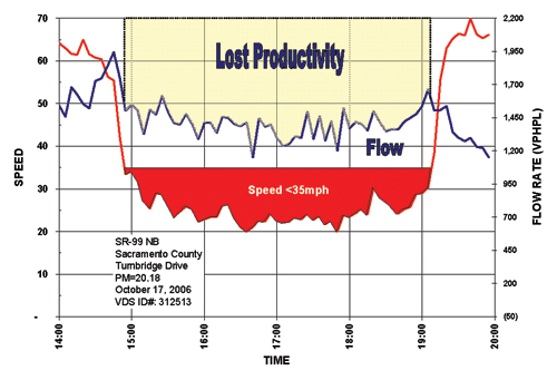 Figure 15 - graph - The chart shows speed and flow rates as a function of time for northbound State Route 99 in Sacramento County at Turnbridge Drive on October 17, 2006. The graph illustrates loss in productivity. As traffic flows increase to the capacity limits of a roadway, speeds decline rapidly and throughput drops dramatically. The area of the graph where speeds are below 35 miles per hour is colored red. The area between the top of the graph and the flow rate is highlighted in a tan color representing the lost productivity of the facility.
Figure 16. Productivity–Average Lost Lane Miles
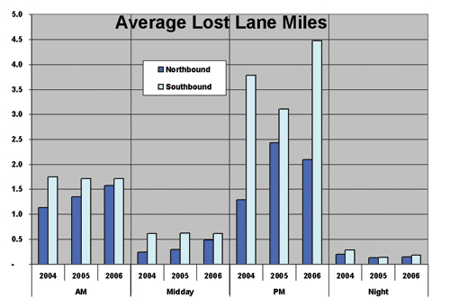 Figure 16 - graph - The exhibit summarizes the productivity losses on the U.S. 101 northbound freeway for the three years analyzed between 2004 and 2006. The chart shows the average lost lane miles in the northbound and southbound directions by time of day including morning, midday, afternoon, and night periods. Northbound is shown in darker blue and southbound is illustrated in light blue. In all four periods, the southbound directions lose more average lane miles. These lost lane-miles represent a theoretical level of capacity that would have to be added in order to achieve maximum productivity.
Overall, the existing freeway conditions analysis for the MTC FPI project corridors were successfully completed under the constraints of limited time and budget through the use of archived data to the extent possible.
There were several findings from the use of archived data for the FPI analyses, summarized as follows:
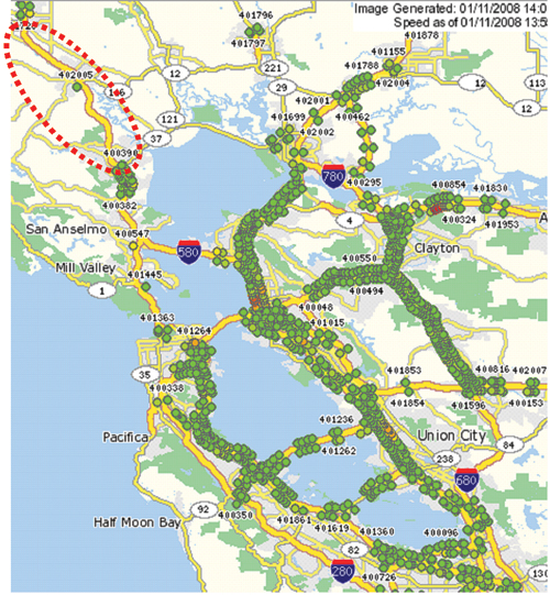 Figure 17 - map - The figure presents a map from PeMS showing the speed detector coverage in the San Francisco regional transportation network, and highlights a portion of US-101 north of I-580 that has sparse detector coverage. Detection is presented as colored circles along the roadways.
MTC is committed to advancing the use of archived data for a variety of activities, including operations planning. This includes the following:
This case study met the goal of summarizing a successful effort of applying archived data for operations planning. The participating agency in this case study, MTC, launched an FPI program and, due to time and budget constraints, the existing conditions analysis relied heavily on archived data. A variety of archived data were used, including PeMS, the MTC 511 system, HICOMP, TASAS, historical probe vehicle runs, and traffic counts. The archived data sets were used to analyze multiple performance measures, which included travel time, speed, delay, travel time reliability, safety, and productivity. Those performance measures played a significant role in understanding the existing conditions on the FPI corridors. As an important part of the study, freeway bottlenecks that create mobility constraints were identified and the causes were analyzed.
Using archived data to conduct operations planning has its advantages, including cost effectiveness, time savings, capture of seasonal and daily variations, analysis of traffic trends, and ability to identify both recurrent and nonrecurrent congestion. This case study, however, also revealed several issues and challenges (e.g., ability to fully mine the archived data, low detector health rate, existence of detection gaps, weakness in capturing nonrecurrent congestion, especially in areas without adequate detector coverage, and conflicts between different data sets). MTC is planning to advance its efforts of applying archived data to operations planning by improving detector coverage, detector health, and PeMS usability. MTC will continue using archived data for planning studies, including bottleneck identification, queue length, queue duration, travel times, speeds, volumes, and accident analysis.