Work Zone Management Program:
| |||||||||||||||||||||||||||||||||||||||||||||||||||||||||||||||||||||||||||||||||||||||||||||||||||||||||||||||||||||||||||||||||||||||||||||||||||||||||||||||||||||||||||||||||||||||||||||||||||||||||||||||||||||||||||||||||||||||||||||||||||||||||||||||||||||||||||||||||||||||||||||||||||||||||||||||||||||||||||||||||||||||||||||||||||||||||||||||||||||||||||||||||||||||||||||||||||||||||||||||||||||||||||||||||||||||||||||||||||||||||||||||||||||||||||||||||||||||||||||||||||||||||||||||||||||||||||||||||||||||||||||||||||||||||||||||||||||||||||||||||||||||||||||||||||||||||||||||||||||||||||||||||||||||||||||||||||||||||||||||||
| Exposure | |
|---|---|
| Amount of time, work activity periods, roadway space, and/or vehicle travel that a work zone affects or requires. | |
| Mobility | Safety |
|
|
slide notes:
This slide simply provides some typical examples of good performance measures. Here, we have also included work zone exposure, as it is sometimes used along with other performance data to normalize to a rate of some type. Exposure basically quantifies who or what was impacted.
Some examples for exposure by use would be vehicles passing through work zone by lane closure or length of the lane closure or hours of work per day or night.
Other measures mentioned here under mobility and safety areas are self-explanatory.
slide 10
Extract data from existing sources, collect it (manually, electronically) or interpolate from existing or collected data.
slide notes:
This is the last slide I'll be presenting. Once the work zone performance measures have been selected, agencies need to identify data sources and methodologies to collect and compute these measures. Required data can be extracted from existing sources, collected normally or electronically specifically for work zones, or interpolated from existing or collected data. Some of the examples of these sources are listed here.
With this, I will hand it over to Bill McNary of Wisconsin DOT to share findings from a recent national survey on work zone performance measurement.
slide 11
Bill McNary – Wisconsin Department of Transportation
slide notes:
Thank you, Jawad. About a year ago, the AASHTO Committee on Traffic Engineering formed a work zone task force. We have about 12 members. The primary purpose of the task force was to identify the existing work zone performance measures that the DOTs are using, or to gather information about work zone performance measures that they would like to be able to use or to implement.
So we held a teleconference about a year ago and then we had a in-person teleconference joint meeting during the AASHTO summer meeting in June. And we're going to be doing that same thing in a couple of weeks coming up in Columbus, where we'll have those that are at the meeting obviously will be in person, but there will also be an opportunity for people to join via teleconference for that meeting.
slide 12
slide notes:
So the primary purpose of the task force, as I mentioned, was to gather information about performance measures that the states are using. One of the first things that we had to do before we could delve into that was to update our contact list so that we had a point of contact in each state to send the survey out to. So we used the CTE distribution list and got a state representative for the surveys.
And we're also looking to collaborate with the ongoing FHWA efforts for work zone data collection and the local data harmonization initiatives. So we fully expect that the results of this survey will dovetail in with those two efforts, and the survey touches on a lot of the elements that Jawad already talked about during his presentation.
Ultimately we want to be able to strengthen the tool box for work zone performance measures and provide information back to the DOT so that they can enhance either their project or program level work zone performance measures.
slide 13
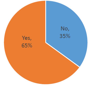
20 States have responded so far
slide notes:
So far, we've had 20 states that have responded to this survey, and I want to stress that the survey is still open. You'll have a link in this presentation.
So if your state has not responded yet, there is still time to do that. If you're not familiar with the survey, you could contact me and I can tell you who the state contact is for you for the survey.
slide 14
slide notes:
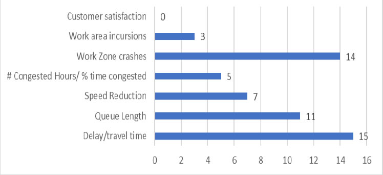
So when the work zone task force brainstormed on what they wanted to include in the survey, we took those individual questions and grouped them into some categories that you can see here. Some of the information that we're collecting, for example, for the types of measure, obviously a lot of it is focused around the safety and mobility.
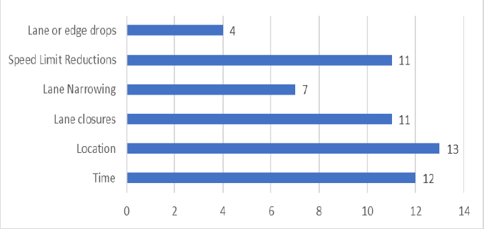
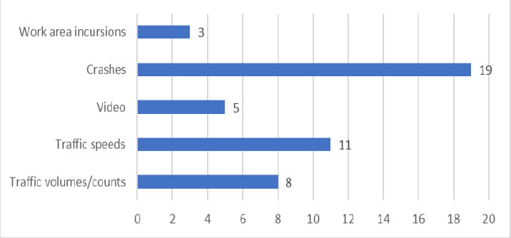
So we asked questions like, does your performance measure collect-- delay your travel time information to speed reductions, work zone crashes, or incursions, that type of thing. We're looking for information about the locations of your work zones. Do you have closures? Do you collect information about narrow lanes or drop-offs? We also talked about what type of tools are used to collect the work zone performance measure information.
So one of the questions was, do you purchase your data, and if so, whom do you purchase it from? Do you have state staff or consultant staff that collect the data? Is it electronic? Are you doing field observations?
slide 15
slide notes:
One of the interesting questions that we have on this is a constant topic for us here in Wisconsin is, how much work zone delay is allowed? How do you determine that? Is it done on a project by project basis? You look at corridors. So most of the responses back so far have averaged around 15 minutes of acceptable delay about normal congestion, but some states also use two lanes when determining what an acceptable delay is.
We also asked about liquidated damages, whether they're calculated by the day, the hour, the minute, and how you know if an LD contract requirement is being violated or if the contractor is in compliance. Another big piece of the survey revolves around crash data, so we asked about both the crash reports that your state has available, but also how you use that information from a performance measure context.
One of the questions in the survey was asking people if they verified the location of the crash information. So if your crash report form doesn't have enough detail, how do you know that the crash actually happened in a work zone? And further, are there specific information from your crash report form that will tell you exactly where in the work zone it happened?
slide 16
slide notes:
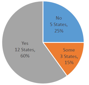
We also had questions about speed limit reductions and how those pertained to work zones, and asked about how DOTs establish their speed limit reductions in their work zones. And I have a couple of slides coming up that show you the results so far based on the 20 responses that we have got.
Typically, speed reductions are based on engineering judgments, primarily related to geometric and pavement conditions, but some are statutorily set and, of course, outside influences impact those speed zone limits as well. So taking a look at the results, this gives you an idea of the types of work zone performance measures that the DOTs are interested in.
Again, you can see kind of a focus on safety and mobility.
slide 17
slide notes:
But like I said, the survey is still open and we're looking for not only just responses to the survey questions, but also if you have examples of performance measures that your state currently does, if you want to send information about how you collect the data or dashboard snapshots, those types of things, would all be very helpful for us.
slide 18
slide notes:
This slide shows some of the results again of work zone data collection, specific more to locations. So asking, for example, do you track lane closures? Do you have an electronic system to track lane closures? We have an issue, for example in Wisconsin, where we're not sure that all of our lane closures are captured in our system.
If it's a last minute maintenance thing, for example, there maybe don't have the time, or they don't think to put the lane closure in our system, and so if it doesn't get accounted for obviously.
slide 19
slide notes:
Focusing on the safety-- again, most of the respondents do some type of crash data collection relative to their work zones. We are very interested in work zone incursions or near misses. We hear little bits and pieces from the contractors or our counties that do our maintenance work about in Wisconsin, but we feel like it's valuable information and it's a piece of data that, at least for us, is kind of difficult to collect. So if people have a good way of collecting work zone incursion data, we're interested in hearing about that.
slide 20
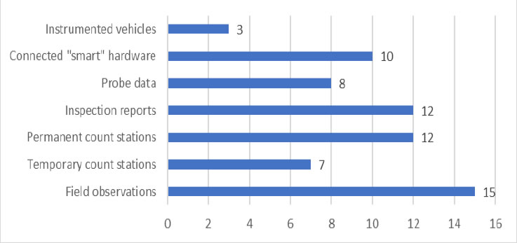
slide notes:
And then we talked about the different data collection tools-- again, this is something that Jawad talked about-- field observations, being the primary one. Smart or connected hardware is becoming more popular, more useful. We use temporary radar units to collect some of our data for both volume and speed.
slide 21
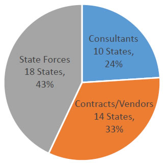
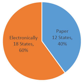
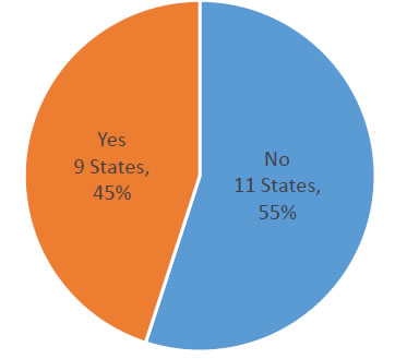
Who Collects Data
How Data is Collected
Is Data Purchased?
Charge Liquidated Damages?
Verify Crash Happened in WZ?
slide notes:
This slide has got a number of pie charts obviously that talks about who is collecting the data, how it's collected, again, whether it's purchased or not.
slide 22
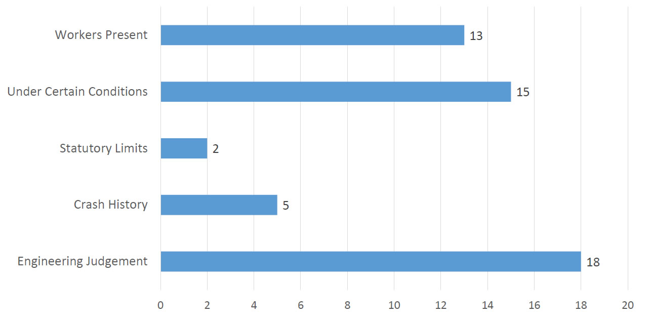
slide notes:
And this slide, the question was, how do you establish your work zone speed limits. Again, as I mentioned, you can see that engineering judgment is used by most of the responding agencies so far.
The conditions vary, which I think kind of goes without saying. No two work zones are exactly the same, so taking an individual look at the work zone situation obviously is going to be important in establishing the appropriate speed limit.
slide 23
slide notes:
And as I said, we're looking for example reports. This is one that was submitted from Missouri. So if you have any type of format that you could send via an attachment or a screenshot, those would all be very welcome.
Again, the survey remains open, so if you haven't submitted a response for your state, please take the time to do that. You can contact me or your work zone contact, if you know that person, for your state, or your CPE member and they can help you find the survey. And again, as a reminder, we'll have our next task force meeting in June, and we'll have a phone line available if people want to join us that way.
slide 24
Bill McNary
Wisconsin Department of Transportation
William.McNary@dot.wi.gov
slide notes:
I'm going to turn it over to Bill Feehan from Ohio.
slide 25
Bill Feehan –Ohio Department of Transportation
slide notes:
So we'll jump back a slide here. So work zone vitals. We used to call these our work zone metrics. And then last year, we were kind of thinking about it and we don't exactly have specific goals, a specific number that we're trying to hit as far as work zone crashes or work zone delay.
And it's really just looking at this select group of long-term work zones that our office mainly focuses on, and kind of looking at the numbers, comparing them to previous numbers, seeing how they change across the construction season to just get an overall general health of the work zones. And so we felt that vitals was maybe a little better term for them.
slide 26
slide notes:
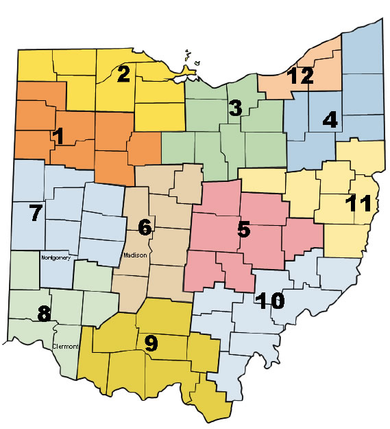
So a little bit about ODOT. So ODOT is broken up into 12 districts. Each of those districts has a work zone engineer and they would be in charge of more of the project by project or ground level monitoring of work zones everywhere from design, planning design, to implementation out in the field. And so when we develop these metrics at central office, we send them out to the districts and they look at them and report back if they're seeing issues in their various districts.
slide 27
slide notes:
So in Ohio, we have a work zone policy and standard procedure. Basically what it says is that our goal is to eliminate, minimize, or mitigate the impacts of the work zones to the greatest extent practical. And what is that? That basically is a queuing policy. I will go into more detail later about exactly what the queuing thresholds are, but this queuing policy is kind of what helps guide our work zone decisions.
slide 28
slide notes:
So work zone data-- ODOT has a contract with INRIX that provides historical speed data. This contract allows us to have access to some of the RITIS platform, not all of the RITIS platform. We also have access to INRIX analytics, which allows us to access what INRIX calls their XD data, which is very helpful.
The RITIS data that we have access to is broken up into TMC segmentation. So basically the speeds are stored in these different size bins and it's usually interchange to interchange. But when we're looking at something like queuing, we found that if the queue stretched into just a little bit of that TMC, then it would have a queue for the entire TMC, so if you had a section that was maybe 10 miles between interchanges in a rural area, it would tell you that was a 10 mile queue, which is not ideal when you're looking to see how things are performing.
So that INRIX analytics and the XD data gives you about a half mile segmentation. So if you're looking at queuing in particular, it's really helpful to have that data. And then we also, as part of our creating the vitals, we have various volume count data from across the state, and a note because we are purchasing that INRIX data, we do not use or utilize the NPMRDS data set.
And I'm not an exact expert on our INRIX contract. That is handled through a different office, and our work zone program kind of just benefits from the fact that we have that data available.
slide 29
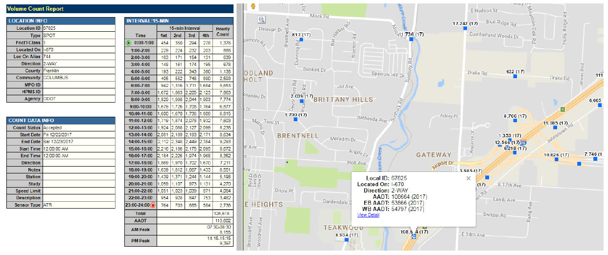
slide notes:
So volume data-- we have a graphical interface that you can look at to find volume data across the state, on the state system, as well as on local roads. It's a mix. It's basically all the different data that they can collect, so if you're looking at a project area, you may get lucky and have a continuous count station, like an ATR or maybe a way in motion that--
You know, here's an example of when you would have that automated counting system. And so you could look at, if you wanted to know what the traffic would be on a Saturday in May, or what it was on an exact day. So that's very helpful if you have that, but in most areas you'll probably be relying on one time data traffic count that was taken. So this data is helpful in developing some of our work zone crash metric or vitals.
slide 30
slide notes:
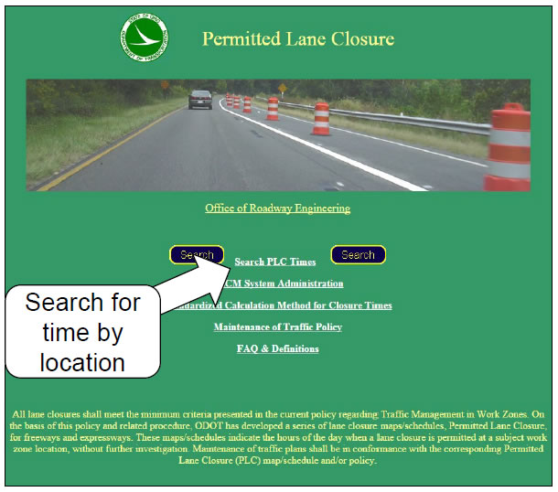
So before the work zone gets out there, we have a whole system of pre-closure analysis and using this system determines if it will be violating that queuing policy that I mentioned earlier. So we have a online-based permitted lane closure schedule. This here is just an example of the first page there. And then you would enter into the search and you can search time and location.
slide 31
slide notes:
So on the permitted lane closures, at its heart, it's a planning tool and it helps identify which hours of the day lane closures should not result in violations to our queuing policy. It is updated annually by central office and district personnel. So basically you have the area that you want to close a lane and you look it up on this schedule and it tells you whether or not it is allowed, and if it is allowed, then you're good to go.
If it's not allowed, then you follow the exception request steps that I'll go through in subsequent slides. And then this would be used for all construction and maintenance work, except for emergency situations. And this mainly covers interstate and interstate look alike locations. We are in the process of revamping this tool and turning into a map-based system. And we're in the process of working on that now.
slide 32
slide notes:
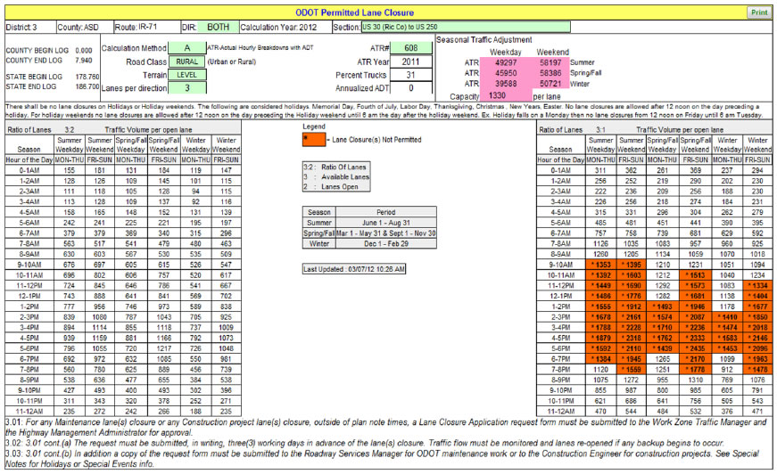
So here's an example, if you were on that first page and you went in and searched your location, this is an example of what comes up. There's notes at the bottom which allows the district to put certain restrictions on. If you're in like Cleveland or Cincinnati and you have sporting events, you can put in there not to have lane closures on certain roads within a certain time of begin or start or end times of those sporting events.
But it takes into account the road classification, the different terrain, and it pulls count data from those continuous count stations. So you can see-- well, it might be tough to see-- but there's a calculation method in the top left that, in this instance, is an A calculation method, which means that there is an ATR, or continuous count station, within that segment. There are different count stations or different calculation methods that take into account how close the count station is to the exact section that you are analyzing, since we don't have a count station in every road section.
So in this instance, it's telling you that you can drop from three to two lanes-- these are lanes in one direction-- anytime, summer, spring, fall, weekend or weekday. And then on the right side in the orange would be when you cannot drop from a three lanes to one lane in one direction. This is not super common that we would have a three lane section where you could drop it to two lanes all the time. In most instances, on most interstates, 24/7 lane closures will violate for at least some hours of the day.
slide 33
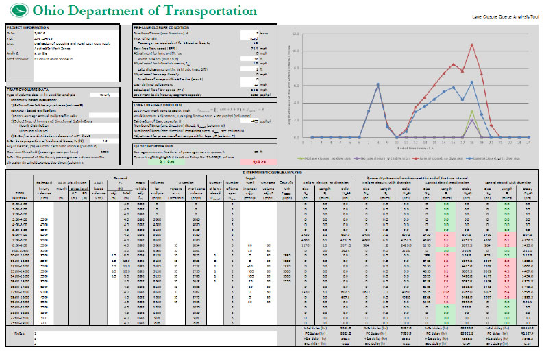
slide notes:
So say you wanted to close a lane in that orange section, then before you do your exception request, you have to run it through our lane closure to analysis tool. This is based on HCM methodology and a research report that was conducted in Ohio, and it basically that research provided a calibration factor to try to match up the work zone capacity from HCM with the volume and the behavior that we see in Ohio.
So this tool allows you to put an hourly volume or ADT volume, change your truck percentage, play with the diversion factor of how many cars-- based on stuff like public information-- how many cars you're hoping are not going to be driving through the project area, and then also work zone intensity, so if the work is more off of the road, that would be a lower intensity, and then if you had pavement or concrete work being done right next to the travel lane, that's going to slow people down and that's going to reduce your capacity.
So as you can see on the right side, the green columns means that it is below 0.75 miles, and then red means that it is violating the queuing policy over 0.75 miles. So if you put in all your data and everything is green, then you don't have to submit an exception request. If you have red and you still want to move forward with that lane closure, then you will be doing an exception request.
slide 34
| Predicted Queue Length | Allowance |
|---|---|
| ≤ 0.75 miles | Unlimited duration allowed |
| > 0.75 miles | Not allowed for any duration - Must do an Exception Request |
slide notes:
So like I mentioned earlier, 0.75 miles is the kind of that threshold that we set. If it's less and limited duration is allowed, and if it's greater than 0.75 miles, you must do an exception request. So there are two committees that would handle that.
Violations that are smaller in either impact or duration go to a smaller committee within the Division of Engineering, and then impacts that are larger go to a larger committee that is more multi-disciplinary committee that has members from all over the department to help decide the best way to handle impacts, and that committee also has power to get funding if the district does not have the funds available to do certain maintenance of traffic schemes that may help reduce the queuing. And so that is for larger impacts.
slide 35
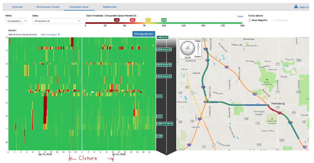
slide notes:
So after-- if you have your exception granted and then you do your exception-- then at central office, we use the INRIX analytics to look at how well traffic performed during the exception request. So for instance, this is an overnight closure. They're closing kind of the hypotenuse of that right triangle there and they are detouring people off at that interchange where the red is.
And so what we're looking for is how well did it perform? Was the queuing similar to what we expected based on our queue analysis tool, or was it way off? So this helps-- it's kind of an after action review to determine why maybe was it queuing less, or was it queuing more? Was there some event going on that we didn't take into account? Was there more public information, so less people took that route?
So it's kind of a valuable tool to help determine how good our planning tools are and how well the public information is distributed for these exception requests. Most likely these exception requests are going to be happening on the weekends, in most instances, to help reduce the impact.
slide 36
| Emphasis Area | 2015 | |||
|---|---|---|---|---|
| Fatalities | Grand total: | 1,110 | Work Zone Total: | 30 |
| Alcohol Related Involvement | 346 | 31.17% | 6 | 20.00% |
| Bicycle Involvement | 26 | 2.34% | 1 | 3.33% |
| Drug Related | 153 | 13.78% | 3 | 10.00% |
| Fixed Object | 396 | 35.68% | 7 | 23.33% |
| Head-on/SS Meeting | 176 | 15.86% | 3 | 10.00% |
| Roadway Departure | 563 | 50.72% | 11 | 36.67% |
| Intersection | 242 | 21.80% | 4 | 13.33% |
| Motorcycle Involved | 163 | 14.68% | 5 | 16.67% |
| Older Driver Involvement (65 or Older) | 260 | 23.42% | 12 | 40.00% |
| Pedestrian Involvement | 120 | 10.81% | 3 | 10.00% |
| Rear-end crashes | 73 | 6.58% | 7 | 23.33% |
| Speed Related Involvement | 336 | 30.27% | 6 | 20.00% |
| Young Driver Involvement (15-25) | 364 | 32.79% | 4 | 13.33% |
| Commercial Motor Vehicle Involvement | 185 | 16.67% | 14 | 46.67% |
| Restraints Not Used Driver/Occupants | 404 | 36.40% | 7 | 23.33% |
slide notes:
So before I get into the office, what my office actually looks at in engineering, some of the numbers that safety keeps track of as far as work zones is they take the traffic reports or the accident reports and keep track of all of the different causes for work zone crashes over the years and create spreadsheets and graphs that we can distribute that is based on crashes all over the state, versus the about 25 to 30 larger projects that the work zone vitals are specifically monitoring.
slide 37
slide notes:
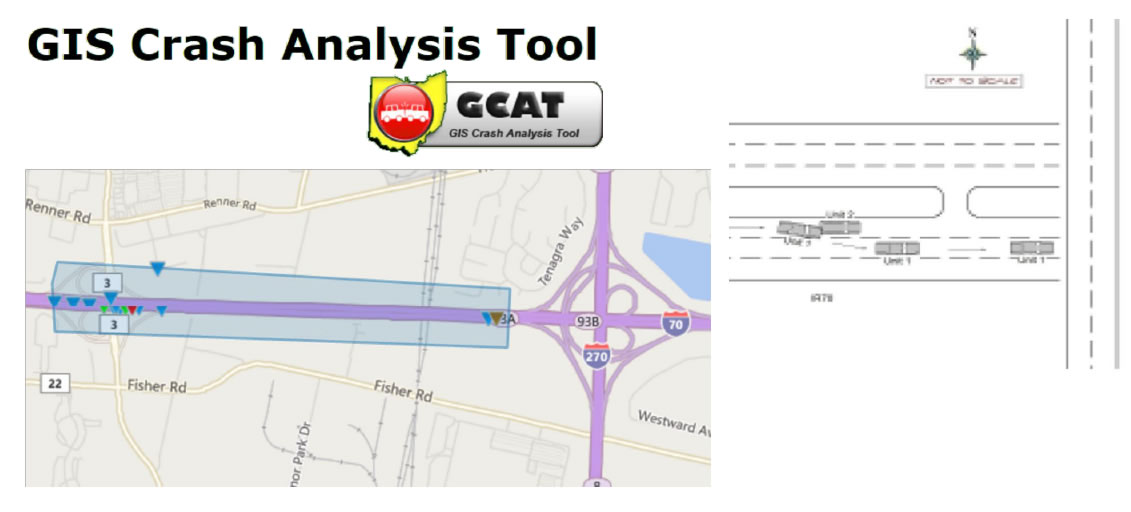
Another tool that we have in Ohio is the GIS Crash Analysis Tool. So if you do have a crash problem in a certain area, this tool allows you to put in criteria and filters, define crashes in that area, and then you can download the crashes and there are different ways to summarize the data, as well as direct access to the crash reports themselves to find the different reasons maybe for what the crashes are-- why they're happening. So it's a good investigative tool, if you have the time to sit down, or if you have a crash issue that is really problematic to look at.
slide 38
slide notes:
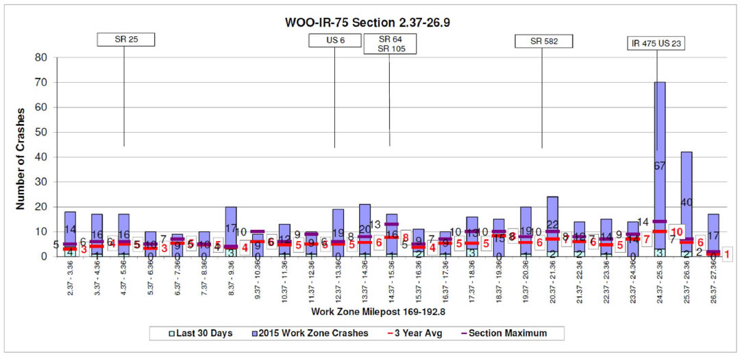
So now this is our first official work zone vital. This is monitoring the work zone crash database. It's monitoring about 30 projects a year. These would be long-term interstate, interstate lookalike projects that have sustained impact to traffic. Usually they have some maintenance or traffic scheme in place for the entire duration, and then also there may be nighttime lane closures or other things like that.
So this crash data is pulled electronically each month, and this report is created in the next-- it's a monthly report, so it'll be created in the month after the month that you're looking at. And it's cumulative. It works from April through November, which is what we kind of consider the construction season in Ohio, even though there's a lot of projects that we continue to run over the winter now.
And so you're looking at the crashes kind of as they vary. There's a couple different graphs that it creates. And so the first one that you're looking at here on this slide would be the crashes as you are driving through the work zone. This is not based on, or broken up, via direction. So this would just be crashes. So you'd have to do some investigation to determine if it's a southbound or northbound crash.
And then we also put on some interchange markers for people because you're usually not all that familiar with exactly where the straight line mileage is. So for instance, this graph, the reason I chose it is obviously you can see that there's a big spike in crashes in this one interchange, and what we determined there was that under the pre-construction setup, traffic-- this is a kind of a system interchange split from I-75.
So traffic going to 475 exited to the left and traffic staying on 75 exited to the right. What this maintenance or traffic scheme did in the phase that caused the spike of crashes was it switched those, where 475 was exiting to the right, and despite a lot of signage, people's GPSs tell them a lot of times what lanes to be in as they approach an interchange, and so therefore people's GPSs had not been updated or would not have been updated to the current maintenance or traffic scheme, and therefore were telling people to be in the wrong lanes and was causing a lot of lane switches right at the decision point.
And therefore, the spike in crashes. So that told us that in that instance, switching which way something exited is probably not the best way to maintain traffic. So that was a valuable lesson that we learned through this graph.
slide 39
slide notes:
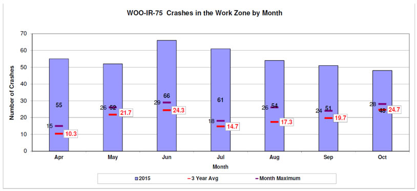
The next one that this database report generates is the crashes by the month. So as on the previous drawing-- I didn't point it out-- you have the crashes. There are bars in blue for the current year, and then you have the three year average, and then the monthly maximum. So that would be the highest number of crashes in one of those years in a month that was recorded.
So this work zone was a long project, about I think at least 30 miles of continuous work zone with barrier on both sides. It was a heavy widening project. And so the crashes were way up across the board. So this gives you an idea of how it looked previous to the work zone and then also how it's behaving as it goes across the year, and if you see a spike in a certain month, then you can investigate what might have caused that spike-- whether it was a different phase that will happened to be in, or different operation that they were doing during that month.
slide 40
| Expected vs Actual Work Zone Crashes April-September 2018 | |||||||||||||
|---|---|---|---|---|---|---|---|---|---|---|---|---|---|
| District | county | Route | Begin Log | End Log | PID | AADT | Lanes in one direction? | Pre-WZ Crashes | WZCMF | Expected Crashes | Actual Crashes | Difference between Actual and Expected | % Difference |
| 1 | HAN | 75 | 13.89 | 20.38 | 87005 | 48,214 | 3 | 60 | 1.48 | 89 | 72 | -17 | -19% |
| 2 | LUC | 75 | 0.6 | 3.25 | 93595 | 80,877 | 3 | 36 | 1.35 | 48 | 47 | -1 | -2% |
| 2 | LUC | 75 | 3.99 | 5.2 | 77254 | 99,327 | 2 | 63 | 1.26 | 79 | 111 | 32 | 41% |
| 3 | LOR | 90 | 11.56 | 14.51 | 83449 | 66,735 | 2 | 22 | 1.30 | 29 | 54 | 25 | 86% |
| 4 | SUM | 76 | 0 | 6.12 | 93501 | 71,694 | 2 | 74 | 1.29 | 96 | 91 | -5 | -5% |
| 4 | SUM | 76 | 9.4 | 11.6 | 77269 | 124,926 | 3 | 111 | 1.24 | 138 | 90 | -48 | -35% |
| 5 | MUS | 70 | 7.9 | 11.29 | 88965 | 38,040 | 2 | 19 | 1.36 | 26 | 21 | -5 | -19% |
| 5 | GUE | 77 | 17.2 | 23.44 | 93017 | 18,757 | 2 | 10 | 1.45 | 15 | 17 | 2 | 14% |
| 6 | FRA | 71 | 9.47 | 15.18 | 104799 | 108,730 | 3 | 140 | 1.28 | 179 | 154 | -25 | -14% |
| 6 | FRA | 270 | 8.65 | 17.59 | 76469 | 107,638 | 3 | 188 | 1.28 | 241 | 202 | -39 | -16% |
| 6 | FRA | 33 | 23.76 | 26.62 | 98111 | 73,430 | 2 | 34 | 1.29 | 43 | 38 | -5 | -13% |
| 8 | HAM | 71 | 1.47 | 8.42 | 82975 | Do not have a CMF for 8 Lane sections | |||||||
| 8 | HAM | 71 | 8.42 | 14.35 | 82975 | 147,284 | 3 | 181 | 1.21 | 218 | 144 | -74 | -34% |
| 8 | HAM | 75 | 12.1 | 15.8 | 82288 | 119,125 | 3 | 155 | 1.26 | 194 | 206 | 12 | 6% |
| 8 | HAM | 275 | 39.31 | 41.6 | 84492 | 77,685 | 3 | 33 | 1.36 | 45 | 47 | 2 | 4% |
| 8 | HAM | 71 | 3.1 | 6.3 | 93964 | 76,284 | 3 | 33 | 1.36 | 45 | 35 | -10 | -23% |
| 12 | CUY | 271 | 0 | 7 | 80418 | 125,660 | 3 | 118 | 1.24 | 147 | 213 | 66 | 45% |
| 12 | CUY | 90 | 25.66 | 27.74 | 87628 | Do not have a CMF for 8 lane sections | |||||||
| 12 | CUY | 480 | 21.91 | 25.2 | 89168 | Do not have a CMF for 8 lane sections | |||||||
| 12 | CUY | 77 | 13.3 | 15.24 | 82388, 13567 | 95,938 | 3 | 51 | 1.30 | 66 | 58 | -8 | -12% |
slide notes:
So that basically is the work zone crash database. So the next one is what I call the work zone CMF report. This is pretty new. We developed it last year. So basically this was created to answer the question of what is-- if you're looking at the crashes, unfortunately we assume that the crashes most likely will go up when a work zone is put into place. So what is a reasonable change in the number of crashes?
So what this does is it takes a work zone CMF-- I know usually they're considered more of a planning tool, and we're using it as an after review tool, but it is a CMF that is just based on work zone presence. It doesn't have any variables for what was out there or when workers were out there, and it's based solely on how many lanes you have in one direction and then the ADT of the section.
And so given that, it gives you the modification factors. We take the pre-work zone on crashes, multiply them by that modification factor, and get what we would call I guess the expected crashes. And then we compare that to the actual crashes. And then in green would be places where the actual crashes are less. Red would be more than a 10% increase and the yellow would be that 0% to 10% increase.
The one limitation that we have to this vital is that the research that created this CMF must have only been done on two and three lane, and they do not have one for four lanes in one direction. And so some of our larger urban sections, we can't use this CMF on. And so it kind of gives us a comparison point for what a healthy work zone might be from a crash standpoint.
slide 41
slide notes:
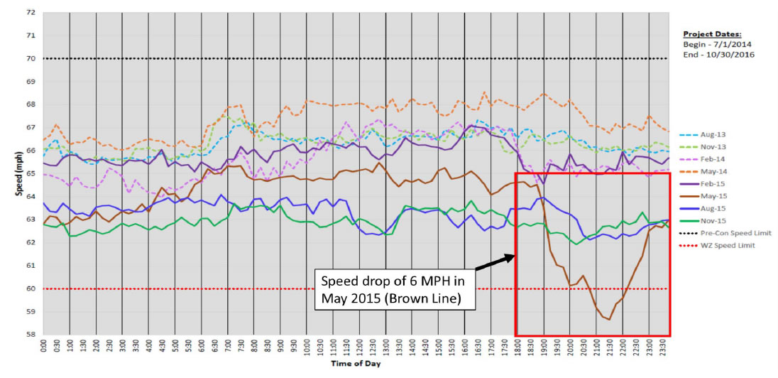
And now the next two vitals are based on INRIX data, INRIX speed data. So the first one is work zone speed comparisons. This was initially asked for and developed as a way to show that people don't really slow down that much when they drive through work zones, which we all kind of know. So you have the previous year speed and then the current year per month speed in the project area.
So usually what we have-- one of the things we've learned from these speed comparisons is that people change their-- in a rural where the speed was probably 70 before, in the work zone is dropping to about 60, so a 10 mile per hour drop. We see about a 3 to 5 mile per hour drop. And then urban areas where the speed limit is already 55 but people may be traveling more like 65 regularly, the drop is very small, if at all.
So that's what we see as far as overall speeds. And then the reason I picked this specific graph is because you can see that in May of 2015, there was a large drop after about 6:00 PM. And we were able to reach out to the project and determine that they had decided to let the contractor close lanes about two hours before the permitted lane closure schedule allowed, which caused queuing and then the delay in those hours in the project area.
Unfortunately, this vital is not as useful as it used to be because ODOT has changed over most projects now are what we call variable speeds in work zones, which the variability is based on worker presence. It's not based on traffic volumes or speeds that the vehicles are traveling in the work zone. It's just basically a drop when workers are present and then it goes back up after they leave.
So since we are not looking at and matching up, at this time, exactly when workers were present versus what the speeds were, it kind of muddies the water as far as looking at the speeds across the whole day.
slide 42
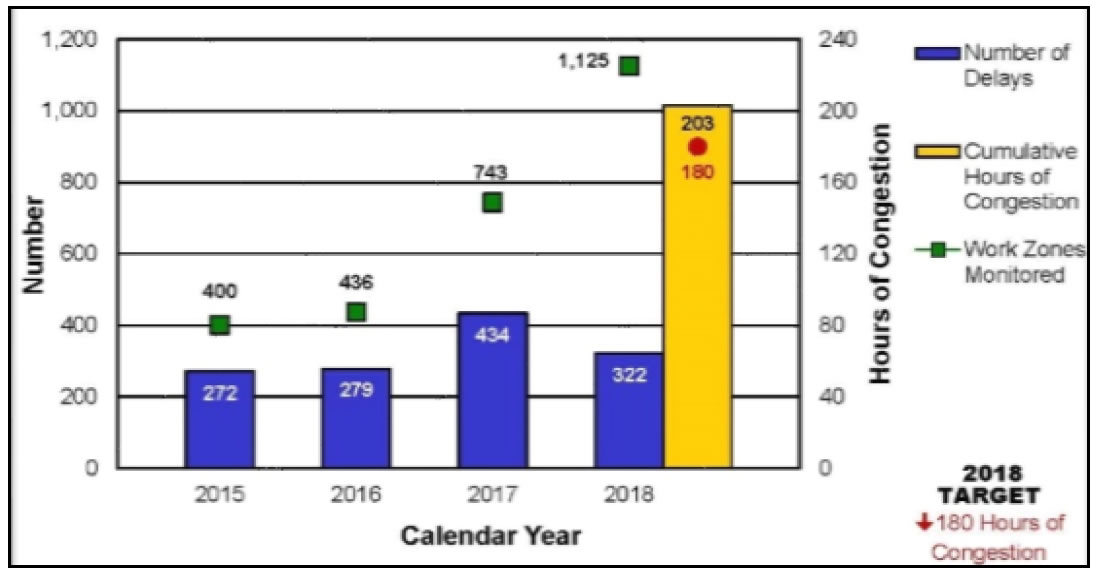
slide notes:
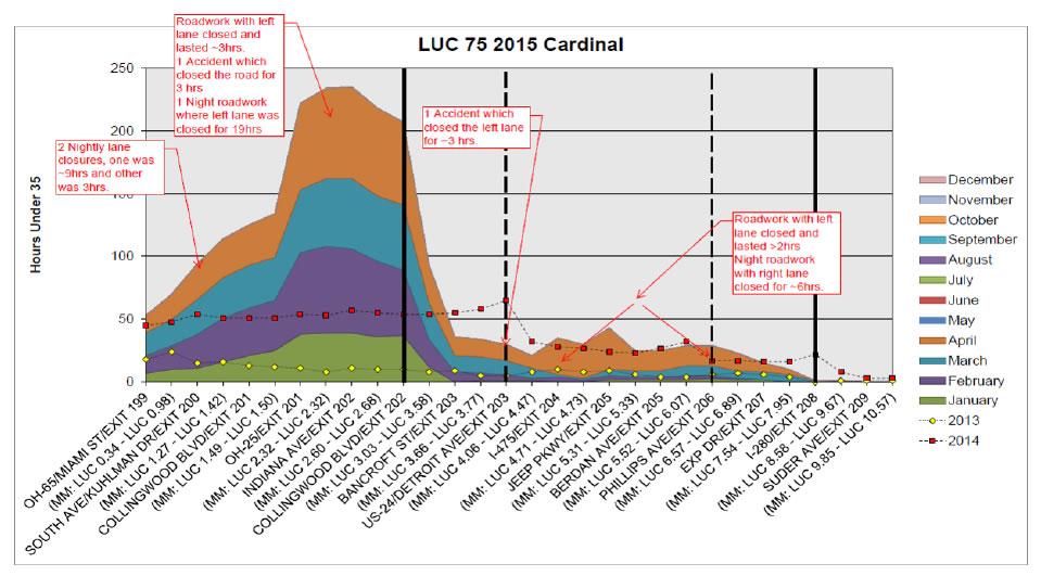
The last INRIX big speed data metric is work zone mobility. So this is a cumulative hours of delay, and we're defining delay as hours under 35. And so this will be cumulative hours of delay as you go through the year, and then it is mapped on the x-axis. You can see there it would be the different-- basically the SLM and the different interchanges as you drive through the project.
And these graphs are done one for cardinal and one for the non-cardinal direction. So this one has the two previous years on it as a point of comparison. The big thing we're looking for is spikes where there wasn't usually a spike before. A lot of times due to rush hour in urban areas, you'll have a spike. Certain places, certain pinch points or other interchanges. And then we look for spikes on kind of a monthly basis.
This one is fairly even as it goes up, but sometimes you see a big spike in delay for a month, and that's when we want to look into it. This example, someone went through and tried to determine what may have caused the jumps in delay, but unfortunately, we don't have the manpower to determine that in the vast majority of projects.
But something you can notice here-- the black lines would be the project limits, and so this project had a large amount of delay right before it got into the project. So it might have had a lane closure or a long-term issue that was causing queuing right as it was going into the project.
slide 43
slide notes:
Here, the next-- so those, the last-- the crash database, the work zone CMF reports, the speed comparisons, and the work zone mobility reports are the main work zone vitals that Ohio is monitoring for those about 25 to 30 projects each construction season. The next thing I want to talk about is our weekend bottleneck reports. These can be run in either INRIX or the RITIS platform.
And basically what we do with these, on Monday I come in and I have all of the interstates plugged in to a query and I look for queuing that occurred over the weekend to see if either stuff that we knew was happening or maybe project impacts that we did not expect might have occurred. And then we use that to help determine what went wrong out there-- kind of, again, more of an after action review.
But this one is to hopefully find stuff that we didn't plan for. A lot of times, our big work zones, we spend a lot of time working on mitigating that delay and we don't have as many issues, and the small work zones that we assume aren't going to be a big problem end up causing the most issue because not as much time was spent planning and working on mitigating their impacts.
So the purpose of this report is to kind of try to find those impacts that we didn't expect. And then also because we're not in on the weekends and that district work zone person most likely is not in on the weekends, to kind of give them a heads up if something happened that they were not aware of.
slide 44
slide notes:
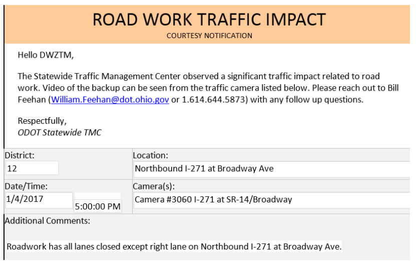
And then the last thing, which has to do with our camera coverage in the state, is that if our traffic management center notices a violation that a contractor is out and they are causing an impact that is greater than that 0.75 mile, give or take and the TMC notices on the camera, they have this form that they can fill out and it automatically sends an email to the district, as well as a person in central office to kind of give us a heads up that something is going on out there.
Maybe they're closing lanes when they're not supposed to and it's causing the impact, because the central office, a lot of times, we don't know. And then also even at the district level, things happen that our district work zone traffic manager is not aware of. And so this tool allows them to get a heads up when the TMC, who's watching the state all the time, maybe see something.
The limitation to this is that the TMC only has camera coverage in the larger cities, but that is kind of expanding as the years go on, so this becomes more valuable as the capabilities of our TMC increases. That's all I have. Next up is Mike Fontaine.
slide 45
Bill Feehan
Ohio Department of Transportation
William.Feehan@dot.ohio.gov
slide notes:
None
slide 46
Mike Fontaine – Virginia Transportation Research Council
slide notes:
All right. Thank you, Bill. Well, I'm very glad that I have the presentation after Bill because I think he did some of the heavy lifting to lead into what I'm going to be talking about today. So I work at the Virginia Transportation Research Council, which is the research division of the Virginia DOT. VDOT has been a very extensive user of probe data for about 10 years now.
We are an INRIX state, so a lot of what I'm going to show you today uses INRIX data. That's in no way an endorsement of INRIX as a data provider. I think a lot of the other data providers like Here and Tomtom could be used to do very similar work to what we're going to present today. So what I'm going to do is cover a couple of different examples that are a little bit different than what Bill has talked about.
slide 47
slide notes:
First of all, I'm going to talk about some macroscopic work that we're doing. So this is essentially looking at how much work zone contributes to overall system vehicle hours of delay by our DOT district, by routes and segments. So this is essentially looking at the work zone delay as part of sort of a transportation system management and operations kind of approach-- so basically looking at work zone within TSMO framework.
And then I'm going to shift gears slightly to talk about things at a very microscopic level and look at project level impacts on queuing and how we can use some of the probe data to do some queuing level analysis that we couldn't do previously.
slide 48
slide notes:
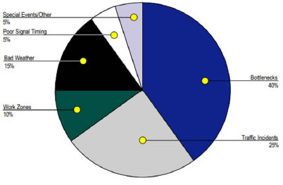
So first of all at a programmatic level, one of the things that there was a lot of interest in the states is essentially looking at what is contributing to total vehicle hours of delay on our system. And so many of you may have seen this pie chart that I've got on this slide. And so this is coming from work that Cambridge Systematics and the Texas Transportation Institute did back in 2005, where they did a nationwide scan and they tried to attribute how much of total delay was due to recurring bottlenecks, incidents, work zone, bad weather, poor signal timing, and special events.
And that work found that about 10% of all delay was attributable to work zones. Now one of the challenges at this time was that this work was done in 2005 before a lot of these pro data providers came onboard. So we were sort of at the mercy of where there were existing pavement detectors or side fire radar where we could get some kind of speed data.
Now that we do have this sort of ubiquitous probe-based travel time and speed data, we can start to look across the entire system much more comprehensively at overall system performance. So what we are trying to do is look at what's the source of delay on our interstate system. In terms of the data and tools that we use for this analysis, we also have access to the RITIS platform that the University of Maryland maintains.
There is a tool within the RITIS platform that calculates vehicle hours of delay on a segment, so they basically fuse the probe data along with historic volume profiles over time that they get from HPMS in order to generate a vehicle hour of delay estimate.
We also use our internal incident data system that we have that will record things like lane blocking incidents, so when we have a broken down vehicle that blocks a lane or crash that blocks a lane, we have information on work zone data in our internal data system and we also have road condition information-- so something like water on the road or snow, other things like that might impact overall delay.
We also with that fused information from 75 weather stations in Virginia that were located near the interstate system. And essentially what happened is our research office, in concert with our operations division, developed Matlab code that combined all these data sets together and then we use Tableau for visualization in order to generate these delay estimates.
slide 49
slide notes:
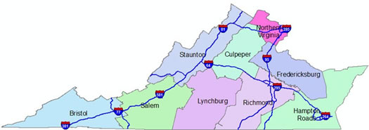
So just to give you a flavor of what we're dealing with the data set here-- so the map at the bottom of the slide shows the nine construction districts in Virginia. And so I don't know if you can see my pointer, but in Virginia, we essentially have an urban crescent that starts in the north around Washington DC, comes down I-95 to the Metro Richmond area, and then goes out east to Hampton Roads, which is Norfolk and Virginia Beach.
And so this is a very congested urban part of the state. The rest of the state is much more rural in nature. Across our interstate system between 2016 and 2017, we had a total of about 15,500 incident events. And so this would include disabled vehicles as well as crashes. We had about 19,600 work zone events, about 8,400 in 2016 and a little over 11,000 in 2017. And each event could span multiple days.
So it could be, if I know that this work zone is going to be in place for a month, one event could last 30 days or it could be a case where it's a utility work zone that's only out there for a few hours. So the work zone vary in duration and in spatial extent. And then on the weather side, what we focused on was precipitation events where we got at least a quarter inch of precipitation an hour.
The reason why we picked that threshold is that's the threshold in the highway capacity manual for where we start to see capacity reductions when it's raining at least a quarter inch an hour or more. So we essentially took the weather station data, snapped that to the interstate system in order to try and look at where that's happening, and we also looked at our ice and snow on the road reports. And so when you look at that, we had a much milder winter in 2017 than we had in 2016, so we had fewer of those events during that time frame.
slide 50
slide notes:
So one of the challenges that we have-- and I'm sure that many of you all have-- is getting information on work zones in the state. And so right now we have five traffic operation centers that cover our entire interstate system. And so the database that we use in order to gather information about work zones was entered by operators in the traffic operation centers.
And one of the challenges we have-- and I'm sure many of you all have-- is consistency in the way in which we're recording this data. So an example would be like a paving job. And so we saw in some cases in 2016 some districts would basically set up a different work zone event night by night for where that paving operation was active at that time.
Other operators would say, for the next two weeks, I've got a 30 mile stretch of road where we're going to be paving somewhere on that stretch of road. Well, that makes it much more difficult to do an apples to apples comparison, when you've got these inconsistencies. So that proved to be a challenge. Another problem we had from a data perspective was how we code what we're calling point work zones.
So if I'm doing a bridge job someplace-- in some cases, someone just basically dropped a pen on a map and said, here's where the work zone is. I have no idea where the traffic controls start or ended. I have no idea of the spatial components of that site. We also have cases where sometimes start and end times of the work zone are the same. And so all of that created some consistency issues with how the data was coded, and a lot of those are being addressed right now to try and minimize those problems.
Another issue we had is-- I think Jawad and Bill both mentioned the idea of using work zone delay as a performance measure. And so one of the issues that we have is what happens if we have a work zone that is on a congested urban section of road that has regular recurring peak period congestion? So how do I separate out that recurring congestion from what's being created by the work zone, or what happens if a car breaks down in the middle of the work zone?
It's not necessarily the work zone that created the delay, but the interaction of the work zone with the breakdown caused that delay. Then we also have the case too where since we're relying on the RITIS Vehicle Hours of Delay Tool, it's using historic estimates of how traffic changes over the course of the day in order to get vehicle hours of delay.
And ideally, we'd have real time volume data in all these sites, but the problem is that one of the first things that happens in a work zone is all the detectors get pulled out so we don't have that real time data in many cases for volume.
slide 51
slide notes:
All right. So we had to come up with some rules in order to try and overcome some of these data challenges. So one of the first things that we did is we wanted to say, what delay are we saying is caused by the work zone versus caused by other sources? And so one of the things that we did is we went through the state and we looked at each segment of the road and we looked at what time today did something happen on this road-- whether it's a work zone or a crash or a weather event or something like that.
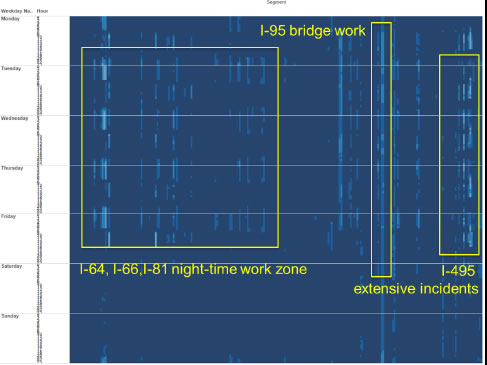
And then all of the times when there was no event recorded on that segment, that became sort of our baseline not a recurring delay. And so what you can see on this slide-- and I apologize for the size of the font-- but on the left side, this is day of the week and hour of the day in the small numbers. And then basically going across the top, these are different segments of the road.
And so the dark blue indicates these are locations where there was very rarely a crash or a work zone or something like that. The lighter the color, the more often we had something happen on that section of road. And so for example, over here in this box on the left hand side, we have several interstates where you can see there's sort of a recurring pattern happening in the overnight hours.
And these are all of the overnight works zones happening on these sites. Over here in the middle block, we have a case where there was a bridge job on Interstate 95 that was out there 24/7 for a period of time, and so almost continuously there's a work zone being recorded at this location. And then another problem we would have is in the DC area where you have very high traffic volumes, we have a lot of incidents that happen on our urban freeways.
And so here you can see, this is the Washington beltway in the block over here on the right and you can see a number of events that are happening during the daytime here. So essentially what we're trying to do is we're trying to find a baseline delay for when nothing's happening. So that's our recurring delay. If we have a work zone present, basically any delay that's occurring above and beyond that recurring delay is what we're attributing to the work zone.
So we're not blaming peak hour rush hour congestion on the work zone. We're only blaming the work zone for the delay that's occurring beyond what would have occurred normally during the rush hour. Likewise, if we have a work zone and we have a crash that happens in the work zone, we're basically saying half that delay is going to the work zone, half that delay is caused by the crash. So we're using just sort of these high level rules of thumb trying to divide up the sources of delay.
slide 52
slide notes:
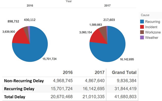
So when we go through all this process, basically what we're able to determine was that work zones contributed about 4% of delay in 2016 and about 7.6% of delay in 2017. And so that's the brown slice of the pie here that you can see. So we had about a doubling of the delay that was attributable to work zones in this time period. So this gives us a lot of information that we can share with our district administrators or our chief engineer about what's the sources of delays that can happen.
And so this helps us in terms of trying to come up with mitigation strategies for whether it's incident-driven, it's recurring congestion, or it's actually in fact caused by what's going on at the work zone.
slide 53
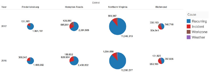
Large increase in work zone delay in Hampton Roads District related to major capacity expansion project (increase from 5.2% to 12.5% of vehicle hours of delay).
slide notes:
Just to give you an idea of how this can be broken out further-- so in our urban districts, so that sort of urban crescent that I showed you earlier, we're able to break this down construction district by construction district. And so the size of the pie here represents the total amount of delay in that district. And so not surprisingly for those of you that are from the area or are familiar with Virginia, the Northern Virginia area around DC has the lion's share of delay in the state.
But what this does allow us to do is if we look over here at the second sets of pies in Hampton Roads, the size of the work zone delay increased substantially from 2016 to 2017 in this district. So we went from about 5% of delay in that district being related to work zones to about 12.5% of delay in that district being related to work zones.
And that was because we had a major capacity expansion project happen on I-64 that basically was there 24/7 and it was their presence during the peak periods and we started seeing a lot large contribution of delay there. So even though the district total delay increased, a lot of it could be attributable to the presence of this work zone. So we know it's not sort of a larger systematic problem. It's something that will hopefully go away once that project is completed.
slide 54
| District/Interstate | Year | Bristol | Culpeper | Fredericksburg | Hampton Roads | Northern Virginia | Richmond | Salem | Staunton | Total |
|---|---|---|---|---|---|---|---|---|---|---|
| 64 | 2016 | 6% | <5% | <5% | <8% | <5% | ||||
| 2017 | <13% | 12% | 10% | 7% | 11% | |||||
| 66 | 2016 | 12% | <5% | 20% | <5% | |||||
| 2017 | <5% | <5% | <5% | <5% | ||||||
| 77 | 2016 | 15% | 6% | 10% | ||||||
| 2017 | 23% | <5% | 13% | |||||||
| 81 | 2016 | 9% | 8% | 13% | 10% | |||||
| 2017 | 41% | 20% | 13% | 20% | ||||||
| 85 | 2016 | 13% | 13% | |||||||
| 2017 | 21% | 21% | ||||||||
| 95 | 2016 | <5% | 38% | <5% | 10% | <5% | ||||
| 2017 | 6% | 58% | <5% | 23% | 7% | |||||
| 264 | 2016 | <5% | <5% | |||||||
| 2017 | <5% | <5% | ||||||||
| 395 | 2016 | <5% | <5% | |||||||
| 2017 | <5% | <5% | ||||||||
| 495 | 2016 | <5% | <5% | |||||||
| 2017 | <5% | <5% |
slide notes:
We're also able to take this and break it down by interstate corridor and region. So again, just another example here. This is the contribution that happened in Hampton Roads due to that major capacity expansion project on I-64. We had another bridge project on a rural section of I-95 that was out there that also caused this large jump in congestion. So this is being used in concert with the other things in this congestion pie to help make some decisions about how we're investing and how we're trying to mitigate some of these problems that we see at our sites.
slide 55
slide notes:
We heard from Bill that some of the queuing work that they're doing in Ohio, and so one of the things that he mentioned was that these probe data providers use something called Traffic Message Channel, or TMC links, which are defined by the digital mapping companies and they're usually interchange to interchange.
And so if we want to use the probe data to look at queuing, this can create a big problem for us because when the TMC links are super long, it basically washes out the effect of that work zone. So in Virginia, we've got some TMC links that are 60 miles long, and so if you have a one mile work zone in the middle of that 60 mile
And so this tends to be a case where it limits the effect of the TMC network.
slide 56
| Network | # of Segs | Total Length (mi) | Mean Length (mi) | Min Length (mi) | Max Length (mi) | |
|---|---|---|---|---|---|---|
| Freeways | TMC | 3,208 | 3,514.4 | 1.10 | 0.003 | 11.29 |
| XD | 6,787 | 3,387.3 | 0.50 | 0.003 | 0.99 | |
| Arterials | TMC | 13,789 | 17,270.1 | 1.25 | 0.002 | 18.09 |
| XD | 68,860 | 30,598.1 | 0.44 | .002 | 0.99 |
slide notes:
And so like Bill mentioned, we're using the INRIX XD network here in Virginia. And so if you look here, this is sort of a snapshot of what the network looks like on freeways and arterioles for the TMC network and the XD network.
And so we see here our average length is about half a mile or so and our maximum length is about a mile, whereas when we look at some of the freeways and the arterioles, you can see how long some of the segments are. And I've heard that the TMC network is even worse when you go out to the Western states.
I was talking to someone from Colorado a few weeks ago and he said they have some TMCs that are in excess of 20 miles long when you get to these rural mountainous roads. All right. So the XD network is certainly an improvement for us if we're trying to look at queuing or speed, but even still, half mile to a mile can create a problem for us if we're trying to really look at what's happening with the queue at a site and look at whether queues are meeting certain queuing thresholds.
slide 57
slide notes:
None
slide 58
slide notes:
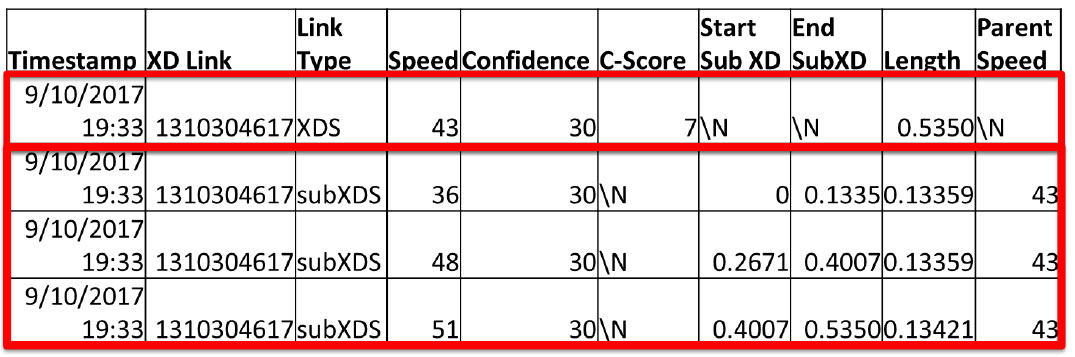
I'm a data geek, so just for the fellow data geeks out there, just to give you a feel for what this looks like-- this top line is what a raw real time XD record would look like. So we've got an identifier. This is the time stamp, so we're getting data every minute. We've got a speed of 43 miles an hour. The 30 means that this is real time data that's coming in, and our total link is a little over a half mile long.
Now in this minute, what happened is it dynamically generated three different sub XD segments that were substantially different from this 43 miles an hour. And so essentially what we're seeing here is that starting at the link for the first 0.13 miles, we have a speed of 36 miles an hour. Then we've got a gap between 0.13 and 0.26 that has this 43 mile an hour speed. And then we have a 48 mile an hour speed and a 51 mile an hour speed.
So this is essentially a link that is right at the lane closure of a work zone. So we're capturing the queue that's right there at the lane closure, and as they get past the lane closure, they're accelerating into the activity area. So now we're able to get this data on a very granular kind of scale.
slide 59
slide notes:
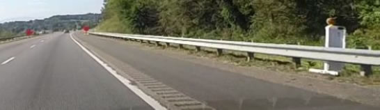
So just to give you an example, we had a case a while back where we deployed a smart work zone on I-95 southbound in Emporia, Virginia near the North Carolina line. They put a bunch of radar sensors in order to measure traffic speeds and they generated queue warning messages. And so we wanted to look at how the system compared to what we were getting off of this INRIX data.
slide 60
slide notes:
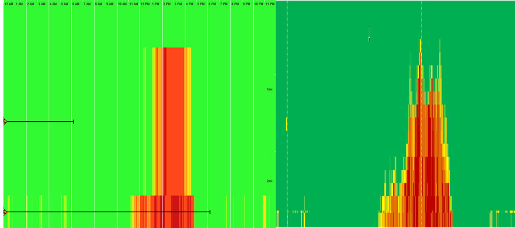
So kind of getting back to what Bill was mentioning, one of the challenges with the TMC data is this particular work zone had two TMCs that covered it. The first one was about 0.3 miles long. The second TMC was 1.6 miles long. So you've got very different levels. So basically what happens is if we're defining a speed threshold below which we consider the traffic to be queued, that 1.6 miles is either all queued or not queued at all-- kind of like Bill mentioned.
And so if we were applying the Ohio DOT queue warning thresholds, we would basically have to have this entire 1.6 miles triggered if we were going to call this data queued. All right. And so this is what the TMC data would look like.
slide 61
slide notes:
Now when we look at the sub XD data, we get something that looks much more granular and is much better picture of what the actual queue looks like.
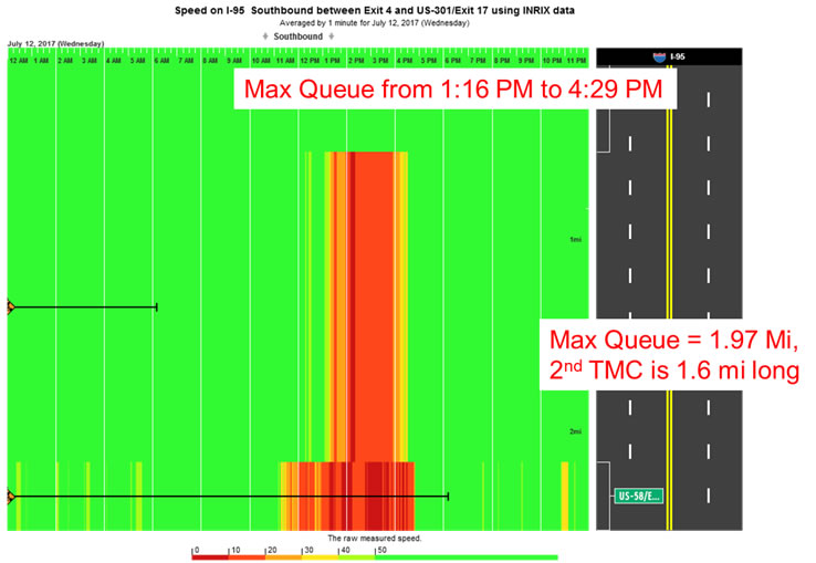
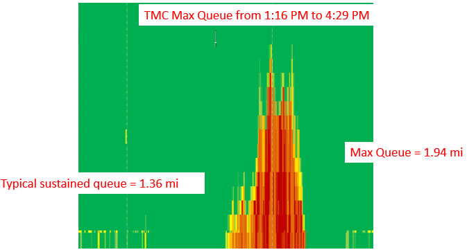
So this is the start of the queue down here at the bottom of the slide. The queue is growing in distance going up. And then this is time of day going across the x-axis. And so in this case, when we look at the prior slide, we had a maximum queue for about three hours.
It was about two miles long according to the TMC data, but when we look at the sub XD data, we still see the maximum queue is around three hours long, but typically our actual sustained queue is over a half mile shorter than what we would have estimated just using the TMC data. So we can get a little bit more granular kind of information here.
slide 62
slide notes:
And then just to sort of put them side by side and what these look like, you can see that even though the general trends are the same, it's telling you a very different story between these two. And so if you're starting to use this for a performance measure perspective, the more granular data is going to give you different results than if you try and get a more microscopic level kind of analysis.
slide 63
slide notes:
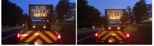
One interesting application where we've been using this data is in the Western part of the state where we have paving jobs on interstate 81. One of the districts has been using manual queue management techniques. So they've essentially been having a pickup truck with a dynamic message sign positioned upstream of nighttime paving jobs that's alerting drivers to slow moving traffic ahead or stopped traffic ahead.
And so we've been using this sub XD data in order to try and look at how this, as well as some smart work zone systems, have been impacting queuing and deceleration into the queue at these sites. So this is an example over here on the right of one work zone where the right side here, this is the start of the work zone. This going from right to left is showing an increase in queue at the site.
And then we've got time of day starting at 8:00 PM going down to 1:00 AM. So here you can see the queue is beginning to grow. Starting from 8:00 AM, we sort of reach this steady state between 8:00 and about 10:00 PM or so, and then the queue starts to dissipate as we go down here.
slide 64
slide notes:
And so one of the things that's been interesting for us in using this very granular kind of data is that this has allowed us to look at deceleration rates into the queue.
So now we're getting a speed every 750 feet as vehicles are traveling from a free flow state, which is represented here in green, into a queued state, where they're in the queue, they're going 30 miles an hour or so. And so we're able to assess whether the smart work zone systems or these advanced warning messages are able to slow that deceleration and much more gradually cause folks to move into the queue.
So we ideally are trying to prevent people from going 70 miles an hour and then having to slam on the brakes and then immediately go 30 miles an hour. Hopefully, they're easing up off the gas and then starting to decelerate in. And so this is getting at Jawad's performance measures that he mentioned was safety surrogate measures. This is one surrogate measure for safety that now we can get from the probe data that we never used to be able to get before with traditional sensors.
slide 65
Mike Fontaine
Associate Director
Virginia Transportation Research Council
Michael.Fontaine@vdot.virginia.gov
slide notes:
So there's my contact information. If anybody is interested in the details of how we're doing the congestion pies or how we're doing the sub XD data, please feel free to reach out to me. We've got a number of documents that we can share that certainly help with all this. And so with that, I will wrap up and hand it off back to Hunter.
slide 66
slide notes:
All right. Very good. Thank you so much, Mike, and thanks to both Bills and Mike all for participating in today's webinar. Got a ton of great information, so we thank you for doing that. I will take a moment here before we move on. We're coming up on the end of the webinar, just a couple more slides to go through here.
So if any of you do have questions for any of the speakers, please do enter those into the chat pod and then we'll make sure to address them at the end. So go ahead and do that so that they're available to answer before we run out of time. So the next thing we wanted to cover are some resources that Better Highways has made available, as well as some upcoming opportunities and things that are going to be occurring around the work zone performance management world.
slide 67
slide notes:
I think then on my slide here-- a bunch of different resources have been made available over the years, some of these as far back as 2011 and 2013. And then some that have been released here in the last month and some that we anticipate being available in the next, honestly, coming days at this point. The first two are kind of go to guided documents on performance management and work zones.
The first, a primer on work zone safety and mobility performance measurement, and the second, guidelines on data needs availability and opportunities for work zone performance measures. Those two documents are just chock full of great information. If you haven't seen those in the past, we definitely recommend that you check those out at the link there.
In addition to those, we have three case studies or fact sheets, we might call them, that Federal Highways have been developing here in the last couple of months. The first, it kind of goes along with what Bill and ODOT talked about just now. It's been kind of synthesized into a 45 page fact sheet on their policy-driven approach for work zone mobility performance measurements.
That document is already available at the link there, so we definitely recommend that you check that out. Read that document and then reach out to Bill if you have any questions. I'm sure he'd be glad to answer them.
The second goes along with what Mike just discussed with VDOT and their use of probe vehicle data for work zone mobility performance measurement. The third one, that one is going to be coming up very soon. It is in the final stages of approval and we think that will be done, if not by the end of this week, then early next week. So you can visit the work zone management programs website there. Keep an eye out for that and you'll be able to see once that's published. We'll also release that through the work zone management programs newsletter, so keep an eye out for that if you're interested.
The third is a Caltrans related document. It's their comprehensive work zone mobility performance management across project stages, similar to the other two that I talked about-- a good four or five page resources synthesizing what these different agencies are doing when it comes to best practices in work zone performance management.
There are additional resources that are available there at the Federal Highways website, that work zone management program there for our highways website. So we definitely encourage you to check that out, even if it's not for performance management, that's kind of your go to stop for anything that has to do with managing the impacts of work zone safety mobility.
slide 68
slide notes:
Next, we do have another webinar that's kind of the first in a series of webinars that we'll be producing when it comes to work zone performance management. The next one is going to be focusing on that NPMRDS, that National Performance Measurement Research Data Set that we've discussed a couple of times in here.
There's a lot of great opportunities and resources associated with that free data set for state DOTs. So we're going to be pooling together some information from additional state DOTs around the country and their use of that data set and how all of you could use it as well. We're targeting an early to mid August frame for that.
If you received the invite for this webinar, you should receive the invite for that one as well. We'll send it out through a mass e blast. And it will look just like this and you'll be able to click on the link and register, and then we would love to have you attend that webinar as well. So keep an eye out for that.
slide 69
slide notes:
Additional resources and opportunities-- there's a couple more documents that are forthcoming that we intend to have complete by that NPMRDS webinar. The first is a tech brief on how you can use the NPMRDS for work zone performance management purposes, and then we're going to do a bit of a case study with I-10 in Texas and kind of some results of using the NPMRDS to measure the performance of that interstate reconstruction program there around the Austin area.
And then in addition to that, kind of an ongoing opportunity. These aren't nailed down, but if you or your state or your local agency would like to learn more about performance management and need some additional help from federal highways, we do have some training modules and training workshops that we have available, and then we do anticipate having a couple of demonstration site visits in the next month or two related to performance management as well.
Keep an eye out for those. We'll send those invites out once they are made available.
slide 70
slide notes:
And then two additional websites that we encourage you to visit-- the National Work Zone Safety Information Clearinghouse, or the clearinghouse, as you've heard it referred to. This website is totally full of all different kinds of great resources, whether it be guidance documents or webinars or training modules.
A ton of great information there when it comes to work zone safety mobility. So we definitely always encourage you to check that out. And keep checking it out as it's continually updated and we are always adding more information to that website.
And then next is the Federal Highway Smarter Work Zones Toolkit. So performance measurement is kind of getting roped into that Smarter Work Zones program. So there's already a lot of good information there. But since it is broadly Smarter Work Zones, as I'm sure most of you are familiar, there's a ton of great information they are on different management techniques and technology applications that you can use to better mitigate those work zone safety mobility impacts.
So we definitely recommend you to check that website out. It's kind of a part of the Work Zone Safety Information Clearinghouse, and there's a specific Smarter Work Zones Toolkit embedded there.
slide 71
Jawad Paracha
FHWA Office of Operations
Work Zone Management Program
Jawad.Paracha@dot.gov
slide notes:
So moving forward, if you have any questions about any of the things that you've heard here, you were shown the contact information for all of our speakers, so if you have anything specific to them, we would definitely recommend you reach out to those speakers. They'd all be more than happy to help you and answer any questions you might have. But other than that, anything work zone mobility or safety related, we recommend you reaching out to Jawad Paracha, who you heard from a little bit earlier. And his email is posted there.
slide 72
Questions?
slide notes:
And with that, I am going to open it up to questions. And we'll go through those. Like I said, if you have any of those before now, we've got four more minutes until we're scheduled to end. Please do send those our way and we'll work through those. The first one we got in, and Bill or Mike-- Bill or Mike, this probably is best for you, and I think you may have answered some of this after the question came in.
But it says, "I saw that you have some access to RITIS modules with the INRIX XD data. By chance, do you or any of the other agencies have access to or have used the Work Zone Performance Monitoring Application within RITIS?" Are any of you using that module, I guess we'll ask.
As far as Ohio, I believe we do not have access to that application because we are not full RITIS members. We just have RITIS, a part of RITIS as part of our contract with INRIX. But I believe that's something that we're going to look into next time, our INRIX-- or our traffic data contract is renewed, whether we can pay for getting access to those work zone performance and other full RITIS tools that they have available.
And this is Mike. We do have access to the RITIS Work Zone Tool. It was actually a case for us where we had access to it and didn't know we had access to it for some time, so the word just got out to our regional work zone safety coordinators last fall about that. So I'm unsure to what degree it's been in use in the field, although we do have access to it right now.
Great. Very good. Thank you both. The only other question I've received is regarding the presentation and audio being made available. When you exit out of this WebEx probe room today, your web browser, whatever your default is, will pop up and it will automatically direct you to a link to a box folder where those slides can be downloaded.
That's obviously just going to be the PDFs of the slides before today's webinar. But a recording of this webinar is being made and we will be posting that to FHWA's Work Zone Management Program website here in the next couple weeks. So keep an eye out for that. It'll be in the same kind of main landing page there that talks about new resources being available. So that will be coming up very shortly.
And that is all the questions I've received. In case any come here in the next couple minutes, we'll address those. But again, I wanted to thank all of our speakers-- Bill McNary, Bill Feehan, and Mike Fontaine today, and obviously for Jawad at the beginning of the webinar. Thank you all so much for doing that.
We appreciate you all attending the webinar, and should you have any additional questions, like I said, please feel free to reach out to any of the speakers or Jawad there. I'll put his contact information back up. But with that, that is all we have. One more minute back, and we thank you all for attending today's webinar. Thanks so much. Have a good day.
|
United States Department of Transportation - Federal Highway Administration |
||