Study Methodology
In order to estimate the number, economic significance, and traffic impact of PSEs nationally, several methodological issues had to be addressed. These included:
- Technical definition of PSEs
- Categorization of event types
- Selection of data collection methodologies
- Selection of case studies
- Case study methodology
- Macro national methodology
- Traffic effect estimation methodology
The following parts of this section explain each of these methodological issues, which were then applied to develop the estimates provided in subsequent sections.
Technical Definition of PSEs
As defined earlier, a PSE is a planned occurrence that “abnormally increases traffic demand.”7 This occurs because PSEs usually attract a large number of attendees from a wide geographic area to a specific location for a specific period of time. Numerous factors influence the degree to which a PSE affects traffic demand, including:
- Attendance
- Arrival and departure patterns (i.e. do attendees arrive and leave at the same time, or is attendance staggered?)
- Available modes of transportation to and from the event
- Location
- Time
When considered individually, the number of attendees is more useful in predicting the likelihood of an event affecting traffic demand than the other factors listed above. Accordingly, estimating the total number of PSEs nationally without regard to attendance size is unlikely to be very useful to transportation planners. This is because there are likely tens of thousands of small events that increase traffic demand slightly, but not significantly.
The wide range and vast number of events that “abnormally” impact traffic are almost too numerous to count. For that reason, this report is concerned with estimating the traffic and economic effects of events that cause significant impacts. In order to exclude low-attendance PSEs that have small effects on traffic demand, project staff, in coordination with FHWA, selected an event attendance size cut-off of 10,000. In order to examine the sensitivity of these results, data on the number of events with attendance of more than 5,000 was collected for two smaller city case studies, where data collection was relatively less complex.
Categorization of Event Types
In order to collect and present data on the magnitude of PSEs, a first step was to develop an economic classification scheme that would help to identify the major types.
The FHWA Handbook identifies five planned special events types:
- Discrete/recurring event at a permanent venue
- Continuous event
- Street use event
- Regional/multi-venue event
- Rural event
The Handbook also defines PSEs by a variety of other Event Operations Characteristics as shown in Exhibit 2-1. Of these Event Operations Characteristics the category Event Type is the most applicable to the collection of economic data. Event types included in Exhibit 2-1 include:
- Sports
- Concerts
- Fairs
- Festivals
- Parades
- Races
- Conventions
Exhibit 2-1: Event Operation Characteristics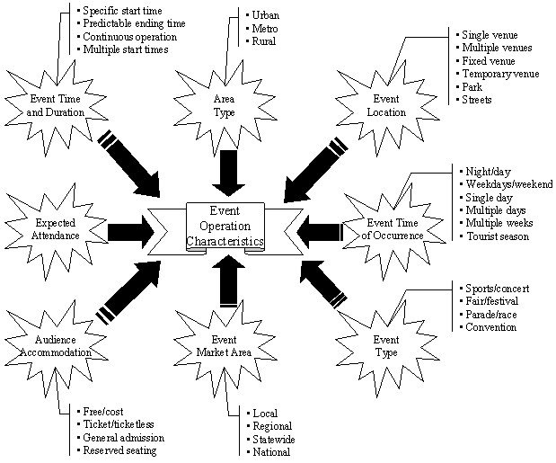
Source: FHWA Handbook, "Managing Travel for Planned Special
Events."
The 2002 Economic Census published by the US Census Bureau and the NCHRP Synthesis 309 report also identify several event types, which are listed in Exhibit 2-2. The Census data is collected according to industries as defined in the North American Industry Classification System (NAICS). Much of the PSE economic activity is contained in NAICS 711 (Performing Arts, Spectator Sports, & Related Industries) report. In addition, some PSEs of interest to this study may also be classified in NAICS 713 (Amusement, Gambling, and Recreational Industries) snf NAICS 6113 (Colleges, Universities, and Professional Schools) as well as elsewhere.
Exhibit 2-2: Types of PSEs Identified in Previous Studies
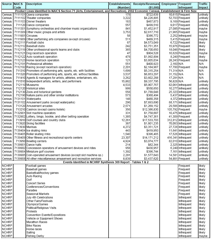
Sources: 2003 NCHRP Synthesis 309: Transportation Planning and Management
for Special Events and "2002 Economic Census: Miscellaneous
Subjects," U.S. Census Bureau.
Exhibit 2-3 provides a state-by-state breakdown of spectator sports revenues/receipts compiled from the 2002 Economic Census. The data reveal notable regional differences (e.g., whereas team sports are big business in more populous states, racetracks command most of the spectator sports market in less populous states such as Alabama and Iowa).
| State | Sports Teams & Clubs | Racetracks | Other Spectator Sports | Total | State Total As % of Nat'l Total |
|---|---|---|---|---|---|
| ALABAMA | 5,992 | 121,948 | 3,493 | 131,433 | 0.60% |
| ALASKA | D | D | 2,941 | 6,989 | 0.00% |
| ARIZONA | 377,971 | 85,865 | 11,861 | 475,697 | 2.10% |
| ARKANSAS | D | D | D | 63,877 | 0.30% |
| CALIFORNIA | 1,733,997 | 663,395 | 360,094 | 2,757,486 | 12.40% |
| COLORADO | 434,867 | 39,745 | 29,850 | 504,462 | 2.30% |
| CONNECTICUT | 23,661 | 24,938 | 4,929 | 53,528 | 0.20% |
| DELAWARE | D | 323,704 | D | 332,323 | 1.50% |
| DISTRICT OF COLUMBIA | D | D | D | D | D |
| FLORIDA | 965,294 | 597,194 | 195,551 | 1,758,039 | 7.90% |
| GEORGIA | 339,331 | D | D | 463,282 | 2.10% |
| HAWAII | 1,961 | D | 1,331 | 3,292 | 0.00% |
| IDAHO | 2,349 | 5,159 | 1,709 | 9,217 | 0.00% |
| ILLINOIS | 578,623 | 285,742 | 81,670 | 946,035 | 4.20% |
| INDIANA | D | D | D | 1,053,549 | 4.70% |
| IOWA | 15,096 | 300,583 | 7,194 | 322,873 | 1.40% |
| KANSAS | 3,886 | 67,735 | 10,963 | 82,584 | 0.40% |
| KENTUCKY | D | 241,126 | D | 339,666 | 1.50% |
| LOUISIANA | D | 302,669 | D | 465,701 | 2.10% |
| MAINE | 5,727 | 14,146 | 733,016 | 20,606 | 0.10% |
| MARYLAND | 331,044 | D | D | 464,832 | 2.10% |
| MASSACHUSETTS | 485,311 | 99,874 | 7,136 | 592,321 | 2.70% |
| MICHIGAN | 429,208 | 154,566 | 15,791 | 599,565 | 2.70% |
| MINNESOTA | 363,985 | D | D | 421,626 | 1.90% |
| MISSISSIPPI | 3,155 | 2,451 | 583,004 | 6,189 | 0.00% |
| MISSOURI | 523,649 | 7,850 | 7,529 | 539,028 | 2.40% |
| MONTANA | 1,256 | 1,170 | 1,093 | 3,519 | 0.00% |
| NEBRASKA | 12,556 | 20,864 | 8,301 | 41,721 | 0.20% |
| NEVADA | D | D | D | 107,983 | 0.50% |
| NEW HAMPSHIRE | D | 101,171 | D | 110,430 | 0.50% |
| NEW JERSEY | 367,878 | 52,409 | 45,354 | 465,641 | 2.10% |
| NEW MEXICO | D | 101,673 | D | 106,744 | 0.50% |
| NEW YORK | 1,288,760 | 398,516 | 105,006 | 1,792,282 | 8.00% |
| NORTH CAROLINA | 290,294 | 102,694 | 748,147 | 1,141,135 | 5.10% |
| NORTH DAKOTA | D | D | D | D | D |
| OHIO | 753,221 | 167,980 | 77,712 | 998,913 | 4.50% |
| OKLAHOMA | 8,280 | 29,909 | 15,711 | 53,900 | 0.20% |
| OREGON | D | D | 5,198 | 121,210 | 0.50% |
| PENNSYLVANIA | 736,019 | 221,563 | 90,778 | 1,048,360 | 4.70% |
| RHODE ISLAND | D | D | D | D | D |
| SOUTH CAROLINA | 19,025 | D | D | 65,866 | 0.30% |
| SOUTH DAKOTA | D | D | D | 9,523 | 0.00% |
| TENNESSEE | 277,815 | D | D | 380,041 | 1.70% |
| TEXAS | 966,054 | 224,114 | 68,817 | 1,258,985 | 5.60% |
| UTAH | D | D | D | D | D |
| VERMONT | D | 2,195 | D | 3,834 | 0.00% |
| VIRGINIA | 226,520 | 100,216 | 50,825 | 377,561 | 1.70% |
| WASHINGTON | 399,861 | D | D | 474,260 | 2.10% |
| WEST VIRGINIA | D | 647,912 | D | 665,619 | 3.00% |
| WISCONSIN | 312,621 | 42,865 | 17,131 | 372,617 | 1.70% |
| WYOMING | D | D | D | 4,653 | 0.00% |
| UNITED STATES | 13,025,050 | 6,702,456 | 2,585,910 | 22,313,416 | 100.00% |
| Note: "D" = nondisclosure by Census bureau
to maintain confidentiality of a business or person. Source: 2002 Economic Census: Miscellaneous Subjects, U.S. Census Bureau |
|||||
One of the shortcomings of the Census data provided in Exhibit 2-2 is that they are only collected from establishments whose primary purpose is arts, entertainment, or recreation. For example, college sports are not included, as the primary purpose of colleges and universities is education. County or state fairs are not included, as the primary purpose of county and state governments is not recreation. In addition, other large attendance events, such as protest marches and parades, are not classified as performing arts, spectator sports, or related industries and thus are not counted in the Census data. Therefore, to add to the Census “product lines,” the second part of Exhibit 2-2 provides event types identified in the NCHRP Synthesis 309 Report.
For each type of industry or event in Exhibit 2-2, the final two columns include a judgment as to whether the events were likely to be regularly occurring (frequent, infrequent) and were likely to have a traffic impact (likely, maybe, unlikely). These judgments were provided in the NCHRP report and were added to the Census data by project staff for this study.
From this list, a reasonable number of event types was selected, including only those event types that were likely to have significant effects. The selection process was completed in coordination with the FHWA. It was determined that the list should be long enough to include the majority of events and impacts, but not so long as to make data collection efforts unreasonably complicated. The final event types selected for inclusion in this study are:
- Professional Football
- Professional Baseball
- Professional Basketball
- Professional Hockey
- College Football
- College Basketball
- College Hockey
- Auto Racing
- Horse Racing
- Golf Tournaments
- Marathons
- Concerts
- Parades
- Fairs
- Festivals
- Protests/Political Events
- Expositions and Shows
Selection of Data Collection Methodologies
Several approaches were employed to collect event size and frequency data. These included both a venue and permitting authority-based approach and an association-based approach. The venue and permitting authority-based approach was designed to collect data from a sample of special events venues and permitting authorities, such as stadiums and police departments at a micro or city-level. The association-based approach was designed to collect data from trade associations representing the relevant entities within various special events categories at the national or macro level.
For the micro or city level approach, the first step was to select representative cities to serve as case studies. Once the case study cities were selected, venues, permitting authorities, and other officials were identified and contacted to develop estimates of the number of PSEs and the attendance at those PSEs. For the macro or national approach, the first step in the process was to collect the available data at the national level from the Census and from associations and other organizations. This process was an effective means for many types of events, particularly for sporting events which have national groups that collect such data such as the NFL, NBA and NCAA. However for other types of events, especially street-use events, data is often not available at the national level. Therefore, for these types of events, the local case studies were used to capture data and develop national estimates using scaling factors.
The primary data items that needed to be collected and estimated for the 17 identified event types were the following:
- Number of event days annual
- Average attendance
- Total attendance
- Revenue or spending per attendee
- Economic effects
- Fiscal effects
Selection of Case Studies
As noted earlier, comprehensive information on PSEs at the national level is not available for many types of events. To the extent information is available, it is typically fragmented. In order to overcome these challenges, sample data was collected from four U.S. cities to gain a better understanding of the types of PSEs, the level of attendance and the characteristics that would affect traffic congestion. The sample city data was also used to aid in the development of national estimates. The four sample cities that were selected are:
- Detroit, Michigan
- Portland, Oregon
- El Paso, Texas
- Columbia, South Carolina
The sample cities were identified based on data from the Texas Transportation Institute's 2007 Urban Mobility Report (UMR). The UMR report provides congestion data for a sample of urban areas in the U.S. This data can be used to create national congestion estimates by scaling up the data to the national level.
The UMR examines congestion data for 85 selected urban areas in the U.S. which it groups into four categories according to population size: Very Large, Large, Medium, and Small. The population ranges represented by each category and the number of urban areas within each one are summarized in Exhibit 2-4. The fifth column in Exhibit 2-4, “Number of Urban Areas in the U.S.,” lists the number of Urban Areas in the country that the FHWA estimates fit into the population range categories used by the UMR.
| Category | Population Range Minimum |
Population Range Maximum |
Number of Urban Areas in UMR Sample* | Number of Urban Areas in the U.S.** |
|---|---|---|---|---|
| Very Large | 3 million | Uncapped | 14 | 13 |
| Large | 1 million | 2.9 million | 25 | 26 |
| Medium | 0.5 million | 0.9 million | 30 | 36 |
| Small | 0.05 million | 0.4 million | 16 | 385 |
| * TTI, Urban Mobility Report,
2007, http://mobility.tamu.edu/ums/congestion_data/national_congestion_tables.stm ** Information based on FWHA, Highway Statistics, 2005 https://www.fhwa.dot.gov/policy/ohim/hs05/pdf/hm72.pdf |
||||
Each urban area listed in the National Congestion Tables in the UMR contains data in the following three fields:
- Annual Delay per Traveler in Hours
- Travel Time Index
- Wasted Fuel per Traveler
For the purpose of this study, an additional field - Population - was added to the three fields in the National Congestion Tables. The population estimates that are used in this report are urban population estimates.
One sample city was selected from each of the four categories. When selecting the sample cities, the intent was to select cities with statistics near the average for each field within each category. For example, Portland was selected for the Large urban area category in part because the city’s data is relatively close to all the category averages in the four fields in the Large urban area category. Exhibit 2-5 compares Large urban area average statistics with Portland’s statistics.
| Urban Area | Annual Delay per Traveler (hours) |
Travel Time Index | Wasted Fuel per Traveler (gallons) | Population (thousands) |
|---|---|---|---|---|
| Large Average (Average) | 37 | 1.24 | 25 | 1,631 |
| Portland, OR-WA | 38 | 1.29 | 27 | 1,729 |
| Source: TTI, Urban Mobility Report, 2007,
http://mobility.tamu.edu/ums/congestion_data/national_congestion_tables.stm
and FWHA, Highway Statistics, 2005 https://www.fhwa.dot.gov/policy/ohim/hs05/pdf/hm72.pdf |
||||
The next criterion used when selecting the sample cities was to represent different major regional areas of the U.S. As is shown in Exhibit 2-6, the selected cities represent four different regions of the U.S.
| Urban Area | Region of U.S. |
|---|---|
| Detroit, MI | North |
| Portland, OR | West |
| El Paso, TX | South |
| Columbia, SC | East |
Thus, the selections of the sample urban areas for analysis in this study were made on the bases of congestion, population, and regional representation. National aggregate estimates were obtained by scaling up by the number of urban areas in the U.S.
Very Large Urban Areas
The National Congestion Table for Very Large urban areas is shown in Exhibit 2-7. Detroit was selected to represent this category. The reasons for its selection included its statistical proximity to the category averages for annual delay per traveler in hours, travel time index, and wasted fuel per traveler. Detroit’s population is not very close to the category population average, largely because the extremely large populations of New York City and Los Angeles skew the average. However, the median population for the category, 4.1 million, is relatively close to Detroit’s population of 3.9 million. Detroit’s average annual delay per traveler is 54 hours, exactly the category average. The city’s travel time index is 1.29, which is slightly below the category average of 1.38. Travelers in Detroit waste an average of 35 gallons of fuel due to congestion annually. This is slightly less than the category average of 38. (For most of the metrics, the cities, especially Portland, are almost exactly equal to the category average.)
It should be noted that the Michigan DOT has a strong planned special events program and has conducted several post event studies. Detroit also has two relatively new stadiums (Comerica Park and Ford Field) that required preparation of traffic impact studies. These types of studies estimate the increase in traffic and congestion caused by planned special events at the proposed venue and provide estimates of the reduced congestion due to mitigation measures.
| Urban Area | Annual Delay per Traveler | Travel Time Index | Wasted Fuel per Traveler | Population (thousands) |
|||
|---|---|---|---|---|---|---|---|
| Hours | Rank | Value | Rank | Gallons | Rank | ||
| Very Large (Average) | 54 | 1.38 | 38 | 5,736 | |||
| Los Angeles-Long Beach-Santa Ana, CA | 72 | 1 | 1.5 | 1 | 57 | 1 | 12,149 |
| San Francisco-Oakland, CA | 60 | 2 | 1.41 | 3 | 47 | 2 | 3,110 |
| Washington, DC-VA-MD | 60 | 2 | 1.37 | 7 | 43 | 5 | 4,251 |
| Atlanta, GA | 60 | 2 | 1.34 | 11 | 44 | 3 | 4,172 |
| Dallas-Fort Worth-Arlington, TX | 58 | 5 | 1.35 | 9 | 40 | 7 | 3,746 |
| Houston, TX | 56 | 7 | 1.36 | 8 | 42 | 6 | 2,487 |
| Detroit, MI | 54 | 8 | 1.29 | 21 | 35 | 10 | 3,931 |
| Miami, FL | 50 | 11 | 1.38 | 6 | 35 | 10 | 5,331 |
| Phoenix, AZ | 48 | 15 | 1.31 | 15 | 34 | 13 | 3,270 |
| Chicago, IL-IN | 46 | 16 | 1.47 | 2 | 32 | 17 | 7,702 |
| New York-Newark, NY-NJ-CT | 46 | 16 | 1.39 | 5 | 29 | 23 | 17,773 |
| Boston, MA-NH-RI | 46 | 16 | 1.27 | 25 | 31 | 19 | 4,077 |
| Seattle, WA | 45 | 19 | 1.3 | 17 | 34 | 13 | 3,002 |
| Philadelphia, PA-NJ-DE-MD | 38 | 33 |
1.28 | 23 | 24 | 34 | 5,296 |
| Source: TTI, Urban Mobility Report, 2007,
http://mobility.tamu.edu/ums/congestion_data/national_congestion_tables.stm FWHA, Highway Statistics, 2005 https://www.fhwa.dot.gov/policy/ohim/hs05/pdf/hm72.pdf |
|||||||
Large Urban Areas
Portland was chosen to represent the Large urban area category. One reason it was selected is its proximity to the category averages for annual delay per traveler in hours, travel time index, wasted fuel per traveler, and population. The National Congestion Table for Large Urban Areas is shown in Exhibit 2-8. Portland’s average annual delay per traveler is 38 hours, which is only one hour more than the category average of 37. The city’s travel time index is 1.29, which is slightly above the category average of 1.24. Travelers in Portland waste an average of 27 gallons of fuel due to congestion annually, slightly more than the category average of 25. Additionally, Portland’s population of 1.7 million is only slightly higher than the category average of 1.6 million.
| Urban Area | Annual Delay per Traveler | Travel Time Index | Wasted Fuel per Traveler | Population (thousands) |
|||
|---|---|---|---|---|---|---|---|
| Hours | Rank | Value | Rank | Gallons | Rank | ||
| Large Average (Average) | 37 |  |
1.24 | |
25 | |
1,631 |
| San Diego, CA | 57 | 6 | 1.4 | 4 | 44 | 3 | 2,903 |
| San Jose, CA | 54 | 8 | 1.34 | 11 | 38 | 9 | 1,649 |
| Orlando, FL | 54 | 8 | 1.3 | 17 | 35 | 10 | 1,335 |
| Denver-Aurora, CO | 50 | 11 | 1.33 | 13 | 33 | 15 | 2,092 |
| Riverside-San Bernardino, CA | 49 | 13 | 1.35 | 9 | 40 | 7 | 1,828 |
| Tampa-St. Petersburg, FL | 45 | 20 | 1.28 | 23 | 28 | 7 | 2,251 |
| Baltimore, MD | 44 | 22 | 1.3 | 17 | 32 | 25 | 2,149 |
| Minneapolis-St. Paul, MN | 43 | 23 | 1.26 | 26 | 30 | 21 | 2,519 |
| Indianapolis, IN | 43 | 23 | 1.22 | 32 | 28 | 25 | 915 |
| Sacramento, CA | 41 | 27 | 1.32 | 14 | 30 | 21 | 1,787 |
| Las Vegas, NV | 39 | 29 | 1.3 | 18 | 27 | 27 | 1,256 |
| San Antonio, TX | 39 | 29 | 1.23 | 28 | 27 | 27 | 1,143 |
| Portland, OR-WA | 38 | 33 | 1.29 | 21 | 27 | 27 | 1,729 |
| Columbus, OH | 33 | 36 | 1.19 | 36 | 24 | 34 | 1,197 |
| St. Louis, MO-IL | 33 | 36 | 1.16 | 46 | 20 | 40 | 2,106 |
| Virginia Beach, VA | 30 | 42 | 1.18 | 39 | 20 | 40 | 1,521 |
| Memphis, TN-MS-AR | 30 | 42 | 1.13 | 53 | 16 | 46 | 1,017 |
| Providence, RI-MA | 29 | 44 | 1.16 | 46 | 17 | 45 | 1,242 |
| Cincinnati, OH-KY-IN | 27 | 45 | 1.18 | 39 | 19 | 42 | 1,619 |
| Milwaukee, WI | 19 | 59 | 1.13 | 53 | 14 | 52 | 1,399 |
| New Orleans, LA | 18 | 63 | 1.15 | 49 | 11 | 62 | 1,009 |
| Kansas City, MO-KS | 17 | 64 | 1.08 | 73 | 10 | 66 | 1,454 |
| Pittsburgh, PA | 16 | 67 | 1.09 | 64 | 9 | 69 | 1,769 |
| Cleveland, OH | 13 | 75 | 1.09 | 64 | 9 | 69 | 1,767 |
| Buffalo, NY | 11 | 77 | 1.08 | 73 | 7 | 76 | 1,123 |
| Source: TTI, Urban Mobility Report, 2007,
http://mobility.tamu.edu/ums/congestion_data/national_congestion_tables.stm FWHA, Highway Statistics, 2005 https://www.fhwa.dot.gov/policy/ohim/hs05/pdf/hm72.pdf |
|||||||
Medium Urban Areas
El Paso, Texas was chosen to represent the Medium urban area category. The reasons for its selection were El Paso’s proximity to the category averages for annual delay per traveler in hours, travel time index, wasted fuel per traveler, and population. El Paso’s average annual delay per traveler is 24 hours, four hours less than the category average. The city has a travel time index of 1.17, which is very close to the category average of 1.16. Travelers in El Paso waste an average of 16 gallons of fuel due to congestion annually, only two gallons less than the category average of 18. Additionally, El Paso’s population of 656,000 is fairly close to the category average of 685,000. The National Congestion Table for Medium Urban Areas is provided in Exhibit 2-9.
| Urban Area | Annual Delay per Traveler | Travel Time Index | Wasted Fuel per Traveler | Population (thousands) |
|||
|---|---|---|---|---|---|---|---|
| Hours | Rank | Value | Rank | Gallons | Rank | ||
| Medium (Average) | 28 | |
1.16 | |
18 | |
685 |
| Austin, TX | 49 | 13 | 1.31 | 15 | 33 | 15 | 641 |
| Charlotte, NC-SC | 45 | 20 | 1.23 | 28 | 31 | 19 | 855 |
| Louisville, KY0IN | 42 | 25 | 1.23 | 28 | 29 | 23 | 904 |
| Tucson, AZ | 42 | 25 | 1.23 | 28 | 26 | 31 | 749 |
| Nashville-Davidson, TN | 40 | 28 | 1.17 | 42 | 25 | 33 | 984 |
| Oxnard-Ventura, CA | 39 | 29 | 1.24 | 27 | 27 | 27 | 367 |
| Jcaksonville, FL | 39 | 29 | 1.21 | 35 | 26 | 31 | 992 |
| Raleigh-Durham, NC | 35 | 35 | 1.18 | 39 | 23 | 37 | 673 |
| Albuquerque, NM | 33 | 36 | 1.17 | 42 | 21 | 39 | 573 |
| Birmingham, AL | 33 | 36 | 1.15 | 49 | 22 | 38 | 680 |
| Bridgeport-Stamford, CT-NY | 31 | 40 | 1.22 | 32 | 24 | 34 | 868 |
| Salt Lake City, UT | 27 | 45 | 1.19 | 36 | 18 | 44 | 970 |
| Sarasota-Bradenton, FL | 25 | 48 | 1.19 | 36 | 15 | 50 | 636 |
| Omaha, NE-IA | 25 | 18 | 1.16 | 46 | 15 | 50 | 571 |
| Honolulu, HI | 24 | 51 | 1.22 | 32 | 16 | 46 | 648 |
| El Paso, TX-NM | 24 | 51 | 1.17 | 42 | 16 | 46 | 656 |
| Grand Rapids, MI | 24 | 51 | 1.1 | 60 | 14 | 52 | 595 |
| Allentown-Bethlehem, PA-NJ | 22 | 55 | 1.14 | 51 | 14 | 52 | 607 |
| Oklahoma City, OK | 21 | 56 | 1.09 | 64 | 13 | 59 | 856 |
| Fresno, CA | 20 | 57 | 1.12 | 55 | 12 | 61 | 616 |
| Richmond, VA | 20 | 57 | 1.09 | 64 | 13 | 59 | 910 |
| Hartford, CT | 19 | 59 | 1.11 | 57 | 14 | 52 | 889 |
| New Haven, CT | 19 | 59 | 1.11 | 57 | 14 | 52 | 558 |
| Tulsa, OK | 19 | 59 | 1.09 | 64 | 11 | 62 | 575 |
| Dayton, OH | 17 | 64 | 1.1 | 60 | 11 | 62 | 287 |
| Albany-Schenectady, NY | 16 | 67 | 1.08 | 73 | 10 | 66 | 524 |
| Toledo, OH-MI | 15 | 71 | 1.09 | 64 | 9 | 69 | 518 |
| Springfield, MA-CT | 11 | 77 | 1.06 | 81 | 7 | 76 | 587 |
| Akron, OH | 10 | 80 | 1.07 | 76 | 7 | 76 | 615 |
| Rochester, NY | 10 | 80 | 1.07 | 76 | 7 | 76 | 658 |
| Source: TTI, Urban Mobility Report, 2007,
http://mobility.tamu.edu/ums/congestion_data/national_congestion_tables.stm FWHA, Highway Statistics, 2005 https://www.fhwa.dot.gov/policy/ohim/hs05/pdf/hm72.pdf |
|||||||
Small Urban Areas
The Small urban area category consists of a total of 16 urban areas in the UMR out of a total of 385 cities of this size. Columbia, South Carolina was selected to represent this category. Factors involved in Columbia’s selection included its proximity to the category averages for annual delay per traveler in hours, travel time index, and wasted fuel per traveler. It should be noted that Columbia’s population of 440,000 is not very close to the category population average of about 313,000, largely because the very small populations of Boulder, CO and Brownsville, TX skew the average. Columbia was ranked 7 out of 16 in terms of annual delay per traveler. Its average annual delay per traveler is 16 hours; the category average is 17 hours. The city’s travel time index is 1.07, which is slightly below the category average of 1.09. Travelers in Columbia waste an average of 10 gallons of fuel due to congestion annually, which is equal to the category average. The National Congestion Table for Small Urban Areas is provided in Exhibit 2-10.
| Urban Area | Annual Delay per Traveler | Travel Time Index | Wasted Fuel per Traveler | Population (thousands) |
|||
|---|---|---|---|---|---|---|---|
| Hours | Rank | Value | Rank | Gallons | Rank | ||
| Small (Average) | 17 | |
1.09 | |
10 | |
313 |
| Charleston-N. Charleston, SC | 31 | 40 | 1.17 | 42 | 19 | 42 | 443 |
| Colorado Springs, CO | 27 | 45 | 1.14 | 51 | 16 | 46 | 489 |
| Pensacola, FL-AL | 25 | 48 | 1.11 | 57 | 14 | 52 | 344 |
| Cape Coral, FL | 24 | 51 | 1.12 | 55 | 14 | 52 | 411 |
| Little Rock, AR | 17 | 64 | 1.07 | 76 | 11 | 62 | 376 |
| Boulder, CO | 16 | 67 | 1.1 | 60 | 9 | 69 | 98 |
| Columbia, SC | 16 | 67 | 1.07 | 76 | 10 | 66 | 440 |
| Eugene, OR | 14 | 72 | 1.1 | 60 | 8 | 73 | 237 |
| Bakersfield, CA | 14 | 72 | 1.09 | 64 | 8 | 73 | 469 |
| Salem, OR | 14 | 72 | 1.09 | 64 | 8 | 73 | 223 |
| Laredo, TX | 12 | 76 | 1.09 | 64 | 6 | 81 | 183 |
| Beaumont, TX | 11 | 77 | 1.05 | 84 | 7 | 76 | 224 |
| Anchorage, AK | 10 | 80 | 1.07 | 76 | 5 | 83 | 278 |
| Corpus Christi, TX | 10 | 80 | 1.06 | 81 | 6 | 81 | 297 |
| Brownsville, TX | 8 | 84 | 1.06 | 81 | 4 | 85 | 148 |
| Spokane, WA | 8 | 84 | 1.04 | 85 | 5 | 83 | 354 |
| Source: TTI, Urban Mobility Report, 2007, http://mobility.tamu.edu/ums/congestion_data/national_congestion_tables.stm FWHA, Highway Statistics, 2005 https://www.fhwa.dot.gov/policy/ohim/hs05/pdf/hm72.pdf |
|||||||
Case Study Methodology
In conducting the case studies, an exhaustive search of national and local data was conducted both to identify venues where large events might occur and to compile data by event type, such as professional and college football, basketball, and other sports, in order to identify event generators. For each venue, when officials were contacted to identify the number of events at their venue and the characteristics of their venue that might affect congestion, they were also asked to identify additional venues that might host special events. For example, if an auto race track was contacted, they were asked whether there were additional tracks in the case study area that might generate additional large attendance events. The next four sections of this study document the results of the case studies for Detroit, Portland, El Paso, and Columbia.
PSEs usually occur in either specially designed event-hosting facilities or in open areas. Specially designed facilities can include stadiums and exposition halls, while the open area venues are usually either streets or parks. Collecting information on PSEs involved contacting facility staff for the specially-designed facilities as well as municipal officials and event organizers for the open area venues.
Survey respondents and interviewees were asked the following questions regarding the event(s) or venue(s) with which they were involved.
- What are the names of the main events?
- How often do the events occur?
- What is the average number of event-days during which participants and attendees exceed 10,000 people? (El Paso and Columbia officials also identified events with more than 5,000 attendees.)
- Is the event accessible by public transportation?
- If the event is accessible by public transportation, which type of public transportation is available (e.g., bus, light rail)?
- Does the event take place in the downtown area, an urban area, a suburban area, or a rural area?
- Is the event close to an interstate highway?
- What is the number of dedicated parking spaces for the event?
- Is arrival at and departure from the event staggered or do most people arrive at the same time and leave at the same time?
The questionnaire stated: “Some of these types of events are periodic – many will be annual (e.g., marathons and festivals). Some others are not periodic (e.g., protests and some concerts). The interest of the report is in annual averages when the information is available. If annual averages are not available, it is possible to use information for a single sample year as a substitute. You may respond to the questions by creating an Excel matrix, using bullet points, or prose.”
A sample response to the questionnaire is provided in Exhibit 2-11. The response was provided the Special Events Coordinator at the Portland Revenue Bureau.
| Event Type | Name | Frequency | Event Days | Public Trans? | Type | Location | Highway | Parking Spaces | Arrival Depart | Participants |
|---|---|---|---|---|---|---|---|---|---|---|
| Marathon | Shamrock Run | 1x annual | 1 | Yes | Bus/ rail | Downtown | Yes | None | Staggered | 11,000 |
| Protest/ March | May 18 Coalition | 1x annual | 1 | Yes | Bus/ rail | Downtown | Yes | None | Same | 19,000 |
| Marathon/ Walk | America's Walk for Diabetes | 1x annual | 1 | Yes | Bus/ rail | Downtown | Yes | None | Same | 12,000 |
| Marathon/ Bike | Bridge Pedal | 1x annual | 1 | Yes | Bus/ rail | Downtown | Yes | None | Staggered | 19,000 |
| Parade | Starlight Parade | 1x annual | 1 | Yes | Bus/ rail | Downtown | Yes | None | Same | 250,000 |
| Marathon/ Walk | Race for the Cure | 1x annual | 1 | Yes | Bus/ rail | Downtown | Yes | None | Staggered | 47,000 |
Another sample response to the questionnaire is shown in Exhibit 2-12. The response was provided by the Special Events Coordinator at the Portland Department of Parks and Recreation.
| Event Type | Name | Frequency | Event Days | Public Trans? | Type | Location | Highway | Parking Spaces | Arrival Depart | Participants |
|---|---|---|---|---|---|---|---|---|---|---|
| Run | Shamrock Run | 1x annual | 1 | Yes | Bus/ rail | Waterfront | Yes | None | Staggered | 11K |
| Protest/ March | Portland Peace Coalition | 1x annual | 1 | Yes | Bus/ rail | South Park Blocks | Yes | None | Staggered | 19K |
| Festival | Cinco de Mayo | 1x annual | 4 | Yes | Bus/ rail | Waterfront | Yes | None | Staggered | 12K-20K per day |
| Festival | Doggie Dash | 1x annual | 1 | Yes | Bus/ rail | Waterfront | Yes | None | Staggered | 10K |
| Festival | Rose Festival Waterfront Village | 1x annual | 11 | Yes | Bus/ rail | Waterfront | Yes | None | Staggered | 20K-40K per day |
| Parade | Rose Festival Junior Parade | 1x annual | 1 | Yes | Bus/ rail | Normandale, Grant | No | None | Staggered | 10K |
| Festival/ Parade | Portland Pride Festival | 1x annual | 2 | Yes | Bus/ rail | Waterfront | Yes | None | Staggered | 12K-14K per day |
| Festival | Blues Festival | 1x annual | 4 | Yes | Bus/ rail | Waterfront | Yes | None | Staggered | 15K per day |
| Festival/ Bike Race | Seattle-to-Portland Classic | 1x annual | 2 | Yes | Bus/ rail | Holladay | Yes | None | Staggered | 10K per day |
| Festival | Cathedral Park Jazz Festival | 1x annual | 3 | Yes | Bus | Cathedral | None | Staggered | 10K per day | |
| Festival | Brewers Festival | 1x annual | 4 | Yes | Bus/ rail | Waterfront | Yes | None | Staggered | 15K-20K per day |
| Festival | The Bite | 1x annual | 3 | Yes | Bus/ rail | Waterfront | Yes | None | Staggered | 15K-20K per day |
| Festival/ Bike Race | Twilight Criterium | 1x annual | 1 | Yes | Bus/ rail | North Park Blocks | Yes | None | Staggered | 10K |
| Festival | Salsa en la Calle | 1x annual | 1 | Yes | Bus | Eastbank Esplanade | Yes | None | Staggered | 10K |
| Concert | Oregon Symphony | 1x annual | 1 | Yes | Bus/ rail | Waterfront | Yes | None | Staggered | 10K |
| Festival | Art in the Pearl | 1x annual | 3 | Yes | Bus/ rail | North Park Blocks | Yes | None | Staggered | 10K per day |
| Festival | Portland Pirate Festival | 1x annual | 2 | Yes | Bus | Cathedral | No | None | Staggered | 10K per day |
| Run/Walk/ Festival | Race for the Cure | 1x annual | 1 | Yes | Bus/ rail | Waterfront | Yes | None | Staggered | 47K |
Note that the Shamrock Run and Race for the Cure were listed by both the Portland Bureau of Licenses and Department of Parks and Recreation. The events were not double counted in the report analysis.
Macro National Methodology
A second methodological approach used to collect data on the economic magnitude of PSEs focused on a macro or national-level methodology. This association-based approach involved data collection from the variety of organizations that compile data on specific types of events. It was particularly effective for certain event types, most notably sporting events, where national groups or leagues collect data on their operations. For example, the National Football League (NFL), the National Basketball League (NBA), and the National Collegiate Athletic Association (NCAA) all collect attendance and revenue information on their events.
The basic approach for this national methodology was to search for sources of information that covered an individual event type. A search for data on the Internet was typically the first step. Where such searches did not provide the necessary information, individuals at various trade groups or industry publications were contacted.
In several cases, most notably street and park event types (parades, fair, festivals, and protests), data were not available at the national level, as these event types are not represented by a trade group. In these cases, data from the case studies was often utilized, adjusted by scaling factors to develop a national estimate of the number of events and attendance per event.
In addition, for many of the event types only some portions of the necessary data were available, while other portions were not. For example, no data were found on a national level for average spending or revenue from auto races, parades, or marathons. Also, while some data was available on the direct spending or revenue from events, there was a desire to measure the larger economic impacts caused by events and the tax revenue generated that could offset the costs of traffic management.
These data gaps were filled in with the aid of a report on PSEs in San Jose, California.8 This report covered six different actual events that occurred in San Jose and was based on data collection from 3,000 surveys of 10,000 actual event attendees. Released by Sports Economics, LLC, in 2007. The San Jose report contains information on spending both inside and outside the events and data on total economic impacts, as well as on the city's tax receipts. Data on economic impacts were rigorously defined to include outside-the-event spending only for attendees who visited San Jose solely to attend the event. The six events in the study and associated data are shown in Exhibit 2-13. The exhibit also indicates which of the PSE event categories used in this study are assigned to each of the six San Jose events.
Economic and Fiscal Effects
The economic effects that spectator spending and event revenue have on the local economy can be estimated using a multiplier. In economics, the multiplier effect refers to the idea that an initial spending rise can lead to an even greater increase in local spending and income. In other words, an initial change in aggregate demand can cause a further change in aggregate output for the economy. Based on the San Jose study, the economic and fiscal impact multipliers assigned to each event type are listed in the shaded rows in Exhibit 2-13.
| Grand Prix | Zero One Festival | Jazz Festival | Tapestry Arts Festival | Mariachi Festival | Rock n' Roll Marathon | |
|---|---|---|---|---|---|---|
| Total Attendance | 117,600 | 84,600 | 76,000 | 130,000 | 34,500 | 63,000 |
| Number of Unique attendees (individual people attending event) | 49,000 | 27,800 | 46,300 | 118,000 | 30,500 | 39,300 |
| Number of "Relevant" Visitors: Count Towards Economic Impact | 21,700 | 15,900 | 27,000 | 36,700 | 7,600 | 23,700 |
| Ratio of Unique to Total Attendees | 0.44 | 0.57 | 0.58 | 0.31 | 0.25 | 0.60 |
| Average Expenditure for Entire trip per "Relevant" Visitor Inside Event | 164 | 39 | 26 | 82 | 60 | 70 |
| Average Expenditure for Entire trip per "Relevant" Visitor Outside Event | 282 | 243 | 206 | 141 | 69 | 368 |
| Total Inside Event Spending - Relevant | $3,558,800 | $620,100 | $702,000 | $3,009,400 | $456,000 | $1,659,000 |
| Total Outside Event Spending - Relevant | $6,119,400 | $3,863,700 | $5,562,000 | $5,174,700 | $524,400 | $8,721,600 |
| Total Inside Event Spending - Others | $3,718,900 | $952,400 | $267,600 | $88,400 | $9,500 | $253,100 |
| Total Inside Event Spending - All | $7,277,700 | $1,572,500 | $969,600 | $3,097,800 | $465,500 | $1,912,100 |
| Average Inside Event Spending - All | $149 | $57 | $21 | $26 | $15 | $49 |
| Total Direct Spending | $13,397,100 | $5,436,200 | $6,531,600 | $8,272,500 | $989,900 | $10,633,700 |
| Total Economic Impact | $23,624,800 | $9,276,600 | $10,884,700 | $12,361,600 | $1,518,500 | $16,479,800 |
| Ratio of Direct Spending to Inside Spending | 1.84 | 3.46 | 6.74 | 2.67 | 2.13 | 5.56 |
| Ratio of Economic Impact to Direct Spending | 1.76 | 1.71 | 1.67 | 1.49 | 1.53 | 1.55 |
| Total Fiscal Impact | $559,000 | $225,500 | $312,400 | $251,400 | $22,600 | $554,900 |
| Ratio of Fiscal Impact to Economic Impact | 0.024 | 0.024 | 0.029 | 0.020 | 0.015 | 0.034 |
| Applicable Special Event Types | Team Sports | Expositions | Parades | Festivals | Concerts | Marathons |
| Applicable Special Event Types | Racing | Protests | |
Fairs | |
|
| Applicable Special Event Types | Golf | |
|
|
|
|
| Source: Sports Economics, 2007, “Analysis
of the Economic and Fiscal Impact of Cultural and Sporting Events in San Jose: Explanation of Recommended Methodology and Impact Assessment for Six Representative Events.” |
||||||
Traffic Impact Estimation Methodology
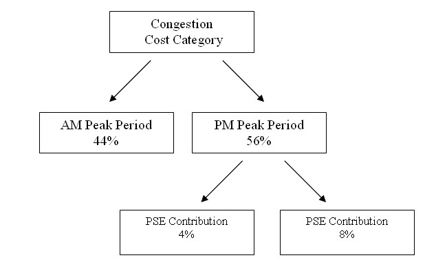
The next few paragraphs describe the methodology used to develop traffic impact estimates associated with PSEs. Cost categories associated with congestion were broken down in order to determine the portion of congestion attributable to planned special events. The steps, as outlined in Exhibit 2-14, were as follows:
- Determine the Congestion Cost Category
- Split into AM and PM peak periods
- Determine a range of values for planned special events
Exhibit 2-14: Traffic Impact Flow Diagram
Congestion Cost Categories
The first step in the process of determining the congestion caused by planned special events was to research Texas Transportation Institute's The 2007 Urban Mobility Report (UMR).9 As previously noted, this document provides congestion information on the 85 most populous urban areas in the United States. The UMR provides data on the average delay per traveler, which is defined as the extra travel time for peak period travel during the year for trips beginning during the AM peak period (6 AM to 9 AM) and the PM peak period (4 PM to 7 PM). In addition, the UMR provides data on wasted fuel per traveler.
The first two analyzed categories in the UMR estimate congestion on a per traveler basis. The following categories use population data along with congestion information to determine the raw numbers of delay and cost. These categories are: 1) travel delay, which represents the total travel time above that needed when compared to a trip at free-flow speed; 2) excess fuel consumed, which is calculated as the extra fuel consumed for trips when compared to free flow conditions; and finally 3) congestion cost, which shows the actual dollar amounts attributable to congestion.
AM Peak Period vs. PM Peak Period
The first category (average delay per traveler) is defined as the extra travel time for peak period travel during the year for trips beginning during the AM peak period (6 AM to 9 AM) and the PM peak period (4 PM to 7 PM). Planned special events rarely affect the AM peak period, since most events begin during the evening hours or on weekends. Thus, it was decided not to analyze the AM peak period and to focus on the PM peak period.
Nevertheless, when a planned special event does occur during the AM peak period, it can be especially detrimental to travelers throughout the region. One example would be a golf tournament, which typically runs all day from Thursday until Sunday. However, for this type of event the finals normally occur on the weekend and this is the main draw. Similar travel patterns occur for tennis championships and even all day concert events: while there is some additional travel during the weekday phase, the main draw of the planned special event is normally on the weekend. (It is difficult to determine congestion on weekends since it is highly site-specific. For instance, resort areas receive much more congestion on weekends, especially during their peak seasons, when compared to AM and PM peak periods. When planned special events take place on weekends, the congestion can be similar to that of a weekday commuting period with the major exception that the background, non-event traffic is much less when compared to the AM or PM peak periods.)
Some exceptions to this pattern are a dignitary's arrival or a funeral procession for a high-ranking official. These types of planned special events may occur within the AM peak period and could greatly increase congestion during that time period. Furthermore, there is often little preparation time available for this type of planned special event. In the case of a funeral procession for a high-ranking official, the route may be predetermined, but the actual implementation may have to be done within days once the schedule of activities is known. It is difficult to quantify these types of events, and the key aspect in regard to congestion is reducing background traffic during the AM peak period.
The report Peak Spreading Models Promises and Limitations, which analyzes data from the San Francisco Bay Area, indicates that 66 percent of the vehicle trips in the AM peak period (6:30 AM to 8:30 AM) and 40 percent of the vehicle trips starting in the PM peak period (4:00 PM to 6:00 PM) were home-based work trips.10 The results of this study begin to show the disparity in commuting periods as well as the types of drivers during each of the periods. The conclusion from this study is that in the San Francisco Bay Area, the PM peak period has about 26 percent more vehicle trip starts than the AM peak period.
This data was then used to extrapolate information from the Congestion Tables in the UMR and segregate the delays into the AM peak period and the PM peak period. Using the data from the UMR, the PM peak period was assigned 26 percent more of the delay component than the AM peak period.
Planned Special Event Contribution
At this point in the analysis, data has been obtained for several key categories of congestion effects for the PM peak periods. The next step in the process is to determine the percentage of the PM peak period congestion attributable to planned special events.
The congestion analyses performed in this study consider each step in the process as being equal. However, a closer look at the characteristics of each venue and each planned special event reveals that there are many factors in some locations that help to reduce congestion caused by planned special events. Specifically, availability of public transportation helps to reduce congestion on the roadways, as does a nearby interstate highway. These factors provide access to the venue and help to reduce the impacts on the local network of arterial streets.
In attempting to put congestion numbers in perspective and to estimate the order of magnitude of congestion caused by planned special events, this study assumes that all traffic conditions are equal with the exception of the presence of planned special events. The only way to obtain specific data for congestion costs for each event would be to undertake a massive data collection effort that would include travel time, speed and delay under normal operating conditions, with no incidents or accidents, and compare that to normal operating conditions with a planned special event added.
According to the report, An Initial Assessment of Freight Bottlenecks on Highways, an estimated 40 percent of congestion is caused by recurring congestion at highway sections that exceed capacity on a regular basis.11 The remaining 60 percent is caused by non-recurring congestion. The report breaks down the sources of congestion as follows:
- Recurring Congestion - 40 percent
- Traffic Incidents - 25 percent
- Bad Weather - 15 percent
- Work Zones - 10 percent
- Poor Signal Timing - 5 percent
- Special Events - 5 percent
According to this reference, planned special events account for approximately 5 percent of all congestion. In addition to the above referenced study, an additional study, The Components of Congestion: Delay from Incidents, Special Events, Lane Closures, Weather, Potential Ramp Metering Gain, and Excess Demand reached similar results.12 Specifically, a 45-mile section of Interstate 880 in the San Francisco Bay Area was studied in depth. This study determined that planned special events accounted for 4.5 percent of the total daily delay, which included the AM peak period, the PM peak period, and the off-peak periods.
The study further broke down the delay caused by special events according to direction (northbound and southbound) in the AM peak period and the PM peak period. The results showed that the percentage of delay caused by planned special events during the PM peak period was 9.3 percent in the northbound direction and 6.6 percent southbound. The percentage of delay caused by planned special events in the AM peak period was negligible and, therefore, was assumed to be zero.
Congestion Factors Due to Planned Special Events
A further breakdown of the congestion statistics in the UMR report can now be used to determine the role of planned special events. This analysis enables a determination of the key congestion factors caused by planned special events. The first congestion category in the UMR report is annual delay per traveler. Given the results of the previous studies, the annual delay per traveler in the PM peak period was determined by allocating 44 percent to the AM peak period and 56 percent to the PM peak period. The results of the other studies indicated that planned special events account for between 4 percent and 8 percent of all PM peak period delay. Utilizing this range, 4 to 8 percent of the previously determined PM peak period congestion was allocated to PSEs.
The next category analyzed in the UMR is wasted fuel per traveler. A similar approach was taken to determine the percentage of wasted fuel per vehicle attributable to planned special events. The third step in the analysis was to utilize the population figures for each city to obtain total values for the effects of congestion. This analysis is vital in order to assess congestion effects in cities of varying sizes and populations.
The next category analyzed in the UMR is travel delay. Similar to the previous breakdowns, the PM peak period was determined to account for 56 percent of this factor, and planned special events accounted for between 4 percent and 8 percent of the PM peak period congestion numbers. The final two categories analyzed in the UMR report were excess fuel consumed and congestion cost. Congestion cost includes the value of personal time, posited to be $14.60 per hour for travelers and $77.10 per hour for commercial truck time. Additional fuel consumption was based on the state’s average fuel costs.
Specific Venue Contributions to Congestion
In order to determine PSE congestion effects caused by specific events and venues in the case studies, attendance figures were used to determine the event or venue with the largest percentage of attendance in each city. Next, this venue was further analyzed to determine its impact on the region based on this percentage. The travel delay for each city is developed in case study sections of this report. These estimates were then disaggregated based on the percentage figure for the most highly attended event in the area. This analysis provided the travel delay due to the most highly attended event in the region on a yearly basis. The number of events at the venue was then used to determine the per-event statistics. This allowed a determination of the travel delay caused by each event at the most popular venue in the region. In addition to the travel delay per venue and events at the venues, the excess fuel consumed and the congestion cost were also calculated.
7Carson, Jodi and Ryan Bylsma, “2003 NCHRP Synthesis 309: Transportation Planning and Management for Special Events,” http://onlinepubs.trb.org/Onlinepubs/nchrp/nchrp_syn_309a.pdf.
8"Analysis of the Economic and Fiscal Impact of Cultural and Sporting Events in San Jose: Explanation of Recommended Methodology and Impact Assessment for Six Representative Events," Sports Economics, 2007.
9 D. Schrank, and T. Lomax, "The 2007 Urban Mobility Report," Texas Transportation Institute, September 2007.
10 C. Purvis, "Peak Spreading Models Promises and Limitations," 7th Transportation Research Board Conference on Application of Transportation Planning Methods, March 1999.
11Federal Highway Administration, "An Initial Assessment of Freight Bottlenecks on Highways" (FHWA White Paper, October 2005).
12 J. Kwon, M. Mauch, and P. Varaiya, “The Components of Congestion: Delay from Incidents, Special Events, Lane Closures, Weather, Potential Ramp Metering Gain, and Excess Demand” (presented at 85th Annual Meeting, Transportation Research Board, January 2006).