Application of Travel Time Data and Statistics to Travel Time Reliability Analyses: Handbook and Support Materials
Chapter 4. Case Study: Developing and Comparing Reliability Measures Using Different Data Sources and Analytic Methods
Analysis Framework
A series of case studies were conducted for comparison of the data sources in computing reliability measures. Table 9 shows a summary of the facilities selected for various analyses. Data from 2017 to 2019 were used except that the trajectory analysis only used 2018 data.
Table 9. Case study analysis plan.
| Analysis Scale |
Road Types |
Data/Method: Detector |
Data Method: Probe/Snapshot |
Data/Method: Probe/Virtual |
Data/Method: Trajectory |
| CA: multiple facilities |
Freeway |
Y |
Y |
Y |
– |
| MD: I-495/I-695 |
Freeway |
– |
Y |
Y |
Y |
| TN: multiple facilities |
Freeway |
Y |
Y |
Y |
– |
| MD: River Road/Rockville Pike |
Arterial |
– |
Y |
Y |
– |
| TN: multiple facilities |
Arterial |
– |
Y |
Y |
– |
| MD: multiple freeways + art facilities |
Freeway + Arterial |
– |
Y |
Y |
Y |
| Urban trip (MD) |
– |
– |
– |
– |
Y |
| Freight trips: urban + long distance |
– |
– |
Y |
Y |
– |
– = no data; Y = Yes.
California Sites:
- I–5 between Tonopath and Hubbard
- I–405 between Artesia and Century
- U.S. 101 between Burlington and Hollywood Reservoir
- State Route (SR) 91 between I–110 and I–710
- I–80 between Lagoon Valley and Leisure Town
- I–80 between Carlson and Richmond Pkwy
- I–580 between Foothill and El Charro
- U.S. 101 between Trimble and State route 237
- I–680 between Amador Valley and Deerwood
Maryland Sites:
- I–495—Old Georgetown Road in Bethesda
- I–495—Baltimore Avenue in Hollywood
- I–270—Rockville: I–495
- I–495—Georgia Avenue in Silver Spring
- I–495
- I–695
- River Road
- Rockville Pike
Tennessee Sites:
- I–24—Nashville
- I–40—Knoxville
- I–75—Knoxville
- U.S. 70—Knoxville
Results
The performance measures were calculated following the procedures described in the analysis procedure section of this document. The results were visualized to assess the differences among the different data sources and travel time methods in calculating the travel time reliability.
Speed and Travel Time Distributions
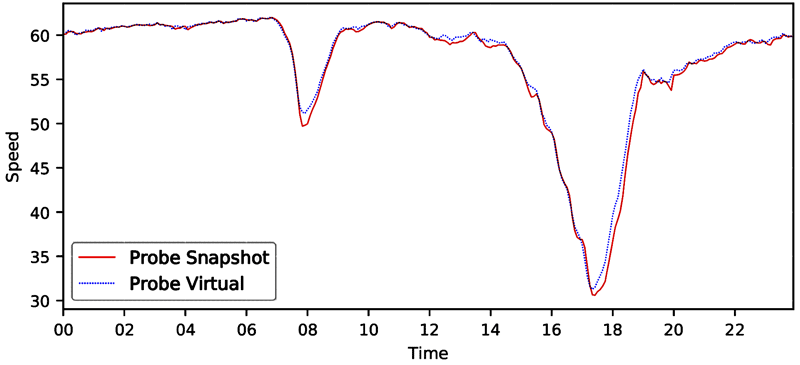
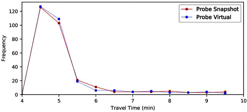
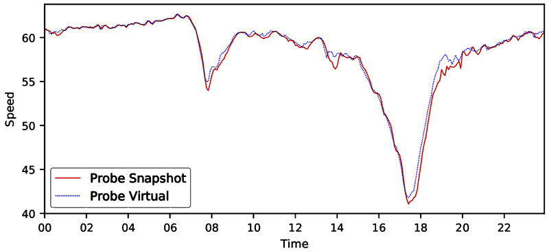
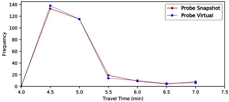
A few selected speed and travel time distributions are shown in figure 9–figure 24. These figures illustrate that:
- The probe snapshot and probe virtual, both using probe-derived link travel times, are reasonably close.
- Detector data generally has higher speeds as compared to the probe data.
- Trajectory data can have higher or lower speeds as compared to probe data and is generally more variable. Trajectory data also can have data gaps especially in less-traveled arterials.
Source: FHWA
Note: Time is the hour of the day.
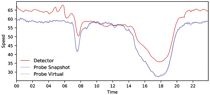
Figure 9. Line graph. Speed distribution—CA I-5 northbound 2017.
A line graph of facility speed distribution where speed is computed by three methods: detectors, probe vehicle/snapshot, and probe vehicle/virtual. The x-axis is time of day (all 24 hours) and the y-axis is speed. All three lines show a sharp dip in speeds during the morning peak hours, with lowest speeds of 35 miles per hour for the probe methods and 40 miles per hour for the detector method. Speeds derived from the two probe methods are virtually identical. Speeds derived from detectors are consistently higher than the probe methods.
Source: FHWA
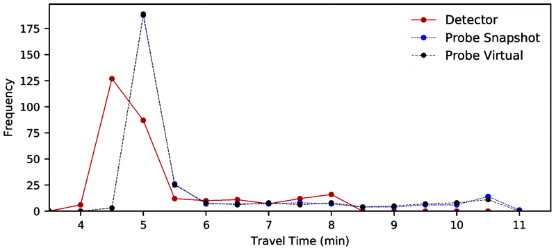
Figure 10. Line graph. Travel time distribution—CA I-5 northbound 2017.
A line graph of travel time distributions developed by three methods: detectors, probe vehicle/snapshot, and probe vehicle/virtual. The travel times derived by the two probe methods are virtually identical. Travel times derived from detectors are consistently lower than the those of the probe methods. The travel time distributions follow a skewed normal shape, with a tail towards higher travel times.
Source: FHWA
Note: Time is the hour of the day.
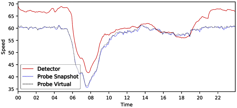
Figure 11. Line graph. Speed distribution—CA I-5 southbound 2017.
A line graph of facility speed distribution where speed is computed by three methods: detectors, probe vehicle/snapshot, and probe vehicle/virtual. The x-axis is time of day (all 24 hours) and the y-axis is speed. All three lines show a sharp dip in speeds during the morning and afternoon peak hours. Speeds derived from the two probe methods are virtually identical. Speeds derived from detectors are consistently higher than the probe methods.
Source: FHWA
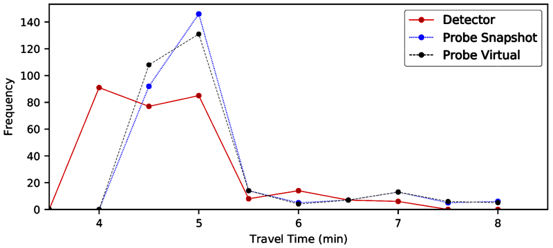
Figure 12. Line graph. Travel time distribution—CA I-5 southbound 2017.
A line graph of travel time distributions developed by three methods: detectors, probe vehicle/snapshot, and probe vehicle/virtual. The travel times derived by the two probe methods are virtually identical. Travel times derived from detectors are consistently lower than the those of the probe methods. The travel time distributions follow a skewed normal shape, with a tail towards higher travel times.
Source: FHWA
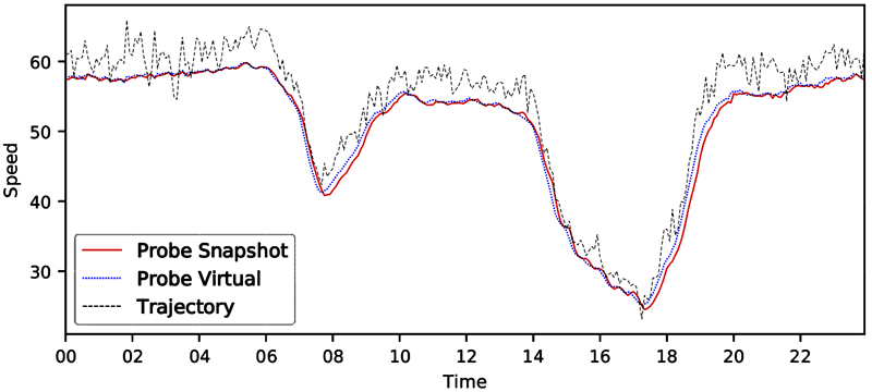
Note: Time is the hour of the day.
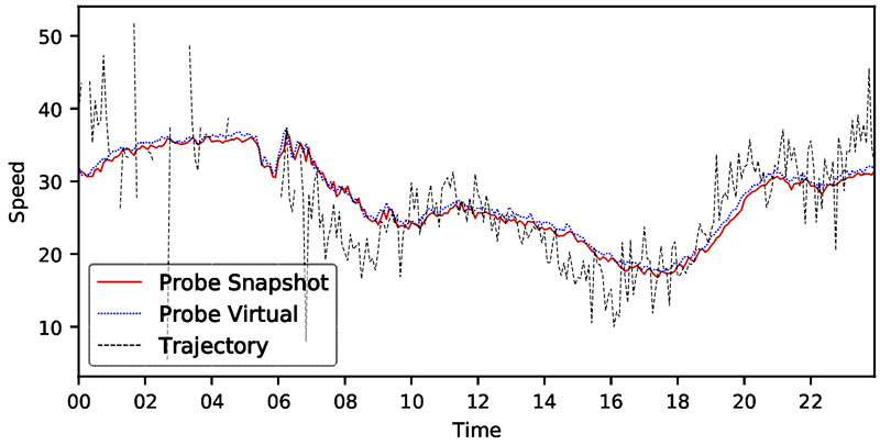
Figure 13. Line graph. Speed distribution—MD I-695 northbound 2018.
A line graph of facility speed distribution where speed is computed by three methods: trajectories, probe vehicle/virtual, and probe vehicle/trajectory. The x-axis is time of day (all 24 hours) and the y-axis is speed. All three lines show a sharp dip in speeds during the morning and afternoon peak hours, with morning peak speeds bottoming out at 40 miles per hour and afternoon peak speeds at 25 miles per hour. Trajectories detectors are consistently higher, but only slightly so, than the probe methods and exhibit a high degree of variation from time period to time period.
Source: FHWA
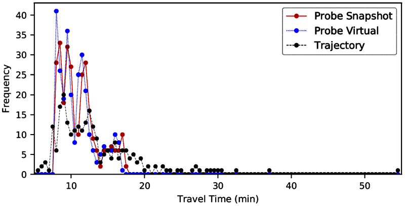
Figure 14. Line graph. Travel time distribution—MD I-695 northbound 2018.
A line graph of travel time distributions developed by three methods: trajectories, probe vehicle/snapshot, and probe vehicle/virtual. The travel times derived by the two probe methods are virtually identical. Travel times derived from trajectories are consistently slightly lower than the those of the probe methods. The travel time distributions follow a skewed normal shape, with a tail towards higher travel times.
Source: FHWA
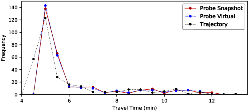
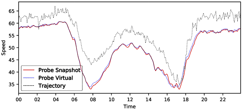
Note: Time is the hour of the day.
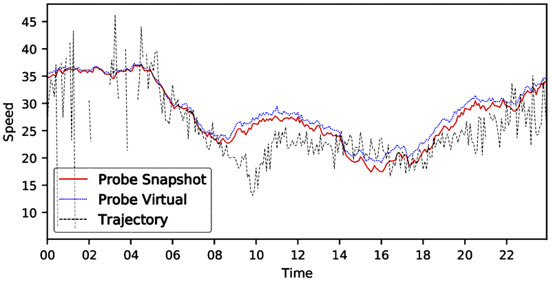
Figure 15. Line graph. Speed distribution—MD I-695 southbound 2018.
A line graph of facility speed distribution where speed is computed by three methods: detectors, probe vehicle/snapshot, and probe vehicle/trajectory. The x-axis is time of day (all 24 hours) and the y-axis is speed. All three lines show a sharp dip in speeds during the morning and afternoon peak hours, with the lowest speeds at around 32 miles per hour in both cases. Speeds derived from the two probe methods are virtually identical. Speeds derived from trajectories are consistently higher than the probe methods and exhibit a high degree of variation from time period to time period.
Source: FHWA
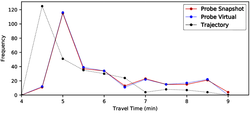
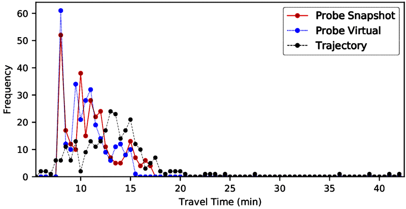
Figure 16. Line graph. Travel time distribution—MD I-695 southbound 2018.
A line graph of travel time distributions developed by three methods: trajectories, probe vehicle/snapshot, and probe vehicle/virtual. The travel times derived by the two probe methods are virtually identical. Travel times derived from trajectories are consistently lower than the those of the probe methods. The travel time distributions follow a skewed normal shape, with a tail towards higher travel times.
Source: FHWA
Note: Time is the hour of the day.
Figure 17. Line graph. Speed distribution—MD I-495 and Georgia Avenue eastbound 2018.
Source: FHWA
Figure 18. Line graph. Travel time distribution—MD I-495 and Georgia Avenue eastbound 2018.
A line graph of travel time distributions developed by three methods: trajectories, probe vehicle/snapshot, and probe vehicle/virtual. The travel times derived by the two probe methods are virtually identical. Travel times derived from trajectories are consistently lower than the those of the probe methods. The travel time distributions follow a skewed normal shape, with a tail towards higher travel times.
Source: FHWA
Note: Time is the hour of the day.
Figure 19. Line graph. Speed distribution—MD I-495 and Georgia Avenue westbound 2018.
Source: FHWA
Figure 20. Line graph. Speed distribution—MD I-495 and Georgia Avenue westbound 2018.
A line graph of travel time distributions developed by three methods: trajectories, probe vehicle/snapshot, and probe vehicle/virtual. The travel times derived by the two probe methods are virtually identical. Travel times derived from trajectories are consistently lower than the those of the probe methods. The travel time distributions follow a skewed normal shape, with a tail towards higher travel times.
Source: FHWA
Note: Time is the hour of the day.
Figure 21. Line graph. Speed distribution—TN I-40/I-75 eastbound 2018.
A line graph of facility speed distribution where speed is computed by two methods: probe vehicle/snapshot and probe vehicle/trajectory. The x-axis is time of day (all 24 hours) and the y-axis is speed. Both lines show a dip in speeds during the morning and afternoon peak hours, with the afternoon peak showing speeds that bottom out at about 30 miles per hour and morning speeds at around 50 miles per hour. Speeds derived from the two probe methods are virtually identical.
Source: FHWA
Figure 22. Line graph. Travel time distribution—TN I-40/I-75 eastbound 2018.
A line graph of travel time distributions developed by two methods: probe vehicle/snapshot and probe vehicle/virtual. The travel times derived by the two probe methods are virtually identical. The travel time distributions follow a skewed normal shape, with a tail towards higher travel times.
Source: FHWA
Note: Time is the hour of the day.
Figure 23. Line graph. Speed distribution—TN I-40/I-75 westbound 2018.
A line graph of facility speed distribution where speed is computed by two methods: probe vehicle/snapshot and probe vehicle/trajectory. The x-axis is time of day (all 24 hours) and the y-axis is speed. Both lines show a dip in speeds during the morning and afternoon peak hours, with the afternoon peak showing speeds that bottom out at about 40 miles per hour and morning speeds at around 55 miles per hour. Speeds derived from the two probe methods are virtually identical.
Source: FHWA
Figure 24. Line graph. Travel distribution—TN I-40/I-75 westbound 2018.
A line graph of travel time distributions developed by two methods: probe vehicle/snapshot and probe vehicle/virtual. The travel times derived by the two probe methods are virtually identical. The travel time distributions follow a skewed normal shape, with a tail towards higher travel times.
PTI Results by Data Source/Method
The PTI is an important measure that indicates the reliability of a facility. This study compares the PTI values of each facility to identify potential patterns of the different data source/method.
The x-axis in figure 25 and figure 26 shows the individual facilities and the y-axis shows the PTI values. The plotted shapes represent the PTIs based on different data source and calculation methods. Some observations include:
- Probe snapshot and probe virtual results are very similar, with probe snapshot PTI values slightly higher than the probe virtual ones (the empty triangle-, diamond-, and circle-shaped points on the graph are close to but slightly higher than the filled shapes).
- Detector PTI values are lower than the ones from the probe-based methods (the circle shape filled with stripes are lower than the empty shapes).
- Trajectory PTI values are generally higher than that of the probe-based methods, but the opposite cases exist as well (the diamond shape filled with stripes are generally higher than the empty shapes).
- The PTI differences (height differences of the triangles) generally increase as the PTI values increase. In other words, the differences in data/method are more obvious for high PTI values.
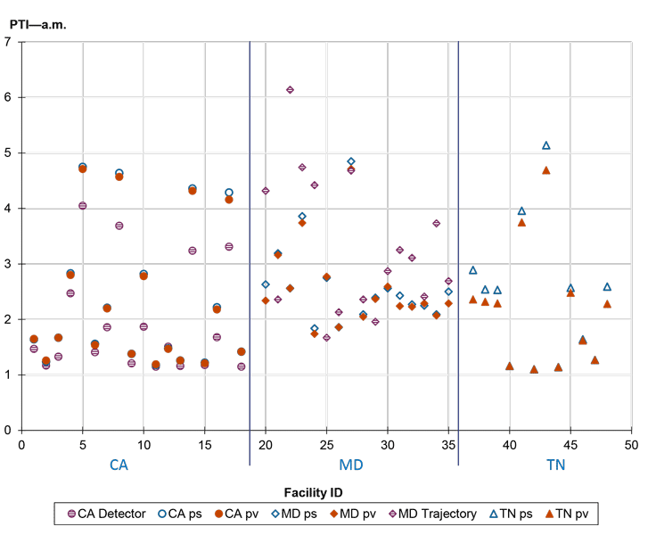
Source: FHWA
Figure 25. Scatterplot. Facility planning time index by data/method—a.m.
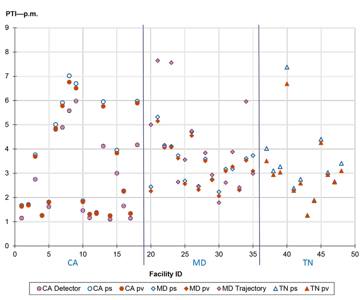
Source: FHWA
Figure 26. Scatterplot. Facility planning time index by data/method—p.m.
Relationships Between Measures by Data Source/Method
As shown in these figures:
- The PTI, TTI80, and TTI are correlated, as the three values are different percentile of speeds over free-flow speeds.
- The PTI and TTI are somewhat correlated with semistandard deviation.
- The PTI and TTI are not well correlated to the LOTTR metric. This lack of a correlation may lead to discrepancies in determining if a facility is reliable.
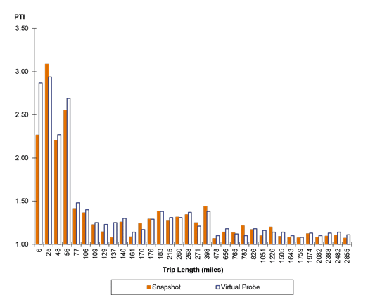
Source: FHWA
Figure 27. Bar graph. Difference in planning time index values by method, continuous trips throughout the year.
Shows the relationship between the PTI and trip length for truck trips, where PTI is calculated by two methods: probe vehicle/snapshot and probe vehicle/virtual. The x-axis is trip length and the y-axis is PTI. The probe vehicle/virtual method generally results in a slightly higher estimate of PTI. As trip lengths increase, the value of PTI drops substantially, as vehicles traverse an increasing amount of low congestion conditions in rural areas.
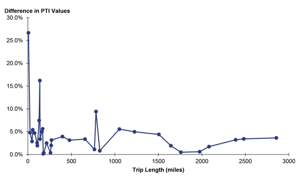
Source: FHWA
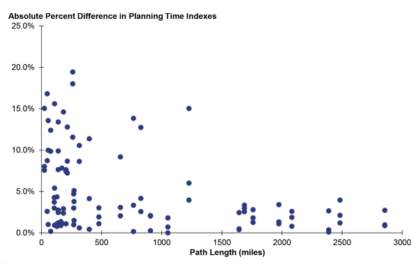
Figure 28. Line graph. Percent difference in planning time index values for continuous trips throughout the year.
A line graph showing the percent difference in the PTI estimates between the probe vehicle/snapshot and probe vehicle/virtual methods for different trips lengths. For short distance trips, the percent difference is highly variable but is generally larger. As trip lengths increase, the percent error drops substantially.
Source: FHWA
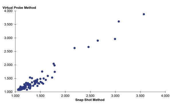
Figure 29. Scatterplot. Planning time index values by computation method for discrete trip start times.
The PTI values computed by the probe vehicle/snapshot and probe vehicle/virtual methods for individual facilities where the x-axis is the probe vehicle/snapshot method and the y-axis is the probe vehicle/virtual method. For values of PTI below 1.7, the two methods produce roughly equivalent values. For higher values of PTI, the virtual probe method produces slightly higher values of PTI.
Source: FHWA
Figure 30. Scatterplot. Percent difference in planning time index values for different methods, discrete trip start times.
Examining Reliability Definitions: PTI versus PM3 System Reliability
The idea behind this analysis is to see how well a widely used reliability measure (PTI) corresponds to the PM3 measure of system reliability for individual facilities. While the PM3 measures and metrics were intended to capture system conditions, it is useful to compute metrics at a project level, especially after improvements, to gauge the improvement's effect on targets. For this analysis, system reliability is computed using the same method as for the system. PTI is measured for the period in which traffic volume peaks during either a weekday a.m. or p.m. The periods for calculating PTI are the same as for computing LOTTR metrics: either on a weekday 6:00–10:00 a.m. or a weekday 4:00–8:00 p.m. Additional data were recruited for this analysis:
- Freeways: Interstates in Fairfax and Prince William County, VA; freeways in Los Angeles and San Francisco.
- Signalized arterials:
- FL 319 and U.S. 90 in Tallahassee, FL
- U.S. 441 and TN 62 in Knoxville, TN
- VA 7 in Fairfax County, VA
As with the previous analyses, the data were grouped into directional facilities.
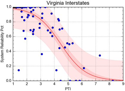
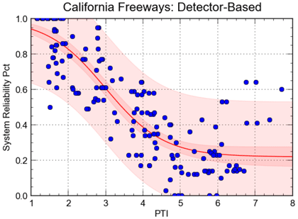
Figure 31 and figure 32 show the relationship between PM3 system reliability and PTI for Northern Virginia interstates and the California freeways used previously. The concept here is that if one measure depicts an unreliable facility, the other measure should also. For example, a PTI = 3.0 on freeways corresponds roughly to a speed of 20 mph, indicating unreliable conditions. However, the figures show that a general relationship exists, with system reliability degrading with increasing PTI as would be expected, but the data are widely scattered.
For the signalized arterial comparison, the new locations in Florida, Tennessee, and Virginia were added to those used from Maryland and Tennessee, which were used in the earlier analyses. Figure 33 again shows a general relationship between system reliability and PTI, but the correlation is much weaker.
Source: FHWA
Figure 31. Graph. Relationship between Performance Measure Rule 3 System Reliability Measure and planning time index, Northern Virginia Interstates.
Source: FHWA
Figure 32. Graph. Relationship between Performance Measure Rule 3 System Reliability Measure and planning time index, Los Angeles and San Francisco freeways.
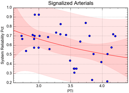
Source: FHWA
Figure 33. Graph. Relationship between Performance Measure Rule 3 System Reliability and planning time index, signalized arterials in several States.