Case Study Analyses
The case study analyses, performed according to the previously described 10-step process, are presented in the following subsections.
Construction and Project Information
Given that the GO I-10 project involved both major rehabilitation efforts and new infrastructure construction, the TxDOT El Paso District undertook a comprehensive effort to inform the public about actual and cancelled construction activities through an extensive media campaign. The TxDOT El Paso District issued press releases with information on each lane closure three weeks in advance. As a result, extensive project and work zone information was available for this case study.
Analysis Type
The objective of this case study is to present an analytical procedure for measuring actual work zone performance. Therefore, the analysis presented herein is descriptive and exploratory, rather than predictive or prescriptive, which are both better suited for predicting and managing future performance. The case study presents two different applications of the process:
- Scenario 1 – A hypothetical scenario for measuring work zone performance during construction as though the GO I-10 project is currently underway. This scenario illustrates how agencies can monitor and manage work zone mobility performance during the construction phase.
- Scenario 2 – Post-hoc work zone performance measurement for a longer time period. This scenario illustrates how agencies may conduct post-hoc mobility performance measurement using NPMRDS data.
Table 1 and table 2 provide the analysis parameters used for the two scenarios, respectively.
| Analysis Purpose | Work zone mobility performance measurement during construction (hypothetical, illustrative) |
| Analysis Tool | Microsoft® Excel
|
| Geographic Resolution | Two years prior to construction start |
| Work Zone Data Period | November 2015 to April 2016
|
Source: FHWA
| Analysis Purpose | Post-hoc work zone mobility performance measurement |
| Analysis Tool | R statistical analysis software
|
| Baseline Period | Two years prior to construction start |
| Work Zone Data Period | November 2015 to December 2017 |
Source: FHWA
Performance Metrics and Visualizations
The case study project team calculated the following performance metrics for Scenarios 1 and 2 mentioned above:
- Average travel time and speed for baseline and work zone conditions
- Number of underperforming instances (hours) when observed travel time was higher than the threshold, and the average travel time for each underperforming hour
- Average speeds for baseline and work zone conditions
- Travel time reliability metrics – Travel Time Index and Planning Index
- Road user costs
The case study project team developed the following charts using the metrics:
- Heat maps showing speeds for the different work zone areas
- Line graphs showing average travel time and speeds by month, day of week, and hour
- Box `My plots showing hourly, daily, and seasonal travel time variation
- Line graphs showing travel time index and planning time index
- Bar graphs and line graphs showing aggregated delays
NPMRDS Data Download
The following are the data download parameters chosen for the GO I-10 case study:
- Work zone area of interest. This case study included only the mainline I-10 corridor in the work zone area of interest; frontage roads, nearby arterial streets, or other network elements were not included. The advance area was four miles upstream of the work zone, and the termination area was two miles downstream of the work activity area. This allowed the analysis to capture both queue buildups and discharges. When mapped to NPMRDS Traffic Message Channel (TMC) segments, the resultant corridor consists of 30 TMC segments.
- Data aggregation (averaging). A one-hour aggregation interval was used because it offers a good balance between analysis granularity and data volume. As a general guide, agencies may start with a one-hour aggregation interval and graduate down to lower levels of granularity depending upon the specific analysis needs and work zone characteristics. for example, more granular data aggregations are generally more appropriate for more detailed and micro-level simulation and queuing analyses to study specific highway sections or localized congestion problem spots.8
- Data elements. Average observed travel times, speeds, and the reference speeds (free flow speeds) were downloaded for each of the 30 TMCs for the baseline and work zone periods. The case study project team cleaned the downloaded data by imputing missing and incomplete entries, thereby avoiding bias in calculating average travel time. This analysis uses only passenger vehicle data (i.e., does not include truck data).
Performance Thresholds
Travel time was the analysis focus for this case study. A threshold of 25-percent increase from the average travel time was used to identify instances where the corridor underperformed (i.e., users experienced unacceptable delays). The case study project team applied the 25-percent threshold independently for the baseline and the work zone periods, represented by the following formulae:
- Baseline Threshold Travel Time = 1.25 x (Average Travel Time during baseline period)
- Work Zone Threshold Travel Time = 1.25 x (Average Travel Time during work zone period)
This approach of calculating threshold travel times independently for the baseline and work zone periods accounts for adjusted travel time expectations that the traveling public may have for the work zone period (i.e., they may expect some increase in travel time due to the work zone).
This case study focuses on travel time, so it did not apply thresholds for any of the other measures. Agencies may choose to apply thresholds for other metrics including speed, travel time reliability, and road-user costs.
Calculations and Results: Scenario 1 – Hypothetical Scenario as though the GO I-10 Project is Currently Underway
Corridor travel time and corridor speed are two foundational metrics for mobility performance. The simplest way to aggregate travel times across multiple, sequential TMCs is to sum the individual TMC travel times at a given time of day to calculate the average travel time for the corridor. Average corridor speed at a given time of day is computed by dividing the length of the corridor by the travel time. Refer to Step 6 in the appendix for additional details on methods to calculate these metrics.
The case study project team used the Estimated Travel Time method to calculate the average corridor travel time, and then divided the travel time by the corridor length to calculate the average speed. Then, the impact of the work zone activities for the six-month construction period was compared with the baseline traffic conditions observed in the preceding one year before construction.
The following steps were taken for the analysis:
- Determined the average hourly travel times for the baseline and work zone periods
- Applied the 25-percent threshold to identify underperforming instances for both the baseline and work zone periods (i.e., hours when the corridor travel time exceeded 125 percent of the average travel time)
- Tallied the total number of underperforming hours and the magnitude of underperformance
This section focuses on a trend analysis of traffic operations during the baseline period and when the GO I-10 project was underway. Trends on corridor performance, average daily travel time, travel time variability, and average delays are presented below.
Corridor Performance Trends
Table 3 and table 4 summarize the average travel time, threshold travel time, and the count of instances (i.e., one-hour interval) when traffic underperformed both in the baseline period and during work zone conditions in the eastbound and westbound directions of travel, respectively.
The following are the key takeaways from the metrics presented in table 3 and table 4:
- Overall, the average travel time for the corridor increased marginally during the first six-month work zone period when compared with the baseline period. However, in some months the average underperforming travel time during work zones was lower compared to the baseline (e.g., in January 2016).
- In general, the work zone impacts in the eastbound direction were comparatively higher than those in the westbound direction.
- On average, the count of underperforming instances during the work zone activities increased by 37 percent and 15 percent in the eastbound and westbound directions, respectively, compared to the baseline period. However, the count of underperforming instances during work zone activity in January 2016 was lower compared to the baseline condition. The extent of the underperforming instances (in terms of average underperforming travel times) was highest in November 2015 and April 2016 in the eastbound direction during work zone period. Similarly, in the westbound direction, the extent of the underperforming instances was highest in December 2015 and March 2016, while the travel time in the other months was actually less than the baseline condition.
- The average travel time during the work zone period in the winter months was lower than what was observed in the one-year baseline period. However, when the travel times in these months were compared to the travel times in the same months of the previous year, there was a marginal increase.
| Condition | Time Period | Average Travel Time (min) | Threshold Travel Time (min) | Count of Underperforming Instances | Average Underperforming Travel Time (min) |
|---|---|---|---|---|---|
| Baseline | Nov-14 to Oct-15 | 10.6 | 13.3 | 616 (~51 per month) |
20.5 |
| Work Zone | Nov-15 to Apr-16 | 11.0 | 13.8 | 422 (~70 per month) |
21.7 |
| Work Zone | Nov-15 | 11.1 | 13.9 | 62 | 22.9 |
| Work Zone | Dec-15 | 11.2 | 14.0 | 80 | 21.4 |
| Work Zone | Jan-16 | 10.1 | 12.6 | 39 | 17.7 |
| Work Zone | Feb-16 | 10.6 | 13.3 | 57 | 19.5 |
| Work Zone | Mar-16 | 11.5 | 14.4 | 92 | 21.5 |
| Work Zone | Apr-16 | 11.8 | 14.7 | 92 | 24.3 |
Source: FHWA
| Condition | Time Period | Average Travel Time (min) | Threshold Travel Time (min) | Count of Underperforming Instances | Average Underperforming Travel Time (min) |
|---|---|---|---|---|---|
| Baseline | Nov-14 to Oct-15 | 10.3 | 12.9 | 774 (~65 per month) |
17.6 |
| Work Zone | Nov-15 to Apr-16 | 10.4 | 12.9 | 422 (~75 per month) |
17.4 |
| Work Zone | Nov-15 | 10.2 | 12.7 | 65 | 16.8 |
| Work Zone | Dec-15 | 10.5 | 13.2 | 82 | 18.6 |
| Work Zone | Jan-16 | 9.9 | 12.4 | 57 | 15.9 |
| Work Zone | Feb-16 | 10.2 | 12.8 | 70 | 16.5 |
| Work Zone | Mar-16 | 11.1 | 13.9 | 105 | 19.6 |
| Work Zone | Apr-16 | 10.2 | 12.7 | 71 | 15.6 |
Source: FHWA
Hourly Average Travel Time Trends
Figure 3 and figure 4 show the trend of the hourly average travel time by day of week in the eastbound and westbound directions, respectively, during the first six months of construction. For example, the hourly average travel times on Monday in November is calculated by averaging the travel times of all Mondays in November by hour of day. In the eastbound direction, travel time was the highest during the morning peak hours and is sustained through afternoon and evening hours. As discussed earlier, the month of January did not experience excessive increase in travel time compared to the other months, while April experienced the highest increase in travel time. Saturday experienced the highest variability in travel time, followed by Monday and Wednesday, while Sunday experienced the least variability. On the other hand, in the westbound direction, travel time was the highest mostly in the afternoon peak hours. The highest travel time was experienced in March, while the lowest was in January.
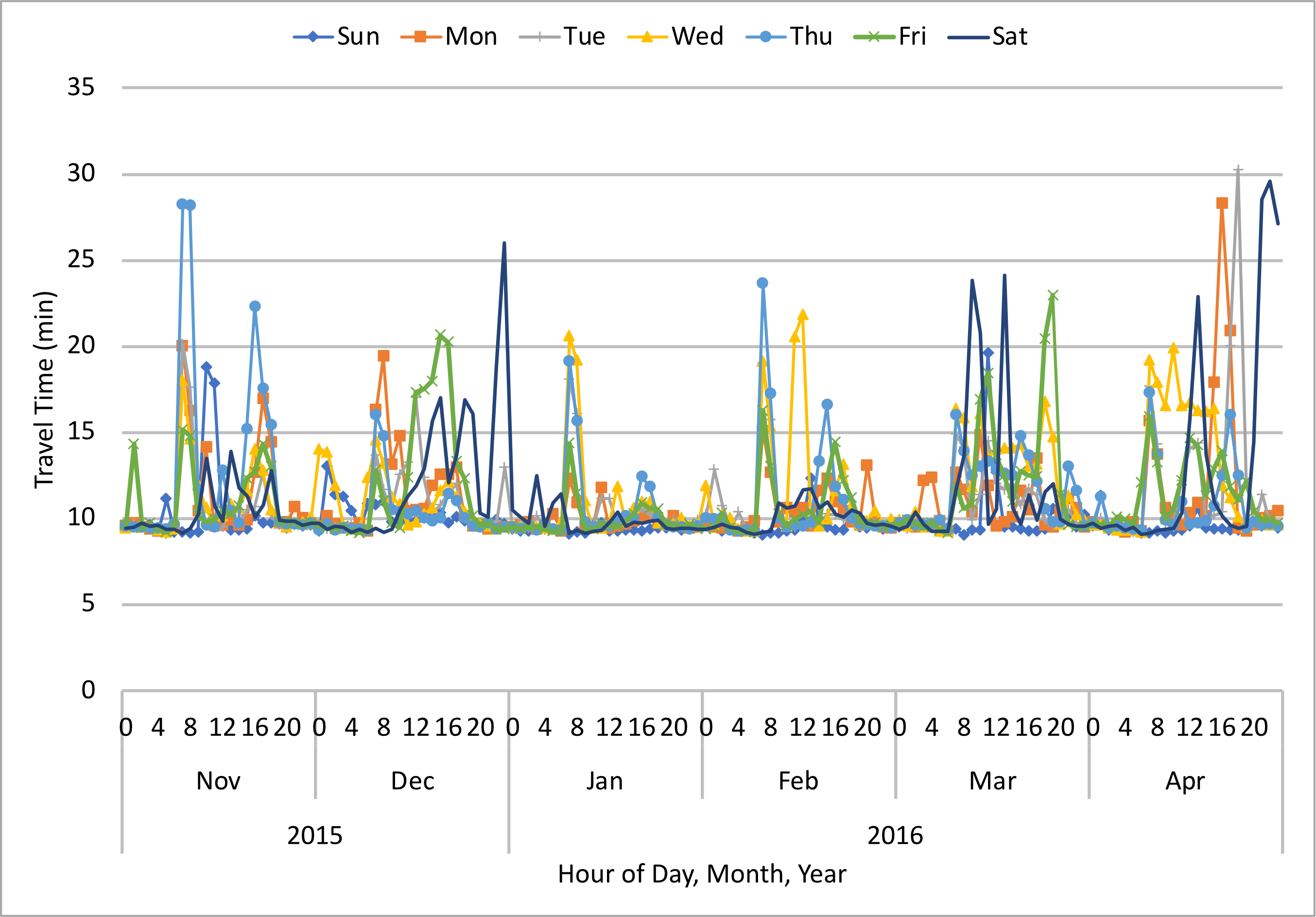
Figure 3. Graph. Scenario 1 - Average hourly travel times during the first six-month construction period in eastbound
direction
Source: FHWA
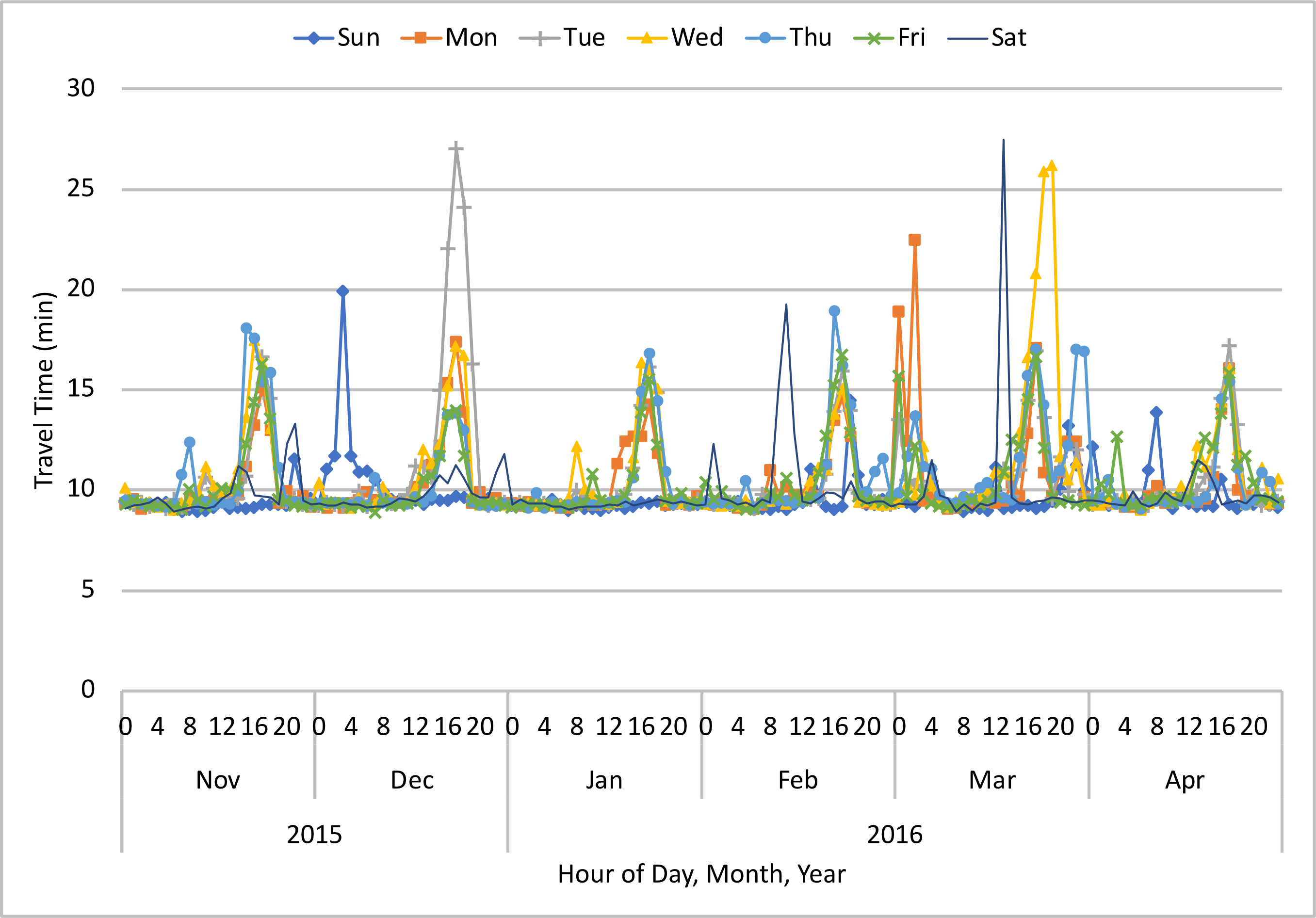
Figure 4. Graph. Scenario 1 - Average hourly travel times during the first six-month construction period in westbound
direction
Source: FHWA
Travel Time Variability When Traffic Underperformed
Figure 5 and figure 6 show the variability of travel time in the first six-month construction period when traffic underperformed (i.e., when the observed travel time was higher than the threshold travel time) in the eastbound and westbound directions, respectively. The box plots show the distribution of travel time in different months, which provide some insight into the travel time variability. In the eastbound direction, March experienced the highest travel time variability followed by December and November. January and February experienced the least variability in travel time. Conversely, travel time variability was fairly stable in the westbound direction except in March when it was slightly higher compared to the other months. In comparison to the eastbound direction, the westbound direction experienced lower variability in travel time.
Note: The graphic to the right shows how to interpret the box plots shown in figure 5 and figure 6. A key takeaway from these charts is that the NPMRDS provides a rich history of 24/7 data, which agencies can use for variability and trend analyses that will help them better understand what drives work zone performance.
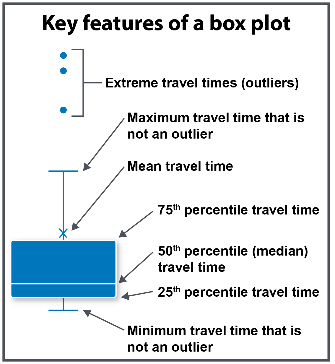
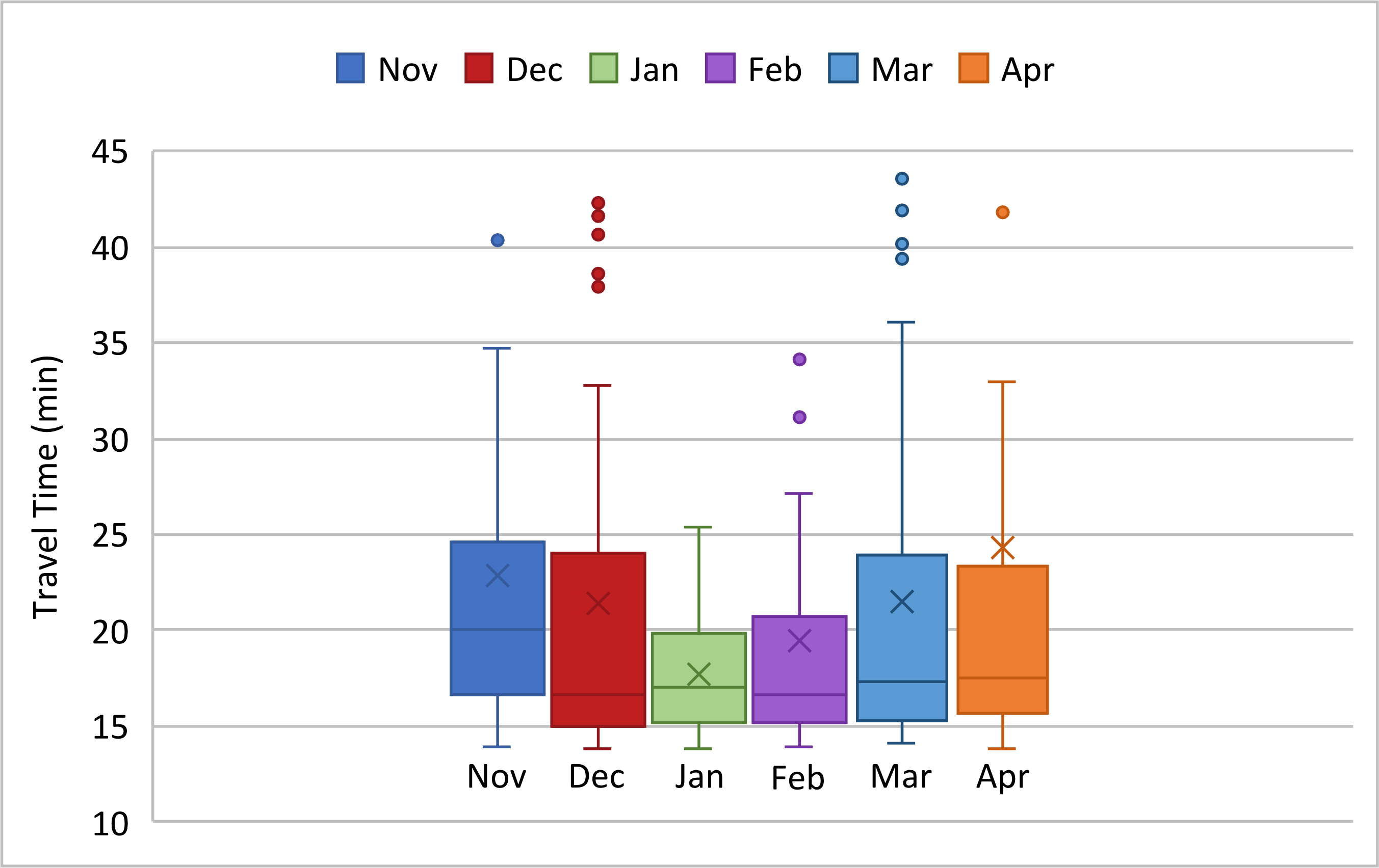
Figure 5. Graph. Scenario 1 - Travel time variability during the first six-month construction period when traffic
underperformed in eastbound direction
Source: FHWA
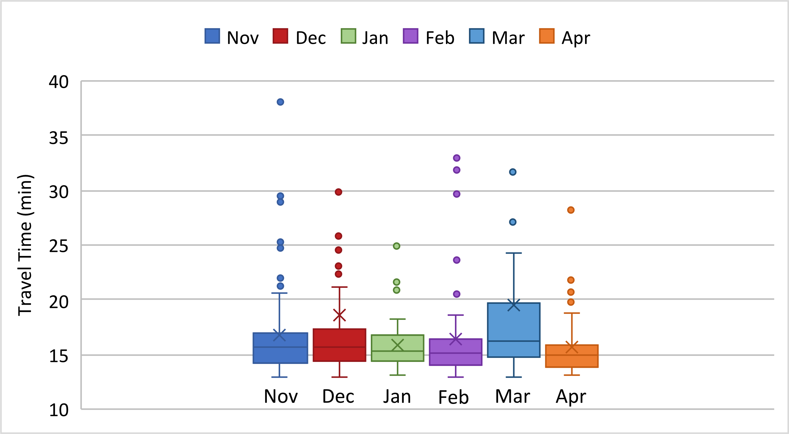
Figure 6. Graph. Scenario 1 - Travel time variability during the first six-month construction period when traffic
underperformed in westbound direction
Source: FHWA
Delay Trends
Figure 7 and figure 8 show the total delay by hour of day aggregated on a monthly basis when traffic underperformed (i.e., when average hourly travel times exceeded the threshold travel time) during the first six months of work zone activities in the eastbound and westbound directions, respectively. Delay is computed as the difference between the observed travel time and the travel time threshold.
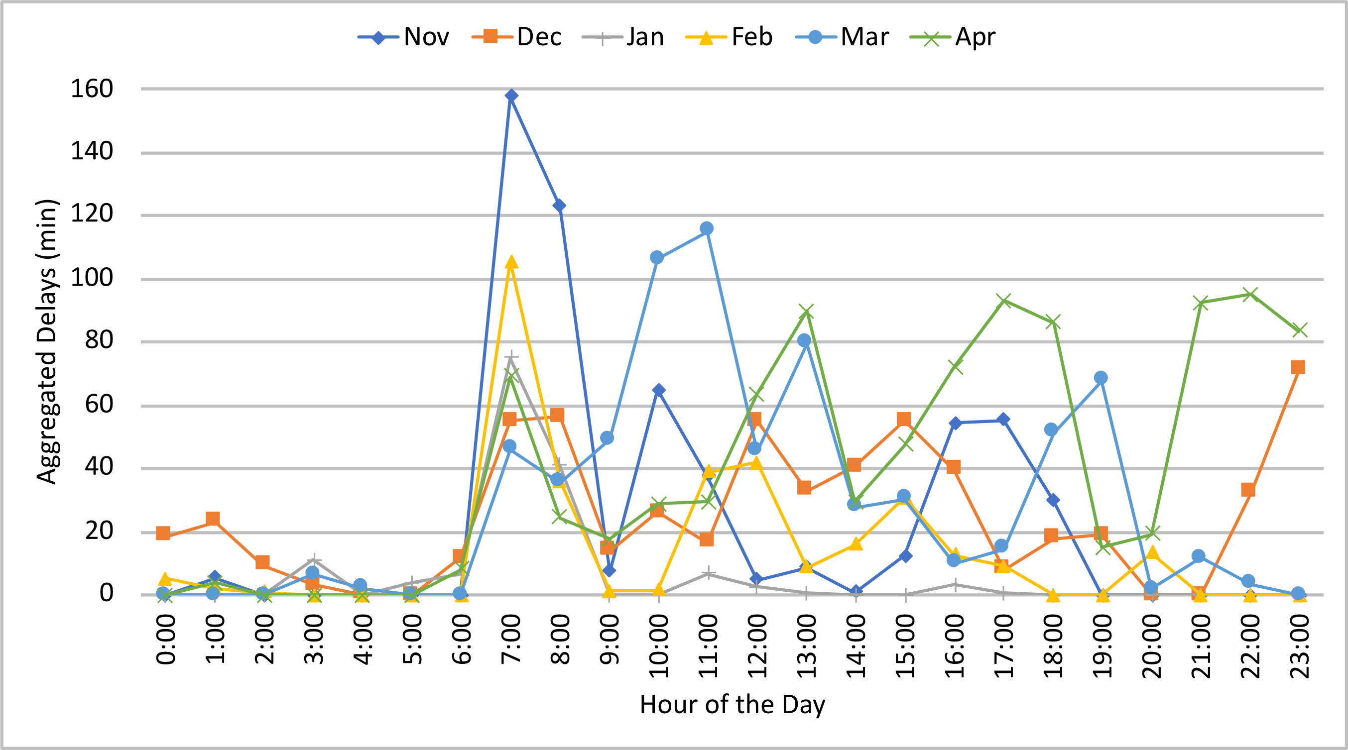
Figure 7. Graph. Scenario 1 - Delay trends during the first six-month construction period in eastbound direction
Source: FHWA
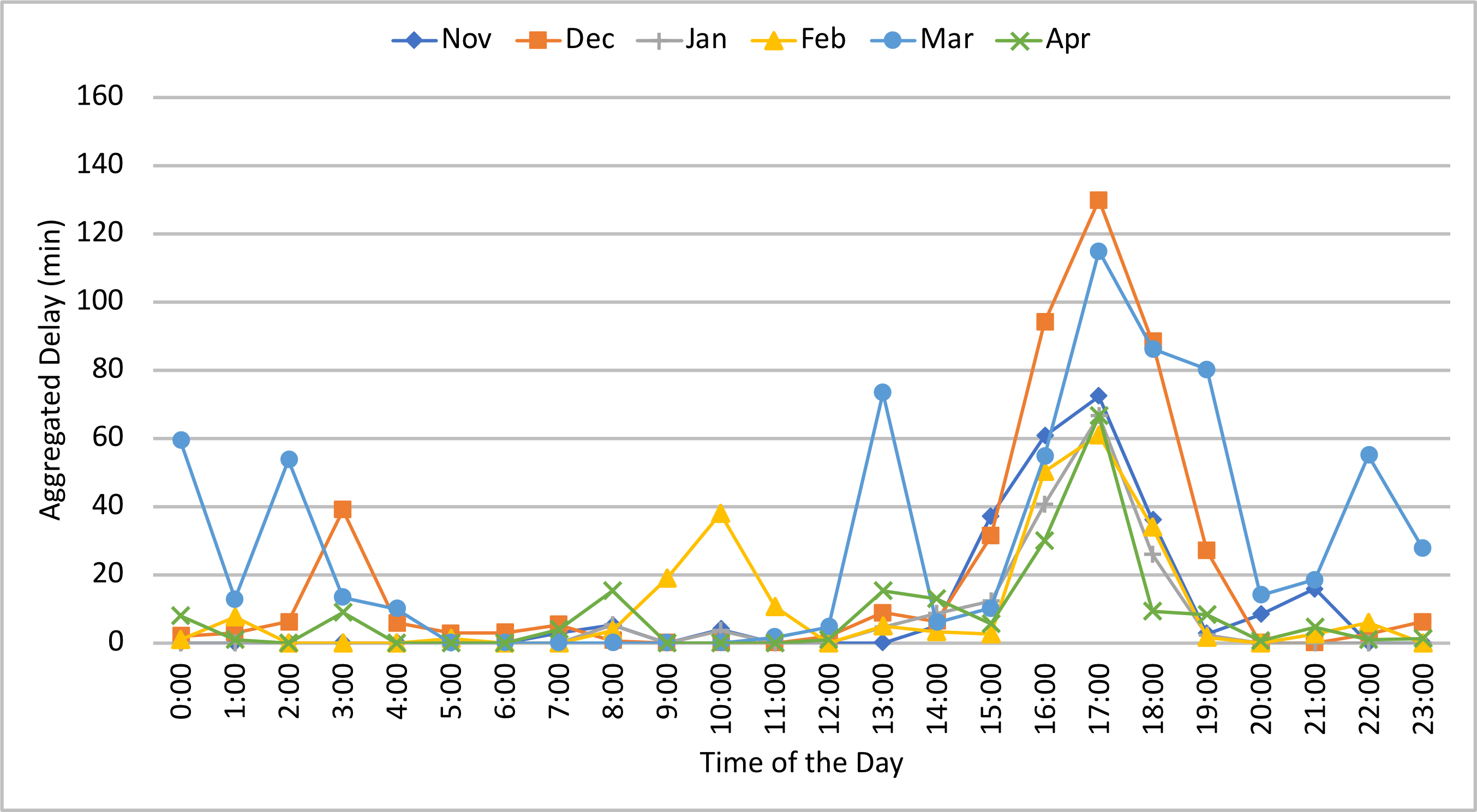
Figure 8. Graph. Scenario 1 - Delay trends during the first six-month construction period in westbound direction
Source: FHWA
These charts help in understanding what hours of the day had the highest total delay for the month, along with how delays trended across the first six months of construction. In the eastbound direction, the pattern of the delay was inconsistent, although typically the delay occurred in the morning peak hours. November had higher delays in the morning peak hours, with some delays in mid-day and late afternoon hours. In December, the delays were concentrated in the morning peak hours and afternoon hours, with some delays around midnight. January saw delays only during the morning peak hours. Most of the delays in February were in the morning peak hours, with some delays around mid-day. The delays in March were mostly experienced around mid-day, with some delays in the evening. April experienced a unique delay pattern, with heavy delays spread across the morning peak, early afternoon, late afternoon, and late evening hours. Conversely, the delays in the westbound direction were relatively consistent in pattern, and most of the delays occurred in the afternoon peak, with some delays in the early night hours. Overall, December and March experienced the highest delays, while January experienced the least. In general, the delay extent in the eastbound direction was higher than the westbound direction.
 Using NPMRDS data, agencies can analyze trends across key performance measures to evaluate the impact of work zone activities and try to
understand how those impacts evolve as construction progresses. Such trend analyses (coupled with mobility, travel behavior, weather, and
other data) could assist agencies to learn which strategies worked well, which did not, and how those strategies can be adjusted in the
future. Trend analysis is not only useful for historical performance analysis but also for developing future projections of work zone
performance, which can lead to better work zone planning and impact mitigation.
Calculations and Results: Scenario 2 – Post-hoc Work Zone Performance Measurement for a Longer Time Period
Corridor travel time and corridor speed are two foundational metrics for mobility performance. One way to aggregate travel times across multiple, sequential TMCs is to sum the individual TMC travel times at a given time of day to calculate the average travel time for the corridor. Average corridor speed at a given time of day is computed by dividing the length of the corridor by the travel time. Refer to Step 6 in the appendix for additional details on methods to calculate these metrics.
The case study project team used the Estimated Travel Time method to calculate the average corridor travel time, and then divided the travel time by the corridor length to calculate the average speed. Then, the impact of the work zone activities during the first two years of construction was compared with the baseline traffic conditions observed in the preceding two years before construction.
The following steps were taken for the analysis:
- Determined the average hourly travel times for the baseline and work zone periods
- Applied the 25-percent threshold to identify underperforming instances for both the baseline and work zone periods (i.e., hours when the corridor travel time exceeded 125 percent of the average travel time)
- Tallied the total number of underperforming hours and the magnitude of underperformance
The case study project team did not consider the effects of other influencing factors (e.g., incidents, crashes, adverse weather conditions, special events) on corridor performance.9 Agencies may choose to consider and appropriately discount data points reflective of excessive delays caused by these external factors.
Overall Corridor Performance
Table 5 summarizes the average travel time, threshold travel time, and the count of instances (i.e., one-hour intervals) when traffic underperformed both in the baseline period and during work zone conditions in each direction of travel.
| Condition | Travel Direction | Average Travel Time (min) | Threshold Travel Time (min) | Count of Underperforming Instances (1-hour periods) | Average Underperforming Travel Time (min) |
|---|---|---|---|---|---|
| Baseline | Eastbound | 9.7 | 12.1 | 1,676 | 20.1 |
| Baseline | Westbound | 9.4 | 11.8 | 1,611 | 16.9 |
| Work Zone | Eastbound | 10.2 | 12.8 | 3,020 | 21.1 |
| Work Zone | Westbound | 10.0 | 12.5 | 2,256 | 19.5 |
Source: FHWA
The following are the key takeaways from the metrics presented in table 5:
- The average travel time for the corridor increased marginally during the work zone period when compared with the baseline period.
- For a comparable two-year timeframe, the number of underperforming hours was about 60 percent higher during the work zone period. On average, the extent of the under-performance also was higher during the work zone period (i.e., an increase of 1.0 minutes or 4 percent for the eastbound traffic and 1.6 minutes or 9 percent for westbound traffic).
- The work zone impacts in the eastbound direction were comparatively higher than those in the westbound direction.
The case study project team also calculated the number of days that motorists were exposed to underperforming traffic conditions. Over the two-year construction period, there were 659 days with one or more underperforming instances in the eastbound direction, while there were 598 days in the westbound direction. Comparatively, the number of days with one or more underperforming instances in the baseline period in the eastbound and westbound directions was 538 and 523, respectively.
Average Traffic Speed
The typical delays on the construction site can be represented by the decrease in the average traffic speed along the 10-mile corridor. Figure 9 uses a heat map to illustrate the average speed in the eastbound direction, both in the baseline and work zone conditions, when traffic underperformed. The start and end of the work zone locations are indicated by the dotted lines. The chart also highlights the location of multiple ramps from and to I-10, CanAm Highway Route 85, and Sunland Park Drive (which give access to nearby shopping areas and the border crossing to Mexico). In general, the average traffic speed under work zone conditions was mostly lower than the baseline scenario. In the eastbound direction, congestion was apparent during the day when construction activities were in progress, specifically during the morning peak and early afternoon hours. In addition, most of the congestion due to the work zone activities occurred within the construction site (i.e., traffic was free flowing both upstream and downstream of the work zone).
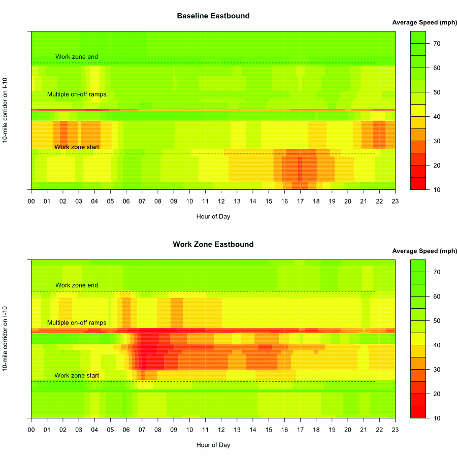
Figure 9. Graph. Scenario 2 - Average traffic speed during baseline and work zone conditions in eastbound direction
Source: FHWA
Similarly, figure 10 shows the average traffic speed along the 10-mile corridor in the westbound direction. The westbound traffic experienced fewer delays compared to eastbound traffic. The typical congestion due to work zone activities occurred during the afternoon peak hours and was located upstream of the construction site. In addition, there was slight congestion in the early morning and late evening hours that occurred at the beginning of the construction site.
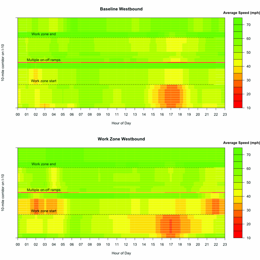
Figure 10. Graph. Scenario 2 - Average traffic speed during baseline and work zone conditions in westbound direction
Source: FHWA
 Such figures assist in visualizing where and when congestion occurred and thus can be useful to adjust traffic control strategies to mitigate
the impact of work zone activities. Similarly, these observations can help traffic engineers identify an optimal location for placing queue
warning systems or dynamic message signs to inform travelers about upcoming traffic conditions.
Hourly, Daily, and Seasonal Travel Time Variability
Traffic is dynamic with different daily, weekly, and seasonal patterns. Examining the distributions of travel time across the hours of the day, days of the week, and months of the year can capture the impact of work zone activities in a variety of traffic patterns. Such analysis will enable agencies to better understand work zone traffic and travel time patterns and appropriately adjust their work zone management strategies. The NPMRDS provides 24/7 data coverage of the entire NHS. It enables engineers and analysts to better understand temporal and spatial variability in transportation system performance and is a rich data resource for performance-driven work zone management.
Figure 11 shows the distribution of hourly travel times during the baseline and work zone underperforming conditions (i.e., when hourly travel times exceeded the threshold travel time) in the eastbound and westbound directions. Note that the baseline condition refers to the two-year time period before construction started (November 2013 through October 2015), and work zone conditions refer to the two-year time period after the construction project started (November 2015 to December 2017). Overall, the hourly travel times during work zone activities were consistently higher than the corresponding travel times in the baseline conditions. Increases in the average hourly travel times due to work zone activities were observed in the morning and afternoon peak hours in the eastbound direction. In the westbound direction, the majority of the increased travel times were observed in the afternoon peak hours and late evening hours. In many cases, the interquartile range of the hourly travel times during the work zone period was higher than the baseline period. This suggests an increase in unreliability of travel time (i.e., higher variability in travel time) during the work zone period. However, there could be confounding variables that the case study project team was not able to control in this analysis because of lack of access to additional information such as weather conditions, work zone activity, work zone traffic management strategies, and incidents, as well as changes in regional travel behavior and options.
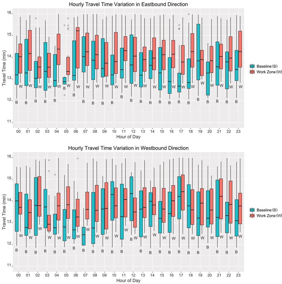
Figure 11. Graph. Scenario 2 - Distribution of hourly travel times during baseline and work zone conditions
Source: FHWA
Figure 12 shows the distribution of travel times in the morning and afternoon peak hours (6:00 a.m. to 9:00 a.m. and 4:00 p.m. to 7:00 p.m.) by day of the week during underperforming conditions. In the eastbound direction, the average peak hour travel time under work zone conditions was consistently higher than the baseline conditions on each day of the week. Most of the increases in peak hour travel times were observed on Fridays and Saturdays, while the least occurred on Tuesdays. In the westbound direction, similar peak hour travel time distributions were observed on Mondays, Tuesdays, and Wednesdays in both the baseline and work zone conditions. However, the increase in the average travel time was significant in the later days of the week and was the highest on Sundays. Overall, the impact of work zone on peak hour travel time variability appears to be little, and this could be due to confounding variables that are not controlled. In addition, a relatively longer time period (i.e., two years) is considered in the analysis – which aggregates total work zone impacts over a longer timeframe. Filtering the data by specific days or time periods may provide a more telling picture of work zone impacts for that particular condition.
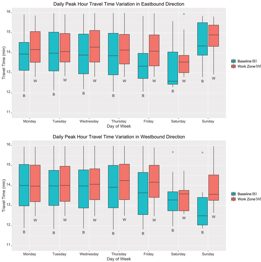
Figure 12. Graph. Scenario 2 - Daily variability of peak hour travel times during morning and afternoon peak hours
Source: FHWA
Figure 13 shows the monthly variability of travel times during the peak hours in the baseline and work zone conditions, enabling the seasonal impact of work zone activities to be examined. In the eastbound direction, the average travel times under work zone conditions were higher in all months of the year than what was observed in the baseline conditions. The increase in the average travel times and its variability was the highest in the months of July, August, and December, and was the least during fall months. Similarly, in the westbound direction, the average travel times during work zone conditions were higher than the baseline conditions in all months of the year, although the impact was lower than the eastbound direction.
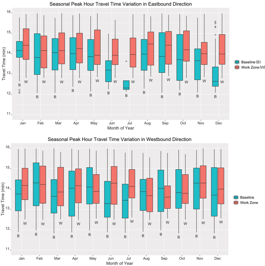
Figure 13. Graph. Scenario 2 - Seasonal variability of peak hour travel times during baseline and work zone conditions
Source: FHWA
Travel Time Reliability
Travel time reliability refers to the consistency, predictability, and dependability of a trip’s travel time. It is an important measure to commuters, especially freight traffic for on-time arrival and delivery schedules.
The case study project team calculated the following reliability metrics:
- Travel Time Index: The ratio of the observed (average) travel time to free flow travel time
- Planning Time Index: The ratio of the 95th percentile of the corridor travel time to the free flow corridor travel time
Figure 14 shows the equations for calculations these indices.10

Figure 14. Equation. Travel Time Index and Planning Time Index
Source: FHWA
If the Travel Time Index is greater than one, on average the travel time is expected to be higher than the Free Flow Travel Time, proportional to the value of the index. The Planning Time Index presents how much time needs to be allocated to be on time 95 percent of the time.
Figure 15 and figure 16 show the travel time and planning time indexes, respectively, to traverse the 10-mile corridor in the eastbound and westbound directions under the baseline and work zone conditions (when the traffic underperformed regardless of day of week and hour of day for the baseline period and the work zone period). In general, travel time was less reliable under work zone conditions compared to the baseline conditions. Travel time reliability in the eastbound direction was impacted higher than the westbound direction by the work zone activities.
In the eastbound direction, travel time during the work zone conditions was less reliable during daytime hours, starting from 6:00 a.m. until 7:00 p.m. It was particularly least reliable during the morning peak hours. For example, in the eastbound direction at 7:00 a.m.:
- The Travel Time Index was 1.63. This means that the typical travel time observed at 7:00 a.m. when traffic underperformed was 1.63 times the free flow travel time.
- The Planning Time Index was 276 percent. This means that a traveler would have to budget a travel time of 2.76 times the free flow travel time to timely traverse the 10-mile corridor 95 percent of the time.
The westbound direction was less impacted by the construction activities compared to the eastbound direction of traffic. The reliability impacts of the construction activities were observed to start in the late morning hours and peak at late-night hours. The highest Travel Time Index was 1.5, which was observed at 5:00 p.m. Similarly, the highest Planning Time Index was 340 percent, observed at 9:00 p.m.
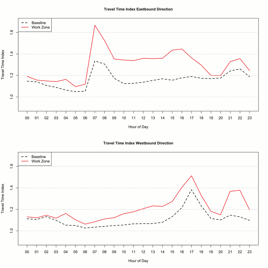
Figure 15. Graph. Scenario 2 - Travel time index during baseline and work zone conditions
Source: FHWA
The impacts on reliability in this analysis were relatively high because only a short trip along the work zone site (i.e., the 10-mile corridor) was considered. If longer trips were considered (e.g., a 30-mile corridor), the impact of the work zone activities on trip reliability would be significantly lower.
The following are some examples of how agencies may use travel time reliability metrics:
- Provide public information during the construction phase of projects, especially those projects that last at least a month and those that are expected to garner significant attention from the traveling public
- Conduct further investigation into what might be driving the variability in travel time—work activity, work zone setup and take down, traffic volume impacts, etc.
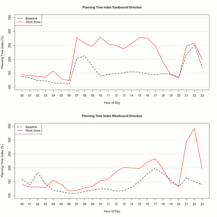
Figure 16. Graph. Scenario 2 - Planning time index during baseline and work zone conditions
Source: FHWA
Road-User Cost Estimation
In addition to examining the average travel time and its variability, the total delay and its monetary value (road-user delay costs) can be estimated. Delay refers to the time difference between the actual travel time and free flow travel time. In this study, as mentioned earlier, only travel times when traffic underperformed are considered (i.e., travel time is 25 percent more than the free flow conditions). Therefore, delay refers to the difference between the actual travel time when traffic underperformed and the threshold travel time. Total hours of delay can be computed by multiplying the calculated delays by the corresponding number of vehicles affected (traffic volume) and the average vehicle occupancy. Volume of traffic represents the number of vehicles that are affected by the delay in each hour of the day. Vehicle occupancy is the average number of occupants of a vehicle during a trip.
The monetary value of the total delays can be estimated by multiplying the total hours of delays by the average value of time. Value of time is a traveler’s opportunity cost of time that is spent on the journey. In other words, it represents the amount of money that a traveler is willing to pay to save one hour. Value of time can be different depending on time of day, income, geographic location, and other factors.
Figure 17 shows the aggregated hourly delays in both travel directions of the construction site in the baseline and work zone conditions (without considering the volume of traffic affected by the work zone activities). In general, the eastbound traffic suffered the most delays compared to the westbound traffic, both in the baseline and work zone conditions. Over the two-year period, the eastbound traffic experienced an additional 193 hours of aggregated delays due to work zone activities when traffic was underperforming (i.e., the difference between 419 hours of delays during work zone conditions and 226 hours of delays during the baseline conditions). Similarly, the westbound traffic experienced an additional 129 hours of delays due to work zone activities.
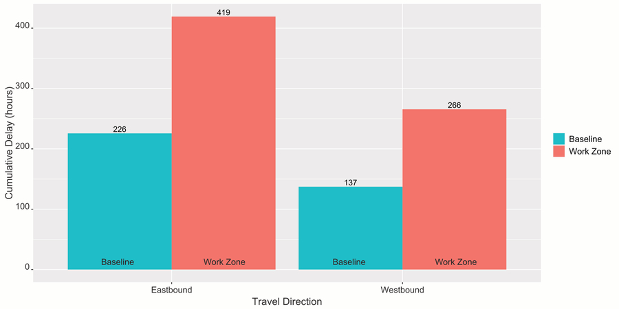
Figure 17. Graph. Scenario 2 - Aggregated delays in the baseline and work zone conditions
Source: FHWA
The breakdown of the aggregated delays by time of day is shown in Figure 18. The impact of the work zone during the day can be clearly observed in the eastbound direction. Most of the delays in the eastbound direction occurred in the morning peak hours, particularly at 7:00 a.m., followed by a slight increase in the early afternoon hours. During late night and early morning hours, the delays observed in the baseline and work zone conditions were comparable. In the westbound direction, on average, no additional delays due to work zone activity were observed until after 9:00 a.m. The work zone delays in the westbound direction were the highest during afternoon peak hours, particularly around 5:00 p.m. and late evening hours.
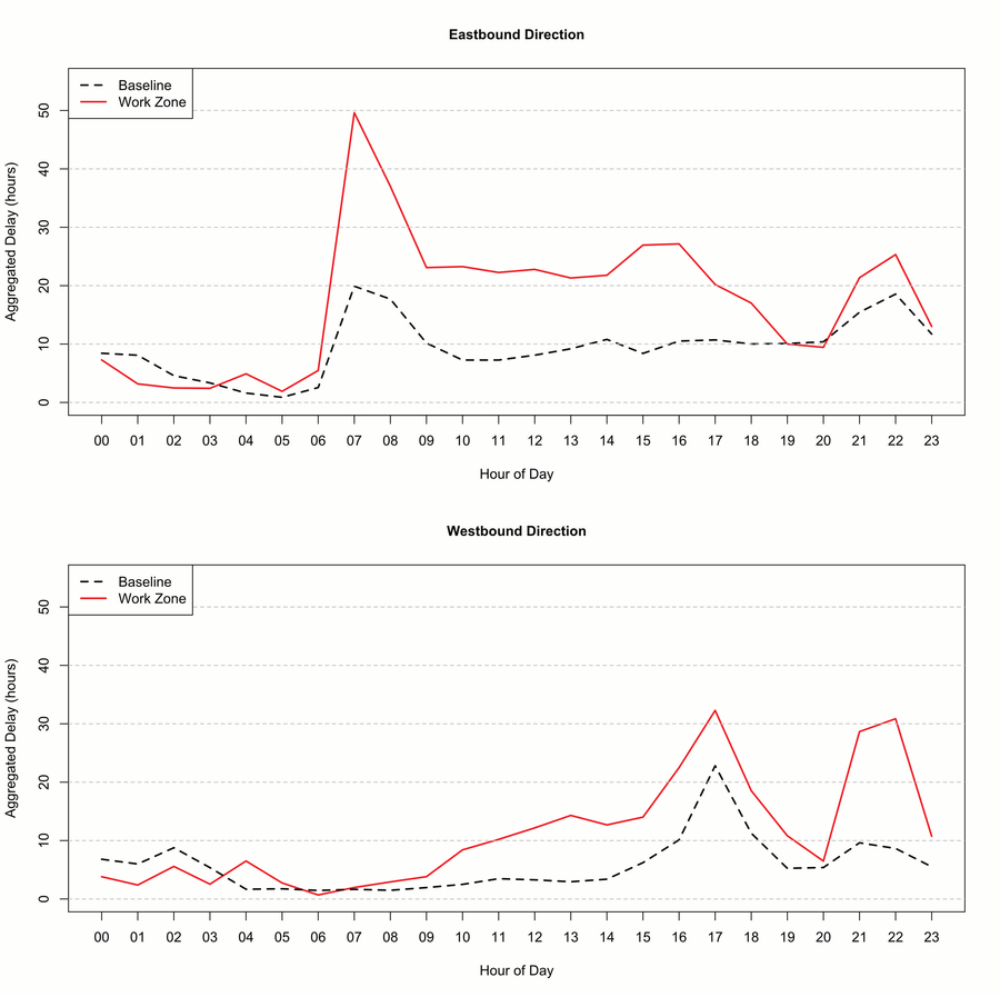
Figure 18. Graph. Scenario 2 - Hourly aggregated delays in the baseline and work zone conditions
Source: FHWA
The hourly aggregated delays can be converted into monetary units by multiplying them by the averages of hourly traffic volume, vehicle occupancy, and value of time of travelers. The case study project team obtained the average hourly traffic volumes for both directions of the 10-mile corridor from the El Paso Metropolitan Planning Organization (MPO). According to the El Paso MPO, the average vehicle occupancy factor in the region is 1.41 persons per vehicle. Similarly, an average value of time of $17.91 per hour was used.11 In this analysis, it is assumed that traffic is composed of only passenger vehicles. Also, the vehicle occupancy factor and the value of time are the same in the baseline and work zone periods.
Table 6 and table 7 show how the monetary values of delays in the eastbound and westbound directions of I-10 traffic, respectively, were estimated. When traffic underperformed, the monetary value of the total delays in the eastbound direction in the baseline condition was estimated to be $18 million, while in the work zone condition, it was estimated to be $39.3 million. Therefore, the monetary value of the delays due to work zone activities in the eastbound direction is estimated to be $21.3 million. Similarly, in the westbound direction, the monetary values of the total delays when traffic underperformed in the baseline and work zone conditions were $10.5 million and $22 million, respectively. Therefore, the monetary value of the delays due to work zone activities in the westbound direction was estimated to be $11.5 million.
| Time | Hourly Aggregated Delays (hours) – Baseline | Hourly Aggregated Delays (hours) – Work Zone | Hourly Volume (veh/hour) | Vehicle Occupancy (person/veh) | Value of Time ($/hour) | Monetary Value of Delays ($) – Baseline | Monetary Value of Delays ($) – Work Zone |
|---|---|---|---|---|---|---|---|
| 0:00 | 8.4 | 7.3 | 476 | 1.41 | 17.91 | 101,275 | 87,547 |
| 1:00 | 8.1 | 3.2 | 333 | 1.41 | 17.91 | 68,016 | 26,731 |
| 2:00 | 4.6 | 2.5 | 276 | 1.41 | 17.91 | 31,983 | 17,296 |
| 3:00 | 3.4 | 2.4 | 304 | 1.41 | 17.91 | 25,728 | 18,587 |
| 4:00 | 1.6 | 4.9 | 569 | 1.41 | 17.91 | 23,160 | 70,481 |
| 5:00 | 0.9 | 1.9 | 1,609 | 1.41 | 17.91 | 35,830 | 77,188 |
| 6:00 | 2.6 | 5.5 | 4,217 | 1.41 | 17.91 | 271,662 | 582,437 |
| 7:00 | 19.9 | 49.6 | 5,603 | 1.41 | 17.91 | 2,817,082 | 7,019,945 |
| 8:00 | 17.7 | 37.0 | 5,082 | 1.41 | 17.91 | 2,271,216 | 4,749,764 |
| 9:00 | 10.2 | 23.1 | 4,281 | 1.41 | 17.91 | 1,098,987 | 2,496,627 |
| 10:00 | 7.3 | 23.3 | 3,841 | 1.41 | 17.91 | 703,906 | 2,256,065 |
| 11:00 | 7.3 | 22.3 | 3,881 | 1.41 | 17.91 | 711,403 | 2,181,158 |
| 12:00 | 8.1 | 22.8 | 3,906 | 1.41 | 17.91 | 798,401 | 2,247,457 |
| 13:00 | 9.2 | 21.3 | 3,950 | 1.41 | 17.91 | 917,044 | 2,125,634 |
| 14:00 | 10.8 | 21.8 | 4,203 | 1.41 | 17.91 | 1,146,099 | 2,311,927 |
| 15:00 | 8.4 | 26.9 | 4,465 | 1.41 | 17.91 | 947,063 | 3,038,119 |
| 16:00 | 10.5 | 27.1 | 4,344 | 1.41 | 17.91 | 1,152,996 | 2,978,186 |
| 17:00 | 10.7 | 20.2 | 4,087 | 1.41 | 17.91 | 1,105,213 | 2,085,301 |
| 18:00 | 10.0 | 17.0 | 3,483 | 1.41 | 17.91 | 880,934 | 1,496,844 |
| 19:00 | 10.1 | 10.0 | 2,610 | 1.41 | 17.91 | 664,737 | 659,623 |
| 20:00 | 10.4 | 9.4 | 2,234 | 1.41 | 17.91 | 586,086 | 532,691 |
| 21:00 | 15.4 | 21.4 | 1,897 | 1.41 | 17.91 | 739,941 | 1,023,223 |
| 22:00 | 18.6 | 25.3 | 1,379 | 1.41 | 17.91 | 646,207 | 882,089 |
| 23:00 | 11.7 | 13.0 | 926 | 1.41 | 17.91 | 273,926 | 304,314 |
| Total | 18,018,896 | 39,269,235 |
Source: FHWA
| Time | Hourly Aggregated Delays (hours) – Baseline | Hourly Aggregated Delays (hours) – Work Zone | Hourly Volume (veh/hour) | Vehicle Occupancy (person/veh) | Value of Time ($/hour) | Monetary Value of Delays ($) – Baseline | Monetary Value of Delays ($) – Work Zone |
|---|---|---|---|---|---|---|---|
| 0:00 | 6.8 | 3.8 | 1,463 | 1.41 | 17.91 | 251,428 | 140,873 |
| 1:00 | 6.0 | 2.4 | 826 | 1.41 | 17.91 | 124,877 | 49,802 |
| 2:00 | 8.8 | 5.6 | 568 | 1.41 | 17.91 | 125,844 | 79,956 |
| 3:00 | 5.4 | 2.5 | 344 | 1.41 | 17.91 | 46,651 | 22,025 |
| 4:00 | 1.7 | 6.5 | 312 | 1.41 | 17.91 | 13,124 | 51,221 |
| 5:00 | 1.7 | 2.7 | 294 | 1.41 | 17.91 | 12,954 | 20,364 |
| 6:00 | 1.5 | 0.7 | 490 | 1.41 | 17.91 | 18,021 | 8,436 |
| 7:00 | 1.6 | 2.0 | 1,148 | 1.41 | 17.91 | 47,814 | 56,887 |
| 8:00 | 1.5 | 2.9 | 2,818 | 1.41 | 17.91 | 105,991 | 207,648 |
| 9:00 | 2.0 | 3.8 | 3,730 | 1.41 | 17.91 | 183,703 | 359,896 |
| 10:00 | 2.5 | 8.4 | 3,463 | 1.41 | 17.91 | 218,576 | 735,460 |
| 11:00 | 3.5 | 10.2 | 3,222 | 1.41 | 17.91 | 282,680 | 830,233 |
| 12:00 | 3.3 | 12.2 | 3,118 | 1.41 | 17.91 | 257,658 | 958,450 |
| 13:00 | 2.9 | 14.3 | 3,442 | 1.41 | 17.91 | 256,339 | 1,243,703 |
| 14:00 | 3.4 | 12.7 | 3,506 | 1.41 | 17.91 | 299,881 | 1,122,941 |
| 15:00 | 6.2 | 14.0 | 3,754 | 1.41 | 17.91 | 589,533 | 1,328,525 |
| 16:00 | 10.1 | 22.5 | 3,881 | 1.41 | 17.91 | 991,839 | 2,204,046 |
| 17:00 | 22.8 | 32.3 | 4,303 | 1.41 | 17.91 | 2,478,621 | 3,507,842 |
| 18:00 | 11.3 | 18.5 | 4,611 | 1.41 | 17.91 | 1,311,228 | 2,159,219 |
| 19:00 | 5.2 | 10.8 | 4,786 | 1.41 | 17.91 | 633,872 | 1,308,009 |
| 20:00 | 5.4 | 6.5 | 4,158 | 1.41 | 17.91 | 565,442 | 681,386 |
| 21:00 | 9.6 | 28.7 | 3,042 | 1.41 | 17.91 | 738,896 | 2,201,500 |
| 22:00 | 8.7 | 30.9 | 2,726 | 1.41 | 17.91 | 595,567 | 2,124,346 |
| 23:00 | 5.5 | 10.7 | 2,191 | 1.41 | 17.91 | 305,067 | 594,575 |
| Total | 10,455,609 | 21,997,345 |
Source: FHWA
 For this case study, hourly traffic volumes for the I-10 corridor were obtained from the El Paso MPO. Traffic volume data may not always be
available. In such case, agencies can use the NPMRDS-provided Average Annual Daily Traffic (AADT) data. The NPMRDS AADTs can be converted to
hourly flow rates by using suitable daily, seasonal, and hourly adjustment factors. More information on this is available at https://npmrds.ritis.org/analytics/help/#npmrds.
Interventions/Actions
This case study presents an example application of NPMRDS data for work zone mobility performance measurement and does not necessarily delve into specific intervention/actions. Identifying when and where work zone traffic congestion occurs and estimating the road-user delays can be useful for implementing appropriate intervention actions to avoid or mitigate future work zone mobility impacts. Such information is crucial for state and local transportation agencies to mainstream their strategies that minimize delays due to work zone activities. Such strategies include regulating lane closure durations, educating construction personnel to consider road-user delays in the construction project management process, and affecting the behavior of road users to manage when and how they travel.
Reporting
The analysis and results should be documented in well-written and clearly structured reports. In doing so, the underlying assumptions, data used, and analytical process followed should be clearly documented so that the analysis performed is defendable and reproduceable.
Simple and concise reports that are easily understood by decision makers, stakeholders, and the general public are beneficial. Supporting the analysis results by visual aids, such as tables, charts, and figures, make the findings easy to understand by technical and non-technical stakeholders.
Lessons Learned
Documenting the lessons learned facilitates identifying areas of potential improvements, recommended actions, and best practices. Lessons learned can cut across all areas of work zone management including planning, design, traffic analysis, engineering, contracting, construction, training, and performance and process improvement. Lessons learned should include both the positive and negative experiences of the work zone mobility management efforts. This effort includes identifying strategies that went right, strategies that went wrong, and practices that could benefit from improvements. As mentioned in Step 10 of the appendix, agencies can take advantage of their bi annual work zone process reviews to document their lessons learned and implement appropriate process improvements using a mindset of continuous improvement.
8 Additional resources and examples of different types of work zone analyses are available on the FHWA’s Work Zone Performance Measurement website at https://ops.fhwa.dot.gov/wz/decision_support/perf_measurement.htm.
9 The case study project team examined incident and crash data from TxDOT (including Dynamic Message Sign messages) but did not use them because not enough background was available to be able to correlate the data with what may have actually happened on a given day. Therefore, the incident and crash data were disregarded.
10 https://ops.fhwa.dot.gov/publications/tt_reliability/ttr_report.htm
11 Ellis, D. (2017). Value of Delay Time for Use in Mobility Monitoring Efforts. Texas A&M Transportation Institute. https://static.tti.tamu.edu/tti.tamu.edu/documents/TTI-2017-10.pdf (accessed in February 2019)
