Automated Traffic Signal Performance MeasuresSample Automated Traffic Signal Performance Measures Use Cases Photo Credit: Pexels
Automated traffic signal performance measures (ATSPM) tools are being adopted by a growing number of agencies across the nation because they are practical and easy to use. In this section, we will look at five use cases where ATSPM can be used by traffic engineers and technicians to solve specific problems encountered on a regular basis. It is important to emphasize that ATSPM tools do not solve problems by themselves; technicians and engineers must interpret ATSPM reports and take action. However, with ATSPM as part of the workflow, engineers and technicians can often identify and solve problems faster than they ever could before.  Photo Credit: Pexels
USE CASE 1: Using Automated Traffic Signal Performance Measures to Improve Traffic Signal System MaintenanceOne of the foundational elements of a modern traffic signal system is reliable vehicle detection. When detectors malfunction or fail, intersection operation suffers. Detector malfunctions can occur at any time of the day or night, so finding intermittent issues or overnight detection issues can be very difficult if an agency only relies on in-person field device checks to find problems. ATSPM currently offers two solutions that can be used to identify persistent detector issues: the ATSPM Watchdog Report and the Purdue Phase Termination Diagram. These performance analysis tools allow troubleshooting to occur in advance of dispatching maintenance crews, significantly reducing the time and level of effort involved in diagnosing problems and completing repairs. ATSPM Watchdog ReportThe ATSPM Watchdog is a scheduled executable that runs daily to identify abnormal activity within the high-resolution traffic signal database logs. These abnormalities are often symptoms of detector failures, communication failures, or signal timing issues. When the following conditions are detected 1, an email alert is generated once per day:
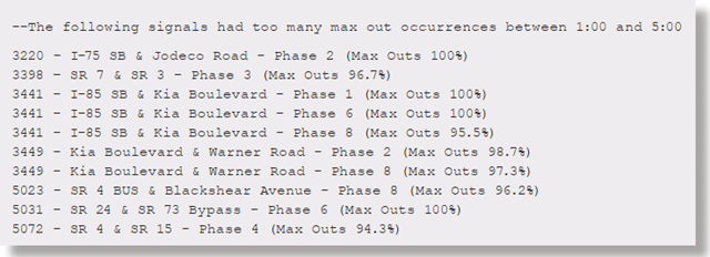 Sample ATSPM Watchdog Report
Source: Georgia Department of Transportation  Photo Credit: Pexels
Purdue Phase Termination DiagramThe Purdue Phase Termination Diagram is a graphic that displays the trigger event (Force-Off, Gap-Out, or Max-Out) for each traffic signal phase at an intersection, typically over a 24-hour period. Time of day is shown on the x-axis while each signal phase is shown in ascending order on the y-axis. Colored dots along each horizontal phase grid line indicate the termination state of each phase at each time of day. Signal plans are indicated by alternating blue and gray background shading
In the example on the following page, courtesy of the Georgia Department of Transportation (GDOT), the dark red bands in the left-most and right-most regions of the diagram denote frequent Max-Outs during the overnight hours, suggesting detection failure. When vehicle detectors fail, the result is typically a continuous call to phase, causing a Max-Out. This was confirmed by a field visit and the detectors were subsequently replaced. 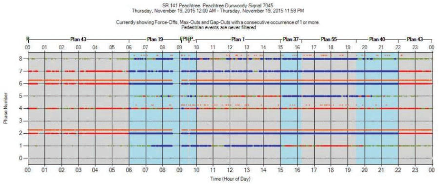 Sample Purdue Phase Termination Diagram
Source: GDOT In another example, a high number of force offs of Phase 1 were observed during the free operation of the signal during overnight hours, as shown in the two left panels of the Purdue Termination Diagram below. A field inspection determined that detection was operating properly. However, a misconfigured parameter in the timing plan was identified and corrected. The right two panels of the diagram show a return to normal operation with no force offs occurring in the red circled time periods. 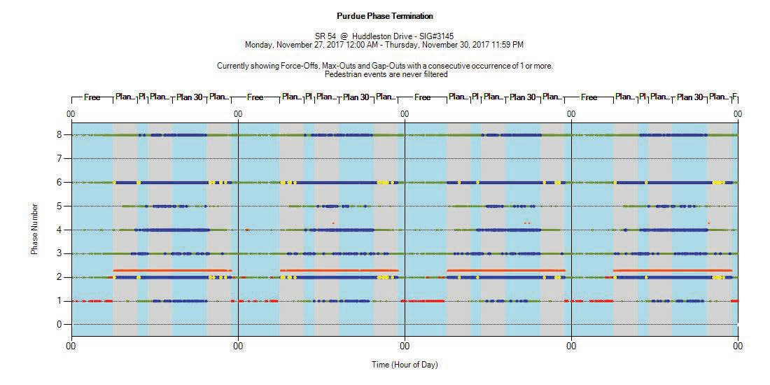 Sample Purdue Phase Termination Diagram
Source: GDOT USE CASE 2: Signal TimingATSPM tools can be very effective in quickly identifying signal timing issues and in providing the context necessary to evaluate potential solutions. Since ATSPM visualizations are normally presented on a 24-hour basis, these charts can spot trends and issues that may be more difficult for a technician making a short-term site visit to see. The following examples show how two different ATSPM visualizations can be used to improve the performance of splits and offsets of an intersection. Purdue Coordination DiagramAs the name suggests, the Purdue Coordination Diagram is used to evaluate the operation of coordinated signals and to identify signal timing parameters that could be modified to improve vehicle progression. The x-axis lists the time of day, while the y-axis denotes beginning (green dots) and end (red dots) of a phase for each cycle. A green line (resulting from consecutive phases starting at the same time during a plan) running horizontally through the middle of the diagram denotes the activation of the green phase, while a red line near the top shows where the red phase was activated. Black dots on the chart indicate arrivals of individual vehicles at the intersection, typically at upstream detectors. Dots below the green line represent vehicles arriving on red, while those above the green line represent vehicles arriving on green. Therefore, intersections with good progression would have the majority of black dots above the green line. In the Purdue Coordination Diagram shown below, the majority of vehicles arriving between 8:00 AM and 8:00 PM before offset optimization arrived on red as shown by the cloud of black dots in the bottom portion of the diagram to the left. As shown in the diagram on the right, after the offsets were optimized, the majority of black dots cluster above the green line, which indicates their arrival on green in the course of good progression. 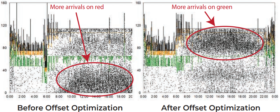 Sample Purdue Coordination Diagram
Source: Iowa State University Purdue Split Failure DiagramAnother tool that can be used to evaluate signal timing performance is the Purdue Split Failure Diagram. A split failure occurs when a phase cannot serve all its demand within one cycle—if it takes a vehicle two or more cycles to execute its movement at an intersection, a split failure has occurred. In the context of ATSPM, split failures are detected by comparing the following two ratios:
When GOR and ROR5 are both high (typically 80 percent or higher), this suggests the occurrence of a split failure. The Purdue Split Failure Diagram denotes each split failure with a vertical yellow line along with the average GOR and ROR5 over the previous 15 minutes. The chart also lists the total number of split failures over the entire day along with the number and percentage of split failures during each timing plan. This information allows traffic engineers to easily determine which plans and phases are encountering the highest number of split failures and where to direct their attention. 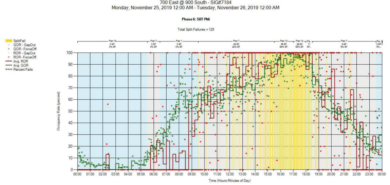 Sample Purdue Split Failure Diagram
Source: Utah Department of Transportation The Purdue Coordination Diagram also lists a parameter known as the arrival on green (AoG), which measures the percentage of vehicles that arrive at the intersection during the green interval of a phase. AoG can be tracked over time in an offline spreadsheet as a measure of intersection performance. In the example below, the AoG decreased between June 2017 and May 2018 due to gradually increasing traffic demand. Signal timing updates in June 2018 and July 2018 caused AoG to increase, which can be seen on the graph below. Traffic engineers can use offline methods like this to track performance of intersections over time and identify where timing plan adjustments could be beneficial. 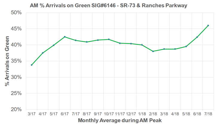 Sample Sample Aggregate Data Percent of Vehicles Arriving on Green
Source: Utah Department of Transportation  Photo Credit: Shutterstock USE CASE 3: SafetyIn addition to maintenance and signal timing activities, ATSPMs can also be used to identify intersection safety concerns in the areas of red light running and pedestrian delay. Yellow and Red ActuationsAccording to the Insurance Institute for Highway Safety2, 890 people were killed in crashes that involved red-light running, while another 132,000 people were injured in red-light running crashes. ATSPM can help traffic engineers identify intersections with high occurrences of red-light running. One of the primary tools available to assist in this effort is the Yellow and Red Actuations diagram. This chart identifies vehicles approaching the intersection on yellow and red whose speed is too high to safely stop. The vehicle arrivals are then plotted against yellow and red overlays that indicate whether the phase was in yellow or red indication. This allows the traffic engineer to see whether vehicles passed through the intersection on yellow, during the red clearance interval, or committed a severe red-light violation by entering the intersection while a conflicting phase was active. The Federal Highway Administration Highway Safety Engineering Studies: Procedural Guide document provides a table that links crash patterns to probable causes and general countermeasures. 3 This table has been further adapted by the New York State Department of Transportation in their Highway Safety Improvement Program (HSIP) manual. 4 For each crash pattern observed, all probable causes should be considered when selecting a general countermeasure. The Yellow and Red Actuations diagram can assist engineers with evaluating insufficient signal timing and yellow phases that are too short. Per the General Crash Pattern and Countermeasures table, countermeasures for a yellow phase that is too short can include increasing the length of the yellow phase and providing an all-red clearance interval. The Yellow and Red Actuations diagram can be used to document the frequency of red-light running instances before and after adjustments to the length of yellow and all-red intervals. Other countermeasures that can improve signal timing include providing progression through a set of signalized intersections and updating the signal timing based on current traffic conditions. These improvements can be validated using ATSPM tools such as the Purdue Coordination Diagram, Split Failure Diagram, and Phase Termination Diagram. 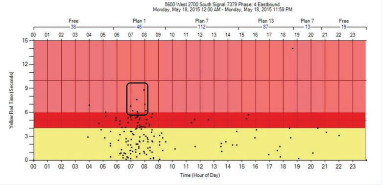 Sample Yellow and Red Actuations Diagram
Source: Utah Department of Transportation Pedestrian DelayATSPM tools can also be used to help traffic engineers improve pedestrian safety. One method involves identifying intersections with excessive pedestrian delay. When a pedestrian actuates a crossing button, there is an expectation that they will receive a crosswalk indication in a reasonable amount of time. Otherwise, they may infer that the crossing button is nonfunctional and attempt to cross traffic without waiting for the pedestrian signal, in which case, the pedestrian is at greater risk of injury. The Pedestrian Delay diagram contains several useful pieces of information that provides insight into pedestrian activity at an intersection. Pedestrian delay is defined as the time between when a pedestrian pushes the crosswalk button and when the walk indication is activated. The diagram shows the number of pedestrian actuations per day in a graph denoting the time when each actuation occurred. Consistently high numbers of pedestrian actuations during certain times of the day could lead traffic engineers to consider operating the intersection in pedestrian recall during certain timing plans. The diagram also shows the minimum, maximum, and average pedestrian actuation delay during the day, along with the pedestrian delay for each actuation. The average pedestrian delay for each timing plan is also shown. While the definition of “excessive pedestrian delay” is subjective, the Pedestrian Delay diagram can provide the traffic engineer with empirical data to compare with citizen complaints and anecdotal information. This data gives traffic engineers a better basis to support their decisions regarding pedestrian timing. 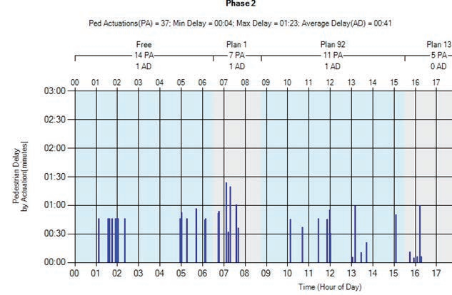 Sample pedestrian delay diagram
Source: Utah Department of Transportation 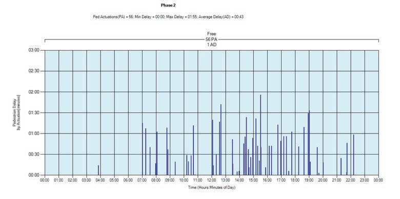 Sample pedestrian delay diagram
Source: Utah Department of Transportation USE CASE 4: Evaluating Adaptive Traffic ControlBecause ATSPM methodologies operate as an observer in parallel with the traffic signal control system, they can be used to monitor a wide variety of traffic control schemes, including adaptive systems. According to Justin Effinger, a traffic engineer with Lake County, Illinois, most adaptive systems are only evaluated at the beginning of their life span – right after they are installed. Without periodic evaluation, it is difficult to determine if the adaptive systems are working as intended. ATSPM provides the data necessary to objectively evaluate the performance of adaptive systems on an on-going basis and at very specific times of the day. One area where ATSPMs can assist with improving adaptive signal control involves the double serving of side streets. When traffic on a major route is light, a side street can be double served to reduce queues and delay. However, when traffic on the major route is heavy, double serving the side street would generally be discouraged since it could lead to increased delays on the major route. The Purdue Coordination Diagram and/or the Split Monitor can be used to identify situations where double serving is either occurring too often or not enough. Double Serving Occurs too FrequentlyOne example of double serving on a side street in Lake County, IL occurred at the intersection of Illinois Route 176 (IL-176) and Hawley Street. IL-176 is the major route, while Hawley Street is the side street. A citizen raised a concern that the signal was cycling too fast and causing backups on IL-176. Closed-circuit television (CCTV) camera footage also confirmed a backup on IL-176. When the ATSPM Split Monitor was reviewed, the traffic engineer noticed shorter green times for IL-176 than would be expected using engineering judgment (as shown in the purple rectangle below). Likewise, when the engineer looked at the InSync adaptive traffic control software, a gap was noticed between the coordinated tunnels, which provided enough time to double serve Hawley Street. In this instance, double serving the side street was not helpful, since it leads to excessive delay on the major route. 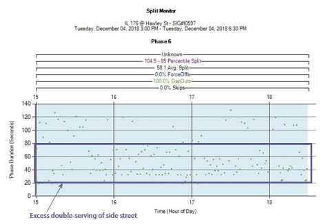 Sample ATSPM split monitor before closing gap Sample ATSPM split monitor before closing gapSource: Lake County, IL The traffic engineer closed the gap between the coordinated tunnels to prevent double serving of Hawley Street when IL-176 was at its busiest. Double serving was still allowed to occur during lighter traffic conditions on IL-176. When the Split Monitor was examined after the change, longer green times for IL-176 were consistently observed, shown by the mostly empty space in the purple region of the chart to the left. CCTV cameras also confirmed that the backup on IL-176 was no longer present.  Sample ATSPM split monitor after closing gap
Source: Lake County, IL More Double Serving Could be BeneficialThe opposite conditions were occurring at the nearby intersection of Gilmer Road (major route) and Freemont Center Road. When the traffic engineer looked at the Purdue Coordination Diagram, a large area of white space was typically observed in the early portion of the green phase, which is shown by the purple region in the chart below. Since black dots represent the arrival of vehicles, white space suggests unused green time on the major route. That is, green time was being given to a relatively empty road when it could potentially be allocated for use by the side street. 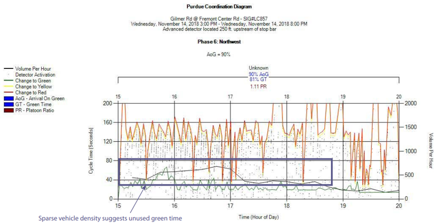 Sample Purdue coordination diagram
Source: Lake County, IL In response to this observation, the traffic engineer modified adaptive control settings to increase the ability to double serve Freemont Center Road. This allows the adaptive system to borrow green time from Gilmer Road and provide it to Freemont Center Road when demand on the side street warrants. When the traffic engineer examined the Purdue Coordination Diagram the following week, the amount of white space within the cycle was reduced. The cycle time was also reduced in some cases, as it was allowed to shrink to fit the actual traffic demand on the major route. When borrowing green time from a major route to provide to the side street, traffic engineers want to make sure that they are not inadvertently making conditions worse on the major route. One way they can confirm this is by comparing the arrival-on-green percentage before and after the timing adjustment. In this example, the arrival-on-green before and after the change was equal to 90 percent. This shows that, although green time on the major route was reduced, it did not have a negative impact on the major route traffic progression. 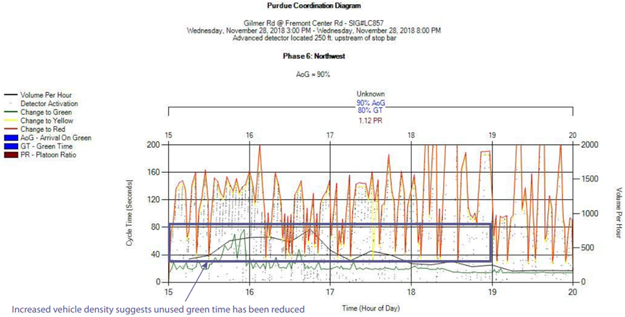 Sample Purdue coordination diagram
Source: Lake County, IL USE CASE 5: Extending ATSPM to Evaluate Program and Corridor PerformanceUsing ATSPM tools, traffic signal engineers can develop a deep understanding of how well intersections are operating from a signal timing perspective. Using tools like the Purdue Coordination Diagram, engineers can also get a sense of how well one intersection is coordinated with the previous intersection. However, getting a picture of corridor-level performance can take some additional manual work in terms of pulling charts for adjacent intersections and comparing them side-by-side. At the time of this writing, the open source ATSPM software does not include corridor-level performance metrics by default. Other agencies are working to extend ATSPM functionality by aggregating ATSPM metrics into corridor-level reports. This use case will examine two examples. Georgia Department of Transportation: Measurement, Accuracy, and Reliability Kit 1 DashboardThe Georgia Department of Transportation (GDOT) manages major signalized arterials in the Atlanta metropolitan area on a corridor level as part of their Regional Traffic Operations Program. Goals of this multi-jurisdictional program include improving traffic flow on a corridor basis and helping local jurisdictions identify and repair traffic signal issues. To monitor performance of each corridor, GDOT developed a dashboard that aggregates ATSPM and other system performance metrics on an automated basis. This dashboard, called the GDOT Measurement, Accuracy, and Reliability Kit (MARK 1), frees up valuable staff time from creating corridor performance reports manually. This allows staff to focus their time on solving issues instead of creating reports. The MARK 1 dashboard, shown below, displays a wide range of information such as arterial performance measures (e.g., arrivals on green, progression ratio, split failures, corridor volumes, and device and communication uptime).  Example of MARK 1 dashboard
Source: Georgia Department of Transportation The MARK 1 dashboard allows users to select tabs to choose monthly and quarterly summary reports, detailed corridor performance output reports by intersection, equipment up-time reports, and watchdog reports for intersections along a corridor (or for all monitored corridors). For example, the Arrivals on Green performance report ranks all intersections along a corridor by their percent arrivals on green. This allows traffic engineers to quickly identify problem intersections. They can then use traditional ATSPM tools to investigate the problem intersection in more detail and identify the root cause of the problem. 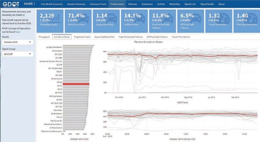 Sample MARK 1 summary report
Source: Georgia Department of Transportation Activity reports like the one below also help traffic signal staff track the number and types of maintenance incidents reported each month and understand how responsive they were in resolving those incidents. 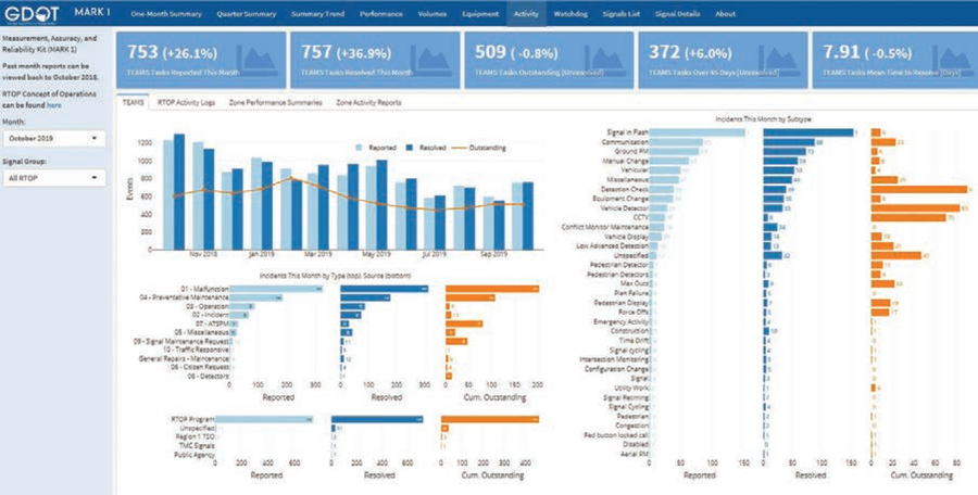 Sample MARK 1 activity report
Source: Georgia Department of Transportation Pennsylvania Department of Transportation: Arterial Performance Metrics using Probe DataThe Pennsylvania Department of Transportation (PennDOT) is approaching ATSPM from a different angle than other agencies discussed in this report. Instead of building ATSPM performance measures from high-resolution traffic controller data, they are exploring how third-party probe data can be used to evaluate arterial performance on a corridor level. In addition, they are also exploring how some traditional ATSPM charts can be reconstructed using third-party probe data. Probe data refers to traffic data obtained from mobile connected data sources that transmit location information back to a centralized system. Examples of such data sources include cell phones, automatic vehicle location equipment installed in delivery fleet vehicles, and connected dashboard navigation devices. Third-party traffic data providers, such as INRIX©, HERE©, and TomTom©, aggregate and anonymize this data then use it to generate average speed and travel time data on roadway segments. PennDOT, along with Purdue University and the University of Maryland Center for Advanced Transportation Technology Laboratory, is working to develop a series of arterial performance metrics tools and integrate them into the Probe Data Analytics Suite. The first of these is a travel time comparison tool that compares arterial travel time using a cumulative frequency diagram, as shown below. 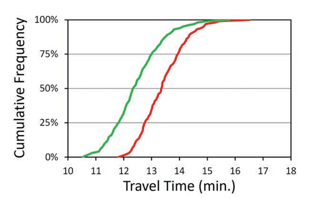 Sample MARK 1 activity report
Source: Pennsylvania Department of Transportation A user would pick a segment of road on an interactive map and then select the date and time ranges they want to compare; the diagram would then be generated automatically. The cumulative frequency diagram shows what percentage of observed travel times were at or below a certain duration. Consider a diagram showing a travel time of 14 minutes with a cumulative frequency of 75 percent. This means 75 percent of the observed travel times during the time period were at or below 14 minutes. In comparing two time periods, if the graph shifts to the left travel times are improving. Likewise, a graph with a steeper slope indicates travel times are more reliable (i.e. consistent) along a corridor. In practice, the cumulative frequency diagram can be used to conduct a before-and-after comparison of signal timing plan adjustments. It can also be used to identify if corridor travel times are degrading over time, thus warranting attention. Another tool PennDOT is working on can simultaneously compare the performance of multiple arterial routes. This is done by plotting the median travel time as a percentage of the speed limit against the interquartile range as a percentage of the speed limit travel time. Conceptually, this graph displays normalized travel time on the x-axis and normalized travel time reliability on the y-axis. Points are plotted on the graph from different time periods. If the trend of these points is down and to the left (moving closer to the axes origin), travel times and reliability are trending better. If the trend is up and to the right, conditions are trending worse. When several corridors are plotted at once, it is possible to see which corridors experience improving conditions and which ones experience deteriorating traffic conditions. Based on this knowledge, the traffic engineer can look more deeply into the root cause of the issue using more traditional ATSPM tools. 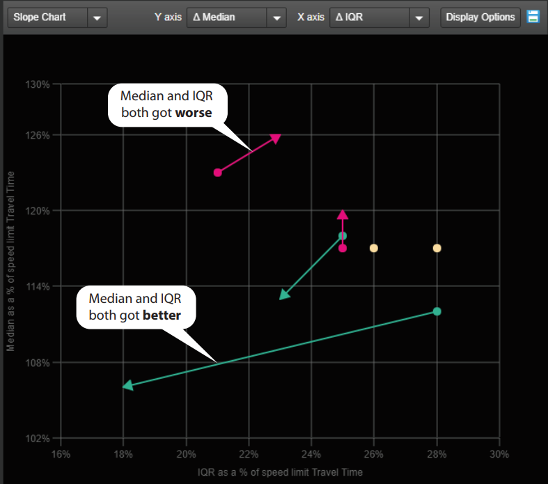 Conceptual plotting of median travel time
Source: Pennsylvania Department of Transportation 1 The default system values, which can be changed based upon the operational environment of the agency’s signal system, are described in each condition. [ Return to Note 1 ]
2
3 https://www.fhwa.dot.gov/publications/research/safety/00003/index.cfm [ Return to Note 3 ] 4 https://www.dot.ny.gov/divisions/operating/osss/highway-repository/Red%20Book.pdf [ Return to Note 4 ] |
|
United States Department of Transportation - Federal Highway Administration |
||
