Approaches to Presenting External Factors with Operations Performance Measures1
Printable Version [PDF, 614 KB]
You may need the Adobe® Reader® to view the PDFs on this page.
Contact Information: Operations Feedback at OperationsFeedback@dot.gov

U.S. Department of Transportation
Federal Highway Administration
Office of Operations
1200 New Jersey Avenue, SE
Washington, DC 20590
FHWA-HOP-18-042
February 2018
Summary
External (or exogenous) factors are influences that affect transportation system performance but typically fall outside the operational control of transportation agencies. To effectively manage system performance, especially in communication and target setting, agencies should understand the nature and extent of the influence of external factors have on system performance.
Project objectives included: 1) using statistical analysis to identify key external factors that can influence system performance, and 2) providing recommendations for including external factors in performance reporting. The project team conducted a statistical analysis on 32 possibly influential external factors, grouped into four categories:
- Travel demand.
- Economic, employment, and price indicators.
- Population and housing indicators.
- Weather conditions.
Identifying Key External Factors
Influential external factors were compared to three system performance measures as calculated in FHWA’s Urban Congestion Report (UCR) program: 1) travel time index; 2) planning time index; and 3) congested hours to determine which external factors were most highly correlated. More details on the UCR measures can be found at the following website: https://ops.fhwa.dot.gov/perf_measurement/ucr/. Table 1 below lists the most highly correlated external factors and their data sources.
While the external factors in Table 1 are important at an aggregate national level, there may be other statistically significant factors important to individual States or regions. States and regions may also choose to track other external factors that may be of particular importance to them.
| Correlated External Factor | Agency Source and Data Hyperlink |
|---|---|
| Traffic volumes | State DOT traffic databases or FHWA TMAS (https://www.fhwa.dot.gov/policyinformation/tables/tmasdata/) |
| Fuel price index | Bureau of Labor Statistics, U.S. Dept. of Labor (https://data.bls.gov/pdq/querytool.jsp?survey=cu) |
| Economic conditions index | Federal Reserve Bank (https://fred.stlouisfed.org/search?st=economic+condition+index) |
| Number of building permits | U.S. Census Bureau (https://www.census.gov/construction/bps/) |
| Rental vacancy rate | U.S. Census Bureau (https://www.census.gov/housing/hvs/data/rates.html) |
| Number of employed persons | Bureau of Labor Statistics, U.S. Dept. of Labor (https://www.bls.gov/bls/news-release/metro.htm) |
Considerations for Displaying External Factors
Think About Your Audience
- Understand who will be consuming the information to determine what information is relevant, how timely that information should be, and how it will best be consumed.
- Understand your audience’s knowledge and interest levels to enhance the effectiveness of the message.
- Create simple visualizations, though content can be technical for knowledgeable audiences.
Consider the Message You Want to Convey
- Decide if the message should show how presented factors correlate with transportation needs to be conveyed to specific groups.
- Limit and focus the visualization, showing only one to three messages; avoid ambiguity in messaging.
Consider How Your Audience Uses Your Visualization
- Anticipate what action the reader may take next to use the information and broaden the message’s reach. For example, will they share your visualization on social media or other outlets or use this information in discussion, planning, or policymaking?
- Ensure the reader can grasp the primary message from your visualization in about 5 seconds or less and remain interested in learning at least one additional detail.
Carefully Choose How External Factors Are Assessed
- How external factors are assessed and displayed matters. For example, unemployment is a reasonable factor to consider in terms of transportation performance measures and may show a high degree of correlation with congestion. However, it may be more effective to display employment gains in real numbers with transportation performance measures.
- Transforming data and placing trend lines in a positive correlation/relationship will greatly increase the readability and interpretability of your visualization.
Determine If External Factors Require Seasonal Adjustment
- Seasonally adjust data if the plotted data look erratic with several peaks and valleys over time. Unadjusted data can make determining the direction and scale of a trend problematic.
- Seasonally adjust if there is a need to show month-to-month comparisons.
Display Factors in a Way That Makes the Message Clearest
- Plot the external factor and transportation performance measure on the same graph.
- Ensure both datasets are on the same time scale and align them. In some cases, one series may lead or lag the other, in which case discretion can be used in shifting the scale. Clarify as needed.
- Differentiate between dual axes, clearly identifying the relationship between the data and the axis through the use of color or other means. Datasets often will have different units and require the use of a dual axes.
- Note the units being used and if there are any special notes about them.
- Align lines to the proper scale to avoid misrepresentation.
- Use complementary colors. Avoid using red-green combinations for low vision readers. Use contrast to ensure charts can be effectively printed in black and white.
Good and Bad Examples
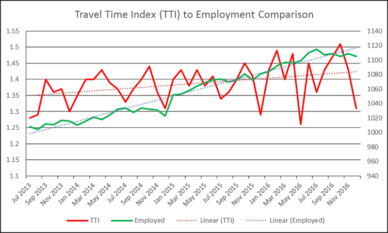
Figure 1 illustrates a bad example that reveals an external factor (employment) found to be statistically related to the travel time index (TTI) in Austin, Texas. Note that even with trend lines drawn, it is difficult to glean any meaningful information from the chart. Poor formatting and lack of seasonal adjustment make interpretation very difficult. Finally, this chart cannot be reused to support telling the agency’s story.

Figure 1. Display of External Factors - Bad Example
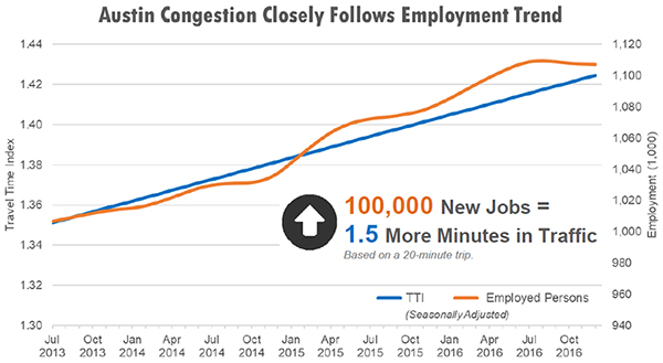
Alternatively, Figure 2 illustrates a good example that presents the same data more thoughtfully, so it is easily digested and understood. The data have been seasonally adjusted to more clearly and accurately show trend information, and the title and supporting text clearly interpret the chart’s meaning for the reader, yet still allows the reader to further examine. Superfluous information has been removed or greyed, colors coordinate with one another, and each element on the chart has meaning.

Figure 2. Display of External Factors - Good Example
Full Report:
https://ops.fhwa.dot.gov/publications/fhwahop18002/index.htm
Contact:
Rich Taylor
rich.taylor@dot.gov
1Note: This report discusses general research associated with operations performance measures. This report was not intended to address the specific requirements associated with the FHWA rule that established national measures for system performance. [Return]