2014 Urban Congestion Trends
Improved Data for Operations Decision Making
Printable version [PDF 3.7 MB]
You may need the Adobe® Reader® to view the PDFs on this page.
Contact Information: OperationsFeedback@dot.gov
*2013 data are Interstates only.
(left to right: Photo by: Razvan Bucur/Shutterstock.com; Photo: Shutterstock.com; Photo by: pbk-pg/Shutterstock.com)

FHWA produces the Urban Congestion Trends report to document the current state of congestion and reliability in the largest urban areas in the United States and to highlight relevant operational strategies and performance management approaches that state and local transportation agencies are implementing successfully.
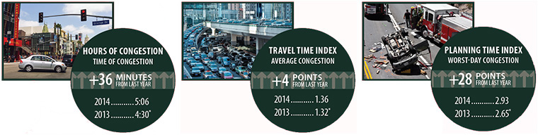
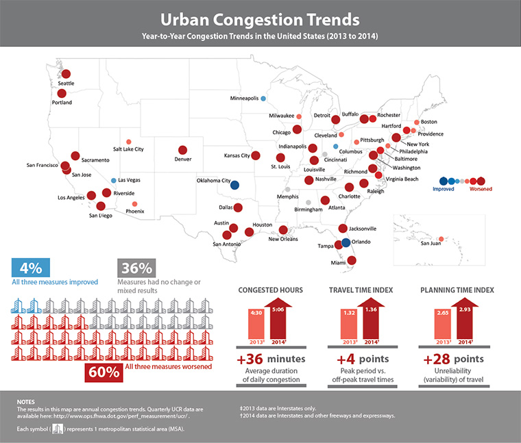
The graphic at right provides year-to-year congestion trends from 2013 to 2014 from data that informs FHWA's Urban Congestion Report (UCR). Overall, congestion has increased from 2013 to 2014. The aggregated congestion measures across all 52 metropolitan statistical areas (MSAs) included in the UCR are all up from 2013 to 2014. There are many ways to address rising congestion. The focus of this report is how operating the highway system can help address growing congestion.
Operational strategies provide a proven toolbox of methods for improving the performance of the transportation system, whether through reducing congestion, improving reliability, or creating options for travelers. Operational strategies often result in other benefits such as increased safety and improved environmental outcomes (e.g., reduced greenhouse gas emissions).
Understanding how the transportation system is operating through monitoring and measuring performance is a vital aspect of performance management, a new approach that is being implemented in part through the MAP-21 Performance Management requirements. UCR and this report demonstrate one approach to calculating these metrics with the newly available National Performance Management Research Data Set (NPMRDS), which includes actual, observed travel times on the National Highway System (NHS) and is available for use by state departments of transportation (DOTs) and metropolitan planning organizations (MPOs) for their performance management activities.
This report includes examples of the use of NPMRDS data for creating the UCR and in one state DOT as well as case studies that highlight innovative ways states and communities throughout the United States have implemented effective operations and measured the impacts on congestion. This report concludes with a discussion of performance measure scalability and target setting, an important aspect of performance management.
Congestion Facts
- All three congestion measures—daily hours of congestion, time penalty for each trip, and worst-trip time penalty—have increased from 2013 to 2014.
- All three measures worsened in 60 percent (31) of the MSAs.
- All three measures improved in 4 percent (2) of the MSAs.
- The time penalty for a trip on an average day increased or remained unchanged in 83 percent (43) of the MSAs.
- Travel time on the worst day per month increased or remained unchanged in 90 percent (47) of the MSAs.
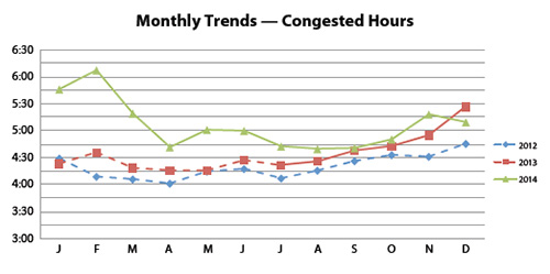
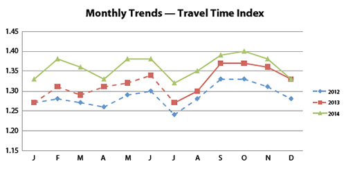
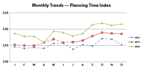
Congestion Measures
- Hours of congestion—amount of time when freeways operate less than 90 percent of free-flow freeway speeds.
- Travel Time Index (TTI)—time penalty for a trip on an average day. A TTI of 1.30 indicates a 20-minute free-flow trip takes 26 minutes (20 × 1.30) in the rush hours.
- Planning Time Index (PTI)—time penalty for a trip to be on time for 95 percent of trips (i.e., late for work on one day per month). A PTI of 1.60 indicates a 20-minute free-flow trip takes more than 32 minutes (20 × 1.60) only one day per month.
- Dashed lines indicate Interstates only.
- Solid lines indicate Interstates and other freeways and expressways.
Using Improved Data to Identify and Solve Congestion Issues
What Is the NPMRDS and What Does It Include?
In an effort to use the best data available for the FHWA UCR Program, FHWA's Office of Operations acquired NPMRDS. This historical traffic speed data set covers the entire NHS. It includes observed measurements (collected 24 hours a day) and provides the user with average travel times in 5-minute intervals in three ways — freight truck, passenger vehicles, and all vehicles.
FHWA has made the data set available to state DOTs and MPOs to facilitate their performance management activities. The data set is available monthly.
How Are NPMRDS Data Processed?
Spatial Data Aggregation
The basic spatial unit of analysis for the NPMRDS-based UCR are traffic message channel (TMC) paths, which are relatively short (average of 1.3 miles among all 52 MSAs) directional roadway paths that are defined by a consortium of several commercial traffic information providers. The three UCR measures are average measures (calculated by averaging values over all TMC paths on the roadway network) and therefore are not factored up to account for time periods where NPMRDS does not provide actual travel times (when no probes reported).
Temporal Data Aggregation
As a first step in the performance measure calculation, researchers summarize the 5-minute day-by-day travel times into 15-minute monthly average travel times by day of week (e.g., each TMC path has a travel time value for 6:00 AM to 6:15 AM for Mondays in January, 6:00 AM to 6:15 AM for Tuesdays in January). Therefore, the result of these summary calculations is a matrix that is 96 (number of 15-minute intervals in a day) by 7 (number of days of the week) for each month and TMC path.
Free-Flow Travel Times
To make meaningful year-to-year comparisons in the NPMRDS-based UCR, it is necessary to keep certain calculation parameters as consistent as possible. Because UCR evaluates quarter-to-quarter performance statistics, a 12-month trailing average of monthly free-flow speeds for the performance measures calculations is used. This approach permits the measure reference point to adapt to changing free-flow speeds, but also not change so dramatically as to adversely affect year-to-year trend comparisons.
Volume Weighting
The NPMRDS-based UCR weights average performance measure values by vehicle-miles of travel (VMT) when combining different TMC paths and time periods. Previously, these VMT weights were calculated directly from the traffic counts measured by fixed-point traffic sensors. Since NPMRDS does not include traffic counts, VMT weights are estimated using traffic count estimates from FHWA's Highway Performance Monitoring System (HPMS).
How Are the Measures Calculated?
The UCR analytics use TMC paths as the roadway analysis unit (or segment length). Other roadway network geographies can just as easily be used when developing these types of performance measures.
Congested Hours are computed as the average number of hours during specified time periods in which TMC paths are congested (operating less than 90 percent of free-flow speeds). This measure is reported for weekdays (6:00 AM to 10:00 PM). Averages are weighted across TMC paths and urban areas by VMT.
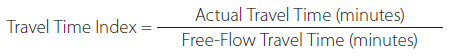
Travel Time Index is the ratio of the peak period travel time as compared to the free-flow travel time (see equation below). This measure is computed for the AM peak period (6:00 AM to 9:00 AM) and PM peak period (4:00 PM to 7:00 PM). Averages are weighted across time periods, TMC path, and urban areas by VMT.
The free-flow travel time for each TMC path is the 15th percentile travel time during traditional off-peak times (weekdays between 9:00 AM to 4:00 PM and 7:00 PM to 10:00 PM; weekends between 6:00 AM to 10:00 PM), not to exceed the travel time at the posted speed limit (or 60 mph where the posted speed is unknown).
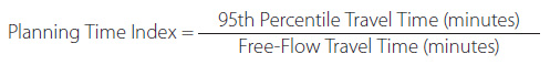
Planning Time Index is the ratio of the 95th percentile travel time as compared to the free-flow travel time (see equation below). The measure is computed during the AM and PM peak hours as defined in the travel time index, and averages are weighted across time periods, TMC paths, and urban areas by VMT. The free-flow travel time is the same as that used for the travel time index.
A Success Story Using NPMRDS Data and Operational Improvement Evaluations
The example from Wisconsin below describes the use of NPMRDS data for performance measure estimation, and the remaining success stories highlight innovative ways states and communities throughout the United States have reduced congestion through effective operations.
Using NPMRDS for Performance Measure Calculation — Wisconsin Department of Transportation
Using NPMRDS travel time data, WisDOT estimated that delay hours decreased by nearly 400,000 hours from spring quarter 2013 to spring quarter 2014 along the nine Interstate corridors in Wisconsin (Travel Time Reliability and Delay Report, Spring 2014).
The Wisconsin Department of Transportation (WisDOT) is actively using performance measures to achieve its mission. WisDOT partnered with the University of Wisconsin Traffic Operations and Safety (TOPS) Laboratory in the development of its performance measures. WisDOT's MAPSS Performance Improvement Program is centered on performance measures and associated goals in the areas of Mobility, Accountability, Preservation, Safety and Service (hence, MAPSS). WisDOT develops a quarterly MAPSS Scorecard summarizing whether each goal has been met, if performance is trending favorably or unfavorably, or if the current trend is holding.
Within the Mobility goal area, WisDOT uses NPMRDS travel time data to estimate reliability (planning time index) and delay (hours of vehicle delay), and more detailed reporting is provided in WisDOT's Travel Time Reliability and Delay Report. PTI and delay are computed on Wisconsin's nine Interstate corridors (and 28 associated freeway and highway segments) to provide performance estimates.
The graphic demonstrates the 2014 results of morning peak period (6:00 AM to 9:00 AM) PTI values on the Milwaukee area Interstates using the NPMRDS data. In the Travel Time Reliability and Delay Report, the enumerated results in the graphic are tied to a results table showing particular information about each segment. WisDOT combines its volume data with the NPMRDS speed data to estimate hours of delay on the nine Interstate corridors.
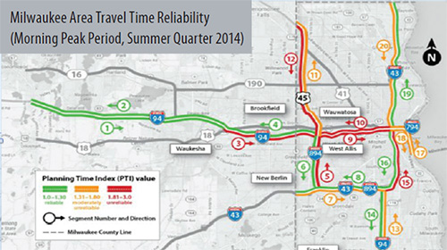
Used with permission from WisDOT Travel Time Reliability and Delay Report, Summer Quarter 2014.
For More Information:
Liz Schneider, Wisconsin DOT, Elizabeth1.Schneider@dot.wi.gov,
http://www.dot.wisconsin.gov/about/performance/index.htm
Automated Traffic Signal Performance Measures — Utah Department of Transportation
Automated Traffic Signal Performance Measures — The automated system shows real-time and historical performance at signals, allowing for optimized operation (Benefits: reduce congestion, save fuel costs, and improve safety).
The Investment
Recognizing the importance of operating traffic signals as effectively as possible, the Utah Department of Transportation partnered with Purdue University and the Indiana Department of Transportation to develop a management structure that allows agencies to maximize the effectiveness of signal systems and produce real-time traffic signal performance measures. The system uses a number of performance measures to evaluate signal progression and effectiveness, including Purdue Coordination Diagrams (progression quality), approach delay and volumes, turning movement counts, Purdue Phase Termination Chart, and split monitor.
The Return
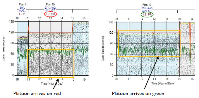
The system collects and stores high-resolution data from the signal controllers, which allows traffic engineers to directly measure what previously could only be estimated and modeled. The graphic below shows a Purdue Coordination Diagram and how it can be used to identify when there is poor progression (platoon of vehicles arriving on red). The user-friendly system can assist with daily operations (basic parameters; coordination; detection problems; complaint response; analyze events, incidents, weather, or construction), reporting (prioritizing signal needs, communicating system status), and modeling/planning.
 Purdue Coordination Diagram Showing Poor Progression (left) and Good Progression (right) in the UDOT Signal Performance Metrics System
Used with permission from Jamie Mackey/Utah DOT, Traffic Signal Systems Committee Presentation, July 22, 2013.
For More Information:
http://aii.transportation.org/Pages/AutomatedTrafficSignalPerformanceMeasures.aspx
http://udottraffic.utah.gov/signalperformancemetrics/
I-95 Ramp Meter Evaluation — Florida Department of Transportation
Freeway Ramp Metering — Signals regulate the flow of vehicles onto freeway lanes. The signals ensure there is more space between the entering vehicles, meaning less disruption to freeway traffic (Benefits: faster freeway speeds, fewer collisions at merge points, and more travelers served).
The Investment
In 2009 and 2010, the Florida Department of Transportation successfully deployed a Ramp Signaling System along I-95 northbound (NB) and southbound (SB) in Miami-Dade County. Eight ramp signals were activated in the NB direction in February 2009, and an additional two NB ramp signals and 12 SB ramp signals were activated in April 2010. The effects on both mainline and on-ramp locations are evaluated on a yearly basis.
The Return
The most recent I-95 Ramp-Signaling Measures of Effectiveness report (August 2014), identified the following benefits along the 10.3-mile route where the Ramp Signaling System was deployed:
- A 9 percent increase in speeds in the NB direction along the non-express local lanes (see graphic);
- A 5 percent increase in speeds in the SB direction along the non-express local lanes (see graphic); and
- All merging influence areas downstream of the ramp meter locations operate at level-of-service (LOS) D (or better), except one that also serves merging onto the Express Lanes (LOS E), and only three operate at LOS D; these results are maintained at the same levels as 2013.
 |
Northbound |
Southbound |
Travel Time and Speed
(Before Ramp Signals) |
14.5 minutes1
43 mph |
14.7 minutes3
42 mph |
Travel Time and Speed
(After Ramp Signals) |
13.1 minutes2
47 mph |
13.9 minutes4
44 mph |
| Percent Change |
-10 percent
+9 percent |
-5 percent
+5 percent |
Notes: Travel time (speed) data are from directional peak periods (southbound from 6:00 AM to 9:00 AM and northbound from 4:00 PM to 7:00 PM). Assumes 10.3-mile corridor in both directions to convert travel times to speeds; floating car (FC) and Transportation Management Center (TMC) travel times used in estimates.
1Based on the average of Jan 2009 FC and TMC travel times. ↑
2Based on the average of Feb TMC data from 2009 to 2014, and Feb 2009 travel times averaged between FC and TMC travel times. ↑
3Based on the average of April 2010 FC and TMC travel times. ↑
4Based on the average of April TMC data from 2010 to 2014, and April 2010 travel times averaged between FC and TMC travel times. ↑
For More Information:
Javier Rodriguez, Florida DOT, javier.rodriguez2@dot.state.fl.us
SFpark Evaluation — San Francisco Municipal Transportation Agency
Parking Management — Incorporating several strategies to make it easier to find a parking space and improve the parking experience (Benefits: reduced time searching for spaces, reduced frustration, and reduced greenhouse gas emissions).
The Investment
SFpark is the name of the San Francisco Municipal Transportation Agency's (SFMTA's) parking management system. It was a demonstration project funded through the United States Department of Transportation's Urban Partnership Agreement (UPA). Several strategies were employed to make it easier to find parking spaces and to generally improve the parking experience, including:
- Demand-responsive pricing;
- Making it easier to pay at meters and avoid citations; and
- Improved parking information to drivers.
The Return
A number of benefits were identified as a result of the SFpark UPA evaluation, including:
- Lowered average hourly rate at meters by 11 cents and at garages by 42 cents;
- Parking occupancy in pilot areas met the target range (60 to 80 percent) 31 percent more often, compared to 6 percent in control areas (see graphic);
- The average amount of time people reported that it took to find a space decreased by 43 percent, compared to a 13 percent decrease in control areas;
- A 30 percent drop in greenhouse gas emissions in comparison to a 6 percent decrease in control areas; and
- A 30 percent decrease in vehicle-miles of travel due to less circling, in comparison to control areas that saw a 6 percent decrease.
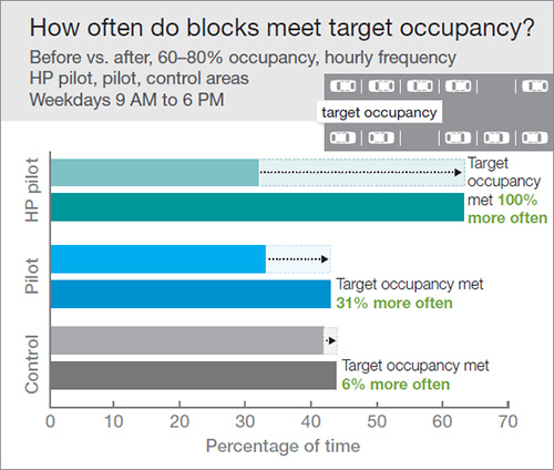
Used with permission from SFpark Pilot Project Evaluation Summary, June 2014.
For More Information:
http://sfpark.org/about-the-project/pilot-evaluation/
Performance Management and Operations
Performance Measure Use at Varied Scales
The purpose of UCR is to present quarterly and annual performance measures that are aggregated to the national (and urban area) level to understand trends over time. In general, the more detailed scale that the measure applies to, with national measures being the least detailed and road segment being the most detailed, the more useful it is to support performance management activities. Agencies can determine which scale applies best to the activities they are undertaking, once aware of the benefits of applying measures at various scales.
For instance, when applying an operational strategy to a portion of the transportation system (such as ramp meters that will smooth flow of traffic into the highway mainline travel lanes), measuring performance at the road segment level (or TMC code level when using the NPMRDS data) both before and after the operational strategy is implemented will allow the agency to identify the potential benefits. Benefits can then be used to justify additional related implementation of strategies in the investment decision-making process.
A key to the successful usage of performance measures is understanding what scale to use, or when to aggregate and when not to aggregate the data. When looking at the performance of a corridor (mainline highway and parallel arterial), aggregating data and measures along the entire length of the corridor may be the best approach. For UCR, aggregating to a national level (all urban areas over 1,000,000 in population) allows for reporting and tracking congestion trends at a big picture level.
Performance Measures Target Setting
An important aspect of performance management is developing targets for future performance based on one or more performance measures. A simplified method for developing targets for future years (e.g., 1-year, 5-year) is to investigate the past trends for the measure and extrapolate that into the future. The measure could be similar to those used in the UCR measures (e.g., Congested Hours, Travel Time Index, and Planning Time Index) or some other mobility measure such as total delay. The extrapolation can be done with consideration of the past trends and supplemented by other available data sources (e.g., VMT growth, population growth, and other economic indicators), and input from previous evaluations of projects and investment dollars available to address problems. An agency can evaluate the projected future measure value and ascertain whether the target is realistic given anticipated supply and demand in the transportation system and the other factors considered, and make practical adjustments necessary to finalize the target.
Contact Information
For more information on this report, contact Rich Taylor (Rich.Taylor@dot.gov).
Visit the Urban Congestion Report website for quarterly congestion trend updates:
www.ops.fhwa.dot.gov/perf_measurement/ucr/index.htm.
April 2015
FHWA-HOP-15-006