Measures of Effectiveness and Validation Guidance for Adaptive Signal Control Technologies
Chapter 8. Literature Review
The literature review is a summary of literature from agencies, consultants, and academics and is not intended to be comprehensive. Many studies are repetitive and consider the same MOEs and methodology and apply the techniques to different locations. The review also focuses on recent studies that consider unique MOEs, and studies that articulate objectives. It has not been common for studies to focus on validation of objectives but rather to evaluate the improvements provided by an ASCT over the previous signal timings. The intention of the review is to identify best practices, common flaws, and emerging trends and in order to develop a recommended practice for validation.
Route Travel Times and Stops
Collecting route travel time data is the most common evaluation approach for traffic studies. Travel time is collected using a variety of means and is a direct measure of how well the traffic flow is for the arterial. In most studies, multiple “probes” travel the corridor collecting start time, time at which each signalized intersection is encountered, and the time to reach the stopping point of the corridor. The test car technique is described well in the Institute of Transportation Engineers Manual of Transportation Engineering Studies. (H.D. Robertson, J.E. Hummer, and D.C. Nelson. Manual of Transportation Engineering Studies. Institute of Transportation Engineers. Prentice-Hall, Englewood Cliffs, NJ. 1994.) For these types of studies, the test car (probe) is driven at the posted speed limit unless impeded by traffic conditions. This methodology is also sometimes referred to as a “floating car” study as drivers are instructed to “pass as many cars as being passed by.” Turner (1998) developed a complete methodology for FHWA using the techniques common to the industry at that time. (Travel Time Data Collection Handbook.) Each of these techniques has been perfected over the years and a variety of new devices are now available for measurement of travel times using GPS probes and vehicle re-identification methods. Figure 12 illustrates a typical exhibit for comparing before and after performance.
Figure 12. Illustration. Example of Speed Versus Distance and Time-Space Diagram Displays in Studies
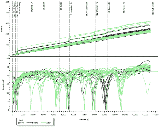
(Source: MoDOT, 2010.)
The collection of travel time data using probes requires a careful consideration of the number of travel runs necessary to be considered statistically significant. The NCHRP Report 3982F (National Cooperative Highway Research Program. Quantifying Congestion. Volume 1 – Final Report. NCHRP 398. Transportation Research Board, 1997, Washington, D.C.) is typically used to identify the suggested sample size for data collection on arterial streets. The recommended approach considers the standard normal variation based on the desired confidence level, coefficient of variation of travel times (percent), and specified relative error (percent). Some studies identified in the literature go through the calculations for the number of travel time runs but the vast majority of methods pick a “reasonable” number of runs which might be between 2 to 15 for a given travel direction. Because probe data has historically been expensive to collect (requiring a driver and a passenger), the data collection is limited by project budget. These relatively low numbers of runs can be used to compare averages, but are not effective in assessing improvements to travel time reliability that may result from application of ASCT. In addition, travel-time varies with traffic volume. Studies that consider this effect such as (Fehon et al., 2010) multiply the average travel time recorded by probe runs by the traffic volume recorded at that time of day to estimate the total vehicle travel time on that route. Further, they weight directional results by distance to combine multiple directions to achieve a plot such as illustrated in Figure 13. Similarly, total stops can be estimated from a similar procedure using the probe data.
Figure 13. Line Graph. Example Comparison of Volume and Distance-Weighted “Total System” Travel Times
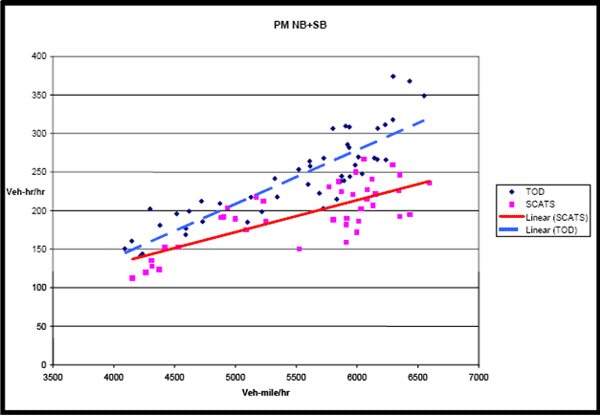
(Source: Fehon, 2010.)
Another approach to reporting performance has been to identify the amount of time spent in “congestion” conditions (Midwest Research, 2010) based on an average speed assumption. In this study time spent traveling at average speed less than 20 mph was defined as congested. An example summary table is shown in Figure 14.
Figure 14. Table. Example of Results Reported as Time Spent in Congested Conditions.
(Source: Midwest Research, 2010.)
Many studies report only arterial end-to-end travel times and neglect collection of data on routes that have different origins and destinations in the system and combinations of turning movements. Only a limited number of studies have considered multiple network paths (Hunter et al., 2005). When probe vehicles are used, most studies report average stops and use graphics to depict differences between before and after conditions. An effective graphic for comparing travel times by time of day is illustrated in Figure 15.
Figure 15. Line Graph. Example Comparison of Travel Times by Time of Day
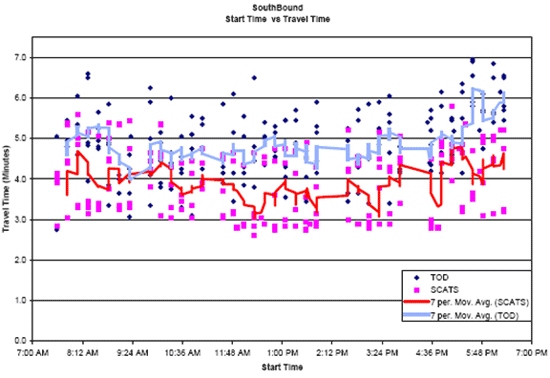
(Source: Midwest Research, 2010.)
When vehicle re-identification technologies are used instead of probe vehicles, stops cannot be computed, so reductions or changes in delay and travel time are only typically reported.
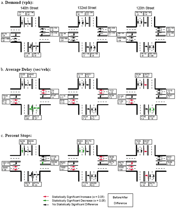
Side-Street Performance
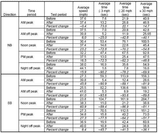
Most studies augment route travel times with collection of a limited amount of side-street performance data using traditional manual observation techniques – counting vehicle queues and estimating delays. Due to the manual labor involved, all studies are limited in the duration of the data collection due to project budget. For example, Wetzel et al. (2011) used the procedures found in the 2010 HCM to evaluate an ASCT system in Seminole County, Florida. A survey period of 30 minutes was used. Survey data collection started at the beginning of the red indication for the study lane group when no vehicles were queued. The field personnel recorded vehicle arrivals, and the number of vehicles in the queue (Queue-count). Vehicle arrivals were classified as “stopped” or “nonstopped.” Vehicles turning right-on-red that did not significantly yield to conflicting traffic were recorded as “not-stopped.” Pedestrian delay is typically measured using a stopwatch technique. Delay was measured from the moment a pedestrian arrived at the intersection until they entered the roadway and started to cross the street. An example exhibit on side-street comparison performance is shown in Figure 16.
Figure 16. Exhibit. Example of Side-Street Performance Summary.
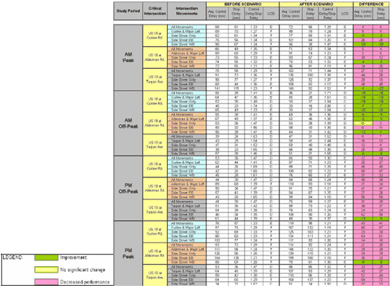
(Source: Pinellas County, Florida, 2007.)
These simple techniques are effective, but just cannot be used for long periods of time due to cost. Human observers contribute errors to the process due to potential inattention and the real needs to take mental and physical breaks. Videotaping locations is also frequently used to reduce the need for on-site observers, but still the amount of information that can be distilled is limited by human-in-the-loop issues. High-resolution phase timing and detection data that is now becoming available from controllers, ASCT, and other signal systems can be used to reduce the manual effort to collect such measures as will be discussed further in this report.
Studies that report queue lengths as performance measures are almost always counted manually with observers. NCHRP 3-79 recommends use of videotaping and manual post processing. A few vendor technologies are emerging that claim the capability to count turning movements and queue lengths automatically from video cameras images. Such systems have not been evaluated and validated extensively enough to consider such automated methods as part of this process at this time.
Before and After Format
Almost all studies approach the data collection efforts in a “before” and “after” format. Fehon (2010) (Adaptive Traffic Signals, Comparison and Case Studies. Fehon and Peters, 2010.) has identified the inherent problems with traditional before and after smooth flow studies (specifically travel time surveys). He noted that the sample sizes are based on performance measures that compare mean values and are not intended to provide a basis for comparing measures of variability in travel times. In addition, before and after studies assume an underlying stability in the traffic conditions during the survey period, which may not be the case. In particular, studies neglect the collection of measures that reflect the ASCT capabilities to modify its operation to efficiently accommodate variations. It was concluded that traditional studies offer under-report the benefits of adaptive systems, and the conclusions drawn from those studies are unreliable.
Fehon (2010) has recently studied ASCT in Walnut Creek, California using a comprehensive performance evaluation. The use of Bluetooth devices were used to collect travel time data over 24 hours per day for two weeks, providing equal sample sizes for both “with” and “without” adaptive conditions. Fehon (2010) has also recently studied ASCT systems in Sunnyvale, California, and Santa Clara County, California. In these studies, the researchers collected travel time data and matched it to volume data measured at the same time, using 15-minute time slices, giving a single statistic of the total corridor performance for each time slice. All of the data points derived for the two weeks of surveys were analyzed and plotted in such a way that it was possible to clearly separate the effects of different volume levels.
It is not uncommon to collect the “before” conditions and “after” conditions with several months of time in between the two studies. Over this time, travel demand can, and typically does change due to a variety of reasons, such as site development and seasonal changes. This variability is often mitigated by collecting data on the same days of the week and within a given season. School schedules are typically accommodated in most studies due to the known changes in travel demand.
On/Off Format
To get around the issues related to before/after studies, several studies have begun to study performance using on/off techniques. A study performed in Seminole Count (SynchroGreen Real-Time Adaptive Traffic Control System: Seminole County SR 436 Deployment, 2011.), Florida analyzed the green time utilization with the system active (“on”) and while it was inactive (“off”). In this case, the floating car technique was used. The probe vehicle began travel time runs at various time points during signal cycles or periods to avoid starting each run at the same location within a platoon. Stevanovic et al. has also applied some on/off techniques in simulation studies (2009) and Fehon recently applied the ON/OFF approach to evaluation as well (2010).
While an ON/OFF approach may be more defensible scientifically because comparisons have a stronger probability of having similar traffic conditions with the system on and off, such a study is more difficult to support politically by the agency owners. Laypeople and nontechnical stakeholders frequently view the intentional disabling of a technology as imprudent, particularly when the ASCT technology is a relatively expensive project with limited visible products (i.e., unlike construction).
Quality of “Before” Timings
The largest contributor to the uncertainty about the benefits of ASCT is due to the quality of timings that the system is compared to. Some reports of hugely successful deployments (90 percent reductions in stops, etc.) have simply compared the ASCT to poorly configured or significantly outdated timings. Other studies report only modest improvements due to ASCT when compared to recently optimized timings or timings that are largely suitable for typical conditions. Both situations are accurate assessments of ASCT value, but tend to distort comparisons between systems when they are used inappropriately for decision-making.
Reporting of Results
Most studies report absolute values, absolute differences, and percentage differences for each measure. Percent differences contribute the most to the uncertainty since percentages amplify differences in small numbers. For example, a change from 1 stop to 0.5 stops is a difference of 50 percent. If the after condition is worse, it could be reported as a 100 percent increase in stops from 0.5 to 1. Such a system might only be a mile in length. Another system with a reduction in stops from 14 to 7 along a 10-mile arterial would also be a 50 percent reduction in stops, but with substantially higher aggregated performance benefits. While percentages are easy for human brains to process (perhaps due to our consumerism culture of 50 percent off sales and the like), there is definitely a need to identify reporting methods that allow fairer comparisons of performance (see Figure 30).
Figure 17. Table. A Typical Evaluation Report Summary Table.
(Source: TJKM, 2011.)
Some evaluations have used other ways of aggregating performance (MnDOT, 1995; NCHRP 03-90, in press) such as accumulating the number or percentage of links that were “better,” “worse,” or “same” into bins by time of day and direction of travel. The MnDOT study on the ICTM (which included both freeway ramp metering and arterial ASCT) is notable in that they reported performance both before and after adjusting for volume changes as illustrated in Figure 18 and Figure 19. Notice in Figure 19 that after adjusting for flow rate differences, the number of links that are “better” increases substantially due to the 3 years of difference between when the “before” data was collected to when the system was fully installed and evaluated. More study is needed to determine the methodology used to adjust the results for volume differences.
Figure 18. Table. Summary of Performance in “Better,” “Worse,” and “Same.”
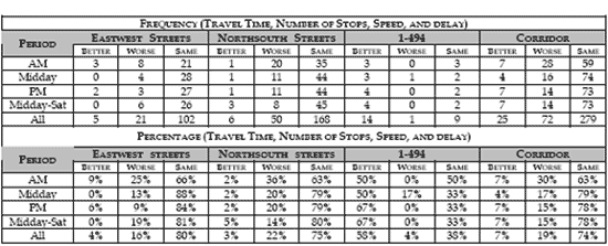
(Source: MnDOT.)
Figure 19. Table. Summary of Performance Adjusted for Volume Changes.
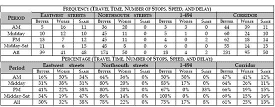
(Source: MnDOT.)
Figure 20 illustrates another method for summary of network performance that might be applied to ASCT validation. Papamichail et al., (2009) used these graphs to illustrate how the distribution of performance across a network is improved in the before and after cases in Melbourne, Australia.
Figure 20. Diagram. Example of Aggregate Performance Indicators For Summary Performance of a Network.
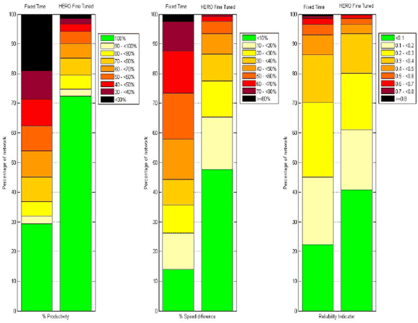
(Source: Papamichail et al., 2009.)
Other studies (Pesti et al., 1999) have shown performance differences in a graphical format as illustrated in Figure 21. Such graphics are helpful in identifying performance benefits in a more user-friendly way than tabular summaries.
Figure 21. Exhibit. Graphical Example of Statistically Different Performance by Movement
(Source: Pesti et al., 1999.)
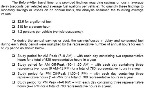
Extrapolation to Benefit/Cost
Similarly, when average results in a limited study are used to extrapolate future performance in benefit/cost assessments, it is assumed that the percentage savings would simply accrue at the same rate for the system life cycle. Typical assumptions and resulting exhibit are illustrated in Figure 22 and Figure 23. Since most agencies retime signals either on a scheduled basis or based on trouble calls, some accommodation for these improvement activities needs to be taken into account in order to make the B/C estimates more from ASCT more realistic.
Figure 22. Exhibit. Example Assumptions for B/C Estimation.
(Source: Pinellas County, Florida, 2007.)
Figure 23. Exhibit. Example Benefit/Cost Exhibit.
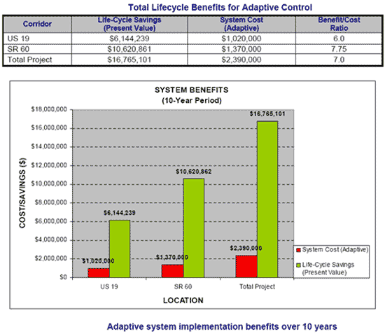
(Source: Pinellas County, Florida, 2007.)
It has been uncommon for agencies to provide targets for improvement goals in system deployments. One study in Menlo Park, California did identify target performance goals for travel time, stops, side-street delay, and average speed (7 percent improvement to stops and 5 percent improvement for the other measures) and the evaluation showed that these goals were met for off-peak times. Lower goals were applied for p.m. peak periods and the ASCT largely met those goals as well (Menlo Park, 2003).