Research, Development, and Application of Methods to Update Freight Analysis Framework Out-of-Scope Commodity Flow Data and Truck Payload Factors
Chapter 6. Farm-Based Shipments of Corn
Methodological Approach
The process for modeling out-of-scope (OOS) farm-based corn commodity flows is based on the portion of the supply chain that constitutes the out-of-scope movement. Like the University of Texas at Austin (UT Austin) Center for Transportation Research (CTR) study, this study assumes that after corn is produced on the farm, it is then transported to a grain elevator or other agricultural storage facility where it then becomes an in-scope commodity movement that is captured by the Commodity Flow Survey. The process uses the following data sources:
- United States Department of Agriculture (USDA) National Agricultural Statistics Service (NASS)—The USDA NASS provides county-level production for corn.
- Grain Elevator Location Data—Data on the locations and sizes of grain elevators at the county level. Grain elevators are included under North American Industry Classification System (NAICS) 493130 and 424510. The U.S. Census Bureau's County Business Patterns database is used as the source of this information.
Key methodological steps are depicted in figure 37 and are described below:
- Estimate County Level Corn Production—Using the USDA NASS data on county level productions, the amount of corn produced at the county level was estimated,
 in figure 35. Importantly, at this point in the approach the methodology defines a set of production-consumption zones that set the boundaries for where farm-based shipments of corn may be attracted. In this sense, production-consumption zones place a ceiling on how far farm-based shipments of corn may travel. in figure 35. Importantly, at this point in the approach the methodology defines a set of production-consumption zones that set the boundaries for where farm-based shipments of corn may be attracted. In this sense, production-consumption zones place a ceiling on how far farm-based shipments of corn may travel.
- Estimate County Level Corn Attractions—First, using U.S. Census Bureau County Business Pattern (CBP) data, the number of grain elevators in each county was counted and its share of all grain elevators was calculated using the NAICS 493130 and 424510 industry codes. Then, the same was done for each county using payroll data from the U.S. Census Bureau CBP. In this sense, payroll data served as a proxy for elevator capacity. The share of grain elevator facilities and payroll for each county were then added and normalized so that the total sums to 100 percent. The combined shares were then rebalanced so that when summed the county level attractions,
 in figure 35, equal the total share of corn produced in each production-consumption zone. In this manner, the grain elevator capacity of each county was estimated and accounted for in the methodological approach. in figure 35, equal the total share of corn produced in each production-consumption zone. In this manner, the grain elevator capacity of each county was estimated and accounted for in the methodological approach.
- Distribute Corn Between Counties—Farm-based corn commodity flows were then distributed to counties based on the proxy for grain elevator capacity using a gravity model as shown in figure 35. The travel time factor between counties,
 in figure 35, is equivalent to the impedance function in figure 36 normalized so that it sums to 1 across a given production county and all its destination consumption counties. Network distances between origin and destination counties were obtained from the Oak Ridge National Laboratory's County Distance Database. An iterative proportional fitting routine was run until the productions and attractions converge. in figure 35, is equivalent to the impedance function in figure 36 normalized so that it sums to 1 across a given production county and all its destination consumption counties. Network distances between origin and destination counties were obtained from the Oak Ridge National Laboratory's County Distance Database. An iterative proportional fitting routine was run until the productions and attractions converge.
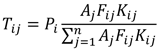 The formula shows the equation for the gravity model which may be used to distribute commodity flows between counties. It takes the following factors into consideration: tons of commodities attracted to a county, tons of commodities produced in a county, an impedance factor for flows between counties, and an adjustment factor for flows between counties.
Figure 35. Equation. Gravity model
(Source: Meyer and Miller, 2001.)
The formula shows the equation for the gravity model which may be used to distribute commodity flows between counties. It takes the following factors into consideration: tons of commodities attracted to a county, tons of commodities produced in a county, an impedance factor for flows between counties, and an adjustment factor for flows between counties.
Figure 35. Equation. Gravity model
(Source: Meyer and Miller, 2001.)
where i,j = counties.
 = tons of commodities between counties i and j. = tons of commodities between counties i and j.
= tons produced in county i.
= tons attracted to county j.
= travel time factor between counties i and j.
 = adjustment factor for commodity flows between counties i and j. = adjustment factor for commodity flows between counties i and j.
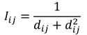 Figure 36. Equation. Impedance function.
(Source: Federal Highway Administration.)
Figure 36. Equation. Impedance function.
(Source: Federal Highway Administration.)
where  = impedance between counties i and j. = impedance between counties i and j.
 = Great Circle distance between counties i and j. = Great Circle distance between counties i and j.
- Aggregate to the Freight Analysis Framework Version 4 (FAF4) Zone Level—After distribution, the county-level productions and attractions were aggregated to the FAF4 zone level.
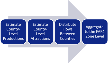 Figure 37. Flow chart. Framework for out-of-scope corn farm-based shipments.
(Source: Federal Highway Administration.)
Figure 37. Flow chart. Framework for out-of-scope corn farm-based shipments.
(Source: Federal Highway Administration.)
Results
Figure 38 depicts the assumed production-consumption zones for corn farm-based shipments. These zones were based on the clustering of counties that produce corn across states. Six production-consumption zones are defined for the contiguous U.S.: Northeast, Southeast, Heartland, Southwest, Mountain, and West Coast as shown in table 15. In keeping with the observation that farm-based shipments are primarily local, the methodology assumes that OOS movements of corn are distributed within these zones.
Table 15. States by zone for corn.
| Zone |
States |
Zone |
States |
| Northeast |
- Connecticut.
- Delaware.
- District of Columbia.
- Maine.
- Maryland.
- Massachusetts.
- New Hampshire.
- New Jersey.
- New York.
- Pennsylvania.
- Rhode Island.
- Vermont.
- West Virginia.
|
Southwest |
- Arizona.
- Texas.
- New Mexico.
- Oklahoma.
|
| Southeast |
- Alabama.
- Arkansas.
- Florida.
- Georgia.
- Kentucky.
- Louisiana.
- Mississippi.
- North Carolina
- South Carolina.
- Tennessee.
- Virginia.
|
Mountain |
- Idaho.
- Nevada.
- Utah.
- Montana.
- Wyoming.
|
| Heartland |
- Illinois.
- Indiana.
- Iowa.
- Kansas.
- Michigan.
- Missouri.
- Minnesota.
- Nebraska.
- North Dakota.
- Ohio.
- South Dakota.
- Wisconsin.
|
West Coast |
- California.
- Oregon.
- Washington.
|
(Source: Federal Highway Administration.)
Also depicted in figure 38 are the results of estimated corn production at the county level. For most counties, the 2017 USDA NASS data explicitly reports total production for each county. However, it aggregates data for other counties due to privacy concerns. For those counties, the amount of corn produced is apportioned equally among them. In total, over 413.6 million tons of shelled corn are estimated to have been produced in 2017. Of that total, the Heartland region produced the vast majority at 88 percent, followed by the Southeast at 6 percent, and the Southwest at over 2 percent. The Northeast, Mountain, and West Coast regions are estimated to have produced the remainder.
Figure 39 depicts the methodology's results for the estimation of corn farm-based attractions at the county level. In general, counties with higher numbers of farm product warehousing and storage establishments (NAICS 493130) and grain and field bean wholesalers (NAICS 424510) as indicated by U.S. Census Bureau County Business Pattern data attract higher amounts of corn farm-based shipments than others. By far the Heartland production-consumption zone has the highest share of these establishments in the U.S. at just under 60 percent. It is followed by the Southeast at just under 15 percent, the Southwest at approximately 9 percent, the West Coast at 8 percent, and the Northeast at 5 percent.
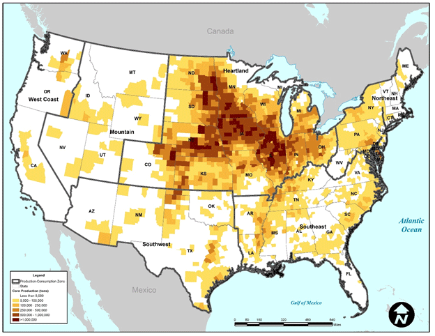 Figure 38. Map. Tons of shelled corn produced at the county level.
(Source: USDA NASS, 2017.)
Figure 38. Map. Tons of shelled corn produced at the county level.
(Source: USDA NASS, 2017.)
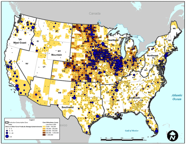 Figure 39. Map. Tons of shelled corn attracted at the county level.
(Source: USDA NASS, 2017; U.S. Census Bureau County Business Patterns, 2016.)
Figure 39. Map. Tons of shelled corn attracted at the county level.
(Source: USDA NASS, 2017; U.S. Census Bureau County Business Patterns, 2016.)
As an example, table 16 shows the results of the analysis of corn for the remainder of Illinois FAF4 zone. In total, over 69.8 million tons of corn are estimated to have an origin or destination within this zone. The results indicate that for the Remainder of Illinois zone nearly one-third (about 32 percent or over 22 million tons) of corn farm-based flows are internal. About 28 percent (19.7 million tons) of flows are inbound while the remainder (about 40 percent or over 28.1 million tons) is outbound. That the methodology estimates that nearly two-thirds of corn farm-based flows for this zone are either inbound or internal is reflective of its relatively large number of farm product warehousing and storage and grain and field bean wholesale establishments.
The results in table 16 also indicate that neighboring states with significant agricultural activity are relatively large receivers of corn farm-based shipments from the Remainder of Illinois zone. For example, the Remainder of Iowa zone is estimated to receive 20 percent of outbound corn farm-based flows from the Remainder of Illinois zone. The Remainder of Iowa FAF4 zone is estimated to be a similarly large shipper of corn farm-based shipments to the Remainder of Illinois zone at 22 percent.
Table 40 shows the distribution of tonnage by distance for all shipments in the Heartland production-consumption zone. The results indicate that about 26 percent of total tonnage travels 50 miles or less and over half (51 percent) travels 200 miles or less. About 81 percent of total tonnage for the Heartland zone is estimated to travel distances of 500 miles or less. The results are the same when viewed over the entire contiguous U.S. (see figure 41) since the Heartland zone produces the majority of U.S. corn. While this is largely consistent with the assumption in the current FAF4 process on distance thresholds for farm-based shipments, the draft methodology does result in about 12 percent of total tonnage traveling distances over 500 miles. In addition, the results indicate a sharp drop in the share of tonnage shipped over the 50–100 mile range. Most likely, this reflects the challenge of calibration as opposed to the underlying, real-world distribution pattern of the commodity.
Table 16. Results for the remainder of Illinois freight analysis framework version 4 zone.
| FAF4 Zone |
Outbound from Remainder of Illinois—Tons |
Outbound from Remainder of Illinois—Percent of Total |
Inbound to Remainder of Illinois—Tons |
Inbound to Remainder of Illinois—Percent of Total |
| Denver-Aurora, CO Commodity Flow Survey (CFS) Area |
191,678 |
1% |
10,237 |
<1% |
| Remainder of Colorado |
349,899 |
1% |
119,980 |
1% |
| St. Louis-St. Charles-Farmington, MO-IL CFS Area (IL Part) |
816,046 |
3% |
625,614 |
3% |
| Chicago-Naperville, IL-IN-WI CFS Area (IL Part) |
2,319,283 |
8% |
1,117,586 |
6% |
| Fort Wayne-Huntington-Auburn, IN CFS Area |
216,319 |
1% |
228,798 |
1% |
| Indianapolis-Carmel-Muncie, IN CFS Area |
591,049 |
2% |
712,306 |
4% |
| Remainder of Indiana |
1,114,599 |
4% |
2,590,053 |
13% |
| Chicago-Naperville, IL-IN-WI CFS Area (IN Part) |
126,202 |
<1% |
341,222 |
2% |
| Remainder of Iowa |
5,615,863 |
20% |
4,282,971 |
22% |
| Remainder of Kansas |
2,047,425 |
7% |
587,918 |
3% |
| Kansas City-Overland Park-Kansas City, MO-KS CFS Area (KS Part) |
981,701 |
3% |
64,500 |
<1% |
| Wichita-Arkansas City-Winfield, KS CFS Area |
276,035 |
1% |
33,349 |
<1% |
| Remainder of Michigan |
695,130 |
2% |
506,316 |
3% |
| Grand Rapids-Wyoming-Muskegon, MI CFS Area |
88,761 |
<1% |
145,290 |
1% |
| Detroit-Warren-Ann Arbor, MI CFS Area |
238,095 |
1% |
102,037 |
1% |
| Remainder of Minnesota |
1,416,596 |
5% |
1,330,563 |
7% |
| Minneapolis-St. Paul, MN-WI CFS Area (MN Part) |
918,170 |
3% |
286,474 |
1% |
| Remainder of Missouri |
1,330,794 |
5% |
1,231,217 |
6% |
| Kansas City-Overland Park-Kansas City, MO-KS CFS Area (MO Part) |
578,320 |
2% |
168,236 |
1% |
| St. Louis-St. Charles-Farmington, MO-IL CFS Area (MO Part) |
473,298 |
2% |
79,795 |
<1% |
| Remainder of Nebraska |
1,404,717 |
5% |
1,466,821 |
7% |
| Omaha-Council Bluffs-Fremont, NE-IA CFS Area (NE Part) |
1,065,282 |
4% |
98,675 |
1% |
| Remainder of North Dakota |
1,771,256 |
6% |
265,087 |
1% |
| Remainder of Ohio |
1,102,734 |
4% |
531,034 |
3% |
| Cleveland-Akron-Canton, OH CFS Area |
99,805 |
<1% |
69,081 |
<1% |
| Cincinnati-Wilmington-Maysville, OH-KY-IN CFS Area (OH Part) |
189,391 |
1% |
58,764 |
<1% |
| Dayton-Springfield-Sidney, OH CFS Area |
217,517 |
1% |
188,479 |
1% |
| Columbus-Marion-Zanesville, OH CFS Area |
180,829 |
1% |
315,529 |
2% |
| Remainder of South Dakota |
835,542 |
3% |
710,897 |
4% |
| Remainder of Wisconsin |
763,551 |
3% |
1,182,553 |
6% |
| Milwaukee-Racine-Waukesha, WI CFS Area |
121,930 |
<1% |
223,522 |
1% |
| Total |
8,137,818 |
100% |
9,674,902 |
100% |
(Source: Federal Highway Administration.)
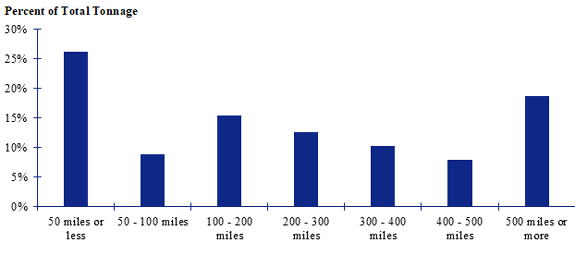 Figure 40. Bar chart. Distribution of shipment distances for farm-based shipments of corn in the Heartland zone.
(Source: Federal Highway Administration.)
Figure 40. Bar chart. Distribution of shipment distances for farm-based shipments of corn in the Heartland zone.
(Source: Federal Highway Administration.)
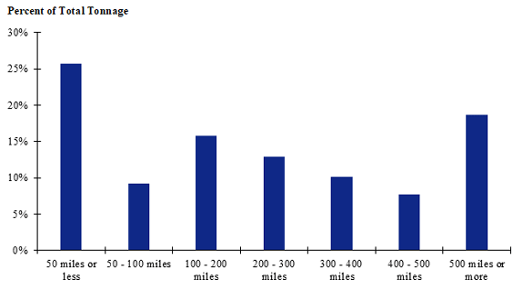 Figure 41. Bar chart. Distribution of shipment distances for farm-based shipments of corn in the contiguous U.S.
(Source: Federal Highway Administration.)
Figure 41. Bar chart. Distribution of shipment distances for farm-based shipments of corn in the contiguous U.S.
(Source: Federal Highway Administration.)
|