Peer Exchange Workshop on the "Perfect World of Measuring Congestion"
Workshop Summary Report
APPENDIX C: WHITE PAPERS
Paper #3: Connecting the Dots: How to Better Link Project-Level Performance Monitoring to Policy-Level Performance Management?
Prepared for:
Peer Exchange Workshop on the “Perfect World of Measuring Congestion”
FHWA Office of Operations
Prepared by:
Texas A&M Transportation Institute and Battelle
FINAL
December 10, 2013
1. Introduction
This is one of four papers prepared for the Peer Workshop on Operations Performance Measures to be held on December 17-18, 2013 in Washington, D.C. The objective of this paper is to outline the important considerations for performance monitoring and management at varying levels of detail to meet different decision-making needs. This paper is intended to stimulate discussion at the December Peer Workshop and is not intended as an exhaustive treatment of this topic area.
2. Continuum of Performance Management
Performance measures can be used in a very wide range of transportation decisions, from making real-time traffic signal adjustments at a single intersection, to making multi-billion dollar transportation investment decisions over the next 20 years in a state of 38 million people.
In some cases, performance measures are also used to determine the effectiveness of improvements (through before-and-after evaluations). For example, did the incident management program improve incident response and clearance times, and further, did it reduce congestion and improve reliability? If certain strategies are more effective than others, than those strategies are more likely to be deployed in the future.
In many cases, performance measures are used to provide situational awareness. For example, is congestion getting better or worse? Which locations have the most congestion? What are the trends over time?
In other cases, performance measures are used to guide transportation investments. For example, where are the most congested or least reliable highways, and therefore the highest return on highway investment? Performance measures can also be used for multimodal alternatives analysis and tradeoff. For example, what combination of land use policies, operations and management strategies, public transit, and highway investments will produce the most favorable performance outcome?
It is clear that performance measures are used by many different audiences for many different types of decisions (see Figures 1 and 2). There may or may not be discrete boundaries between these different types of decisions; instead, a continuum exists. In some agencies, even the lines between “operations” and “planning” become less clear.
Figure 1. Performance Measures Provide Answers to Questions at Several Levels
Figure 2. General Characterization of Performance Reporting Parameters
Several questions arise when considering the use of performance measures in such a wide range of decisions:
- How varied are the performance measures used for “microscopic” vs. “macroscopic” decisions?
- If different performance measures are used at different decision levels, how can one ensure logical consistency between decisions made at “micro” and “macro” levels? In other words, do performance measures at the “micro” level “tell a different story” than performance measures at the “macro” level?
- If the same or very similar performance measures are used throughout the different levels, can the same or very similar datasets be used for performance-based decisions at these different levels?
- Is it necessary to measure performance at all these different levels? Can we just measure everything at the “micro” level?
We will explore these questions and other issues in more detail at the Peer Workshop in mid-December. Workshop participants are encouraged to share their perspectives and experiences with performance-based decisions at their respective agencies.
3. Illustrative Example
Specific examples are usually best to help illustrate key concepts. This section includes two examples1 that illustrate different ends of the spectrum in regards to performance measurement:
- A project-specific performance evaluation of I-465 in Indianapolis, Indiana.
- A statewide ranking of annual performance trends in Indiana.
The first example illustrates the congestion reduction impacts of a specific transportation improvement called Accelerate I-465, a series of geometric design improvements and capacity additions along an 11-mile section of I-465. However, the more detailed nature of this performance assessment is equally applicable to before-and-after operational improvements.
Figure 3 shows a color-coded speed diagram that visually indicates the congestion at several interchanges for all months in 2011, while Figure 4 shows the same speed diagram for all months in 2012. The congestion improvement from 2011 to 2012 is readily apparent, as the 2012 diagram has fewer yellow blocks (indicating speeds of 45 to 54 mph) and more green blocks (indicating speeds of 55 to 64 mph). The congestion improvements are also quantified in terms of several quantitative performance measures; however, these “qualitative” illustrations (i.e., speed diagrams) are a helpful visual aid that provides time- and location-specific detail.
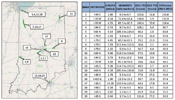
Figure 5 illustrates the second example, which provides a statewide perspective on the most improved Interstate segments based on 2011-2012 changes in the travel time deficit. The section of I-465 that showed the significant improvement in Figures 3 and 4 is ranked as #16 in the Top 20 Most Improved segments across Indiana’s monitored roadway system.
Figure 5. Top 20 Most Improved Performance (Based on Change in Travel Time Deficit, 2011-2012)
Source: 2012 Indiana Mobility Report, http://docs.lib.purdue.edu/imr/.
Figure 6 provides a systemwide context for specific improvements along I-465. The leftmost chart shows distance-weighted congestion hours, and the I-465 congestion quantities are shown as the dark and light purple slivers (a small proportion of the overall congestion). Similarly, the rightmost chart shows total travel time deficit, and the I-465 congestion quantities are shown in dark and light purple. Figure 6 appears to be an effective way to “connect the dots” and make the link between project-specific benefits and system-wide performance.
4. Findings and Conclusions
The previous section showed two illustrative examples of performance measurement that were at different ends of the spectrum in regards to level of detail. Figures 3 and 4 visually illustrated time- and location-specific congestion reduction impacts of a specific project on I-465. Figures 5 and 6 provided a “big picture” view of system (i.e., statewide) performance, and showed the I-465 project in this system-wide context.
Figure 6 is a general characterization of performance reporting parameters. Only three levels are shown in this graphic for the sake of clarity. In practice, however, there is a continuum of level of detail and information requirements, and these may vary between different agencies depending upon its decision-making process.
There are several other performance reporting efforts in the U.S. in which one could find similar examples that span a range of detail, from specific facilities/projects to system-wide. The best practices appear to have these characteristics:
Project-specific examples that clearly show the benefits of specific transportation improvements in easily-understood terms. These examples may be qualitative (e.g., visual) and/or quantitative. These project-specific examples are more detailed and are likely to help decision-makers relate to real-world examples. However, project-specific examples don’t provide the “big picture” in terms of overall system performance.
System-wide statistics are necessary to show the “big picture” view for higher-level decision-makers. System-wide trends over multiple years are also desirable, even if all of the change may not be fully attributable to specific transportation improvements. However, system-wide reporting is not ideal for showing specific problem areas or specific causes.
Showing specific improvements in the context of overall system changes (as shown in Figure 6) is important to logically connect specific projects to the overall system performance. By providing this context, decision-makers can see what impact specific projects have on the overall problem.
Using the same or logically similar performance measures at different levels of detail helps provide continuity and consistency between specific project impacts and overall system performance. For example, Figures 3 and 4 used speeds as a performance measure, while Figures 5 and 6 used travel time deficit. In this case, speeds and travel times are logically similar and provide continuity between different levels of reporting.
Ideally, one could use the same data for performance reporting at all levels of detail, from project specific to system-wide. Due to current limitations in data, this may not always be feasible in current practice.
Aggregate, system-wide reporting is more likely to be influenced by external variables (the subject of another white paper for this workshop) outside of public agency control. Conversely, project-specific evaluations are more likely to control for these external variables to isolate the impacts of the investment or strategy.