|
|
|
final report
Traffic Congestion and Reliability:
Trends and Advanced Strategies for Congestion Mitigation
3.0 Recent Trends in Congestion
3.1 ESTIMATING THE SOURCES OF CONGESTION
The previous section emphasized the value of estimating the size of each contributing source to total congestion so that strategies can be tailored to specific conditions. However, teasing out each source from the whole of congestion has proven to be elusive, and we are only beginning to understand the complexities and interactions involved (see Figures 2.3a and 2.3b). Even with continuous measurement of travel times enabled with ITS technologies, some level of modeling is required to assign the contribution of each source.
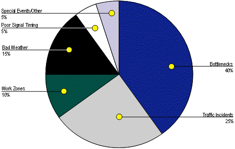
The results of two studies based purely on modeling are shown in Figure 3.1. These studies used similar data—but different modeling techniques—to provide national estimates of congestion by source. While not directly comparable, these two studies do provide a picture of congestion that is highly dependent on traffic-influencing events, as identified in the last section. Note that the studies are limited in the sense that neither considered all seven sources of congestion. As a result, FHWA has produced the composite estimate of congestion by source shown in Figure 3.2. Until better information is developed, the breakdown in Figure 3.2 is our best estimate of what contributes to congestion nationally.
National estimates of congestion by source are useful to guide FHWA's program and to identify which areas should be emphasized. However, local conditions vary widely and methods for estimating congestion sources on individual highways would be highly useful to transportation engineers "in the trenches" trying to decide how to craft mitigation strategies. A study in Seattle, Washington is currently underway to identify the contribution of congestion sources in three freeway corridors.
3.2 WHAT HAS BEEN HAPPENING TO CONGESTION NATIONALLY?
3.2.1 What the Roadway-Based Data Are Telling Us
Is congestion getting worse? Yes. The best single source for monitoring congestion trends is produced annually by the Texas Transportation Institute (TTI).13 In their 2005 report, TTI's researchers found that congestion levels in 85 of the largest metropolitan areas have grown in almost every year in all population groups from 1982 to 2003, as exemplified by the following trends.
Figure 3.1 Results of Two Modeling Studies to Estimate Congestion by Source
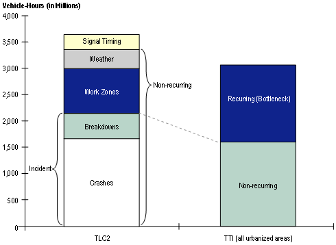
Source: Chin, S.M., Franzese, O., Greene, D.L., Hwang, H.L., and Gibson, R.C., Temporary Loss of Highway Capacity and Impacts on Performance: Phase 2, Report No. ORLNL/TM-2004/209, Oak Ridge National Laboratory, November 2004. "TLC2" is the methodology developed for this work; "TTI" are the results from the Texas Transportation Institutes annual Urban Mobility Study for 2004 (http://mobility.tamu.edu).
Figure 3.2 The Sources of Congestion
National Summary
Ten-Year Average Urban Congestion Trends (1993 to 2003)
- Peak-period trips take an average of about 7 percent longer. (In most metropolitan areas, the idea of "rush hour" is obsolete—congestion happens for multiple hours on both morning and evening weekdays.)
- Travelers spend 47 extra hours per year in travel compared to 40 hours in 1993.
- The percent of urban freeway mileage that is congested has grown from 51 percent to 60 percent.
21-Year Urban Congestion Trends (1982 to 2003)
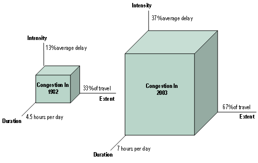
- Congestion has grown substantially over the past 20 years. While the largest cities are the most congested, congestion occurs—and has grown—in cities of every size (Figure 3.3).
- Congestion extends to more time of the day, more roads, affects more of the travel, and creates more extra travel time than in the past. And congestion levels have risen in all size categories, indicating that even the smaller areas are not able to keep pace with rising demand (Figure 3.4).
- Sixty-seven percent of the peak-period travel is congested compared to 33 percent in 1982. Travelers in the 85 urban areas studied spent an average of 47 hours per year stuck in traffic in 2003, up from 16 hours in 1982.
- Sixty percent of the major road system is congested compared to 35 percent in 1982.
- The number of hours of the day when travelers might encounter congestion has grown from 4.5 hours to 7.1 hours.
Congestion has clearly grown. Congestion used to mean it took longer to get to/ from work in the "rush hour." It used to be thought of as a "big city" issue or an element to plan for while traveling to special large events. Sure there was slower traffic in small cities, but it was not much more than a minor inconvenience. The problems that smaller cities faced were about connections to and between cities, manufacturing plants, and markets.
Figure 3.3 Congestion Has Grown Substantially in U.S. Cities over the Past 20 Years
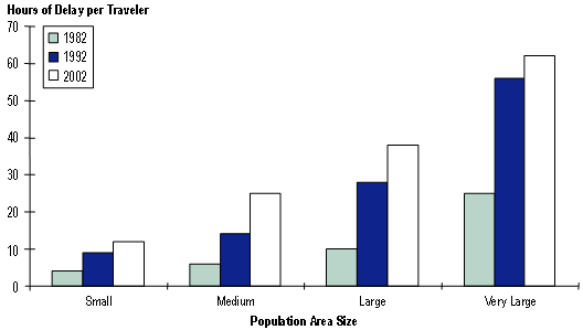
Figure 3.4 Peak-Period Congestion Trends by Urban Area Population Group
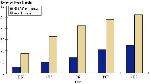
Source: Reference (1). Delay per peak traveler is a measure of the amount of extra travel time due to congestion. It is the amount of travel time above that required to complete a trip under ideal conditions.
As the economy and lifestyles have changed over the past two decades, congestion is an element that is taken into consideration as we plan our daily travel. Congestion effects are reflected in decisions about business location and expansion, home and job sites, school, doctor visits, recreation, and social events and even who you date.14 But it also is due to the fact that congestion affects more trips, more hours of the day and more of the transportation system (Figure 3.5). Congestion is affecting not only weekday commuter travel but several other types of travel: weekend travel in suburban shopping areas, travel near major recreational areas, and travel related to special events (such as sporting events).
Figure 3.5 Weekday Peak-Period Congestion Has Grown in Several Ways in the Past 20 Years in Our Largest Cities
Consider the following characteristics of congestion trends:
- Congestion affects more of the system. You might encounter stop-and-go traffic on any major street or freeway. Congestion effects have spread to neighborhoods, where cities and residents have developed elaborate plans and innovative techniques to make it harder for commuters to use the streets where kids play as bypass routes for gridlocked intersections. These are just the average conditions. Many cities have a few places where any daylight hour might see stop-and-go traffic. Weekend traffic delays have become a problem in recreational areas, near major shopping centers or sports arenas and in some constrained roadways.
- Congestion affects more time of the day. We are not just seeing these problems in the "rush hour." Peak periods typically stretch for two or three hours in the morning and evening in metro areas above one million people (Figure 3.6). Larger areas can see three or four hours of peak conditions.
- The extra travel time penalty has grown. It just takes longer to get to your destination. Not just work or school, but shopping trips, doctor visits and family outings are planned around the questions "How long do I want to spend in the car, bus or train?" and "Is it worth it?" Peak-period trips required 37 percent more travel time in 2003 than a free flow trip at midday, up from 28 percent 10 years earlier.
Figure 3.6 How Many Rush Hours in a Day?
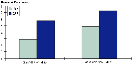
Source: Analysis of data used in 2005 Annual Urban Mobility Report, Texas Transportation Institute
Travel Reliability is getting worse. There really is a fourth characteristic to the congestion problem—Reliability. The extra travel time and amount of the day and system affected by travel delays is not the same every day. It may not even be as it was predicted 10 minutes ago (Figure 3.7).
Figure 3.7 Travel Time Reliability Illustration
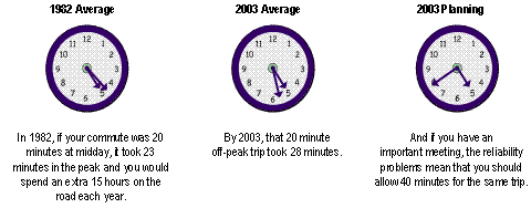
Source: Analysis of data used in 2005 Urban Mobility Report, Texas Transportation Institute
- 1982 – If your midday trip took 20 minutes, it would take you 23 minutes in the peak. Although no reliability statistics exist from that long ago, analysis of recent data suggest that you would have to add an additional nine minutes to that trip to guarantee on-time arrival at your destination; a total of 32 minutes might be planned for that trip.
- 2003 – By 2003, that 20-minute free-flow trip took 28 minutes. And if on-time arrival was important you should allow 40 minutes for the trip.
3.2.2 What the Survey Data Are Telling Us
In addition to the Urban Mobility report and Mobility Monitoring Program, congestion trends are tracked through travel surveys. On the national level, the two primary sources of data that exist are the National Household Travel Survey (NHTS) and the decennial Census. Some metropolitan areas, such as the San Francisco Bay Area, have also conducted their own household travel surveys. In general, all these surveys point to ever increasing congestion for the traveling public.
While the NHTS and Census indicate increasing congestion, the nature of travel behavior is changing as well. This is partially due to the change in family structure and the increase in vehicle ownership. On average, people are also traveling more miles to and from work. However, work trips comprise only a small percentage of all the trips that are taken.15
Increasing congestion can be represented by examining a combination of increasing travel time, increasing distance and decreasing speeds for privately owned vehicles (POV; Figures 3.8 to 3.10). Commuters are traveling longer distances at a slower rate. This trend is occurring in metropolitan statistical areas (MSA) of all sizes.
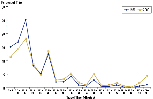
The Metropolitan Transportation Commission (MTC) in the San Francisco Bay Area has also conducted its own household travel survey in 1990 and 2000. Comparison of the results of the two surveys has been documented in the report, "Activities, Time, and Travel: Changes in Women's Travel Time Expenditures, 1990-2000." More people travel for a longer (more than 25 minutes) duration in 2000 than in 1990. The distribution of the travel time duration in Figure 3.11 is derived from data presented in the report.16
Figure 3.8 The Average Commute Travel Time in a Privately Owned Vehicle (POV) Has Increased
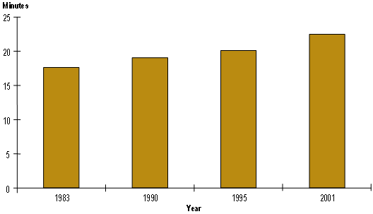
Figure 3.9 The Average Commute Trip Length in a POV Has Increased
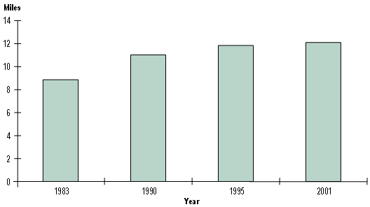
Figure 3.10 After Showing Modest Improvement in the 1990s, Average Commute Speeds Have Begun to Worsen
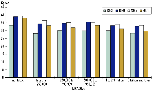
Figure 3.11 Trips in San Francisco Are Now Taking Longer to Complete
3.3 A CLOSER LOOK AT CONGESTION TRENDS
3.3.1 Cities with Detailed Traffic Monitoring Systems
FHWA has been compiling traffic monitoring data in major metropolitan areas since 2000. The program started with 10 cities and has added new cities every year. Additionally, some cities add traffic monitoring to new highways every year. The Appendix provides a description of the technologies used and the data collected from these systems. These data can be summarized at the areawide level or at the individual corridor level. Data from three cities whose participation began in 2000 follows.
Figures 3.12 and 3.13 summarize data from San Antonio for the 2000-2004 period. Congestion trends over the five years appear to relatively stable, with a slight increase overall in both congestion level and unreliable travel.
Figure 3.12 Daily and Monthly Trends in Congestion
San Antonio, Texas, 2000-2004
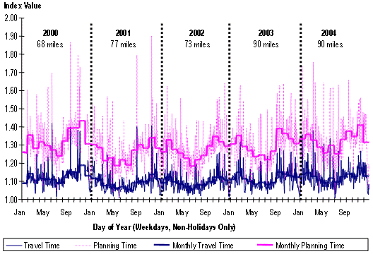
Source: Analysis of data from FHWA's Mobility Monitoring Program. The Travel Time Index (TTI) is a measure of total congestion. It is the ratio of the peak-period travel time to the travel time under ideal conditions. A TTI value of 1.2 indicates that peak-period travel takes 20 percent longer than under ideal conditions. All are shown for individual days. The "-Month" indices are monthly averages and are shown to smooth out the trends. Although weekends and holidays are excluded, days next to holidays show light peak-period traffic characteristics (e.g., July 5). Note the upturn in peak-period delay and unreliability in the Autumn months as vacationing travelers return to work and school. Note also that as the Travel Time Index increases, so does unreliable travel.
Figure 3.13 Annual Trends in Congestion
San Antonio, Texas, 2000-2004
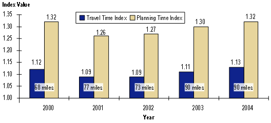
Note: The number of miles indicated on the chart is the amount of highways directly monitored by TxDOT in the San Antonio area in each year.
The dip in congestion in 2001 and 2002 can be due to two possible reasons: a decrease in economic activity and/or changes in the amount of roadway monitored. Another trend displayed in San Antonio that is also observed in many other cities is that as average congestion level increases, so does the amount of unreliable travel. This provides some empirical evidence for the theoretical relationships between bottleneck delay and traffic incident delay previously identified in Figure 2.4.
Examining trends in individual corridors removes the problem of changing traffic surveillance coverage from year to year. Table 3.1 shows corridor-level trends in the Seattle, Washington and Atlanta, Georgia areas. As with the San Antonio data, both cities exhibit the upturn in congestion level in 2001, followed in most corridors by a decrease in 2002, followed by a slight upturn in 2003. The fact that congestion is influenced by the general state of the economy has been noted anecdotally for many years, and these data provide some empirical evidence of the relationship. Also, the positive correlation between average congestion level (Travel Time Index) and reliability level (Buffer Index) is demonstrated very well in these data (Figure 3.14).
| Corridor SEATTLE |
Travel Time Index | |||
|---|---|---|---|---|
| 2000 | 2001 | 2002 | 2003 | |
| I-5A, NB (I-405 to I-90 11.13 mi) | 1.20 | 1.32 | 1.22 | 1.22 |
| I-5A, SB (I-90 to I-405 11.13 mi) | 1.13 | 1.25 | 1.17 | 1.17 |
| I-5B, NB (I-90 to SR 520 2.69 mi) | 1.25 | 1.74 | 1.53 | 1.54 |
| I-5B, SB (SR 520 to I-90 2.69 mi) | 1.22 | 1.31 | 1.24 | 1.23 |
| I-5C, NB (SR 520 to SR 526 21.39 mi) | 1.17 | 1.33 | 1.29 | 1.31 |
| I-5C, SB (SR 526 to SR 520 21.39 mi) | 1.22 | 1.27 | 1.30 | 1.36 |
| I-90, EB (S Norman Street (I-5) to Front Street 14.06 mi) | 1.08 | 1.17 | 1.13 | 1.12 |
| I-90, WB (Front Street to 12th Avenue (I-5) 14.32 mi) | 1.18 | 1.15 | 1.16 | 1.13 |
| I-405A, NB (I-5 S to I-90 9.01 mi) | 1.32 | 1.36 | 1.30 | 1.26 |
| I-405A, SB (I-90 to I-5 S 9.01 mi) | 1.20 | 1.30 | 1.31 | 1.23 |
| I-405B, NB (I-90 to I-5 N 15.44 mi) | 1.23 | 1.27 | 1.25 | 1.17 |
| I-405B, SB (I-5 N to I-90 15.44 mi) | 1.26 | 1.27 | 1.28 | 1.22 |
| Corridor SEATTLE |
Buffer Index | |||
|---|---|---|---|---|
| 2000 | 2001 | 2002 | 2003 | |
| I-5A, NB (I-405 to I-90 11.13 mi) | 30% | 51% | 29% | 30% |
| I-5A, SB (I-90 to I-405 11.13 mi) | 21% | 30% | 32% | 35% |
| I-5B, NB (I-90 to SR 520 2.69 mi) | 32% | 62% | 63% | 78% |
| I-5B, SB (SR 520 to I-90 2.69 mi) | 36% | 37% | 29% | 25% |
| I-5C, NB (SR 520 to SR 526 21.39 mi) | 21% | 35% | 32% | 33% |
| I-5C, SB (SR 526 to SR 520 21.39 mi) | 38% | 33% | 43% | 43% |
| I-90, EB (S Norman Street (I-5) to Front Street 14.06 mi) | 19% | 71% | 29% | 31% |
| I-90, WB (Front Street to 12th Avenue (I-5) 14.32 mi) | 31% | 27% | 38% | 30% |
| I-405A, NB (I-5 S to I-90 9.01 mi) | 26% | 35% | 24% | 24% |
| I-405A, SB (I-90 to I-5 S 9.01 mi) | 25% | 26% | 25% | 21% |
| I-405B, NB (I-90 to I-5 N 15.44 mi) | 18% | 31% | 19% | 16% |
| I-405B, SB (I-5 N to I-90 15.44 mi) | 24% | 22% | 31% | 24% |
| Corridor ATLANTA |
Travel Time Index | |||
|---|---|---|---|---|
| 2000 | 2001 | 2002 | 2003 | |
| I-75A, NB (I-285 to I-20 7.72 miles) | 1.09 | 1.13 | 1.11 | 1.14 |
| I-75A, SB (I-20 to I-285 7.36 mi) | 1.05 | 1.10 | 1.08 | 1.15 |
| I-75B, NB (I-20 to I-85 Split 3.73 mi) | 1.21 | 1.32 | 1.30 | 1.58 |
| I-75B, SB (I-85 Split to I-20 4.04 mi) | 1.38 | 1.66 | 1.56 | 1.88 |
| I-75C, NB (I-85 Split to I-285 8.95 mi) | 1.11 | 1.17 | 1.09 | 1.11 |
| I-75C, SB (I-285 to I-85 Split 9.63 mi) | 1.05 | 1.09 | 1.12 | 1.19 |
| I-85A, NB (Camp Creek Parkway to I-75 4.18 mi) | 1.02 | 1.01 | 1.01 | 1.02 |
| I-85A, SB (I-75 to Camp Creek Parkway 4.05 mi) | 1.02 | 1.01 | 1.01 | 1.01 |
| I-85B, NB (I-75 to Jimmy Carter Boulevard 14 mi) | 1.07 | 1.16 | 1.49 | 1.13 |
| I-85B, SB (Jimmy Carter Boulevard to I-75 13.6 mi) | 1.10 | 1.12 | 1.09 | 1.14 |
| Corridor ATLANTA |
Buffer Index | |||
|---|---|---|---|---|
| 2000 | 2001 | 2002 | 2003 | |
| I-75A, NB (I-285 to I-20 7.72 mi) | 21% | 29% | 33% | 35% |
| I-75A, SB (I-20 to I-285 7.36 mi) | 12% | 22% | 25% | 33% |
| I-75B, NB (I-20 to I-85 Split 3.73 mi) | 48% | 59% | 58% | 100% |
| I-75B, SB (I-85 Split to I-20 4.04 mi) | 24% | 36% | 32% | 56% |
| I-75C, NB (I-85 Split to I-285 8.95 mi) | 30% | 39% | 32% | 35% |
| I-75C, SB (I-285 to I-85 Split 9.63 mi) | 13% | 29% | 42% | 50% |
| I-85A, NB (Camp Creek Parkway to I-75 4.18 mi) | 6% | 1% | 1% | 3% |
| I-85A, SB (I-75 to Camp Creek Parkway 4.05 mi) | 7% | 8% | 5% | 8% |
| I-85B, NB (I-75 to Jimmy Carter Boulevard 14 mi) | 22% | 49% | 19% | 23% |
| I-85B, SB (Jimmy Carter Boulevard to I-75 13.6 mi) | 41% | 37% | 31% | 34% |
Figure 3.14 Corridor Statistics for Seattle and Atlanta
2000-2003
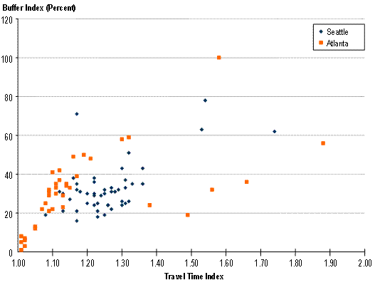
Source: Analysis of data from FHWA's Mobility Monitoring Program. The Travel Time Index (TTI) is a measure of total congestion. It is the ratio of the peak period travel time to the travel time under ideal conditions. A TTI value of 1.2 indicates that peak period travel takes 20 percent longer than under ideal conditions. The Buffer Index is a measure of reliability; as it increases, travel times become increasingly unreliable. (See Table 2.2 for definitions)
3.3.2 The Nation's Major Traffic Bottlenecks
Physical bottlenecks have been the focus of transportation improvements—and of travelers' concerns—for many years. On much of the urban highway system, there are specific points that are notorious for causing congestion on a daily basis. These locations—which can be a single interchange (usually freeway-to-freeway), a series of closely spaced interchanges, or lane-drops—are focal points for congestion in corridors; major bottlenecks tend to dominate congestion in corridors where they exist. Many acquire nicknames from local motorists such as:
- "Spaghetti Bowl" in Las Vegas;
- "Hillside Strangler" in Chicago; and
- "Mixmaster" in Dallas.
How bad congestion becomes at a bottleneck is related to its physical design. Some bottlenecks were originally constructed many years ago using designs that were appropriate when there were built, but are now considered antiquated. Others have been built to extremely high design specifications and are simply overwhelmed by traffic. A recent examination of national bottlenecks identified the worst physical bottlenecks in the country and examined the positive effects that improving them could have on travel times, safety, emissions, and fuel consumption. Table 3.2 provides a ranking of these bottlenecks.
| Rank | City | Freeway | Location | Annual Hours of Delay (Hours in Thousands) |
|---|---|---|---|---|
| 1 | Los Angeles | U.S. 101 | U.S. 101 (Ventura Freeway) at I-405 Interchange | 27,144 |
| 2 | Houston | I-610 | I-610 at I-10 Interchange (West) | 25,181 |
| 3 | Chicago | I-90 | I-90/94 at I-290 Interchange ("Circle Interchange") | 25,068 |
| 4 | Phoenix | I-10 | I-10 at SR 51/SR 202 Interchange ("Mini-Stack") | 22,805 |
| 5 | Los Angeles | I-405 | I-405 (San Diego Freeway) at I-10 Interchange | 22,792 |
| 6 | Atlanta | I-75 | I-75 south of the I-85 Interchange | 21,045 |
| 7 | Washington (D.C.-Maryland-Virginia) | I-495 | I-495 at I-270 Interchange | 19,429 |
| 8 | Los Angeles | I-10 | I-10 (Santa Monica Freeway) at I-5 Interchange | 18,606 |
| 9 | Los Angeles | I-405 | I-405 (San Diego Freeway) at I-605 Interchange | 18,606 |
| 10 | Atlanta | I-285 | I-285 at I-85 Interchange ("Spaghetti Junction") | 17,072 |
| 11 | Chicago | I-94 | I-94 (Dan Ryan Expressway) at I-90 Skyway Split (Southside) | 16,713 |
| 12 | Phoenix | I-17 | I-17 (Black Canyon Freeway) at I-10 Interchange (the "Stack") to Cactus Road | 16,310 |
| 13 | Los Angeles | I-5 | I-5 (Santa Ana Freeway) at SR 22/SR 57 Interchange ("Orange Crush") | 16,304 |
| 14 | Providence | I-95 | I-95 at I-195 Interchange | 15,340 |
| 15 | Washington (D.C.-Maryland-Virginia) | I-495 | I-495 at I-95 Interchange | 15,035 |
| 16 | Tampa | I-275 | I-275 at I-4 Interchange ("Malfunction Junction") | 14,371 |
| 17 | Atlanta | I-285 | I-285 at I-75 Interchange | 14,333 |
| 18 | Seattle | I-5 | I-5 at I-90 Interchange | 14,306 |
| 19 | Chicago | I-290 | I-290 (Eisenhower Expressway) Between Exits 17b and 23a | 14,009 |
| 20 | Houston | I-45 | I-45 (Gulf Freeway) at U.S. 59 Interchange | 13,944 |
| 21 | San Jose | U.S. 101 | U.S. 101 at I-880 Interchange | 12,249 |
| 22 | Las Vegas | U.S. 95 | U.S. 95 west of the I-15 Interchange ("Spaghetti Bowl") | 11,152 |
| 23 | San Diego | I-805 | I-805 at I-15 Interchange | 10,992 |
| 24 | Cincinnati | I-75 | I-75, from Ohio River Bridge to I-71 Interchange | 10,088 |
Source: Unclogging America's Arteries: Effective Relief for Highway Bottlenecks, American Highway Users Alliance (AHUA), February 2004. Delay is the extra time it would take to travel through the bottlenecks compared to completely uncongested conditions. The report did not consider many severe bottlenecks from the New York City area. As most travelers know, congestion in and around the boroughs of New York can be significant. However, a very large amount of delay in the New York area is related to bridge and tunnel crossings into Manhattan, most of which are toll facilities. Also, while the New York metropolitan area is laced with Interstates, parkways, and expressways, they seldom reach the proportions seen in other major areas, except where multiple highways converge on bridge of tunnel crossings. (A typical lane configuration for a New York area freeway is six lanes, three in each direction. But there are many of these.) Toll facilities were excluded from the study because toll facilities are fundamentally different from other physical bottlenecks (such as freeway-to-freeway interchanges) that are prevalent around the country. Delay comparisons between toll facilities and other types of bottlenecks might not be consistent since different modeling techniques would be used. If objective field measurements of delay could be made at all locations around the country, several river crossings into Manhattan would no doubt be included in a list of the nation's worst bottlenecks.
A current FHWA study is identifying the location of bottlenecks specific to truck traffic.17 Not surprisingly, when total truck delay is considered, urban locations dominate the bottleneck rankings (Figure 3.15). In fact, many of the same locations identified in the AHUA study as commuting bottlenecks also appear as truck bottlenecks, though the rankings shift due to higher truck volumes at some locations. The fact that trucks get caught in congestion at urban bottlenecks (resulting in productivity losses and increased transportation costs) only increases the significance of these bottlenecks as major transportation problems. Conversely, alleviating congestion at specific bottleneck locations will result in substantial benefits to commuters and truckers alike, and these benefits will be passed onto the economy at-large.
Figure 3.15 Interchange Capacity Bottlenecks on Freeways Used as Urban Truck Corridors
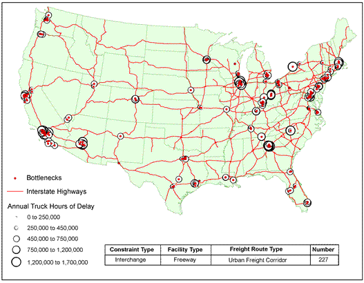
Source: Cambridge Systematics and Battelle Memorial Institute, Freight Bottlenecks, unpublished white paper for FHWA Office of Policy, March 2005
3.3.3 Expected Congestion in the Future: Not Just for Metropolitan Areas Anymore
Figure 3.16 depicts congestion at the national level for 1998. As shown, congestion is confined to metropolitan areas. In contrast, Figure 3.17 shows the expected growth in congestion by 2020, assuming no additional increases in physical and operational highway capacity. In addition to more metropolitan areas experiencing congestion, Figure 3.17 shows that congestion will spread into formerly rural areas, the urban fringe, and intercity corridors. Much of this congestion will affect intercity truck traffic, which is expected to grow by 75 percent between 2000 and 2020.18
Figure 3.16 Congested Highways (1998)
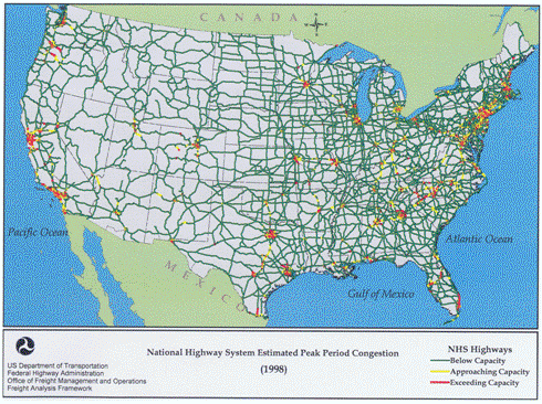
Source: Federal Highway Administration Freight Analysis Framework.
Figure 3.17 Potentially Congested Highways (2020)
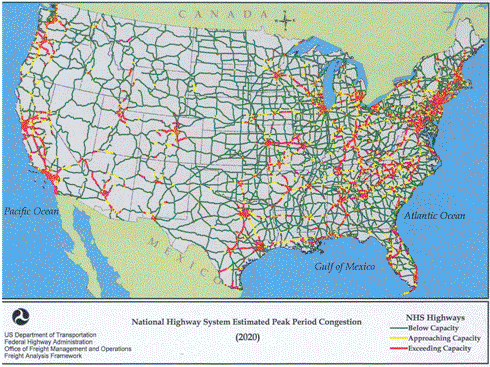
Source: Federal Highway Administration Freight Analysis Framework
In addition to the long-range modeling used to produce the data in Figure 3.17, examination of trends over the past decade, reinforce the idea that congestion is spreading out of cities. Figure 3.18 shows that vehicle-miles of travel are growing faster in rural areas than in urban areas. While there is currently enough excess capacity in most rural areas to absorb this increase, it will be eventually overtaken by traffic growth. Moreover, the first indications of nonmetropolitan congestion are beginning to manifest themselves. A recent study by transportation interest groups identified several rural recreational and tourist destinations that routinely experience congestion during the summertime peaks.19 While congestion at these locations is far less than in urban areas—the bottleneck restrictions are not as severe and delay is incurred usually only on peak-season weekends—the growth in rural traffic of all kinds means that congestion in nonmetropolitan areas will continue to increase.
Figure 3.18 Vehicle-Miles of Travel on Major Rural and Urban Roads Increased Between 1990 to 2002
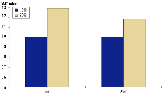
Note: For the VMT Index, 1.0 = 1990 level
Source: American Highway Users Alliance, AAA, and TRIP, Are We There Yet? A Report on Summer Traffic Bottlenecks and Steps Needed to Ensure that Our Favorite Vacation Destinations Remain Accessible, June 30, 2005.
http://www.highways.org/pdfs/travel_study2005.pdf.
- Schrank, D. and Lomax, T., 2005 Urban Mobility Report, Texas Transportation Institute.
- Caitlin Liu. Los Angeles Times. SigAlert on the Roadway to Love; Traffic Sometimes Dictates the Route of Romance in Los Angeles. February 13, 2004.
- A Walk Through Time: Changes in the American Commute, http://nhts.ornl.gov/2001/ presentations/commuting/index.shtml.
- Activities, Time, and Travel: Changes in Women's Travel Time Expenditures, 1990-2000, by Rachel Gossen and Charles L. Purvis. http://www.mtc.ca.gov/maps_and_data/ datamart/research/Changes-in-Womens-Travel-Time-Expenditures-1990-2000.pdf.
- Cambridge Systematics and Battelle Memorial Institute, Freight Bottlenecks, unpublished white paper for FHWA Office of Policy, March 2005.
- FHWA Freight Analysis Framework, https://ops.fhwa.dot.gov/freight/freight_news/FAF/talkingfreight_faf.htm.
- American Highway Users Alliance, AAA, and TRIP, Are We There Yet? A Report on Summer Traffic Bottlenecks and Steps Needed to Ensure that Our Favorite Vacation Destinations Remain Accessible, June 30, 2005. http://www.highways.org/pdfs/travel_study2005.pdf.
Previous | Table of Contents | Next
| Last modified: March 23, 2020 | ||